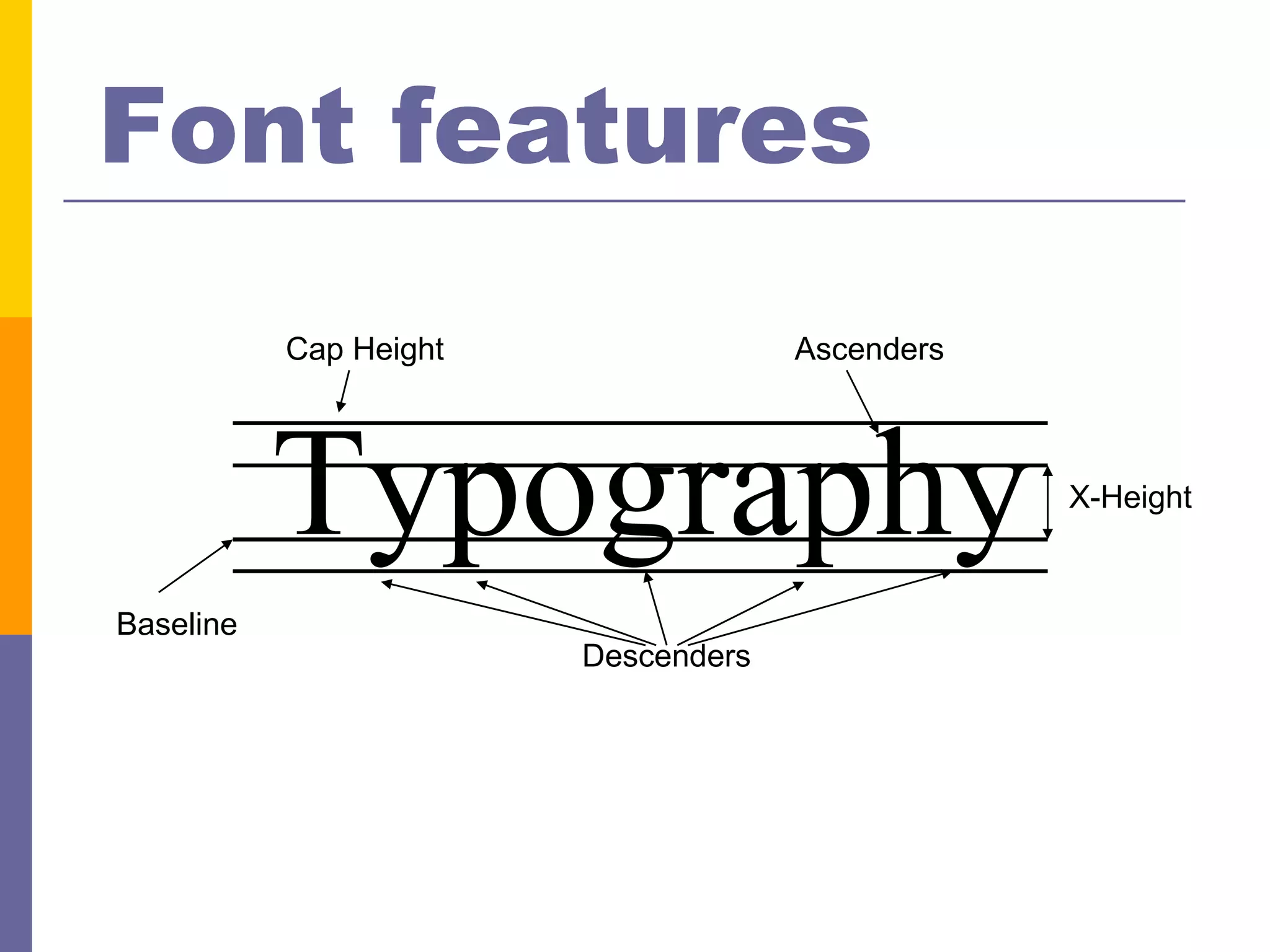
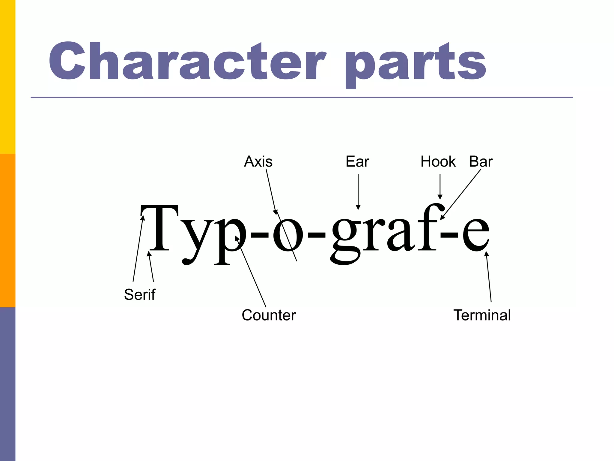
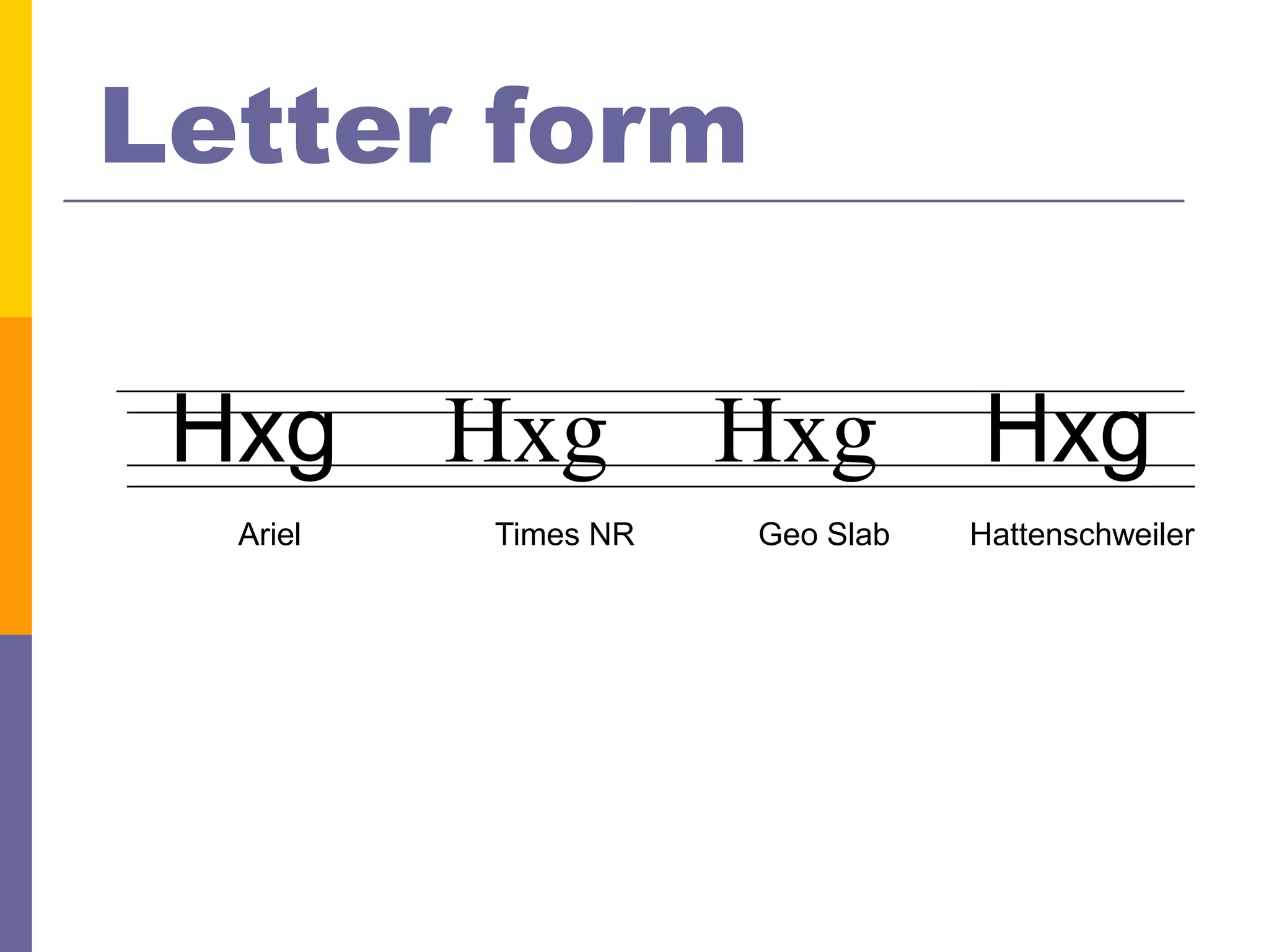
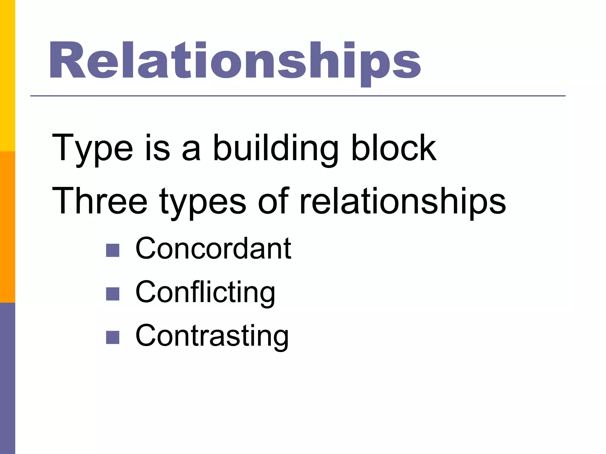
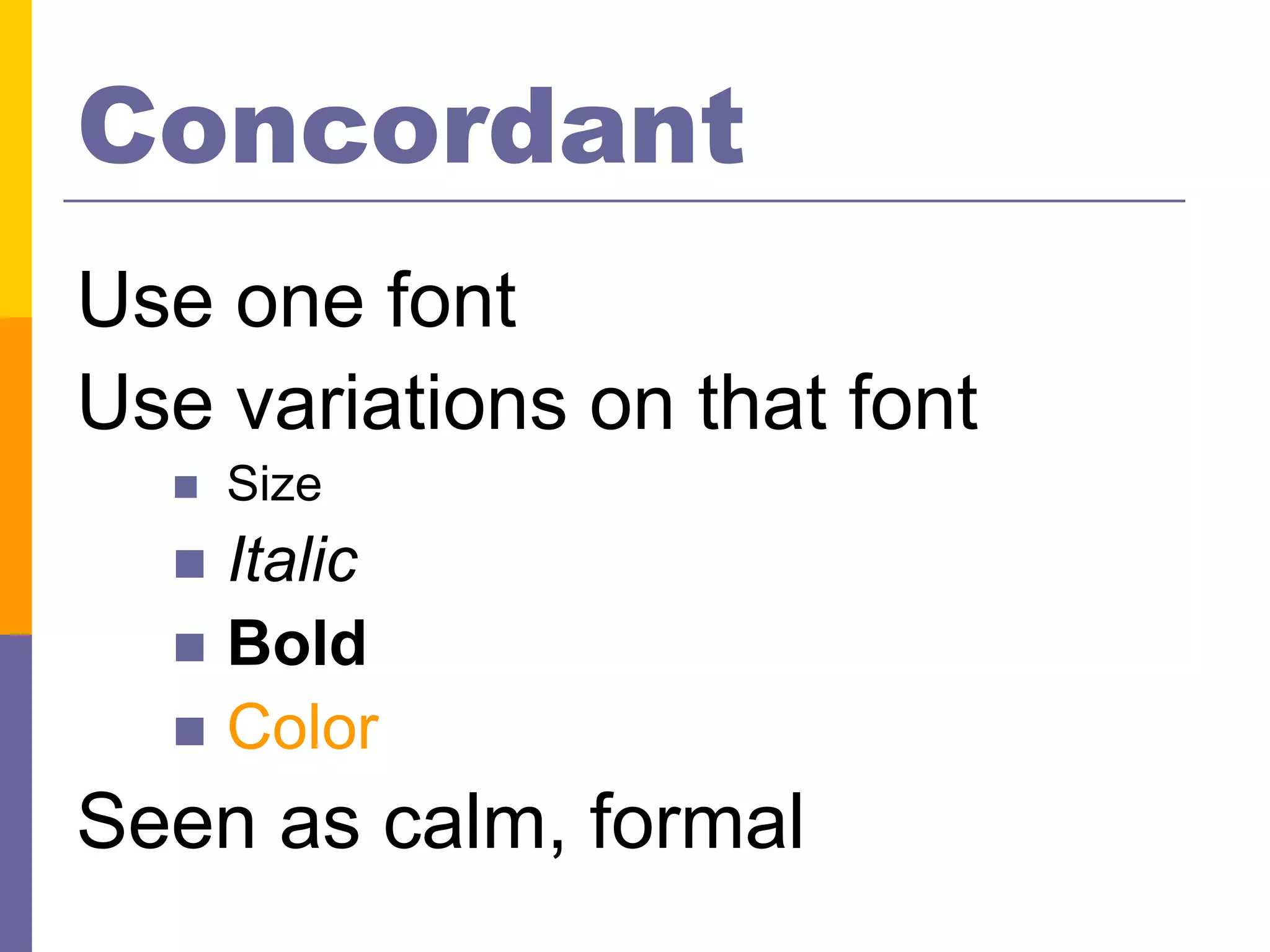
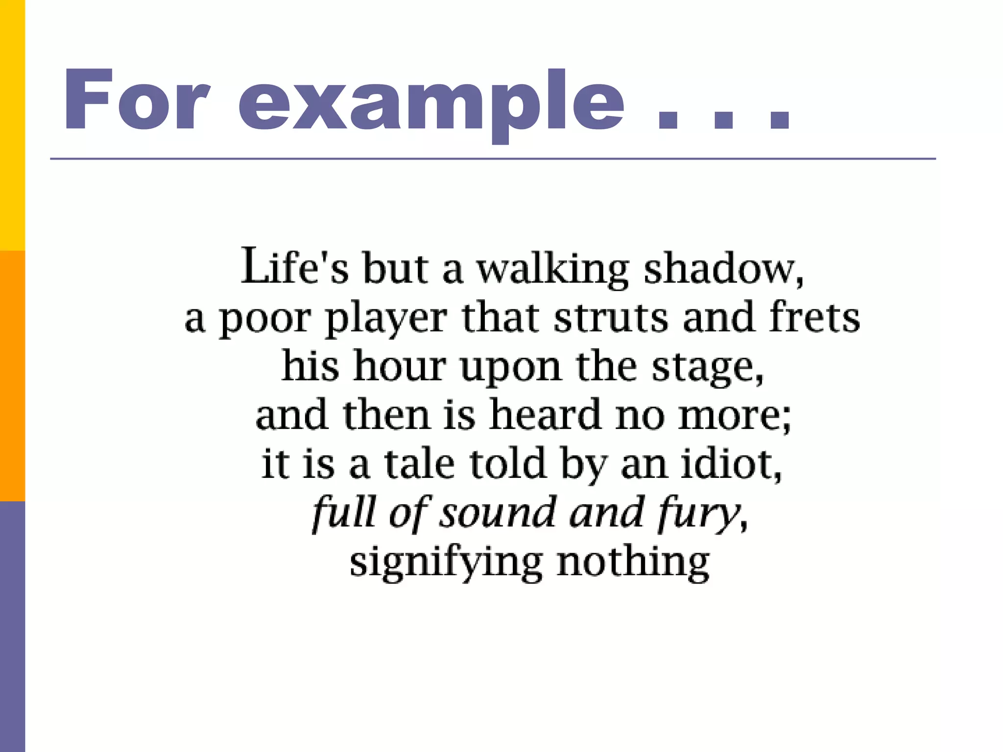
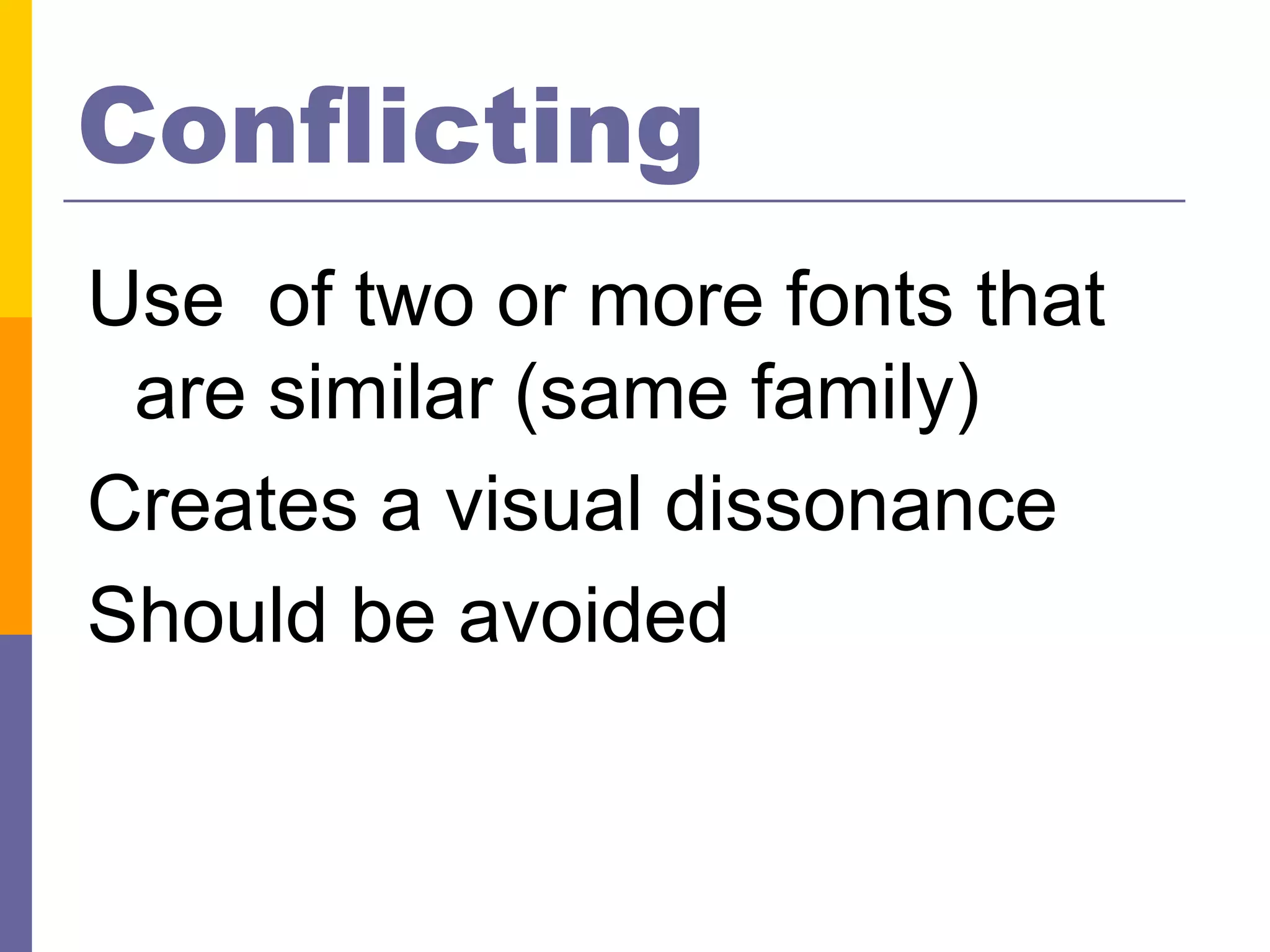
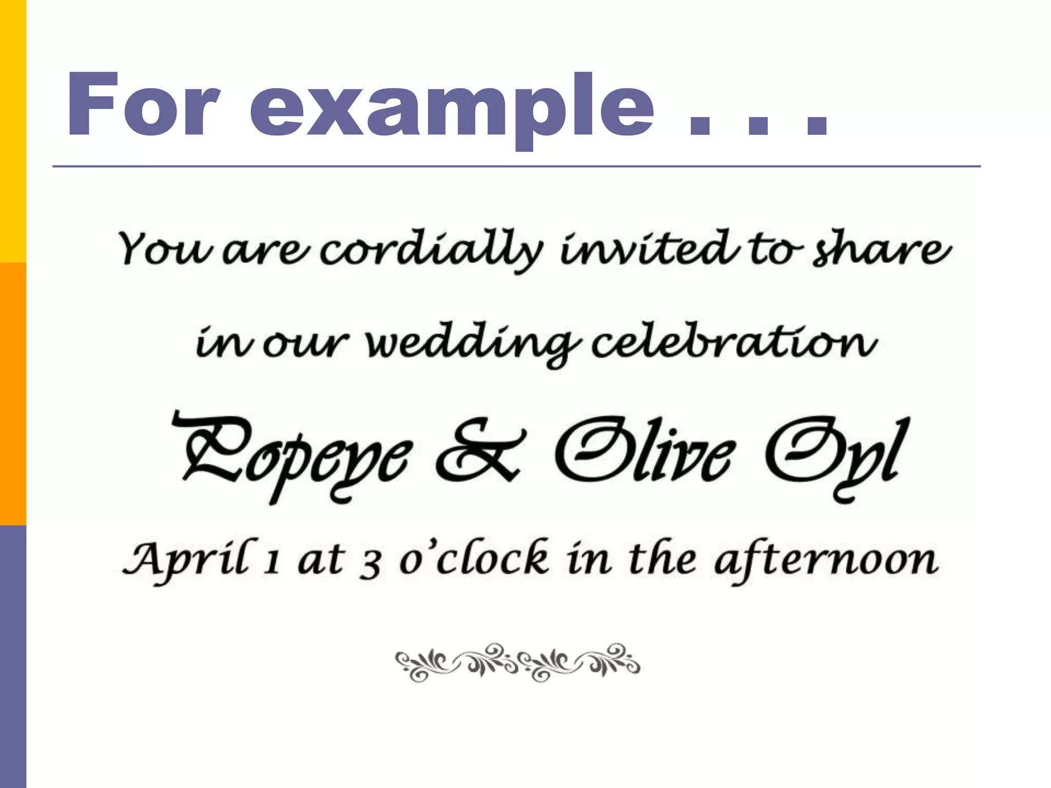
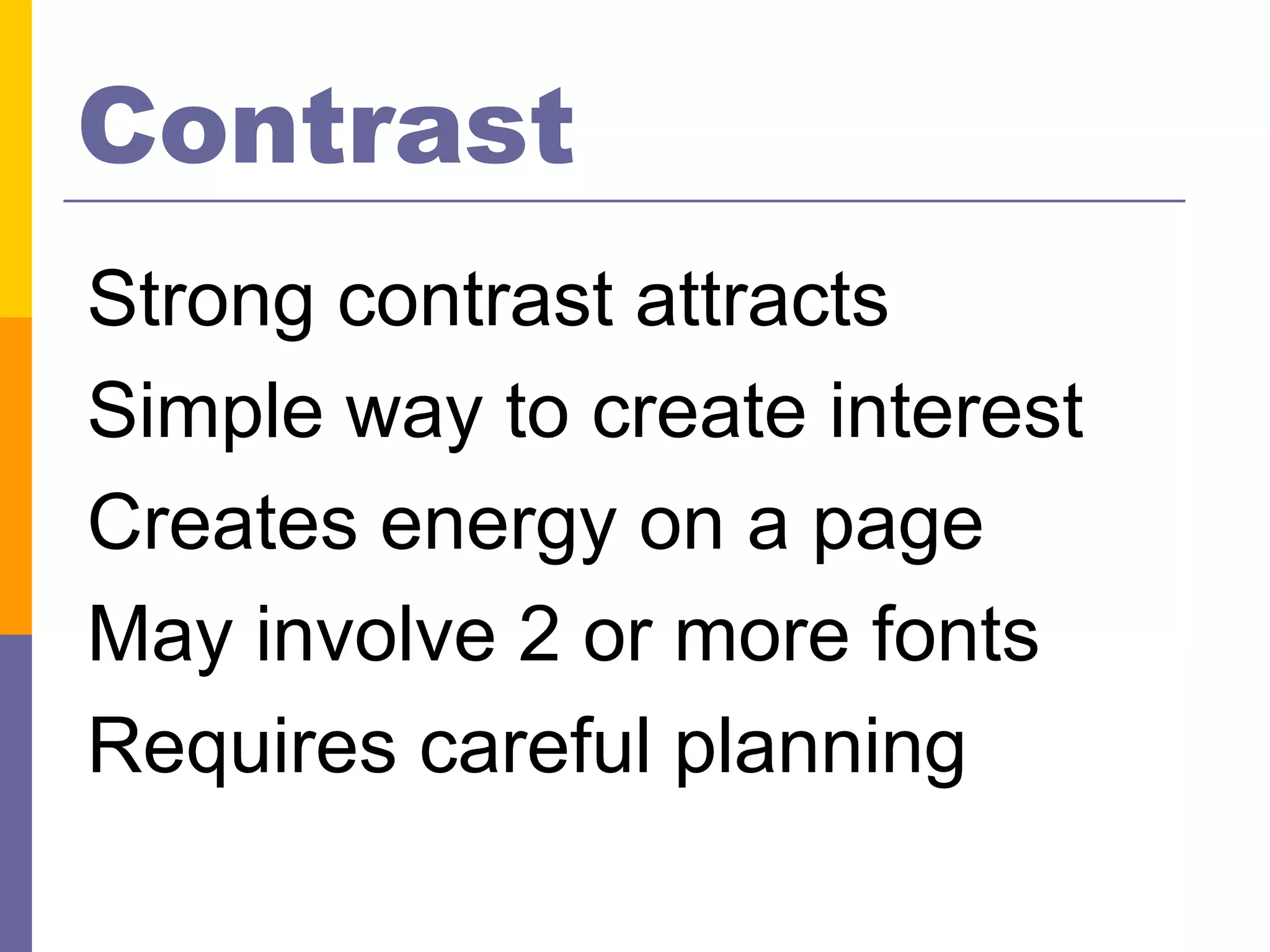
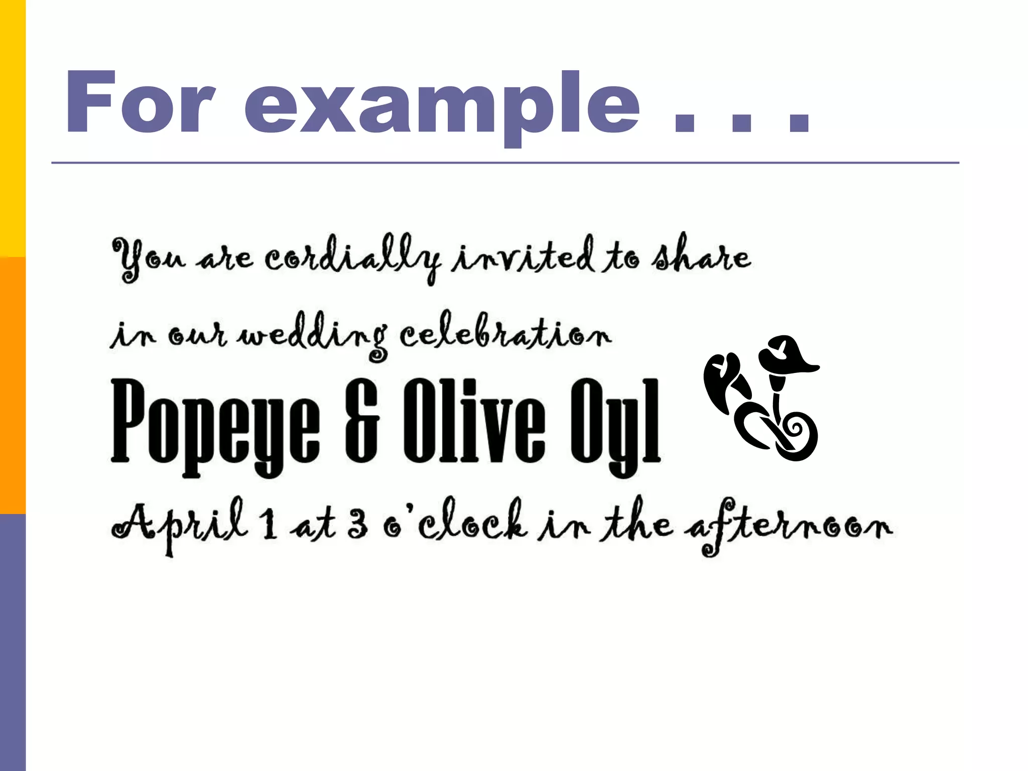
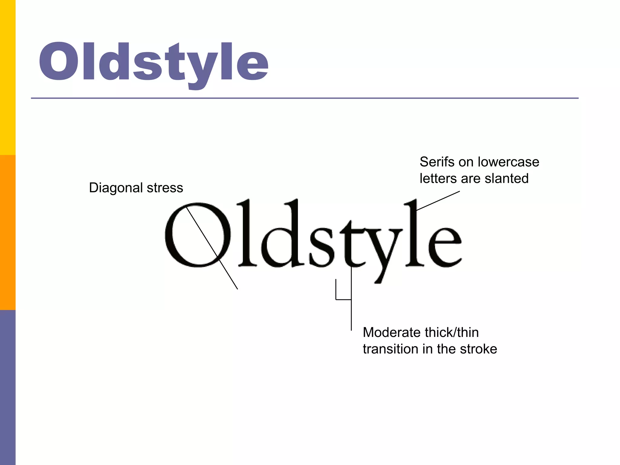
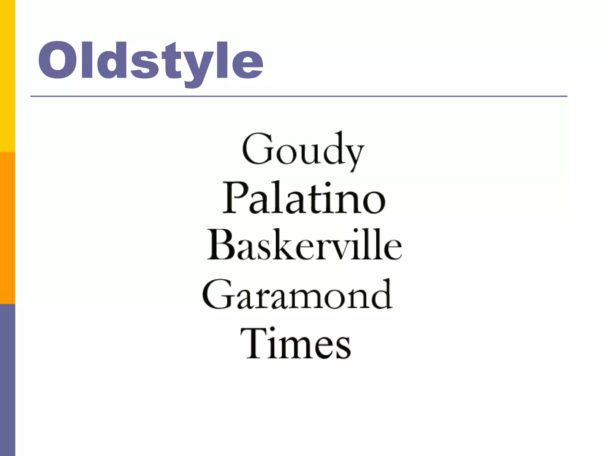
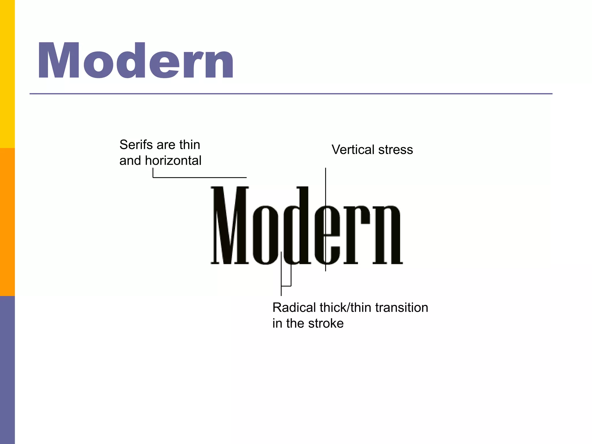
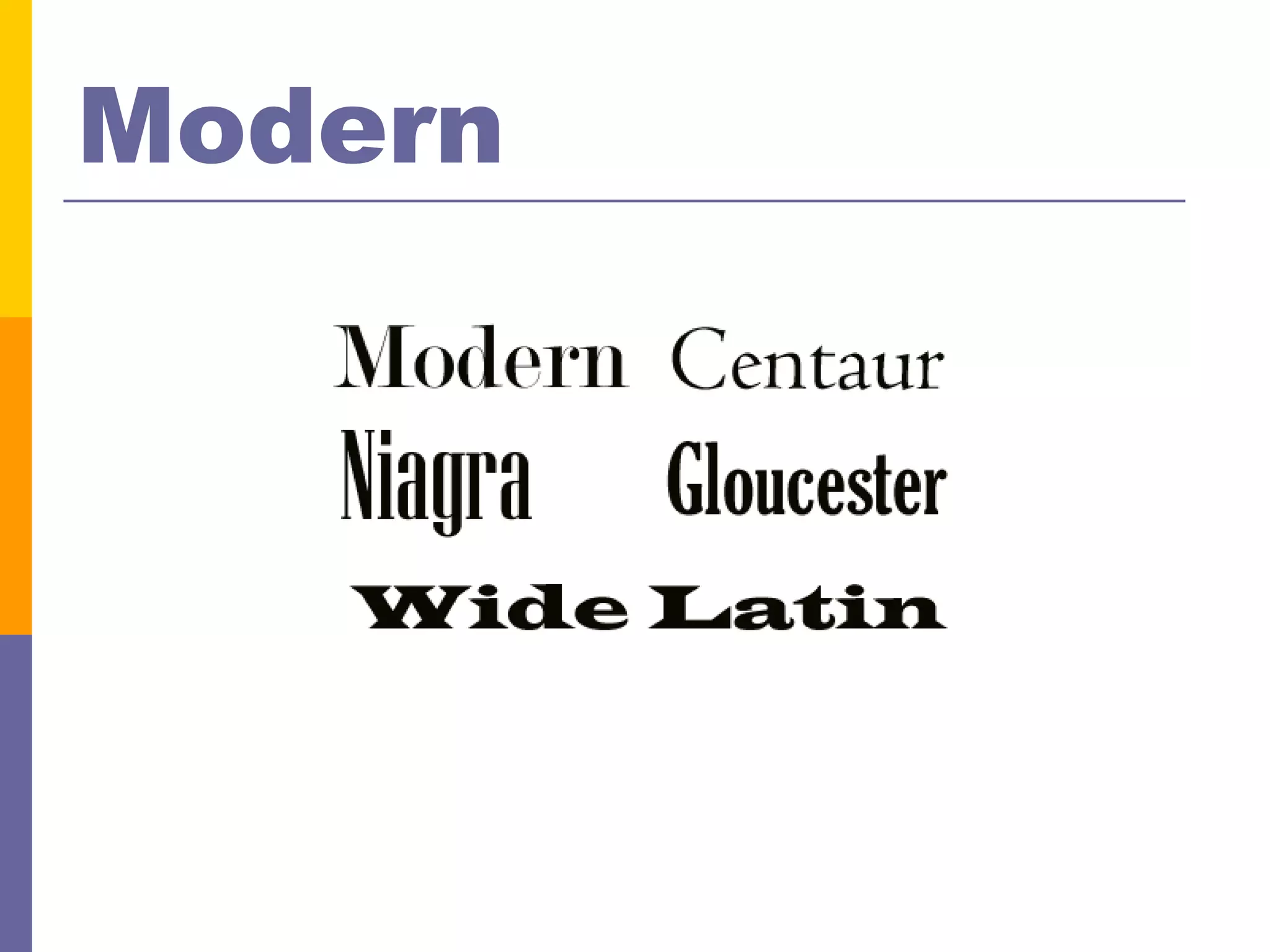
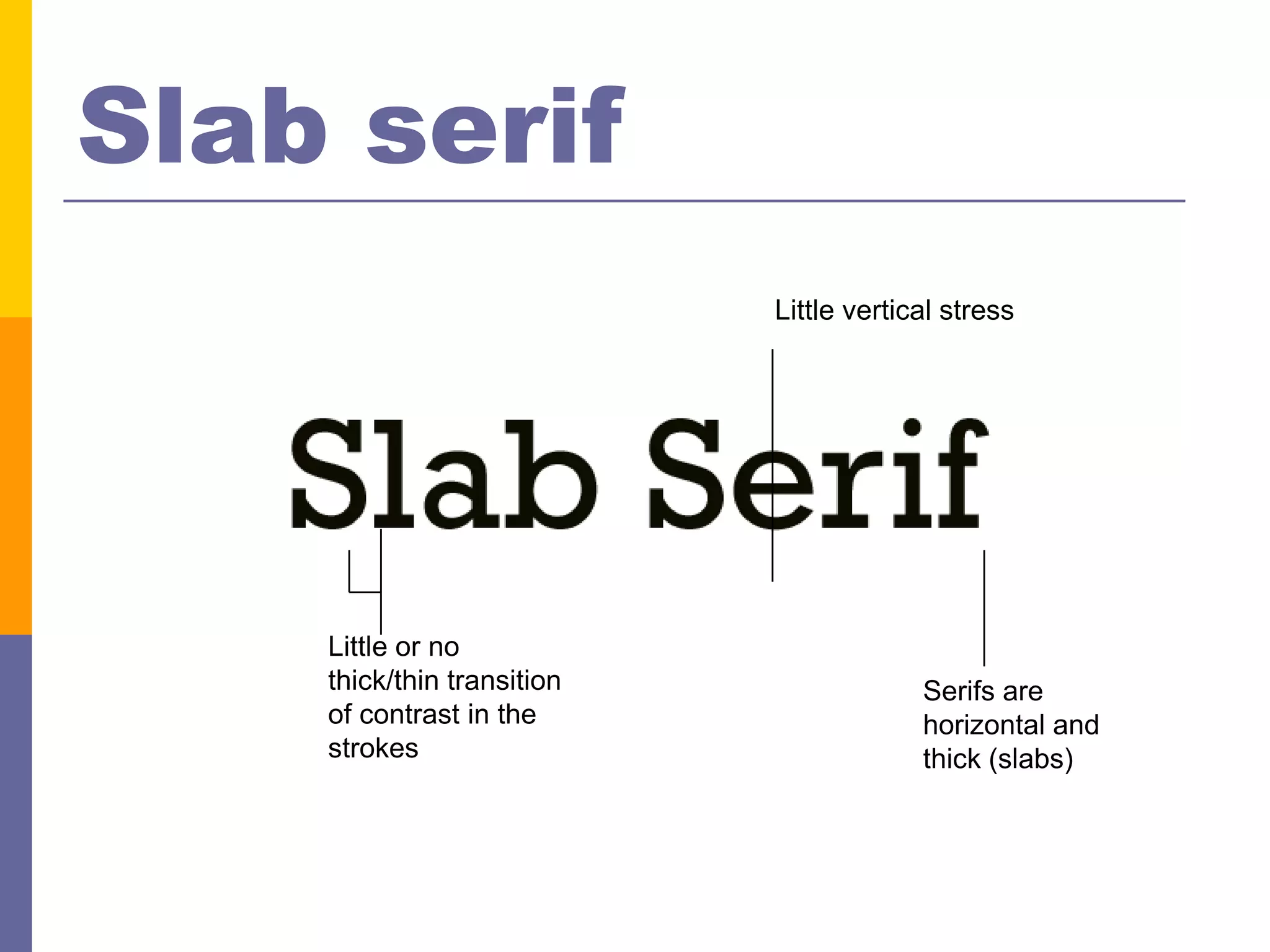
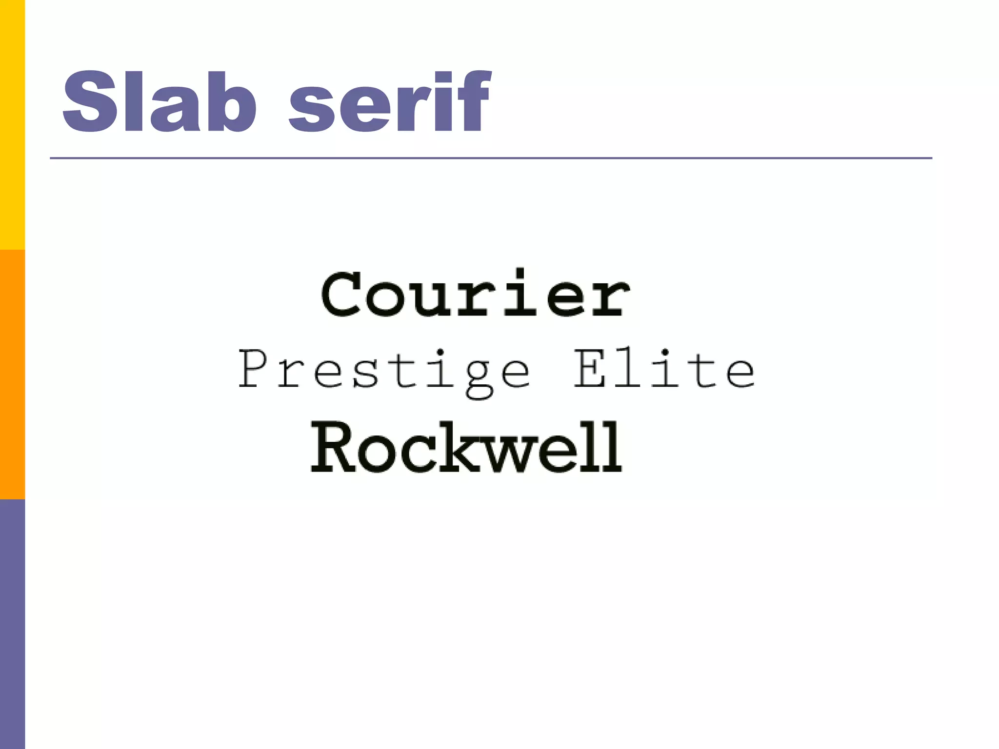
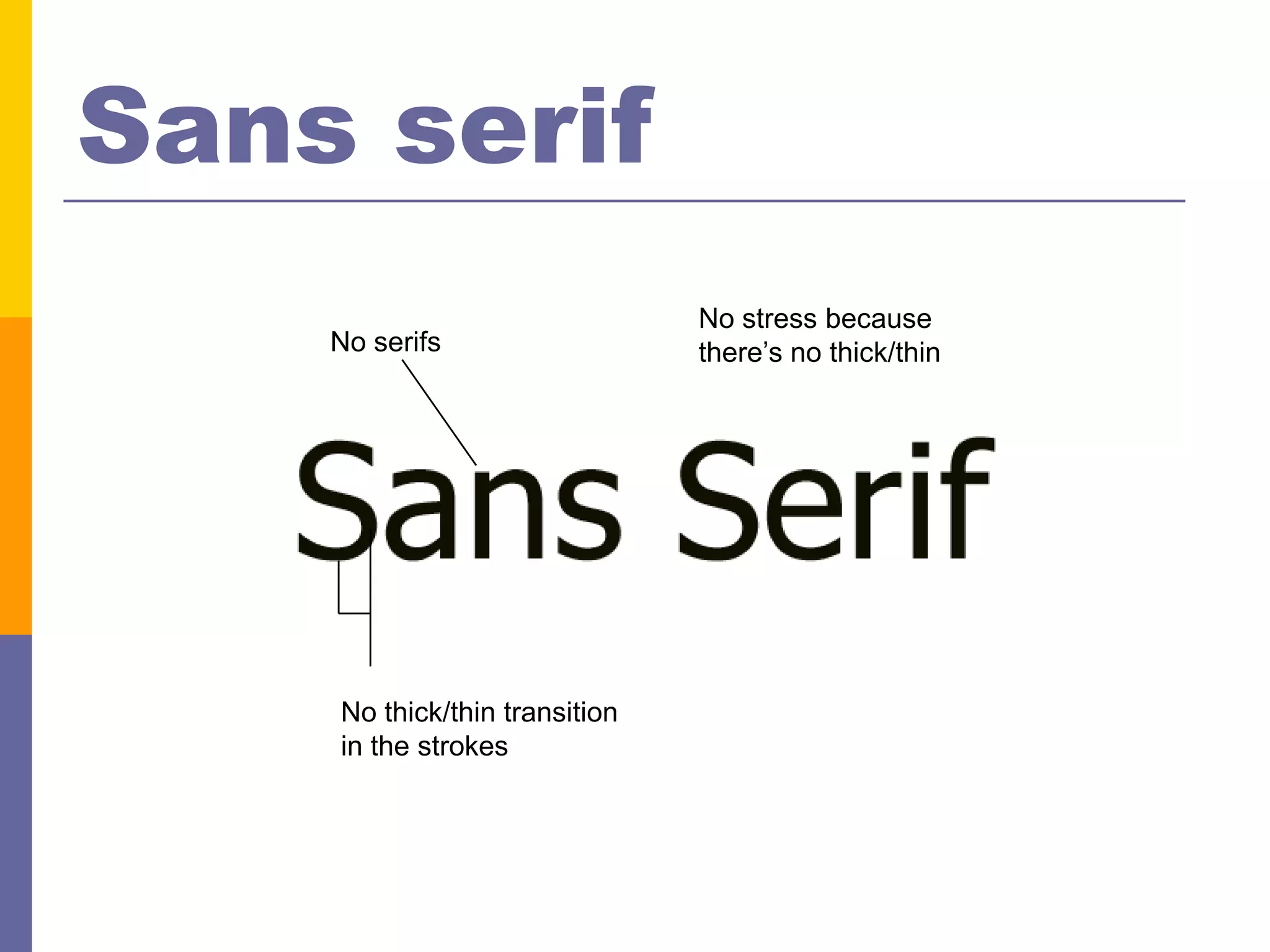
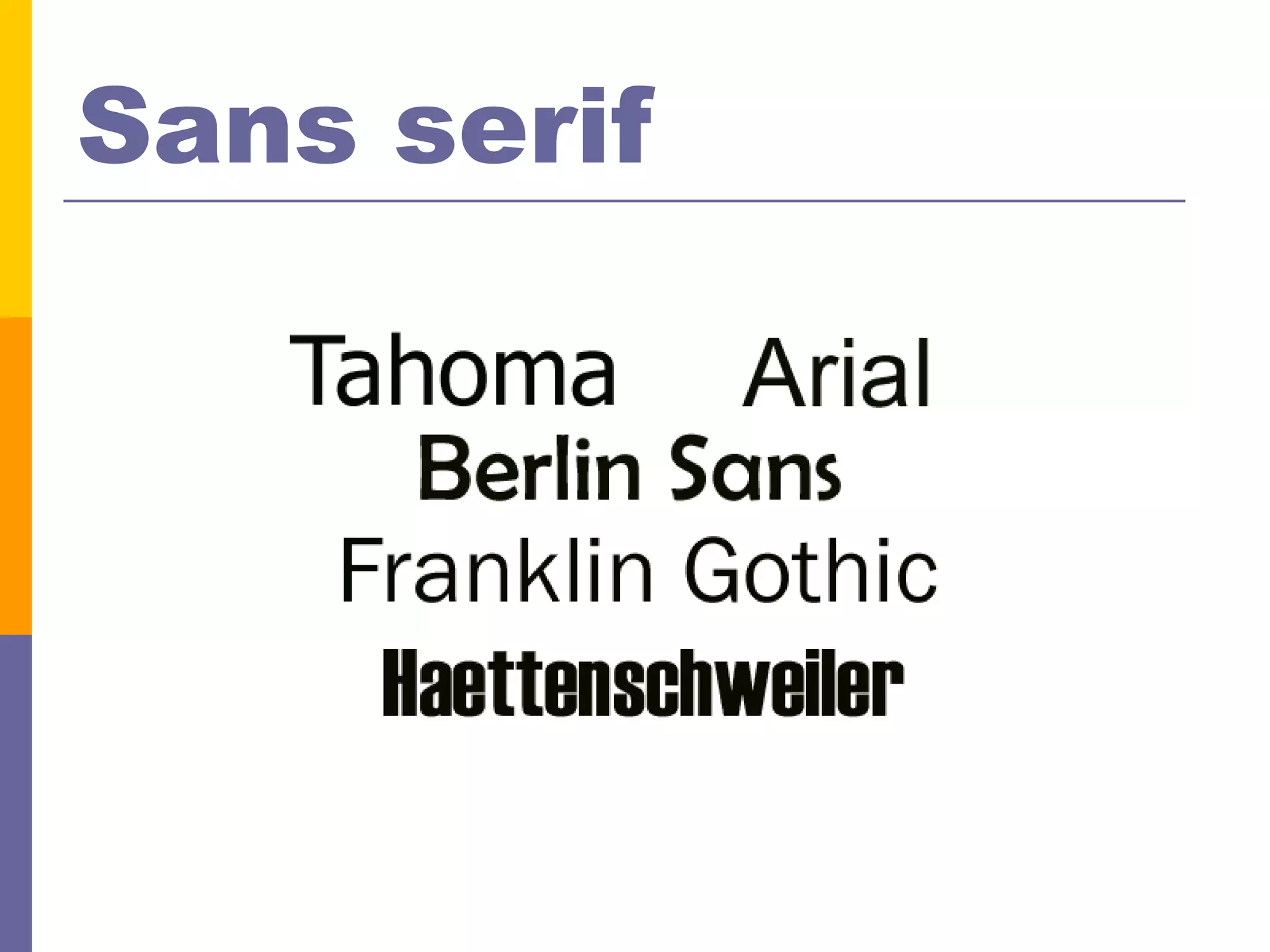
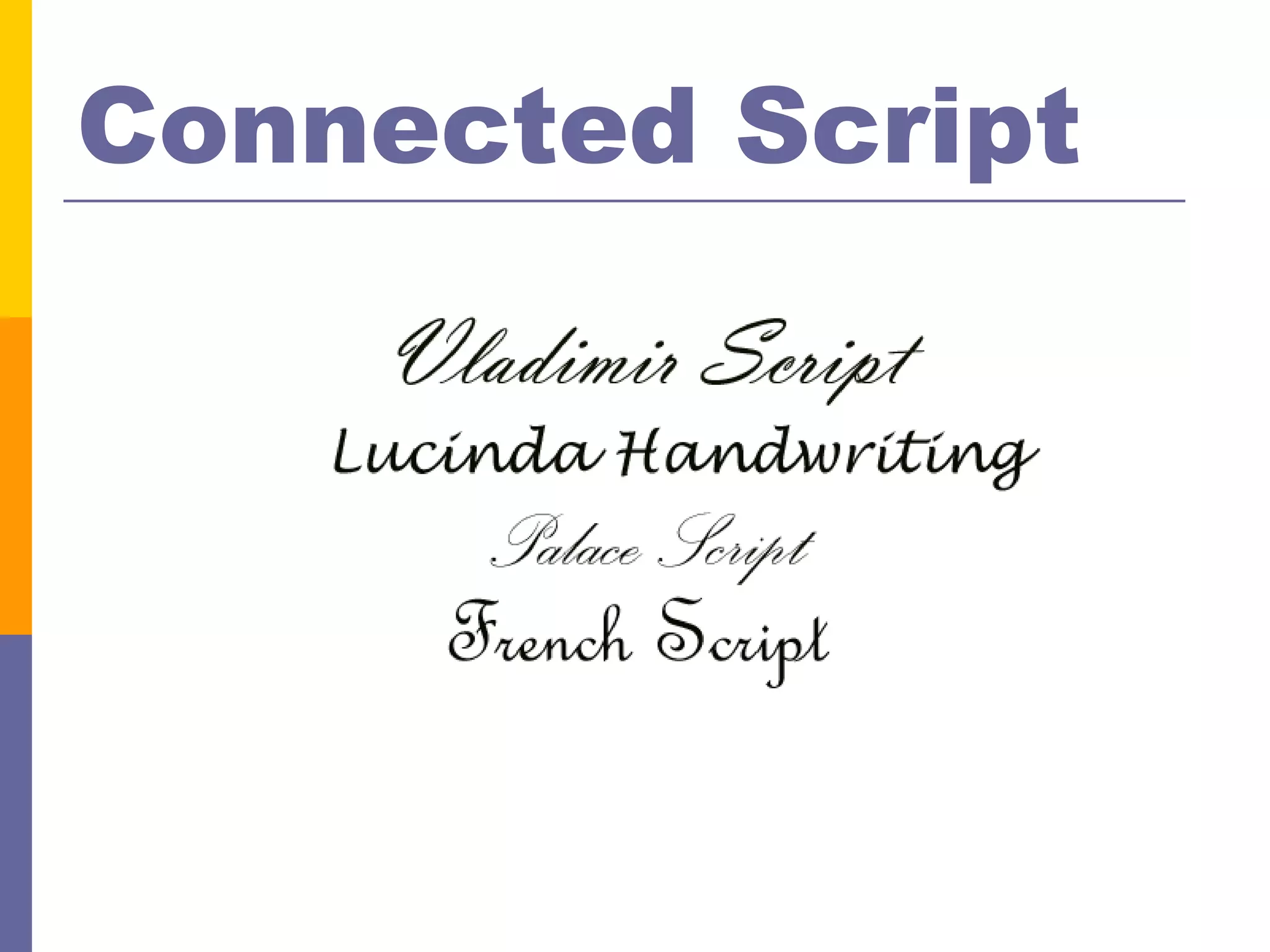
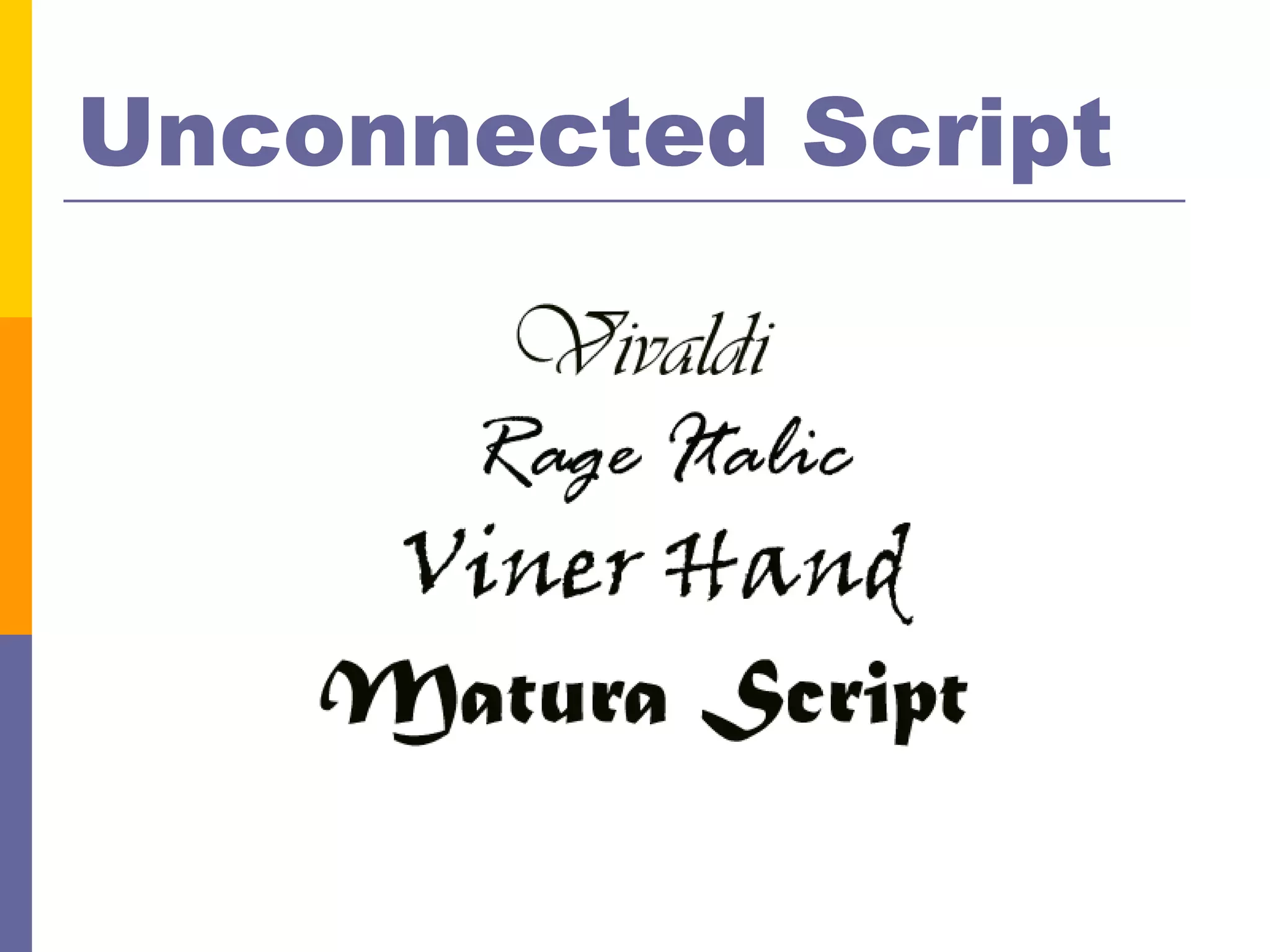
Typographical
Font features
           Cap Height                Ascenders


           Typography                            X-Height


Baseline
                        Descenders
Character parts
          Axis      Ear   Hook Bar


    Typ-o-graf-e
  Serif
          Counter            Terminal
Letter form

 Hxg      Hxg        Hxg        Hxg
  Ariel   Times NR   Geo Slab   Hattenschweiler
Kerning
Inter-character spacing


       Time        Unkerned type


       Time        Kerned type TNT
Tracking
Leading                       (Line spacing)

Leading refers to the space      Leading refers to the space
between lines. It can be         between lines. It can be
tightened or expanded as
needed to fill space. (1)        tightened or expanded as
                                 needed to fill space. (1.25)


Leading refers to the space      Leading refers to the space
                                 between lines. It can be
between lines. It can be         tightened or expanded as
tightened or expanded as         needed to fill space. (.8)

needed to fill space. (1.4)
Relationships
Type is a building block
Three types of relationships
      Concordant
      Conflicting
      Contrasting
Concordant
Use one font
Use variations on that font
     Size
   Italic
   Bold
   Color

Seen as calm, formal
For example . . .
Conflicting
Use of two or more fonts that
 are similar (same family)
Creates a visual dissonance
Should be avoided
For example . . .
Contrast
Strong contrast attracts
Simple way to create interest
Creates energy on a page
May involve 2 or more fonts
Requires careful planning
For example . . .
Oldstyle
                             Serifs on lowercase
                             letters are slanted
 Diagonal stress


                   Moderate thick/thin
                   transition in the stroke
Oldstyle
Modern
  Serifs are thin             Vertical stress
  and horizontal


                    Radical thick/thin transition
                    in the stroke
Modern
Slab serif
                            Little vertical stress


    Little or no
    thick/thin transition                Serifs are
    of contrast in the                   horizontal and
    strokes                              thick (slabs)
Slab serif
Sans serif
                               No stress because
    No serifs                  there’s no thick/thin


    No thick/thin transition
    in the strokes
Sans serif
Connected Script
Unconnected Script
Decorative
Typography exists
to honor content
      Robert Bringhurst, The Elements of Typographic Style
Typographic basics

Typographic basics