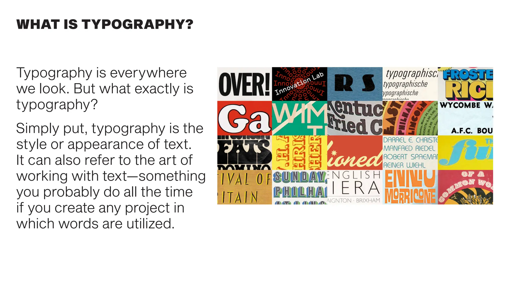
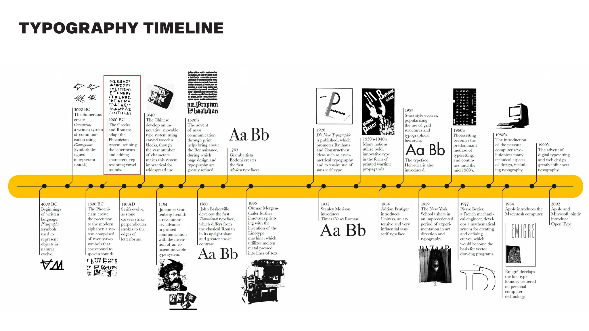
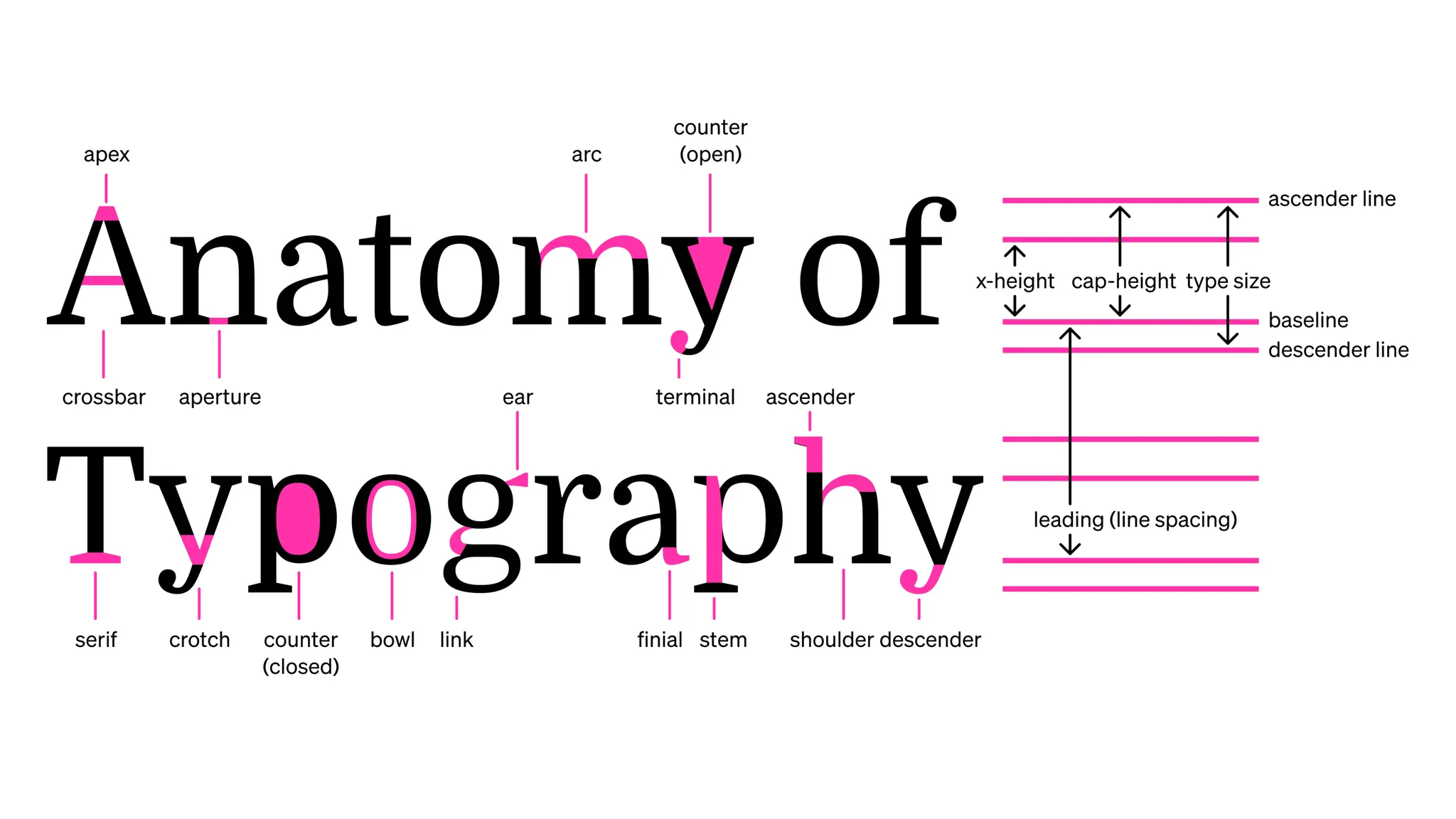
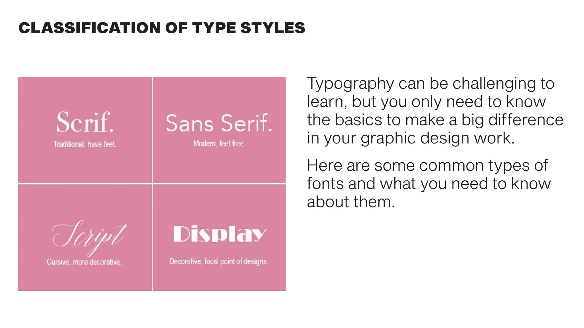
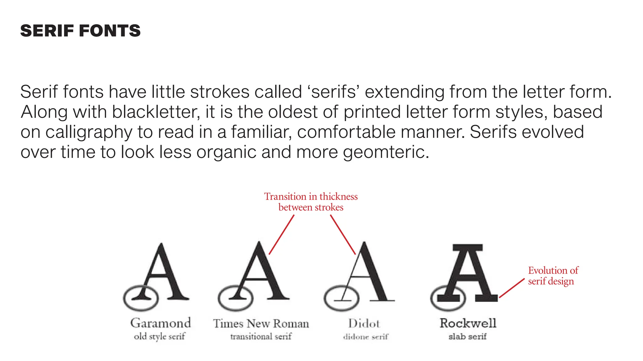
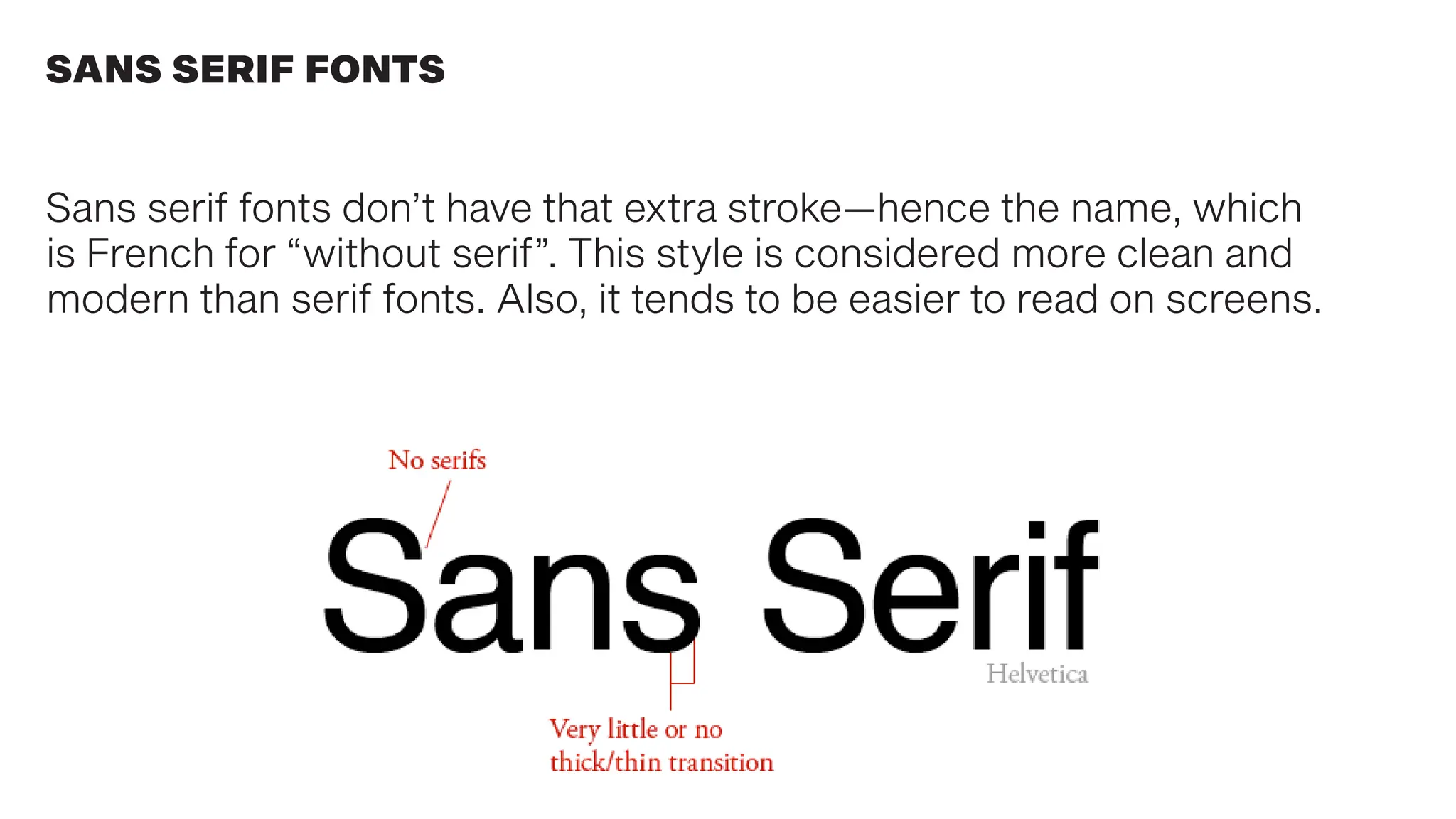
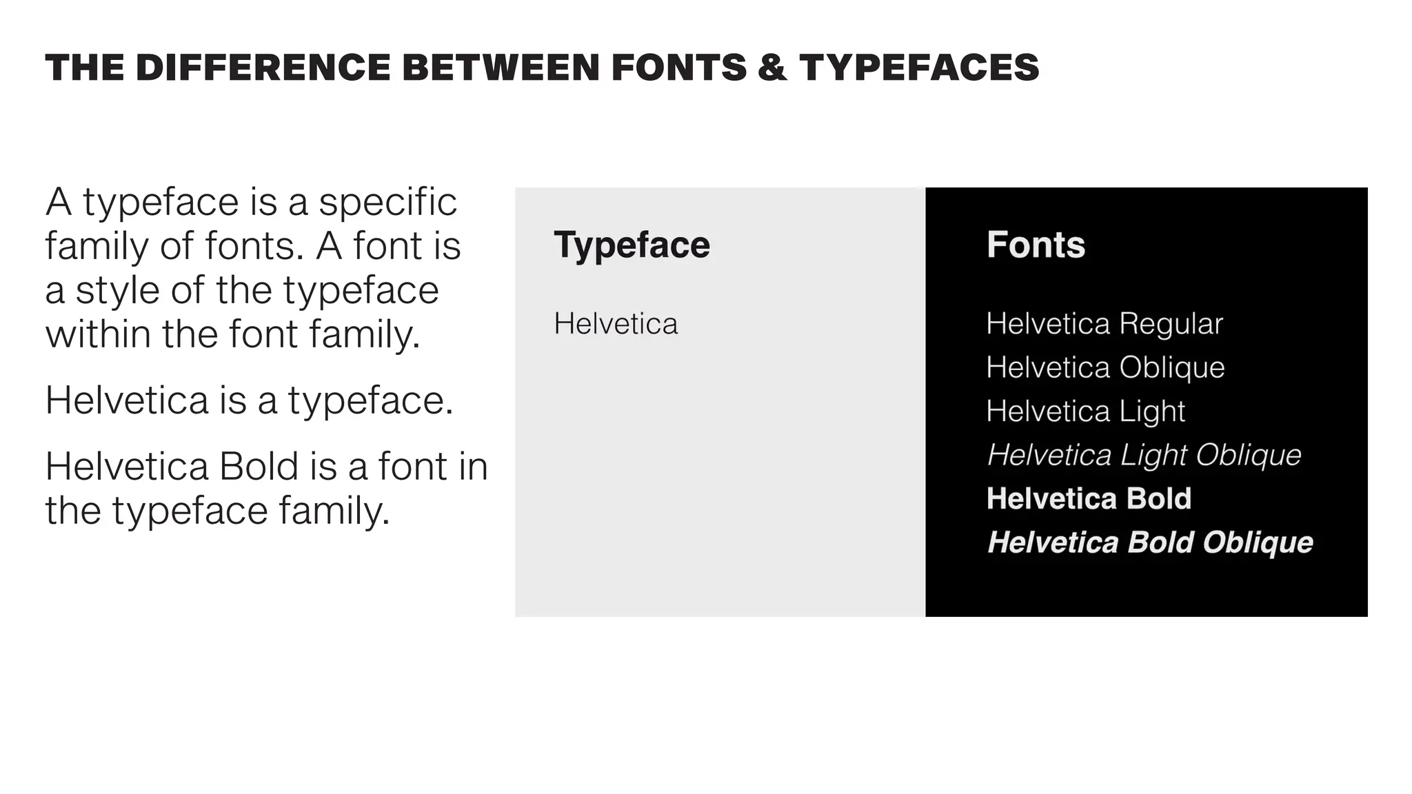
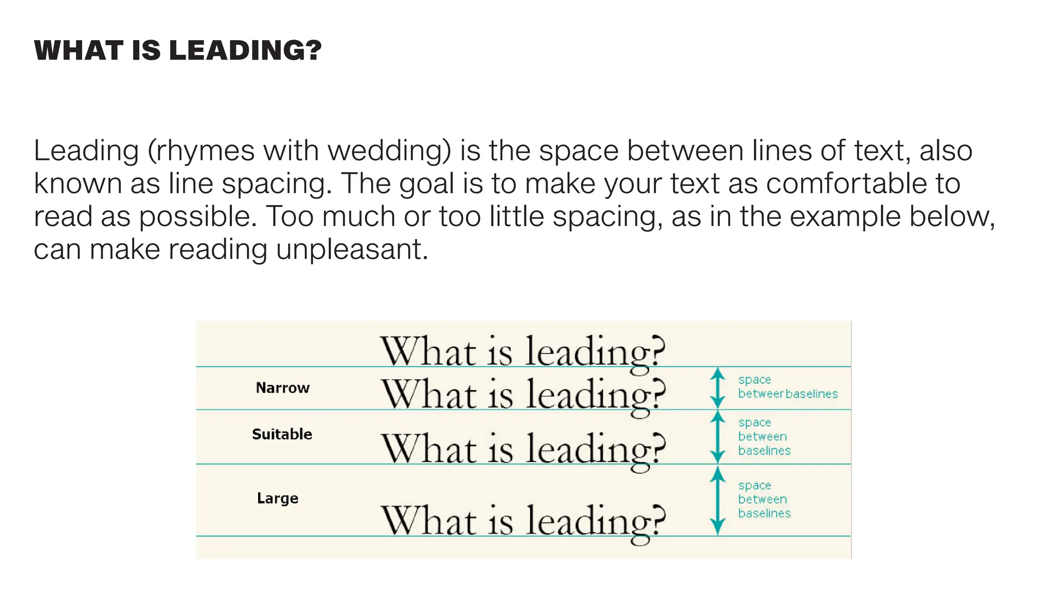
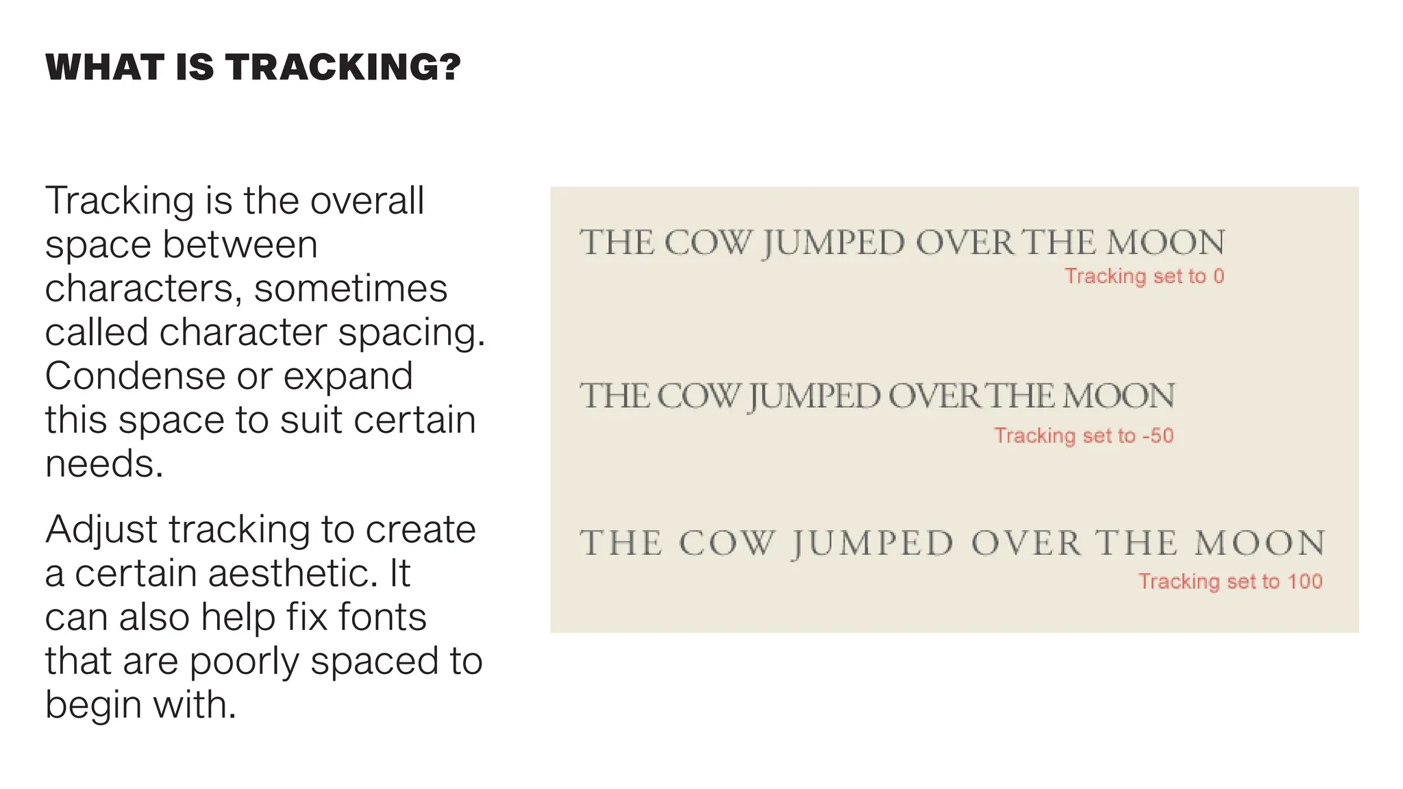
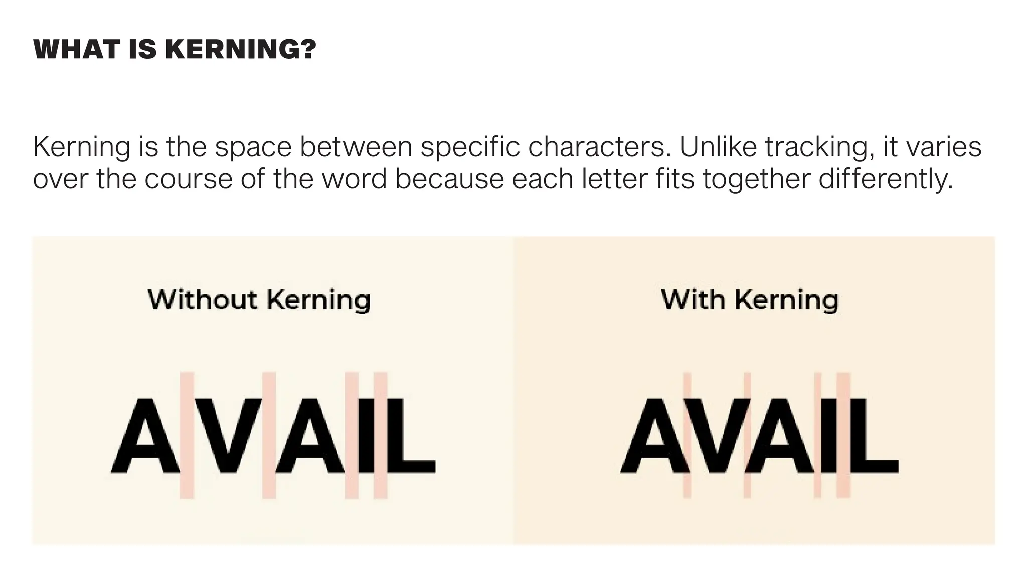
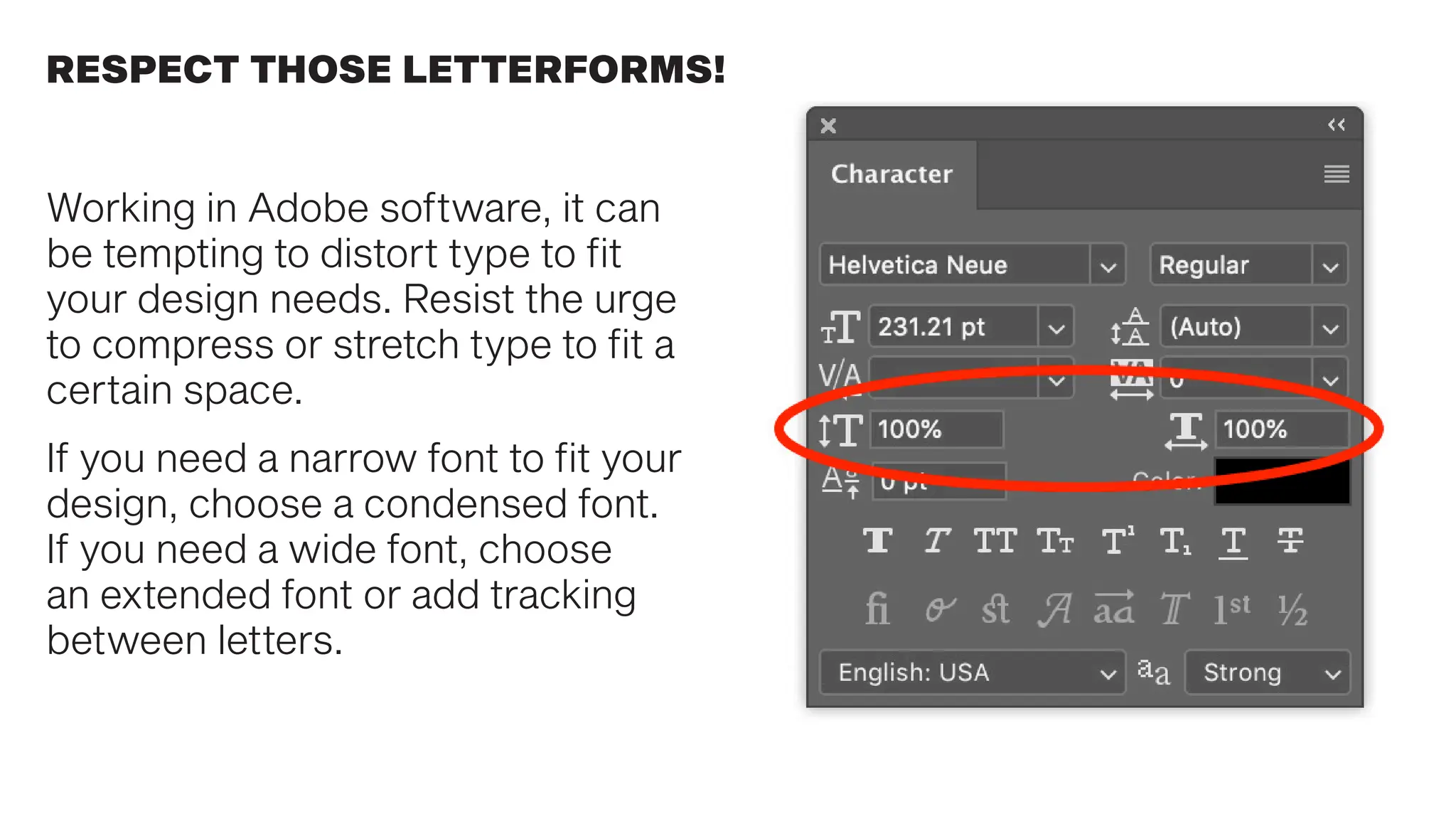
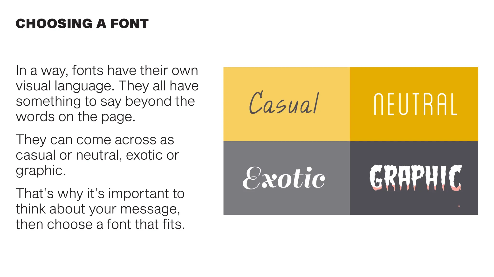
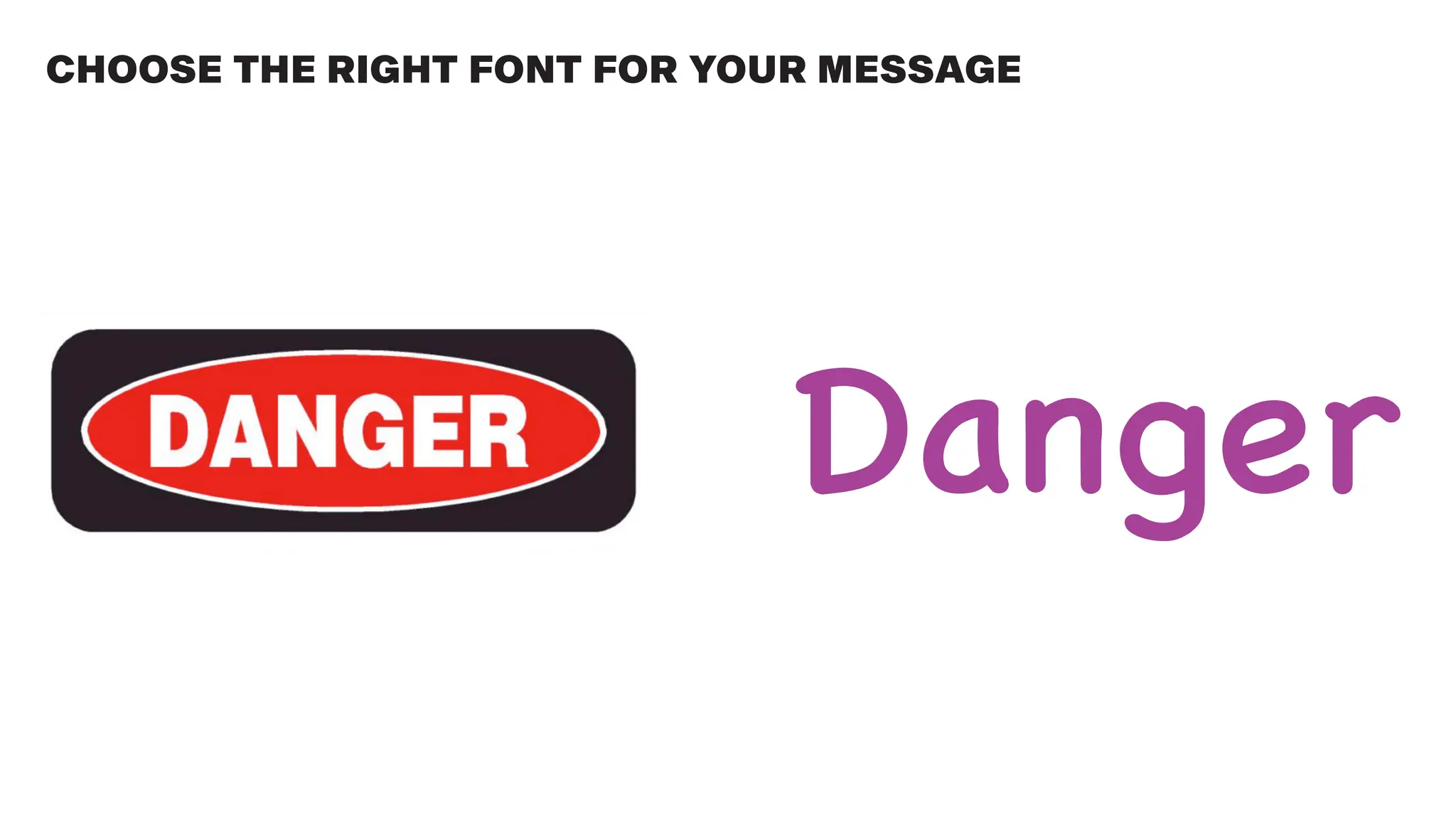
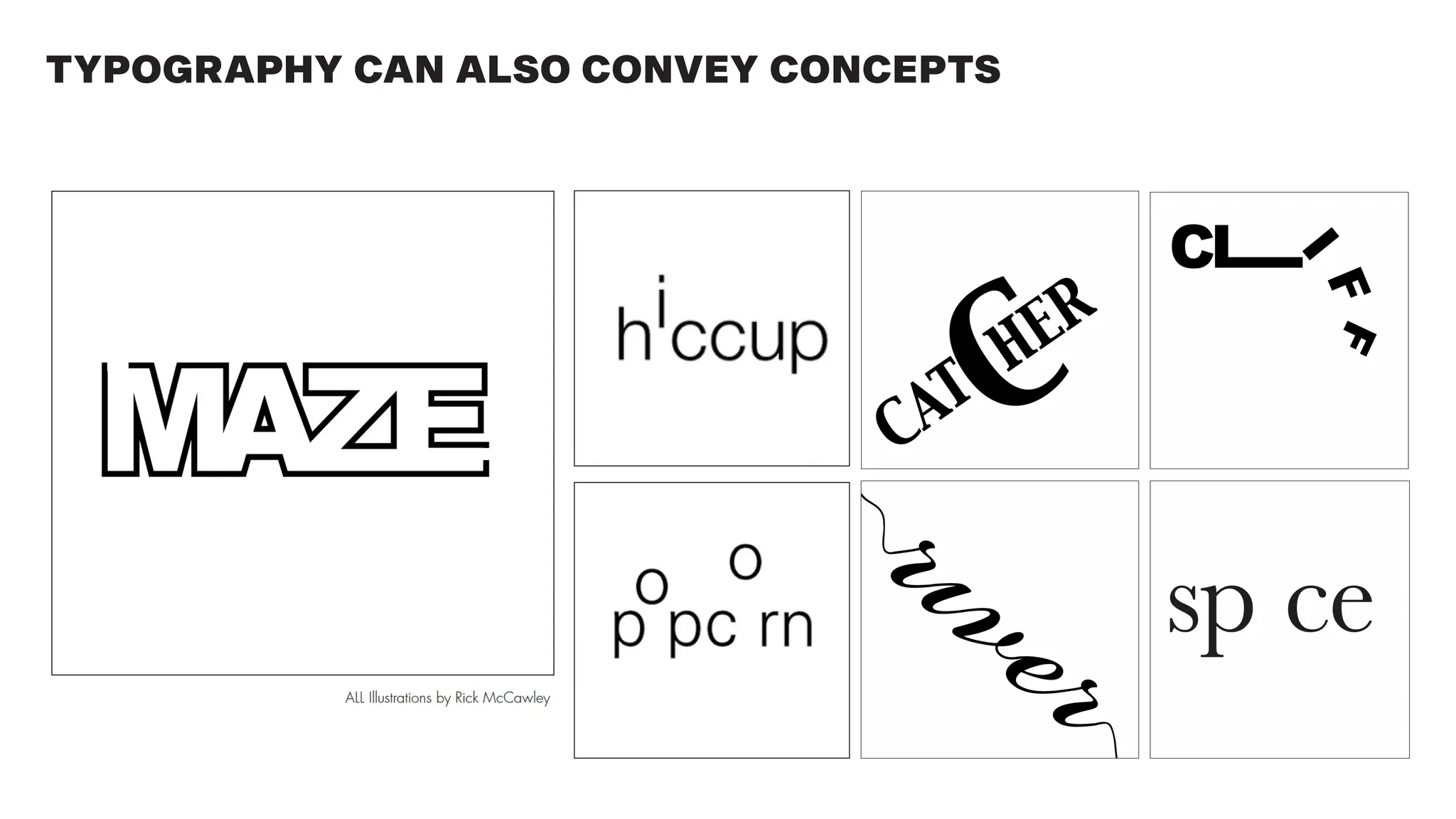
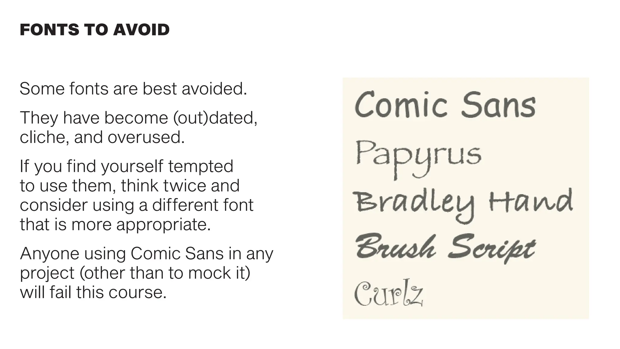
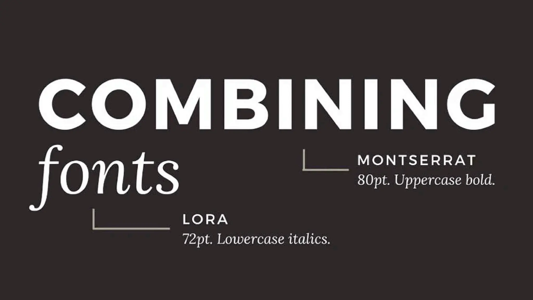
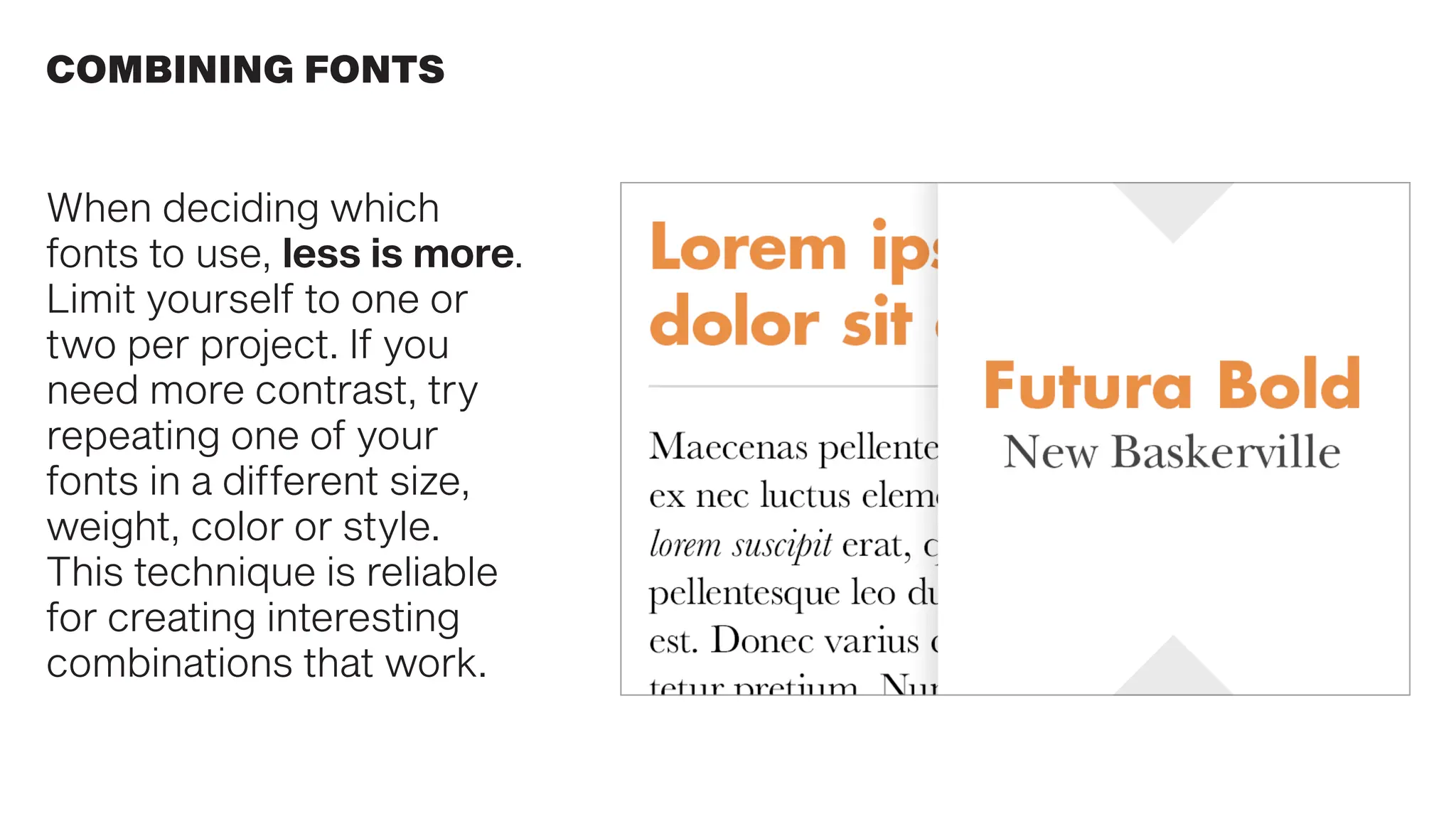
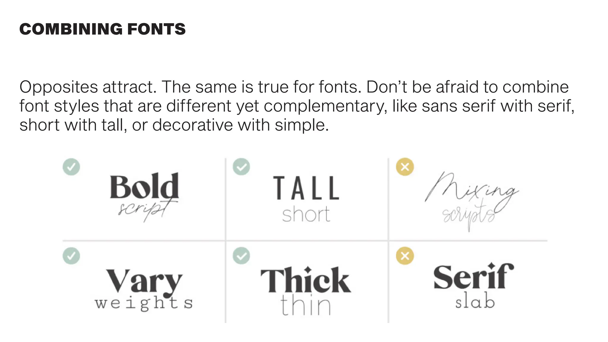
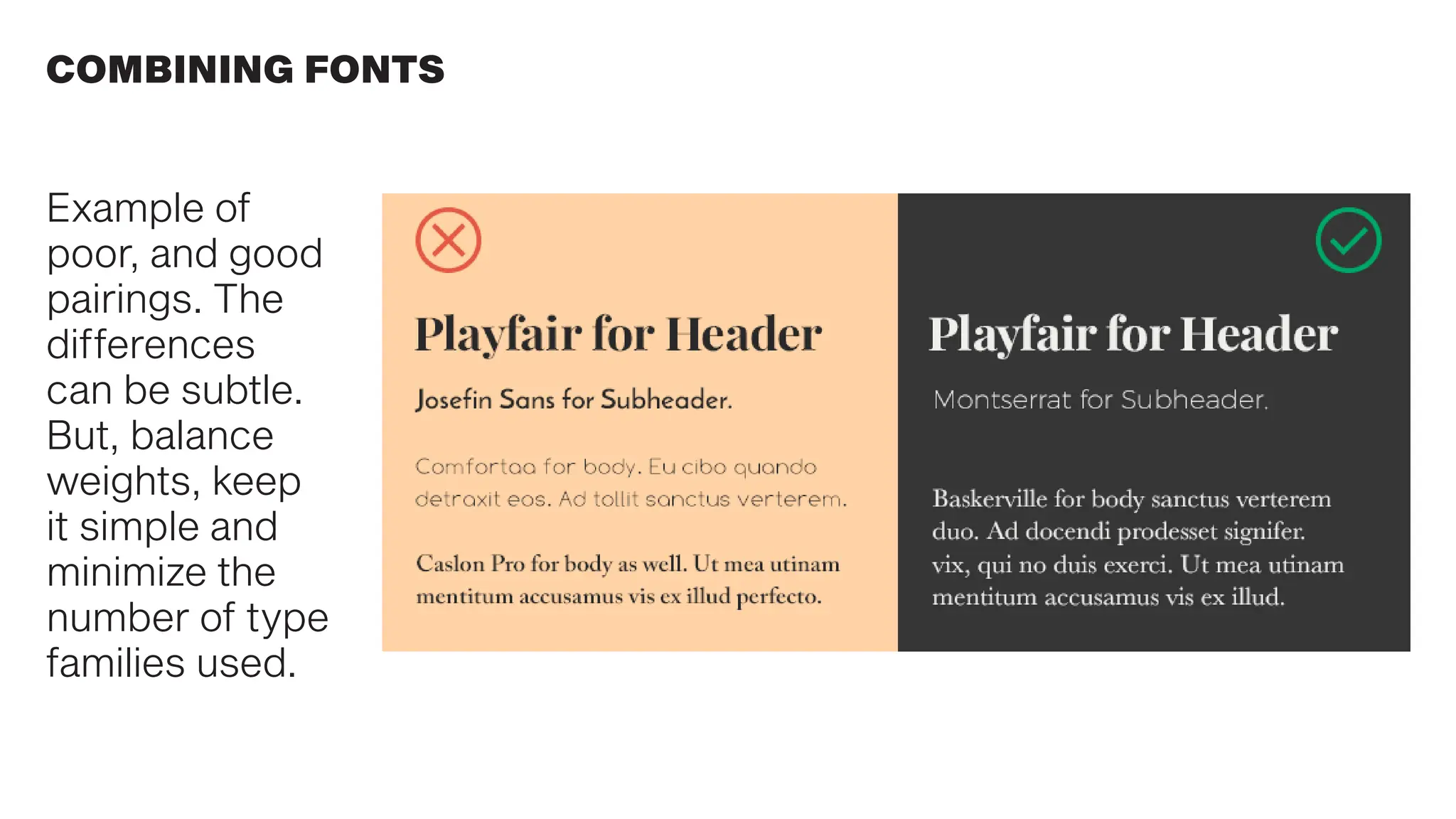
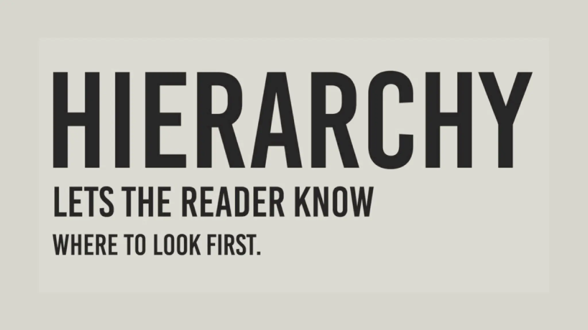
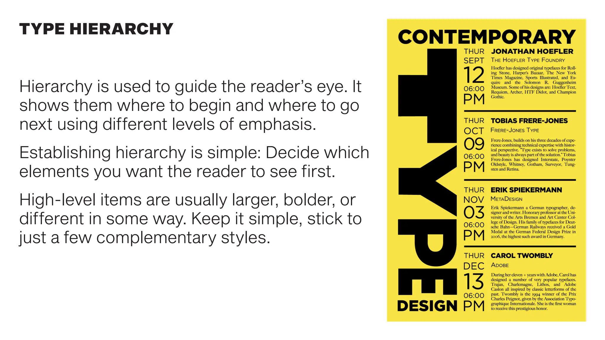
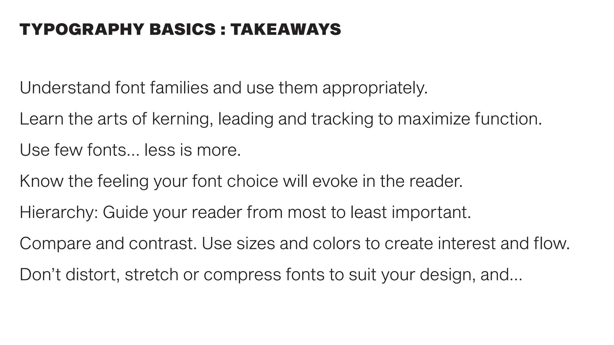
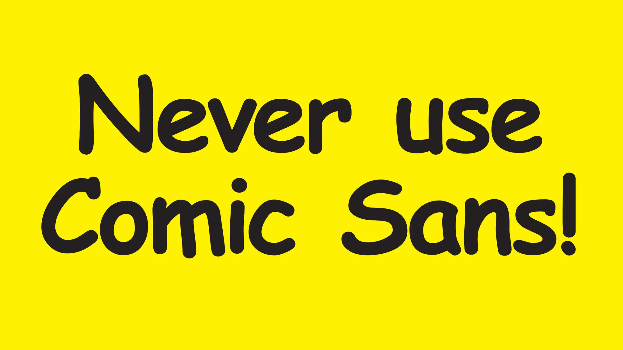
TYPOGRAPHY IN DESIGN 2
Typography is everywhere
we look. But what exactly is
typography?
Simply put, typography is the
style or appearance of text.
It can also refer to the art of
working with text—something
you probably do all the time
if you create any project in
which words are utilized.
WHAT IS TYPOGRAPHY?
TYPOGRAPHY TIMELINE
TYPOGRAPHY ANATOMY TERMS
Typography can be challenging to
learn, but you only need to know
the basics to make a big difference
in your graphic design work.
Here are some common types of
fonts and what you need to know
about them.
CLASSIFICATION OF TYPE STYLES
Serif fonts have little strokes called ‘serifs’ extending from the letter form.
Along with blackletter, it is the oldest of printed letter form styles, based
on calligraphy to read in a familiar, comfortable manner. Serifs evolved
over time to look less organic and more geomteric.
SERIF FONTS
Transition in thickness
between strokes
Evolution of
serif design
SERIF FONTS
Serif fonts are easy
on the eye and
comfortable to read.
This is why they
are so frequently
used for typesetting
longer bodies of
copy like books.
Sans serif fonts don’t have that extra stroke—hence the name, which
is French for “without serif”. This style is considered more clean and
modern than serif fonts. Also, it tends to be easier to read on screens.
SANS SERIF FONTS
SCRIPT FONTS
Script fonts are also based on
hand lettering and calligraphy.
The styles range from
classic and formal, to causal
handwritten and friendly.
Not generally used for narrative
copy, mostly headlines,
ornament, or accent font.
Display fonts come in many different styles
and can convey many different feelings, eras,
attitudes or tones.
Because of their decorative nature, display
fonts are best for small amounts of text, and
not a good choice for longer blocks of copy.
Display fonts convey emotion and feeling
very effectively.
UNITY OF DESIGN IN LETTERFORMS
Regardless of the type style,
letterforms share similar parts.
Repeated curves, verticals,
horizontals, and serifs are
combined to bring variety and
unity to typographic designs
using this typeface.
All well-designed type fonts
display this principle of repetition
with variety that is demonstrated
in Times Roman Bold.
TYPE MEASUREMENT
The American measurement system has two units: the point and the pica.
There are 72 points in an inch, and 12 points in a pica.
There are 6 picas in an inch.
This is the system used to spec type size in all Adobe software.
A typeface is a specific
family of fonts. A font is
a style of the typeface
within the font family.
Helvetica is a typeface.
Helvetica Bold is a font in
the typeface family.
THE DIFFERENCE BETWEEN FONTS & TYPEFACES
Leading (rhymes with wedding) is the space between lines of text, also
known as line spacing. The goal is to make your text as comfortable to
read as possible. Too much or too little spacing, as in the example below,
can make reading unpleasant.
WHAT IS LEADING?
WHAT IS TRACKING?
Tracking is the overall
space between
characters, sometimes
called character spacing.
Condense or expand
this space to suit certain
needs.
Adjust tracking to create
a certain aesthetic. It
can also help fix fonts
that are poorly spaced to
begin with.
WHAT IS KERNING?
Kerning is the space between specific characters. Unlike tracking, it varies
over the course of the word because each letter fits together differently.
RESPECT THOSE LETTERFORMS!
Working in Adobe software, it can
be tempting to distort type to fit
your design needs. Resist the urge
to compress or stretch type to fit a
certain space.
If you need a narrow font to fit your
design, choose a condensed font.
If you need a wide font, choose
an extended font or add tracking
between letters.
In a way, fonts have their own
visual language. They all have
something to say beyond the
words on the page.
They can come across as
casual or neutral, exotic or
graphic.
That’s why it’s important to
think about your message,
then choose a font that fits.
CHOOSING A FONT
Type can convey emotions
and feelings that influence
the way we process the
words they depict.
The type you choose will
affect how the reader
interprets the message in
the words.
EACH FONT HAS IT’S OWN VOICE
CHOOSE THE RIGHT FONT FOR YOUR MESSAGE
TYPOGRAPHY CAN ALSO CONVEY CONCEPTS
Some fonts are best avoided.
They have become (out)dated,
cliche, and overused.
If you find yourself tempted
to use them, think twice and
consider using a different font
that is more appropriate.
Anyone using Comic Sans in any
project (other than to mock it)
will fail this course.
FONTS TO AVOID
When deciding which
fonts to use, less is more.
Limit yourself to one or
two per project. If you
need more contrast, try
repeating one of your
fonts in a different size,
weight, color or style.
This technique is reliable
for creating interesting
combinations that work.
COMBINING FONTS
COMBINING FONTS
Opposites attract. The same is true for fonts. Don’t be afraid to combine
font styles that are different yet complementary, like sans serif with serif,
short with tall, or decorative with simple.
COMBINING FONTS
Example of
poor, and good
pairings. The
differences
can be subtle.
But, balance
weights, keep
it simple and
minimize the
number of type
families used.
Hierarchy is used to guide the reader’s eye. It
shows them where to begin and where to go
next using different levels of emphasis.
Establishing hierarchy is simple: Decide which
elements you want the reader to see first.
High-level items are usually larger, bolder, or
different in some way. Keep it simple, stick to
just a few complementary styles.
TYPE HIERARCHY
Understand font families and use them appropriately.
Learn the arts of kerning, leading and tracking to maximize function.
Use few fonts… less is more.
Know the feeling your font choice will evoke in the reader.
Hierarchy: Guide your reader from most to least important.
Compare and contrast. Use sizes and colors to create interest and flow.
Don’t distort, stretch or compress fonts to suit your design, and…
TYPOGRAPHY BASICS : TAKEAWAYS
Never use
Comic Sans!

Defining Typography. An introduction to exploring graphic design using typograhy.pdf

  • 1.
  • 2.
    Typography is everywhere welook. But what exactly is typography? Simply put, typography is the style or appearance of text. It can also refer to the art of working with text—something you probably do all the time if you create any project in which words are utilized. WHAT IS TYPOGRAPHY?
  • 3.
  • 4.
  • 5.
    Typography can bechallenging to learn, but you only need to know the basics to make a big difference in your graphic design work. Here are some common types of fonts and what you need to know about them. CLASSIFICATION OF TYPE STYLES
  • 6.
    Serif fonts havelittle strokes called ‘serifs’ extending from the letter form. Along with blackletter, it is the oldest of printed letter form styles, based on calligraphy to read in a familiar, comfortable manner. Serifs evolved over time to look less organic and more geomteric. SERIF FONTS Transition in thickness between strokes Evolution of serif design
  • 7.
    SERIF FONTS Serif fontsare easy on the eye and comfortable to read. This is why they are so frequently used for typesetting longer bodies of copy like books.
  • 8.
    Sans serif fontsdon’t have that extra stroke—hence the name, which is French for “without serif”. This style is considered more clean and modern than serif fonts. Also, it tends to be easier to read on screens. SANS SERIF FONTS
  • 9.
    SCRIPT FONTS Script fontsare also based on hand lettering and calligraphy. The styles range from classic and formal, to causal handwritten and friendly. Not generally used for narrative copy, mostly headlines, ornament, or accent font.
  • 10.
    Display fonts comein many different styles and can convey many different feelings, eras, attitudes or tones. Because of their decorative nature, display fonts are best for small amounts of text, and not a good choice for longer blocks of copy. Display fonts convey emotion and feeling very effectively.
  • 11.
    UNITY OF DESIGNIN LETTERFORMS Regardless of the type style, letterforms share similar parts. Repeated curves, verticals, horizontals, and serifs are combined to bring variety and unity to typographic designs using this typeface. All well-designed type fonts display this principle of repetition with variety that is demonstrated in Times Roman Bold.
  • 12.
    TYPE MEASUREMENT The Americanmeasurement system has two units: the point and the pica. There are 72 points in an inch, and 12 points in a pica. There are 6 picas in an inch. This is the system used to spec type size in all Adobe software.
  • 13.
    A typeface isa specific family of fonts. A font is a style of the typeface within the font family. Helvetica is a typeface. Helvetica Bold is a font in the typeface family. THE DIFFERENCE BETWEEN FONTS & TYPEFACES
  • 14.
    Leading (rhymes withwedding) is the space between lines of text, also known as line spacing. The goal is to make your text as comfortable to read as possible. Too much or too little spacing, as in the example below, can make reading unpleasant. WHAT IS LEADING?
  • 15.
    WHAT IS TRACKING? Trackingis the overall space between characters, sometimes called character spacing. Condense or expand this space to suit certain needs. Adjust tracking to create a certain aesthetic. It can also help fix fonts that are poorly spaced to begin with.
  • 16.
    WHAT IS KERNING? Kerningis the space between specific characters. Unlike tracking, it varies over the course of the word because each letter fits together differently.
  • 17.
    RESPECT THOSE LETTERFORMS! Workingin Adobe software, it can be tempting to distort type to fit your design needs. Resist the urge to compress or stretch type to fit a certain space. If you need a narrow font to fit your design, choose a condensed font. If you need a wide font, choose an extended font or add tracking between letters.
  • 18.
    In a way,fonts have their own visual language. They all have something to say beyond the words on the page. They can come across as casual or neutral, exotic or graphic. That’s why it’s important to think about your message, then choose a font that fits. CHOOSING A FONT
  • 19.
    Type can conveyemotions and feelings that influence the way we process the words they depict. The type you choose will affect how the reader interprets the message in the words. EACH FONT HAS IT’S OWN VOICE
  • 20.
    CHOOSE THE RIGHTFONT FOR YOUR MESSAGE
  • 21.
    TYPOGRAPHY CAN ALSOCONVEY CONCEPTS
  • 22.
    Some fonts arebest avoided. They have become (out)dated, cliche, and overused. If you find yourself tempted to use them, think twice and consider using a different font that is more appropriate. Anyone using Comic Sans in any project (other than to mock it) will fail this course. FONTS TO AVOID
  • 24.
    When deciding which fontsto use, less is more. Limit yourself to one or two per project. If you need more contrast, try repeating one of your fonts in a different size, weight, color or style. This technique is reliable for creating interesting combinations that work. COMBINING FONTS
  • 25.
    COMBINING FONTS Opposites attract.The same is true for fonts. Don’t be afraid to combine font styles that are different yet complementary, like sans serif with serif, short with tall, or decorative with simple.
  • 26.
    COMBINING FONTS Example of poor,and good pairings. The differences can be subtle. But, balance weights, keep it simple and minimize the number of type families used.
  • 28.
    Hierarchy is usedto guide the reader’s eye. It shows them where to begin and where to go next using different levels of emphasis. Establishing hierarchy is simple: Decide which elements you want the reader to see first. High-level items are usually larger, bolder, or different in some way. Keep it simple, stick to just a few complementary styles. TYPE HIERARCHY
  • 29.
    Understand font familiesand use them appropriately. Learn the arts of kerning, leading and tracking to maximize function. Use few fonts… less is more. Know the feeling your font choice will evoke in the reader. Hierarchy: Guide your reader from most to least important. Compare and contrast. Use sizes and colors to create interest and flow. Don’t distort, stretch or compress fonts to suit your design, and… TYPOGRAPHY BASICS : TAKEAWAYS
  • 30.