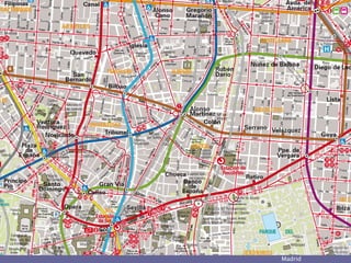
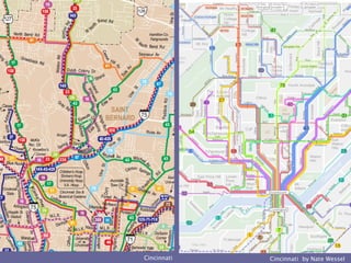
Transit Maps
Dennis McClendon
Chicago CartoGraphics
city
Blanchard Chicago 1917
Philadelphia
Oakland AC Transit 1981
Madrid
Berlin
Chicago RTA South Suburban 1975 Wuppertal 1984
Grants Pass
CopenhagenAnn Arbor
Madison
ManchesterLondon
London 1985
Washington 1988
Los Angeles 1985
Göttingen
city
Philadelphia by
Richard Saul Wurman
Chicago HiltonCTA 1977
Chicago 2007
city
Oklahoma City
UK postage stamp
art poster
mobile device, Chicago
Grand Rapids
Brooklyn
Montreal 1984
Montreal
Toronto
Chicago
city
Austin
Cincinnati by Nate WesselCincinnati
San Francisco 1982
Montreal
city
Los Angeles
Baltimore
DB fahrplan 1984
Galesburg
Bloomington-Normal
Twin Cities
Portland
Perfection in anything at all is
attained not when nothing more
can be added, but when nothing
more can be taken away.
—Antoine de Saint-Exupery
city
transitmaps.tumblr.com
Cameron Booth
mappingtwincities.tumblr.com
Kyril Negoda
Dennis McClendon
Chicago CartoGraphics
dennis@chicagocarto.com
city
San Francisco
San Francisco

Editor's Notes

  • #3 35 years ago, I was a grad student at the Univ. of Texas. Hanging on the back of my dorm room door was—not the ubiquitous Farrah Fawcett poster—but this remarkable map of Chicago transit.
  • #4 Today I have a small firm that does a wide variety of map design—I wouldn’t have it any other way—but I’m proud to be the designer of the successors to that Chicago transit map.
  • #5 Back in the late 1990s, I designed the Chicago Transit Authority’s diagrammatic trains map, and—more relevant to this talk—the system map that shows all trains and buses, a more complex undertaking.
  • #6 Transit maps go back to nearly the beginnings of electric public transport. You just take a street map, and overlay on it the streetcar and rapid transit lines.
  • #7 And that is a useful approach for many cities. Philadelphia is perhaps the most venerable example of this approach.
  • #8 In the early 1980s, I was very influenced by the work of Reineck + Reineck on Bay Area maps. I found this technique of dark bus lines on top of white streets, reversed out of a neutral ground, to be both a practical and useful piece of information design.
  • #9 Here’s a similar modern example from Madrid: lots of information, but set up in a visual hierarchy that makes it all accessible.
  • #10 This Berlin map, part of a citywide rethinking of transport and mobility graphics that I think was guided by Erik Spiekermann, is quite remarkable in making visible U- and S-Bahn Lines, buses and tram stops, every street, hundreds of landmarks, and even house numbers.
  • #11 I’ve seen route maps displayed on top of aerial photos. For European country buses, it can even be logical to use an actual topographic map as the base.
  • #12 However, the logic of using a cadastral map, showing real estate parcels, isn’t apparent to me.
  • #13 Icons can be tricky business. Sometimes they’re mere decoration that add no value to the user. But these stylized buildings in Copenhagen are carefully constructed to aid the user’s visual memory of places, and thus aid wayfinding.
  • #14 The biggest design problem in transit maps is coincident routes: The situation where several different bus routes run on the same street. Sometimes, God gives us glacial lakes to offer a design solution….
  • #15 British practice was to show what routes run “through” a particular section of street—which of course in the UK is usually the entire distance the street has the same name.
  • #16 Not as satisfactory is the plaza-to-plaza matching game, made more thinkable because European buses often have stops almost this widely spaced. OK, quick: Memorize the list of numbers at Leicester Square and then compare it to the dozen numbers at Liverpool Street Station. Any matches?
  • #17 Even stranger was this approach used by Washington, which told you not where the buses ran . . . but only where they turned!
  • #18 Here’s an innovative approach to coincident lines used in the 1990s by Los Angeles: interspersed dots of different colors to indicate a street with more than one route.
  • #19 Similarly, lines can be braided together like strands of yarn.
  • #20 Today, cartography is heavily reliant on the idea of beginning with highly precise geodata. But that doesn’t like being bent to our will. It can’t easily be displaced or shifted to show multiple lines. These are shapefiles for bus lines in Elgin, outside Chicago.
  • #21 And here’s my redrawing of those lines to displace coinciding lines, to unravel overlapping junctions.
  • #22 This sort of work may prove to be the last stand of THINKING cartographers: those who carefully work out which line goes on top to avoid recrossings; the kind of cartographic license needed to clarify. At the top is the old map; in the center the raw shapefiles; at bottom my redrawing.
  • #23 Downtown areas can be thought of as the height of the coincident routes problem, usually made even more complex by one-way street patterns. Here’s some nice recent work for Richmond, Virginia.
  • #24 Back in the 1970s, Richard Saul Wurman tried small multiples for Center City Philadelphia buses. What way are you headed, kiddo?
  • #25 In the 1970s, Chicago had a downtown transit guide with a small map for every single route, detailing how it went through and around downtown. I have similar small multiples on some of my tourist maps, with four or five selected routes of special utility to visitors.
  • #26 We use small multiples in Chicago to declutter the main map—and then there’s a further list of routes we don’t show at all. We call these the cognoscenti buses: if you or a coworker doesn’t already know about them, you’ll not easily find them.
  • #27 One small design feature that I think substantially aids route following is curved corners. Look at how they make complex routings possible to follow, even where lines of the same color cross.
  • #28 Here’s some nice recent work by CHK America, using the various tricks to make Oklahoma City easier to understand.
  • #29 Eventually simplification crosses over into becoming diagrammatic. But the London Underground map and its progeny are a whole other talk. They’ve become icons of information design and even symbols of the cities some of us love enough to carry the diagram around on the ultimate mobile device.
  • #30 Another design problem is the visual hierarchy created inadvertently when using different colors for what are, essentially, the exact same thing. In this example, it’s a while before you even see the pink #6 bus line. It looks like the poor stepchild, less important that in-your-face red #2.
  • #31 New York City bus maps have color carefully chosen to seem similar in intensity, but for historical reasons, the subway lines are presented as mere background information.
  • #32 For my RTA Chicago redesign, I took pains to choose five colors of similar chroma or color intensity, yet ones that would allow the regional rail lines—backbone of the system—to dominate.
  • #33 Here’s how Montreal made the Métro important back in the 1980s: by making it impossibly thick, so that it seems to span bus lines that are a quarter-mile apart.
  • #34 Two more recent approaches: color shading underneath other information; or using color inside the station symbols only.
  • #35 Toronto was long a very admirable design, but adopting colors for the subway lines turned the hierarchy upside-down. This map is overly dominated by the red streetcar and bus lines.
  • #36 This was a problem with the colors used on the old RTA map. Many of these routes only run four times a day but they dominate the map, at the expense of the regional commuter train system.
  • #37 I wanted to correct that in the new map, putting the regional rail system front and center, with the suburban buses as feeders, seen secondarily.
  • #38 The visual hierarchy can be affected by tiny things. For decades, Chicago had floated the route numbers next to the bus lines. I tried putting them in shields sitting on the lines, and we were amazed at the difference it made, flattening the hierarchy so the bus route and its number are all on the same level.
  • #39 One unusual problem we have in Chicago is a three-level street system in places, with buses running on the middle level. I used half opacity to try to indicate that in an easily understood way not requiring a novel new line style explained in the legend.
  • #40 Transit maps are often complicated by rush-hour-only and express routes. There’s an eternal tension in transit service plannin: between convenience and legibility—between services that are scheduled one-seat rides for those taking it every day to work, and simple service patterns that are easily grasped by new users. One way to handle the issue on a system map is by symbolizing frequent service more prominently that specialized routes.
  • #41 On the left, Cincinnati’s complex map of all bus routes. On the right, the frequency map of Cincinnati, for which Nate Wessel won the NACIS 2014 student award.
  • #42 It’s certainly not a new idea; here’s once I drew in 1981 of frequent bus service in San Francisco. It helps you understand the basic pattern, and if you’re halfway in between routes, it helps you decide which street is likely to have a shorter wait for a bus.
  • #43 Sometimes the frequent-service network is called out as its own small map, as in Montreal.
  • #44 Another tricky problem we have in Chicago is that it’s thought of as extremely orthographic, and people expect straight lines for streets running north-south and those running east-west, and even a straight diagonal. But that requires some artistic license to get everything to fit, without any stations ending up on the wrong side of the street.
  • #45 As I’ve said, eventually simplification becomes abstraction, as in this recent map of Los Angeles, where the local geography supports this particular geometry.
  • #46 I was somewhat more surprised to find a similar approach taken in Baltimore.
  • #47 Ever since I picked up this German example in 1984, I’ve been intrigued by the possibility of the combination map-and-timetable.
  • #48 A decade ago, I got the chance to try it in Galesburg, Illinois, a small-city system whose four bus lines run once an hour.
  • #49 A similar approach works for Bloomington-Normal’s Connect Transit. The map tells you what time after each hour the bus should come past a particular corner.
  • #50 Today, we have the opportunity to do combinations of map and schedule in innovative new ways, and I’ve been investigating how best to put system maps on the Web. Here’s the very basic approach I developed in Chicago back in 1998: dividing the big system map into logical sections and allowing easy navigation from one to another. But people increasingly expect slippy maps, even for maps like transit maps—where that’s not easy to create.
  • #51 As a first step, I’ve been creating local maps that are double-scale enlargements of the regional system map. In places, that allows additional detail to be shown as I move from 150,000 to 75,000 scale.
  • #52 What I don’t think is a good approach is what I see a lot of agencies doing: taking their bus route shapefiles and displaying them on top of a slippy map background. Because of the coincident line problem, that means you have to choose to see one line at a time.
  • #53 The perverse result is that to figure out what bus you want, you have to first make a guess what line to turn on, and then check to see if you guessed correctly. It makes quite a game for the clueless visitor who doesn’t know what streets or suburbs are east and which are west.
  • #55 Eventually, we’ll figure out how to get system maps on the Web, and they’ll be richer in content than paper maps ever could be. But despite our best efforts . . . there will still be folks who have trouble figuring it out.
  • #56 A couple of design resources other than myself for folks interested in transit maps …