1) The document analyzes monthly airline passenger revenue miles data from January 2003 to December 2016 to forecast airline revenue for the next 2 years.
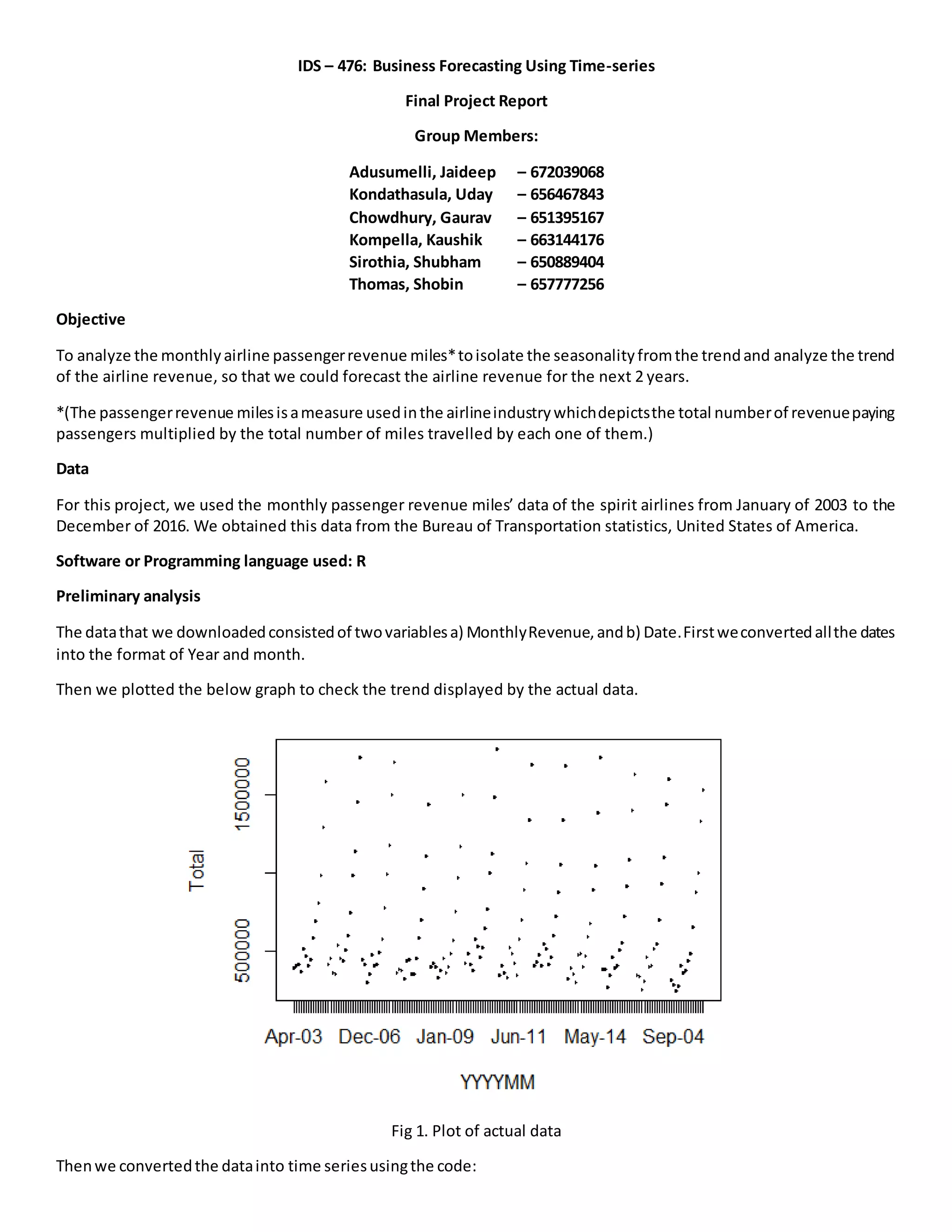
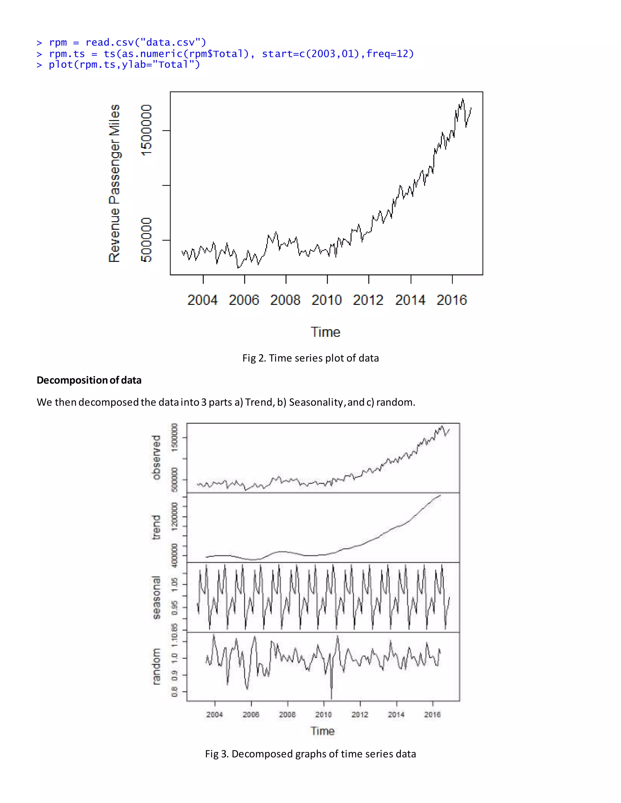
2) Preliminary analysis showed an upward trend in the time series data. The data was then decomposed into trend, seasonality, and randomness components using multiplicative decomposition.
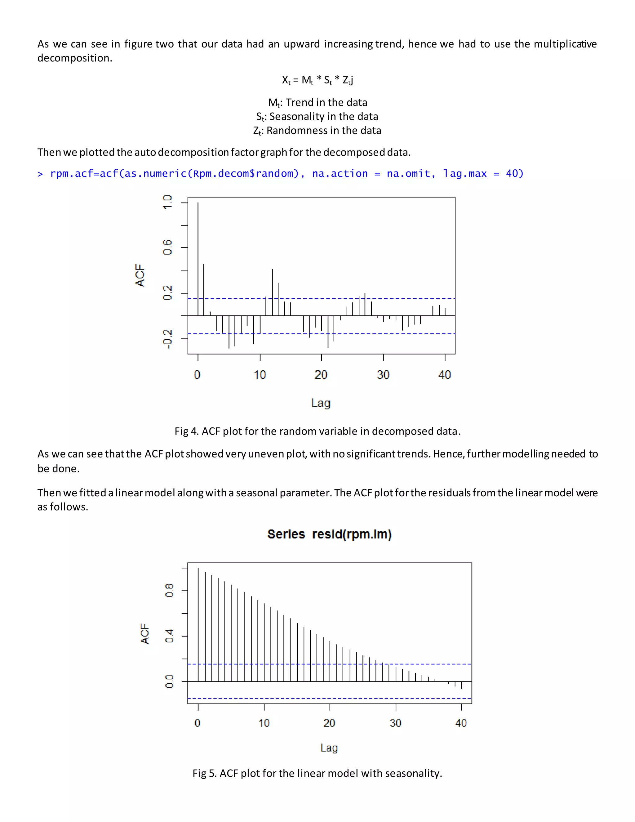
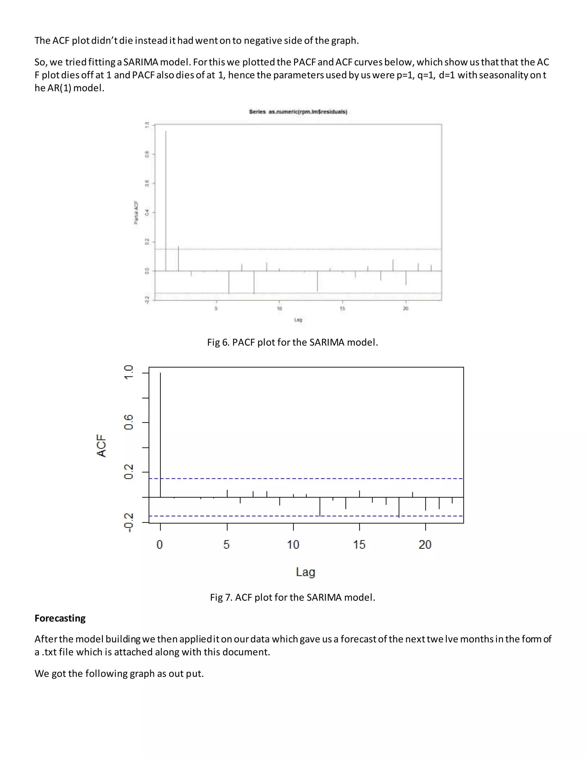
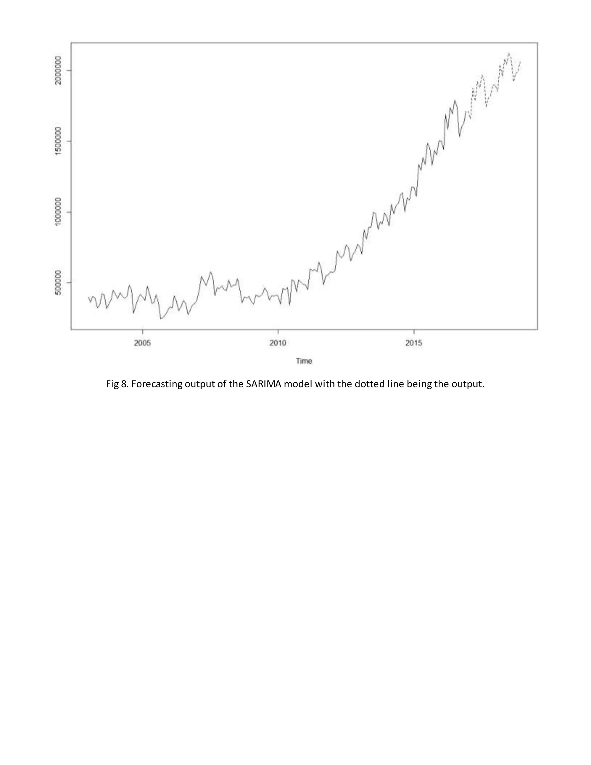
3) Different time series models like linear and SARIMA were fitted to the data. The SARIMA model with parameters p=1, q=1, d=1 and seasonality on the AR(1) model provided the best fit. This model was then used to forecast the next 12 months of airline revenue.


![ARIMA Models - [Lab 3]](https://cdn.slidesharecdn.com/ss_thumbnails/ydqcxn5vtqizjoun2as1-signature-e1de5ad681d661531c2467ca0d3e475440809ccfdbcb78c5369a1bb749945888-poli-141230090527-conversion-gate01-thumbnail.jpg?width=640&height=640&fit=bounds)


![[DSC Europe 25] Dragana Ilic - AI for Big Data in Astronomy.pptx](https://cdn.slidesharecdn.com/ss_thumbnails/8palya86qaatvjhva1ms-2-dragana-ilic-ai-ilic-251208151906-652b819c-thumbnail.jpg?width=640&height=640&fit=bounds)


![[DSC Europe 25] Nikola Rajovic - Hardware Technologies Under the Hood: RISC-V...](https://cdn.slidesharecdn.com/ss_thumbnails/o2gptrmtoyqndgoshwgq-dsc2025-tenstorrent-rajovic-251205090438-814685f5-thumbnail.jpg?width=640&height=640&fit=bounds)

![[DSC Europe 25] Max Talanov - Non digital NNs.pptx](https://cdn.slidesharecdn.com/ss_thumbnails/wif8tr3gtua74qvtopke-non-digital-nns-251205090438-26b0eea6-thumbnail.jpg?width=640&height=640&fit=bounds)


![[DSC Europe 25] Dragan Vucic - Building the Learning Organization - How AI Tr...](https://cdn.slidesharecdn.com/ss_thumbnails/8brigo2sbu6qur6gxrra-7-251205085715-6ae07d24-thumbnail.jpg?width=640&height=640&fit=bounds)
![[DSC Europe 25] Petar Zivanov - AI meets documents From chatbots to AI-powere...](https://cdn.slidesharecdn.com/ss_thumbnails/xer2bb6nrdc8pdpev0pc-8-251204082258-7c2fa4a1-thumbnail.jpg?width=640&height=640&fit=bounds)