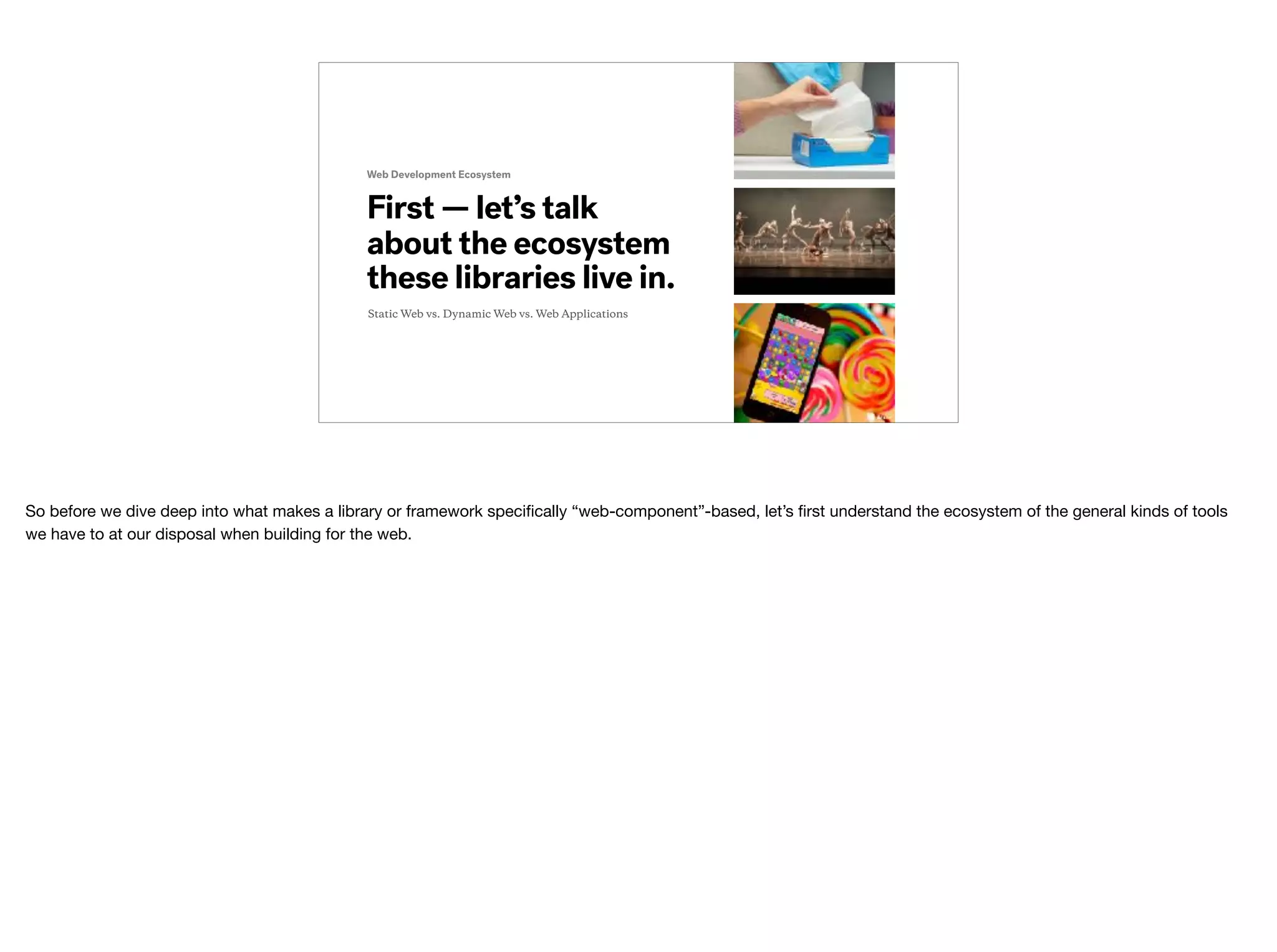
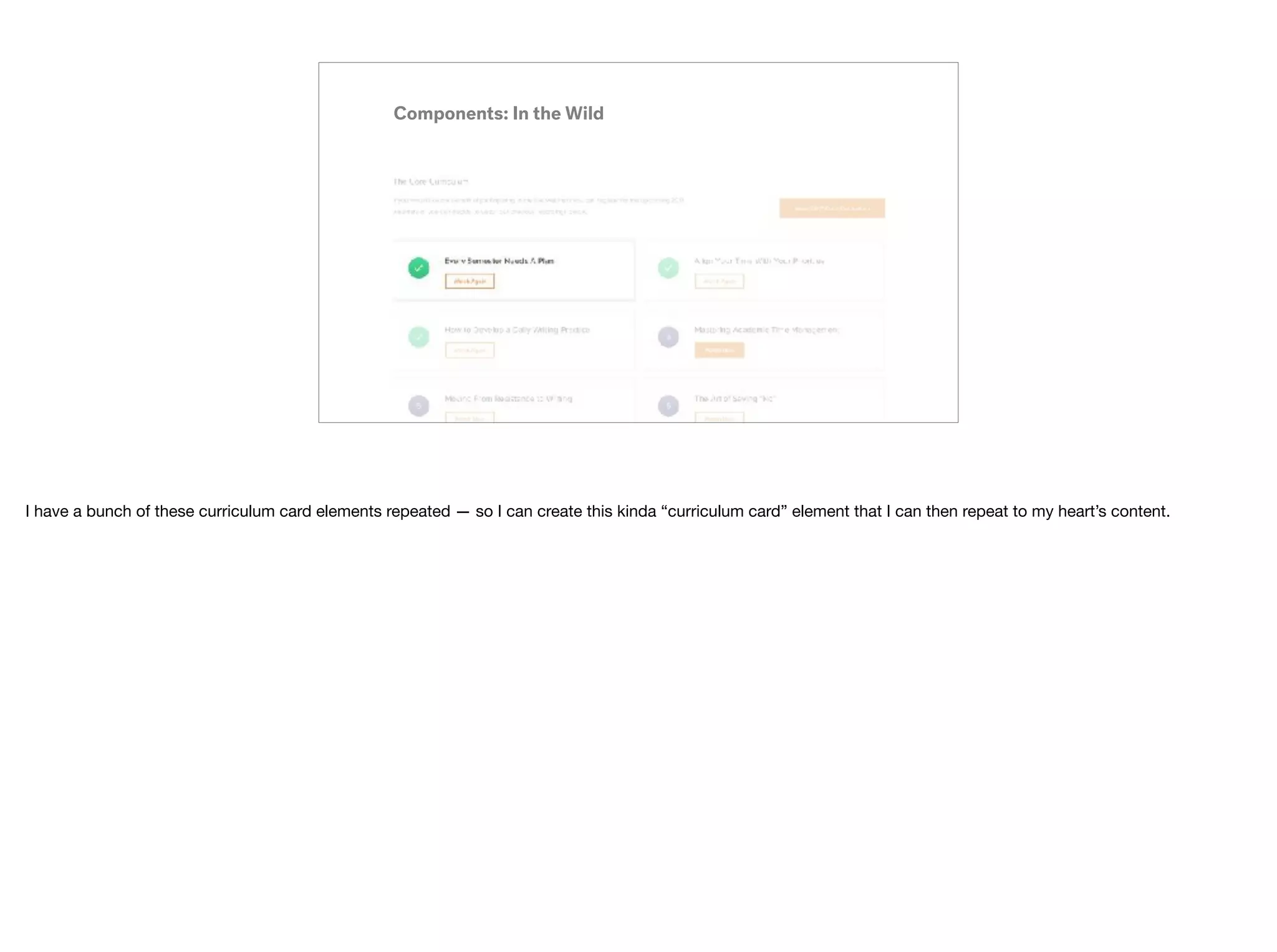
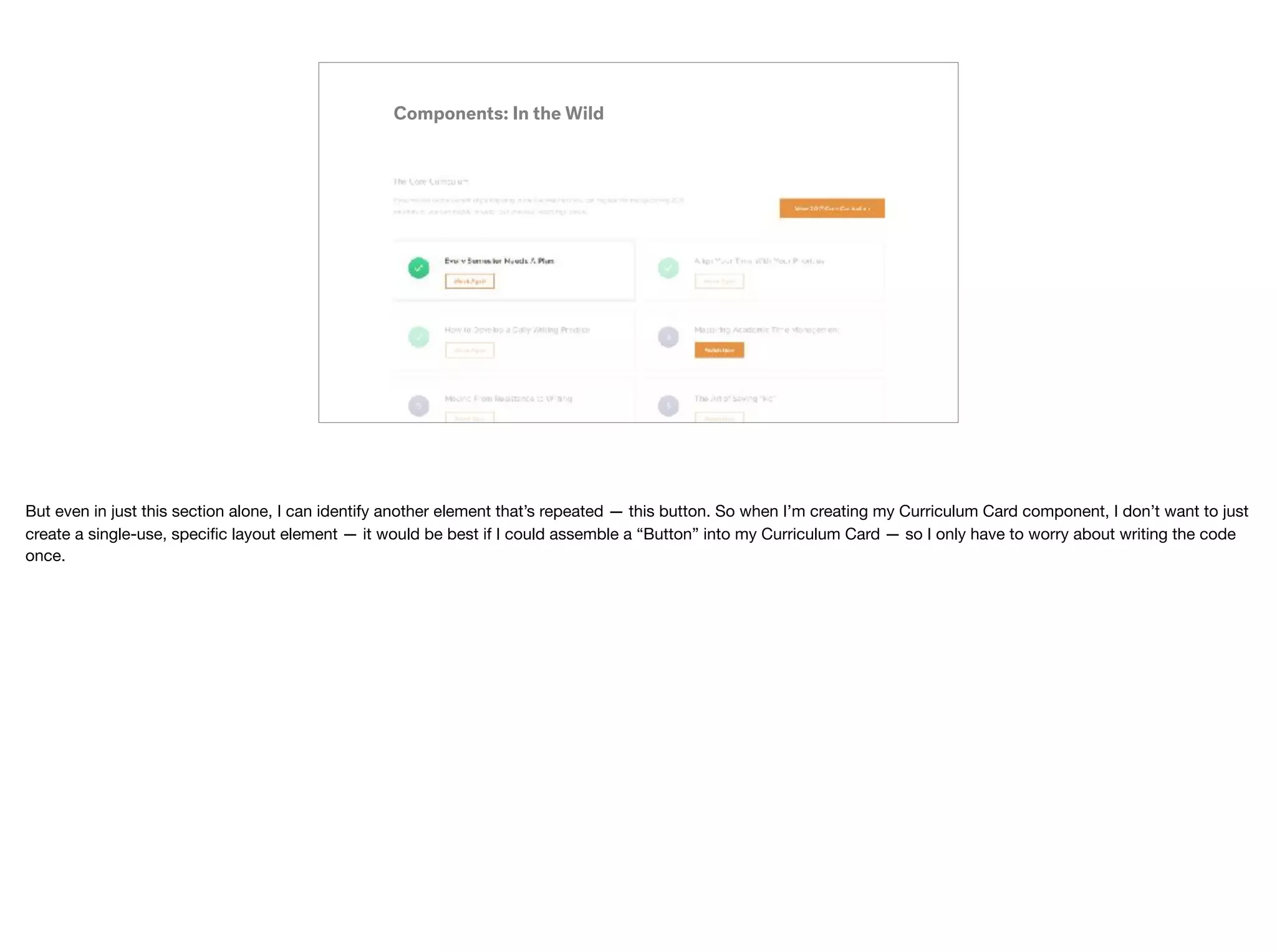
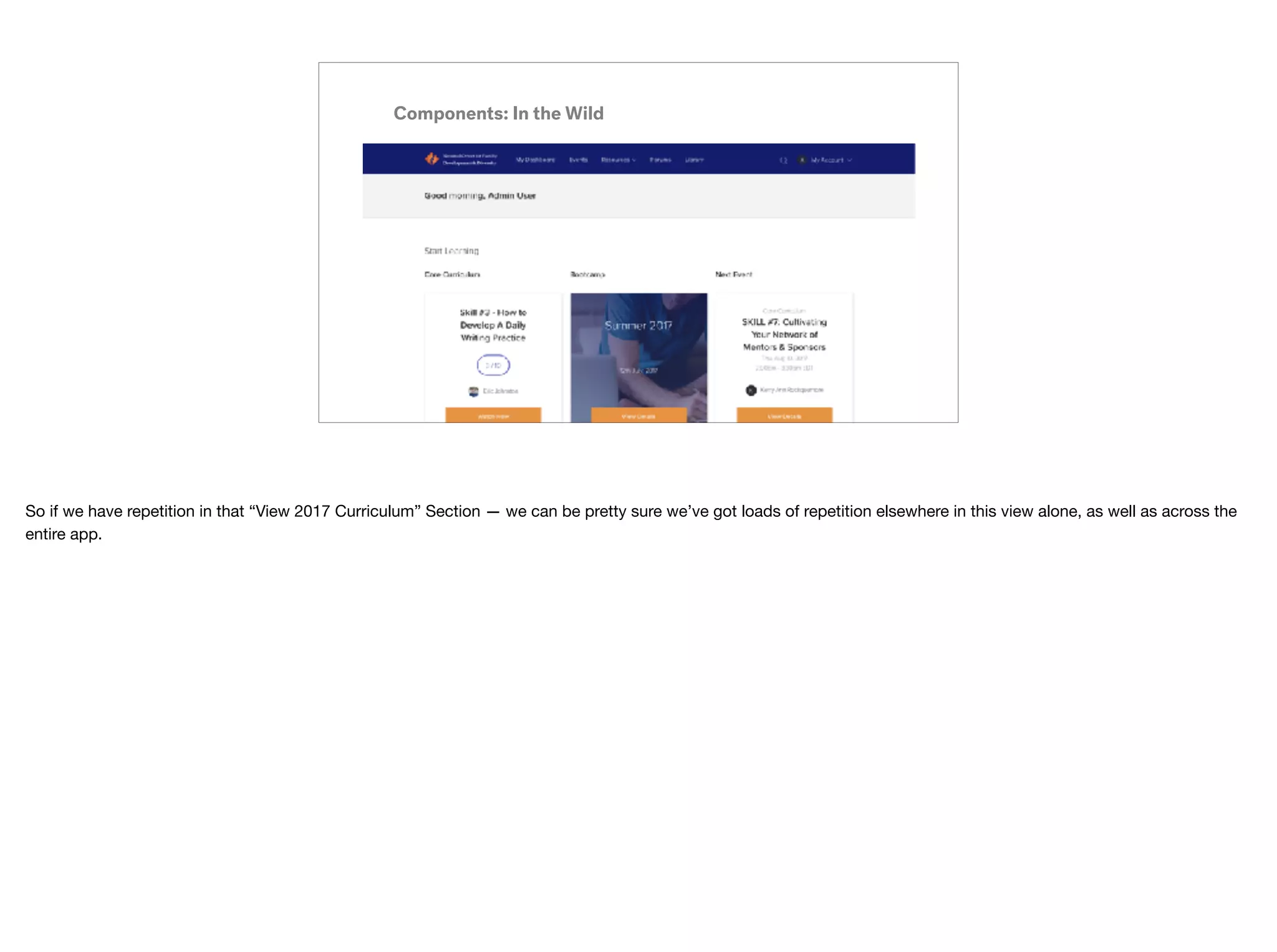
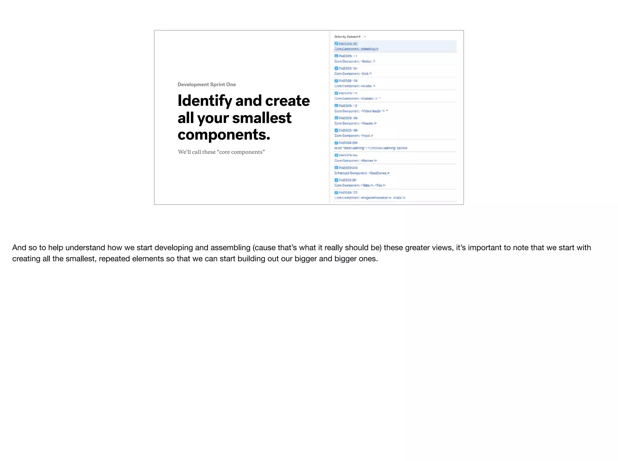
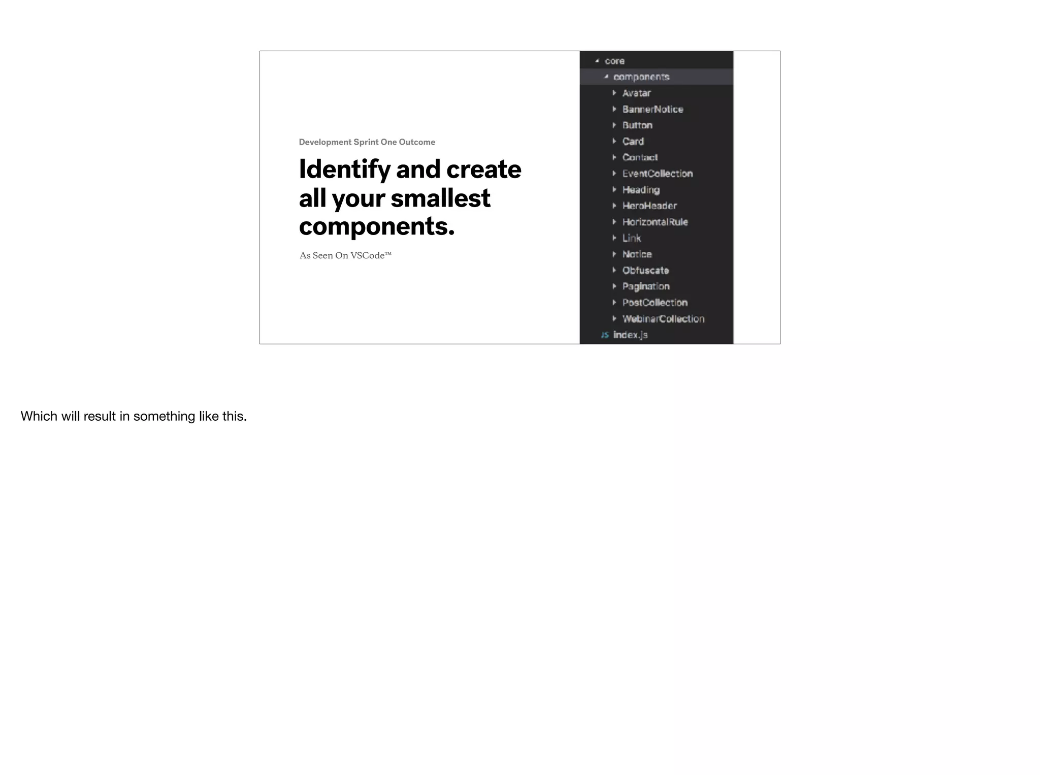
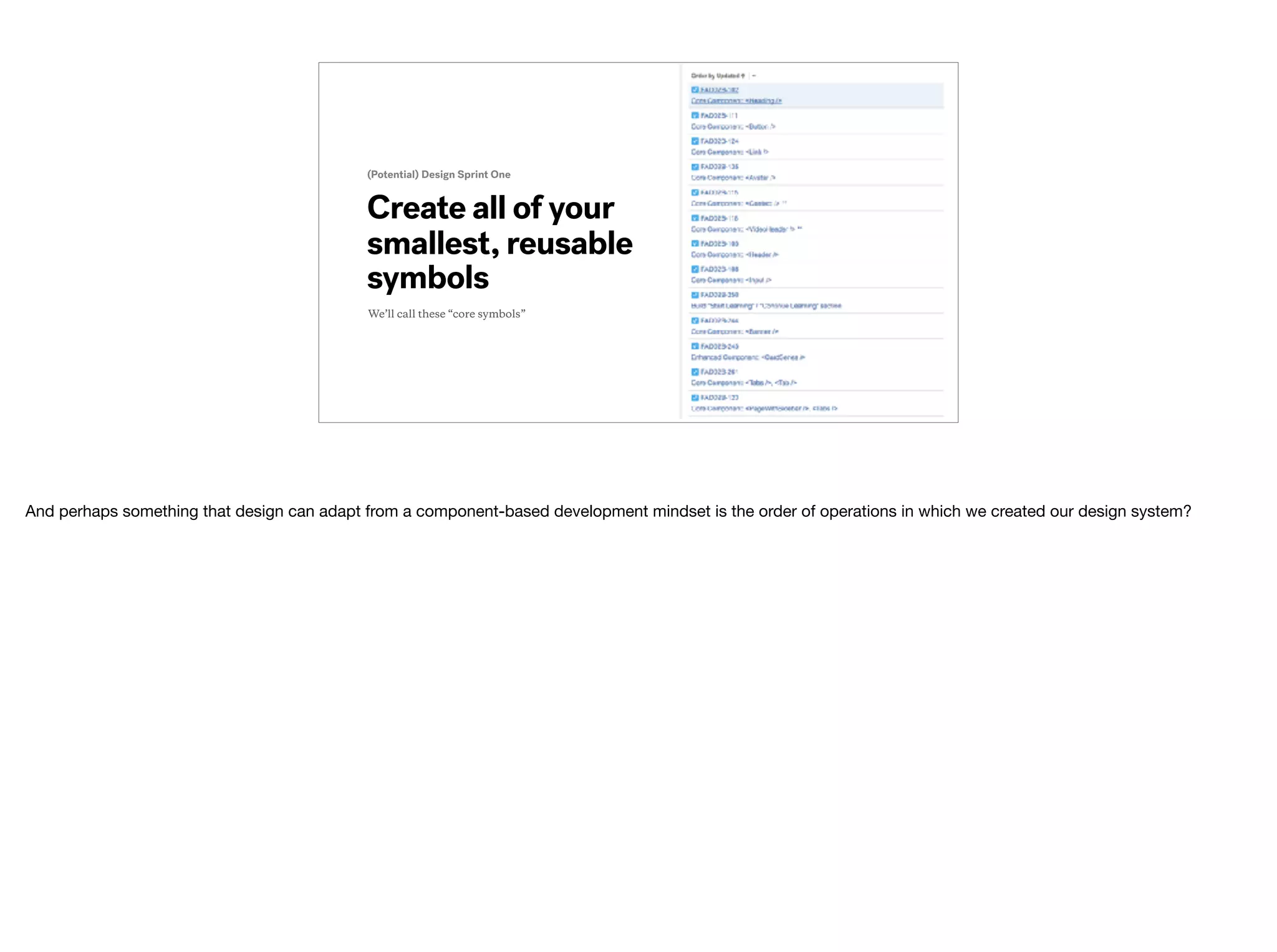
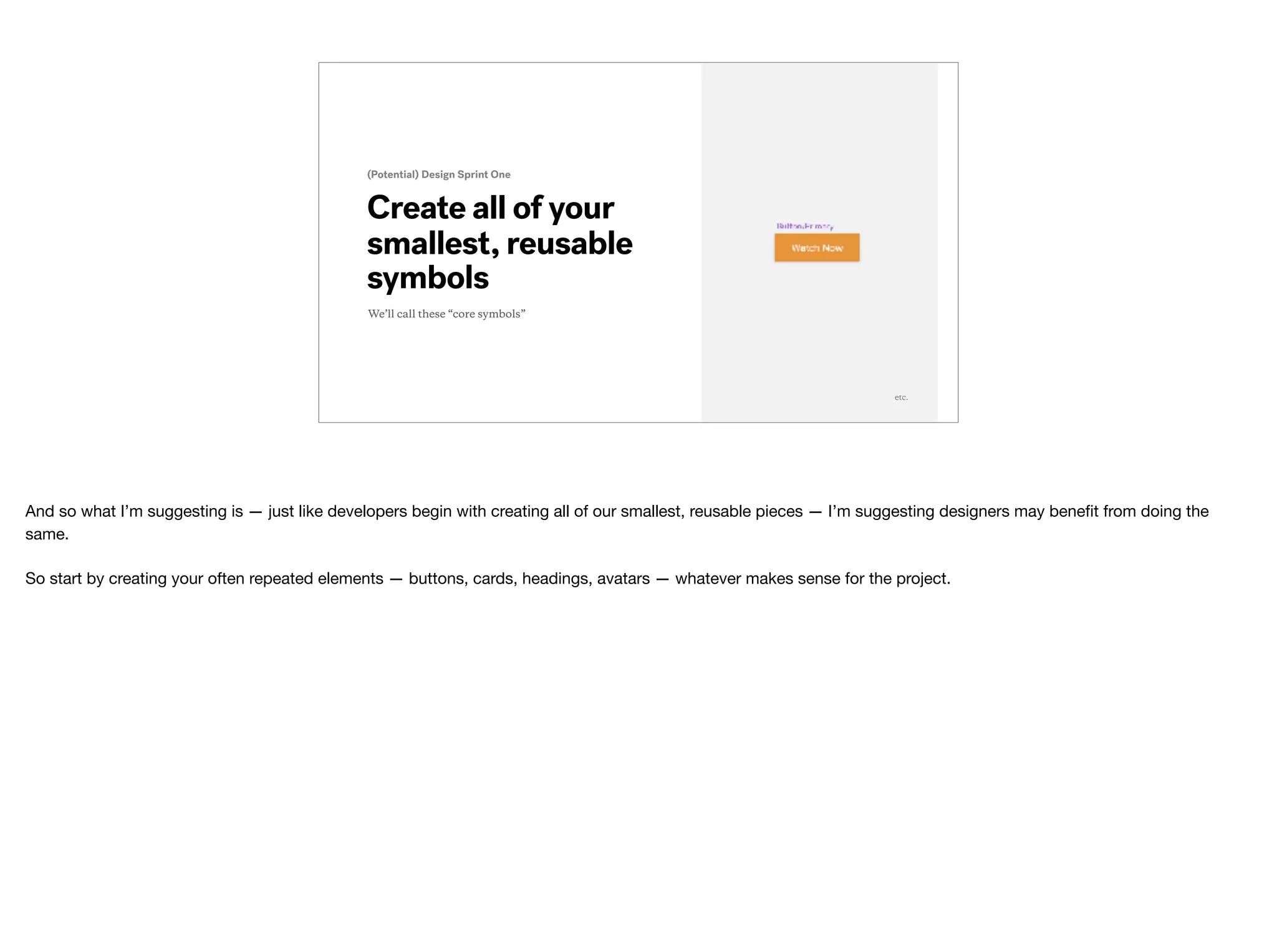
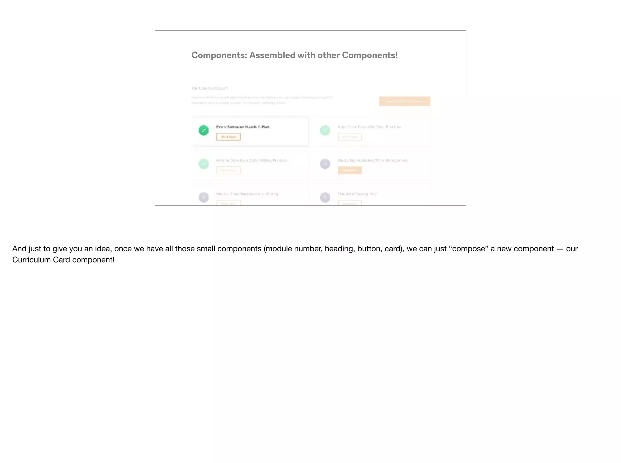
Downloaded 17 times
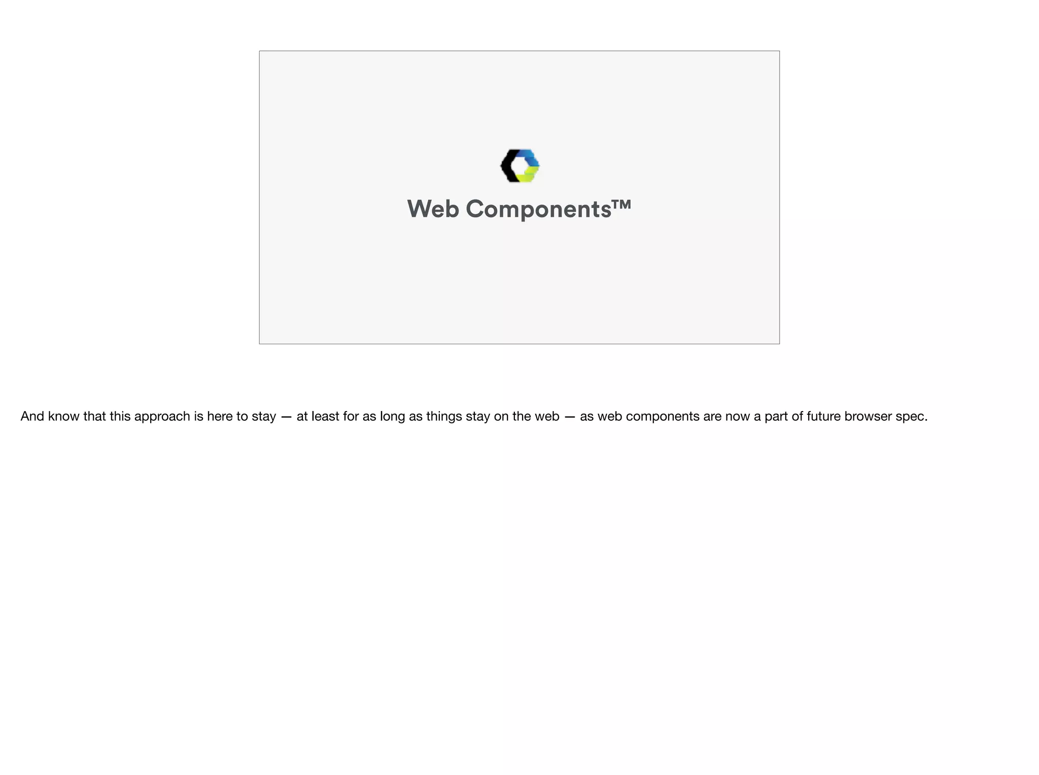
![https://en.wikipedia.org/wiki/Web_Components
A custom element that
allows for reusability
and modularity.
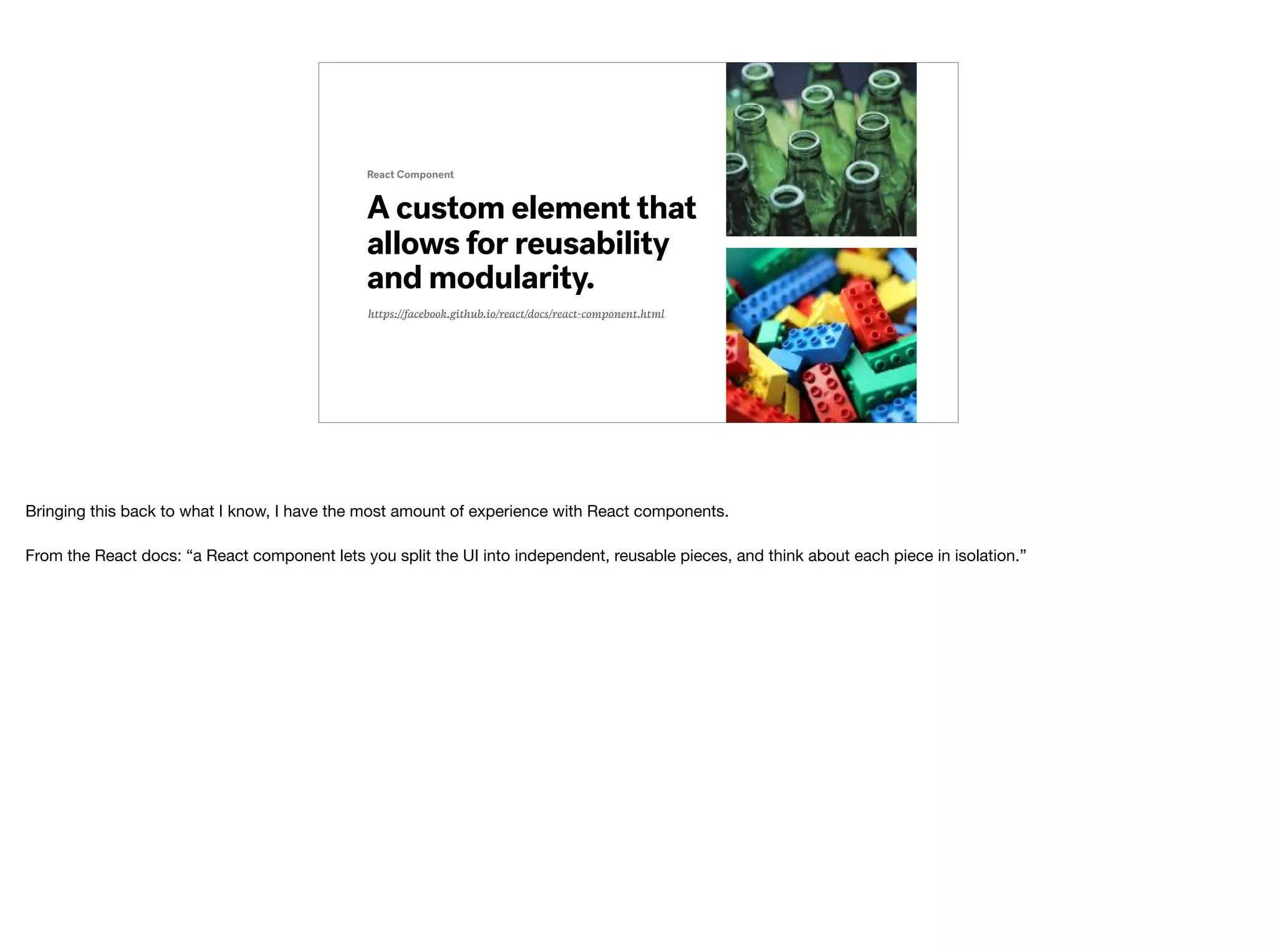
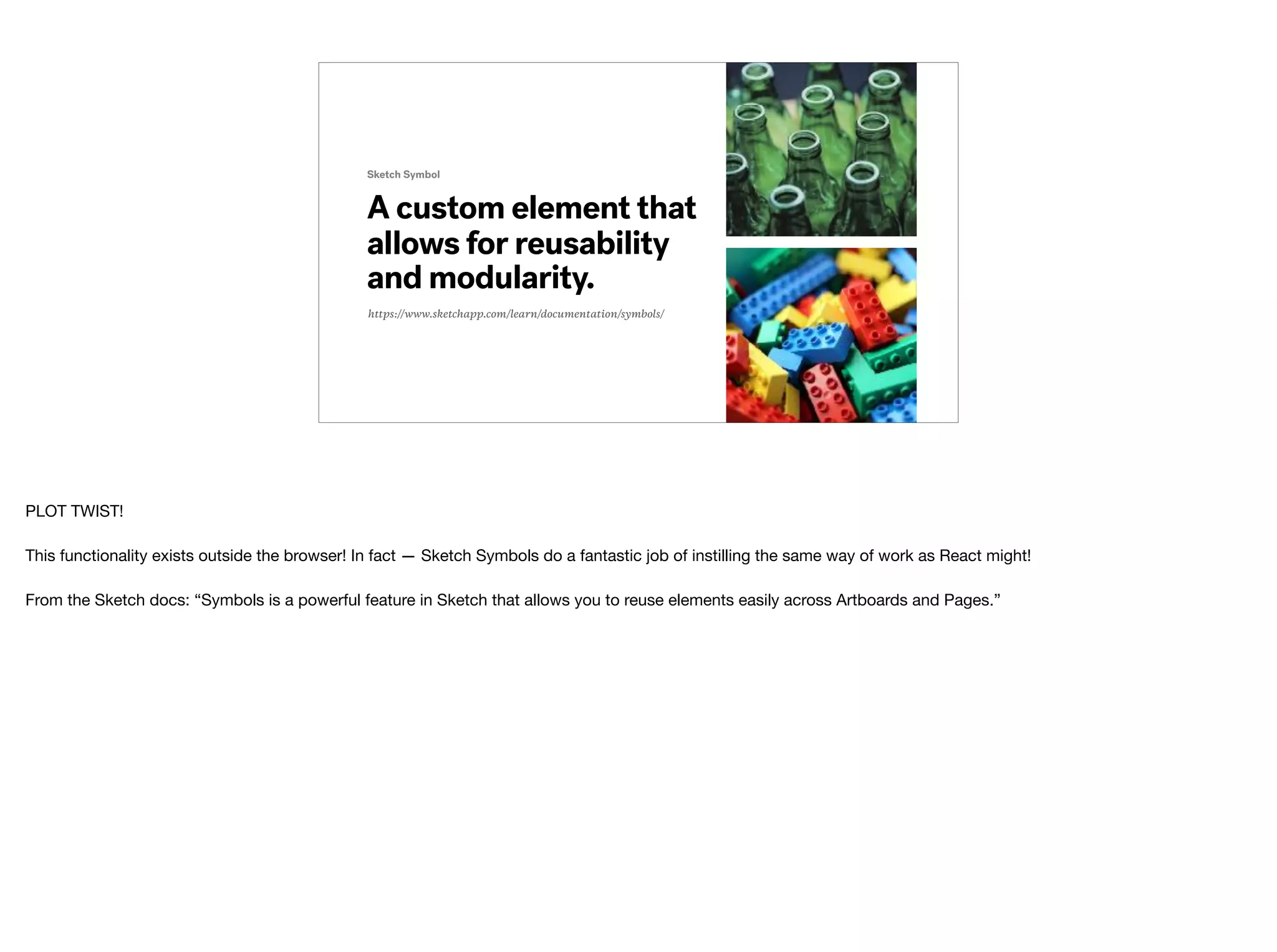
Web Component
A web component is an element that is completely self contained — all the markup, styles and logic are all bundled into one component.
“Web Components are a set of features currently[1] being added by the W3C to the HTML and DOM specifications that allow for the creation of reusable widgets or
components in web documents and web applications.”](https://image.slidesharecdn.com/thinkingincomponentsw-notes-170926192843/75/Thinking-in-Components-21-2048.jpg)

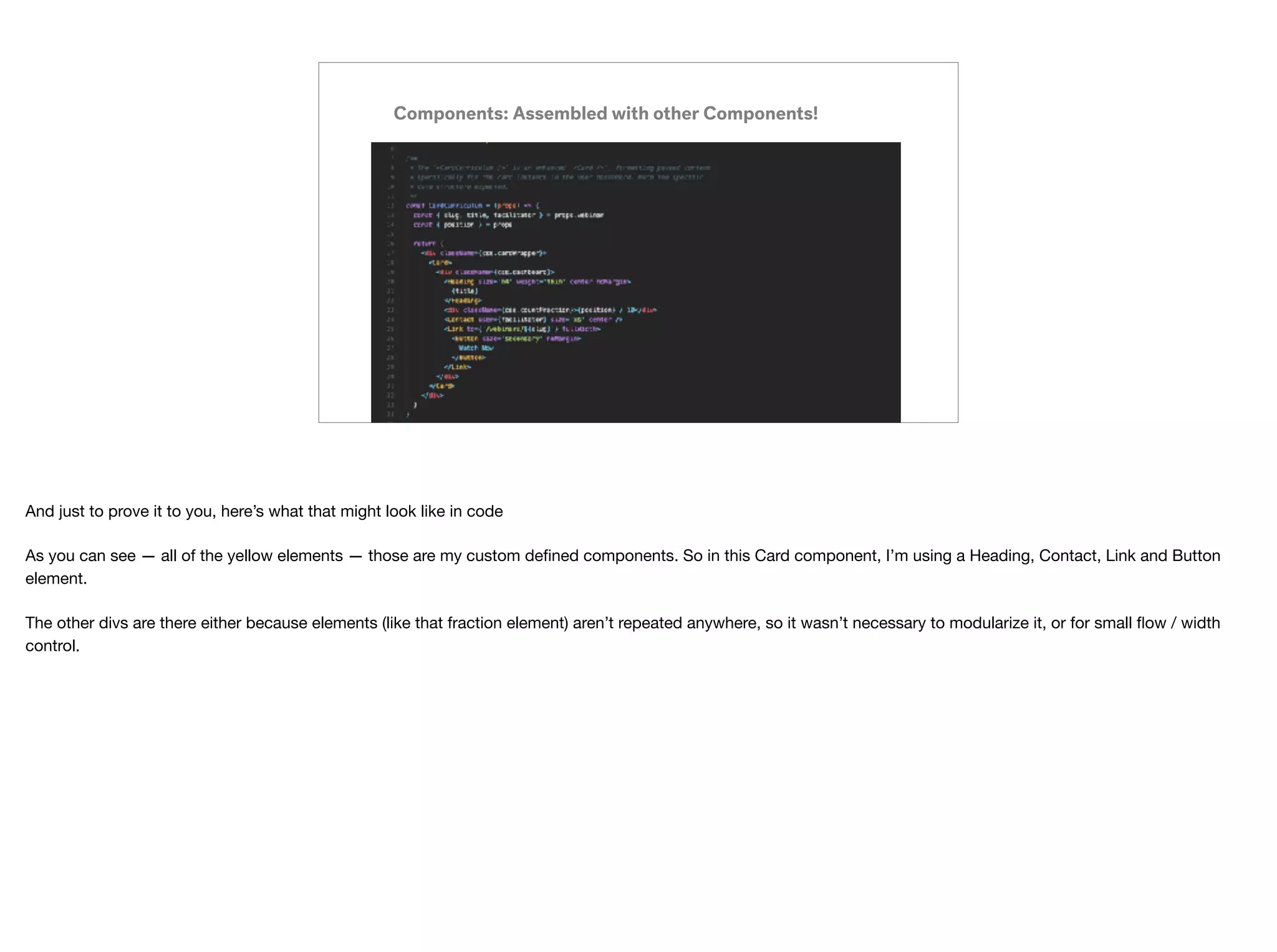
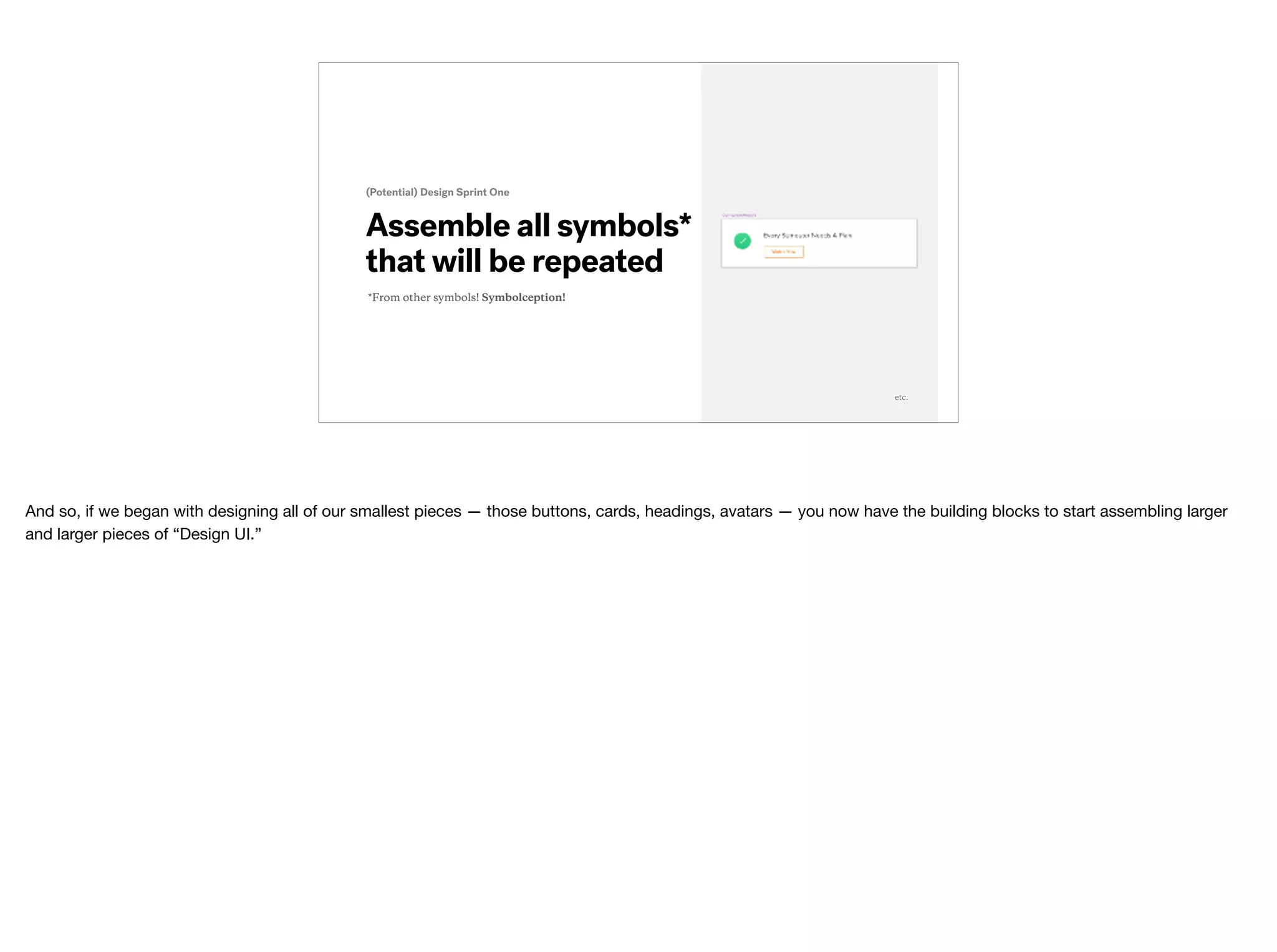
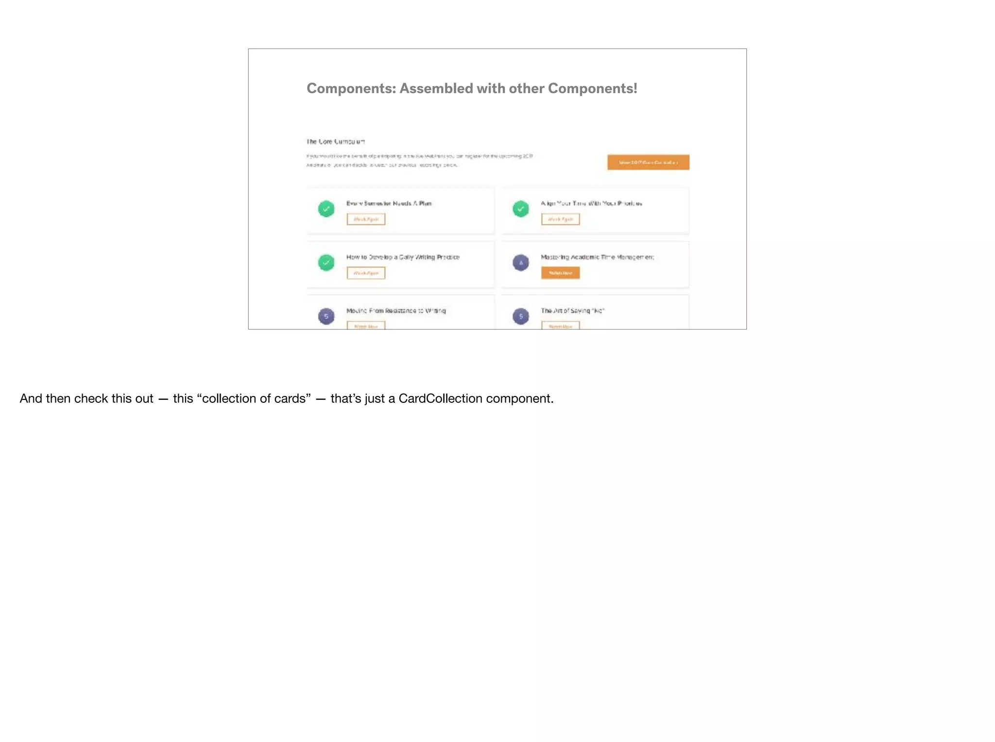
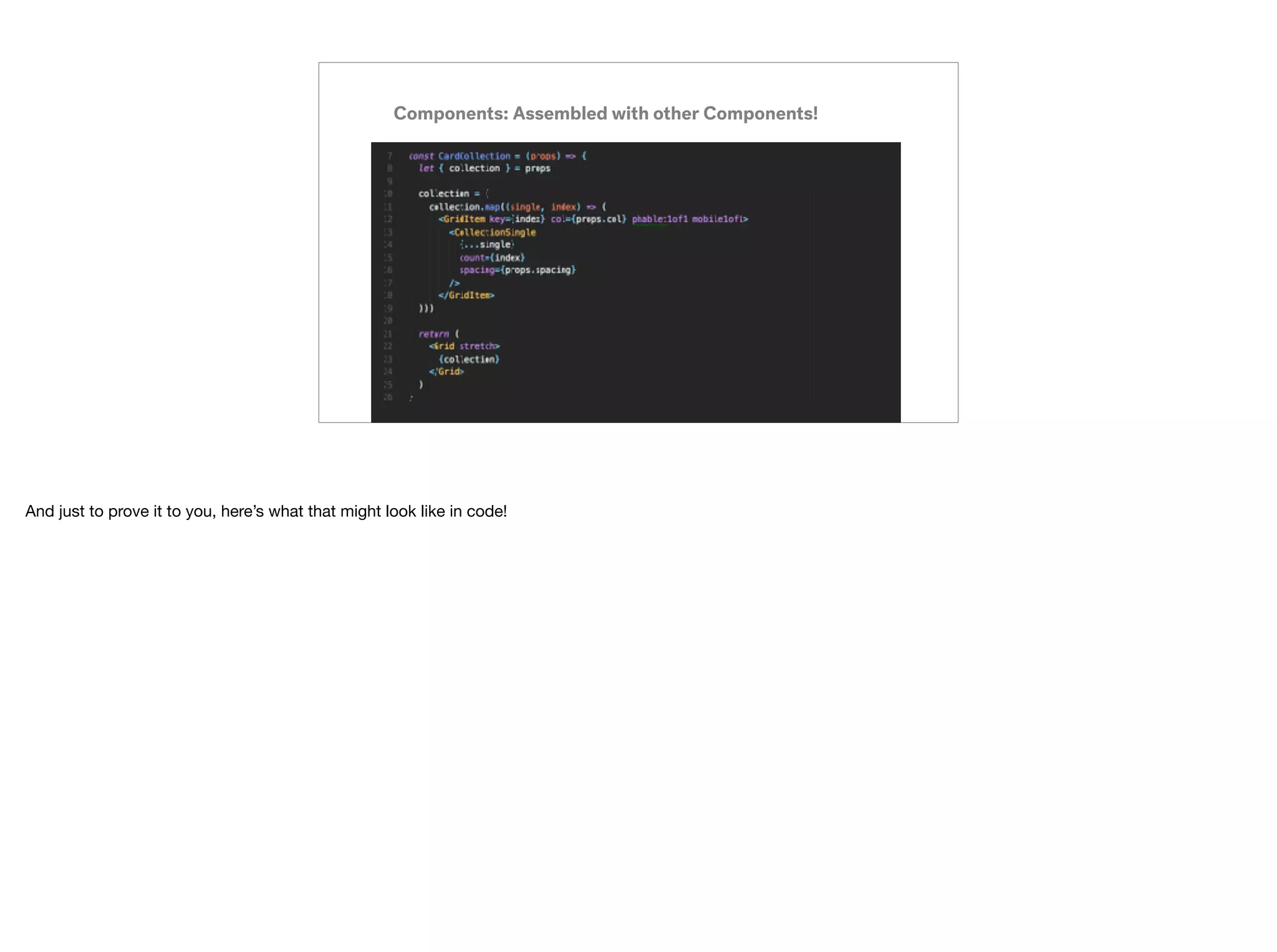
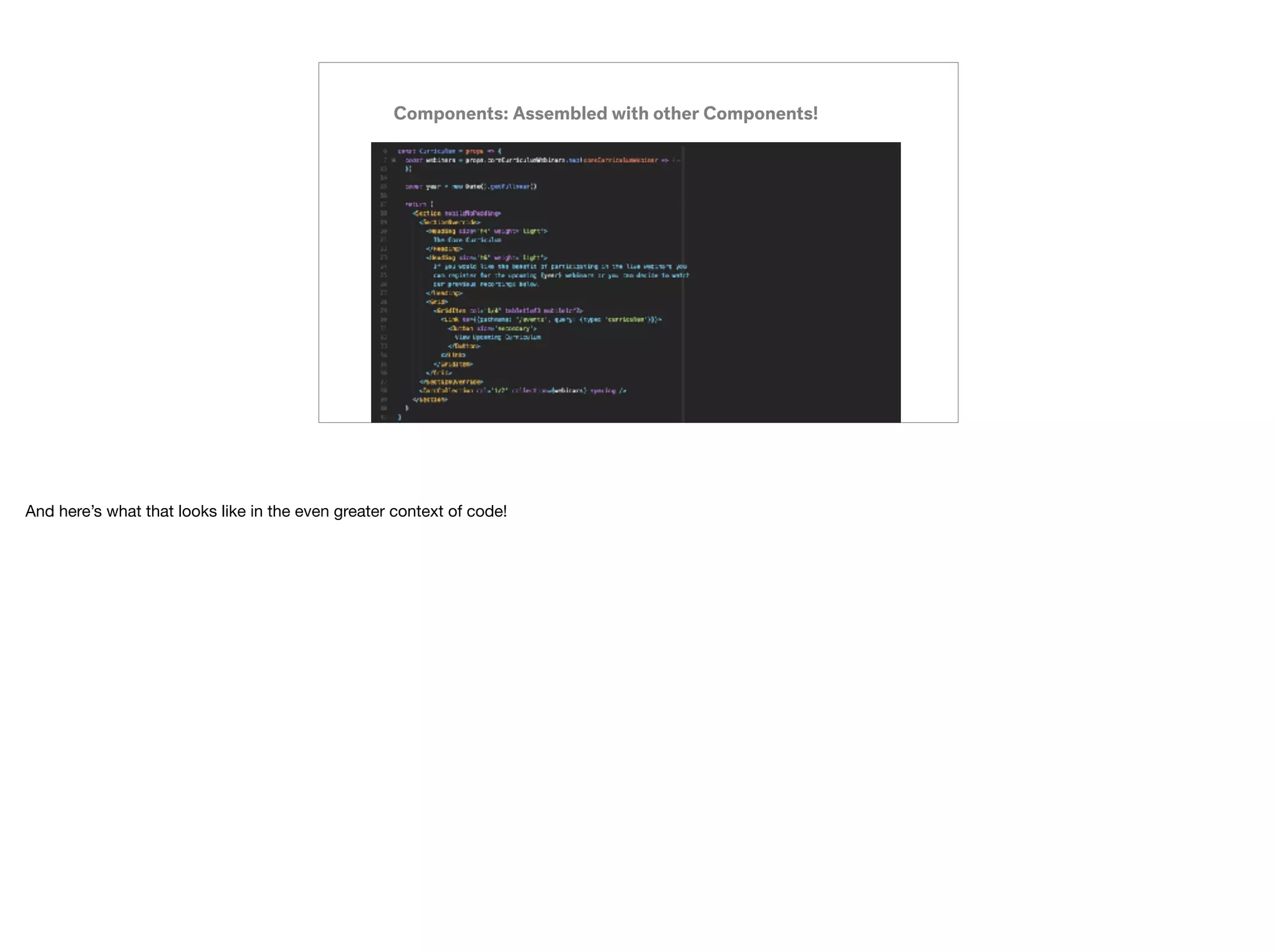
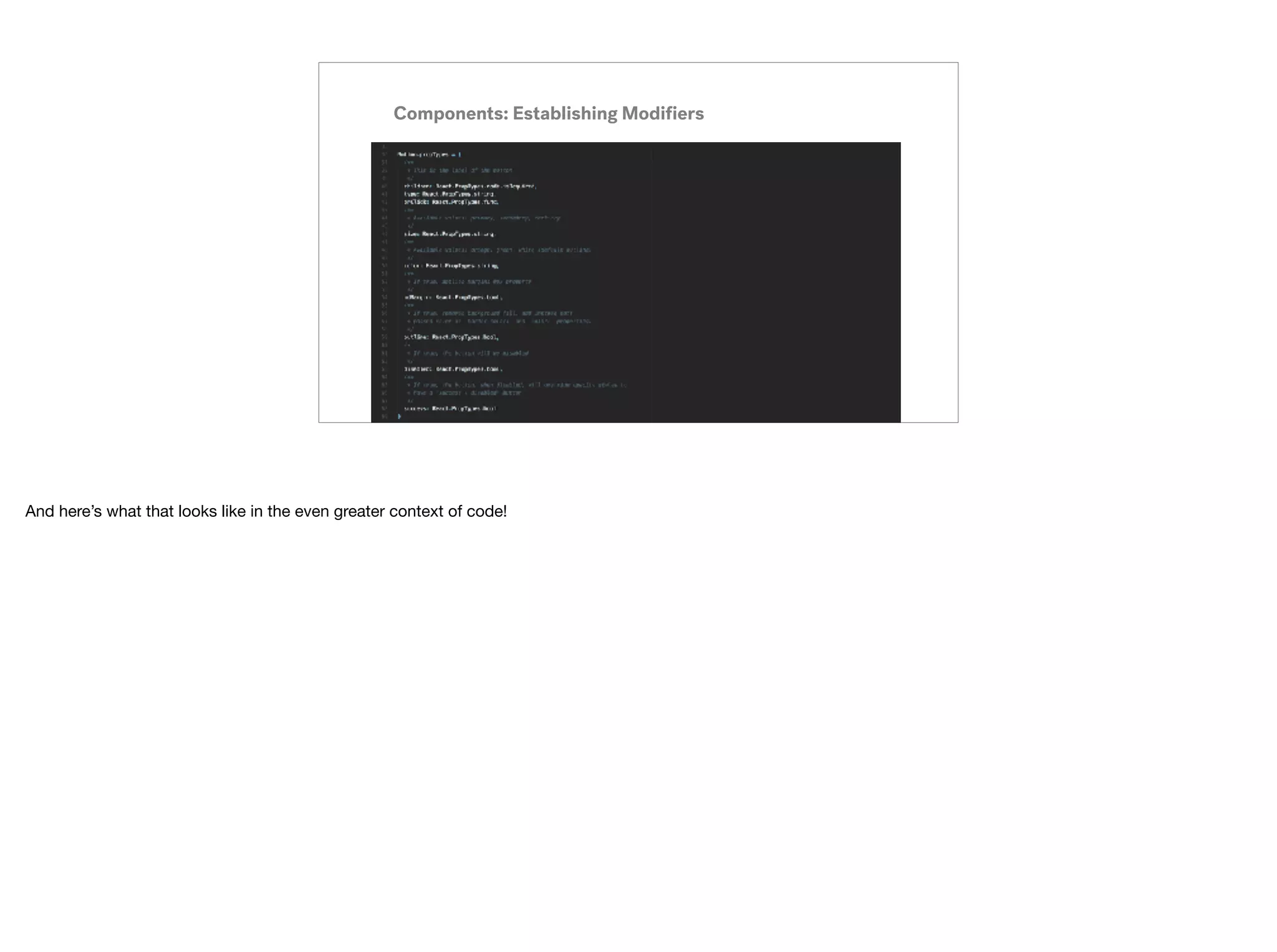

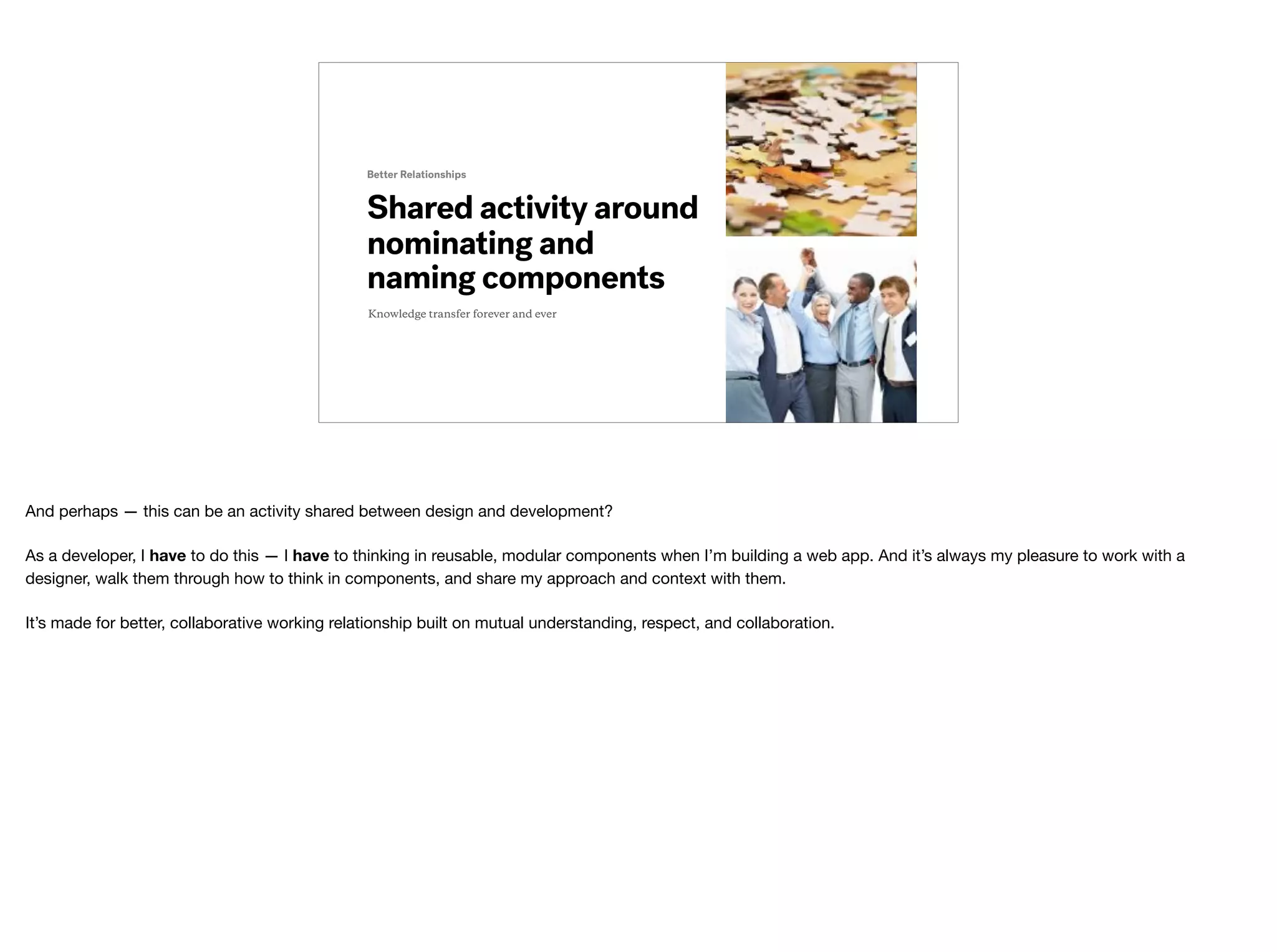
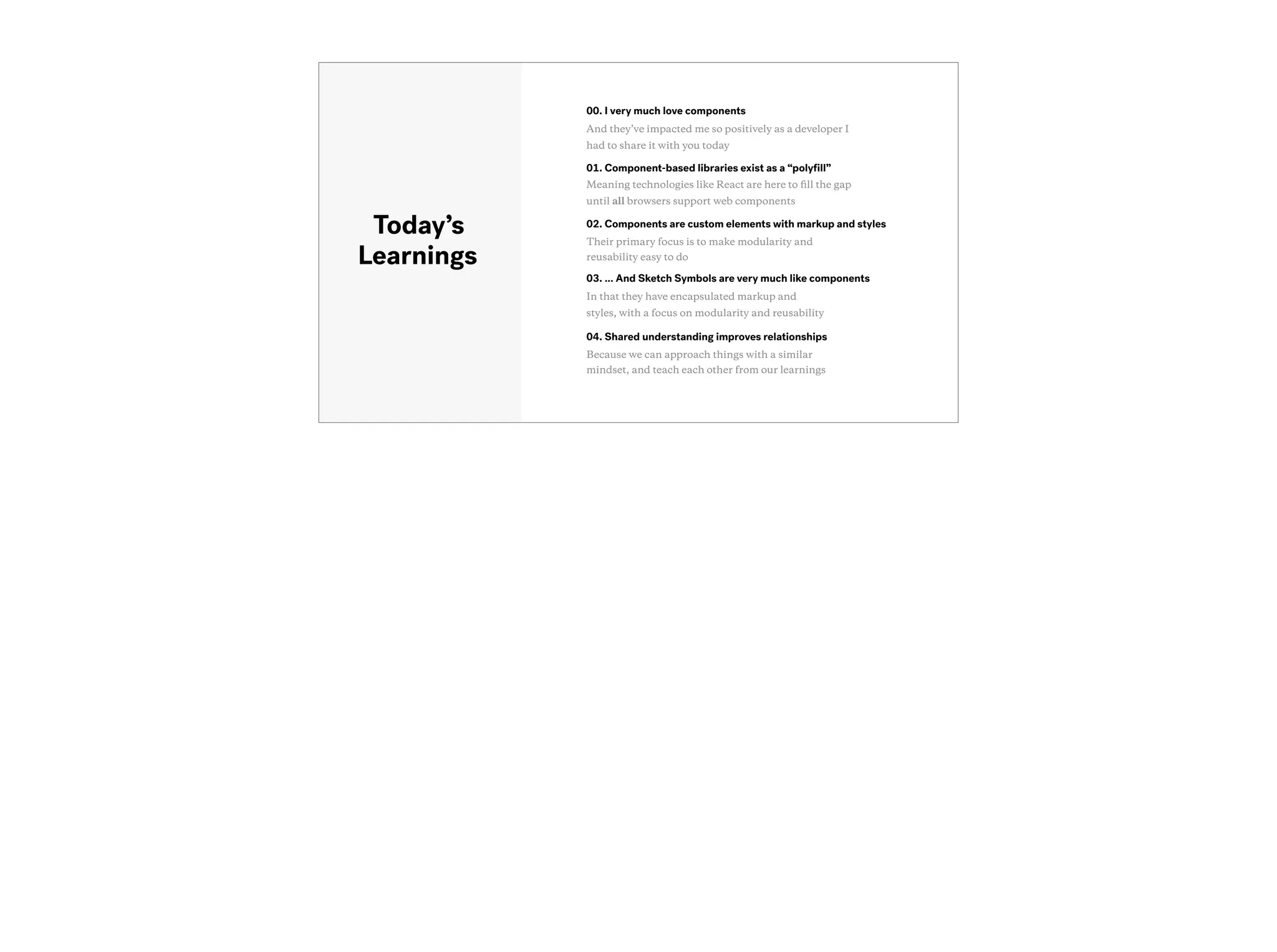

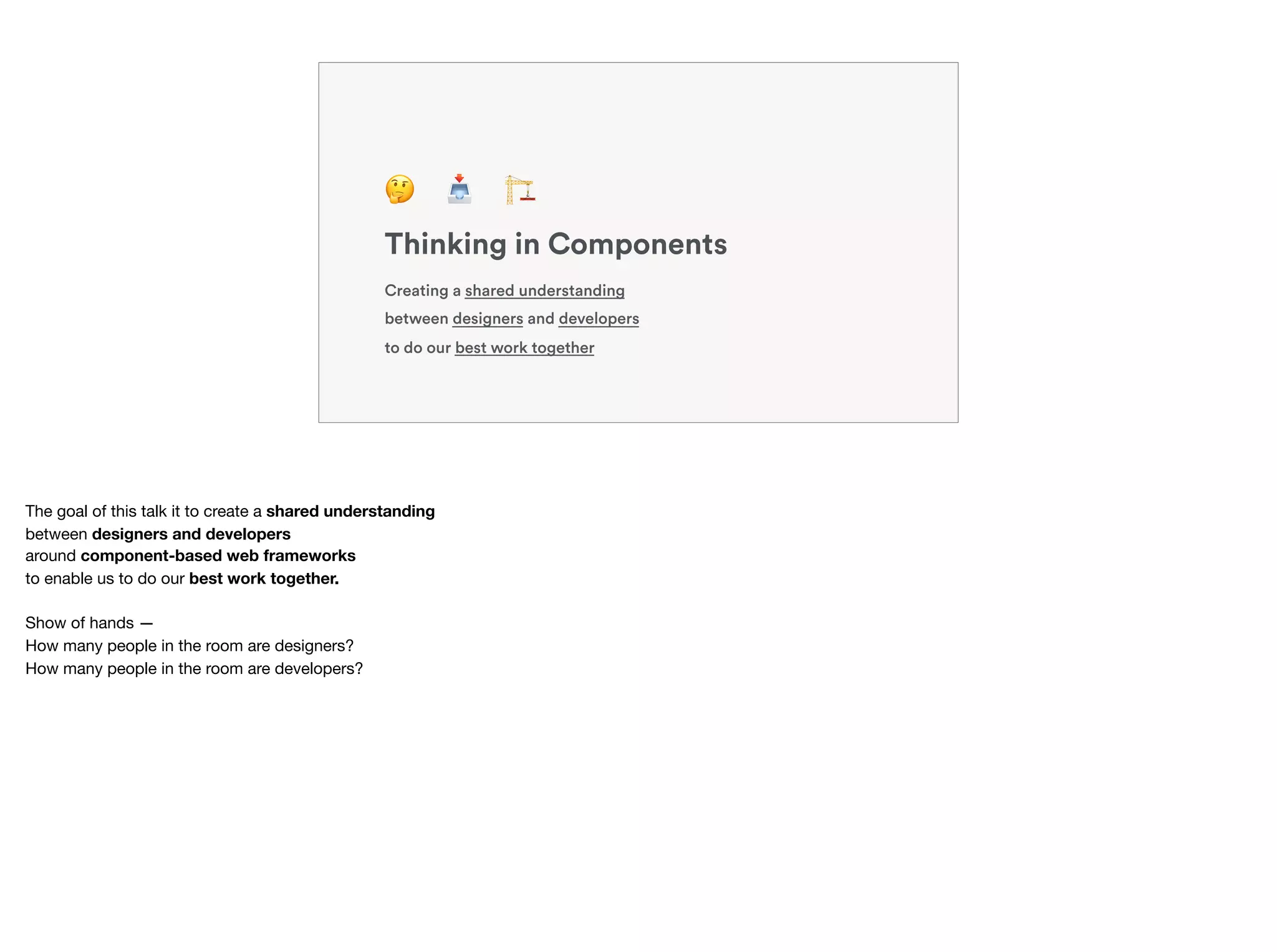
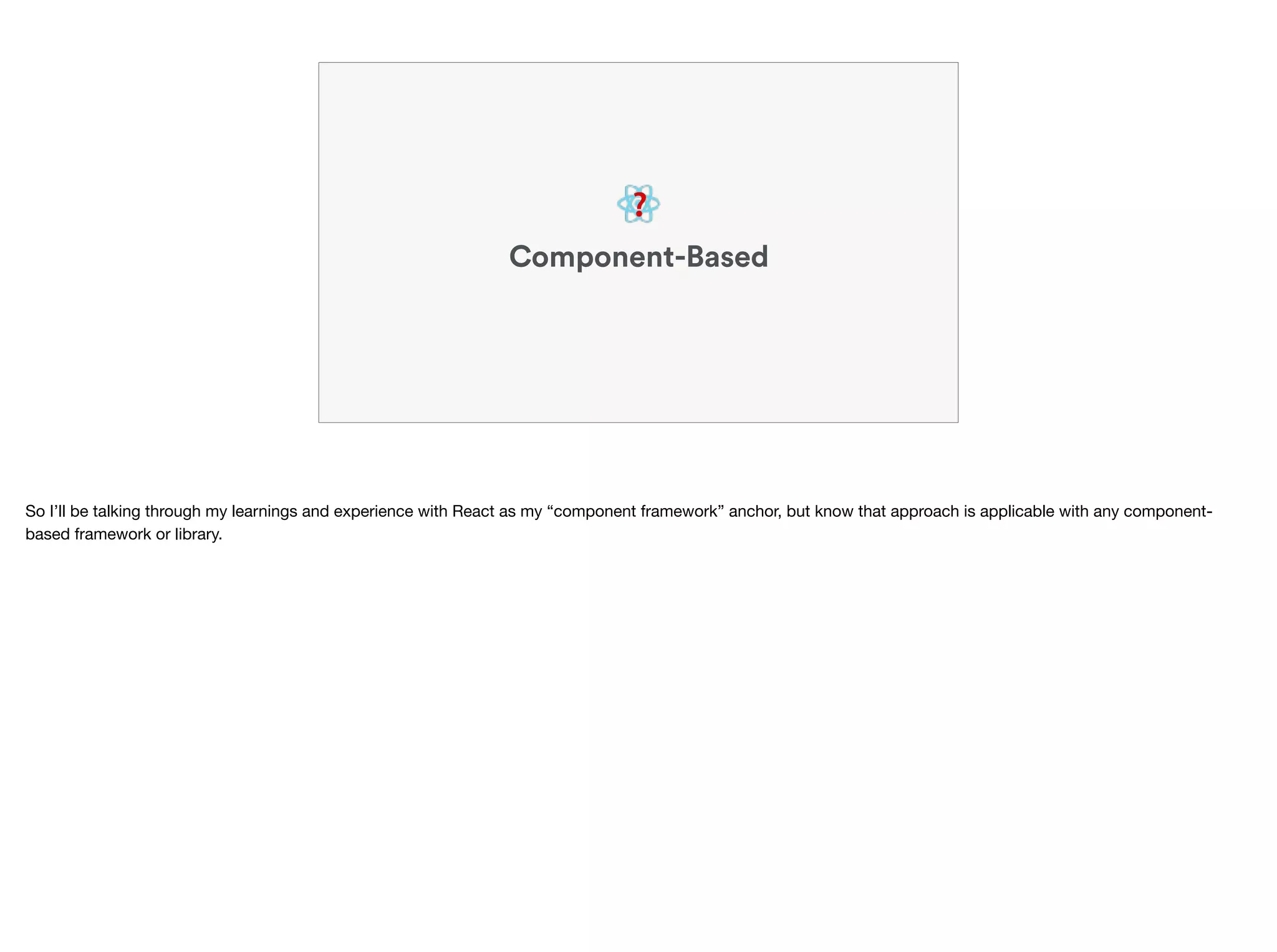
The document discusses the importance of thinking in components for both designers and developers, focusing on how component-based web frameworks, like React, improve efficiency and collaboration. It emphasizes creating a shared understanding around reusable elements to enhance design workflows and development handoffs. Ultimately, this component-centric approach fosters better working relationships and improved user interface assembly across teams.


![Vibe Coding vs. Spec-Driven Development [Free Meetup]](https://cdn.slidesharecdn.com/ss_thumbnails/vibecodingvsspecdrivendevelopment-251209105622-43f455e7-thumbnail.jpg?width=640&height=640&fit=bounds)


