Downloaded 11 times


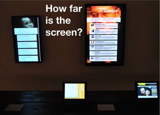


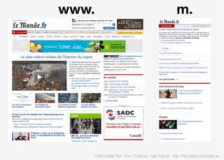


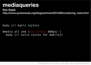
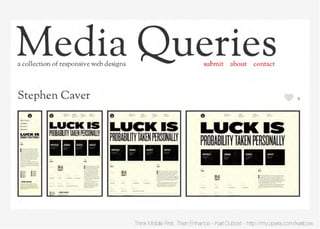


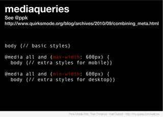


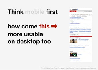


The document discusses the importance of designing websites with mobile users in mind first before enhancing the experience for desktop users. It recommends starting with a fluid or semi-fluid layout, using responsive design techniques like viewports and media queries to customize styles for different screen sizes, keeping file sizes small with techniques like image sprites and gzip compression, and testing on actual mobile devices using tools like Opera Dragonfly. The overall message is to prioritize simplicity, usability and the mobile experience early in the design process.


