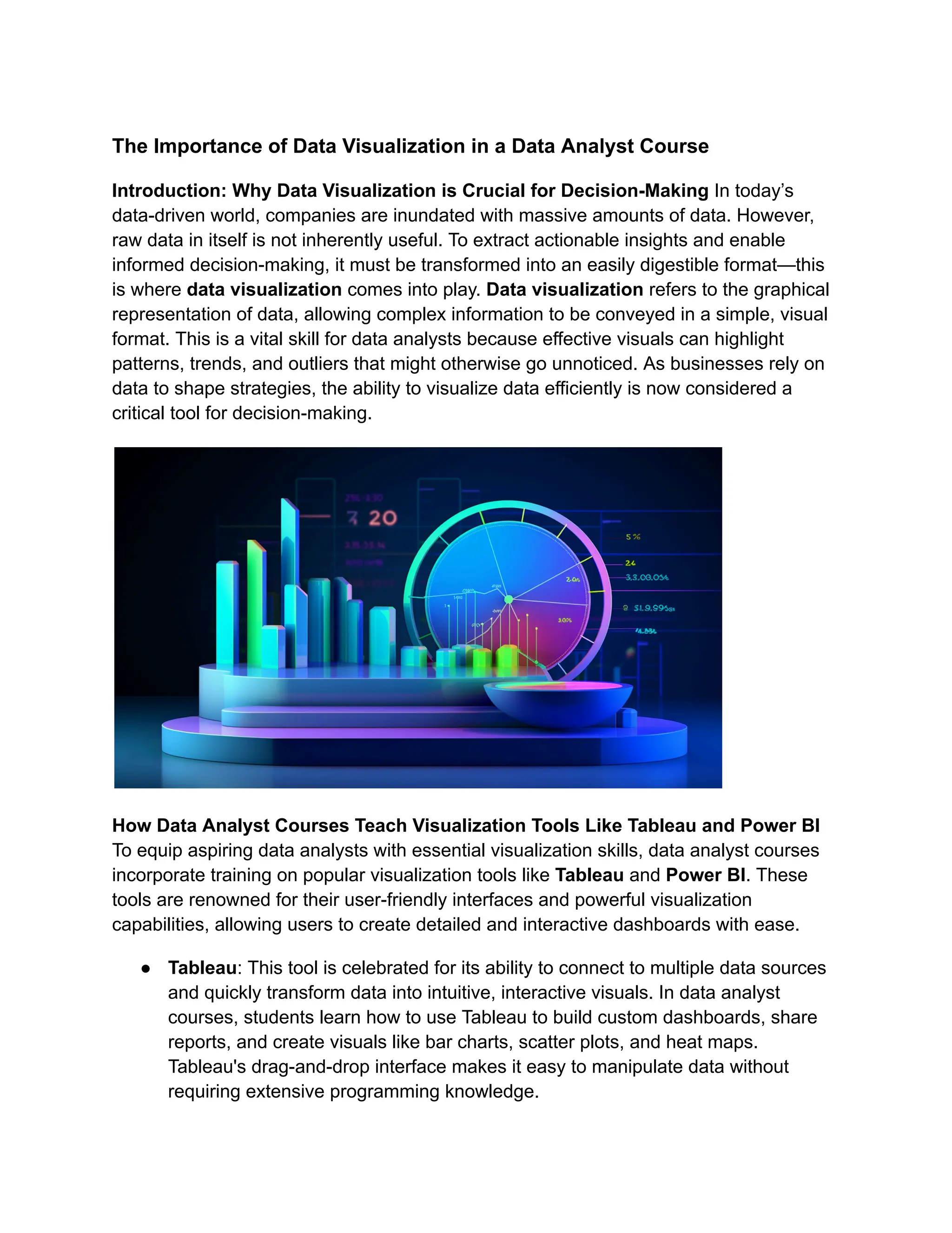
The Importance of Data Visualization in a Data Analyst Course
Introduction: Why Data Visualization is Crucial for Decision-Making In today’s
data-driven world, companies are inundated with massive amounts of data. However,
raw data in itself is not inherently useful. To extract actionable insights and enable
informed decision-making, it must be transformed into an easily digestible format—this
is where data visualization comes into play. Data visualization refers to the graphical
representation of data, allowing complex information to be conveyed in a simple, visual
format. This is a vital skill for data analysts because effective visuals can highlight
patterns, trends, and outliers that might otherwise go unnoticed. As businesses rely on
data to shape strategies, the ability to visualize data efficiently is now considered a
critical tool for decision-making.
How Data Analyst Courses Teach Visualization Tools Like Tableau and Power BI
To equip aspiring data analysts with essential visualization skills, data analyst courses
incorporate training on popular visualization tools like Tableau and Power BI. These
tools are renowned for their user-friendly interfaces and powerful visualization
capabilities, allowing users to create detailed and interactive dashboards with ease.
● Tableau: This tool is celebrated for its ability to connect to multiple data sources
and quickly transform data into intuitive, interactive visuals. In data analyst
courses, students learn how to use Tableau to build custom dashboards, share
reports, and create visuals like bar charts, scatter plots, and heat maps.
Tableau's drag-and-drop interface makes it easy to manipulate data without
requiring extensive programming knowledge.
● Power BI: Known for its integration with Microsoft products, Power BI is widely
used in business environments. It enables users to connect, model, and visualize
data quickly, often leveraging existing data stored in Excel or databases. Data
analyst course cover how to use Power BI’s features to create dynamic, real-time
dashboards that provide up-to-the-minute insights on key performance indicators
(KPIs).
Both tools are included in the curriculum to ensure that students can translate raw data
into actionable insights through meaningful visualizations.
Real-World Examples of Data Visualization in Action Data visualization has a direct
impact on many sectors, shaping business strategies, and improving performance. Here
are some real-world applications:
● Marketing: A marketing team might use data visualization to track the
performance of different advertising campaigns across various platforms. By
visualizing campaign data, they can easily identify which ads are performing well,
which audiences are engaging the most, and how budgets can be optimized.
● Healthcare: Hospitals and healthcare organizations leverage data visualizations
to monitor patient data and treatment outcomes. For example, patient recovery
trends can be visualized to spot inefficiencies or to identify successful treatments
for particular conditions.
● Finance: Data analysts in finance use visualizations to track stock market trends,
analyze portfolio performance, and monitor risks. A dashboard showing real-time
stock performance allows investors to make timely decisions based on visual
insights.
These examples show how data visualization can simplify complex information and
facilitate swift, informed decision-making in real-world scenarios.
Best Practices for Creating Impactful Data Visualizations While creating
visualizations is essential, it’s important to ensure that they communicate insights
effectively. Some best practices taught in data analyst course in Nashik include:
1. Choose the Right Visualization Type: Use the right chart or graph to convey
the message. For example, bar charts are great for comparing quantities, while
line graphs are ideal for showing trends over time.
2. Simplify and Focus on Clarity: Avoid clutter by using a clean, simple layout.
The goal is to highlight the key insights without overwhelming the audience with
unnecessary information.
3. Use Color Effectively: Colors should be used to draw attention to key data
points, but overuse or poor color choices can confuse the viewer. Stick to a
consistent color palette that supports the message you want to convey.
4. Provide Context: Always include labels, legends, and titles that explain the data
clearly. A good visualization should stand alone without the need for extensive
explanation.
5. Ensure Accuracy: Data visualizations must always reflect the true meaning of
the data. Misleading scales, distorted graphs, or inappropriate aggregation of
data can lead to incorrect interpretations and poor decision-making.
Conclusion: Mastering Visualization for Better Data Communication Data
visualization is not just a technical skill; it’s an art that requires understanding the
audience, the data, and the message. In any data analyst course, mastering the tools
and techniques of data visualization is essential for translating complex data into
actionable insights. Whether using Tableau, Power BI, or other tools, the ability to
present data in a clear, impactful manner can significantly improve business outcomes
and facilitate more informed decision-making. For anyone pursuing a career in data
analysis, mastering data visualization is a vital step toward success in the field.
Contact us for more in Information
Business Name: ExcelR - Data Science, Data Analyst Course in Nashik
Address: Office No 1, 1st Floor, Shree Sai Siddhi Plaza, Impact Spaces,
Trambakeshwar Rd, next to Indian Oil Petrol Pump, near ITI Signal, Mahatma Nagar,
Nashik, Maharashtra 422005
Phone number: 07204043317
Email id: enquiry@excelr.com

The Importance of Data Visualization in a Data Analyst Course.pdf

  • 1.
    The Importance ofData Visualization in a Data Analyst Course Introduction: Why Data Visualization is Crucial for Decision-Making In today’s data-driven world, companies are inundated with massive amounts of data. However, raw data in itself is not inherently useful. To extract actionable insights and enable informed decision-making, it must be transformed into an easily digestible format—this is where data visualization comes into play. Data visualization refers to the graphical representation of data, allowing complex information to be conveyed in a simple, visual format. This is a vital skill for data analysts because effective visuals can highlight patterns, trends, and outliers that might otherwise go unnoticed. As businesses rely on data to shape strategies, the ability to visualize data efficiently is now considered a critical tool for decision-making. How Data Analyst Courses Teach Visualization Tools Like Tableau and Power BI To equip aspiring data analysts with essential visualization skills, data analyst courses incorporate training on popular visualization tools like Tableau and Power BI. These tools are renowned for their user-friendly interfaces and powerful visualization capabilities, allowing users to create detailed and interactive dashboards with ease. ● Tableau: This tool is celebrated for its ability to connect to multiple data sources and quickly transform data into intuitive, interactive visuals. In data analyst courses, students learn how to use Tableau to build custom dashboards, share reports, and create visuals like bar charts, scatter plots, and heat maps. Tableau's drag-and-drop interface makes it easy to manipulate data without requiring extensive programming knowledge.
  • 2.
    ● Power BI:Known for its integration with Microsoft products, Power BI is widely used in business environments. It enables users to connect, model, and visualize data quickly, often leveraging existing data stored in Excel or databases. Data analyst course cover how to use Power BI’s features to create dynamic, real-time dashboards that provide up-to-the-minute insights on key performance indicators (KPIs). Both tools are included in the curriculum to ensure that students can translate raw data into actionable insights through meaningful visualizations. Real-World Examples of Data Visualization in Action Data visualization has a direct impact on many sectors, shaping business strategies, and improving performance. Here are some real-world applications: ● Marketing: A marketing team might use data visualization to track the performance of different advertising campaigns across various platforms. By visualizing campaign data, they can easily identify which ads are performing well, which audiences are engaging the most, and how budgets can be optimized. ● Healthcare: Hospitals and healthcare organizations leverage data visualizations to monitor patient data and treatment outcomes. For example, patient recovery trends can be visualized to spot inefficiencies or to identify successful treatments for particular conditions. ● Finance: Data analysts in finance use visualizations to track stock market trends, analyze portfolio performance, and monitor risks. A dashboard showing real-time stock performance allows investors to make timely decisions based on visual insights. These examples show how data visualization can simplify complex information and facilitate swift, informed decision-making in real-world scenarios. Best Practices for Creating Impactful Data Visualizations While creating visualizations is essential, it’s important to ensure that they communicate insights effectively. Some best practices taught in data analyst course in Nashik include: 1. Choose the Right Visualization Type: Use the right chart or graph to convey the message. For example, bar charts are great for comparing quantities, while line graphs are ideal for showing trends over time. 2. Simplify and Focus on Clarity: Avoid clutter by using a clean, simple layout. The goal is to highlight the key insights without overwhelming the audience with unnecessary information.
  • 3.
    3. Use ColorEffectively: Colors should be used to draw attention to key data points, but overuse or poor color choices can confuse the viewer. Stick to a consistent color palette that supports the message you want to convey. 4. Provide Context: Always include labels, legends, and titles that explain the data clearly. A good visualization should stand alone without the need for extensive explanation. 5. Ensure Accuracy: Data visualizations must always reflect the true meaning of the data. Misleading scales, distorted graphs, or inappropriate aggregation of data can lead to incorrect interpretations and poor decision-making. Conclusion: Mastering Visualization for Better Data Communication Data visualization is not just a technical skill; it’s an art that requires understanding the audience, the data, and the message. In any data analyst course, mastering the tools and techniques of data visualization is essential for translating complex data into actionable insights. Whether using Tableau, Power BI, or other tools, the ability to present data in a clear, impactful manner can significantly improve business outcomes and facilitate more informed decision-making. For anyone pursuing a career in data analysis, mastering data visualization is a vital step toward success in the field. Contact us for more in Information Business Name: ExcelR - Data Science, Data Analyst Course in Nashik Address: Office No 1, 1st Floor, Shree Sai Siddhi Plaza, Impact Spaces, Trambakeshwar Rd, next to Indian Oil Petrol Pump, near ITI Signal, Mahatma Nagar, Nashik, Maharashtra 422005 Phone number: 07204043317 Email id: enquiry@excelr.com