Task 9
Oli Georgiou
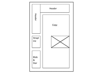
Header
Header
Copy
Blob
&
Star
Strapl
ine
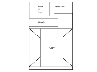
Strap-line
Header
Blob
&
Star
Copy
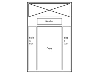
Header
Copy
Blob
&
Star
Blob
&
Star
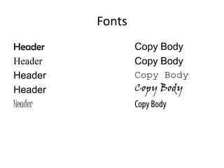
Fonts
Header
Header
Header
Header
Header
Copy Body
Copy Body
Copy Body
Copy Body
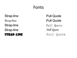
Fonts
Strap-line
Strap-line
Strap-line
Strap-line
Strap-line
Pull Quote
Pull Quote
Pull Quote
Pull Quote
Pull Quote
Analysis
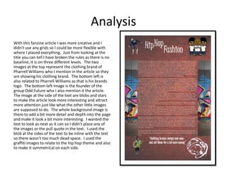
With this fanzine article I was more creative and I
didn’t use any grids so I could be more flexible with
where I placed everything. Just from looking at the
title you can tell I have broken the rules as there is no
baseline, it is on three different levels. The two
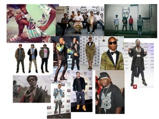
images at the top represent the clothing brand of
Pharrell Williams who I mention in the article so they
are showing his clothing brand. The bottom left is
also related to Pharrell Williams as that is his brands
logo. The bottom left image is the founder of the
group Odd Future who I also mention it the article.
The image at the side of the text are blobs and stars
to make the article look more interesting and attract
more attention just like what the other little images
are supposed to do. The whole background image is
there to add a bit more detail and depth into the page
and make it look a bit more interesting. I wanted the
text to look as neat as it can so I didn’t place any of
the images or the pull quote in the text. I used the
blob at the sides of the text to be inline with the text
so there wasn’t too much dead space. I used the
graffiti images to relate to the hip hop theme and also
to make it symmetrical on each side.
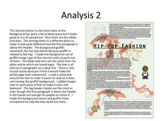
Analysis 2
This fanzine article is a bit more basic as the
background has quite a lot of dead space but it looks
good as it is all spread out. Also there are less blobs
and stars. The writing starts in a different place to
make it look quite different how the first paragraph is
above the Header. The background graffiti
represents the hip hop theme because graffiti is
related to hip hop. I made the background out of
graffiti image I got of the internet and cut parts out
of them. The blobs and stars are the same from my
other article which are brand logos. The text is all
laid out in paragraphs on a base-line. There is also
no pull quote because I think it would make the
whole page look unbalanced. I used a white box
around the text to make it easier to read so it does
not overlap the graffiti background. I added images
next to each piece of text to make it even and
balanced. The big header stands out the most so
even though the first paragraph is above the header
it still stands out enough for people to notice it. I
made the background colour and graffiti more
transparent to help the text stand out more.
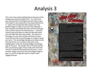
Analysis 3
This is the most urban looking fanzine because of the
background and the Headers font. It is a bit more
eye catching with the background and reverse copy.
The header is also coloured to also draw attention to
it. I have still included the little shapes from the
graffiti image to make it look a bit more detailed. I
also included some blobs and stars of the brand logo
and a cartoon version of a brand owner. I used the
reverse copy technique to make the text box stand
out and make the text more visible. The colours in
this page are a lot more visible and there are also
more colours that my second page so it helps it stand
out more. The camouflage background relates to the
hip hop theme as it is known to be quite a hip
hop/gangster trend, for example baggy camouflage
tops or trousers. The header font is a lot less formal
than my previous pages I have made and I think this
one fits in with the hip hop theme the most. I used
another image to put over the camouflage image to
give it a sort of muddy dirt look to make it look
rugged and raw.

Task 9

  • 1.
  • 2.
  • 3.
  • 4.
  • 5.
  • 6.
  • 8.
    Analysis With this fanzinearticle I was more creative and I didn’t use any grids so I could be more flexible with where I placed everything. Just from looking at the title you can tell I have broken the rules as there is no baseline, it is on three different levels. The two images at the top represent the clothing brand of Pharrell Williams who I mention in the article so they are showing his clothing brand. The bottom left is also related to Pharrell Williams as that is his brands logo. The bottom left image is the founder of the group Odd Future who I also mention it the article. The image at the side of the text are blobs and stars to make the article look more interesting and attract more attention just like what the other little images are supposed to do. The whole background image is there to add a bit more detail and depth into the page and make it look a bit more interesting. I wanted the text to look as neat as it can so I didn’t place any of the images or the pull quote in the text. I used the blob at the sides of the text to be inline with the text so there wasn’t too much dead space. I used the graffiti images to relate to the hip hop theme and also to make it symmetrical on each side.
  • 9.
    Analysis 2 This fanzinearticle is a bit more basic as the background has quite a lot of dead space but it looks good as it is all spread out. Also there are less blobs and stars. The writing starts in a different place to make it look quite different how the first paragraph is above the Header. The background graffiti represents the hip hop theme because graffiti is related to hip hop. I made the background out of graffiti image I got of the internet and cut parts out of them. The blobs and stars are the same from my other article which are brand logos. The text is all laid out in paragraphs on a base-line. There is also no pull quote because I think it would make the whole page look unbalanced. I used a white box around the text to make it easier to read so it does not overlap the graffiti background. I added images next to each piece of text to make it even and balanced. The big header stands out the most so even though the first paragraph is above the header it still stands out enough for people to notice it. I made the background colour and graffiti more transparent to help the text stand out more.
  • 10.
    Analysis 3 This isthe most urban looking fanzine because of the background and the Headers font. It is a bit more eye catching with the background and reverse copy. The header is also coloured to also draw attention to it. I have still included the little shapes from the graffiti image to make it look a bit more detailed. I also included some blobs and stars of the brand logo and a cartoon version of a brand owner. I used the reverse copy technique to make the text box stand out and make the text more visible. The colours in this page are a lot more visible and there are also more colours that my second page so it helps it stand out more. The camouflage background relates to the hip hop theme as it is known to be quite a hip hop/gangster trend, for example baggy camouflage tops or trousers. The header font is a lot less formal than my previous pages I have made and I think this one fits in with the hip hop theme the most. I used another image to put over the camouflage image to give it a sort of muddy dirt look to make it look rugged and raw.