Pie Chart Shows Class Distribution
•
0 likes•304 views

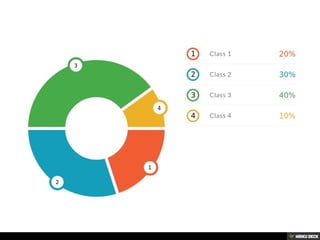
This pie chart shows data from 4 classes. Class 3 makes up the largest portion at 40, followed by Class 2 at 30, then Class 1 at 20, with Class 4 being the smallest at 10. The values seem to represent the number of students or some other quantifiable measure in each class.

Recommended
More Related Content
Featured
Featured (20)
Pie Chart Shows Class Distribution
- 1. Pie chart Class 1: 20 Class 2: 30 Class 3: 40 Class 4: 10