
More Related Content
Recently uploaded
Recently uploaded (20)
Featured
Featured (20)
Proposal art 101
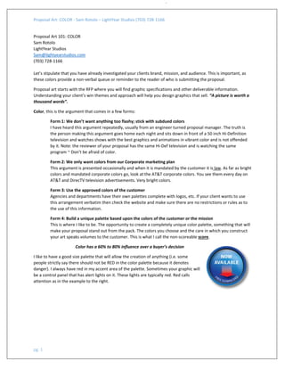
- 2. Proposal Art: COLOR ‐ Sam Rotolo – LightYear Studios (703) 728‐1166 pg. 2 On left the basic meaning of the colors chart Here is a tip that will save you many dollars. TIP$ ‐ If you have several artists working on your project, ask your lead artist to create templets for different size graphics, page sizes, and orientation. Include the color palette inside each template and then distribute the templets to each artist. When an artist opens a template for a specific graphic size etc. they will have the palette embedded within and not spend time recreating color swatches. Palette breakdown: Primary colors: These colors will dictate the look and feel of your proposal. I choose between 4 and 6 Primary colors. Secondary colors: These colors are complements to your primary colors. In addition to your primary colors, secondary colors are utilized when creating pie charts or other geometry that has many segments that need to be identified separately. Accent colors: These are brighter, more saturated colors. These colors are for the rare occasion when you need to draw the attention of the reader quickly to an item (i.e. your best value icon should stand out so it is quickly identified on the page when you need to draw the reader’s attention to an item that will be a discriminator). Tints and Shades: I also use the tints and shades of each of the colors above to expand the palette even more.