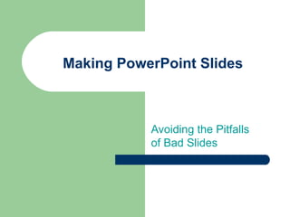
This document provides tips for creating effective PowerPoint slides by avoiding common pitfalls. It addresses how to structure slides with outlines and bullet points, use fonts and colors that are easy to read, include graphs and charts to visualize data, check for spelling and grammar errors, and conclude with a clear summary and invitation for questions. Key recommendations include using a large font size, limiting each slide to 4-5 main points in point form, employing high-contrast colors, including descriptive titles on all visuals, and proofreading for clarity and correctness.
Hadj Ounis's most notable work is his sculpture titled "Metamorphosis." This piece showcases Ounis's mastery of form and texture, as he seamlessly combines metal and wood to create a dynamic and visually striking composition. The juxtaposition of the two materials creates a sense of tension and harmony, inviting viewers to contemplate the relationship between nature and industry.
Hadj Ounis's most notable work is his sculpture titled "Metamorphosis." This piece showcases Ounis's mastery of form and texture, as he seamlessly combines metal and wood to create a dynamic and visually striking composition. The juxtaposition of the two materials creates a sense of tension and harmony, inviting viewers to contemplate the relationship between nature and industry.
2137ad - Characters that live in Merindol and are at the center of main storiesluforfor
Kurgan is a russian expatriate that is secretly in love with Sonia Contado. Henry is a british soldier that took refuge in Merindol Colony in 2137ad. He is the lover of Sonia Contado.
2137ad Merindol Colony Interiors where refugee try to build a seemengly norm...luforfor
This are the interiors of the Merindol Colony in 2137ad after the Climate Change Collapse and the Apocalipse Wars. Merindol is a small Colony in the Italian Alps where there are around 4000 humans. The Colony values mainly around meritocracy and selection by effort.
Explore the multifaceted world of Muntadher Saleh, an Iraqi polymath renowned for his expertise in visual art, writing, design, and pharmacy. This SlideShare delves into his innovative contributions across various disciplines, showcasing his unique ability to blend traditional themes with modern aesthetics. Learn about his impactful artworks, thought-provoking literary pieces, and his vision as a Neo-Pop artist dedicated to raising awareness about Iraq's cultural heritage. Discover why Muntadher Saleh is celebrated as "The Last Polymath" and how his multidisciplinary talents continue to inspire and influence.
2. Tips to be Covered
Outlines
Slide Structure
Fonts
Colour
Background
Graphs
Spelling and Grammar
Conclusions
Questions
3. Outline
Make your 1st
or 2nd
slide an outline of your
presentation
– Ex: previous slide
Follow the order of your outline for the rest of
the presentation
Only place main points on the outline slide
– Ex: Use the titles of each slide as main points
4. Slide Structure – Good
Use 1-2 slides per minute of your presentation
Write in point form, not complete sentences
Include 4-5 points per slide
Avoid wordiness: use key words and phrases
only
5. Slide Structure - Bad
This page contains too many words for a
presentation slide. It is not written in point
form, making it difficult both for your audience
to read and for you to present each point.
Although there are exactly the same number of
points on this slide as the previous slide, it
looks much more complicated. In short, your
audience will spend too much time trying to
read this paragraph instead of listening to you.
6. Slide Structure – Good
Show one point at a time:
– Will help audience concentrate on what you are
saying
– Will prevent audience from reading ahead
– Will help you keep your presentation focused
7. Slide Structure - Bad
Do not use distracting animation
Do not go overboard with the animation
Be consistent with the animation that you use
8. Fonts - Good
Use at least an 18-point font
Use different size fonts for main points and
secondary points
– this font is 24-point, the main point font is 28-point,
and the title font is 36-point
Use a standard font like Times New Roman or
Arial
9. Fonts - Bad
If you use a small font, your audience won’t be able to read what you have written
CAPITALIZE ONLY WHEN NECESSARY. IT
IS DIFFICULT TO READ
Don’t use a complicated font
10. Colour - Good
Use a colour of font that contrasts sharply with
the background
– Ex: blue font on white background
Use colour to reinforce the logic of your
structure
– Ex: light blue title and dark blue text
Use colour to emphasize a point
– But only use this occasionally
11. Colour - Bad
Using a font colour that does not contrast with
the background colour is hard to read
Using colour for decoration is distracting and
annoying.
Using a different colour for each point is
unnecessary
– Using a different colour for secondary points is also
unnecessary
Trying to be creative can also be bad
12. Background - Good
Use backgrounds such as this one that are
attractive but simple
Use backgrounds which are light
Use the same background consistently
throughout your presentation
13. Background – Bad
Avoid backgrounds that are distracting or
difficult to read from
Always be consistent with the background that
you use
14. Graphs - Good
Use graphs rather than just charts and words
– Data in graphs is easier to comprehend & retain
than is raw data
– Trends are easier to visualize in graph form
Always title your graphs
15. Graphs - Bad
January February March April
Blue Balls 20.4 27.4 90 20.4
Red Balls 30.6 38.6 34.6 31.6
16. Graphs - Good
Items Sold in First Quarter of 2002
0
10
20
30
40
50
60
70
80
90
100
January February March April
Blue Balls
Red Balls
18. Graphs - Bad
Minor gridlines are unnecessary
Font is too small
Colours are illogical
Title is missing
Shading is distracting
19. Spelling and Grammar
Proof your slides for:
– speling mistakes
– the use of of repeated words
– grammatical errors you might have make
If English is not your first language, please
have someone else check your presentation!
20. Conclusion
Use an effective and strong closing
– Your audience is likely to remember your last words
Use a conclusion slide to:
– Summarize the main points of your presentation
– Suggest future avenues of research
21. Questions??
End your presentation with a simple question
slide to:
– Invite your audience to ask questions
– Provide a visual aid during question period
– Avoid ending a presentation abruptly