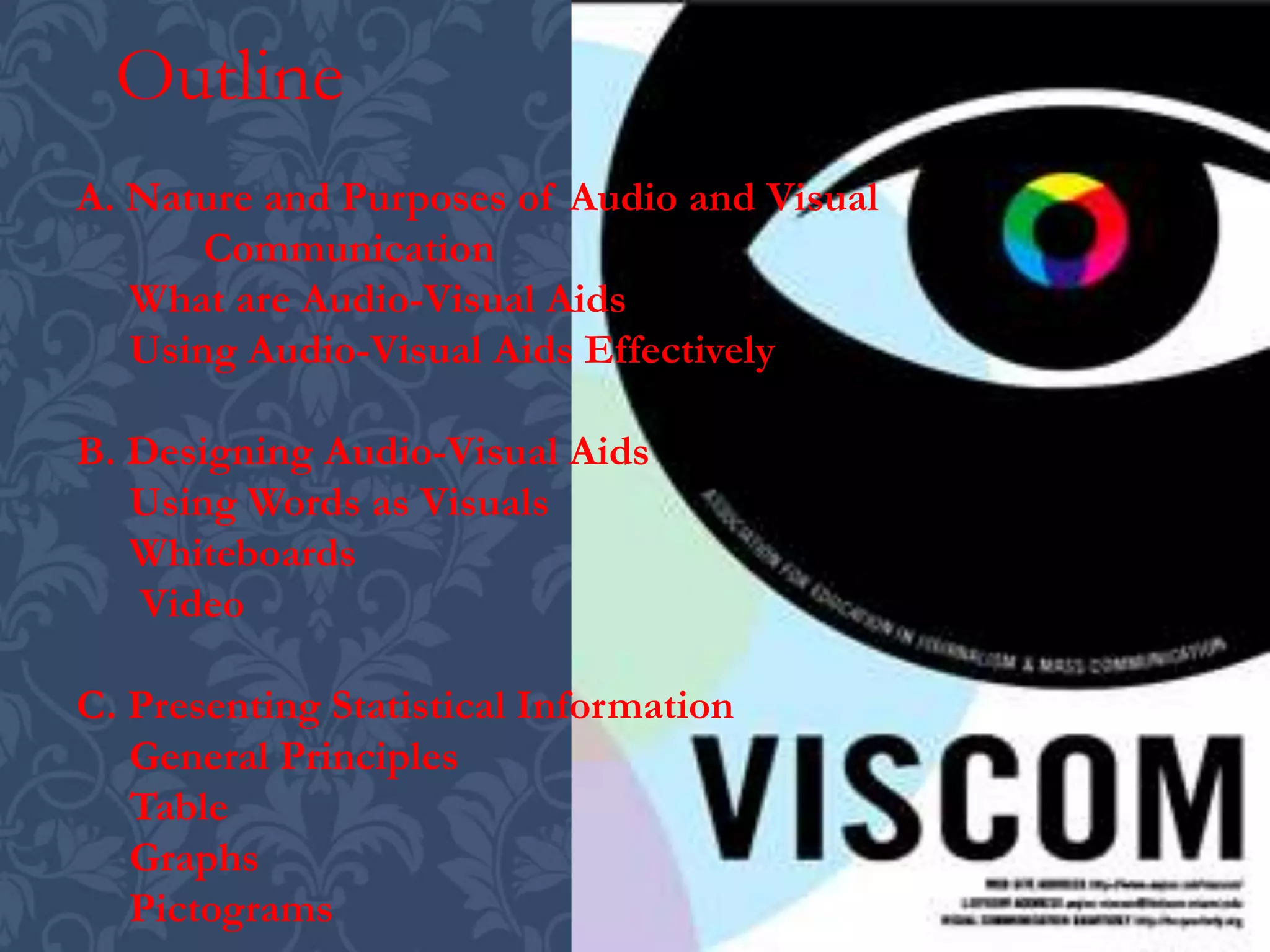
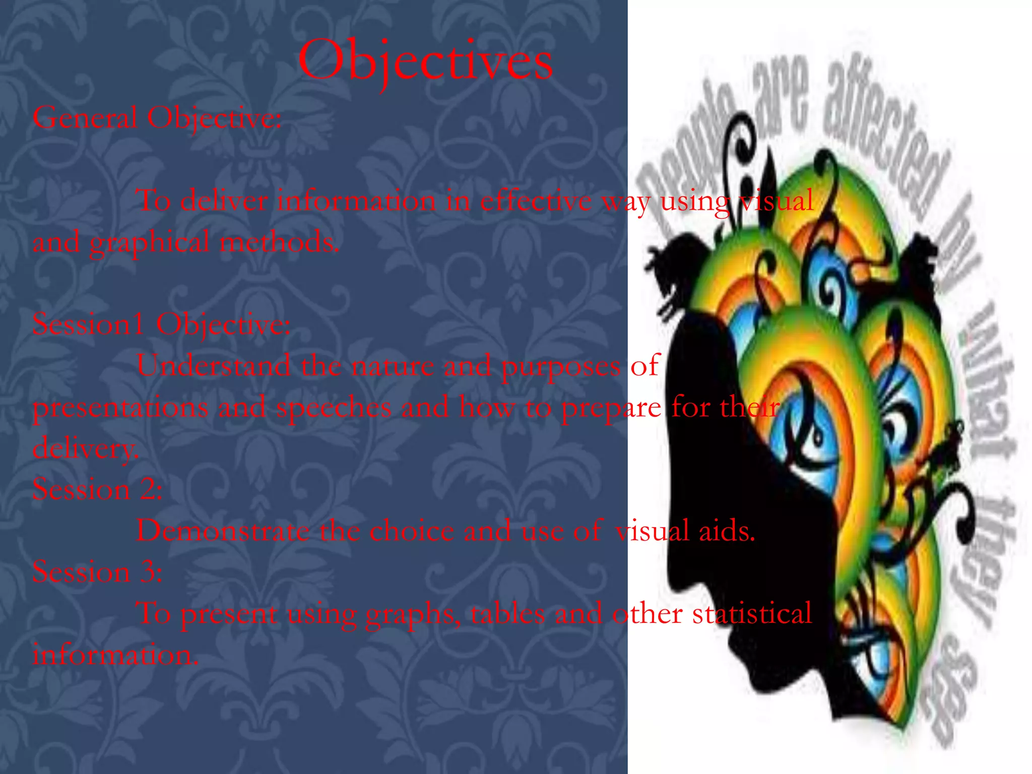
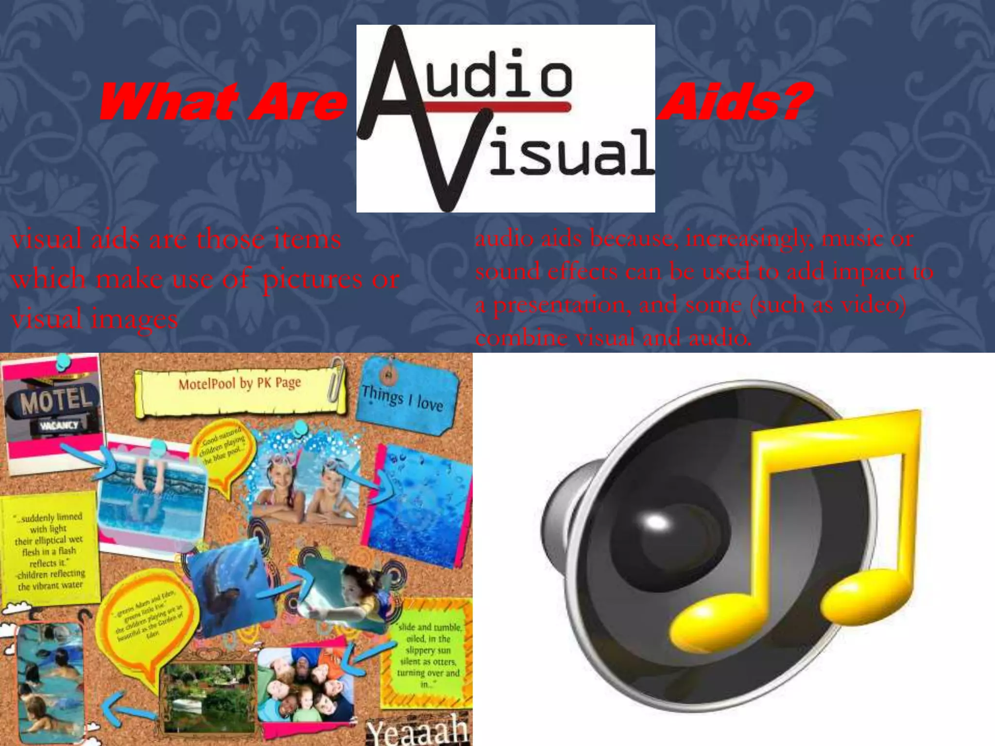
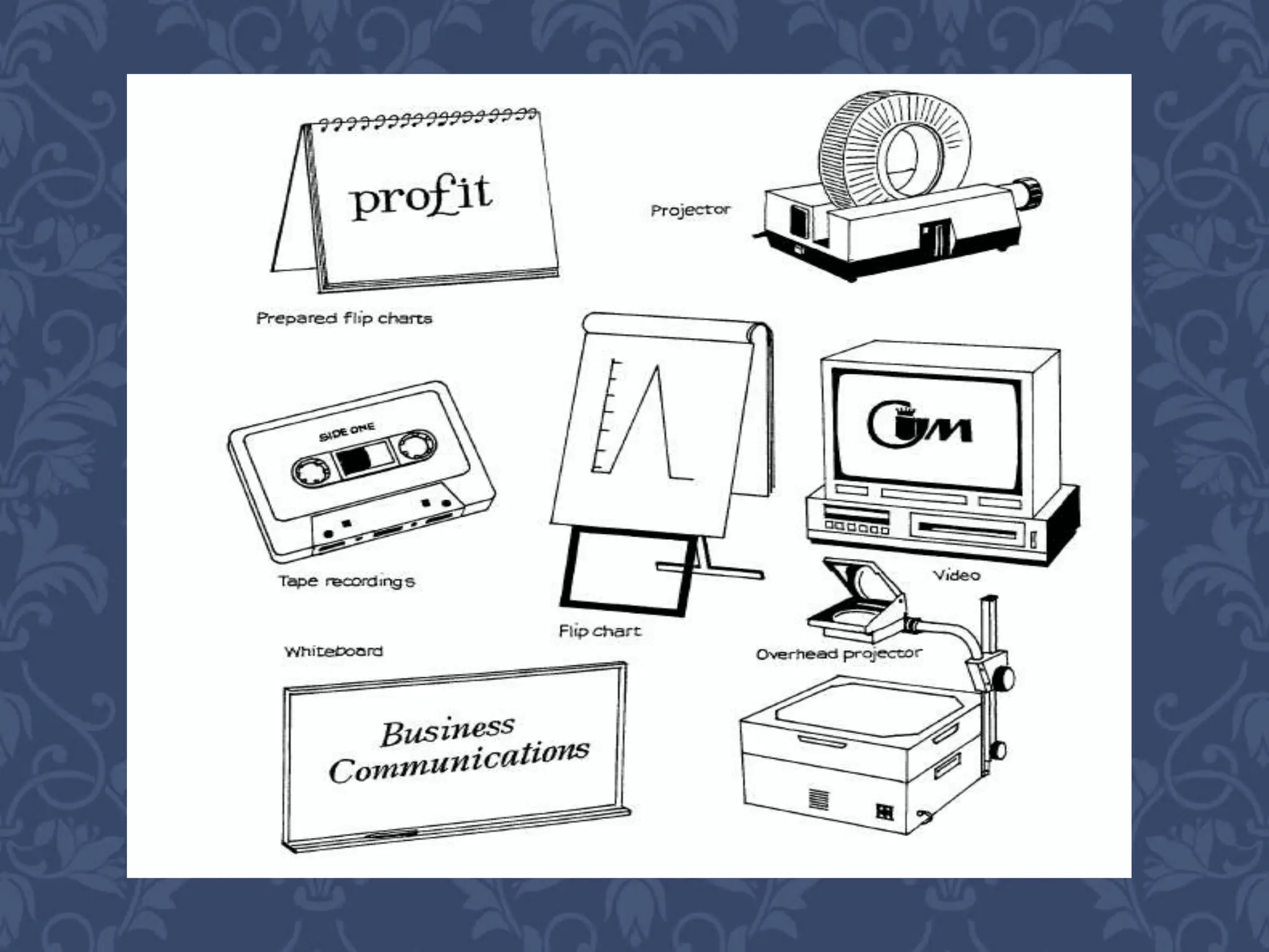
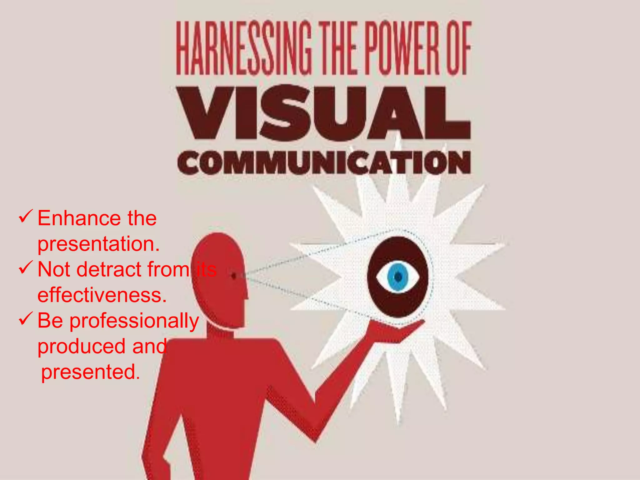
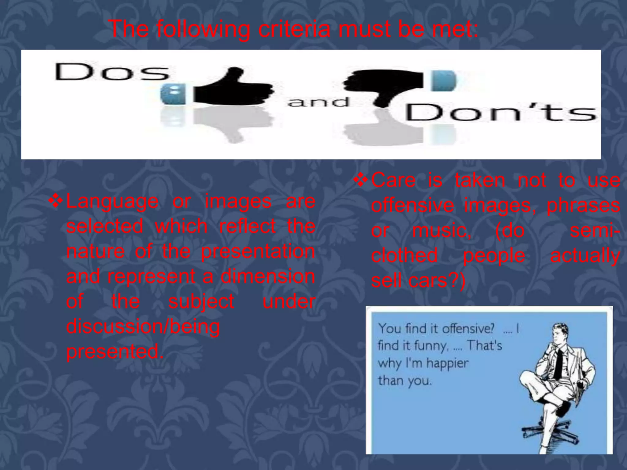
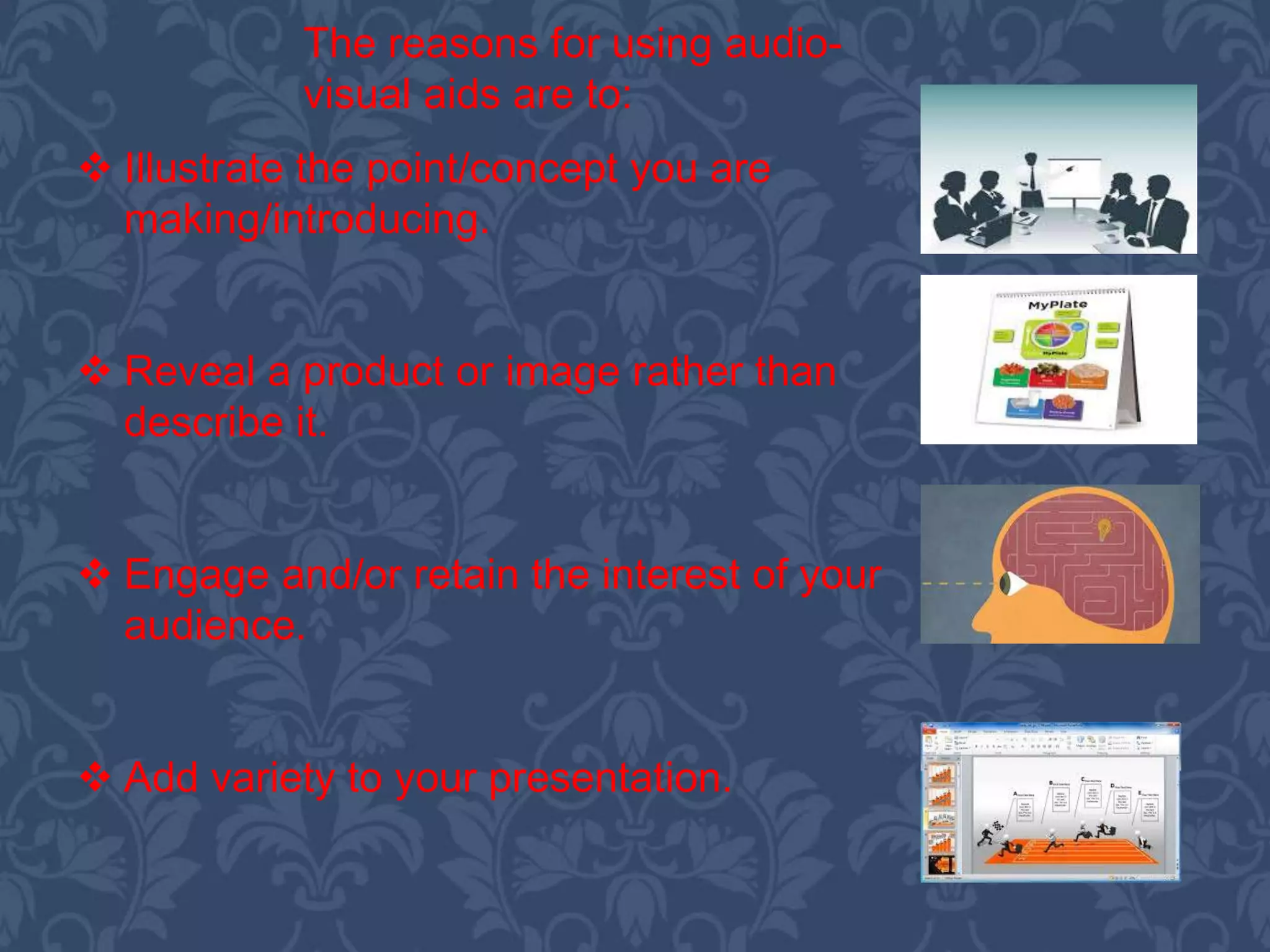
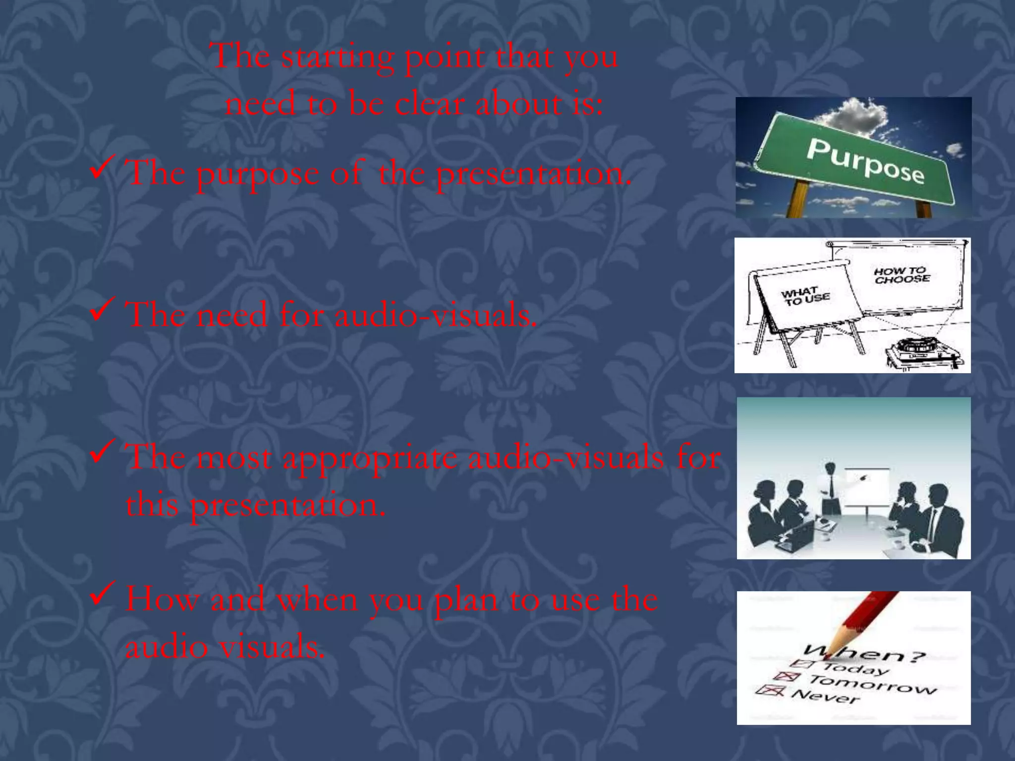
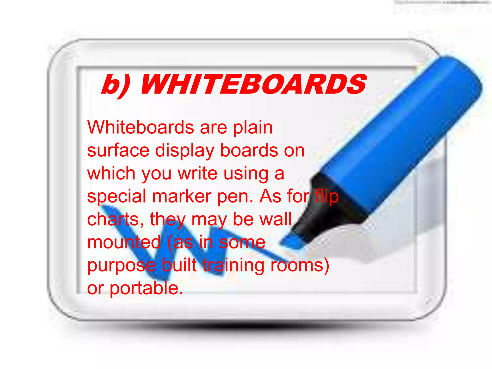
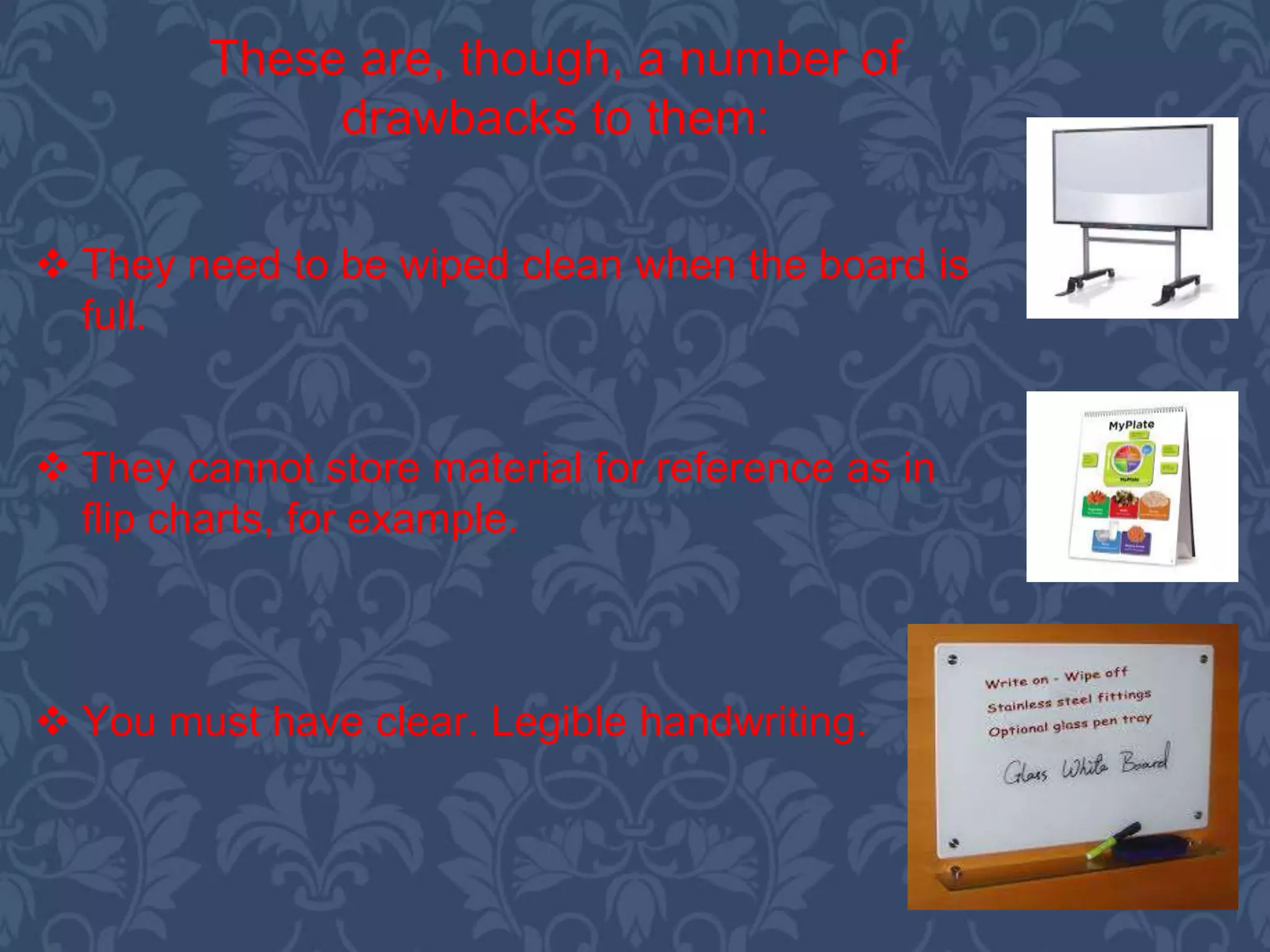
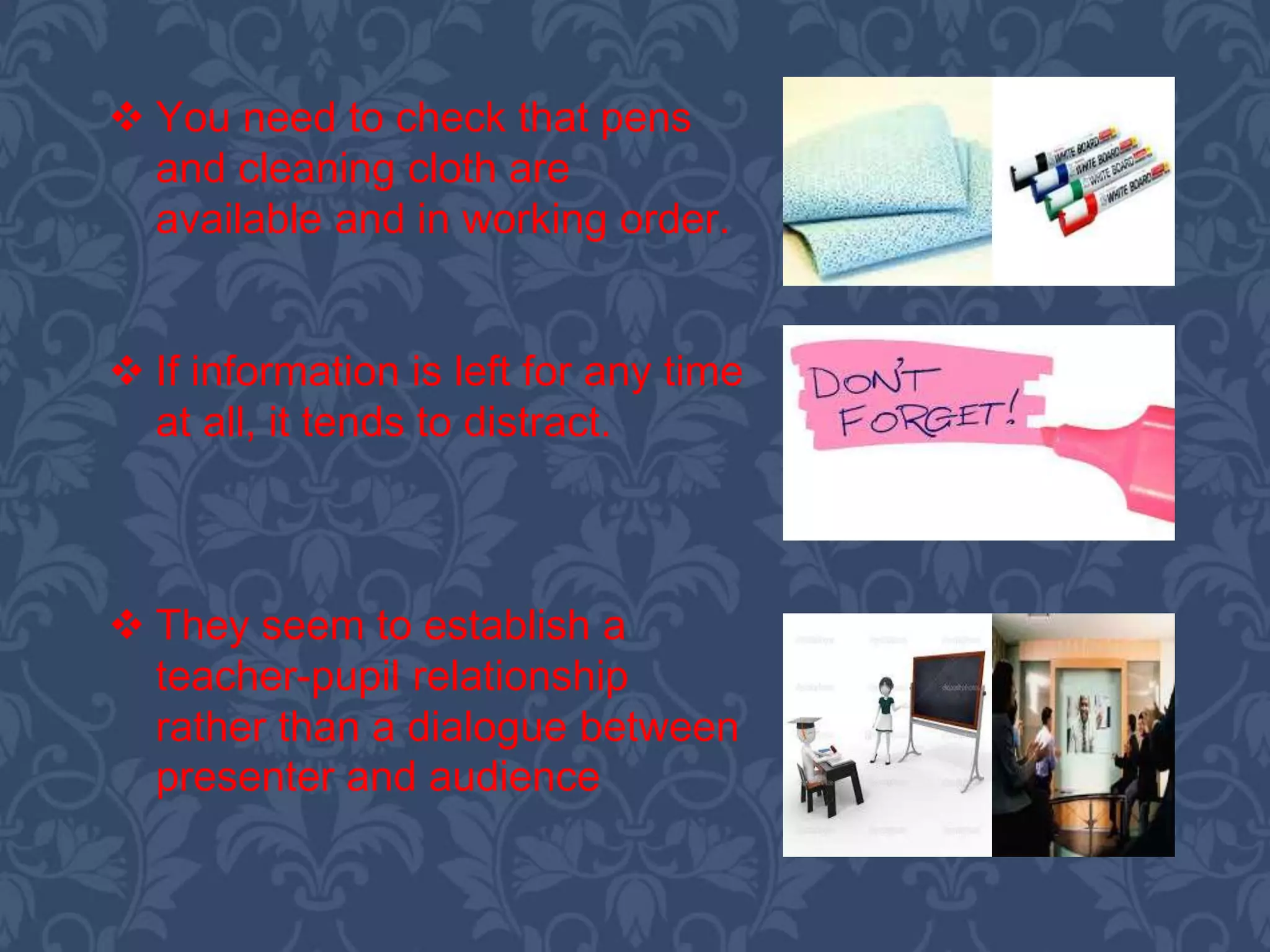
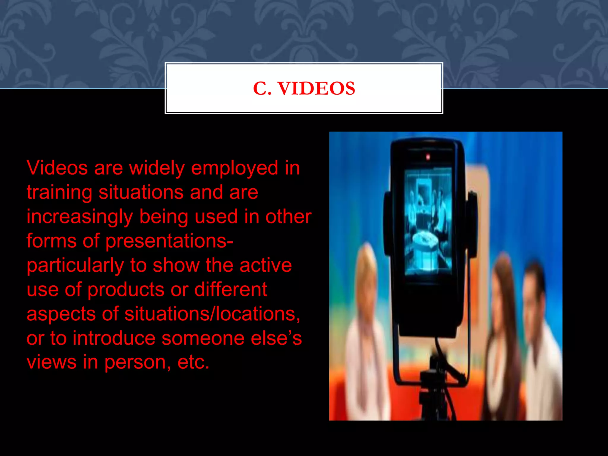
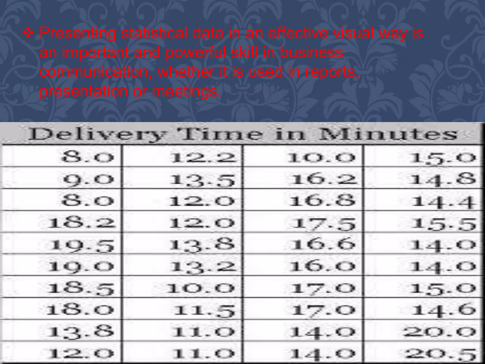
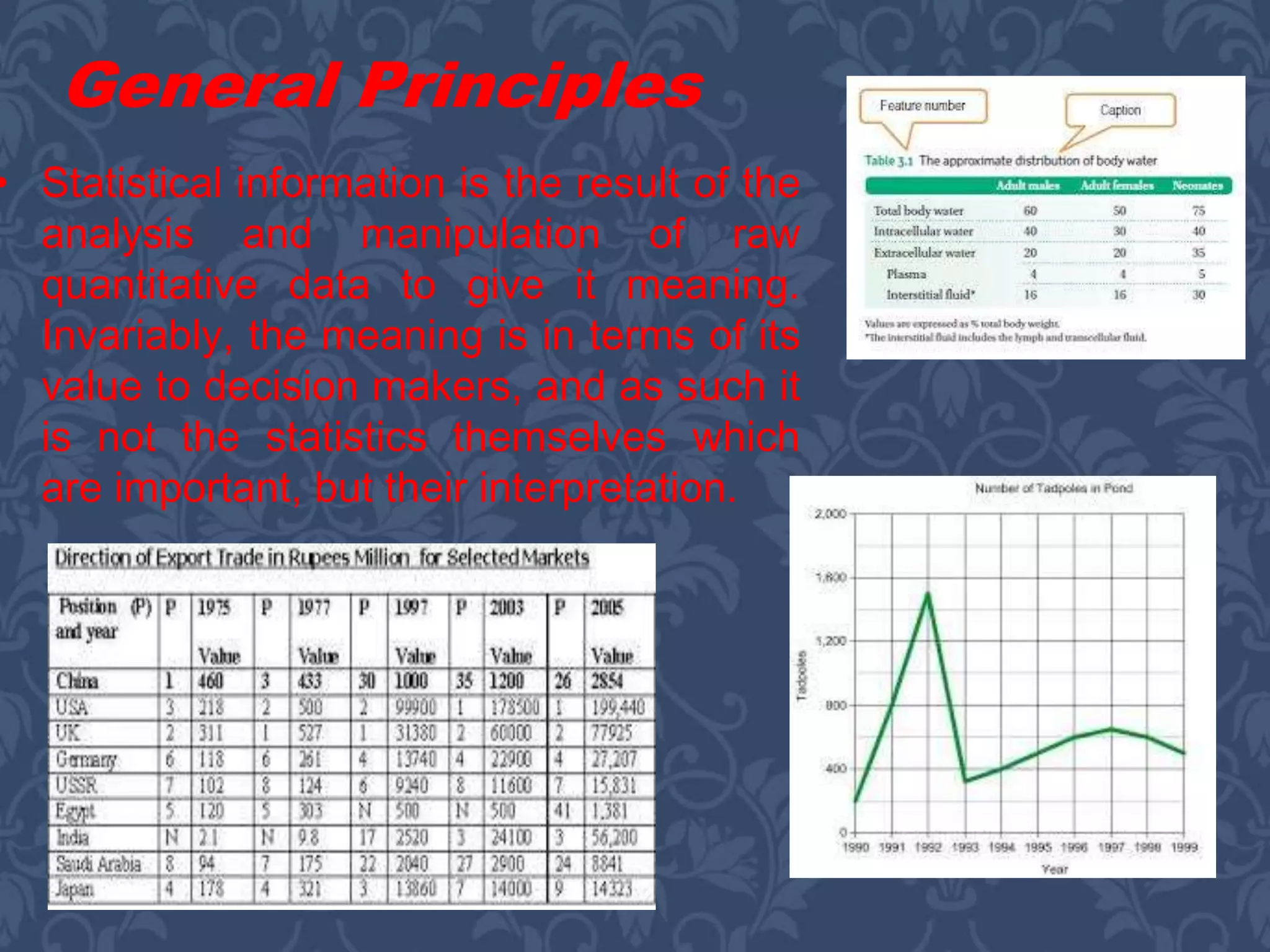
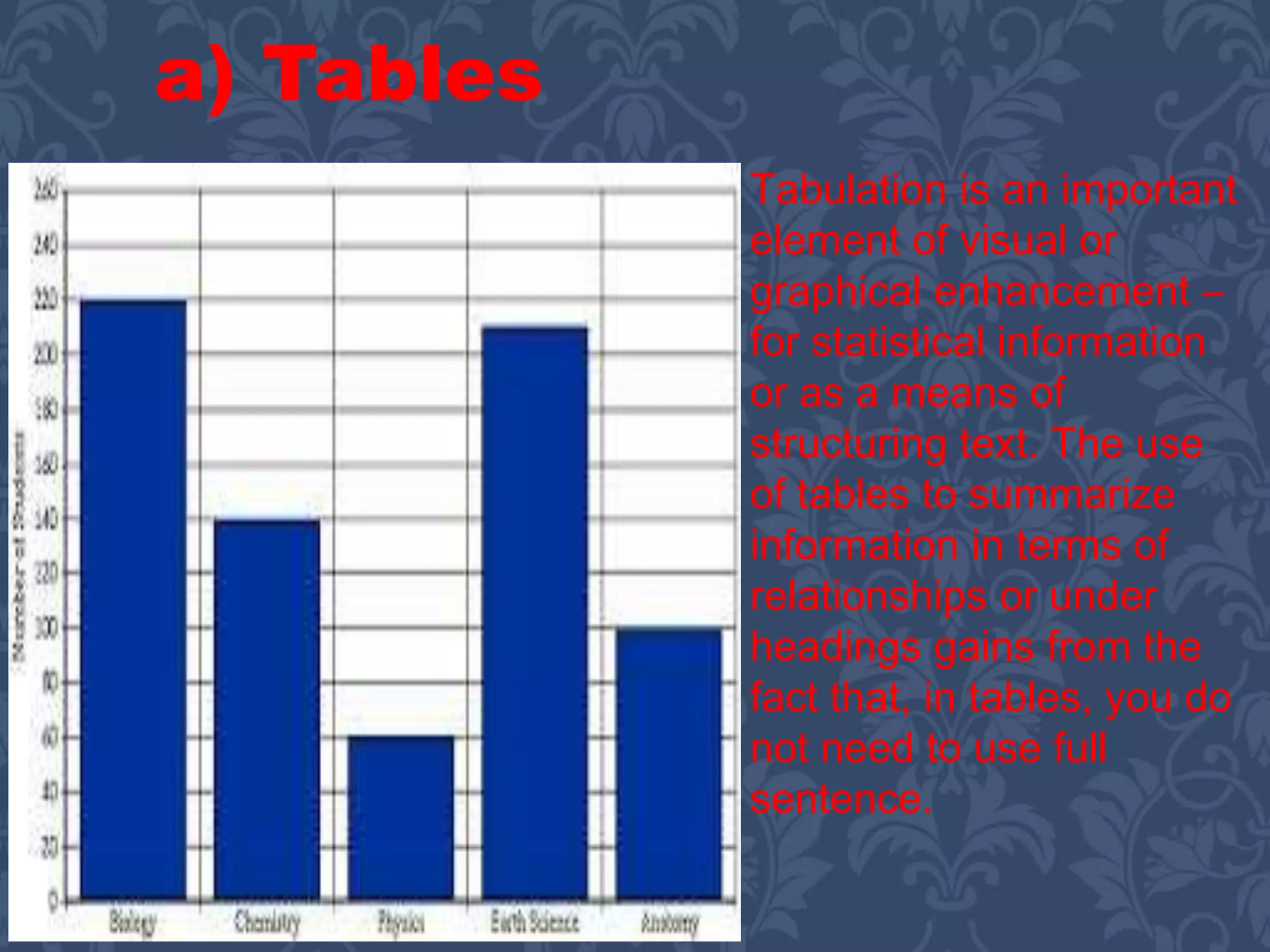
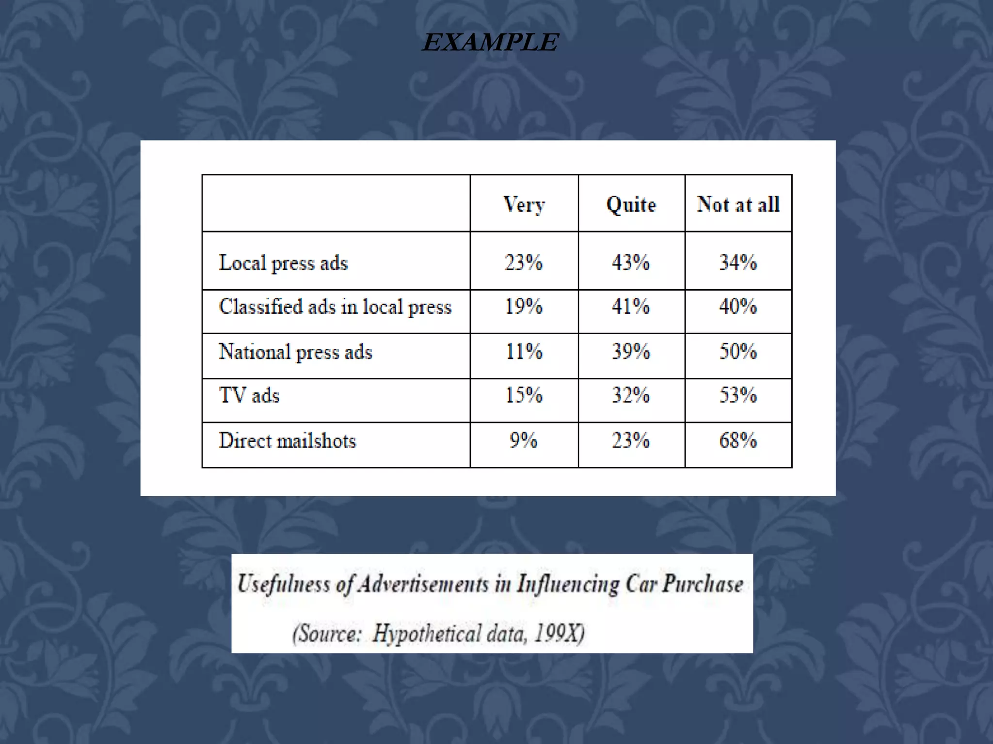
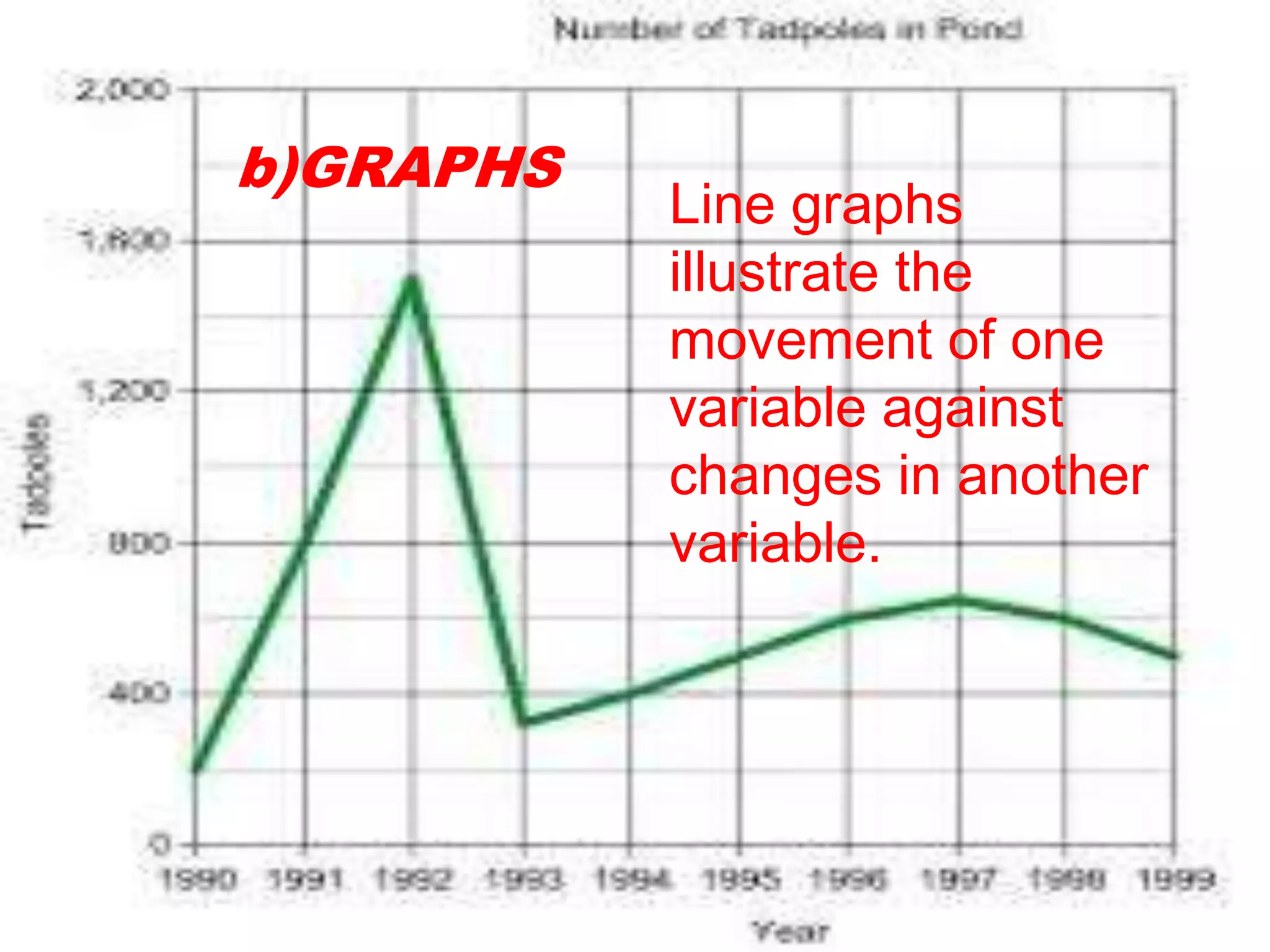
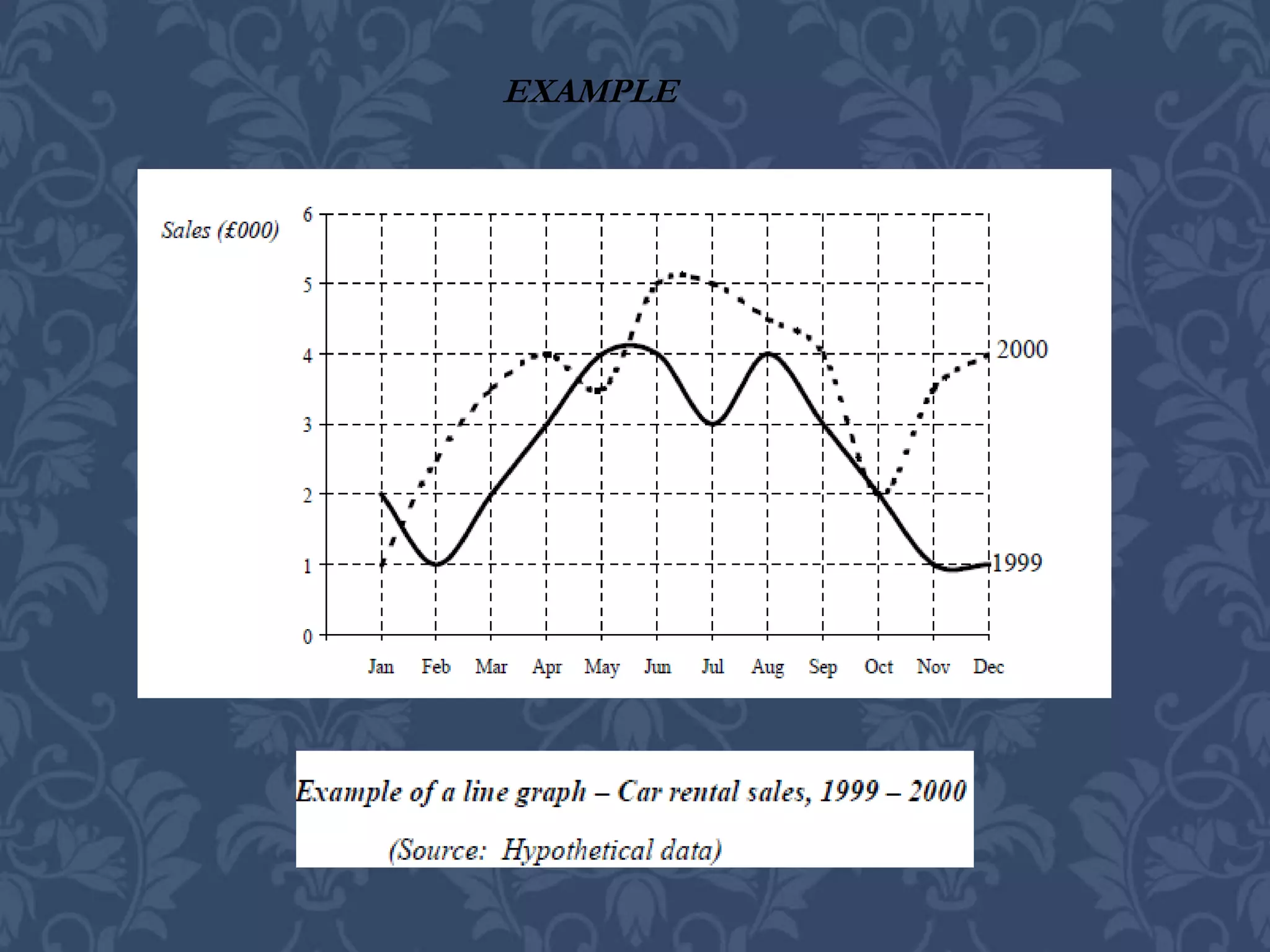
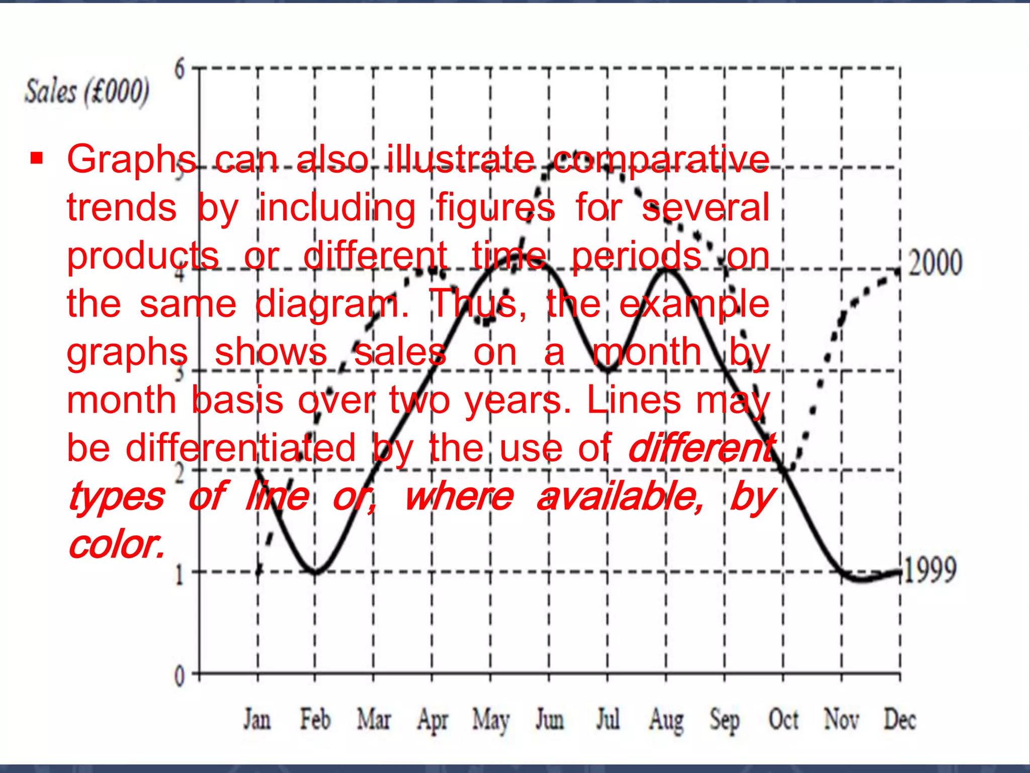
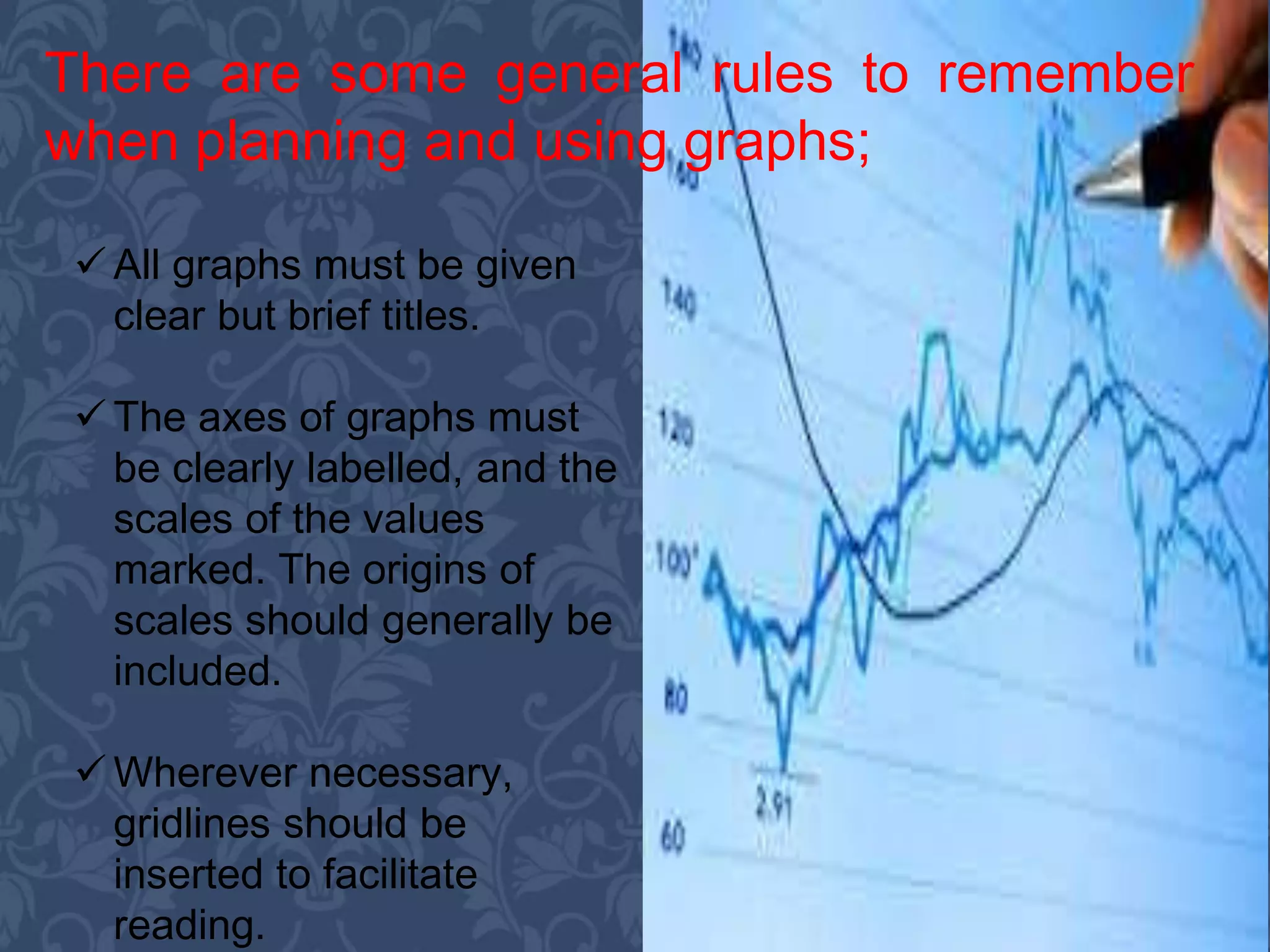
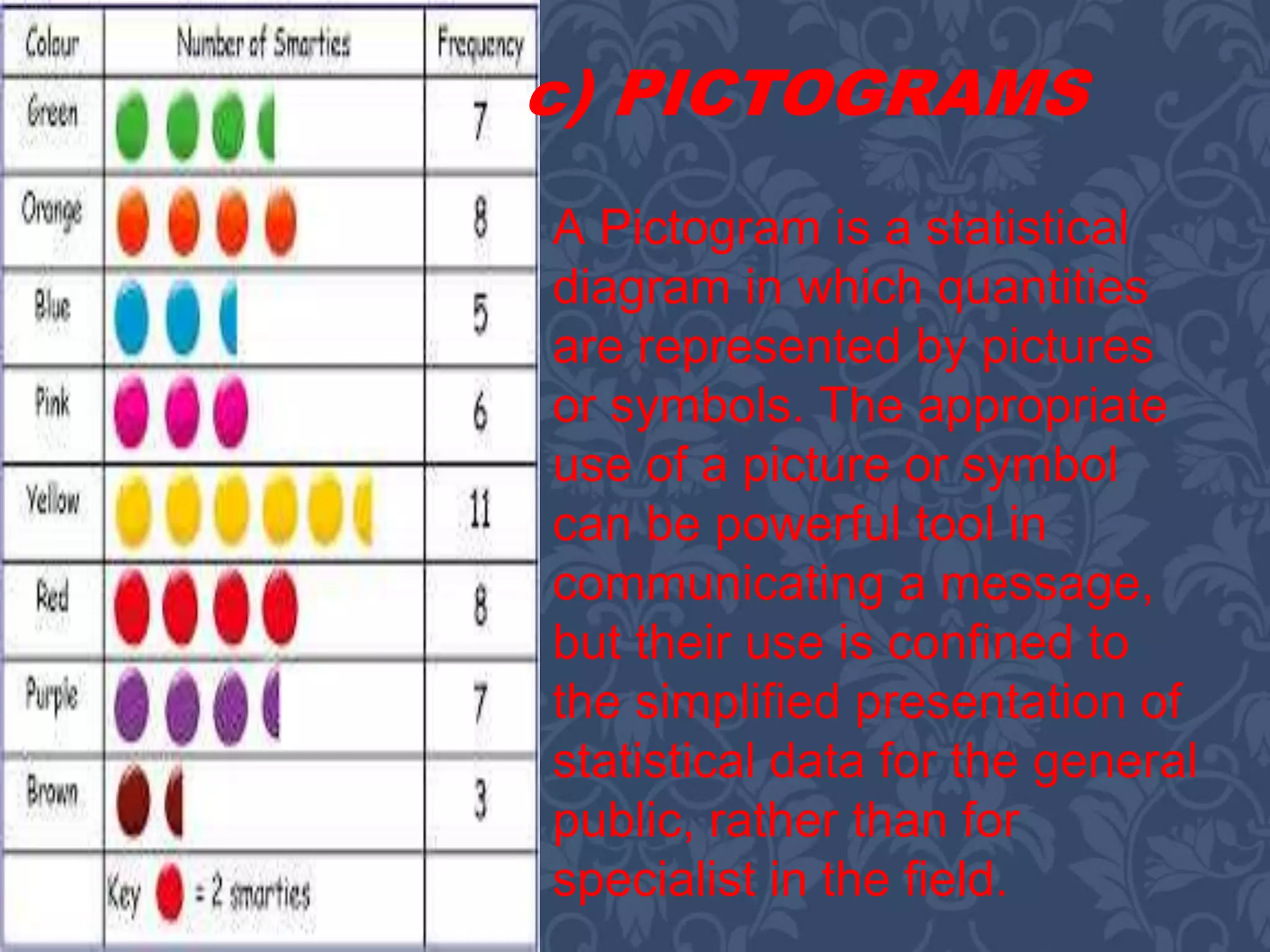
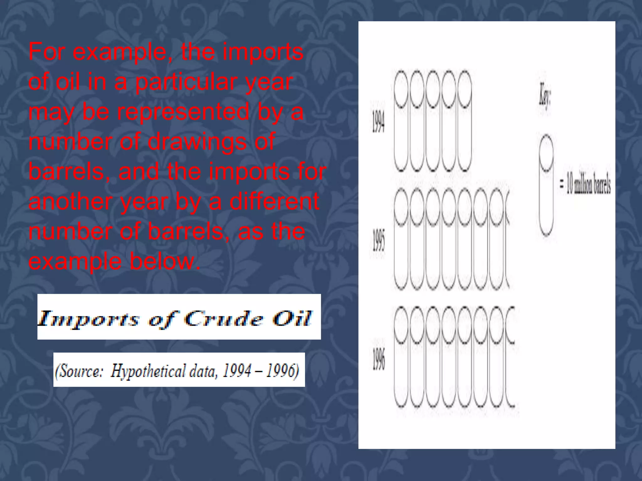
Outline
A. Nature and Purposes of Audio and Visual
Communication
What are Audio-Visual Aids
Using Audio-Visual Aids Effectively
B. Designing Audio-Visual Aids
Using Words as Visuals
Whiteboards
Video
C. Presenting Statistical Information
General Principles
Table
Graphs
Pictograms
Objectives
General Objective:
To deliver information in effective way using visual
and graphical methods.
Session1 Objective:
Understand the nature and purposes of
presentations and speeches and how to prepare for their
delivery.
Session 2:
Demonstrate the choice and use of visual aids.
Session 3:
To present using graphs, tables and other statistical
information.
 Creating awareness;
 Encouraging interest;
 Retaining involvement;
 Achieving instant results/responses;
 Describing in one image an entire
proposal or concept;
 Being memorable;
 Complementing the spoken word;
 Reinforcing corporate identity.
What Are Aids?
visual aids are those items
which make use of pictures or
visual images
audio aids because, increasingly, music or
sound effects can be used to add impact to
a presentation, and some (such as video)
combine visual and audio.
 Enhance the
presentation.
 Not detract from its
effectiveness.
 Be professionally
produced and
presented.
The following criteria must be met:
Language or images are
selected which reflect the
nature of the presentation
and represent a dimension
of the subject under
discussion/being
presented.
Care is taken not to use
offensive images, phrases
or music, (do semi-
clothed people actually
sell cars?)
The seating
arrangements/room
layouts are designed so
that everyone can hear or
see what’s going on.
There is sufficient
technical back-up.
Always make reference to
a visual.
You do not use effects
which could upset your
audience (e.g. loud bangs,
flickering lights, fireworks)
or even endanger them.
To keep attention, use
audio-visuals at low
attention periods such as
after lunch, before a break
or towards the end of a
session.
Rehearse.
Don’t turn away from the
audience to operate audio-
visuals; either use
technical support or
arrange for your and the
audience’s convenience.
Try not to obscure visuals
by standing in front of
them.
B. DESIGNING
AUDIO-VISUAL
AIDS
 Illustrate the point/concept you are
making/introducing.
 Reveal a product or image rather than
describe it.
 Engage and/or retain the interest of your
audience.
 Add variety to your presentation.
The reasons for using audio-
visual aids are to:
 The purpose of the presentation.
 The need for audio-visuals.
 The most appropriate audio-visuals for
this presentation.
 How and when you plan to use the
audio visuals.
The starting point that you
need to be clear about is:
A.) Using Word as Visuals
Clearly, many visual
aids will include
words-indeed, words
will often be the
dominant image on
overhead projector
(OHP)
transparencies,
slides and flip
charts, etc. You will
probably want to use
them to summarize
and highlight key
words or phrases.
 The text is clear, straight and large enough
to be read easily throughout the room;
 All words are spell correctly
 There is a clear margin around the edge of
the whole display and that there is sufficient
white space around the words to enable
them to stand out clearly.
Whenever you use words in visual
displays, always ensure that:
Whiteboards are plain
surface display boards on
which you write using a
special marker pen. As for flip
charts, they may be wall
mounted (as in some
purpose built training rooms)
or portable.
b) WHITEBOARDS
 They need to be wiped clean when the board is
full.
 They cannot store material for reference as in
flip charts, for example.
 You must have clear. Legible handwriting.
These are, though, a number of
drawbacks to them:
 You need to check that pens
and cleaning cloth are
available and in working order.
 If information is left for any time
at all, it tends to distract.
 They seem to establish a
teacher-pupil relationship
rather than a dialogue between
presenter and audience
C. VIDEOS
Videos are widely employed in
training situations and are
increasingly being used in other
forms of presentations-
particularly to show the active
use of products or different
aspects of situations/locations,
or to introduce someone else’s
views in person, etc.
C.
PRESENTING
STATISTICAL
INFORMATION
 Presenting statistical data in an effective visual way is
an important and powerful skill in business
communication, whether it is used in reports,
presentation or meetings.
• Statistical information is the result of the
analysis and manipulation of raw
quantitative data to give it meaning.
Invariably, the meaning is in terms of its
value to decision makers, and as such it
is not the statistics themselves which
are important, but their interpretation.
General Principles
As such, a number of general principles can be identified
for the use and presentation of statistics:
 All statistical information needs to be set in a
context which explains its relevance to the points
being made.
 The amount of detail needs to be kept to the
minimum necessary to support the arguments in the
report/presentation.
 The source of the data must always be stated.
Tabulation is an important
element of visual or
graphical enhancement –
for statistical information
or as a means of
structuring text. The use
of tables to summarize
information in terms of
relationships or under
headings gains from the
fact that, in tables, you do
not need to use full
sentence.
a) Tables
The following rules should be observed in the preparation
of statistical tables:
o Each table should serve a single purpose –
attempting to show more than one group of
relationships in the same table tends to
obscure the message;
o The table itself should have a title or
caption, and each grouping of information
must have a heading, all of which should
be as short as possible and self-
explanatory;
o Tables should not contain figures with a large
number of digits – rounding numbers is acceptable
since a high degree of accuracy is not usually that
important (it is the relationships which are), and
expressing all figures in, say, thousands is better
than writing them all out in full;
o The number of columns and headings should be
kept to a minimum – a multiplicity of headings etc.
prevents the proper emphasis being given to the key
facts and tendencies shown by the table;
o Units must always be stated
o Figures showing relationships such as percentages,
ratios, etc. should be placed as near as possible to the
figures from which they are derived.
EXAMPLE
Line graphs
illustrate the
movement of one
variable against
changes in another
variable.
b)GRAPHS
EXAMPLE
 Graphs can also illustrate comparative
trends by including figures for several
products or different time periods on
the same diagram. Thus, the example
graphs shows sales on a month by
month basis over two years. Lines may
be differentiated by the use of different
types of line or, where available, by
color.
 All graphs must be given
clear but brief titles.
 The axes of graphs must
be clearly labelled, and the
scales of the values
marked. The origins of
scales should generally be
included.
 Wherever necessary,
gridlines should be
inserted to facilitate
reading.
There are some general rules to remember
when planning and using graphs;
A Pictogram is a statistical
diagram in which quantities
are represented by pictures
or symbols. The appropriate
use of a picture or symbol
can be powerful tool in
communicating a message,
but their use is confined to
the simplified presentation of
statistical data for the general
public, rather than for
specialist in the field.
c) PICTOGRAMS
For example, the imports
of oil in a particular year
may be represented by a
number of drawings of
barrels, and the imports for
another year by a different
number of barrels, as the
example below.
Submitted
to:
Prof.
Cecilia
Tadeo
Presentation
In
CSM 5
Submitted by:
Amador, Charmelyn
C.
Cadorna, Rosaline
R.
Togonon Marve S.
Presentation in csm 5

Presentation in csm 5

  • 2.
    Outline A. Nature andPurposes of Audio and Visual Communication What are Audio-Visual Aids Using Audio-Visual Aids Effectively B. Designing Audio-Visual Aids Using Words as Visuals Whiteboards Video C. Presenting Statistical Information General Principles Table Graphs Pictograms
  • 3.
    Objectives General Objective: To deliverinformation in effective way using visual and graphical methods. Session1 Objective: Understand the nature and purposes of presentations and speeches and how to prepare for their delivery. Session 2: Demonstrate the choice and use of visual aids. Session 3: To present using graphs, tables and other statistical information.
  • 4.
     Creating awareness; Encouraging interest;  Retaining involvement;  Achieving instant results/responses;  Describing in one image an entire proposal or concept;  Being memorable;  Complementing the spoken word;  Reinforcing corporate identity.
  • 5.
    What Are Aids? visualaids are those items which make use of pictures or visual images audio aids because, increasingly, music or sound effects can be used to add impact to a presentation, and some (such as video) combine visual and audio.
  • 7.
     Enhance the presentation. Not detract from its effectiveness.  Be professionally produced and presented.
  • 8.
    The following criteriamust be met: Language or images are selected which reflect the nature of the presentation and represent a dimension of the subject under discussion/being presented. Care is taken not to use offensive images, phrases or music, (do semi- clothed people actually sell cars?)
  • 9.
    The seating arrangements/room layouts aredesigned so that everyone can hear or see what’s going on. There is sufficient technical back-up. Always make reference to a visual.
  • 10.
    You do notuse effects which could upset your audience (e.g. loud bangs, flickering lights, fireworks) or even endanger them. To keep attention, use audio-visuals at low attention periods such as after lunch, before a break or towards the end of a session.
  • 11.
    Rehearse. Don’t turn awayfrom the audience to operate audio- visuals; either use technical support or arrange for your and the audience’s convenience. Try not to obscure visuals by standing in front of them.
  • 13.
  • 14.
     Illustrate thepoint/concept you are making/introducing.  Reveal a product or image rather than describe it.  Engage and/or retain the interest of your audience.  Add variety to your presentation. The reasons for using audio- visual aids are to:
  • 15.
     The purposeof the presentation.  The need for audio-visuals.  The most appropriate audio-visuals for this presentation.  How and when you plan to use the audio visuals. The starting point that you need to be clear about is:
  • 16.
    A.) Using Wordas Visuals Clearly, many visual aids will include words-indeed, words will often be the dominant image on overhead projector (OHP) transparencies, slides and flip charts, etc. You will probably want to use them to summarize and highlight key words or phrases.
  • 17.
     The textis clear, straight and large enough to be read easily throughout the room;  All words are spell correctly  There is a clear margin around the edge of the whole display and that there is sufficient white space around the words to enable them to stand out clearly. Whenever you use words in visual displays, always ensure that:
  • 18.
    Whiteboards are plain surfacedisplay boards on which you write using a special marker pen. As for flip charts, they may be wall mounted (as in some purpose built training rooms) or portable. b) WHITEBOARDS
  • 19.
     They needto be wiped clean when the board is full.  They cannot store material for reference as in flip charts, for example.  You must have clear. Legible handwriting. These are, though, a number of drawbacks to them:
  • 20.
     You needto check that pens and cleaning cloth are available and in working order.  If information is left for any time at all, it tends to distract.  They seem to establish a teacher-pupil relationship rather than a dialogue between presenter and audience
  • 21.
    C. VIDEOS Videos arewidely employed in training situations and are increasingly being used in other forms of presentations- particularly to show the active use of products or different aspects of situations/locations, or to introduce someone else’s views in person, etc.
  • 23.
  • 24.
     Presenting statisticaldata in an effective visual way is an important and powerful skill in business communication, whether it is used in reports, presentation or meetings.
  • 25.
    • Statistical informationis the result of the analysis and manipulation of raw quantitative data to give it meaning. Invariably, the meaning is in terms of its value to decision makers, and as such it is not the statistics themselves which are important, but their interpretation. General Principles
  • 26.
    As such, anumber of general principles can be identified for the use and presentation of statistics:  All statistical information needs to be set in a context which explains its relevance to the points being made.  The amount of detail needs to be kept to the minimum necessary to support the arguments in the report/presentation.  The source of the data must always be stated.
  • 27.
    Tabulation is animportant element of visual or graphical enhancement – for statistical information or as a means of structuring text. The use of tables to summarize information in terms of relationships or under headings gains from the fact that, in tables, you do not need to use full sentence. a) Tables
  • 28.
    The following rulesshould be observed in the preparation of statistical tables: o Each table should serve a single purpose – attempting to show more than one group of relationships in the same table tends to obscure the message; o The table itself should have a title or caption, and each grouping of information must have a heading, all of which should be as short as possible and self- explanatory;
  • 29.
    o Tables shouldnot contain figures with a large number of digits – rounding numbers is acceptable since a high degree of accuracy is not usually that important (it is the relationships which are), and expressing all figures in, say, thousands is better than writing them all out in full; o The number of columns and headings should be kept to a minimum – a multiplicity of headings etc. prevents the proper emphasis being given to the key facts and tendencies shown by the table; o Units must always be stated o Figures showing relationships such as percentages, ratios, etc. should be placed as near as possible to the figures from which they are derived.
  • 30.
  • 31.
    Line graphs illustrate the movementof one variable against changes in another variable. b)GRAPHS
  • 32.
  • 33.
     Graphs canalso illustrate comparative trends by including figures for several products or different time periods on the same diagram. Thus, the example graphs shows sales on a month by month basis over two years. Lines may be differentiated by the use of different types of line or, where available, by color.
  • 34.
     All graphsmust be given clear but brief titles.  The axes of graphs must be clearly labelled, and the scales of the values marked. The origins of scales should generally be included.  Wherever necessary, gridlines should be inserted to facilitate reading. There are some general rules to remember when planning and using graphs;
  • 35.
    A Pictogram isa statistical diagram in which quantities are represented by pictures or symbols. The appropriate use of a picture or symbol can be powerful tool in communicating a message, but their use is confined to the simplified presentation of statistical data for the general public, rather than for specialist in the field. c) PICTOGRAMS
  • 36.
    For example, theimports of oil in a particular year may be represented by a number of drawings of barrels, and the imports for another year by a different number of barrels, as the example below.
  • 38.