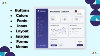
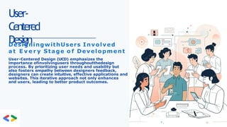
User-
Centered
Design
DesigningwithUsers Involved
a tE v e r y Stage o f Development
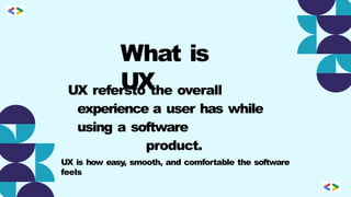
User-Centered Design (UCD) emphasizes the
importance ofinvolvingusers throughoutthedesign
process. By prioritizing user needs and usability but
also fosters empathy between designers feedback,
designers can create intuitive, effective applications and
websites. This iterative approach not only enhances
and users, leading to better product outcomes.
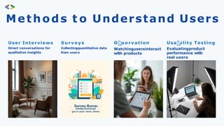
Methods t oUnderstand Users
User Interviews
Direct conversations for
qualitative insights
S u r v e y s
Collectingquantitative data
from users
O servation
Watchingusersinteract
with products
Usa ility Testing
Evaluatingproduct
performance with
real users
User Journey
A UserJourneyshowsthecomplete experience a user goes
through while using a product.
It focuses on steps, emotions, and problems from start to finish
17.
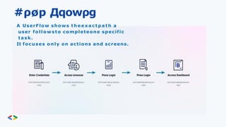
#ρøp Дqowρg
A UserFlowshows t h e e x a c t p a t h a
user followsto completeone specific
task.
It focuses only on actions and screens.
18.
Benefits o fUCD
B e t t e r Experience Higher SatisfactionReduced Errors
Intuitive designslead
to user satisfaction.
Meeting userneeds
increases loyalty and
trust.
Earlydetection
minimizes costly
redesigns and
fixes.
19.
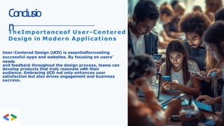
Conclusio
n
TheImportanceof User-Centered
Design inModern Applications
User-Centered Design (UCD) is essentialforcreating
successful apps and websites. By focusing on users’
needs
and feedback throughout the design process, teams can
develop products that truly resonate with their
audience. Embracing UCD not only enhances user
satisfaction but also drives engagement and business
success.
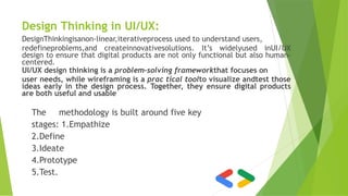
Design Thinking inUI/UX:
DesignThinkingisanon-linear,iterativeprocess used to understand users,
redefineproblems,and createinnovativesolutions. It’s widelyused inUI/UX
design to ensure that digital products are not only functional but also human-
centered.
UI/UX design thinking is a problem-solving frameworkthat focuses on
user needs, while wireframing is a prac tical toolto visualize andtest those
ideas early in the design process. Together, they ensure digital products
are both useful and usable
The methodology is built around five key
stages: 1.Empathize
2.Define
3.Ideate
4.Prototype
5.Test.
22.
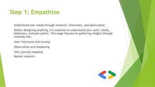
Step 1: Empathize
Understanduser needs through research, interviews, and observation.
Before designing anything, it’s essential to understand your users’ needs,
behaviors, and pain points. This stage focuses on gathering insights through
methods like:
User interviews and surveys
Observation and shadowing
User journey mapping
Market research
23.
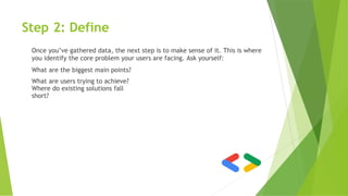
Step 2: Define
Onceyou’ve gathered data, the next step is to make sense of it. This is where
you identify the core problem your users are facing. Ask yourself:
What are the biggest main points?
What are users trying to achieve?
Where do existing solutions fall
short?
24.
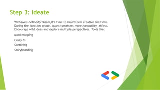
Step 3: Ideate
Withawell-definedproblem,it’stime to brainstorm creative solutions.
During the ideation phase, quantitymatters morethanquality, atfirst.
Encourage wild ideas and explore multiple perspectives. Tools like:
Mind mapping
Crazy 8s
Sketching
Storyboarding
25.
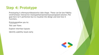
Step 4: Prototype
Prototypingis whereyourideasstartto take shape. These can be low-fidelity
wireframesor interactive mockupsthatrepresentyourproposed solution.The
goal here isn’t perfection but to visualize the design and test how it
functions.
Prototypesallow you to:
Test user flows
Explore interface layouts
Identify usability issues early
26.
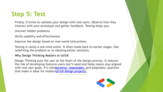
Step 5: Test
Finally,it’stime to validate your design with real users. Observe how they
interact with your prototype and gather feedback. Testing helps you:
Uncover hidden problems
Verify usability and effectiveness
Improve the design based on real-world interactions
Testing is rarely a one-time event. It often leads back to earlier stages, like
redefining the problem or re-ideating better solutions.
Why Design Thinking Matters in UI/UX
Design Thinking puts the user at the heart of the design process. It reduces
the risk of developing features users don’t need and helps teams stay aligned
with real user goals. It’s collaborative, repeatable, and adaptable, qualities
that make it ideal for modernUI/UX Design projects.
27.
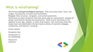
What is wireframing?
Wireframesareblueprintsofdigitalinterfaces. They strip away colors, fonts, and
images, focusing only on layout and functionality.
Purpose: Show structure, navigation, and content placement.
Wireframes are basic blueprints that help teams align on requirements, keeping UX
design conversations focused and constructive. Think of your wireframe as the
skeleton of your app, website, or other final product. Your wireframe shows the
design team and stakeholders the bare-bones outlines of essential webpages,
components, and features, including:
Screen layouts
Navigation bars
Components of
UX andUIdesign
Interactive
elements
28.
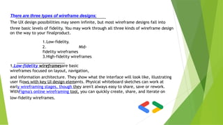
There are threetypes of wireframe designs:
The UX design possibilities may seem infinite, but most wireframe designs fall into
three basic levels of fidelity. You may work through all three kinds of wireframe design
on the way to your finalproduct.
1.Low-fidelity.
2. Mid-
fidelity wireframes
3.High-fidelity wireframes
1.Low-fidelity wireframesare basic
wireframes focused on layout, navigation,
and information architecture. They show what the interface will look like, illustrating
user flows with key UI design elements. Physical whiteboard sketches can work at
early wireframing stages, though they aren't always easy to share, save or rework.
WithFigma's online wireframing tool, you can quickly create, share, and iterate on
low-fidelity wireframes.
29.
2.Mid-fidelity wireframeshelp designersiterate and shape the final design.
Design teams may add annotations and content as they try out different
approaches to user flows and UI design elements, mapping out core functionality
and key interactions. This enables teams to settle on the final wireframe design
framework before adding visual design components.
3.High-fidelity wireframeslook like early product mockups, with
interactive and visual design elements—but without the functionality of
low-fidelity prototypes. At this point of the design process, you may want
to add brand elements like fonts, colors, and logos. That way, you can
capture the look and feel of the final product for user testing.
30.
4 key benefitsof wireframing:
Wireframing supports exploration in the early stages of the design process. UX
design teams can use wireframesto:
1.Get stakeholder alignment:Wireframes encourage collaboration with
strategists, product managers, and the development team on high-level
structure, information architecture, user flow, andUIdesign.
2.Speed product design:Wireframes are easy to make—no polish necessary.
Design teams can whip them up quickly to scope basic features and user
interactions.
3.Create user-centered designs:User testing wireframes helps designers
find a direction that best supports audienceneeds.
4.Spot potential problems.:Wireframes help teams identify issues
early,
avoiding costly mistakes in the final designs for a digital product.
31.
pre e ncoded. png
UI Design
Fundamentals: Design
with Intent
•
•
•
Visual
Hierarchy
Typography
Color Theory
32.
pre e ncoded. png
C H A P T E R 1
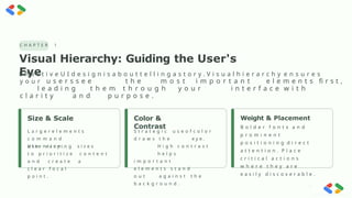
Visual Hierarchy: Guiding the User's
Eye
E ff e c t i v e U I d e s i g n i s a b o u t t e l l i n g a s t o r y . V i s u a l h i e r a r c h y e n s u r e s
y o u r u s e r s s e e t h e m o s t i m p o r t a n t e l e m e n t s fi r s t ,
l e a d i n g t h e m t h r o u g h y o u r i n t e r f a c e w i t h
c l a r i t y a n d p u r p o s e .
Size & Scale Color &
Contrast
Weight & Placement
B o l d e r f o n t s a n d
p r o m i n e n t
p o s i t i o n i n g d i r e c t
a t t e n t i o n . P l a c e
c r i t i c a l a c t i o n s
w h e r e t h e y a r e
e a s i l y d i s c o v e r a b l e .
L a r g e r e l e m e n t s
c o m m a n d
a t t e n t i o n .
U s e v a r y i n g s i z e s
t o p r i o r i t i z e c o n t e n t
a n d c r e a t e a
c l e a r f o c a l
p o i n t .
S t r a t e g i c u s e o f c o l o r
d r a w s t h e e y e .
H i g h c o n t r a s t
h e l p s
i m p o r t a n t
e l e m e n t s s t a n d
o u t a g a i n s t t h e
b a c k g r o u n d .
33.
pre e ncoded. png
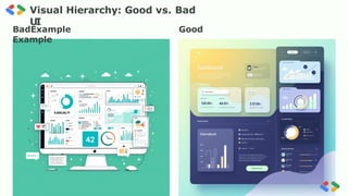
Visual Hierarchy: Good vs. Bad
UI
BadExample Good
Example
34.
pre e ncoded. png
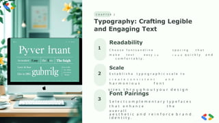
C H A P T E R 2
Typography: Crafting Legible
and Engaging Text
2
3
1
Readability
C h o o s e f o n t s a n d l i n e s p a c i n g t h a t
m a k e t e x t e a s y t o r e a d q u i c k l y a n d
c o m f o r t a b l y .
Font Pairings
S e l e c t c o m p l e m e n t a r y t y p e f a c e s
t h a t e n h a n c e t h e
o v e r a l l
a e s t h e t i c a n d r e i n f o r c e b r a n d
i d e n t i t y .
Scale
E s t a b l i s h a t y p o g r a p h i c s c a l e t o
c r e a t e c o n s i s t e n t a n d
h a r m o n i o u s f o n t
s i z e s t h r o u g h o u t y o u r d e s i g n
35.
pre e ncoded. png
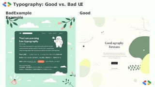
Typography: Good vs. Bad UI
BadExample Good
Example
36.
pre e ncoded. png
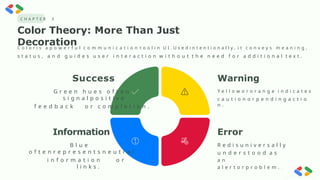
C H A P T E R 3
Color Theory: More Than Just
Decoration
C o l o r i s a p o w e r f u l c o m m u n i c a t i o n t o o l i n U I . U s e d i n t e n t i o n a l l y , i t c o n v e y s m e a n i n g ,
s t a t u s , a n d g u i d e s u s e r i n t e r a c t i o n w i t h o u t t h e n e e d f o r a d d i t i o n a l t e x t .
Success
G r e e n h u e s o f t e n
s i g n a l p o s i t i v e
f e e d b a c k o r c o m p l e t i o n .
Information
B l u e
o f t e n r e p r e s e n t s n e u t r a l
i n f o r m a t i o n o r
l i n k s .
Error
R e d i s u n i v e r s a l l y
u n d e r s t o o d a s
a n
a l e r t o r p r o b l e m .
Warning
Y e l l o w o r o r a n g e i n d i c a t e s
c a u t i o n o r p e n d i n g a c t i o
n .
37.
pre e ncoded. png
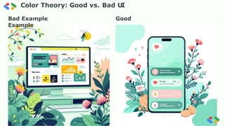
Color Theory: Good vs. Bad UI
Bad Example Good
Example
38.
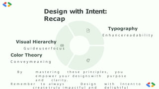
Design with Intent:
Recap
VisualHierarchy
G u i d e u s e r f o c u s
Color Theory
C o n v e y m e a n i n g
B y m a s t e r i n g t h e s e p r i n c i p l e s , y o u
e m p o w e r y o u r d e s i g n s w i t h p u r p o s e
a n d c l a r i t y .
R e m e m b e r t o a l w a y s D e s i g n w i t h I n t e n t t o
c r e a t e t r u l y i m p a c t f u l a n d d e l i g h t f u l
Typography
E n h a n c e r e a d a b i l i t y
preencoded.png
41.
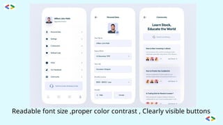
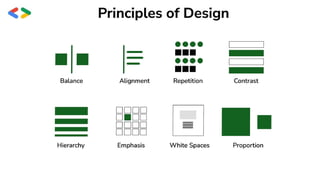
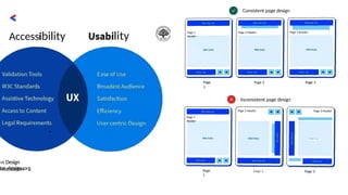
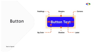
Ui Principies
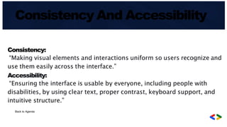
SimpliCiŽ¿š Designsshould be easy to use and require minimal
effort .
User-Centered
Dmign:
Visibility:
focus on user needs and preferences, ensuring
accessibility for all, including those with
disabilities
Important tasks and interface elements should be
clearly visible .
E f š c i e n c y : Optimize design for speed and performance, enabling
quick
completion of user goals .
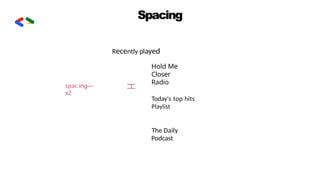
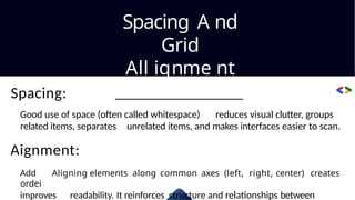
Spacing A nd
Grid
Allignme nt
Spacing:
Good use of space (often called whitespace) reduces visual clutter, groups
related items, separates unrelated items, and makes interfaces easier to scan.
Aignment:
Add Aligning elements along common axes (left, right, center) creates
ordei
improves readability. It reinforces structure and relationships between
51.
Exploring Figma and
Framer:Menus and
Toolbars Explained
Acomprehensiveguidetomasteringtheessentialinterfaces of two
leading design platforms
52.
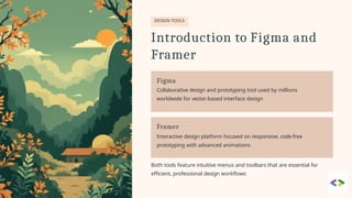
DESIGN TOOLS
Introduction toFigma and
Framer
Figma
Collaborative design and prototyping tool used by millions
worldwide for vector-based interface design
Framer
Interactive design platform focused on responsive, code-free
prototyping with advanced animations
Both tools feature intuitive menus and toolbars that are essential for
efficient, professional design workflows
53.
Figma's Menu Overview
MenuStructure
Located at the top of the interface, providing comprehensive access to all
features
File, Edit, View, Object, and more
Project management tools
Design settings and preferences
Plugin marketplace access
Collaboration and sharing
features
Quick tip: Command/Control + K opens the actions menu for
lightning-fast navigation
54.
TOOLBAR
Figma Toolbar Essentials
03
KeyboardShortcuts
Speed up workflow: V for Move, F for Frame, T for Text
Move, Frame, Shape, Pen, Text,
and Hand tools positioned above
the canvas
01 02
Core Design Tools Collaboration Hub
Access plugins, comments, and
sharing options directly from the
toolbar
55.
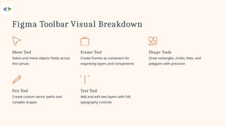
Figma Toolbar VisualBreakdown
Pen Tool
Create custom vector paths and
complex shapes
Move Tool
Select and move objects freely across
the canvas
Text Tool
Add and edit text layers with full
typography controls
Frame Tool
Create frames as containers for
organising layers and components
Shape Tools
Draw rectangles, circles, lines, and
polygons with precision
56.
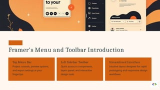
Framer's Menu andToolbar Introduction
Top Menu Bar
Project controls, preview options,
and export settings at your
fingertips
Left Sidebar Toolbar
Quick access to components,
layers panel, and interactive
design tools
Streamlined Interface
Intuitive layout designed for rapid
prototyping and responsive design
workflows
57.
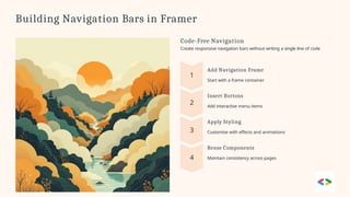
Building Navigation Barsin Framer
Code-Free Navigation
Create responsive navigation bars without writing a single line of code
Add Navigation Frame
Start with a frame container
Insert Buttons
Add interactive menu items
Apply Styling
Customise with effects and animations
Reuse Components
Maintain consistency across pages
58.
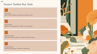
Framer Toolbar KeyTools
Insert Tool
Add UI elements: buttons, text, images, and shapes instantly
Layers Panel
Organise and nest elements for complex, structured designs
Preview Button
Instantly test prototypes on desktop or mobile devices
Properties Panel
Adjust size, position, animation, and interaction settings precisely
59.
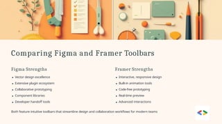
Comparing Figma andFramer Toolbars
Figma Strengths
Vector design excellence
Extensive plugin ecosystem
Collaborative prototyping
Component libraries
Developer handoff tools
Both feature intuitive toolbars that streamline design and collaboration workflows for modern teams
Framer Strengths
Interactive, responsive design
Built-in animation tools
Code-free prototyping
Real-time preview
Advanced interactions
60.
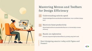
Mastering Menus andToolbars
for Design Efficiency
Understanding unlocks speed
Deepknowledgeofmenusandtoolbarsenablesfaster, more confident design
work
Shortcuts boost productivity
Masterkeyboardshortcutsandtoolbarfeatures to dramatically increase
efficiency
Hands-on exploration
Discoveruniquestrengthsandworkflows by actively using both tools
Start designing smarter today with Figma and
Framer!


