Pen nib and ink - Guide to the technique of hatching
•
15 likes•4,530 views

This is a guidebook to inform and prepare students of my workshops on Pen Nib and Ink, so that they can understand the fundamentals of the tool and the technique and proceed to suggested practices beforehand. There are discussions on the nib's functioning, suggestion of best brands and models for a precise and detailed hatching, methods for restoring nibs, procedures to conserve them, supply list etc.

Recommended
Recommended
More Related Content
What's hot
What's hot (20)
Similar to Pen nib and ink - Guide to the technique of hatching
Similar to Pen nib and ink - Guide to the technique of hatching (20)
Recently uploaded
Recently uploaded (20)
Pen nib and ink - Guide to the technique of hatching
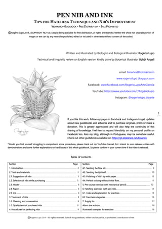
- 1. ©Rogério Lupo 2019 – All rights reserved. Sale of this guidebook, either total or partial, is prohibited. Distribution is free. 1 PEN NIB AND INK TIPS FOR HATCHING TECHNIQUE AND NIB’S IMPROVEMENT WORKSHOP GUIDEBOOK – FREE DISTRIBUTION – SALE PROHIBITED ©Rogério Lupo 2018. (COPYRIGHT NOTICE: Despite being available for free distribution, all rights are reserved. Neither the whole nor separate portion of images or text can by any means be published, edited or included in other texts without consent of the author) Written and illustrated by Biologist and Biological Illustrator Rogério Lupo Technical and linguistic review on English version kindly done by Botanical Illustrator Bobbi Angell email: bioartes@hotmail.com www.rogeriolupo.blogspot.com Facebook: www.facebook.com/RogerioLupoArteCiencia YouTube: https://www.youtube.com/c/RogérioLupo Instagram: @rogeriolupo.bioarte If you like this work, follow my page on Facebook and Instagram to get updates about new guidebooks and artworks and to purchase originals, prints or make a donation. This is greatly appreciated and will also help the continuity of this sharing of knowledge. Feel free to request friendship on my personal profile on Facebook too. Also my blog, although in Portuguese, may be somehow useful. Check out other guidebooks available on: https://pt.slideshare.net/bioartes *Should you find yourself struggling to comprehend some procedures, please check out my YouTube channel, for I intend to soon release a video with demonstrations and some further explanations on hard issues of this whole guidebook. So please confirm in your current time if the video is released. Table of contents Section Page 1. Introduction………………………….………….…………………………………………….….. 2 2. Tools and materials…………………………….………..……………………………………. 3 2.1. Suggestions of nibs .……………………………………………………………..….…….. 3 2.2. Selection of nibs while purchasing ………………………….…………………...... 5 2.3. Holder ……………………………………………………..………………..…………………..... 6 2.4. Papers ……………………………………………………..….………………………..…..…….. 6 2.5. Ink ……..……………………………………………………………………..………………..….... 6 3. Treatment of nibs ……………………………………………………...…………………….... 8 3.1. Cleaning and conservation ……………….…..………………………………………... 8 3.2. Quality tests of purchased nibs ……………………………………………………… 9 4. Procedures for perfecting nibs ………………………………………………………….. 9 Section Page 4.1. Sanding the flow slit…………………………………………………………………………… 9 4.2. Sanding the tip itself…… …………………………………………..………………..…….. 10 4.3. Polishing of nib’s tip with paper……………….…………………………………….... 10 4.4. Perfect scribing without initial flow..……………………..………………….………. 11 5. Pre-course exercise (with mechanical pencil)………………………………..…..... 12 6. Hatching exercises (with pen nib)..………………………..……..……….…………….. 12 6.1. Index and explanation for practices…………….……...……………………………. 13 6.2. Exercises categories……………………………….…………..……………………………. 16 7. Supply list……...……………………………...…………………………………………….……… 17 About the authors……………………..……………………………………..………….………….. 18 Illustrated examples for exercises ………………………………………………………….... 19
- 2. ©Rogério Lupo 2019 – All rights reserved. Sale of this guidebook, either total or partial, is prohibited. Distribution is free. 2 1. Introducing the tool and its functioning Pen nibs are tools of immense variety, allowing many means of handling and many methods of use. Essentially, it is a metal point split on half that registers strokes on paper by taking advantage of the ink’s surface tension, that is, the force that unites molecules and causes the ink that is sticking to paper to "pull down" the ink that is still on the nib. Thus, gravity is not the principal agent but the ink’s viscosity is, although gravity plays a role in it. Most nibs have a reservoir in form of a "hole" placed at some distance from their tip, as seen in figure 1. A slit extending from this reservoir towards the nib’s tip functions as a riverbed where ink runs downwards, more by capillary action than by gravity. Capillary action is the effect of ink’s surface tension within the slit that causes a bind and leads it to run forward like a stream to fill in the slit. Under pressure the slit opens, as seen in figure 2, and the film of ink that covers it enlarges on the tip bringing more ink onto the paper, hence thickening the line drawn. The more flexible the pen nib blades are, the more easily and broadly the slit will open under pressure, and higher is the possibility of varying line’s thickness, as seen in the example of the same figure 2 where the pen is working. Many nibs are sanded or polished on the flow slit in a mode perpendicular to the slit itself. This aims to shallow the "riverbed" of ink, as well as to remove burrs raised by the cut of the nib which generates the slit. It also evens out the "river banks", thus perfecting the flow of ink and hence the lines drawn. Another function of the manufacturer’s sanding is it creates microgrooves perpendicular to the slit, so that the ink that sticks as a film over the nib is always headed towards the central slit by capillary action. This polished treatment is perceptible in the nibs on the right in figure 3 (h, i, j) further below. The same models and brands of pen nibs (especially delicate ones) may present nibs as different as individual people can be. This may be the case when it comes to results, more so than appearance at face value. Under a magnifying lens glaring differences may show up. Thus when purchasing nibs, one has to be acutely selective, preferably looking under a potent magnifying lens of jeweler’s type. The best pen nibs (from any model or brand) are those whose cut (the flow slit) is in a perfectly symmetrical position, placed exactly in the middle of the blades, and these are well paired all throughout their length, both having rounded tips when seen in microscale. In addition, the feature that makes a nib most promising is the exact juxtaposition of the blades over the entire length of the slit, especially at their tips. Furthermore, in the best nibs, when we force blades apart (while working, under the hand’s pressure that thickens the line) they have a similar response when subjected to the same pressure, and when they recede and return to resting state, they pair perfectly back to their initial site, without being separated or decoupling, nor bestriding one another. This can all be checked by our fingers exerting pressure over the nib’s blades while we observe it under magnifying lens, but even naked eyes can assess something. It is also better to avoid nibs with burrs derived from cutting, especially at their extreme tip. However, this is a less severe defect, for it can be corrected with sanding and polishing, as we will see later. Burrs along the flow slit are the least prejudicial ones, because careful perpendicular sanding of the slit (further to what is made during the very manufacture) is a simple procedure with a great outcome that will easily solve the problem. Figure 2. Nib’s blades are spread apart when pressure is applied, which allows us to vary line thickness without lifting the nib up from paper. The best hand position should be sought so that the heaviest pressure during thickening neither causes injury to paper nor impairs hand’s steadiness while drawing. Figure 1. Nomenclature used in this text for the essential elements of the nib. The model in this example is a Speedball Hunt 100.
- 3. ©Rogério Lupo 2019 – All rights reserved. Sale of this guidebook, either total or partial, is prohibited. Distribution is free. 3 2. Tools and Materials 2.1. Suggestions of brands and models of nibs: I have been testing a variety of nibs of several models and brands, some are among the most delicate tools available worldwide which provide the most precise and ultra-fine lines. My best results were obtained with Gillott 290 (Vintage, bronze – figure 3f, not the currently manufactured blue nib made of brass – figure 3g) and with Speedball Hunt 100 (figure 3h). Gillott’s model is called a “lithographic pen”, and Hunt's model is called "round pointed". Both have very similar designs. Recently I have tested Deleter Maru Pen, which also provides excellent thin lines, among the finest and stablest I can obtain. Moreover, the manufacturer seems to be meticulous on quality control, since all nibs I tested presented refined finishing and high evenness of performance. However, it is not quite flexible, being suitable to render rather delicate hatching where no great thickening of lines is required. One of the brands most easily found (at least in Brazil, where I live), among the nibs with design somewhat similar to the former ones addressed above, is Hiro Leonardt 700. But I have tested it over and over for decades, and although I am able to perform miracles by sanding nibs, I have never been able to make it work decently for a consistent and delicate stroke, and many of them do not even scribe anything on paper at all. As for the currently available Gillott 290, blue, made of brass (fig. 3g), eventually one or another nib may be good or work better after some sanding, but its factory’s finishing has been dreadful. Hence, choosing between it and the Speedball Hunt 100 (fig. 3h) the latter is preferable, since after a careful selection while purchasing I always get some perfect one, at the very least after sanding. There is also Hunt's 103 - fig. 3i, with a few differences in design compared to Hunt 100 (and slightly more flexible blades), but it never worked well in my tests. Other brands may present similar models and always worth it a test, but I have found no similar results so far, just similar design. The Speedball Hunt 104 (fig. 3j) may yield good results, but it is not very flexible. It may be excellent for precise and ultra-fine contours on which we need to avoid undesired thickness variations caused by unsteady hand’s force and it may be good for detailed stippling too. For contours on which I need to vary thickness, I use Hunt 102 ("crow quill" type – whose shape is different from the Figure 3. S models of different brands of pen nibs. The five ones to the right are those which provide the most ultra-delicate and thin lines among all nibs produced today or throughout recent history. Illustrative figure: Microlicia cogniauxiana (left) and Barbacenia piranga (right), botanical illustrations made with pen nib and ink using hatching technique. Nibs used are Speedball Hunt 100 and Gillott 290 Vintage (both on both drawings), improved with sanding and kept always new with correct cleaning. Zoom it on PDF file to see details.
- 4. ©Rogério Lupo 2019 – All rights reserved. Sale of this guidebook, either total or partial, is prohibited. Distribution is free. 4 others, as explained further on). It provides lines a bit thicker but quite steady, being not much subject to subtle variations of hand’s pressure, while simultaneously allowing controlled and relatively broad thickening of lines. Among innumerable models of pen nibs available, some are preferred by designers, some others by illustrators, others by Animee artists and others by calligraphers etc. It all depends on the personal uses one intends to make. People have their own personal goals in art, and one has to try as much materials as possible in order to find what will suit one’s demands. Thus, for not so delicate nor ultrathin lines there are nibs truly worshiped by artists. Some of them would be the Nikko G (fig. 3a), the Zebra G, Principal EF Leonardt (fig. 3e), Presbitero 505 EF (fig. 3c), Brause & Co. 76 (fig. 3b); all these models are slightly similar, sturdy, somewhat flexible, providing relatively firm and delicate lines and good capacity of thickening them. Many of these nibs can be found in specialized art supply stores. The best course of action is always to try out what is available, especially if we are able to select the best nibs in store. And in such case, better to purchase models that we can intuitively sense will meet our expectations: if we want a delicate line, we should prefer nibs with finer and more acute tips; if we want wider variation of line thickness, we should acquire thin-tipped ones, but with longer and flexible blades, eventually larger nibs as a whole. It is better if we are able to test the nibs in store (forcing them to open over our nail, for example) to check how much and how easy the blade tips move apart and open under pressure. I usually buy at least 5 to 10 nibs from the same brand and model, so that I can choose the best ones among them. There is also plenty of material on internet describing and recommending brands and models of pen nibs, eventually with tests, videos, artists’ accounts on their experiences etc. Searches in English are likely to provide more numerous references. Use in searches also terms like the expression "dip pen nib", name specifically used for this type of material, referring to our mode of working by dipping it into ink. Some materials available, such as those in figure 4 (these are Hiro Leonardt), are actually scratch-knives, used for scraperboard (often called ‘scratchboard’ in USA), a technique in which the strokes of drawing are made by removal of dry ink through scratching. Lines generated on scraperboard are white, since the nib removes ink to bring back the white of the paper. We can also use a paper of another color, paint it white and scratch it to regain paper’s color and, in such case, strokes will be darker and not lighter. For this purpose, these nibs need to be kept quite sharp all the time, so that they maintain an absolute accuracy in strokes, and the paper generally has to have a surface that endures scratches without having its fibers damaged. Plastic or latex surfaces, for example, are better for that. This technique can be helpful not only for traditional scraperboard but also for scratching over other media – such as acrylic paint, gouache and even watercolor and oil –, always after drying, when the most precise strokes can be obtained. But the quality of lines will always depend on the surface where the drawing is done. Using this resource, it is possible to create "hybrid" artworks blending both scraperboard and pen nib and ink techniques, as shown in figure 5, where gray paint (black ink blended with white gouache) is applied in a flat mode, that is, uniformly. Afterwards white strokes are Figure 4. Pen nibs for scraperboard, with flat (left) or concave tip (right). Figure 5. Parts of different Croton species. Here the fundamental tone is made with gray paint and scraped to obtain white strokes, and there is posterior detailing done by strokes and hatchings of ink with pen nib. This particular plant has types of hairs and scales that, when blended with hatching made for shading, would provide a result visually confusing if done only in black. The possibility of being more faithful to light, dark and half tones with this technique has resulted in a clearer and more reliable representation of reality (zoom in PDF file for details).
- 5. ©Rogério Lupo 2019 – All rights reserved. Sale of this guidebook, either total or partial, is prohibited. Distribution is free. 5 made through scratching and black strokes applied with pen nib and ink. The paper is a coated “supreme cardstock paper” (a cardstock with higher GSM – Grams per Square Meter: the higher the GSM, the thicker the paper) prepared with some layers of gesso and then a few coats of white acrylic paint, which makes the surface suitable for scratching. All layers of gesso and acrylics are sanded. The process of preparation of the paper is well detailed in an article on my blog – soon to be translated: check it out now to see if I have translated it by the time you read this (address on introduction page). Some models of paper are manufactured specifically for this technique, but they are hardly found in Brazil, where I live and where the technique is not very well known and rarely used. As for figure 6 the process used is only scraperboard, but instead of gray paint for the general basis, pure black ink was applied in a flat and uniform way, and all white strokes were made by scratching. Details with dark hairs and dark strokes were added with pen nib too, at finishing stages. The technique allows many corrections since one can scratch, apply ink again if some error occur and then scratch it again. Complications may arise only by excessive depth in scratching, because then the acrylic coat ends up being locally completely removed. Yet more acrylic layers can be locally applied to restore surface damages. 2.2. Selection of best nibs while purchasing Suggestions of procedure: Assess the nib using a hand lens (jewelers’ type, for example) with magnifying index at least 5X. Check whether blade tips are coinciding, matching, well-paired when seen from all perspectives (move the nib under lens in every possible ways). Check to make sure that they are not kneaded or bent, that blades are well juxtaposed all along the slit and the slit is not open. Be sure that blades tips are new, polished, with no signs of oxidation, and that they are somewhat mildly rounded on their top edges, examining also to be sure both tips end at equal height. It is very important to assess also the whole symmetry of blades, mainly regarding the flow slit and its central position. The more centralized it is, the more auspicious will be the nib. ONLY for delicate and flexible nibs such as Gillott 290 and Hunt 100: proceed to a gentle, VERY careful bending of the nib’s blades, having the convex side facing down as seen in figure 7 (consider that figures display used nibs inserted in a holder, whereas buying in store you will need to proceed to these tests with the nib detached, held by your fingers). If blades tips remain paired and do not get crossed under this gentle and slow pressure, the nib is more likely to have the vocation to produce a good and delicate drawing line and to perform finely during thickness variations, as this resistance to crossing indicates that the cut which forms the slit is perpendicular, thus it was done in the proper manner. If they cross easily under certain gentle pressure as seen in figure 8, it does not mean the nib is useless, but only that the probability of being excellent is lower. All nibs cross blades under certain pressure, but the best ones do not cross easily under gentle pressure, they persist paired longer before crossing. Furthermore, this is not just a test, rather it often works as an improvement too: a little bending brings blades closer together on slit if they are not quite juxtaposed, and this twisting may be required for further closure of slit on brand-new nibs, as well as on nibs somewhat worn that have been forced to open too many times along the work, and whose blades thus have become a bit separated from each other. A pen nib that does not cross blades easily is better because its central cut probably is not skewed, what means that the evenness of its scribing will likely not shift during line thickening when blades move apart. But even more importantly: Figure 6. Hemistephanus cylindricus, a wasp species made with scraperboard technique. Initially ink is uniformly applied and then scraped to obtain white lines, and finally dark strokes are locally added for the finishing (apply zoom in the PDF file for details). Figure 7. Blades’ cross test: the nib is held down on a surface with its concave (inner) side facing upwards and a gentle force is slowly and gradually exerted to bend the metal from its tips. Figure 8. The blades tips crossing under pressure. The more easily they cross under certain slight force, the more it determines that central cut is skewed.
- 6. ©Rogério Lupo 2019 – All rights reserved. Sale of this guidebook, either total or partial, is prohibited. Distribution is free. 6 when we get back to thinner lines by relaxing our hand pressure, such a nib returns to its original position with blades well paired, therefore allowing that delicate lines drawn after thicker ones can become quite fine again as desired. Otherwise, at the end of line thickening, if the nib cut is skewed, blades tend not to pair back so well, hence lines may not become again as thin and delicate as possible. It is as though when returning to the ultrafine line the nib would bring the reminiscence of blades opening. But again, this is not necessarily always the case, since many nibs with skewed cuts can provide great performance, so I am emphasizing what is just a tendency and not an inescapable rule. 2.3. Holder The pen nib has to be attached into a holder as seen in figures 9 and 10. Models of nibs that are a curved metal plate like all of those in figure 3, having their bases in form of a mini breastplate, are adjustable to the model of holder in these pictures. Nibs that have an entirely cylindrical base are the "crow quill" ones (e.g. Hunt 102) and have to be inserted into another type of holder with a pin in its top that should fit inside this cylindrical base, thus fixing the nib. 2.4. Papers For use of pen nib and ink the best papers are those as smoothest and satin as possible. Among the best and most available are the Fabriano 4L and Lana Bristol. Back in the days there was the excellent Canson Lavis Technique (now apparently off production). Hahnemühle Bristol can be an alternative, although to my senses it grasps excessively the nib’s tip under increased hand’s pressure, hence lines thickening causes side bleeding which jeopardizes the aesthetics of finishing. More Bristol papers, which are some of the most appropriate papers for this technique, have been increasingly emerging, such as Fabriano's Bristol, which I have not tested yet. Great care and meticulous testing is required before adopting some of these papers, since Winsor & Newton’s model, for example, can be highly abrasive, making the nib’s tip end up becoming a bezel, actually abraded by the paper’s surface, what damages the nib’s functioning and forces us to proceed to a restoration. Canson Bristol does not present this issue, but it has a somewhat bluish coloration that I do not particularly appreciate. Among the papers I have not tried yet, but are potentially good, are Strathmore Bristol (with several series available) and Clairefontaine Lavis Dessin Technique. What provides smoothness and whiteness to these ink-specific papers and the difference they have from other papers is the treatment they generally receive of a thin layer of gesso which, in addition to pleasantly allowing the nib to slide easily, helps when corrections are required, what can be done by “shaving” the paper with razor blades. After this scraping, when it is necessary to retouch or redo the drawing with more nib strokes, we need to repair that portion of paper’s surface, that may have its fibers slightly damaged. This is usually done with a polished stone (like agate) that must be gently rubbed over the damaged surface to smooth it (better using another thin paper in between for protection, avoiding direct attrition during rubbing). This repair works well also when done with eraser pencils directly over the paper’s surface, which can help to remove little remaining spots of ink that razor blades may not have been able to erase. Of course, since the gesso coating is quite thin, the paper endures only minimal correction; hence if we need to correct it twice, the error may be irreparable. Solution and prevention is to study enough before getting to the final work. 2.5. Ink Suggestion of brands (order of preference): Talens, Staedtler Mars, Cretacolor. Ink’s quality makes a fundamental difference, since what determines the best performance of the technique are physical and chemical characteristics that involve ink’s viscosity, Figure 9. Wooden holder is recommended for the use of pen nib. The weight of this stick offers ideal support, providing more steadiness during use. But plastic holders, although lightweight, also offer good support after we get accustomed to them. Figure 10. The holder’s cusp carries a metal apparatus where the nib should fit, being firmly fixed between the inner metal foils and the cylinder where these foils are attached.
- 7. ©Rogério Lupo 2019 – All rights reserved. Sale of this guidebook, either total or partial, is prohibited. Distribution is free. 7 surface tension etc. The recommendation, then, is choose a good reliable brand and seek excellent quality (we should swatch and follow other people’s experiences – anyway always swatch, regardless of others’ advices and regardless of brand’s reputation, because even good brands may produce bad quality inks). The second recommendation – but not least – is preserving ink’s characteristics, that is, prevent it from deteriorating and losing its original hydration. Hence the ink bottle must remain closed for as long as possible. However, to work with pen nibs we need to be able to dip it constantly into ink, hence the bottle ends up being opened and closed too often, not to mention cases when it is carelessly left open all the time. In order to avoid that ink loses its good qualities of a newly purchased stuff, I solve this dilemma by using a small vial (figure 11) to which I transfer ink from the original bottle with a dropper, but only enough to form an ink column that reaches nib’s reservoir hole when I dip it in there. These are penicillin vials (found for sale in stores of laboratory supplies or discarded by hospitals) with quite a practical rubber cap. Vials with small bases (21 to 25 mm diameter) require less ink in order to form a column high enough to reach the nib’s reservoir. The vial’s neck has to be wide enough to fit the top of the nib’s holder so that it enters therein with certain clearance. The advantage of the vial in figure 11 is it has a rubber cap that can easily be pulled out and put back with no threading, hence the vial can remain capped all the time except when we need to dip the nib in it. When eventually, even though the vial has not been frequently open, the ink ends up dehydrating or losing its best qualities, I add a very few drops of water to replace what was lost; then I test for results. When one or two drops of water are not enough to bring ink’s good qualities back, I withdraw the whole ink from the penicillin vial, which is not much, and mix it back into the main original bottle so that the quality losses are diluted within the preserved ink’s main body. Afterwards I refill the small vial with another appropriate ink column. Waste is minimal thereby. When one uses the main bottle (the original one) for dipping the nib in, it is very likely that there will be accidents and spilling of all its content, and even worse: it can happen over the drawing. This is why the small glass vial helps eliminate this problem, since there are ways of fixing the vial and making it become spilling-proof. One solution is to use a hard support (such as cardstock, hard thin styrofoam, a plastic plate etc.) for fixing the ink vial with adhesive tape onto this base, such that we can freely move the assembly, hence not stiffening our posture and movements. Even with this freedom of movement we get, the vial becomes much less likely to be overturned. Besides these precautions I take an extra measure, which is to work with ink at very low temperatures (near 0o C), leaving it inside a refrigerator before use, and while working I maintain the vial sunken inside a receptacle with compact ice up just to the height of the ink column. The ice has an empty hole in it where the vial base fits perfectly (Figure 12). Hence not only is the ink subject to less evaporation both within the vial and on the nib, but it also gets more viscous by being so cold, which causes it to have more binding so that drawn lines tend to be consistent and uninterrupted. As this process reduces ink’s dehydration during the time it is on the nib while drawing, then the need of dipping it inside ink becomes a bit less frequent (nevertheless I still do it often to avoid having troubles). The distance from nib’s tip to its reservoir hole varies depending on the nib model, thus one fills the ink vial up to a particular level. For nibs such as Gillott 290 and Hunt 100, whose distance between tip and reservoir is short, an ink column with some 7 to 8 mm height is enough to reach the reservoir. Caution must always be taken to avoid bumping the nib onto the vial’s brim when dipping, what may cause severe injury to the nib’s tip. We have to avoid also abruptly touching the glass bottom when dipping, because after many dips the nib’s blades and tip would be likely damaged by so many shocks. By all means, one should always prevent ink from imbibing the nib far above the reservoir level when the pen is dipped, for in this case the excess of ink ends up concentrating by gravity action as a droplet near the tip, and fatefully that droplet will detach and fall on drawing, probably by surprise. This is avoided by the procedure suggested above, since Figure 11. Penicillin vial, used to avoid wasting ink, is easily opened and closed, avoiding ink dehydration and dust ingress. Figure 12. The supplementary vial is sunken in ice, which keeps ink cold, hence more viscous and subject to less evaporation when coating the nib. The receptacle with ice is attached to a piece of sturdy cardstock with adhesive tape to avoid spilling the vial.
- 8. ©Rogério Lupo 2019 – All rights reserved. Sale of this guidebook, either total or partial, is prohibited. Distribution is free. 8 when we keep ink only in its original bottle, we have to be excessively cautious to dip the nib down just to the ideal depth and avoid formation of ink droplets. Whereas using the small vial, all we need is to be cautious while dipping the nib slowly until it gently touches the bottom, where there is ink at ideal height. Though this may seem to demand excessive caution, over time we get used to the correct movement of dipping and to the ideal moment of slowing down to avoid shocks. Figure 13 shows the ideal ink height imbibing a nib, in this case a Speedball Hunt 100. 3. Treatment of nibs 3.1. Cleaning and conservation When resting, the nib must be kept always dry. It should never be left in water, not even for a few minutes. The same goes indeed for the wooden holder, which would be surely damaged by water absorption: therefore, do not use water at all. While working with the nib, one recharges it with ink by dipping periodically, but once it begins to fail at scribing, to draw interrupted lines or present any other problems, the correct procedure is to remove the existing ink with a lint free cloth or paper, then finish the cleaning by wiping the nib with a hard brush imbibed with alcohol. The suggestion is to use a bristle brush (Figure 14). Use a small brush so as to not waste alcohol, provided it has at least 4mm width on hair’s base. I usually trim and shorten tips of the new brush, since hairs are thinner at their tips, tending to fragment and contaminate the nib’s slit with residues that jeopardize the quality of lines. Use 70 to 99% ethyl or isopropyl alcohol, available in pharmacies, because it helps remove even old, dry inlaid ink. But the ideal habit is never letting ink dry on the nib, cleaning it frequently enough, at least every 3 or 5 minutes, besides constantly dipping it in fresh ink while drawing, therefore trying to always keep fresh ink imbibing the nib. Although this meticulous method seems fairly tedious at face value, once we harvest the outcomes realizing how better our work flows now, it becomes quite pleasant to engage more often in cleaning so that it looks like we are always working with a brand-new nib. When cleansing the nib, do so carefully and patiently, removing any crusts of dry ink eventually formed, gently scrubbing the brush with alcohol from the nib’s reservoir towards its tip, paying particular attention to the inner portion of the flow slit where cleansing must be even more gentle. One must move blades slightly apart from each other and scrub with the brush therein, from inside the slit towards both tip and reservoir. This will remove any dust particles locked within the slit. Make sure cleaning is always done with alcohol being kept as pure as possible and not with a mixture of alcohol plus ink residues. Once the cleaning is done, the nib must be wiped with a lint-free cloth (such as poplin, most recommended, or else silk, viscose etc.). Any lint locked inside slit, although microscopic, is able to change and thicken drawing lines of the most delicate nibs and it can perhaps occur even to larger and sturdier nibs. After wiping with cloth, it is recommended to run fingertips along the nib’s length, as long as your fingertips are clean and dry, without greasiness or especially sweat. Running fingers gently, from nib’s base to its tip while slightly opening the slit, may help removing any residual lint (oddly our skin is the best tool for it). If drawing lines are eventually thicker than usual when the work is resumed, it is necessary to try and remove any stubborn intruding lint with another thorough cleaning with brush and alcohol again. In such cases, most times a closer look with jeweler magnifying lens may reveal that a persistent lint is camped there, graciously attached. Observe it then, to learn making diagnosis of the most common problems of nibs. A pen nib kept always clean, well conserved and stored, used responsibly and without unwary maneuvers or excessive pressure, can last for many years and even when presenting problems, it can be restored by sanding, honing and polishing. Once a nib has this vocation for yielding a good stroke, it is worth it continuing to invest, restoring the nib when wear problems arise, which are natural. For stowing, choose ventilated rather than closed ambiences. Nevertheless, the most deleterious to nibs are saline particles from our own hands or sweat that remain on the metal when we store it. For the salt is what practically magnetizes humidity from air, which landing over the nib will cause severe oxidations, sometimes micro damages on the tip or slit, not visible to the naked eye but highly prejudicial to the performance while drawing. Therefore, the ideal behavior is cleaning the material quite well with alcohol – what somehow will have the metal a little hydrophobic too –, then no longer touching our skin on its upper half before storing. Figure 13. The ideal height of ink imbibing the nib must exceed just a little bit the height of the reservoir, thus preventing ink from accumulating down at the point and dropping on drawing. Figure 14. Bristle brush used for cleaning. After having its soft tips trimmed, it acquires stiffness enough to remove quite well any ink particles.
- 9. ©Rogério Lupo 2019 – All rights reserved. Sale of this guidebook, either total or partial, is prohibited. Distribution is free. 9 3.2. Quality test for nibs already selected and acquired – Suggestions of procedure: Regardless of being a brand-new nib, clean it thoroughly with the brush imbibed in alcohol and wipe it with the cloth. Dip it into ink, up to the level of the reservoir as shown in figure 13, scribe and check the fineness of strokes (always remember: use NEW ink for nib testing, since ink quality may be the cause of failure of functioning). A procedure that helps to achieve the finest line possible is to not keep the paper entirely lying on the desk, but rather raising its edge near the site where we are working, so that right under the nib paper is slightly floating, delicately held up by our other hand. Working like that, the paper’s lifted portion will recede and slightly bend down when the nib touches and run over it, acting like a shock absorber and helping to attenuate the pressure we naturally exert while drawing, what is also essential to equalize our hand’s unsteady weight. After scribing a few times with the first bit of ink stuck onto the nib, dip it again until ink stabilizes, grabbing well onto the metal. Usually, by the first dip of a new nib, or when after a clean nib has been stored without use, ink does not seem to want to grab to the metal, thus not forming a consistent coat over it: that will change after further dips. When the pen nib rests clean for too long without use, it may seem that it does not work so well when we try it out again, or that it does not perform as delicate or continuous lines as it was doing before being stored, but most times it is enough to imbibe it further into ink or thoroughly clean it with alcohol again (even though it is already clean), and then the performance seems to take on another characteristic: the nib that was apparently not working properly any longer is now again as it has been before. Pen nibs are full of mood swings, we have to get used to it. After the second dip, start again drawing some lines and try to thicken them while scribing, gently exerting pressure as seen in figure 2 (section 1, introduction); then draw one or two lines with the nib inverted and somewhat slanted down (that is considered the “wrong” way: convex side facing paper and nib quite slanted, as in figure 7); after that, return to the “correct”(*) position, checking out if some change has taken place. This movement helps removing any particles of dust or lint trapped in the upper side of the flow slit (on nib’s convex face) by driving them out along with ink. These are particles that would hardly leave solely through the use of normal scribing, since the nib’s position on its “correct” use does not favor their removal. If lines are still thick and do not get thinner and ultradelicate under the lightest hand pressure (remember to hold and partially uplift paper with your other hand while drawing), then proceed to bending the nib as seen in figure 7 and 8. Force it to bend on paper some two or three times, first mildly and then firmly, exerting pressure so as to mold the metal (one can do this even while nib is coated by fresh ink - sometimes blades will cross and ink will sprinkle, do not freak out). Scribe again with the nib now back in its “correct” fashion (convex side and flow slit facing upwards). Note that this procedure aims to adjust and further juxtapose blades in case slit is somewhat open. Some nibs will yield ideal lines after this bending alone, yet they may need fine polishing to soothe tip’s friction with paper. (*) – Although I am referring to one way of holding the pen nib as “correct” (tacitly classifying other ways as “wrong”), this refers only to the method addressed here, hence the quotation marks. Any specific way of working might never be decreed wrong, since artists are unconditionally free to experiment and choose what works particularly better for them. Moreover, I have seen artists making amazing ink artworks while holding the pen nib the “wrong” way all the time. That said, I emphasize that concerning free line thickening and thinning as this method aims to teach, one can achieve it only by holding the pen the “correct” way here recommended. 4. Procedures for perfecting new nibs or restoring quite used or worn out nibs. 4.1. Sanding the flow slit This should be done under microscope or any instrument that can magnify at least 15x. If the procedures and tests recommended above are not effective, it is necessary to proceed to sanding work. IMPORTANT: ALWAYS clean the nib with alcohol before and after each sanding, especially before scribing tests, not ever forgetting to remove residues after cleaning by running your clean, dry fingertips along the slit while they simultaneously open blades slightly apart, because lints within the slit might be locked between both blades. Do not EVER underrate the huge line-spoiling power of a ridiculous piece of lint! Furthermore, remnants of metallic dust from the very sanding can settle within the slit, thus causing thickening of drawing lines too. This careful cleaning all along the sanding is essential, since after a little abrading the nib may be perfect, but lack of cleaning could deprive us of realizing that it works well already. Figure 15. Sanding of the flow slit is made on its convex side, with a curled (semi-cylindrical) sandpaper. The arrows indicate the correct directions in which the sanding should occur.
- 10. ©Rogério Lupo 2019 – All rights reserved. Sale of this guidebook, either total or partial, is prohibited. Distribution is free. 10 The first and most important sanding procedure is that of the flow slit. The intention is to abrade the slit’s surface on the nib’s convex side to shallow the “riverbed” where ink flows. Thereby, the slit will allow only the passage of a tiny fillet of ink, conducting little liquid squeezed into a thin ink “river” that provides the most delicate stroke. This sanding must always be done in the transverse direction – i.e. perpendicular to direction of flow –, with water sandpaper (silicon carbide or aluminum oxide at least 1200 grit) curled into a semi-cylindrical form to prevent the nib’s tip from being sanded at this stage, as indicated in figure 15. The entire slit must be mildly and gradually scrubbed from the reservoir to the tip, always transversely from side to side, up to the portion where the slit finishes at the tip, taking care to avoid sanding tip itself. One important point is to ensure that during the whole sanding process both blades are perfectly paired ALL along the flow slit; otherwise a difference in levels, a “step”, may be formed between blades on slit’s margins, which severely jeopardizes nib’s performance. Therefore, looking under a magnifying lens, make sure that the blades are perfectly and meticulously paired and coincident, and if needed use a finger on the concave side to support and secure blades juxtaposed while scrubbing the convex side. When sanding the entire slit and especially its ultimate portion, one must necessarily use magnifying lens of at least 15X to avoid grave errors. Sanding of the slit on its terminal portion is the most important, since it is what will ultimately determine a good performance. Most nibs may yield the optimal stroke already at this step, requiring then just some soft polishing at tip itself as described in the sections below, for reduction of attrition with paper. 4.2. Sanding the tip itself (under magnifying lens): When nib’s strokes are already delicate, it is necessary to check their constancy, making sure drawing flows with ease and softness and lines are not displaying interruptions or rifts, nor is the nib excessively scratching the paper. Even after slit sanding, drawing lines often may be impossible to become more delicate. In all these cases, it may be necessary to go on through the riskiest procedure of all: sanding the nib’s tip itself. Much care must be taken here, always working rather gradually, without provoking sudden changes on tip’s sculpture. Here we should deal with two cases: 4.2.1. Should strokes be not fine and delicate enough yet, despite slit sanding, it is necessary to use a more drastic procedure: abrading the outer border of blades up to their tips (the blade’s edge that opposes to where they meet in the central cut), as indicated in figure 16, making tips become a bit sharper without overkill. A good tip has its blades finely adjusted to one another at their contact in the slit and they are always rounded in their final micro-portion (see figure 17). Sandpaper 600 grit is used to abrade blade’s outer borders. Yet when working on the very tip itself, one must always use at least 1200 grit water sandpaper. All edges of the tip of each blade must be slightly rounded, thus avoiding and eliminating any remnants of micro-burrs. Nevertheless, both blades’ tips coming together to form the slit in between must be perfectly adjusted and paired, touching each other all along the slit length, with both blades’ tips forming a continuum as one single point with its entire surface polished and rounded, as seen under microscope in figure 17. Then we move on to procedures 4.2.2 and 4.3, but besides polishing the inner side of the tips (VERY carefully and minimally, never actually entering the slit, but keeping restricted to its very end upon the ultimate tips), we must soften angles and eliminate burrs that may still exist on both tips’ edges. Sanding should not turn the nib’s tip into an absolutely sharp one, rather both blades’ tips joined together must assume, in their terminal micro-portion, a form that is attenuated, round-edged when observed under potent magnifying lens, with tips ending at the same height, perfectly symmetrical with their inner edges absolutely juxtaposed in the slit. It must look like one single entire piece merely split in half as seen in figure 17 (“single piece split in half” is actually the case in the nib’s origin – thus the slit should never present a broad terminal “river delta”). 4.2.2. If the drawing lines are already delicate, the intention is only to polish the tip, abrading it very gently to remove burrs thus making it slide smoothly while drawing, so that scribing becomes soft. Any excess at this point might spoil the whole sanding work altogether, forcing us back onto previous steps. Practically all delicate nibs, especially most all Hunt 100, will need this final polishing work at the end of sanding, and the same goes even to brand-new nibs that do not require any sanding. This is because Figure 16. The blade is abraded on its side portion to hone the tip, but does not leave it so sharp as a needle. The main feature of these models Gillott 290 and Hunt 100 is they have a (micro) rounded tip. Figure 17. Nib’s tip under microscope (convex side): blades perfectly juxtaposed in their contact at the center, symmetrical, rounded and without burrs. The flow slit forms a narrow, uniform central fillet, mainly in its ultimate tip.
- 11. ©Rogério Lupo 2019 – All rights reserved. Sale of this guidebook, either total or partial, is prohibited. Distribution is free. 11 they are produced with this natural tendency to "hook" at paper fibers (no matter how smooth the paper is), creating undesirable side "micro-bleedings" all along the strokes thickened by enhanced hand pressure. To avoid that, the solution is to slightly open the nib’s blades with one hand’s fingertips while proceeding to an ultra-mild polishing of the tips with 1200 grit sandpaper. This polishing is done on the inner side of the ultimate blades’ tips, where they juxtapose and where they touch paper. This must be done very carefully and bit by bit, as “caressing” the tips with the sandpaper. While blades’ tips are slightly kept apart, a little piece of sandpaper must smoothly caress each tip’s end as lightly as possible, mainly on their inner side (but NEVER properly entering slit), and the sandpaper must be held by fingers quite loosely while they gently glide it onto the metal, only a few times before we feel and observe, under the magnifying lens, whether the micro burrs and angles are already slightly polished and attenuated. Then we must test scribing, not ever forgetting to clean the nib before tests. The idea is that both terminal portions of tips become a bit rounded all over their edges, without being disengaged, that is, maintaining the perfectly juxtaposed contact of both, almost absolutely up to their terminal point. However, as both tips will be a bit rounded, it is impossible that they touch each other up to their ultimate apices, but this terminal rounding has practically a nanometric order, it is a micro-rounding that leaves a final nano-"V" between tips (a micro “river delta”), almost invisible even under magnifying lens. In order to achieve this, one can instead draw VERY gently directly over sandpaper, even using ink to do rather short strokes (0.5 mm length - yes, half a millimeter), with extreme delicacy, no more than two micro-strokes to avoid beveling the ultimate tips of blades, then testing on paper afterwards. This short-scribing directly on sandpaper must be done in three directions, from left to right and vice-versa, and toward the nib’s concave side, always maintaining pen’s position in the most symmetrical relationship with paper, but also a bit slanted according to your own personal handling (by the way the best manner to hold the pen while drawing is not too slanted, but nearly vertical, just a bit slanted). Important warning: DO NOT EVER SAND OR POLISH THE INTERNAL BLADE EDGES, INSIDE THE SLIT WHERE THEY JUXTAPOSE. You will lose your time and your nib. The only site where inner edges can be polished is on the ultimate end of tips to form the “delta”, where we are practically polishing the tip itself. 4.3. Internal polishing of nib’s tip with the very paper: Sometimes the result shown in drawn lines is already very satisfactory, but we might feel there can be more to improve for a softer sliding of the nib, yet there may be the fear of ruining it all if it were further polished with sandpaper. When this fear arises, it is a sign that perhaps the best attitude is avoiding anything but subtle interventions, then we better proceed to polishing by using only the actual drawing paper. For that, one must draw lines on paper using a firm and somehow rough manner, as though one wants to deliberately wear the nib out a little bit (no need of fear while doing that, provided that drawing position of pen is kept correct). The suggestion is to cause both nib’s tips to open apart under some hand pressure while scribing long lines, thus making ink flow down to thicken these lines. But avoid overkill, excessive pressure and drastic zigzags. Eventually these long lines can be interleaved with some firm and quick pen movements without too much hand pressure, what produces some rough scratching sound denoting the correct attrition that nib is having on paper while it is polished. Then the paper itself will manage to bring the required smoothness to nib’s sliding, but this process can be quite time-consuming and may need to be done many times. Use intuition to decide whether to continue polishing nib with paper or further polish it with a very smooth sandpaper, always very gently and cautiously. In fact, over time and responsible use, the more one uses the nib, the more perfected and softer it becomes, thanks precisely to the polishing provided by the simple daily use on paper. Hence this final polishing done on paper – rough and subtle at once – is a form of accelerating this process that otherwise would last longer during everyday use. 4.4. Perfect scribing, but without initial flow: Sometimes the nib may present excellent results on drawings, but it seems to be "choked" in starting to scribe even though it is freshly loaded with ink, and we have to press it on paper until ink begins to flow down (WARNING: this could also be ink’s problem, for eventually it has become dehydrated, therefore I emphasize tests must always be done with brand-new ink or at least the most well preserved body of ink we possess). Solving this “initial flow issue” is usually one of the last sanding procedures necessary and should be done with extreme caution: the nib loaded with ink must have its tip touched on the sandpaper (grit 1200), at the normal position of drawing, being then just slightly opened as result of a gentle hand pressure. It must be done without sliding nor scribing: the nib JUST lands down and receives this gentle force so that tips of blades move apart a little bit. This forms a droplet on the sandpaper since ink flows down through the enlarged slit. Then the nib must be withdrawn up from the paper in a steady and sudden vertical move by which blades unite again and hence are sanded only on the inner portion of their ultimate tips. The idea is to minimally enlarge the micro "delta" that exists almost invisibly in the point of contact of blades’ ultimate tips. This tends to expand the area where ink contacts paper at nib’s extreme tip, opening the "delta" of the nib’s slit at the "mouth" of ink “stream”. This sanding improves then the property of nibs to always have a micro-droplet of ink on its tip, ready to adhere to paper and start the stroke by pulling the rest of ink river to flow down by action of its viscosity. On a microscopic level, ink is essentially a soft glue and we have to understand how these properties work so that we make use of this knowledge for detection and diagnosis of nib’s problems.
- 12. ©Rogério Lupo 2019 – All rights reserved. Sale of this guidebook, either total or partial, is prohibited. Distribution is free. 12 Figure 18. Suggestion of pre-course exercises for practice of hatching using mechanical pencil, thus initially delaying worries about the fussy demands of pen nib and ink. 5. Pre-course exercise This exercise aims to develop or improve, prior to the course, the practice of drawing parallel lines. The suggestion is to use a fine mechanical pencil 0.3 or 0.5 mm and some sheets of A4-sized (8.5 x 12”) paper. Draw diagonal lines as suggested in figure 18, such that at the beginning, starting in the upper left corner, lines will be short, and when reaching the sheet’s diagonal extension lines will be longer. Let your hand and arm be loose and comfortable and be aware of your overall body posture (spine upright); let your body feel good and relaxed and let breathing be natural and flowing, with special attention towards a relaxed exhalation. Focusing on relaxed abdominal breathing is highly recommended (diaphragmatic breath: that in which only navel moves back and forth while thorax remains still). Do not be too concerned with getting the lines right, rather just allow yourself to be absorbed by practice and lines will end up being improved by themselves. During this exercise, movements can involve fingers, wrist and forearm all at once, but in some cases, emphasis needs to be put on moves of certain portions of arm or hand. However, it is not necessary for example to "lock" wrist and move only fingers nor anything like that. Just allow unbound movements to flow and let your own body determine everything by itself, simply focusing on making lines at an appropriate length according to paper’s site on which you are working. In a relaxed mood, aim to draw the present line parallel to the previous one, no matter its length, and let hand movements and physical adjustments occur naturally by themselves. In order to make very short strokes, one relies mainly on isolated movements of fingers, whereas for less short strokes one involves mainly wrist movement. For longer lines one uses the movement of the entire forearm, with the elbow as a fixed support, firmly backed on desk and the forearm moving freely, just like a compass does. The lines should ultimately be parallel, but when beginning your practice, avoid that such a demand overcome the need of performing steady and relaxed movements. Initially lines may be slightly curved and/or straight, distancing about 2 mm from each other whenever possible. As you go through exercises, try bringing lines closer and then focus on keeping constant distance between them, about 1 mm and even less, coming down to 0.5 mm if possible. The distance may then be raised back again too. One hint to getting an increasingly better parallelism is to keep gazing on the line previously made, not on the one which is being drawn now, except with the corner of your eye. It is possible then to somehow remain attentive to both lines as the new one is happening right next to the former, but the main focus must be on the guiding line already done, the one we want to follow. Using this technique, the hand that performs the current line tends to follow and reproduce even tiny curves and deviations from the previous line and finally, after some practice, one line can perfectly follow the other. After practicing straight and/or slightly curved strokes, increase curvature toward both sides, adding more drastic curves and sinuosity in all directions, always striving to maintain parallelism and bringing strokes gradually closer. One helpful tip is to find the ideal speed of drawing that allows good control of parallelism (neither too fast nor too slow – aim to vary until results are efficient), then try keeping speed constant from start to the ultimate finish. After achieving proper speed, focus on keeping the pace stroke after stroke, avoiding at best any breakings of pace. Also make sure that the pressure of the mechanical pencil on paper is uniform all throughout strokes. Fill several A4 sheets until you feel there is some practical control. Suggestion: work 30 to 40 minutes a day (or even more, if you feel okay) every day until the date of workshop. Be playful while freely inventing forms so that exercises become exciting and hypnotic rather than boring. These exercises are a requirement before my workshop and your results must be presented at the beginning of classes, displaying the initial practice through the latter, so that each attendee is able to assess her or his own entire personal development. 6. Hatching exercises and forms of visual representation (to develop the practice of hatching and improve craftmanship on handling the pen nib) The exercises proposed below and exemplified visually on the last page are not required prior to workshop, but they can be done, if you will, using pen and ink. These are all just suggestions of practice styles to be done after one is aware of details of the
- 13. ©Rogério Lupo 2019 – All rights reserved. Sale of this guidebook, either total or partial, is prohibited. Distribution is free. 13 course content and demonstrations, which will be provided at the workshop. The suggested exercises follow an order of increasing challenge and complexity, and are proposed as solutions to various types of pictorial renderings generally required in our craft. They contain some frequent visual representations demanded for illustrations specifically in botany, but all of them are helpful in a wide range of other situations. One needs not keep confined to making strokes within squares, nor follow absolute vertical direction of lines as shown in the examples. The suggestion is that you use these examples to freely assemble all kinds of exercises proposed within a wide mosaic of blended textures, working in an absolutely free and relaxed mood, with strokes done as you wish in multiple shapes, extensions, and directions. Use creativity and do not cling to what you see here nor be imprisoned by it, but allow yourself to make miscellaneous abstractions. The visual language of hatching works fundamentally with patterns combined with breaks and gaps of these patterns, something that is fairly well captured and interpreted by our eyesight when done correctly, hence the need to strive for producing excellent evenness in patterns. The constant distance between lines should be sufficient to maintain uniformity within the filled area. However, both too distant or too close overall lines may end up undermining the visual impression of uniformity within the pattern. Lines drawn too distant from each other become individually more visible than they should be. Lines drawn too close tend to bring up some struggle to avoid that they touch each other while we draw them – or that they just almost touch, what already impairs evenness. This will inevitably make stains arise in the pattern. Of course, these considerations do not apply to cases when we deliberately want stains to arise or lines to touch each other, in order to cause a desired break of pattern that is adequate to what we want to represent. One can and should try varying the beginning and the sequential steps of each exercise; for instance, starting strokes from above instead of coming from below, and also making strokes from right to left and not always from left to right, checking then how it feels (left-handed people should reverse this phrase). Check always which procedure allows for more technical ease. Write down in your former studies the numbers regarding each example followed (again, when working on any isolated example, do not keep restricted to square shapes, feel free to subvert any limits and to blend patterns of several exercises at once). After concluding many studies or all of them, the suggestion is that one does the exercises in an absolutely loose and unpretentious fashion, inventing unreal forms or else representing real things. Allow any and all patterns, now hopefully practiced and embodied, to arise spontaneously, complementing and freely merging one another without censorship, so that practical learning and settlement of the technique come by themselves. 6.1. Index and explanations for each practice (apply zoom to PDF file to see details of pictures in the last page) *Should you find yourself struggling to comprehend this script, check out my YouTube channel, as I intend to release a video with demonstrations and some further explanations on hard issues of this whole guidebook. So please check, as you read this, to see whether the video has been released. 1. Lines are all equidistant, starting from below, a bit thicker, becoming finer and more delicate upwards. It can be done from top to bottom as well (or in any direction other than vertical), to test nib and check comfort with the technique. By all means always start with thicker lines and gradually refine them. 2. Lines are all equidistant and maintain the same ultra-delicacy all throughout their extension, without initial or final thickening, thus performing a rather even pattern. The challenge here is to fill some space with a uniform pattern made by the finest lines possible, without allowing marks or stains to arise. 3. Lines are equally thin and even, but not equidistant. In the beginning they are close to one another, having the same ultra-thin quality of exercise 2 all along their length. Then towards center lines gradually move away from each other and come closer again as they get to the other side. 4. Always equidistant, at first lines are thicker all along their length, with the following lines gradually getting thinner and then thicker again in the end. Being able to vary hand pressure gradually on the pen, while maintaining precise distance between lines, is a training of extreme concentration. 5. This one blends both exercises number 3 and 4: the lines start thicker and closer, move away from each other while getting simultaneously thinner and then return to how they were at the beginning. (exercises 1 to 5: multiple applications to rendering a variety of forms) 6. The process is the same of exercise 4, but lines are doubled, made in pairs, so that distance between pairs is a bit larger than distance between both lines of a pair. The sequence is: line + little space + line + larger space + line + little space… (gradually refining towards center, then thickening again). (exercises 6 to 10, concentrate also on further thickening the first lines done at one side and the last ones done at the other) 7. Same as exercise 6, but one line within each pair, either the left of the right one, is more delicate than the other. 8. Same as exercise 7, but with three lines, two delicate and another one thicker: thin line + little space + thin line + little space + thicker line + larger space + thin line... (exercises from 6 to 8: helpful, for instance, while rendering structures with parallel nerves) 9. Similar to exercise 4, but lines have different extensions: long and short strokes are alternating. Short strokes are also different from each other, alternately ending upon different heights. Aim to bring lines closer than on exercise 4 too.
- 14. ©Rogério Lupo 2019 – All rights reserved. Sale of this guidebook, either total or partial, is prohibited. Distribution is free. 14 10. Similar to exercise 9, but at first all the long strokes must be made, leaving just enough distance for new lines to be inserted. After these first lines are all done, insert alternately short and even shorter lines between the ones already done. (exercises 9 and 10 are applicable e.g. for representation of different colors within one same structure or when we need to further darken some shades; In the latter case use it sparingly since it is difficult to avoid staining shades, as addition of lines within empty spaces can cause a drastic change – an alternative to this kind of darkening is to cross-hatch lines, as suggested on exercise 36). 11. The basic pattern is made of ultra-delicate and equidistant lines; some few lines are made in this uniform pattern, then the space after a line is left blank; next is a thicker line, then an ultra-delicate line is done quite close to the thicker line and finally the basic pattern returns, thus restarting the cycle. 12. Process opposite and complementary to the exercise 11: basic pattern equally made of some ultra-delicate lines, a thicker line is placed quite close to the previous delicate one, space of one line is left blank, then the basic pattern returns restarting the cycle. (11 is applicable e.g. for rendering features of structures with prominent raised veins, whereas 12 is applicable for features of structures with delicate grooved veins, such as petals, leaves or some stems. Light source would be coming from left in both examples. Note also the general shade which darkens towards right side of both examples, forged either by thickening or approaching lines). 13. This one begins at the upper row, with short strokes made from the bottom up, a bit thicker at first and then turning delicate; then we move on to the row below doing the same, always making the nib "fly" off the paper at each stroke’s end, touching or just almost touching the bottom of the previous row as strokes go fairly thinner before nib fly off. 14. Similar to exercise 13, but direction is changed: lines now go fairly parallel to the grooves represented. In the example, the upper lines close to blank ribs are more delicate and more distant from each other, getting closer and thicker downwards, in a process similar to exercises 5 and 12. 15. Similar to exercise 14, but here the strong lines that represent grooves are made first, sinuous and slightly thickened in their middle portion. It is important to note that the pattern of shade lines does not directly follow the sinuosity: lines remain fairly parallel, being either thickened or thinned (sometimes ending with nib’s "flight"), approximating or distancing from each other when it is necessary to change shade’s tone. (13 to 15 are applicable in a variety of situations to represent veins, ribs or marks imprinted in surfaces of both flat and bullate structures. As variations of these three exercises, the degree of impression, curvature and relief between grooves might be made more or less accentuated. Light source might change sides so aim to detect technical difficulties by looking for personal solutions. Again, do not be restricted to square shapes during practice. Note also that besides shade variation within each row between grooves, there can be a general variation of tone towards the right side of the example. This points out the need of holotropic attention, that is, the capacity of concentrating on both local and on general variations of patterns. We may be able to illustrate quite well the shades of veins in a leaf, but we should not neglect to represent the whole leaf’s variations of light and shade) 16. Lines start out quite thin, being thickened along some extension as we advance, then becoming thinner again. Location of thickening can vary within each line, but aiming to achieve a continuum formed by the whole set of independent thickened portions is a good practice to develop holotropic attention. 17. Opposite to exercise 1: the beginning of lines must be delicate and they are thickened at the end. Thickening can be at the top or bottom or side, but whichever direction, the beginning of stroke must always be delicate and the end thicker. Lines need not be equidistant as on exercise 1 and might get closer to each other in the beginning and the end. Pay attention to difficulties of avoiding smudges at the withdrawal of the nib off paper after the final thickening. (On both former exercises 16 and 17, a concentrated effort must be made to keep lines straight and parallel mainly while thickening, since there can be a strong proclivity to deflect the line as we exert further hand pressure to thicken it). 18. Same as exercise 16, but while thickening, one deflects the line by making a curve, returning afterwards to the pattern of straight line. The direction of deflection might be towards any preferred side, but ideally one should try both sides to test what works better, thus mastering the technique. 19. An anti-exercise: in a manner opposite to the former exercise, the line begins thick and during deflection one tries to make it turn delicate, as NOT seen in the example (I could not make it). This goes against the very functioning of the nib, which needs favorable space and position to allow lines to become delicate after thickening. When such result is required, one needs to find other solutions such as, for example, interrupting the thick line and splicing it with another line that begins already thin. By all means I suggest trying this exercise such as proposed, so that it becomes clear that this cannot work. 20. The lines begin as much ultra-delicate as possible and finish even thinner (“impossible” but feasible, believe it or not), with the nib "flying" off from paper; first they come from one extreme towards center and then they come from the other extreme, avoiding lines to splice in the center, thus leaving a "corridor of light". Practice, however, also doing perfect splices of lines in the center. 21. Opposite to exercise 20: first lines start ultra-delicate from the center, "flying" from paper when arriving at border, as seen in the left side of example. Then with the same extreme delicacy, one starts from the beginning of each line already drawn, from center towards the opposite border, thus making splices at the beginning and "flying" off at the end again. The set of starting spots of all lines might constitute a zigzag (as shown at left on example) to help minimize splice marks. The tip is: when adding the spliced line, do not start right over the stroke already made, but leave a micro space in between. (Remember to not be limited to square forms in any exercise, especially on both previous exercises right above. Feel free to subvert borders and shapes).
- 15. ©Rogério Lupo 2019 – All rights reserved. Sale of this guidebook, either total or partial, is prohibited. Distribution is free. 15 22. Effect supposed to be similar to exercise 21, yet with even more ultra-delicacy and a different approach: there are no splices and the nib enters paper "flying" and leaves it “flying”, everything done with extreme gentleness, performing a gradient all around the perimeter of the intervention. Also practice thickening lines a bit more in the central portion, always making the beginnings and the ends of lines ultra-delicate. 23. Exercise similar to #11, but with addition of a second order of shorter and transverse strokes (like "veins") made beforehand. Hatching is parallel to the long markings of first order, but is interrupted when approaching the shorter marks of second order, generating short and uniform blank ribs. Hatching lines should be delicate and the nib is gently withdrawn from paper as the line approaches the marks of second order. The good finishing of an overall even pattern is achieved when one does not fill the hatching by making multiple short strokes side by side. Instead, it is suggested that each line should be done all along the space to be filled and when second order marks are met, the nib skips it and the line restarts further on. It is important to note that at some specific sites these long lines eventually cease to be interrupted and thus tend to become entire as they approach marks of first order, thus conveying the impression of a gradual reduction of prominent marks of “veins” of second order. 24. Complementary to #23, this exercise reverses the effect, as if it were the opposite side of the same leaf and its veins. But on behalf of diversification of training, the direction of strokes suggested here is parallel to the markings of second order, following in this practice a filling similar to what is done on exercise 12, which is: even pattern with equidistant lines + one slightly thicker line quite next to the pattern’s last line + space of one line left blank (although here this space is not entirely blank as it has one or more strokes somewhat shortened) + back to even pattern. In contrast to previous exercise, short strokes should be done side by side instead of long interrupted lines all along the area. [23 and 24 are useful e.g. for representing abaxial ("lower") and adaxial ("upper") faces of leaves with prominent/grooved veins]. 25. The "intrusive" transverse structures are made beforehand (note they have just a lower lineation). Aim to do them quite transverse to the direction intended for the parallel lines of hatching in the background. Parallel strokes are then made from the bottom up in an ultra-delicate uniform pattern and must be interrupted when they meet the lineation of the intrusive structures and continued above it, leaving considerable blank space. Careful concentration and precision must be aimed to keeping lines unchanged (delicate, without spots) both before and after interruptions (i.e. maintaining the even pattern) in order to avoid accidental marks that may produce an undesired shadow effect. 26. Exercise similar to #25, but the intrusive structures are less transverse, that is, closer to the direction intended for the background’s parallel lines. It is also proposed that the background pattern be gradually darkened somewhere along the area filled, so that attention during drawing have to be both on interrupting lines and on representing background’s light and shade. With this inclination of lines, the upper edge of the intruder structures, which has no lineation and is determined by the blank space, can be somewhat jeopardized by a "stairway" or "embroidery" effect, as seen in the leftmost intruder here and more clearly in all intrusive structures of the next exercise. The solution is seen in the most central intrusive structure here, as well as in the one to the right: as background lines restart after interruption, they describe a micro-curve towards the parallel previous line yet without touching it, thus providing integrity to the structure’s edge formed by blank space. Take into account that the "error" of stairway effect arising may be a helpful resort in some cases where we need to represent exactly this artifact. 27. Exercise similar to #26 but the background is similar to #12 and becomes darker toward its right side. Furthermore, projected shadows of the intrusive structures are added. Note that lines drawn to represent shadows beside the three upper structures of the example are intersecting crosswise to the parallel lines of the background, whereas beside the two lower structures, rather short tiny strokes are inserted between the parallel lines of background (this difference is imposed on behalf of training). Note that each shadow gently “bends” according to background’s relief. To avoid distractions, there is no need to worry about the stairway effect here, but one may choose to fix it too. 28. Exercise quite similar to #25, but with only one change: the lineation of intrusive structures is made at their upper edges, so that background pattern made from the bottom up is interrupted leaving a rib of blank “void” below the lineation and continued from that lineation upwards. Check which manner seems easier for you (comparing to exercise 25) in order to perform a homogeneous margin determined by blank space. [On exercises 25 to 28 one can use some subtle pencil marking (which should be erased afterwards) to delineate the structure’s edge that is left blank. These exercises are applicable in a number of situations with standardized backgrounds, flat or not, which are overlapped by thin or filiform structures such as thorns, or magnified views of trichomes (hairs), as well as stamens/anthers overlapping petals, stems in front of leaves, etc. Correction of stairway effect is quite helpful in cases in which one wants to leave a precise fillet of blank space to sharply delineate the illuminated margin of some structure] 29. Globose or cup-shaped structure: the strokes are drawn vertically and always parallel, regardless of the structure’s shape, which is determined by the strokes’ thickness or delicacy in relevant sites and also by the distance or proximity between strokes. 30. Similar to exercise 29, but here strokes have their deflection influenced by the outlines of the structure. At their beginning lines are led by the edge’s bend, then they gradually lose curvature towards center where they assume vertical orientation, more or less. Then they gradually tend to curve and lean toward the other side, guided by the outline of the opposite margin where intervention with shades will end. 31. The main bold markings are made first of all, with strokes somewhat thick that start vertical and soon bend to one side. Some of these markings look like extensions of others (forming a continuum) and some do not, as seen in the example. Pay attention to the fact that the markings do not meet each other, i.e. do not close gaps, for there is a small space remaining to suggest thickness of a leaf nerve as well as light and shade. Next, we aim to fill in, with an even pattern, the interior spaces delimited by each marking, trying to keep blank ribs consistent with the light and shade visually suggested by the first markings and gaps. In contrast to exercise 23, here it is proposed that each individual space is filled separately, such that it becomes a good training to concentrate on universally maintaining a uniform pattern, despite working in compartments.
- 16. ©Rogério Lupo 2019 – All rights reserved. Sale of this guidebook, either total or partial, is prohibited. Distribution is free. 16 32. Proposal similar to exercise 25, but here everything is "miniaturized", seen in smaller scale, though without a grooved background (yet it may be done for the sake of training). Each line of background must start at the bottom and go all the way up, being interrupted by the intruders and restarting above them leaving a tiny blank fillet. Strokes representing hair’s projected shadows are all done crosswise to lines of background pattern. The fixing up of stairway effect is not essential, but a good even pattern should be achieved, with background lines quite close to each other and blank fillets sharply defined (emphasizing that the smaller the intrusive structures are, the closer and more uniform the background lines must be to globally convey a good visual impression). 33. Proposal similar to exercise 32, but instead of thin and filiform structures like trichomes, small strokes are initially added as tiny semi-circles in order to represent a papillose surface (covered with wart-like projections). Lines of the basic background pattern are interrupted when they touch the bottom of these marks, leaving a complementary semi-circled blank space above each of them and then being continued, so as to convey the impression of micro-spheres. Finally, micro-interventions of shade are added such as a very tiny stroke inside the “sphere” in its lower corner, and other one or two micro-strokes inserted in between lines of the background, below each “papillae”. 34. A blend of exercises 10 and 33, but here the semi-circles are larger and not meant to be warts or spheres because there is no blank space left above them. Rather they are just marks on the surface that could be representing color, texture or soft relief, consisting of parallel short strokes inserted in between lines of background – these short strokes together describe a semi-circled format. 35. A proposal that reverses the effect of exercise 33: now the initial semi-circled markings are instead bent upwards (it is suggested that they are broader than in example 33), and the parallel lines that determine the background pattern are interrupted not as they touch markings but a bit below, prior to meeting them, leaving therefore a circular blank space. Then lines restart from the markings upwards, so describing the impression of semi- spherical crater-like concavities on a surface. Half the interior of each concavity is then filled with micro-strokes of a semi-circled shading, though leaving below them a semi-circled blank space too. Tip: after finishing, turn your drawing upside down and examine what is the impression conveyed by the concavities then. 36. Proposal initially identical to exercise 5, when we begin with a pattern of parallel lines with controlled distance variation. Then, a new layer of parallel lines is overlapped, now slightly inclined in relation to the former pattern. This will cause an unpredicted new pattern to arise, formed by the marks of strokes’ intersections and by diamond-like figures. Such pattern appears less clearly on the left side of the example and is quite evident on its right side, where overlapped lines are tilted a bit further. As this tilt increases even more, the new unforeseen pattern tends to disappear and the evenness is established. This allows crossing strokes to be used for posterior darkening if that is eventually required (which in my opinion should be sparingly used though, as they tend to sometimes "foul" the visual effects, but this may depend on personal preferences). 37. Proposal that somehow blends exercises 34 and 35, but here the semi-circled marks are done with strokes crossed transversely to the basic background pattern. 38. The basic uniform pattern is broken by another pattern of several darker strips consisting of lines more closely united, with absolute uniformity, avoiding at best the emergence of sudden breaks of light or dark that could end up conveying impression of relief: the intention is to create the impression of changing only colors, while the form remains overall flat. 39. The strokes might represent trichomes (hairs) and, being curved upwards in the example, this determines that the lower ones must always be made first, because they will assume the foreground in relationship to the upper ones. The example is also supposed to represent the right side of a globose curved surface, which suggests that strokes (trichomes) at left are done first, because these trichomes would appear in front of those to the right. The important thing, following this order, is interrupting each stroke before it meets another stroke, leaving the fillet of blank space that will suggest hair thickness, exactly as we would do if we were working on a background pattern. But here we use instead just these strokes that represent hairs or trichomes and we respect their spatial position, with strokes correctly occupying their respective location on the foreground or background. 40. Proposal in essence similar to exercise 39: we aim to make first the lines that represent leaves that would bend towards the observer (the central ones, which form narrow semi-ellipses). Being curved downwards, these “leaves” would take the front of those below them, hence the upper ones are made first. Then both sides are completed always from center to extremes, by addition of several strokes that would represent other leaves, made as semi-ellipses less and less narrow as they are placed more laterally in relation to observer. Just like on exercise 39, sometimes stroke is interrupted before reaching another stroke, leaving a blank gap to suggest light, restarting right over the very stroke; or else it may go vice versa (depending on the position of the leaf and the imagined position of the light source): the stroke would be interrupted exactly over the other stroke it meets, leaving then a tiny gap before restarting on the other side. The visual sum of neighbor gaps beside each “leaf” is what conveys the impression of a continuum blank fillet that represents the “illuminated” edge of the leaf; all this happens by effect of negative drawing. 6.2. Exercises categories (to choose the most suitable for each moment): Items 1 to 3, 5, 37 Exercises of Moderate Hypnosis Items 6 to 8, 11 a 15, 17, 18, 20 Exercises of Deep Hypnosis Items 4, 9, 10, 16, 21 to 24, 29 to 31, 34, 36, 38 to 40 Exercises of Sick Concentration Items 25, 26, 28 Exercises of Consolidation of Insanity Items 27, 32, 33, 35 Exercises of Complete Madness Item 19 Off Category (test of vocabulary for cursing)
- 17. ©Rogério Lupo 2019 – All rights reserved. Sale of this guidebook, either total or partial, is prohibited. Distribution is free. 17 7. Supply list: 7.1a – Pen nibs suggested: better to have three or more individual nibs from the brands and models chosen. Hints and tips about selection at the time of purchase are in the main text above. Remember to have also the correct holder(s), since some nib styles require different holders: Speedball Hunt #100 - this should be the first preference; it provides thin lines and has flexibility that allows good line thickening. It allows for some of the finest lines of all pen nibs currently available; Speedball Hunt #104 - thin lines, but blades are short, hence there is less flexibility and quite a limited capacity of line thickening. Nevertheless, it is suitable when one wants to avoid unwilled thickening and it is also excellent for micro stippling; Speedball Hunt #102 - crow quill style, it makes thicker lines compared to the models above and is steadier, however it can provide fine lines and also allows for some good thickening, being suitable for contours. 7.1b – Alternative choices (order of preference) Gillott #290 VINTAGE: hard to find and expensive, but worth it, depending on its conditions. Some rarely found brand-new nibs, with good manufacturing conditions such as those the guidebook suggests, can be used for quite a long time provided that they are well conserved and cared for. Deleter Maru-pen: (find it here http://deleter-mangashop.com/goods_en_usd_259.html): this is quite a well manufactured and refined nib. Crow quill style, they provide awesome fine lines, but as they are not very flexible, the capacity of line thickening is a bit limited. This is the only reason why it is not ahead of Speedball in the ordination. Gillot #290 (currently made): this is the last and least resort, not a great option because the quality of manufacturing of current nibs is extremely low and the rate of usable nibs comes to something close to just 10 or 20%. Therefore, in order to have a few useful nibs, one has to buy at least some 30 nibs and be lucky. But if you can find a vintage bronze model as suggested on section 2 (fig. 3f), go for it. Refillable/disposable pens: for outlining, one can use a good refillable pen – or even a disposable one, provided that its ink is quite dark, since some of them have a somewhat diluted tone. Note that thickness variations during scribing are not possible with such pens. Recommended brands and models are Micron (disposable), Koh-I-Noor Rapidograph and Rotring Isograph (both refillable). Besides the options suggested above, feel free to choose and bring to course any material of your preference. Nibs I mentioned earlier are Nikko G, Zebra G, Principal EF Leonardt, Presbitero 505 EF and Brause and Co. 76. Most of these are not able to provide so delicate lines as the other suggested models do, but it is worth trying. 7.1c – Nibs to be avoided: Speedball Hunt #103 - design really quite similar to #100, a bit more flexible, but usually does not work well at all, for some reason; Do NOT be attracted to HIRO Leonardt #700. Just do not buy it!! 7.2. India Ink - suggested brands are (in order of preference): 1. Talens 2. Staedtler Mars – ‘paper’ (give preference to the model labeled for “paper”, since the model for “film + paper” has a secant that can cause functioning troubles), 3. Cretacolor. Feel free to bring inks from any brand of your preference instead, or any material you had already acquired. 7.3. Paper - (order of preference): Lana Bristol, Fabriano 4L, Strathmore 500 Bristol Plate Finish. Canson Bristol is also an option, in case one does not mind its bluish tone. Winsor & Newton Bristol may appear excellent at face value and indeed provides a marvelous surface, but as the work develops the paper reveals its abrasive tendency to literally wear down the pen nib’s tip. Feel free to bring any paper of your preference or any brand that you had already acquired. Two sheets size A3 (12 x 17”) or four sheets size A4 (8,5 x 12”) will be enough, but it depends of your own rhythm and manner of working, thus bring more if you think you will need. 7.4. Little brush with stiff hairs (nylon, plastic, hog bristle): it will be used to clean the pen nib with alcohol, so its size must be compatible with the nib’s size. Width of 5mm in hair’s base is enough, be it rounded or flat. Prefer a non-expensive brush, for hairs will have their tips cut to increase stiffness. 7.5. Alcohol 99% (or at least a minimum of 70%) - to wipe the pen nib. It can even dilute and remove dry inlaid ink from old pens. 7.6. Penicillin vial WITH CAP (as seen in figure 11) - as explained previously, this vial is useful for maintenance of good conditions of the principal body of ink in the original bottle. Its use is simple and indispensable to our goals in this workshop. In case of difficulty in obtaining one, bring any similar container you believe may be helpful, preferably with a snap-on cap rather than a screw top.
- 18. ©Rogério Lupo 2019 – All rights reserved. Sale of this guidebook, either total or partial, is prohibited. Distribution is free. 18 7.7. Lint free cloth or paper towel to wipe the pen nibs. Paper towel is also used to protect drawing from hand’s touch. 7.8. A little piece of cardboard or any rigid paper plus adhesive tape - to be a base for fixing the ink vial over and then avoid spilling. 7.9. A dropper, a little straw or a pipette - to transfer ink from original bottle to penicillin vial. 7.10. A cup, a glass or a pencil holder - to support pen nibs with their holders so that they stand firm, preventing scrolling, falls and disasters. 7.11. A magnifying lens of jeweler’s type, with magnifying index at least 5x, to check conditions of cleaning and help while sanding. 7.12. Double edge razor blades and eraser pencil for corrections. Rogério Lupo - I was born in São Paulo - SP, Brazil, in 1970. I graduated with a bachelor degree in Biological Sciences at the University of São Paulo (USP) in 1997. During my college years I also studied classical drawing and art techniques at Escola Clássica de Arte (Classical School of Art), guided by Prof. Angel Martínez. Since 1998 I have been teaching Art and Scientific Illustration to the general public and making illustrations for academic research and scientific purposes. I am currently living in the countryside of Itatiba, a relatively small city in the state of São Paulo, not too far from its capital where I was born. I work in various media and feel not able to choose one as favorite. I am always interested in all drawing and pictorial techniques, and after starting to work on one, I aim to develop and refine it to reach an accurate performance. From this perspective, the majority of my work has been the fruits of self-taught endeavors. My original artworks are integrated into collections around the world and, among my prizes, worthy of note are the Margaret Flockton Award (Botanical Illustration – RBG Sydney, Australia) which I won in 2010 and 2013, and the Margaret Mee Contest of Botanical Illustration - black and white category (Margaret Mee Foundation, Rio de Janeiro, Brazil), which I won in 2002 and 2003. Bobbi Angell - I have been drawing plants for scientific research since 1978, including many Brazilian species. I first saw Rogério’s artwork in 2002 when I was asked to draw species related to ones he had illustrated and I have admired and learned from his incredible skills ever since. Thank you for honoring and studying this work. I wish you success along your practice and development with this fascinating technique! Rogério Rogério Lupo
- 19. ©Rogério Lupo 2019 – All rights reserved. Sale of this guidebook, either total or partial, is prohibited. Distribution is free. 19