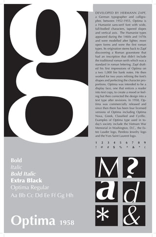
I created this Optima type poster for my Introduction to Graphic Design Course. The emphasis of the project was to play around with the shapes of the variations of the Optima typeface.
young call girls in Pandav nagar 🔝 9953056974 🔝 Delhi escort Service
The History and Design of the Optima Typeface
1. DEVELOPED BY HERMANN ZAPF,
a German typographer and calligra-
pher, between 1952-1955, Optima is
a Humanist sans-serif font with wide,
full-bodied characters, tapered slopes
and vertical axis. The Humanist types
appeared during the 1460s and 1470s
and were modelled after lighter, more
open forms and were the first roman
types. Its origination stems back to Zapf
discovering a Roman gravestone that
had an inscription that didn’t include
the traditional roman serifs which was a
standard in roman lettering. Zapf draft-
ed his first impressions of Optima on
a two 1,000 lire bank notes. He then
worked for two years refining the font’s
shapes and perfecting the character pro-
portions. Optima was intended to be a
display face, one that entices a reader
into text copy, to create a mood or feel-
ing but then corrected the design into a
text type after revisions. In 1958, Op-
tima was commercially released and
since then there has been four licensed
versions of Optima including Optima
Nova, Greek, Classified and Cyrillic.
Examples of Optima type used in to-
day’s society include the Vietnam War
Memorial in Washington, D.C., the Es-
tee Lauder logo, Pandora Jewelry logo
and the Yves Saint Laurent logo.
d
M?
&
Bold
Italic
Bold Italic
Extra Black
Optima Regular
Optima 1958
a
*
Aa Bb Cc Dd Ee Ff Gg Hh
1 2 3 4 5 6 7 8 9
! @ # $ % ^ & * (