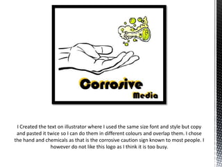
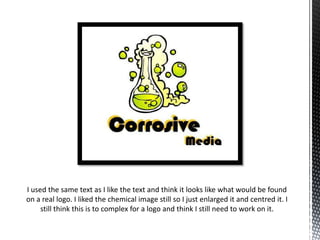
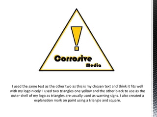
Gaby Skingle created three logo designs using the same text but varying the images and layout. The first logo overlapped the text in different colors with a hand and chemicals symbol. The second enlarged the chemical image and centered it with the text. The third used triangles representing a warning sign and included an exclamation mark made of geometric shapes combined with the text. Overall, Gaby felt the designs were too complex and needed further refinement.


![[rokonz.com] Glossary of Semantic SEO Part-2.pdf](https://cdn.slidesharecdn.com/ss_thumbnails/rokonz-260123200719-92199ba8-thumbnail.jpg?width=640&height=640&fit=bounds)


