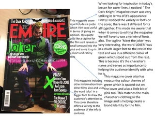
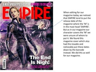
MORE ON MAGAZINES
When looking for inspiration in today’s
lesson for cover lines, I noticed ‘ The
Dark Knight’ magazine cover was very
striking in terms of it’s appearance.
Firstly I noticed the variety in fonts on
the cover, there was 3 different fonts
all together. This made me aware that
when it comes to editing the magazine
we will have to use a variety of fonts
also. The tagline ‘Meet the joker’ was
very interesting, the word ‘JOKER’ was
in a much larger font to the rest of the
text and was in a different colour of
green which stood out from the rest.
This is because it’s the character’s
name and serves as importance to
helping the audience identify with who
he is.
This magazine cover also has
reoccurring colour themes of
green which is spaced out on
the cover and also a little bit of
pink too. This matches the main
character’s clothing in the
image and is helping create a
brand identity for the film.
This magazine includes
other information from
other films also and uses
the word ‘plus’ in a
bigger font to draw the
audience’s attention in.
This cover therefore
offers a variety to the
audience of the info it
contains.
This magazine cover
also includes a quote
which I felt was useful
in terms of giving an
opinion. This quote
acts like a tagline for
the film as it reveals a
small amount into the
plot and sums it up in
a short and catchy
way.
When editing for our
magazine today, we noticed
that EMPIRE tend to put the
release date of the
magazine where the ‘M’ is
in the mast head ‘EMPIRE’.
But as in our magazine our
character covers the ‘M’ we
were unsure of where to
put it. We found this
magazine cover which also
had this trouble and
noticeably put these dates
down by the barcode
instead. We did this as well
for our magazine.

More on magazines

  • 1.
  • 2.
    When looking forinspiration in today’s lesson for cover lines, I noticed ‘ The Dark Knight’ magazine cover was very striking in terms of it’s appearance. Firstly I noticed the variety in fonts on the cover, there was 3 different fonts all together. This made me aware that when it comes to editing the magazine we will have to use a variety of fonts also. The tagline ‘Meet the joker’ was very interesting, the word ‘JOKER’ was in a much larger font to the rest of the text and was in a different colour of green which stood out from the rest. This is because it’s the character’s name and serves as importance to helping the audience identify with who he is. This magazine cover also has reoccurring colour themes of green which is spaced out on the cover and also a little bit of pink too. This matches the main character’s clothing in the image and is helping create a brand identity for the film. This magazine includes other information from other films also and uses the word ‘plus’ in a bigger font to draw the audience’s attention in. This cover therefore offers a variety to the audience of the info it contains. This magazine cover also includes a quote which I felt was useful in terms of giving an opinion. This quote acts like a tagline for the film as it reveals a small amount into the plot and sums it up in a short and catchy way.
  • 3.
    When editing forour magazine today, we noticed that EMPIRE tend to put the release date of the magazine where the ‘M’ is in the mast head ‘EMPIRE’. But as in our magazine our character covers the ‘M’ we were unsure of where to put it. We found this magazine cover which also had this trouble and noticeably put these dates down by the barcode instead. We did this as well for our magazine.