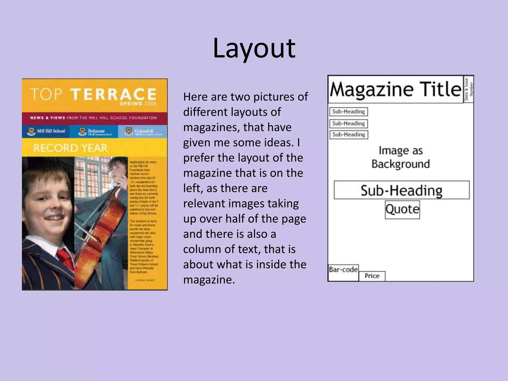
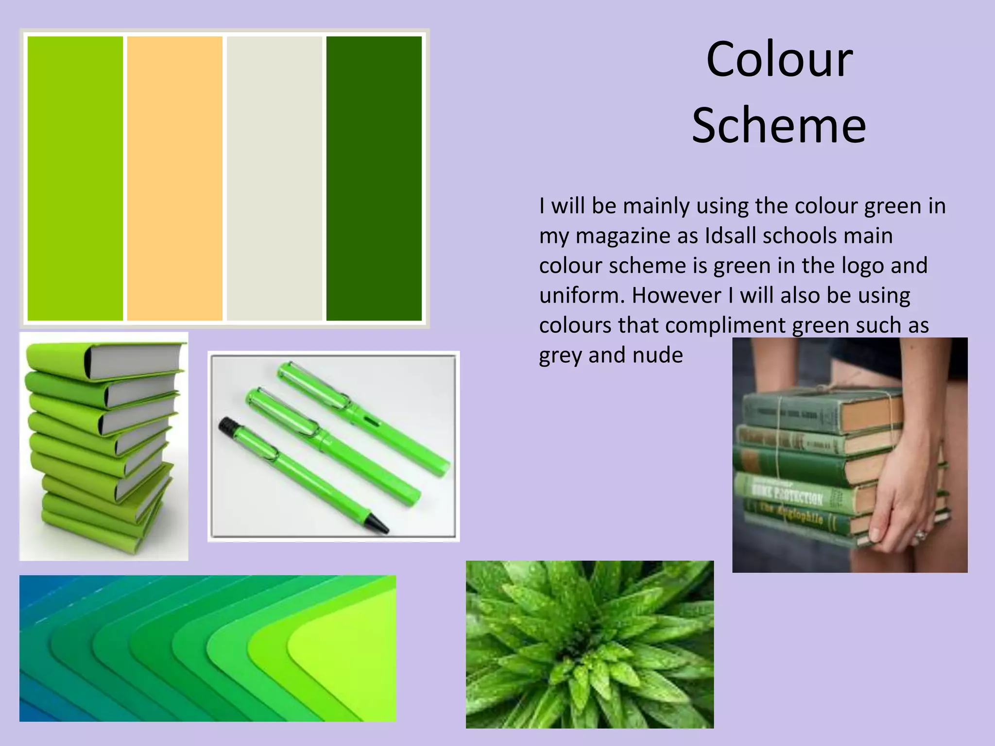
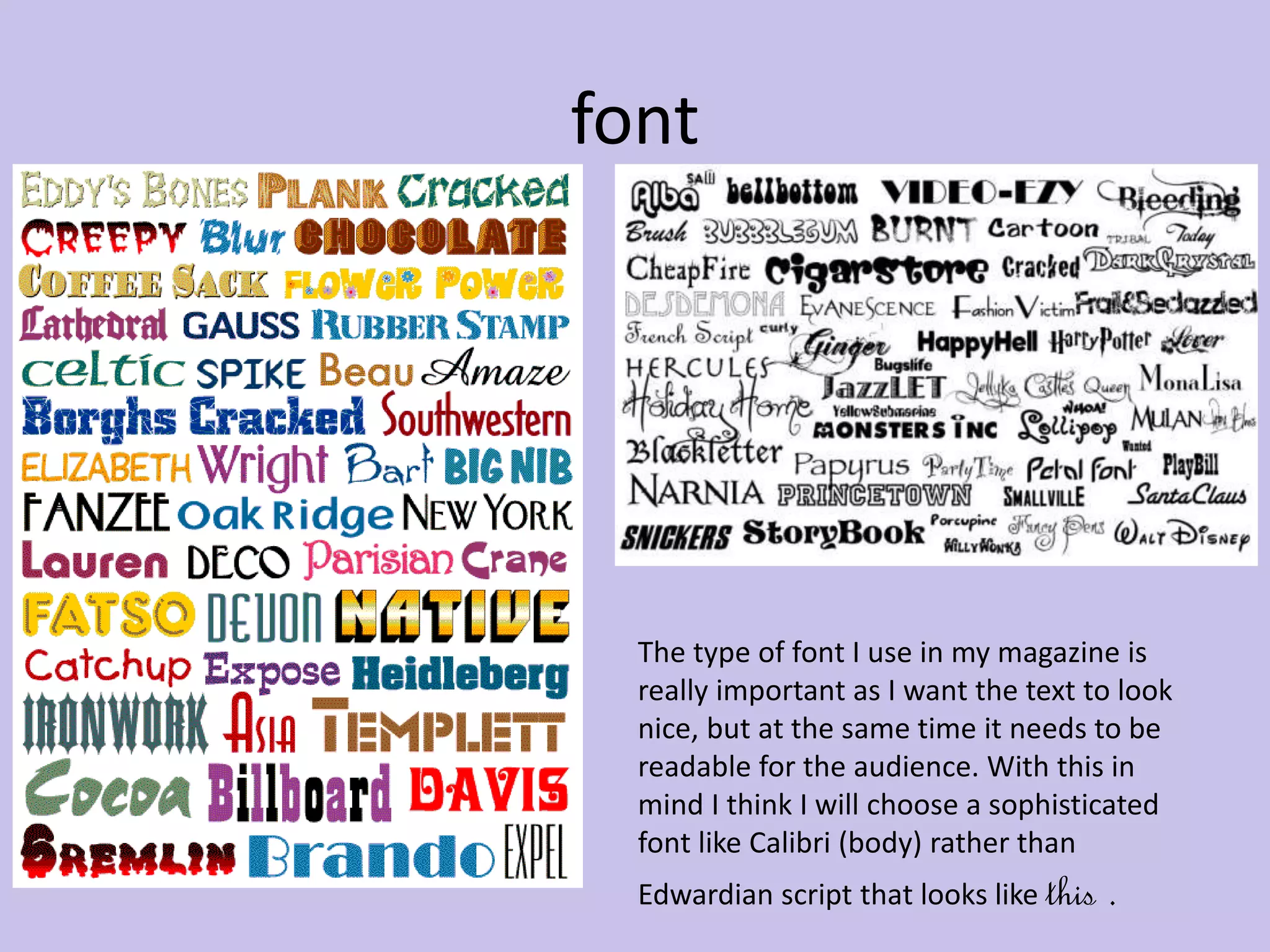
Images 
The use of images in my magazine is 
really important as I need to take 
relevant pictures that are linked into 
the text in the magazine. Here are 
some pictures of pupils and teachers 
around Idsall school, also a picture 
of the sports centre and the oak tee 
in the school logo.
Layout 
Here are two pictures of 
different layouts of 
magazines, that have 
given me some ideas. I 
prefer the layout of the 
magazine that is on the 
left, as there are 
relevant images taking 
up over half of the page 
and there is also a 
column of text, that is 
about what is inside the 
magazine.
Colour 
Scheme 
I will be mainly using the colour green in 
my magazine as Idsall schools main 
colour scheme is green in the logo and 
uniform. However I will also be using 
colours that compliment green such as 
grey and nude
font 
The type of font I use in my magazine is 
really important as I want the text to look 
nice, but at the same time it needs to be 
readable for the audience. With this in 
mind I think I will choose a sophisticated 
font like Calibri (body) rather than 
Edwardian script that looks like this .

prelim task- school mag (Mood board) AS media

  • 2.
    Images The useof images in my magazine is really important as I need to take relevant pictures that are linked into the text in the magazine. Here are some pictures of pupils and teachers around Idsall school, also a picture of the sports centre and the oak tee in the school logo.
  • 3.
    Layout Here aretwo pictures of different layouts of magazines, that have given me some ideas. I prefer the layout of the magazine that is on the left, as there are relevant images taking up over half of the page and there is also a column of text, that is about what is inside the magazine.
  • 4.
    Colour Scheme Iwill be mainly using the colour green in my magazine as Idsall schools main colour scheme is green in the logo and uniform. However I will also be using colours that compliment green such as grey and nude
  • 5.
    font The typeof font I use in my magazine is really important as I want the text to look nice, but at the same time it needs to be readable for the audience. With this in mind I think I will choose a sophisticated font like Calibri (body) rather than Edwardian script that looks like this .