Download as PDF, PPTX
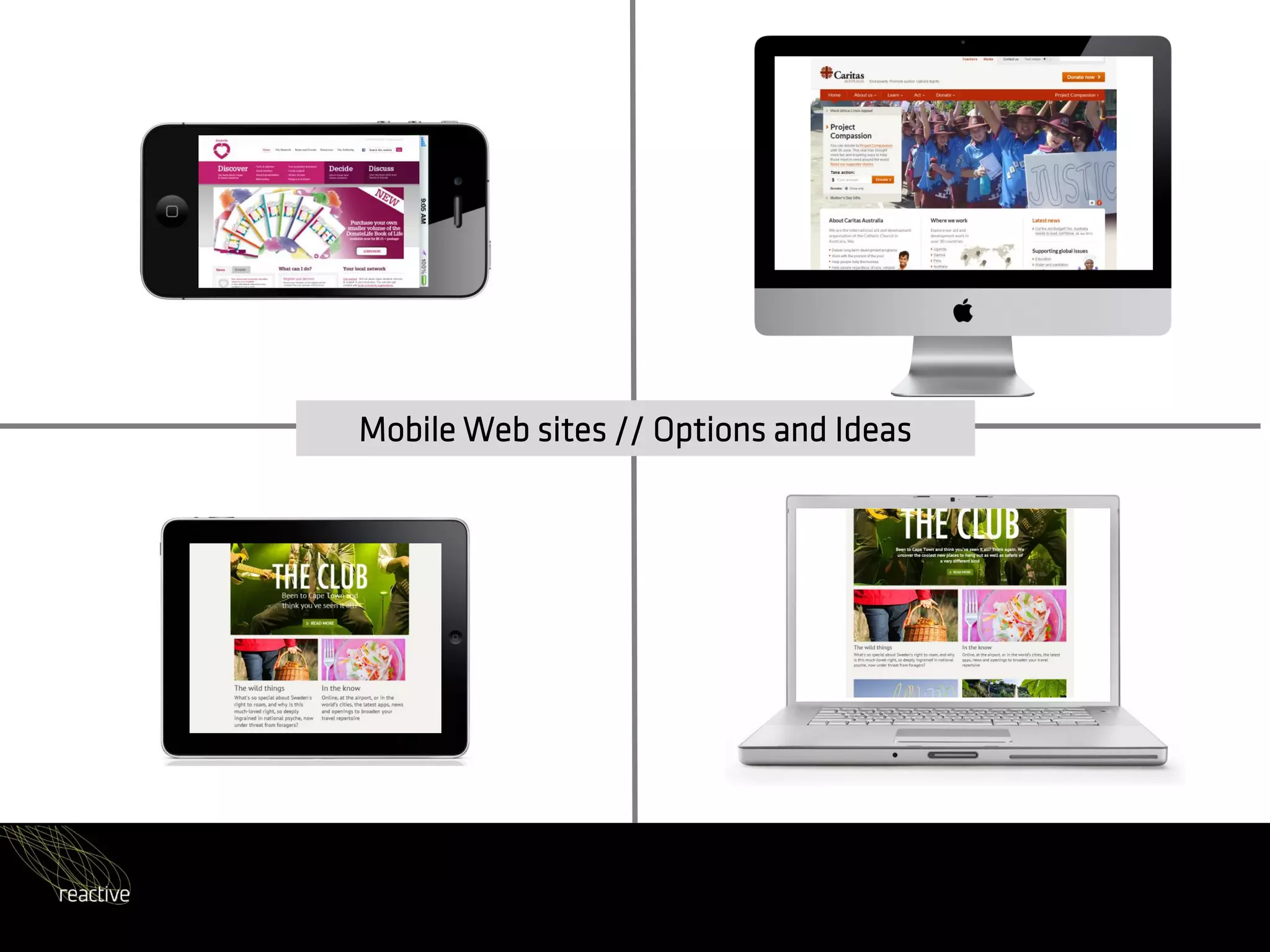

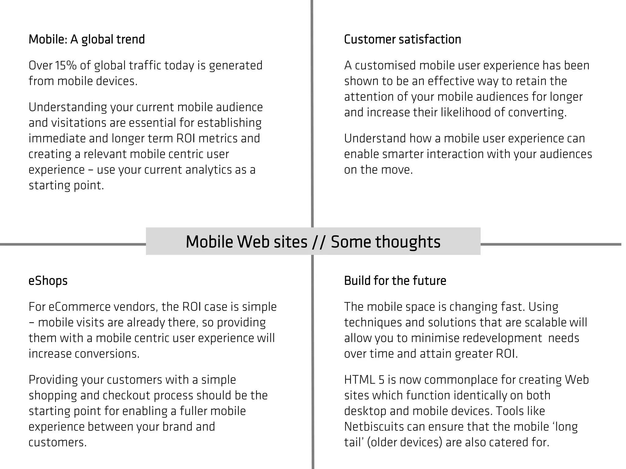

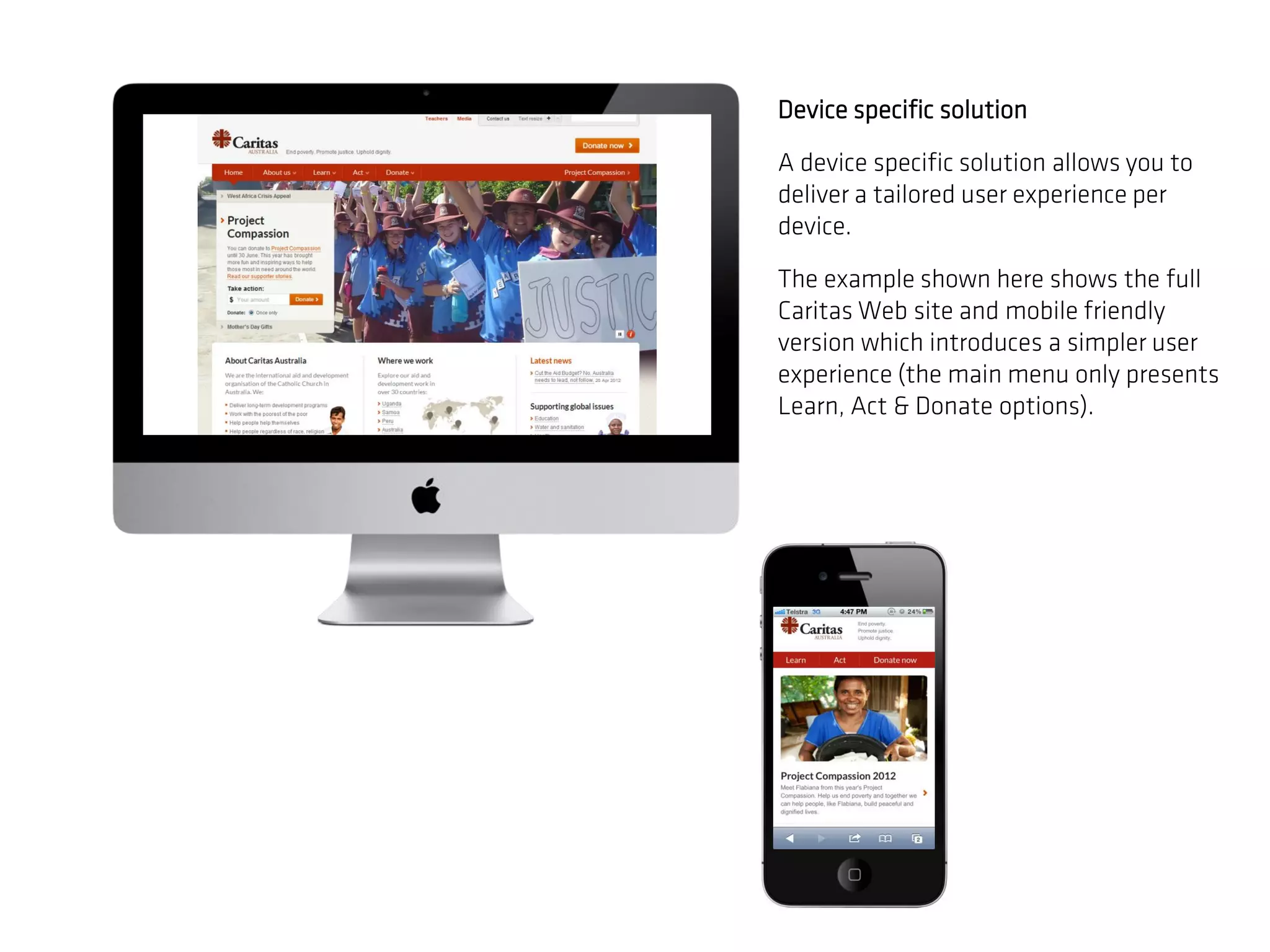
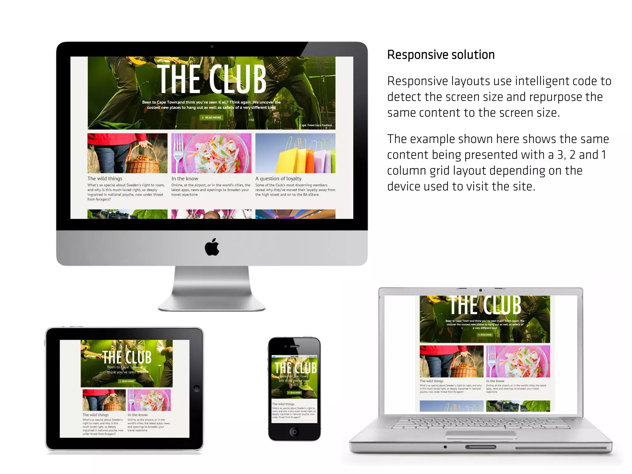
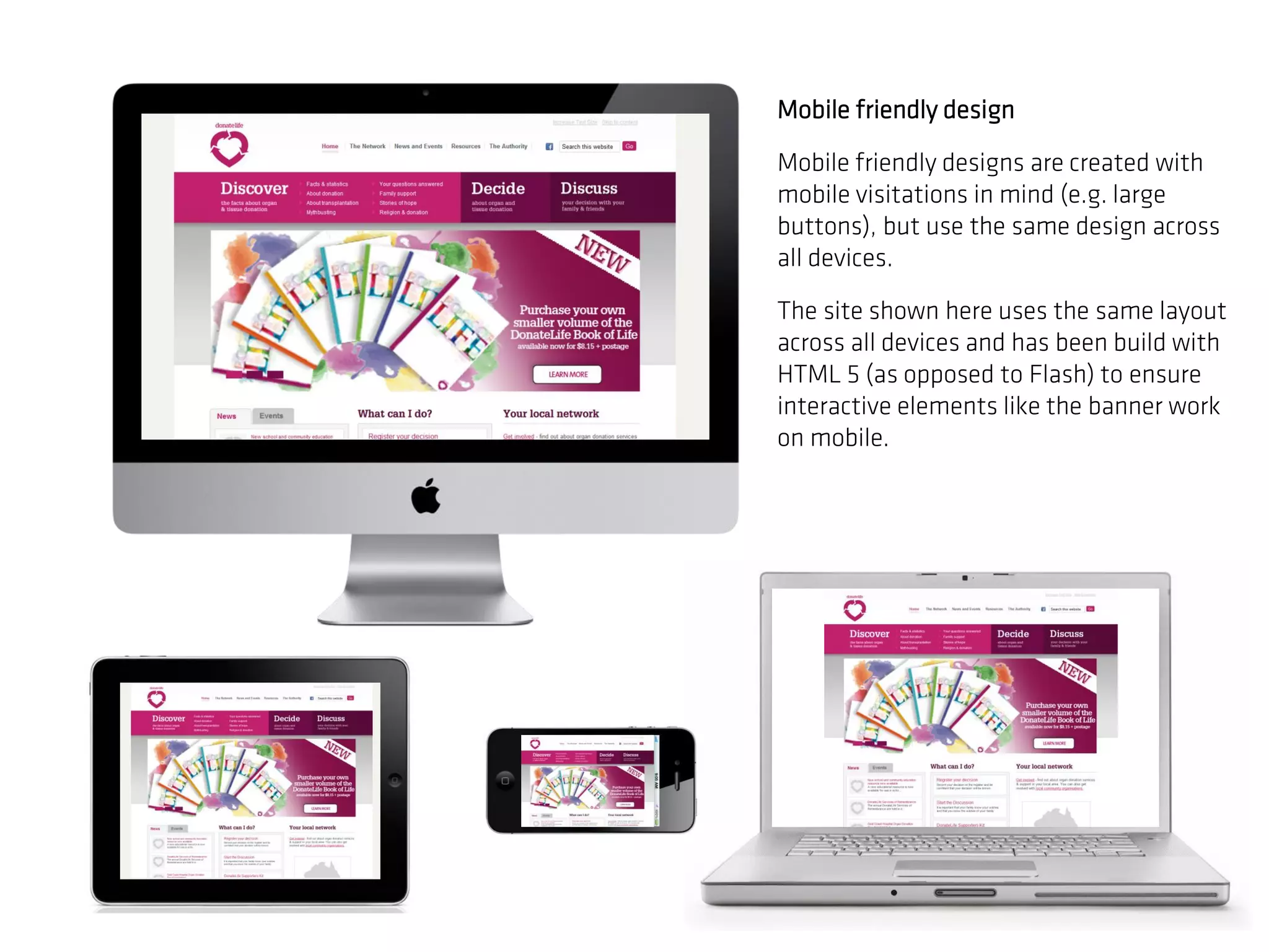
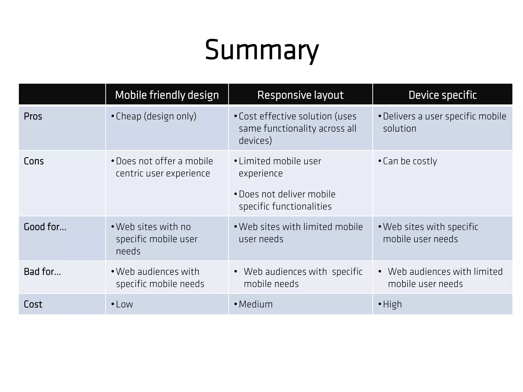

The document discusses the considerations and options for building mobile websites, highlighting the importance of a tailored mobile user experience to improve customer retention and conversions. It presents various solutions including device-specific designs, responsive layouts, and mobile-friendly designs, each with their pros and cons, while emphasizing the need for scalability and robustness. The document also encourages e-commerce vendors to think ahead and utilize analytics for better mobile engagement and ROI.


