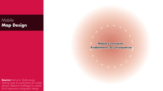
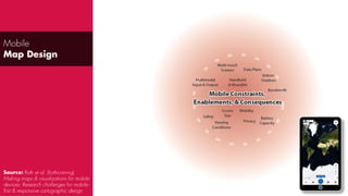
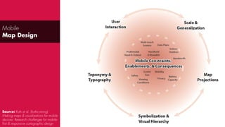
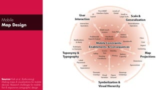
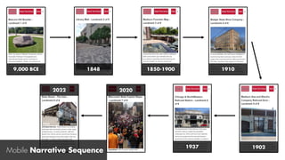
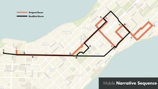
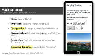
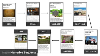
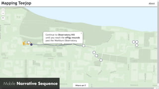
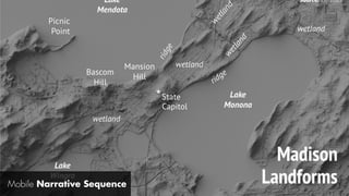
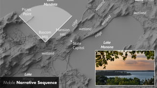
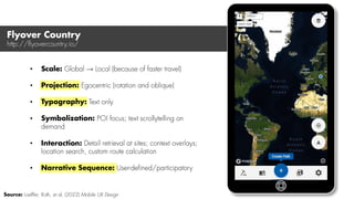
Lately, it seems that process became trendier than core leadership skills. Agile, Scrum, Kanban stole the focus.
BUT - it is leadership that fuels process adoption rather than process auto-magically fixing disfunction teams.
In this talk we'll explore what went wrong in this process adoption race: from hiring or promoting the wrong people, avoid setting clear expectations from our leaders, to dropping lean practices due to lack of deep understanding (forgetting why we started to begin with).
The dark side is interesting to explore, but we are here for the bright light - we will bring the FOCUS back to how we want our leadership to look like.
We'll try to figure out how we want our leaders to look like in the "Agile era"
Agenda:
== THE WHY ==
- The essence
- Goals balance
- Surviving in chaos
- Team leader definition
- Business vision
- Throughput .vs. latency
- Confidence is not cheap
- Risks management
- Beautiful code
- Beautiful document
== THE HOW ==
- Visibility over progress
- Must, Delegate and External
- Ownership as a driver
- Define “minimum working unit” early
- Define “done” that works for you
- Quality is God (or at least Jesus)
- Test to last
- Bullets knowledge base
- Estimate together
- Teach to move forward
الدليل المبسط لعمل هئية التمريض في المستشفى.pptxssuser139631
في هذا الدليل سوف نتعرف على كيفية تحديد وضعية المريض على السرير ،
وتعرف على أوضاع السرير الشائعة .
السرير الطبي هو سرير مصمم خصيصًا للمرضى المقيمين في المستشفيات أو غيرهم ممن يحتاجون إلى شكل من أشكال الرعاية الصحية. تتميز هذه الأسرّة بميزات خاصة لراحة المريض ورفاهه ولراحة العاملين في مجال الرعاية الصحية
Making Meaningful Maps: Seeing Geography through Cartographyreroth
Public lecture organized jointly by the Leibniz Institute for Regional Geography, Leipzig University, and the German Cartographic Society | November 15th, 2017. Abstract: Maps have gone viral: they are in our cars, on our phones, and across our news feeds. While the pervasiveness of maps is clear, has this popularity resulted in a tangible improvement to our collective geographic understanding? Is the world any better for the maps we make? In this presentation, I ask how we as cartographers, data scientists, and storytellers might bring more meaning to our work. I hang this discussion across three, multi‐month interactive mapping projects completed in the University of Wisconsin Cartography Lab that had complementary research and design elements. The projects covered very different datasets and contexts—climate change, globalization, and environment justice—but each afforded a deep engagement with domain experts and target users to puzzle through the design and delivery of a meaningful map product. Across these projects, my opinion on what mattered shifted away from the data, and even the map, to the people and places quantified by the data and represented in the map…to the geography. I conclude by brainstorming ways to bring more meaning to our map designs, helping our audience see the geography through our cartography to enable geographic thinking and promote global citizenship.
Invited talk given to Maptime AMS at De Waag in Amsterdam, the Netherlands | November 8th, 2017. Abstract: Professor Robert Roth will discuss emerging principles of user experience (UX) design for maps. The margin of success for geospatial technologies increasingly is in their design: it is not enough for mapping tools to simply work technically, they also must enable a productive and satisfying user experience. Cartographers increasingly are taking on the role of UX designer as maps move online and to mobile devices, blending established principles on cartographic representation with new ideas from interface design and usability engineering. In this presentation, Rob will give a crash course on UX, translating ideas from R&D into actionable design recommendations that can be applied to mapping projects of any scale.
Taxonomies for Interactive Cartography & Visualization: Invent!ory or Listless?reroth
Invited talk given to the ITC Twente VISresearch Group in Enschede, the Netherlands | October 18th, 2017. Abstract: A taxonomy is a classification of discrete states or conditions for an empirically observable phenomenon. Taxonomies are a common intellectual product of research on interactive cartography and visualization, used to articulate, evaluate, and critique the available “design space” for various visual decisions. However, taxonomies perhaps are too common in the literature today, making it difficult for both designers and researchers to choose an appropriate taxonomy for a given problem, much less to get a sense of how all taxonomies relate (or do not relate) to one another. In this presentation, I weigh the advantages and limitations of taxonomies for visual design and research, outlining the purpose of general taxonomies versus problem-oriented requirements. I then compare and contrast taxonomies used in representation design versus interaction design, such as Norman’s stages of interaction, Bertin’s visual variables with extensions from MacEachren, and my own composite taxonomy of interaction primitives. I conclude with open discussion through several interactive mapping and visualization examples by way of exploring my ad hoc “taxonomy of taxonomies”.
Towards a Science of Interaction: The Case for Empirical Research on Interact...reroth
Invited talk given to the City University of London giCentre lab | September 25th, 2017
Abstract: Interactivity is fundamental to exploratory visualization. While much of our time as researchers and designers is dedicated to information processing or graphic rendering, it is the interface to our designs that makes the visualization come alive for their users, that empowers them to spontaneously generate new and insightful views as they demand them, and that enables them to tinker, to question, to reason, and ultimately to discover the unknown. Accordingly, there are now numerous proposals in Information Visualization, Visual Analytics, and my home discipline of Cartography to establish a “science of interaction”. Yet, although there are a growing number of conventions, frameworks, and taxonomies for interaction design, relatively limited empirical research has been conducted by the visualization community on interaction. In this presentation, I discuss my research on the “science of interaction”, with a focus on interactive maps and geographic visualizations. I begin by summarizing a series of studies I conducted to empirically derive a taxonomy of interaction primitives, or basic building blocks of interaction. I then discuss how I employed this taxonomy for controlled experimentation on interaction design, using mapping case studies in crime analysis, public health, and environmental justice. I conclude with a call to action, outlining empirical challenges we must address to realize a “science of interaction”.
How Interactive Maps Work: Concepts, Methods, & Opportunitiesreroth
Invited talk given to the ITC Twente Department of Geo-Information Processing in Enschede, the Netherlands | September 7th, 2017
Abstract: Maps have gone viral: they are in our cars, on our phones, and across our news feeds. Further, professionals in a variety of fields use mapping technologies to address our planet’s most pressing problems: they organize activities during emergency and crisis events; they inform how best to cope with changing climates and demographics; they assist in managing local and global trade. However, advances in personal computing and information technologies have fundamentally transformed how maps are produced and consumed, as many maps now are highly interactive and delivered online or through mobile applications. Today, professionals and students alike must be able to both encode geographic information based on sound cartographic principles as well as how to code a useful and usable interface for exploring the resulting maps. While much of the empirical research in cartography over the past half century has addressed representation design, evaluating the graphic symbols employed to communicate meaning in geographic information, relatively few empirical studies in cartography approach interaction design, research that is needed to understand how to successfully design and implement digital mapping interfaces that meet user needs and promote geographic understanding.
My research grapples with the central question “How do interactive maps work?”, treating interaction as a fundamental complement to representation for cartographic design. In this presentation, I first make the case for cartography in the ever-widening discipline of GIScience by highlighting a series of recent developments in the United States. I then introduce my main research interests, providing a whirlwind tour through my recent contributions to interactive cartography and geographic visualization. In particular, I pair my conceptual research on interaction primitives—the basic building blocks of interaction design that mirror the visual variables in representation design—with my methodological research on user-centered design, putting theory into practice through several case study examples. I conclude by discussing research and design opportunities in interactive cartography, outlining several current projects I have underway on the topics of mobile map design, visual storytelling, and cartographic pedagogy.
The Design Challenge: A Day-long Mapping Workshop for Creativity and Discovertyreroth
Paper read at the 2017 Esri Education Conference in San Diego, CA | July 8th, 2017.
Abstract: In this paper, we report on lessons learned from an annual, day-long “Design Challenge” mapping workshop held at the University of Wisconsin-Madison. The Design Challenge brings together students from all sub-areas of geography to apply their critical, analytical, and mapping training to a cross-cutting geographic problem. The Design Challenge somewhat follows the mold of other lock-in-like coding and writing events, but is unique in its focus creativity and discovery. Specifically, the Design Challenge emphasizes the analytical and design thinking throughout the day, building several collaborative activities into the event, and focuses on the process of making rather than the final products. We have now held three Design Challenges on three very different geographic topics: the transnational hazardous waste trade in North America using a large and uncertain transaction dataset, climate change communication using a complex and disparate spatiotemporal fossil dataset, and a radical atlas of Madison using design inspiration from art and social theory. In the presentation, we discuss the importance of informal and non-traditional pedagogy for mapping, the logistics of the Design Challenge, and enduring lessons learned from the process.
Rethinking Cartography Curriculum to Train the Contemporary Cartographerreroth
Paper read at the 6th International Conference on Cartography & GIS in Albena, Bulgaria | June 14, 2016
Abstract: In this paper, I discuss my experience over the past five years restructuring the cartography curriculum at the University of Wisconsin–Madison to account for sweeping shifts in conceptual framings, mapping technologies, and professional expectations. To guide the refresh, I aligned the cartography curriculum to an orthogonal pair of axes: the traditional distinction in cartography between mapmaking and map use, and an emerging distinction between representation and interaction. A single course was designed to cover each of the four pairwise antipodes of the orthogonal axes, with a fifth course positioned at the intersection of these axes to integrate influences and technologies. In the paper, I discuss the pedagogical philosophy guiding the revised curriculum, the organization of design concepts and technical skills taught in each course, and lessons learned from my experience for keeping curriculum malleable as cartography continues to evolve.