#2 Thank organizers.
I’m excited to share observations and ideas around the topic of visual storytelling. These represent some preliminary thoughts on the role of new media in cartography, and I’ve tried to pull from some of your designs to stimulate discussion.
#3 Based on the cartosummit talk; recording available
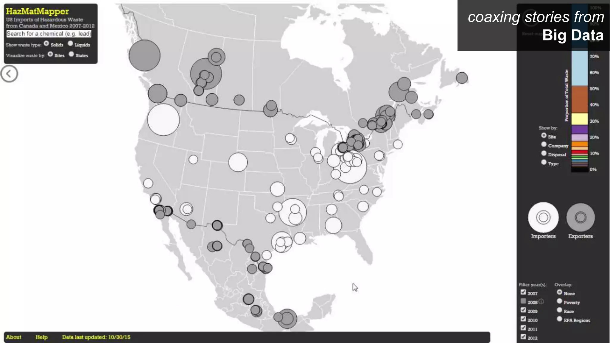
#4 I started getting interesting in visual storytelling and data journalism about two year ago when I was working with NOAA to design a visualization depicting changing water levels resulting from climate change. We had relative success creating interactive dashboards for expert stakeholders, but I think we were less successful in producing a product for a general audience.
This is particularly troubling with a topic like climate change, given the negative rhetoric and denial of climate change science, but also is true for many of the world’s most pressing problems.
Our current research canon has helped us design for the perceptual and cognitive limits of our target audience, but has shed significantly less light on how to design maps that make geography relatable and meaningful this audience.
#5 Visual storytelling is one opportunity in which cartography can borrow from the digital humanities, making use of new media to make our maps more relevant.
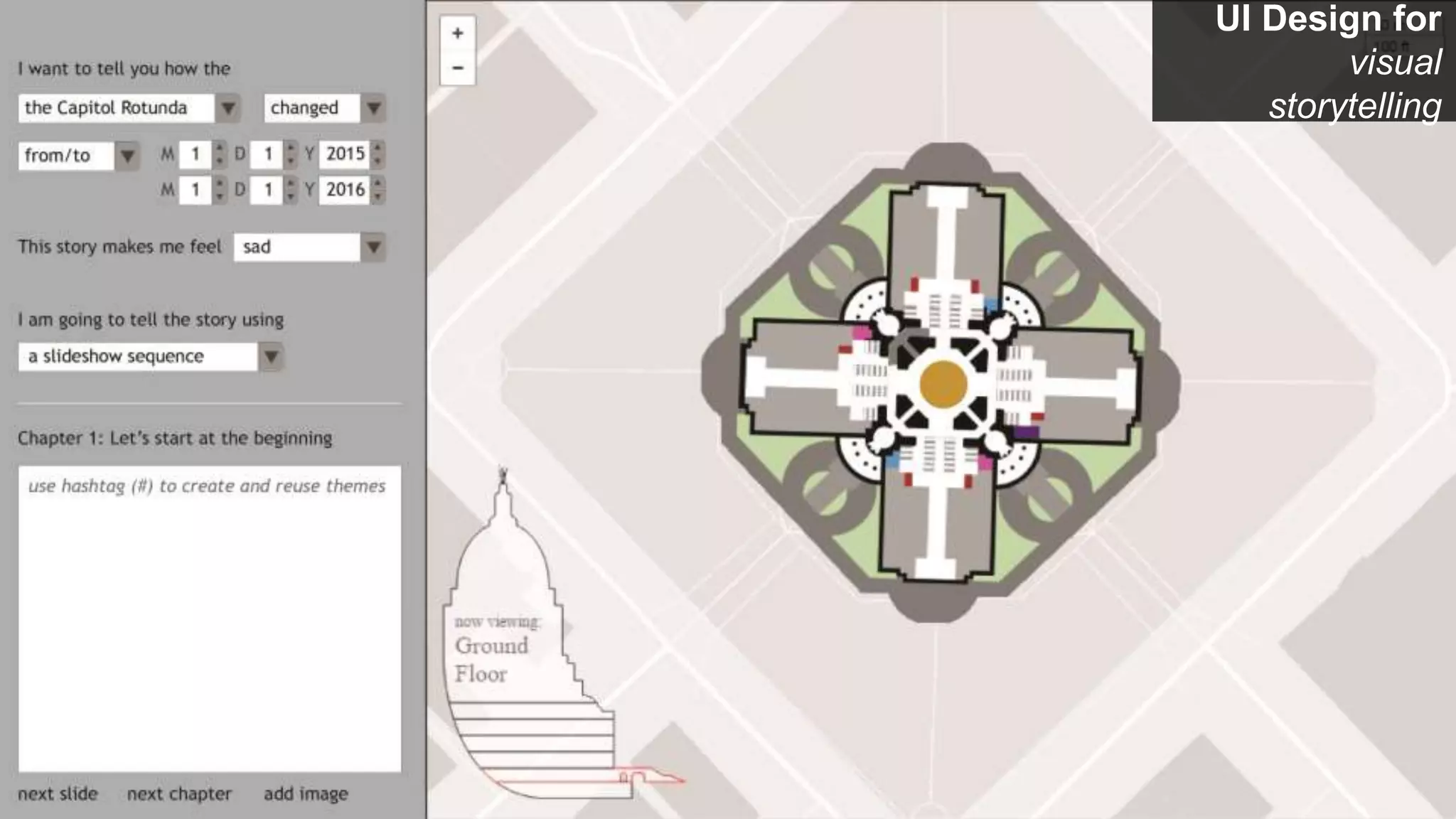
From what I could tell, the term visual storytelling has it’s roots in film, but often is evoked for editorial cartography and data journalism. Here, the map is structured less by a geography, and more by a narrative in which characters evolve from beginning to end.
The story’s narrative is defined by a discrete, typically linear sequence of events, or acts. Can be narrative templates that help us create storymaps.
#6 Based on the approach for enforcing linearity, and also for use of new media in the design.
#7 Linearity is enforced by changing slides.
Relate to Esri storymaps
#8 Linearity is enforced by scrolling and hyperlinking content.
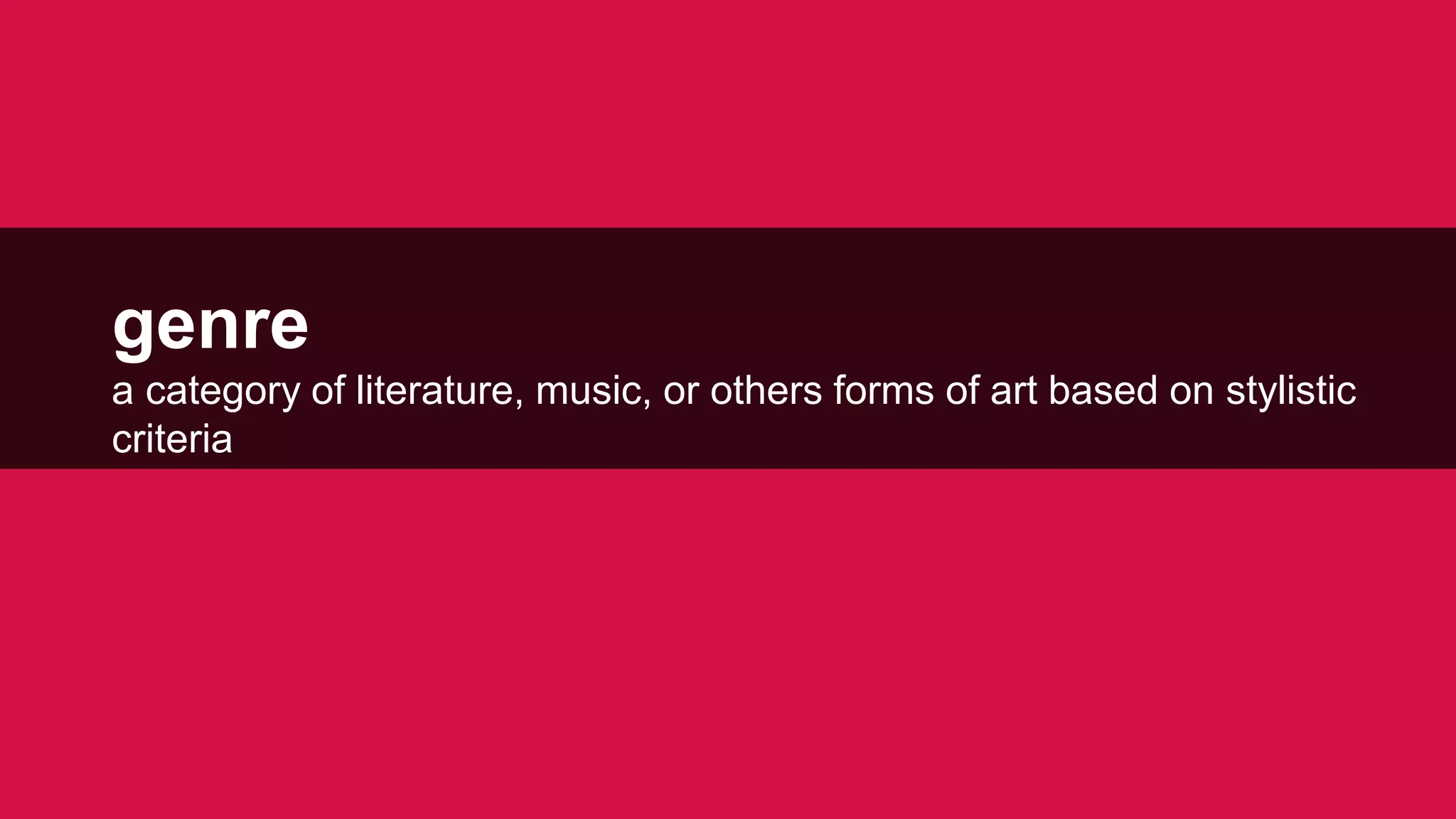
#9 Genres are like different thematic map types: different visual story types
#10 In the next several minutes, I want to discuss several ways in which a storytelling approach may led us to more effective cartographic design.
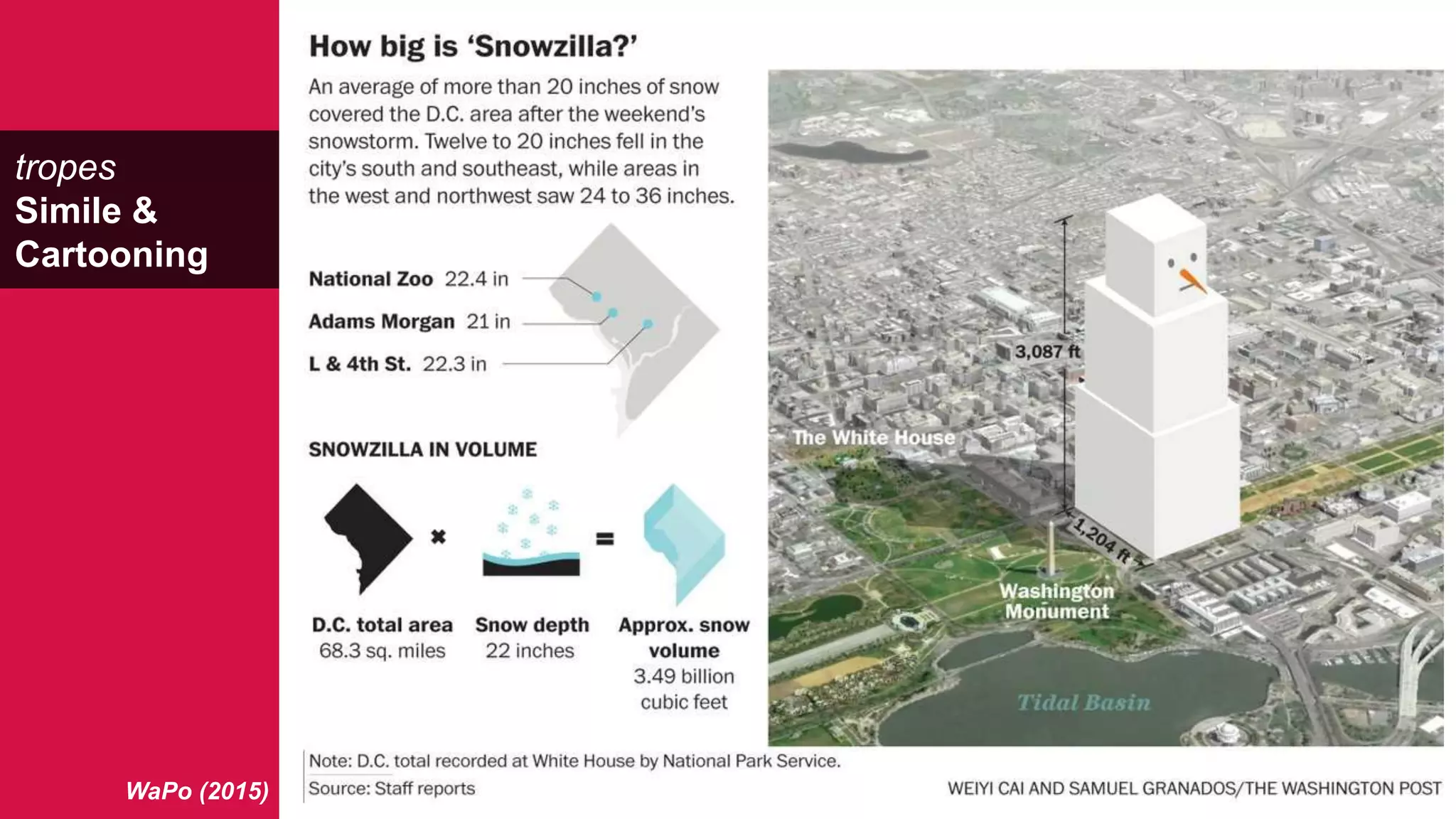
Specifically, I want to introduce the concept of tropes in visual storytelling, and how they may impact our design. A trope is a literary or rhetorical device used to advance a story. And so if in literature we have these figures of speech, to we have similar figures of visual storytelling that we can use in our graphic design?
#11 The tropes are like different visual variables: different design solutions / approaches to visual storytelling.
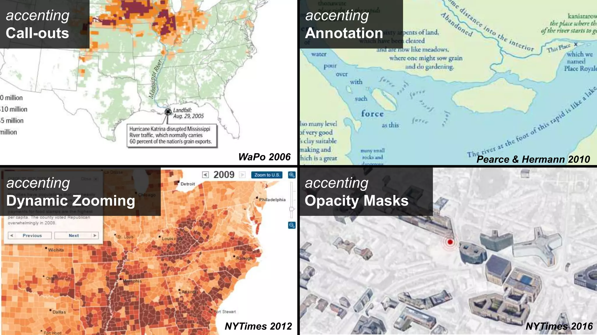
#12 Information dosing
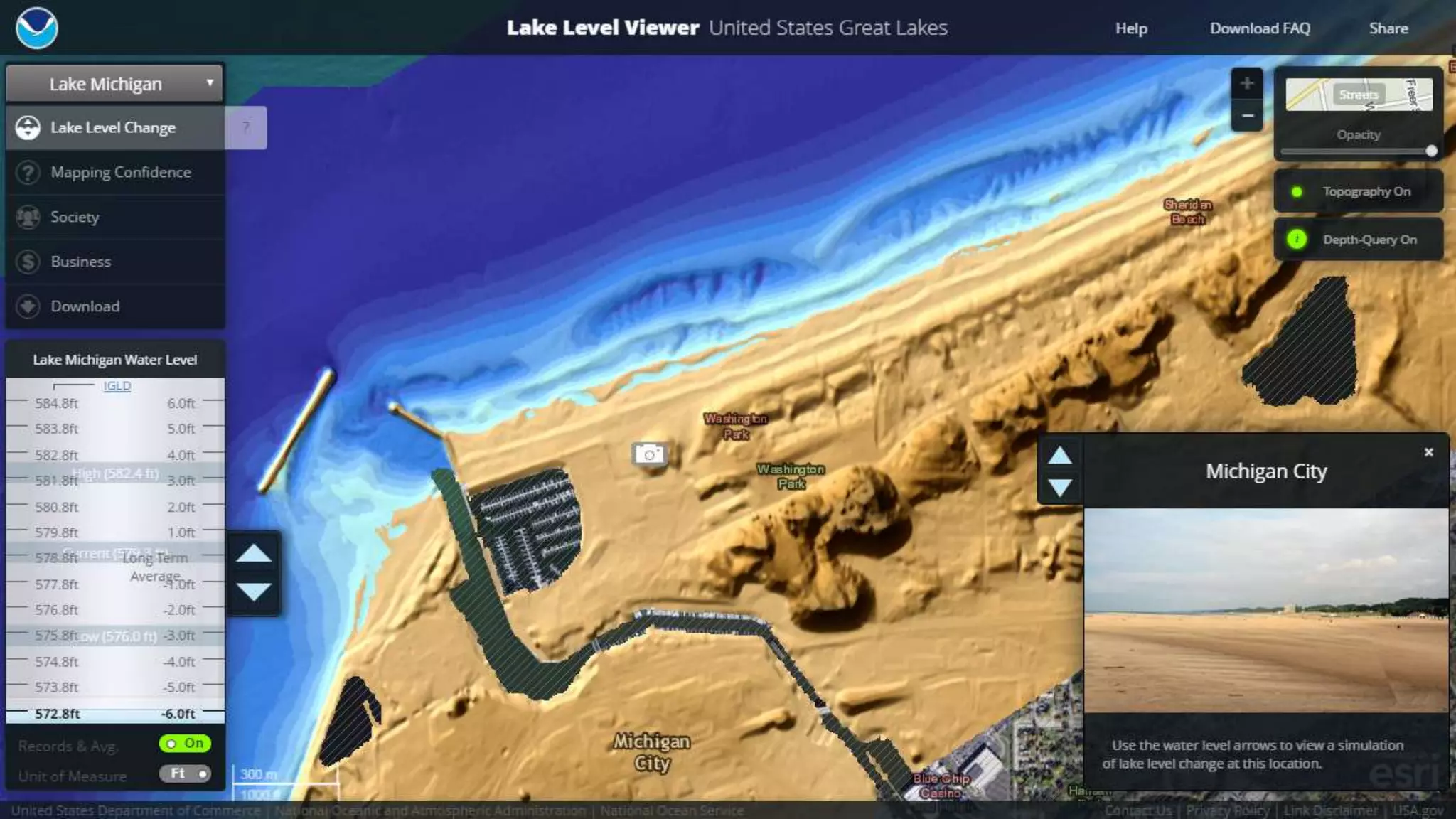
From call-outs and opacity masks to those afforded by new media, such as dynamic zooming, user-generated hightlighting, and information popups.
#14 Connect across different portions of the story.
Use the visual variables for redundancy across graphics and development of motifs, rather than for representing information.
#15 Much like Mark Harrower’s visual benchmarks, but with the benchmark a meaningful and hyperreal reference instead of an abstract symbol
#16 I started getting interesting in visual storytelling and data journalism about two year ago when I was working with NOAA to design a visualization depicting changing water levels resulting from climate change. We had relative success creating interactive dashboards for expert stakeholders, but I think we were less successful in producing a product for a general audience.
This is particularly troubling with a topic like climate change, given the negative rhetoric and denial of climate change science, but also is true for many of the world’s most pressing problems.
Our current research canon has helped us design for the perceptual and cognitive limits of our target audience, but has shed significantly less light on how to design maps that make geography relatable and meaningful this audience.
#17 In the next several minutes, I want to discuss several ways in which a storytelling approach may led us to more effective cartographic design.
Specifically, I want to introduce the concept of tropes in visual storytelling, and how they may impact our design. A trope is a literary or rhetorical device used to advance a story. And so if in literature we have these figures of speech, to we have similar figures of visual storytelling that we can use in our graphic design?
#23 Thank organizers.
I’m excited to share observations and ideas around the topic of visual storytelling. These represent some preliminary thoughts on the role of new media in cartography, and I’ve tried to pull from some of your designs to stimulate discussion.


![[BROCHURE] Italy Tour Project | @SlideON](https://cdn.slidesharecdn.com/ss_thumbnails/brochure8-251215152319-2805af68-thumbnail.jpg?width=640&height=640&fit=bounds)


