Download to read offline
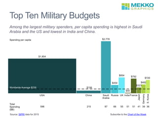


The document outlines the top ten military budgets of the largest military spenders. It highlights that per capita military spending is highest in Saudi Arabia and the United States, while it is lowest in India and China. The data referenced comes from SIPRI for the year 2015.


