Report
Share
Recommended
Blood Circulation & Flow
This document discusses blood circulation and regulation. It describes the structure and function of arteries, capillaries, and veins. It explains how blood flows through the peripheral and pulmonary circulatory systems. It also covers the local and neural control of blood flow, dynamics of blood pressure and flow, and long-term regulatory mechanisms like the renin-angiotensin system that control blood pressure. Finally, it defines shock and its stages when blood flow to tissues is inadequate.
Sweetpotato pig feed
Over the last three decades, pig populations and pork consumption have increased significantly in Uganda, providing income for rural and peri-urban households. However, pig productivity is low due to inadequate and seasonal feed availability. Sweetpotato residues are commonly used but availability is limited to certain seasons. Farmers resort to lower quality alternative feeds or destock herds during feed shortages. Sweetpotato silage making is proposed as a feed conservation strategy to mitigate shortages. A business case study examines a multi-level model for organized sweetpotato value chains, conservation through silage making, and marketing of silage specifically for pig feeds. The model aims to strengthen linkages between pig farmers and sweetpotato traders while building capacity for entrepreneur
Про що треба пам’ятати учасникам зно 2014 року (Опора)
Про що треба пам’ятати учасникам зно 2014 року (Опора)
Decalogo equipo 5 9 b (1)
Este documento presenta un decálogo para convivir en armonía. Sus principios incluyen ser ordenados, creativos, responsables, autónomos, respetuosos, puntuales, cuidadosos, trabajadores, unidos como equipo y mantener una alta autoestima para no desmotivarse ni fracasar.
Untitled Presentation
Haiku Deck is a presentation tool that allows users to create Haiku style slideshows. The tool encourages users to get started making their own Haiku Deck presentations which can be shared on SlideShare. In just a few sentences, it pitches the idea of using Haiku Deck to easily create brief, visually focused presentations.
CAROL CHAMBERS RESUME JULY 2014
Carol Chambers is a certified nursing assistant and experienced caretaker seeking a position as a CTH2 Counselor. She has over 10 years of experience providing personal care and assistance to patients, including bathing, feeding, grooming, vital sign monitoring, and mobility assistance. Chambers is empathetic, a good listener, and able to follow instructions and adapt to new situations. She has reliable transportation and strong communication skills.
Boletim 1
O boletim oficial número 1 da Copa Cebolão Atacadista de Futsal 2015 - Taça Ecotrat da Fundação Fexponece relata os resultados da primeira fase do torneio realizado em 16 de janeiro de 2015, incluindo as parciais de três partidas e os patrocinadores do evento.
VIDA SANA
El documento ofrece consejos a los padres sobre cómo hablar con sus hijos acerca de la sexualidad y las relaciones de manera adecuada y saludable. Recomienda no tener miedo de abordar estos temas y en su lugar proveer información correcta para que los hijos tomen mejores decisiones. También enfatiza la importancia de establecer límites claros sobre las relaciones de los adolescentes.
Technology
The document discusses three technologies the author learned to use during the construction of their final project. They learned to use the zoom and erase tools in Paint to precisely edit images. They also learned to use Photoshop's cropping tools to cleanly cut out images and place them on white backgrounds. Finally, they learned to use SlideShare to upload PowerPoint presentations and copy the HTML to include the slides in their blog.
Nme magazine 1985
The document summarizes and compares two front covers of NME Magazine from 1985 and 2011. Some key differences noted are:
1) The 1985 cover has a lower printing quality and simpler masthead compared to the 2011 cover, which has clearer photography due to advances in technology.
2) The 1985 cover uses a coupon to attract customers during a post-war economic period, while the 2011 cover no longer needs incentives, showing the magazine's increased sophistication.
3) Both covers feature the artist prominently at the center maintaining eye contact with the reader, demonstrating consistency in NME's cover design over time.
Co
The double page spread features a large black and white photo of a band taking up over half the page. Additional information about the band and other similar artists is provided in boxes with contrasting colors. The article uses bold fonts, varying colors, and column formatting to attract readers' attention and highlight key details about the featured band through a prominent quote and interview text.
Double page spread conventions
The double page spread features a large photo of the band wearing black clothes against a light blue background. The band's name is prominently displayed in bold black font that contrasts with the blue page. Additional information about the band and similar artists is provided in boxes with contrasting black and white colors. The interview is laid out in a column format with a large quote from the band in the splash color to entice readers.
Double page spread convention
The double page spread features a large main image of the band taking up over half the space. Information about the band is presented in a light blue font that contrasts the black clothes worn by the band in the photo. Additional side details about other similar bands are included in white writing on a black background. The font size allows for an in-depth interview in a column format with little white space and a prominent quote from the band in the splash color intends to intrigue readers.
Med26
I have chosen a single black and white photograph from my previous photo shoot with Darius for my double page spread to create a calmer atmosphere. I edited the image to black and white to avoid clashes with the teal green box and text. The teal green box at the top further enhances the house style. The quote "Dark and Light" is a play on words referring to the black and white image but will also be mentioned in the upcoming interview. I used white text below the black text to further signify dark and light. I provided a brief overview of the opposite page without making it too detailed.
Med24
1) The document summarizes the layout and design elements of a rock music magazine cover and contents page.
2) It describes graphical elements like the main image of a rocker and band name that reinforce the genre.
3) Informational elements like the issue number, date, and section titles and subtitles help organize the contents for readers.
Med18
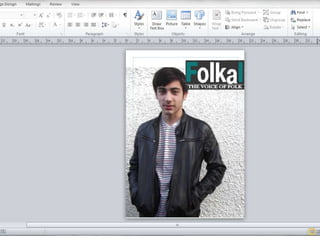
The main image on the magazine cover is of an artist to attract readers who are fans of him. His name, "DARIUS", is written in bold white font against his dark jacket to make it stand out and immediately grab readers' attention. Additional text uses symbols like "+" and mentions other folk artists to intrigue readers and lure them into buying the magazine to read more about the featured artist. As is standard, the bar code is placed in the bottom right corner and includes pricing details.
Med17
The document summarizes key design elements of magazine covers. The 50 is highlighted in orange to stand out from the black text. The masthead, in a dark grey rectangle at the top, informs readers of the magazine title and genre. The strapline uses enticing phrases in eye-catching fonts and placements to intrigue readers about the magazine's contents. The price is featured above the barcode in a small, understated font as magazines may be considered expensive during an economic crisis.
Med12
The document discusses design choices for the front cover of a magazine. It describes using orange text in a box to announce "IS BACK" to grab readers' attention about the return of the main feature, Darius. It also uses teal green font from the masthead title over a black box to incorporate the title and make the writing more visible. Finally, it uses the words "booze, drugs and rehab" under Darius' name to intrigue readers about what he has been doing.
More Related Content
More from kjenkins1825
Technology
The document discusses three technologies the author learned to use during the construction of their final project. They learned to use the zoom and erase tools in Paint to precisely edit images. They also learned to use Photoshop's cropping tools to cleanly cut out images and place them on white backgrounds. Finally, they learned to use SlideShare to upload PowerPoint presentations and copy the HTML to include the slides in their blog.
Nme magazine 1985
The document summarizes and compares two front covers of NME Magazine from 1985 and 2011. Some key differences noted are:
1) The 1985 cover has a lower printing quality and simpler masthead compared to the 2011 cover, which has clearer photography due to advances in technology.
2) The 1985 cover uses a coupon to attract customers during a post-war economic period, while the 2011 cover no longer needs incentives, showing the magazine's increased sophistication.
3) Both covers feature the artist prominently at the center maintaining eye contact with the reader, demonstrating consistency in NME's cover design over time.
Nme magazine 1985
The document summarizes and compares two front covers of NME Magazine from 1985 and 2011. Some key differences noted are:
1) The 1985 cover has a lower printing quality and simpler masthead compared to the 2011 cover, which has clearer photography due to advances in technology.
2) The 1985 cover uses a coupon to attract customers during a post-war economic period, while the 2011 cover no longer needs incentives, showing the magazine's increased sophistication.
3) Both covers feature the artist prominently at the center maintaining eye contact with the reader, demonstrating consistency in NME's cover design over time.
Co
The double page spread features a large black and white photo of a band taking up over half the page. Additional information about the band and other similar artists is provided in boxes with contrasting colors. The article uses bold fonts, varying colors, and column formatting to attract readers' attention and highlight key details about the featured band through a prominent quote and interview text.
Double page spread conventions
The double page spread features a large photo of the band wearing black clothes against a light blue background. The band's name is prominently displayed in bold black font that contrasts with the blue page. Additional information about the band and similar artists is provided in boxes with contrasting black and white colors. The interview is laid out in a column format with a large quote from the band in the splash color to entice readers.
Double page spread convention
The double page spread features a large main image of the band taking up over half the space. Information about the band is presented in a light blue font that contrasts the black clothes worn by the band in the photo. Additional side details about other similar bands are included in white writing on a black background. The font size allows for an in-depth interview in a column format with little white space and a prominent quote from the band in the splash color intends to intrigue readers.
Med26
I have chosen a single black and white photograph from my previous photo shoot with Darius for my double page spread to create a calmer atmosphere. I edited the image to black and white to avoid clashes with the teal green box and text. The teal green box at the top further enhances the house style. The quote "Dark and Light" is a play on words referring to the black and white image but will also be mentioned in the upcoming interview. I used white text below the black text to further signify dark and light. I provided a brief overview of the opposite page without making it too detailed.
Med24
1) The document summarizes the layout and design elements of a rock music magazine cover and contents page.
2) It describes graphical elements like the main image of a rocker and band name that reinforce the genre.
3) Informational elements like the issue number, date, and section titles and subtitles help organize the contents for readers.
Med18
The main image on the magazine cover is of an artist to attract readers who are fans of him. His name, "DARIUS", is written in bold white font against his dark jacket to make it stand out and immediately grab readers' attention. Additional text uses symbols like "+" and mentions other folk artists to intrigue readers and lure them into buying the magazine to read more about the featured artist. As is standard, the bar code is placed in the bottom right corner and includes pricing details.
Med17
The document summarizes key design elements of magazine covers. The 50 is highlighted in orange to stand out from the black text. The masthead, in a dark grey rectangle at the top, informs readers of the magazine title and genre. The strapline uses enticing phrases in eye-catching fonts and placements to intrigue readers about the magazine's contents. The price is featured above the barcode in a small, understated font as magazines may be considered expensive during an economic crisis.
Med12
The document discusses design choices for the front cover of a magazine. It describes using orange text in a box to announce "IS BACK" to grab readers' attention about the return of the main feature, Darius. It also uses teal green font from the masthead title over a black box to incorporate the title and make the writing more visible. Finally, it uses the words "booze, drugs and rehab" under Darius' name to intrigue readers about what he has been doing.