
Recommended
More Related Content
What's hot
What's hot (19)
Viewers also liked
Viewers also liked (16)
Recently uploaded
Recently uploaded (20)
Lrt map
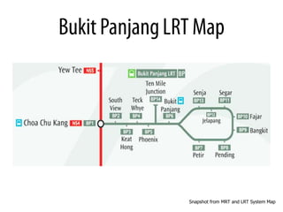
- 1. Snapshot from MRT and LRT System Map
- 2. • There are 2 platforms: Platform 1 and Platform 2. • There are also 2 LRT services: Service A which goes the Senja way and Service B via Petir. The track divides into 2 ways at Bukit Panjang Station. • Even though the train service goes 2
- 3. • This shows the Bukit Panjang LRT has 2 train services: Service A and B. Service A from Choa Chu Kang goes towards Senja, Service B from Choa Chu Kang goes towards Petir. • It divides into two different ways after Bukit Panjang Station, and it goes a loop. • It also shows that normally Platform 2 will not open unless during peak hours, but for people who do not know this, it is an disadvantage for them. As some people are not aware of the Wikipedia info and not all
- 4. • Inform passengers on train schedule(timing) –Eg. Next train: 3mins
- 5. • Inform passengers of the different stops/stations the train service will go to • Direct passengers which way to go to
- 6. Service A, B and a overall LRT route Service A, B and a overall LRT route under Platform 2 Map. under Platform 1 Map.
- 7. Arrow Arrow indicating the indicating direction the direction Service A via Senja (It goes towards Service B via Petir (It goes towards Senja’s way first) then one around back Petir’s way first) then one around back
- 9. Platform 1: Showing the next Service and the timing of next service. Platform 2: Normally not in service, only when it is during peak hours
- 10. • People stood in front of the map for a long time • It took them some time to figure out what the map is actually showing • People do not understand the map • People having confused look on their faces • Some of the people didn’t even realize there’s an arrow indicating the route individual service is going • People do not know where to stand to wait for the LRT, they just follow the crowd • Many people stand at Platform 2 because they do not know Platform 2 is not in service
- 11. • Personal Experience(First time taking the LRT): – Confused after looking at the map • 2 platforms, only 1 is in service • 1 platform, 2 Services (Service A and B) • Didn’t know which service to take – Map is not straight forward • No indication on Via Senja or Via Petir (The only indication is an arrow, which is not obvious enough) – Didn’t know Platform 2 is not in service because the screen showing words flashing is fast and not obvious enough – Color of the arrow is same as the route, which is gray. There’s no contrast
- 12. Person A, which is the stranger, was on the same LRT ride with me from Choa Chu Kang • Person A: Excuse me, does this train goes to Jelapang Station? I looked at the map for a long time but didn’t get it, in the end I just took it without knowing, so I need your help to get to the station. • Me: I…think so. (Reason I answered this is because the LRT hasn’t reach Bukit Panjang station yet so I myself forgot which service I took as each service goes different ways, that is why
- 13. • Person 1: – Confused over the platform and train schedule on the screen: As there are 2 platforms, but only 1 platform is in service, and it includes both Service A and B. – Confused over the map: Couldn’t see the arrow that’s indicating the direction and the map looks messy
- 14. • Person 2: – Hard to understand the LRT Map: “It was little bit confusing at the first look. But after carefully reading it a few times, i then understood how the train moves along the map.” – “I didn't know which track was available, until i heard the announcement.” – “To be honest, I didn’t even realize there was an arrow, but now I find it confusing still.”
- 15. • Person 3: – “It’s very confusing to me” – “It’s not as direct as MRT’s one” – “It took me awhile to figure out what it is showing.” – “There’s no duration given between each station on the map”
- 16. Screen is: • Direct • Simple • Easy to understand
- 17. MRT Map: • Clear • Simple (One straight line down) • Straight forward • Not confusing • Provides duration between individual stop • One platform for one way
- 18. • Someone who just shifted into a new house at this particular area that have to take the LRT everyday to travel • Someone who is going to visit a friend that’s staying at the area that requires to take the LRT I decide to combine these 2 scenarios together since both scenarios needs a clearer and better map direction to find out their way or the service they need to take to get to their designated place.
- 19. Question to ask: • Instead of having 2 platforms providing the same services and 1 of the platform is normally not in use, why not make each platform provide individual service?
- 20. • Why not make one service to each platform? – Platform 1: Via Senja, Platform 2: Via Petir – It would be better so one map include only the stations the service go to – But might not be a good idea, reason why is platform 2 not in service normally is because it is not rush hour, so…it breaks down to: • Why not make the “platform not in service” more obvious to the passengers instead? • For the map, why not make it into one straight line instead of the whole map and using one small arrow to indicate the direction?
- 21. • Platform 1 – Service A, Platform 2 – Service B • One platform for one service
- 22. • LRT Map, One service – one route The difference between the 2 services
- 23. • Making the “NOT IN SERVICE” more obvious to people
- 25. • Using different colors to indicate the change of route
- 26. • I’m planning to do a few more ideation on the designs and after that I will be testing out on people so that I can improvise on the designs.