Download as PDF, PPTX
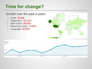
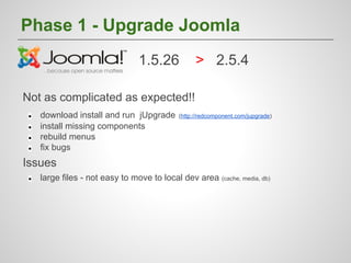
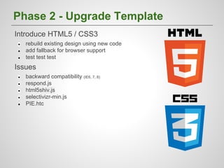

The document outlines the process of upgrading Joomla from version 1.5.26 to 2.5.4, detailing the phases of the upgrade including issues encountered with large files and backward compatibility. It emphasizes the importance of responsive design, highlighting mobile-first strategies, testing tools, and performance enhancements. Acknowledgments are given to various contributors and the Joomla community for their support during the upgrade process.


![5G Explained! A High Level Overview [Introduction]](https://cdn.slidesharecdn.com/ss_thumbnails/5gexplainedahighleveloverview-260119165306-cc137a3e-thumbnail.jpg?width=640&height=640&fit=bounds)


