Id Alert 0904 Method Branding
•
3 likes•19,369 views

Tieto, a Finnish IT company, launched a new brand identity in late 2008 that shortened its name from TietoEnator to simply Tieto. The rebranding aims to modernize the company's image as it operates in 30 countries worldwide, primarily in Northern Europe and Russia, with about 16,000 employees. The new identity features a simplified wordmark in blue intended to communicate the company's focus on technology and innovation. While streamlining the name, the rebranding hopes to strengthen Tieto's position in the global IT market.

More Related Content
Similar to Id Alert 0904 Method Branding
Similar to Id Alert 0904 Method Branding (20)
More from Philip Unger
Id Alert 0904 Method Branding
- 1. New Identity Alert April 2009
- 2. NEW IDENTITY ALERT page 2 April 2009 Among the brand identities featured this month Is this the correct strategy? It is hard to find are FICO, Fiserv, StoneRiver, Axiata, OnLive, Gubb a compelling rationale for such a move. Virtually & Ellis, GLOBALFOUNDRIES, Intact Insurance, and every reason that would compel a company to the province of Alberta. rebrand would also make it try to communicate this as widely as possible. This issue also marks the fifth anniversary of New Identity Alert. This is the 33rd issue and over There are basically four reasons most corporate 360 brand identities have been featured (see the brand identities are created. One reason is that list towards the back of this issue). Some brands there has been a merger or major acquisition; have been featured more than once, mainly due a subsidiary or business unit is divested; a new to mergers. Xerox, for example, has been featured start-up or joint venture is launched; or there has twice since it has had two changes to its brand been a major change in the direction or focus of identity in the last five years. the company. Each one of these reasons warrants the company to explain to its stakeholders why Not surprisingly, a number of the companies they have (re)branded, and what the brand means. featured no longer exist, or they have changed, as a result of mergers, or spin-off. Axiata, which is In the end, the colour of the symbol or style of featured in this issue, “demerged” from TM, which the logotype is not the story. What the company was featured in the June 2005 issue. stands for and what, if anything, has changed or is changing in the company’s behavior – these are Reviewing all the past issues, there were no the issues which need to be communicated. Even surprises. Some of the trends noted in past issues if the brand identity has just evolved, it behooves are quite visible, such as spin-offs from large the company to let its stakeholders know what global (and well branded) companies adopting has, and what has not changed. amateurish brand identities. Finding these brand identities and writing about There were, no doubt, interesting brand them continues to be a tremendous learning identities launched in the past five years and have experience. It will be fascinating to explore and not been featured. One reason for missing them find the next 360 brand identities. is that some companies decide to launch brand identities without issuing a press release and attempt to keep the new brand identity out of the public limelight.
- 3. NEW IDENTITY ALERT An occasional survey of new corporate brand page 3 identities compiled from on-line news sources April 2009 by Method Branding. F I CO Fair Isaac, the company that has created a leading credit score system, has changed its name in March to FICO™, the name of its credit rating. With its head office in Minneapolis, FICO also has offices in Japan, China, Australia, Singapore, the UK and Brazil to serve its customers in over 80 countries. Its credit rating products and services are said to “increase customer loyalty and profit- OLD BR AND iDeNtit y ability, cut fraud losses, manage credit risk, meet regulatory and competitive demands, and rapidly build market share” and are used by many of the leading banks, insurance companies, and retailers around the world. Comment Considering the business they are in, this is a very appropriate wordmark. Sombre colour and straightforward typography are the correct elements for this company. FICO is not responsible for the economic turmoil, but it is very much involved in the efforts of financial institutions to overcome the challenges (a kind word) that they are faced with. Solid, no nonsense for FICO is good, and is better than the Fair Isaac look. The name change also makes sense, given the strength of the myFICO brand. One wonders, though, having adopted the FICO name, why the myFICO wordmark has not been updated to be consistent with the corporate wordmark. The other question is why they have decided to maintain Fair Isaac as the legal name of the company? No rationale for this decision was found on their site. Still, this is a well done brand identity. fico.com
- 4. NEW IDENTITY ALERT An occasional survey of new corporate brand page 4 identities compiled from on-line news sources April 2009 by Method Branding. F I s E R v This “world leader in information management and e-commerce systems for finan- cial services” unveiled its new brand identity in February. Fiserv also announced all of its products and services would be adopting the Fiserv name. Fiserv specializes in transactional technology solutions, such as products and services for online banking, electronic billing and payment, account OLD BR AND iDeNtit y processing, data warehousing, card manufacturing and personalization services, high-volume laser printing and electronic document distribution and archiving. Based in Brookfield, Wisconsin, Fiserv is a Fortune 500 company and states it has 20,000 employees in 250 locations worldwide, with over 18,000 customers. Comment The new wordmark is better than the old one. But how good is it? Compared to the FICO wordmark, the new Fiserv wordmark looks solid, but it also looks dated even if it is in orange, a colour in vogue for the past couple of years. For a six character name (including the letter i) the lettering style could have been less condensed, giving the name more breadth, even if it meant losing some of the verticality of the wordmark. There is not much excitement in the new word- mark. One only has to look at the brand identity for StoneRiver, a spin-off from Fiserv (see next page) to see the possibilities of what could have been. Even if it did not have a symbol, the new brand identity would certainly have benefitted from something more than simply a period following the name. fiserv.com
- 5. NEW IDENTITY ALERT An occasional survey of new corporate brand page 5 identities compiled from on-line news sources April 2009 by Method Branding. s TO N E R I v E R Following the sale of Fiserv Insurance Solutions to a private equity firm, the company’s new name and brand identity was launched at the same time as former parent Fiserv launched its own brand identity at the beginning of March. StoneRiver provides software and processing solutions to the insurance industry, from insurance companies, agents and brokers to OLD BR AND iDeNtit y pharmacies. Based in Brookfield, Wisconsin, StoneRiver has offices across the United States. Comment Is it coincidence that the name of the company that manages the equity fund that made the acquisition is Stone Point Capital (the brand identities do not look alike)? While it is not clear why the name StoneRiver was selected, it is nonetheless a strong, evocative name. The symbol with its overall shape and internal shapes accentuate the meaning of the name. The result is a brand identity that retains whatever brand equity it had with Fiserv being blue, and yet created a warm, friendly look with blue and grey: something one would not expect. The logotype is also very legible, a marked improvement over the old Fiserv. The interesting question, now, of course is which is more successful: the new Fiserv or StoneRiver brand identity? While the new Fiserv web site is stronger than StoneRiver’s, and without being privy to what transpired in both board- rooms, the StoneRiver symbol and logotype have more subjective appeal. stoneriver.com
- 6. NEW IDENTITY ALERT An occasional survey of new corporate brand page 6 identities compiled from on-line news sources April 2009 by Method Branding. G LO B A L F O U N D R I E s AMD and the Advanced Technology Investment Company (ATIC) announced at the beginning of March the launch of their joint venture, GLOBALFOUNDRIES, a semiconductor manufacturing company. The company will provide AMD with manufacturing, as well as offer services to third-party customers. The company is headquartered in Silicon Valley’s PAReNt BR AND iDeNtities Sunnyvale with facilities in New York state, Texas and Germany. Comment At first glance, the digital globe and logotype is attractive. The globe is expertly rendered, with gradients in all the small dots which vary in size and shape according to their position on the globe (see the detail to the lower right). However, with the lettering style for the De tAiL logotype, one is reminded of Arthur Andersen, the global accounting firm that collapsed in disgrace following the Enron debacle. Granted, these are different industries, but why draw the inevitable comparison? If they had opted for a different colour palette, with a different lettering style, they would have landed in a much better place. Also confounding is why the company uses GLOBALFOUNDRIES in capital letters in the text of its communications. GlobalFoundries in upper and lowercase letters is much easier to read. Just as logotypes in lowercase letters should not be set in lowercase in text, it is also absurd to write the company name in capitals letter in text, just because that’s the way it appears in the logotype (the exception being acronyms). globalfoundries.com
- 7. NEW IDENTITY ALERT An occasional survey of new corporate brand page 7 identities compiled from on-line news sources April 2009 by Method Branding. A x I ATA Following its “demerger” from TM in April 2008, Axiata launched its new name and brand identity at the beginning of April. The company is a key telecommunications company in several Asian countries, including Malaysia, Indonesia, Sri Lanka, Bangladesh, Cambodia, India, Singapore, Thailand, Pakistan and Iran. Some of the mobile brand names it operates under OLD BR AND iDeNtit y include Celcom, XL, Dialog, AKTEL, HELLO, Idea, Spice M1 and MTCE. Based in Malaysia and with over 25,000 employees, Axiata claims it has close to 90 million mobile subscribers in Asia. Comment This is a reasonably well executed brand identity. One can tell by the care that was taken to align the symbol’s longest vertical to the edge of the last letter a, and how the angle on the letter t aligns to the diagonal of the symbol. The symbol itself is fine, but not inspirational, ground- breaking or even striking. The bird-like symbol for TM is a more exciting icon. It is noteworthy that even though Axiata “de- merged” from TM, it was somehow still compelled to stay within the TM colour palette. The symbols are in the same colour range and the logotypes are virtually the identical blue. The characters also mimic the TM logotype, with the “shoulders” of the x and t also curved. It really seems that Axiata did not want to stray too far from its former parent. axiata.com
- 8. NEW IDENTITY ALERT An occasional survey of new corporate brand page 8 identities compiled from on-line news sources April 2009 by Method Branding. O N L I v E A new company was launched the third week of March, after seven years of “stealth” development. OnLive is “a revolutionary, on demand video game platform delivering the latest and most advanced games instantly, on any TV via a sleek, inexpensive MicroConsole, or on almost any PC or Mac.” Many games from the leading video game companies will be offered, including games from Electronic Arts, Ubisoft, Take-Two Interactive Software, Warner Bros. Interactive Entertainment, THQ Inc., Epic Games, Eidos, Atari Interactive and Codemasters. Based in Palo Alto, CA, OnLive was founded by Steve Perlman, credited on the OnLive web site as the inventor of QuickTime, WebTV and as holding over 80 US patents. The OnLive Game Service is expected to launch later this year. Comment Though the symbol is hardly a unique, original concept (see Grant Thornton, New Identity Alert, April 2008) this is still a well done brand identity. The Mobius loop idea is certainly appro- priate, given the core idea that video games can be played from existing televisions or computers without having to invest every few years in new game consoles. This is yet another orange brand identity, though the colour that appears to be on the web site is subjectively more interesting than the copper symbol colour used on a white background. The logotype is reasonably contem- porary and in general this brand identity is corporate and straightforward. One has to think this is a deliberate decision which will give the video games, with their decidedly more aggressive looks, more “visual” space. onlive.com
- 9. NEW IDENTITY ALERT An occasional survey of new corporate brand page 9 identities compiled from on-line news sources April 2009 by Method Branding. I N TA C T I N s U R A N CE With the close of the sale of its home, auto and business insurance subsidiary, ING Canada announced in late February that the subsidiary was changing its name and brand identity to Intact Insurance Company. Following the approval of the name change by its shareholders, the holding company ING Canada Inc., will be renamed Intact Financial OLD BR AND iDeNtit y Corporation. ING Canada claims it is one of the 60 largest Canadian publicly-traded companies, and Intact Insurance is the largest insurance company in the country. Based in Toronto, the company has 6,700 employees offering insurance under the Intact Insurance, belairdirect and Grey Power brands. Comment The President and CEO of ING Canada was quoted as saying, “We have the unique opportunity to launch a new brand that speaks to what consumers are looking for from an insurance company, and a brand that reinforces our custom- er orientation.” This is then a missed opportunity. One wonders how they could go from the regal (and quirky) lion symbol to this amateurish word- mark. With financial institutions in trouble around the world (granted Canada’s financial institutions have escaped the calamities of their international peers), this is not a brand identity that instills confidence in the management of the company. Were they told by their advertising agency or branding firm that this wordmark gives them a youthful, edgy look? What could have been the rational given for this? Or did the company just hand this to one of their internal desktop designers who had no idea what they doing? intactinsurance.com
- 10. NEW IDENTITY ALERT An occasional survey of new corporate brand page 10 identities compiled from on-line news sources April 2009 by Method Branding. T E N AYA C A p I TA L The venture capital unit of Lehman Brothers was sold off to an investment group that includes managers of the business. Founded in 1995 as Lehman Brothers Venture Partners, the company has raised over $1 billion, investing in a wide range of high-growth technol- ogy companies including software, consumer Internet, communications, semiconductors, OLD BR AND iDeNtit y electronics, and cleantech. Tenaya Capital has offices in Menlo Park, California, and Boston, Massachusetts. Comment There is something appealing in the hand drawn pine tree as the symbol for this venture capital firm that claims to be “Partners in Growth.” It takes the brand identity away from the formality of the Lehman Brothers wordmark. It’s unfortunate though that the logotype is not as successful. The word Tenaya is just big and bold, with no finesse and the word Capital virtually disapears given the light weight of the characters and the colour it’s in. There will be more new brand identities that are born as a result of these troubled times. Given that the demise of firms such as Lehman Brothers has a significant impact beyond those immediately affected, (employees, shareholders, customers, suppliers, etc.), we should hope that other brands to be created from this mess will be more successful, both in terms of their brand identities and of their success in the marketplace. tenayacapital.com
- 11. NEW IDENTITY ALERT An occasional survey of new corporate brand page 11 identities compiled from on-line news sources April 2009 by Method Branding. T I E TO Late last year this Finnish-based IT company launched its new brand identity, shortening its name to Tieto. Founded in 1968 as Tietotehdas, it merged in 1999 and became TietoEnator. With about 16,000 employees, Tieto operates on 30 countries around the world, though its principal markets are the Northern European countries and Russia. OLD BR AND iDeNtit y Comment In the launch press release, Hannu Syrjälä, the company CEO is quoted as stating, “A new and unified brand is a visible sign of the changes in our company. The new name is short, simple, and reflects our sharper focus and the idea of ‘less is more.’” Well, the name has been shortened, but what happened to the idea of less is more? Why create a brand identity that has several colour options, plus a reverse look that uses bands of colour tone? Less is more does not translate to a complicated brand identity system. Even with that, the new brand mark does not “reflect a sharper focus.” One reads the name out of the “shadow”, not the characters themselves, which are white. The look generally feels dated, with its type treatment looking like it was created in the 1970s. For a company with global ambitions and working in a field that is reinventing itself at an ever-faster pace, a brand identity more focused and innovative would have served it better. tieto.com
- 12. NEW IDENTITY ALERT An occasional survey of new corporate brand page 12 identities compiled from on-line news sources April 2009 by Method Branding. G R U B B & E L L I s In the middle of March, this global commercial real estate company launched its new brand identity. Grubb & Ellis states it is one of the largest and most respected commercial real estate services and investment companies, with more than 130 owned and affiliate offices worldwide, offering property owners, corporate occupants and investors OLD BR AND iDeNtit y comprehensive integrated real estate solutions, including transaction, management, consulting and investment advisory services supported by proprietary market research and extensive local market expertise. Based in Santa Ana, CA, they also claim to currently manage a portfolio of more than 225 million square feet of real estate. Comment This is a definite improvement over the previous brand identity. The symbol is much better, with the “bridge symboliz(ing) how Grubb & Ellis connects the needs of clients with the various real estate services and investment programs the firm provides.” The bridge is simple, and yet has a real sense of movement; of “getting from here to there.” The logotype is also a definite improvement. It is very legible, contemporary, yet is also timeless and has more gravitas than the old logotype. The use of yellow and black main- tains the equity built by the old brand identity, and here again, the new yellow is better than the pale colour used before. The only criticism is the use of their tag lines, locked up to the brand identity. The result would have been a stronger brand identity had the tag line not been tucked in so close to the name. grubb-ellis.com
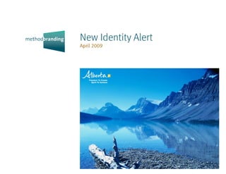
- 13. NEW IDENTITY ALERT An occasional survey of new corporate brand page 13 identities compiled from on-line news sources April 2009 by Method Branding. A L B E RTA This western Canadian province launched its new brand identity in late March. In addition to a script wordmark, they have also launched a brand identity system for all the provincial government ministries and depart- ments. With a population of over 3.5 million, Alberta has had a strong economy based on oil and gas (with the tar sands oil fields in Northern OLD BR AND iDeNtit y Alberta), as well as tourism, farming and ranching. The province claims its emerging economic base is in such areas as nanotechnology, biotechnol- ogy, pharmaceuticals, and software development. The new Alberta brand highlights open, aspirational, dynamic, strong and genuine as its attributes. The core idea (and the tag line derived from it) is The freedom to create and the spirit the OtheR OPtiONs ALBeRtA GOveRNmeNt miNistRies to achieve. Comment It was interesting to review the documents posted by the Alberta government relating to the creation of this new brand. Of particular interest were the market research reports of the testing of the various marks that had been developed. Not surprisingly, the option that was adopted for the Alberta brand identity scored the highest. What was surprising was that the second and third favourite option were eliminated from the final round of testing (the top two options to the right). And no surprise, the preferred option was preferred significantly over the other two final options. Why they tested the preferred option against the least favourite alternatives was information that was not found (or made public). (See next page)
- 14. NEW IDENTITY ALERT An occasional survey of new corporate brand page 14 identities compiled from on-line news sources April 2009 by Method Branding. Still, the hand-lettered script is well done and appealing. The square at the end varies in colour, and is an obvious link to the brand identity system developed for the government ministries and departments. While it is understandable that the latter is relatively generic in look, so it does not conflict with the wordmark, the square makes no sense. It does not add anything to either the script wordmark or to the dozens of government brand signatures. They could have easily used another simple shape to link the wordmark to the ministry signatures. For example, the official flower of Alberta is the wild rose. A simple shape based on the rose would have been a more meaningful option than a generic square. There is also much to commend about this brand identity, including some spectacular images that have been used in the Alberta Brand book and web site. These photographs are not just of breathtaking vistas in the Rockies, but cover a variety of subjects.* Overall, there is much to commend, just that “darn” square… (See next page)
- 15. NEW IDENTITY ALERT An occasional survey of new corporate brand page 15 identities compiled from on-line news sources April 2009 by Method Branding. * It has just been revealed (to much ridicule in Canada and Great Britain) that one of the images is not from Alberta, but from a beach near Bamburgh Castle in Northumberland, U.K. (see the page from the Alberta brand book and an ad to the right). The Alberta Minister of Tourism apparently first told reporters her department had nothing to do with the rebranding campaign, that it was done by an Edmonton public relations firm. Since then, the Alberta government has apologized, posting on its blog an explanation, saying: “At one point in the narrative we men- tioned our regard for people in other places, and in that place we used the only image that did not come from Alberta. Intentionally.” “Then we screwed up… We took images from the narrative, and used them as standalone still pictures on our website. And along the line, we grabbed that one, solitary image that was not from Alberta and added our nifty new ‘Alberta’ signature.” “We’re sorry.” Sure, this image clearly communicates that Alberta cares about the rest of the world? One wonders, in that case, what their definition is of the world. This was poorly thought through and executed. alberta.ca albertabrand.com alberta.ca/blog/home.cfm
- 16. NEW IDENTITY ALERT An occasional survey of new corporate brand page 16 identities compiled from on-line news sources April 2009 by Method Branding. L I v E R p O O L The British city, familiar around the world as the birthplace of the Beatles, launched its new brand identity at the end of March. The brand is part of a 15-year vision to improve the lives of every resident. This includes efforts in increasing employment creation; increasing the city’s population by building more family homes; making Liverpool one of the OtheR BR AND iDeNtities cleanest, greenest and safest cities in the UK; to improving the health of every resident by reducing levels of obesity and the number of people smoking. The new brand identity is intended to promote Liverpool around the world. Comment As with Alberta, Liverpool uses a hand-lettering script for its name, which gives the brand identity a human, friendly look. However, this brand identity is a puzzle. First, it is an imitation of the brand identity they had to mark Liverpool as the “European Capital of Culture” in 2008. Second, featuring what one has to presume is the Liverpool skyline does not make sense for a brand identity that is targeting stake- holders around the world. It is meaningless. To further confuse matters, the brand signature is used in a wide variety of colours. While one could not expect the city to use the likeness of the Beatles for their brand identity, there are many options that they could have used to align them- selves with the emotions and visual language that is evoked by the Beatles, and still have something that is unique to Liverpool and is visually fresh and contemporary. liverpool.gov.uk liverpoolcitybrand.com
- 17. NEW IDENTITY ALERT An occasional survey of new corporate brand page 17 identities compiled from on-line news sources April 2009 by Method Branding. L I sT O F B R A N D I D E N T I T I E s Alliance Boots Oct 2006 Better Place Sep 2008 Ceva Logistics Dec 2006 F E AT U R E D As stated earlier, this Alltel May 2005 Bharti Nov 2008 CFA Institute Jun 2004 issue marks the fifth anniversary ALM Feb 2005 Bladex Sep 2004 Chemtura Sep 2005 of this newsletter. Below, and on the next three pages, is a list of all the Amegy Bank Mar 2005 Blue Run Ventures Mar 2005 Chevron Jun 2005 brands that have been featured so America Online Dec 2004 BNSF Mar 2005 Chorus Feb 2008 far in New Identity Alert. We hope American Medical Bombay Stock Exchange Oct 2005 Chrysler Oct 2007 that you have found the newsletters Association Sep 2005 Booz & Company Jul 2008 Ciena Dec 2004 interesting and topical. Ameriprise Financial Jun 2005 Bosch Group May 2005 CIMB Group Oct 2006 April 2004-April 2009 Anheuser-Busch InBev Nov 2008 Boys Town Dec 2007 Cingular Dec 2004 ArcelorMittal Jul 2007 AARP Feb 2007 Bravo Mar 2005 Cinterion Jul 2008 Abelica Global Dec 2007 ASBBank May 2005 Abitibi Bowater Dec 2007 Brocade Feb 2007 Cisco Oct 2006 Assurant Apr 2004 Access Dec 2006 BRP Sep 2004 Citigroup Feb 2007 AT&T Jan 2006 A-Channel Sep 2005 BSG Feb 2006 Citroën Feb 2009 Atlanta Nov 2005 AEP Networks Mar 2005 Clear Source Mar 2005 Avago Technologies Jan 2006 Aeroplan Jun 2004 CA Jan 2006 CNIB Jul 2006 Avanquest Feb 2007 Aéroports de Paris Sep 2005 Cambria Suites Mar 2005 CNW Goup Mar 2005 Aveos Nov 2008 AfghanMark Feb 2007 Canadian Institute of Colonial Life Feb 2008 Avis Budget Group Oct 2006 Chartered Accountants Oct 2007 Aflac Feb 2005 Comfort Inn Mar 2005 Axiata Apr 2009 Canwest Feb 2008 Connex Feb 2005 Azingo Feb 2008 Capgemini May 2004 AGC Feb 2007 Cooper Tires Nov 2005 Capital One Feb 2008 Agility Dec 2006 Baird Dec 2006 Cardiac Science Apr 2008 Air Canada Dec 2004 Cornell University Dec 2004 BASF May 2004 Carestream Health May 2007 Air France Feb 2009 Covidien Jul 2007 Baskin Robbins Nov 2005 Caribbean Airlines Dec 2006 Air Mauritius Feb 2009 CRA International Jun 2005 Bausch & Lomb May 2004 Cartus Apr 2006 Aker Solutions Apr 2008 Credit Suisse Jul 2005 Belden Oct 2006 AkzoNobel Jul 2008 CSC Nov 2008 Belfast Sep 2008 CCTA Oct 2004 Alberta Apr 2009 Current TV Sep 2005 Bell Canada Sep 2008 Ceridian May 2004 Alcatel-Lucent Dec 2006 Cybertrust Feb 2006
- 18. NEW IDENTITY ALERT An occasional survey of new corporate brand page 18 identities compiled from on-line news sources April 2009 by Method Branding. Daiichi-Sankyo Oct 2005 Fiat Group Nov 2005 Habitat for Humanity Jun 2005 JDSU Oct 2005 Daimler Oct 2007 FICO Apr 2009 Hancook May 2004 Jockey Jul 2006 Days Inn May 2007 Fido Nov 2008 Hanwha Dec 2006 Johnson Controls Oct 2007 DC Comics Jun 2005 FIFA World Cup Jul 2006 Harland Clarke Apr 2008 Delta Air Lines May 2007 Fiserv Apr 2009 Helio Nov 2005 Kayak Feb 2006 Deluxe Apr 2008 Free Library of Philadelphia Oct 2005 Hexion Jun 2005 KerrMcGee Feb 2006 DetNorske Jul 2008 Fujifilm Oct 2006 Holiday Inn Dec 2007 Kikkoman Jul 2008 DG3 Feb 2008 Gavilon Apr 2008 Holland+Knight Oct 2004 Kmart Sep 2004 Dijji Jan 2006 GE Jun 2004 Hotpoint Jun 2004 Kodak Feb 2006 DMA Nov 2005 Gennum Apr 2008 Huawei Jul 2006 KPN Apr 2006 Kraft Foods Feb 2009 Docdata Apr 2008 Genpact Oct 2005 ICE Feb 2006 Kraton Jul 2006 Dr. Pepper Snapple Jul 2008 Genworth Sep 2004 Idearc Dec 2006 Kruger Dec 2006 GeoEye Feb 2006 IdenTrust Apr 2006 Kumho Asiana Apr 2006 Econolodge Sep 2008 Glitnir Apr 2006 IFRA Feb 2008 KYB Nov 2005 EDF Sep 2005 GLOBALFOUNDRIES Apr 2009 InBev Dec 2004 Elektrobit Jul 2007 Global TV Jan 2006 Independence Air May 2004 Lanxess Mar 2005 Embarq Feb 2006 GO Jul 2007 Industrial Alliance May 2007 Laureate Jun 2004 Emdeon Sep 2005 Golden Telecom Dec 2006 Inegrys May 2007 LedgeNet Feb 2008 Emergis Feb 2005 Google Sep 2004 Innospec Jul 2006 Lime Sep 2005 EQT Feb 2009 Grand & Toy Feb 2007 Innovene May 2005 Linspire Oct 2004 Ersol Jul 2007 Liverpool Apr 2009 Eurail Dec 2007 Grant Thornton Apr 2008 Intact Insurance Apr 2009 Logica Apr 2008 Europ Assistance Jan 2006 Group 4 Securicor Sep 2005 Intel Jan 2006 London 2012 Jul 2007 Group NBT Mar 2005 International Business LoyaltyOne Sep 2008 Leaders Forum May 2007 Exensys Oct 2005 Groupe Aeroplan Sep 2008 Intuit Jul 2008 Experian Dec 2007 Grubb & Ellis Apr 2009 LPGA Oct 2007 I-play May 2005 FedEx Kinko’s May 2004 GS Holdings Apr 2005 LS Cable Apr 2005 GS1 Mar 2005 Luminant Energy Jul 2007
- 19. NEW IDENTITY ALERT An occasional survey of new corporate brand page 19 identities compiled from on-line news sources April 2009 by Method Branding. LV= Jul 2007 NASDAQ OMX Apr 2008 Oslo Jul 2005 Qantas Oct 2007 LycoRed Feb 2006 National Honey Board Mar 2005 Oslo Børs VPS Sep 2008 Quark Apr 2006 National Jewish Health Sep 2008 OTP Bank Feb 2007 Quark Oct 2005 MAN Oct 2004 National Sep 11 Memorial & Museum at OZ Sep 2008 the World Trade Center Oct 2007 Manpower Apr 2006 RCN May 2005 National Starch Mar 2005 Manroland Jul 2008 Pacnet Feb 2008 Realogy Apr 2006 Navilyst Medical Sep 2008 MasterCard Worldwide Oct 2006 Palm Sep 2005 Reckitt Benskiser Feb 2009 NBC Universal Jun 2004 MBNA Mar 2005 Pantone Dec 2006 Red Bee Nov 2005 NEI Apr 2008 McMillan Jul 2008 Parallels Dec 2007 Reynaers Aluminium May 2007 NetApp Apr 2008 MedAvant Jan 2006 Payless ShoeSource Oct 2006 Ricoh Jun 2005 NewPage Sep 2005 Mega Jul 2006 PDL BioPharma Feb 2006 Rogers Centre Mar 2005 Memorex Nov 2008 Peel District School Board Oct 2005 ROHM Semiconductor Feb 2009 Nielsen Feb 2007 Mentum Oct 2007 Pepsi Feb 2009 RSA Apr 2008 NIK Software Apr 2006 PGA Feb 2008 Nokia Siemens Networks May 2007 Meridian Credit Union May 2005 PGI Nov 2008 SAB Sep 2004 Norway Post Nov 2008 Migros Bank Feb 2006 Safeway May 2005 Nova Scotia Apr 2005 MillerCoors Sep 2008 Philips Sep 2008 Safran Apr 2005 Novelis Feb 2005 Mitsubishi UFJ Mar 2005 Pironet NDH Apr 2005 Samy-Sega Sep 2004 NTT DoCoMo Apr 2008 Mittal Feb 2005 Pittsburgh Glass Works Sep 2008 Sanofi-Aventis Oct 2004 Nuance Nov 2005 Mobile 365 Oct 2004 Plantronics Sep 2005 Sears Oct 2004 Nulogx Apr 2006 Molson Coors Mar 2005 Poet May 2007 Shriners Hospitals NV Energy Nov 2008 for Children Dec 2007 Morrisons May 2007 Power Stream Sep 2004 NXP Oct 2006 SK Nov 2005 Mosaic Oct 2004 PPR Mar 2005 NYC2012 May 2004 SNCF May 2005 Movenpick Dec 2004 Prague Stock Exchange Nov 2005 Sodexo Feb 2008 Preferred Hotel Group Jun 2005 OLG Jul 2006 Movistar May 2005 (Product) Red Feb 2006 OnLive Apr 2009 MTV2 Mar 2005 Prysmian Nov 2005 openreach Oct 2005 MWV Apr 2008 Oreco Apr 2005
- 20. NEW IDENTITY ALERT An occasional survey of new corporate brand page 20 identities compiled from on-line news sources April 2009 by Method Branding. Sofitel Dec 2007 Tenaya Captial Apr 2009 Unum May 2007 Xerox Feb 2008 Sony Ericsson Oct 2006 The Bank of New York Mar 2005 USAid Feb 2005 Xerox Oct 2004 SourceMedia Apr 2005 The Bank of New York Mellon Oct 2007 Southern LINC Mar 2005 The CW Oct 2006 VakifBank Sep 2008 Yellow Pages Association Dec 2004 Spectrum Brands Mar 2005 The New School Sep 2005 Vale Dec 2007 Yogen Früs Apr 2008 Spice Telecom Jan 2006 The Paley Center for Media Jul 2007 Valeo Oct 2004 Spirit Areosystems Sep 2005 The Standard Apr 2005 Vallent Mar 2005 Zune Oct 2006 Sprint Jul 2005 Thomson Reuters Apr 2008 Vancouver 2010 May 2005 St Paul Travelers May 2004 Thomson Jul 2006 Vauxhall Jul 2008 St. Jude Medical Jul 2008 Teito Apr 2009 Veolia Environnement Jan 2006 Visa Apr 2005 StoneRiver Apr 2009 TM Jun 2005 Visiqor Dec 2004 Suntrust May 2005 Tomorrow Jul 2007 Visit London Apr 2004 Super 8 Sep 2008 Tourism Toronto Jul 2005 Susan G. Komen for the Cure Feb 2007 Tourism Vancouver May 2005 Vistec Jul 2006 Swiss Life May 2004 Tourism Victoria, BC Apr 2006 Viterra Oct 2007 Swisscom Dec 2007 Towers Perrin Sep 2004 Vivendi Jul 2006 Symbion Health Jan 2006 Transat Sep 2004 Voca Dec 2004 Symetra Sep 2004 Travelers May 2007 Vodafone Nov 2005 Syniverse Apr 2004 Travelocity Apr 2004 Sysco Nov 2008 Travelport Oct 2006 Walmart Jul 2008 Western Digital Dec 2004 2ergo Jul 2008 True May 2004 Westnet Oct 2005 3SY Feb 2006 TW Telecom Apr 2008 Windstream Communications Jul 2006 TAP Portugal Apr 2005 Tyco Electronics Jul 2007 Wolters Kluwer Apr 2005 TBS Jun 2004 WORLDHOTELS Mar 2005 Telenor Apr 2006 UDR May 2007 WorldSpace Feb 2006 Telent Feb 2006 Unilever Jun 2004 Wyndham Worldwide Apr 2006 Teridian Oct 2005 United Way Sep 2004
- 21. NEW IDENTITY ALERT An occasional survey of new corporate brand page 21 identities compiled from on-line news sources April 2009 by Method Branding. Please contact us if you have any comments about ABOUT METhOD BRANDING the corporate brand identities featured in this A design firm with extensive experience, we issue, or if you wish to alert us to new identities work with a wide variety of clients including that have been just launched or are about to be corporations, government agencies, not-for-profit launched. We also welcome receiving the names organizations, start-up companies and others. and e-mail addresses of anyone you think would be interested in receiving this newsletter. We work collaboratively with other communication agencies and firms, and collaboratively with our And if you have a branding challenge, we would clients, to create compelling solutions. The brands of course be pleased to meet you and discuss how and branded communications (brochures, annual your brand can be effectively leveraged to its reports, etc.) we create endure and build value. maximum potential. Bringing together the science and art of branding, our solutions are engineered to elicit the desired responses from stakeholders, building maximum brand value for our clients. methodbranding.com info@methodbranding.com Philip Unger President and Creative Director 366 Adelaide Street W. Suite 207 Toronto, Ontario Canada M5V 1R9 416.597.1114 tel 416.596.0807 fax Thank you to Jim Hynes for his proofreading Note: The brand identities and trademarks in this and wise counsel. document are the property of their respective owners. They are used here solely for information purposes. jameshynes@rogers.com © Method Branding, 2008