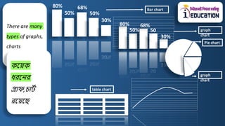
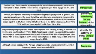
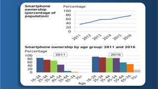
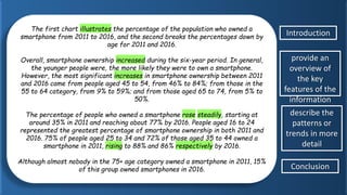
Structured information
to detailed
information
Information
Describing graph &
chart is a way to
explain data
presented in a
graph/chart/Diagra
m where we
highlight the key
features and try to
make understand the
symbolized
information in a
short and effective
way
গ্রাফ এবং চার্ট
বর্ ট
না করা হল
একটর্
গ্রাফ/চার্ট/ডাযাগ্রা
মে উপস্থাপপত
মডর্া বযাখ্যা করার
একটর্ উপায
মেখ্ানন আেরা
েূল
ববপিষ্ট্যগুপলনক
গুরুত্ব মেই এবং
সংপিপ্ত ও
কাে ট
কর উপানয
প্রতীকী তথ্য
মবাঝার মচষ্ট্া কপর
There are many
types of graphs,
charts
কয়েক
ধরয়ের
গ্রাফ,চার্ট
রয়েয়ে
80%
30%
50% 50%
68%
80%
30%
50% 50
%
68%
Bar chart
graph
chart
Pie chart
graph
chart
table chart
A graph chart has four
segments/parts(েখ্ন আেরা
গ্রাফ/চার্ট বযাখ্যা কপর তখ্ন েূলত
চারটর্ স্তনর আেরা তথ্য পেনয থ্াপক)
Introductio
n
(সূচো)
Conclusion
(উপসংহার)
Describe the
pattern or trends
in more detail
সংখ্যাগত তথ্য
মেগুনলানক
একটর্ পযার্ানন ট
সাজাননা
মসগুনলানক
আনরা
ভানলাভানব
বযাখ্যা করা
Provide an
overview of the
key features of
the information
তনথ্যর েূল
ববপিষ্ট্যগুপলর
একটর্ সংপিপ্ত
পববরর্ প্রোন
করুন৷
The first chart illustrates the percentage of the population who owned a smartphone
from 2011 to 2016, and the second breaks the percentages down by age for 2011 and
2016.
Overall, smartphone ownership increased during the six-year period. In general, the
younger people were, the more likely they were to own a smartphone. However, the
most significant increases in smartphone ownership between 2011 and 2016 came from
people aged 45 to 54, from 46% to 84%; from those in the 55 to 64 category, from 9% to
59%; and from those aged 65 to 74, from 5% to 50%.
The percentage of people who owned a smartphone rose steadily, starting at around 35%
in 2011 and reaching about 77% by 2016. People aged 16 to 24 represented the greatest
percentage of smartphone ownership in both 2011 and 2016. 75% of people aged 25 to
34 and 72% of those aged 35 to 44 owned a smartphone in 2011, rising to 88% and 86%
respectively by 2016.
Although almost nobody in the 75+ age category owned a smartphone in 2011, 15% of
this group owned smartphones in 2016.
Introduction
describe the
patterns or
trends in more
detail
provide an
overview of
the key
features of the
information
Conclusion
LENGT
H
PARA
Title
SHOULD WE DRAW
GRAPH ?
1.5/2 line
3 para
no
no
Often students start their essay with ‘The graph shows…’. While
this is fine, the verb ‘shows’ could be replaced by a more exciting
and high-level vocabulary word. Here are four different prompts
to start your essay (প্রাযিই ছাত্ররা 'গ্রাফ মিা...' পেনয তানের
প্রবন্ধ শুরু কনর। েপেও এটর্ টিক আনছ, 'মিা' ক্রিযাটর্ আরও
ভানলা এবং উচ্চ-স্তনরর িব্দভান্ডানরর িব্দ দ্বারা প্রপতস্থাপপত
হনত পানর। আপনার প্রবন্ধ শুরু করার জনয এখ্ানন চারটর্
The graph illustrates the trends in…
The graph reveals information about the changes in…
The graph provides the differences between…
The graph presents how X has changed over a period of…
ADVERB MEANING
Approximately
Dramatically
Erratically
Gradually
Markedly
Almost, but not completely exact; roughly
By a quick and large amount
In a way that is uneven or
irregular
By slow degrees
Noticeably, significantly
ADVERB MEANING
Significantly
Slightly
Slowly
Steadily
In a way that is worthy of attention;
importantly
To a small degree
At a slow speed, not quickly
In a regular or even way
Increase
Climb
Improve
Jump
Leap
Move
upward
Rocket
Skyrocket
Soar
Shoot
Pick up
Surge
Recover
Collapse(v)
Decline
Decrease
Deteriorate
Dip
Drive
Drop
Go down
Plummet
Plunge
Slide
Slip (back)
Slump
Take a
nosedive
Decline(n)
Deterioratio
n
Decrease
Dip
Drop
Plunge
Freefall
Slide
Slip
Dive
Reduction
Slump
Be erratic
Be fitful
Vary
Rise and fall
Ups and
downs
ebb and flow
good and bad
times
peaks and valleys,
Wax and wane
TIME PHRASE EXAMPLE
SENTENCE
Between...and Between 1982 and 1992 there was a steady
drop.
From...to From 1992 to 1996 there was a dramatic
increase.
In the year… In the year 2020, unemployment spiked.
During/over
the period
During the 1980s, trends stayed consistent
TIME PHRASE EXAMPLE
SENTENCE
over the latter half of the
year/century/decade/period
Over the latter half of the century, more
women entered the workforce
over the next/last/previous… Over the previous year, work-from-home
rates sharply increased
days/weeks/months/years/d
ecades
For several weeks, stock prices have
remained stable.
by… By 1997, market growth had stabilized
The (bar) chart shows the various information of (যে বিষেটর্ থাকয়ি). It is a very
prime/important/influential topic for a developing Country like Bangladesh. According to
the statistics of the graph shows/illustrates/indicates that the result of (বিষে) is different.
From the graph, we can see that the highest rate is (সংখ্যা/পবরমাণ/শতকরা ো যেো
থাকয়ি) in (সাল). On the other hand the lowest rate is (পবরমাণ) in (সাল). There is a
noticeable/remarkable difference between the highest rate and the lowest rate "The
difference is (সয়ি ট
াচ্চ সংখ্যাটর্ যথয়ক সি ট
বেম্ন সংখ্যাটর্ িাে বেয়ল যে পাথ ট
কযর্া পাওো োয়ি
যসর্া এখ্ায়ে িবসয়ে যেি) between the highest and the lowest rate. This difference is not
as compelling as we expected. By the way it has impacts on our personal/ social/socio-
economic/economic life. We can notice form this graph (বিষে) is increasing/decreasing
day by day . To tell the truth, some experts said that this condition can not bear welfare
for any developing country. That's why, we should take some effective steps to improve
this situation. It is a matter of joy that the government and many non-governmental
organizations play a vital role in this regard. Finally analyzing the survey, it can be said that
the day is not far away when every person will show positivity/objection in this regard.
The first chart illustrates the percentage of the population who owned a
smartphone from 2011 to 2016, and the second breaks the percentages down by
age for 2011 and 2016.
Overall, smartphone ownership increased during the six-year period. In general,
the younger people were, the more likely they were to own a smartphone.
However, the most significant increases in smartphone ownership between 2011
and 2016 came from people aged 45 to 54, from 46% to 84%; from those in the
55 to 64 category, from 9% to 59%; and from those aged 65 to 74, from 5% to
50%.
The percentage of people who owned a smartphone rose steadily, starting at
around 35% in 2011 and reaching about 77% by 2016. People aged 16 to 24
represented the greatest percentage of smartphone ownership in both 2011 and
2016. 75% of people aged 25 to 34 and 72% of those aged 35 to 44 owned a
smartphone in 2011, rising to 88% and 86% respectively by 2016.
Although almost nobody in the 75+ age category owned a smartphone in 2011, 15%
of this group owned smartphones in 2016.
Introduction
provide an
overview of
the key
features of the
information
describe the
patterns or
trends in more
detail
Conclusion
HSC Graph Chart tips & tricks.pdf

HSC Graph Chart tips & tricks.pdf

  • 1.
  • 2.
    Describing graph & chartis a way to explain data presented in a graph/chart/Diagra m where we highlight the key features and try to make understand the symbolized information in a short and effective way গ্রাফ এবং চার্ট বর্ ট না করা হল একটর্ গ্রাফ/চার্ট/ডাযাগ্রা মে উপস্থাপপত মডর্া বযাখ্যা করার একটর্ উপায মেখ্ানন আেরা েূল ববপিষ্ট্যগুপলনক গুরুত্ব মেই এবং সংপিপ্ত ও কাে ট কর উপানয প্রতীকী তথ্য মবাঝার মচষ্ট্া কপর
  • 3.
    There are many typesof graphs, charts কয়েক ধরয়ের গ্রাফ,চার্ট রয়েয়ে 80% 30% 50% 50% 68% 80% 30% 50% 50 % 68% Bar chart graph chart Pie chart graph chart table chart
  • 4.
    A graph charthas four segments/parts(েখ্ন আেরা গ্রাফ/চার্ট বযাখ্যা কপর তখ্ন েূলত চারটর্ স্তনর আেরা তথ্য পেনয থ্াপক) Introductio n (সূচো) Conclusion (উপসংহার) Describe the pattern or trends in more detail সংখ্যাগত তথ্য মেগুনলানক একটর্ পযার্ানন ট সাজাননা মসগুনলানক আনরা ভানলাভানব বযাখ্যা করা Provide an overview of the key features of the information তনথ্যর েূল ববপিষ্ট্যগুপলর একটর্ সংপিপ্ত পববরর্ প্রোন করুন৷
  • 5.
    The first chartillustrates the percentage of the population who owned a smartphone from 2011 to 2016, and the second breaks the percentages down by age for 2011 and 2016. Overall, smartphone ownership increased during the six-year period. In general, the younger people were, the more likely they were to own a smartphone. However, the most significant increases in smartphone ownership between 2011 and 2016 came from people aged 45 to 54, from 46% to 84%; from those in the 55 to 64 category, from 9% to 59%; and from those aged 65 to 74, from 5% to 50%. The percentage of people who owned a smartphone rose steadily, starting at around 35% in 2011 and reaching about 77% by 2016. People aged 16 to 24 represented the greatest percentage of smartphone ownership in both 2011 and 2016. 75% of people aged 25 to 34 and 72% of those aged 35 to 44 owned a smartphone in 2011, rising to 88% and 86% respectively by 2016. Although almost nobody in the 75+ age category owned a smartphone in 2011, 15% of this group owned smartphones in 2016. Introduction describe the patterns or trends in more detail provide an overview of the key features of the information Conclusion
  • 6.
    LENGT H PARA Title SHOULD WE DRAW GRAPH? 1.5/2 line 3 para no no
  • 8.
    Often students starttheir essay with ‘The graph shows…’. While this is fine, the verb ‘shows’ could be replaced by a more exciting and high-level vocabulary word. Here are four different prompts to start your essay (প্রাযিই ছাত্ররা 'গ্রাফ মিা...' পেনয তানের প্রবন্ধ শুরু কনর। েপেও এটর্ টিক আনছ, 'মিা' ক্রিযাটর্ আরও ভানলা এবং উচ্চ-স্তনরর িব্দভান্ডানরর িব্দ দ্বারা প্রপতস্থাপপত হনত পানর। আপনার প্রবন্ধ শুরু করার জনয এখ্ানন চারটর্
  • 9.
    The graph illustratesthe trends in… The graph reveals information about the changes in… The graph provides the differences between… The graph presents how X has changed over a period of…
  • 10.
    ADVERB MEANING Approximately Dramatically Erratically Gradually Markedly Almost, butnot completely exact; roughly By a quick and large amount In a way that is uneven or irregular By slow degrees Noticeably, significantly
  • 11.
    ADVERB MEANING Significantly Slightly Slowly Steadily In away that is worthy of attention; importantly To a small degree At a slow speed, not quickly In a regular or even way
  • 12.
  • 13.
    Collapse(v) Decline Decrease Deteriorate Dip Drive Drop Go down Plummet Plunge Slide Slip (back) Slump Takea nosedive Decline(n) Deterioratio n Decrease Dip Drop Plunge Freefall Slide Slip Dive Reduction Slump
  • 14.
    Be erratic Be fitful Vary Riseand fall Ups and downs ebb and flow good and bad times peaks and valleys, Wax and wane
  • 15.
    TIME PHRASE EXAMPLE SENTENCE Between...andBetween 1982 and 1992 there was a steady drop. From...to From 1992 to 1996 there was a dramatic increase. In the year… In the year 2020, unemployment spiked. During/over the period During the 1980s, trends stayed consistent
  • 16.
    TIME PHRASE EXAMPLE SENTENCE overthe latter half of the year/century/decade/period Over the latter half of the century, more women entered the workforce over the next/last/previous… Over the previous year, work-from-home rates sharply increased days/weeks/months/years/d ecades For several weeks, stock prices have remained stable. by… By 1997, market growth had stabilized
  • 17.
    The (bar) chartshows the various information of (যে বিষেটর্ থাকয়ি). It is a very prime/important/influential topic for a developing Country like Bangladesh. According to the statistics of the graph shows/illustrates/indicates that the result of (বিষে) is different. From the graph, we can see that the highest rate is (সংখ্যা/পবরমাণ/শতকরা ো যেো থাকয়ি) in (সাল). On the other hand the lowest rate is (পবরমাণ) in (সাল). There is a noticeable/remarkable difference between the highest rate and the lowest rate "The difference is (সয়ি ট াচ্চ সংখ্যাটর্ যথয়ক সি ট বেম্ন সংখ্যাটর্ িাে বেয়ল যে পাথ ট কযর্া পাওো োয়ি যসর্া এখ্ায়ে িবসয়ে যেি) between the highest and the lowest rate. This difference is not as compelling as we expected. By the way it has impacts on our personal/ social/socio- economic/economic life. We can notice form this graph (বিষে) is increasing/decreasing day by day . To tell the truth, some experts said that this condition can not bear welfare for any developing country. That's why, we should take some effective steps to improve this situation. It is a matter of joy that the government and many non-governmental organizations play a vital role in this regard. Finally analyzing the survey, it can be said that the day is not far away when every person will show positivity/objection in this regard.
  • 19.
    The first chartillustrates the percentage of the population who owned a smartphone from 2011 to 2016, and the second breaks the percentages down by age for 2011 and 2016. Overall, smartphone ownership increased during the six-year period. In general, the younger people were, the more likely they were to own a smartphone. However, the most significant increases in smartphone ownership between 2011 and 2016 came from people aged 45 to 54, from 46% to 84%; from those in the 55 to 64 category, from 9% to 59%; and from those aged 65 to 74, from 5% to 50%. The percentage of people who owned a smartphone rose steadily, starting at around 35% in 2011 and reaching about 77% by 2016. People aged 16 to 24 represented the greatest percentage of smartphone ownership in both 2011 and 2016. 75% of people aged 25 to 34 and 72% of those aged 35 to 44 owned a smartphone in 2011, rising to 88% and 86% respectively by 2016. Although almost nobody in the 75+ age category owned a smartphone in 2011, 15% of this group owned smartphones in 2016. Introduction provide an overview of the key features of the information describe the patterns or trends in more detail Conclusion