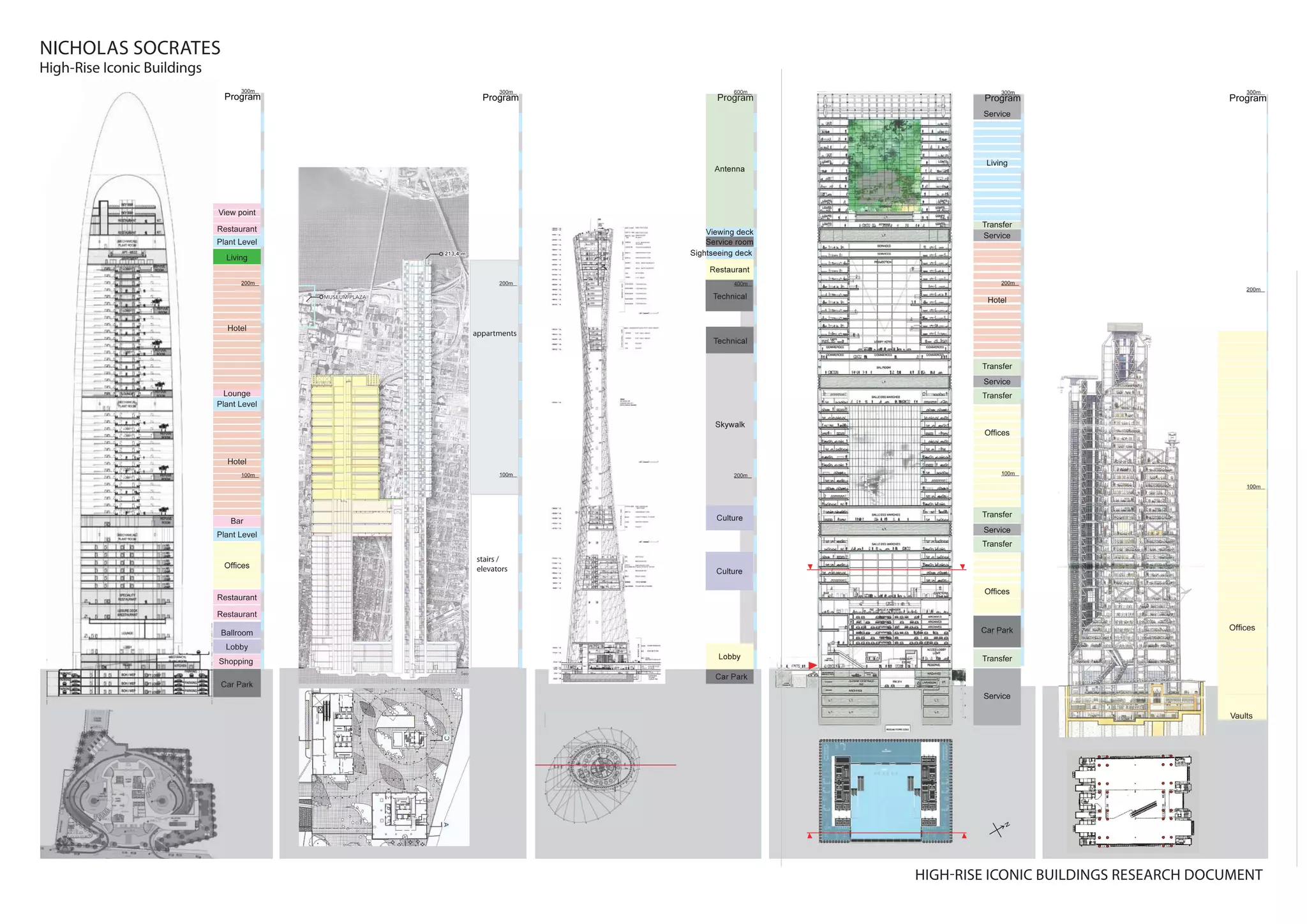
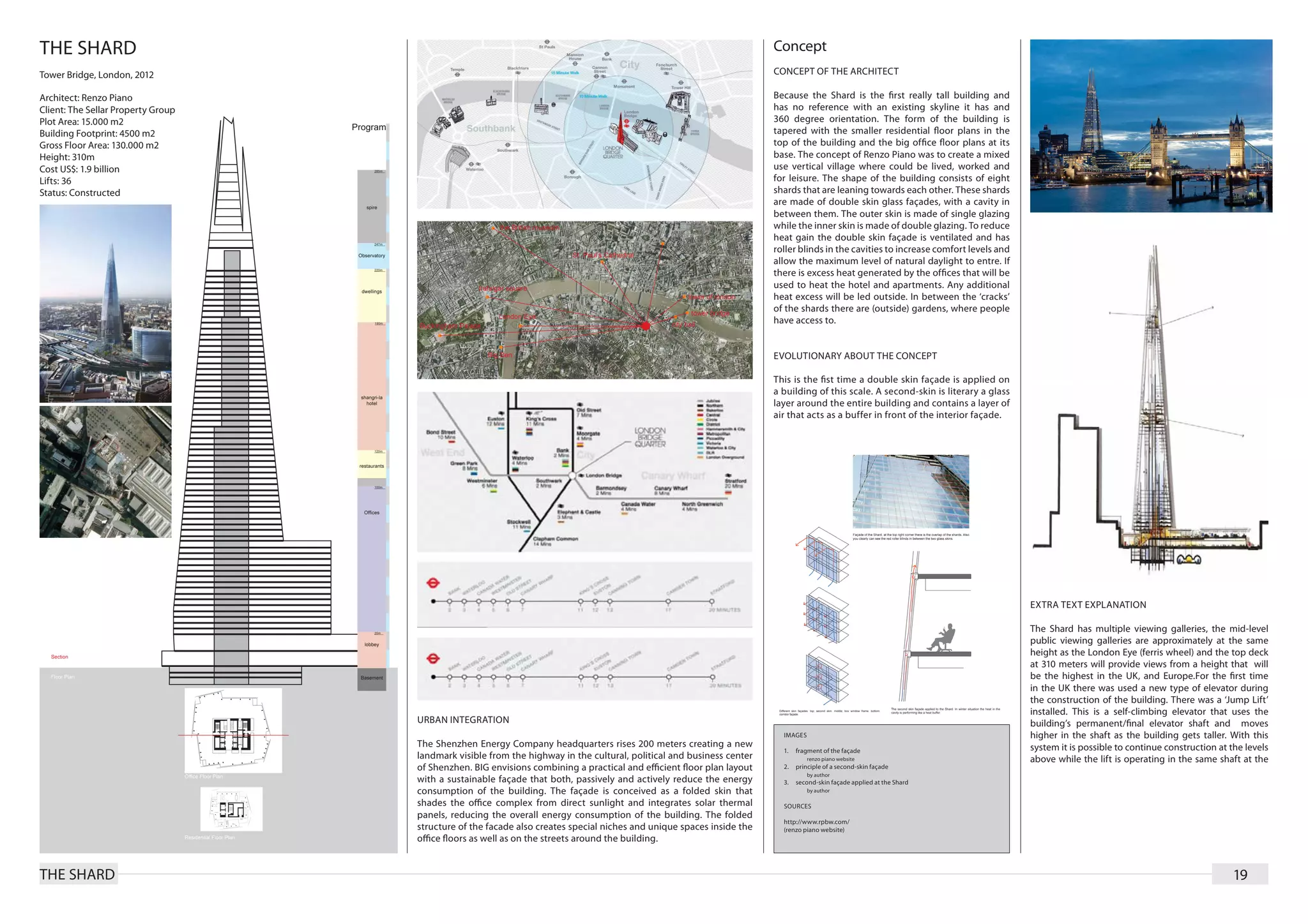
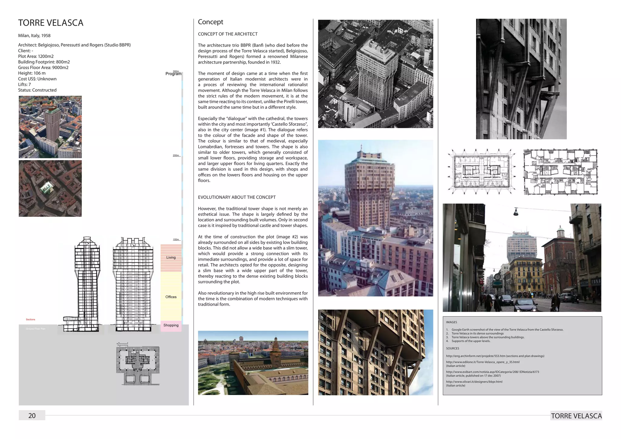
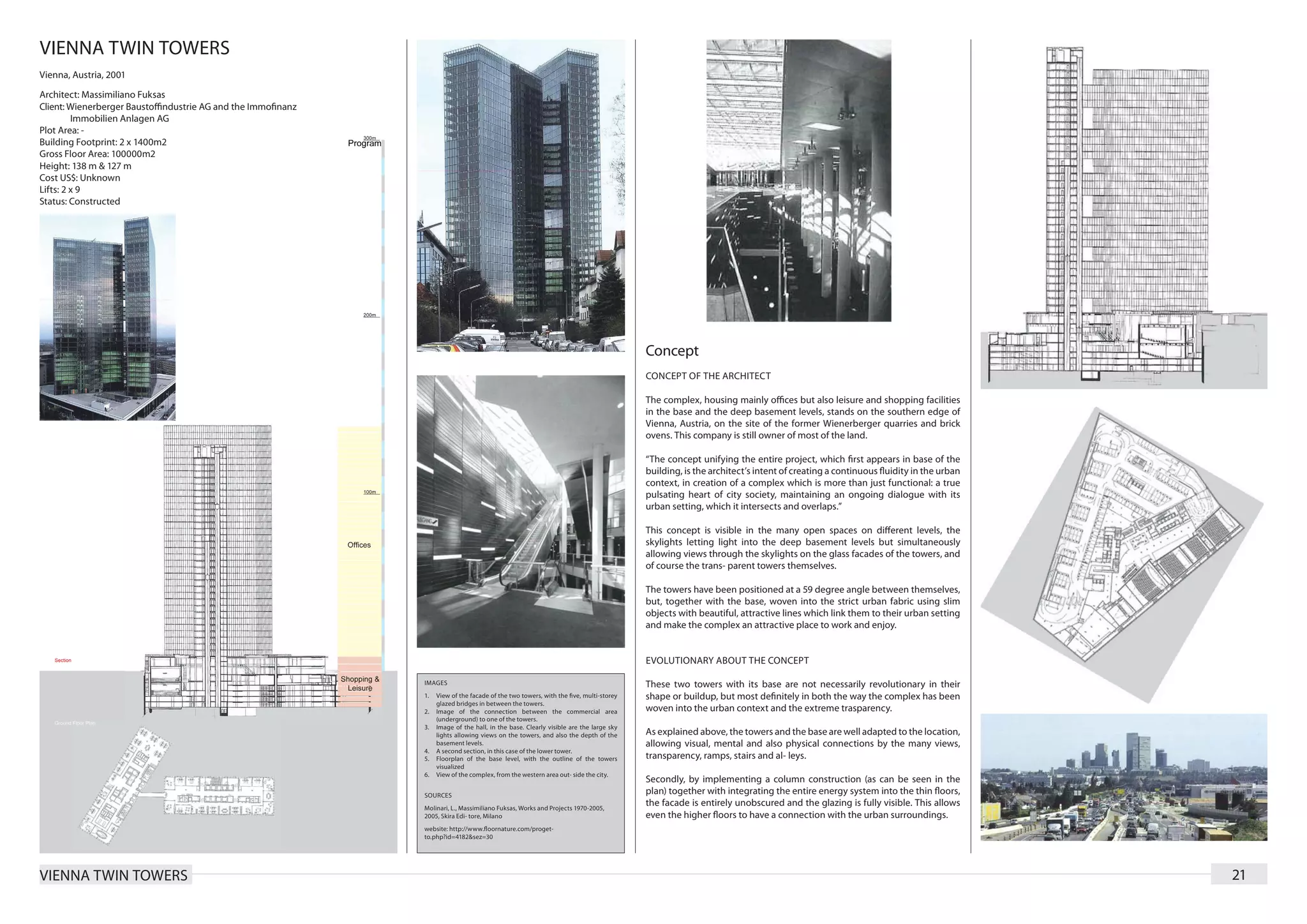
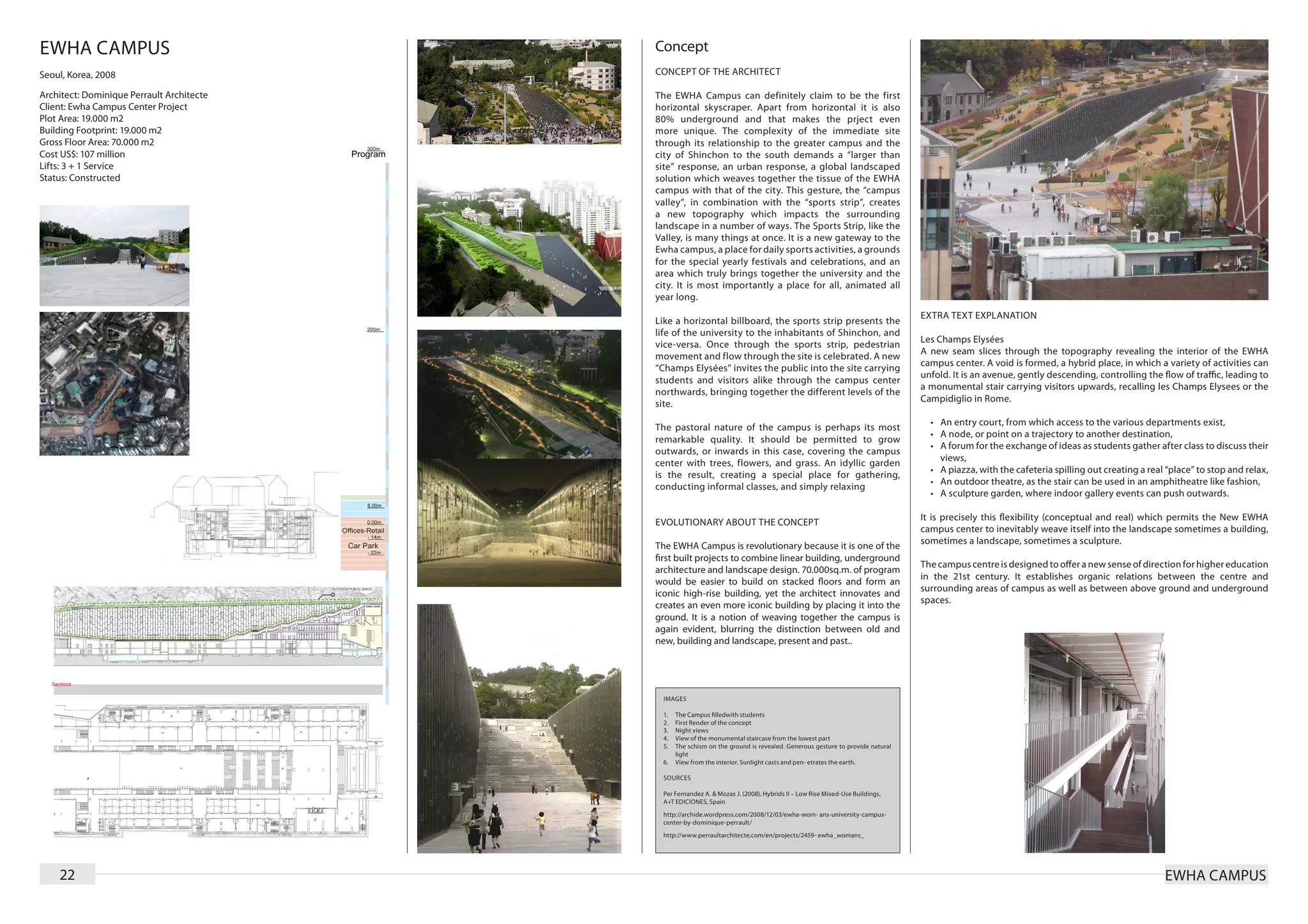
Download as PDF, PPTX
![TOUR SIGNAL
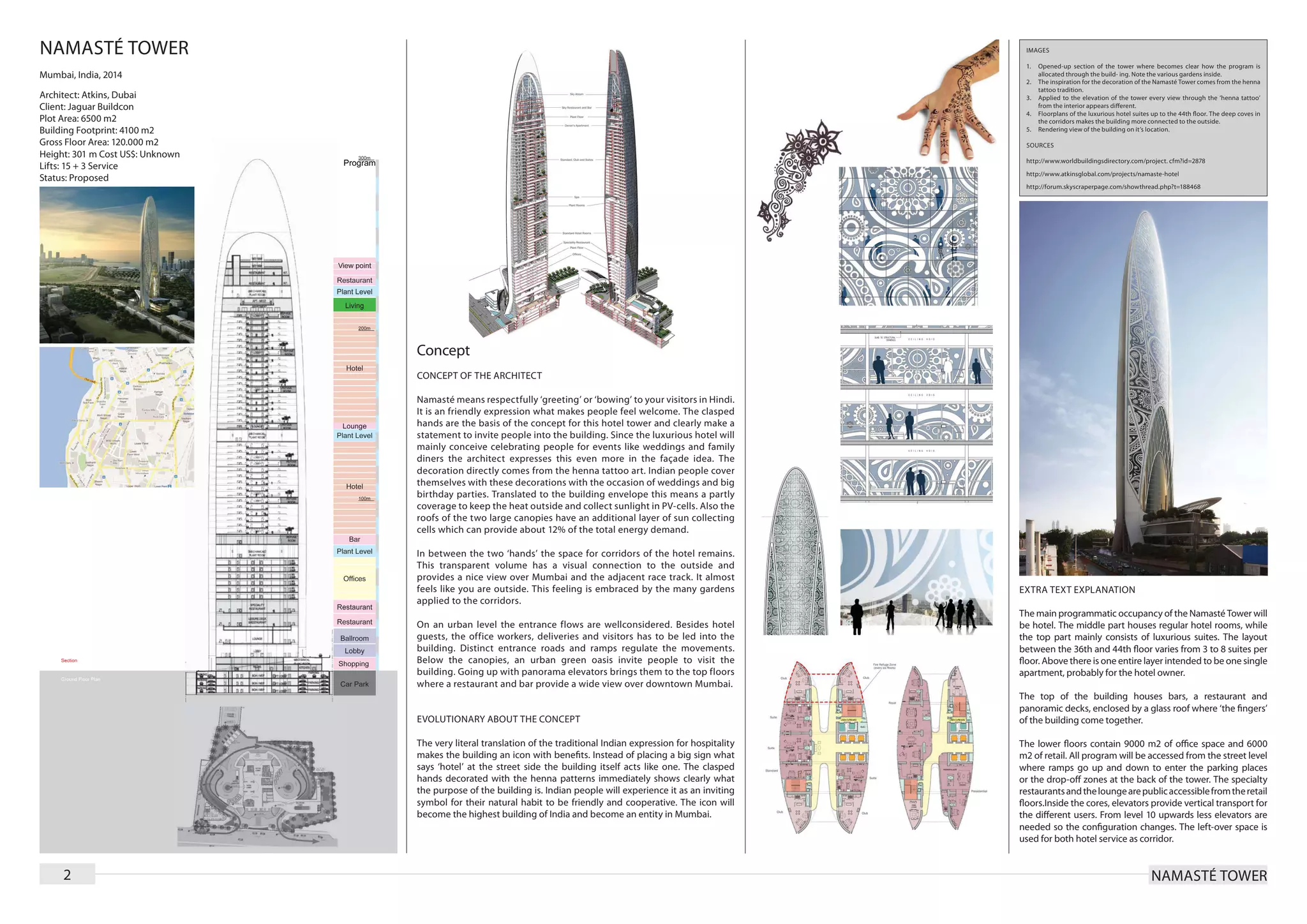
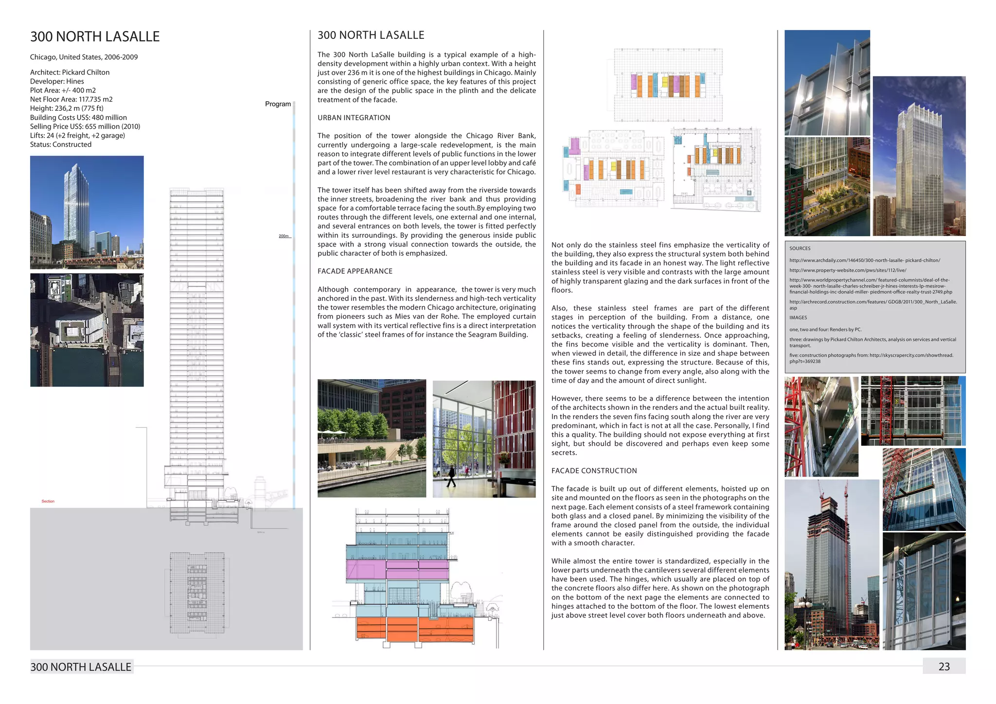
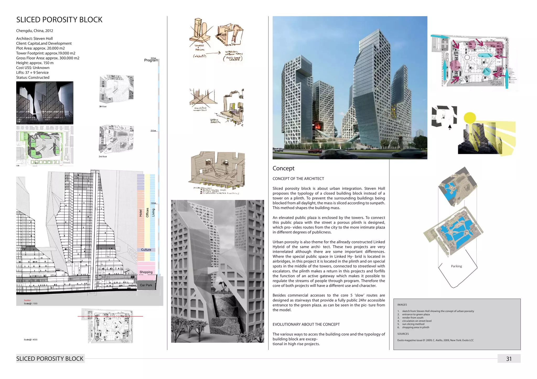
Paris, France, planned 2013
Architect: Jean Nouvel
Client: EPAD
Plot Area: unknown
Building Footprint: approx. 4000 m2
Gross Floor Area: 140.000 m2
Height: 301 m
Cost US$: 864 million (estimated)
Lifts: unknown
Status: Design Stage
Concept
CONCEPT OF THE ARCHITECT
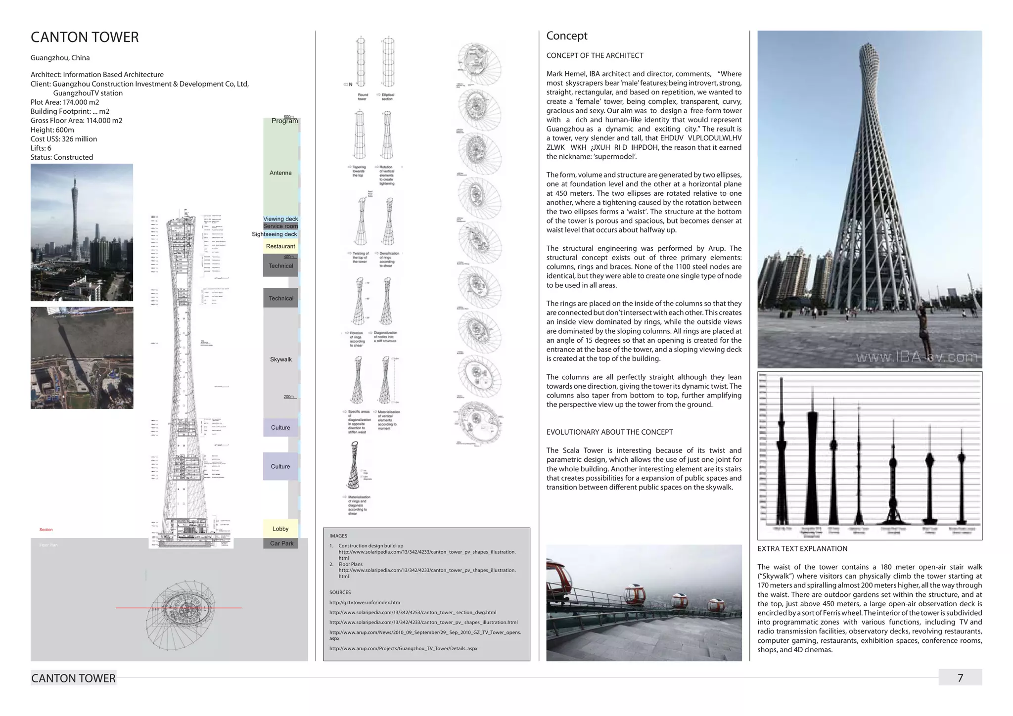
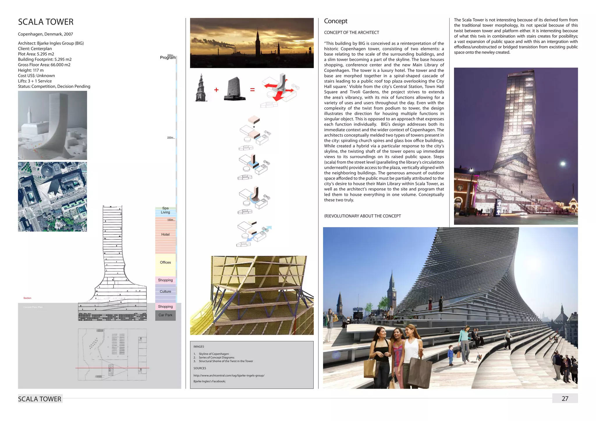
The design of tour Signal by Jean Nouvel is also called the
loggia tower by the designer himself. Four enormous loggias
stacked upon each other expose the different functions
located in this tower to the city. The loggias function as
public space where the common utility of each function
(office, hotel and living) are located. These loggias connect
tower and city
Service and transfer levels are placed repeatedly in the same
way for each block. First a service level, then a transfer level,
then the loggia, with functional floor area surrounding it, a
second transfer level and again the service level and so on.
There are two main entrances for pedestrian. The most
public entrance on the east side of the building leads the
visitor from a plaza on a long escalator to the first loggia
located on the 12th level where a cafeteria welcomes them in
the building. The second entrance in the south facade leads
the visitor directly to the office transfer level. Vehicles enter
the building on a lower level as can be seen in the section on
the first page.
The floor space in the loggias is enlarged through balconies.
through the whole tower an area for vertical transport is
reserved on both sides of the loggia. This area is larger at
IMAGES the bottom, where office function requires less horizontal
transport area and more space is needed for elevatorshafts,
1. north-south section
2. floorplan of office block, cutted through loggia then in the top.
3. schematic representation of east-west section with public spaces and
transfer levels indicated
4. render: view from hotel loggia This design was the price winning design of a competition
5. render: streetview on plaza entering the tower from the east and remains still in the design fase
6. floorplans with indicated area for vertical transport
7. view on la Defence district after contruction tour Signal
8. picture from model representing east facade
SOURCES EVOLUTIONARY ABOUT THE CONCEPT
Bosser, J, La tour signal: un nouveau défi pour LaDéfense, Paris : Éditions
de la Martinière, 2009 The space reserved reserved for the loggia’s is extroardinary for
Salmi, L., 2008. Nouvel takes pole position in Paris. World architecture hig rise projects. The ratio between functional floor area and
news, [internet] 2 June. Available at: http://www.worldarchitecturenews. constructed area is very low. The loggia’s contribute to a very
com/index. php?fuseaction=wanappln.projectview&upload_ id=2370
[Accessed 20 Decembre 2009] high feeling of recognision with the surrounding city.
TOUR SIGNAL 37](https://image.slidesharecdn.com/high-rise-130217042316-phpapp02/75/High-Rise-Building-Research-Document-37-2048.jpg)

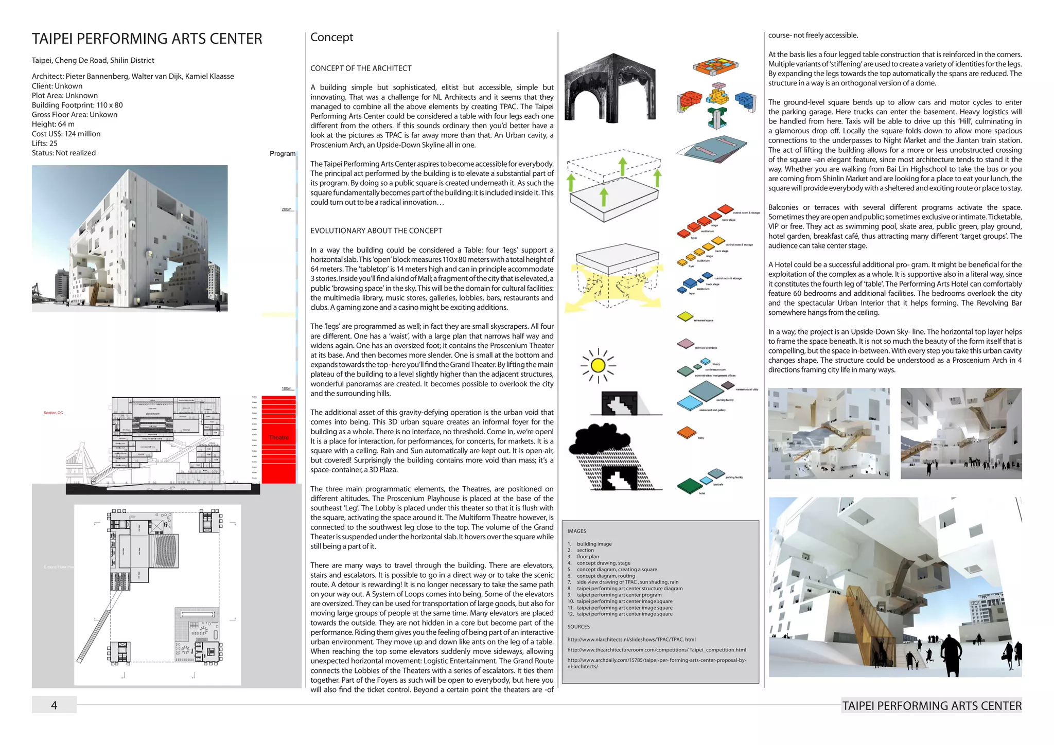
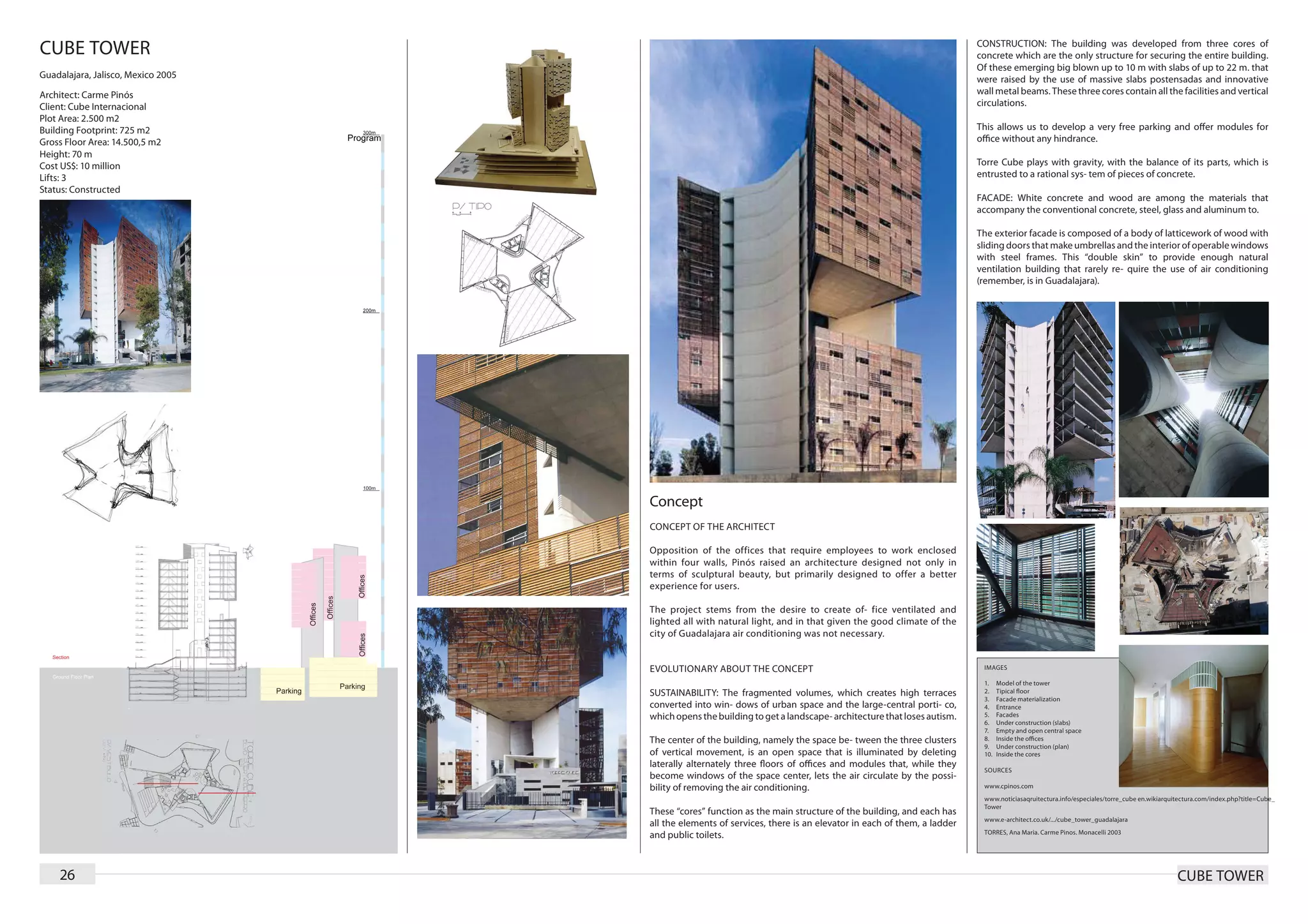
The Taipei Performing Arts Center in Taiwan elevates a substantial part of its program to create an open public square underneath. By lifting the main plateau, panoramic views of the city are created. The building contains more void space in the form of this three-dimensional urban square than mass. The square fundamentally becomes part of the building and is activated by various balconies and terraces with different programs. The four "legs" of the building that support the horizontal slab are each programmed differently and contain performance spaces at varying altitudes, connected by a system of loops, stairs, and elevators.