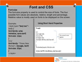
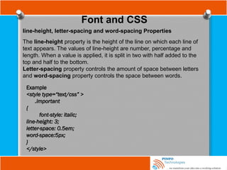
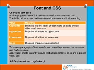
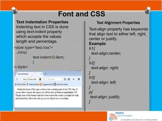
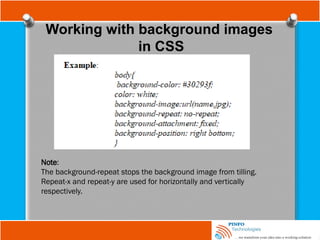
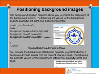
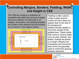
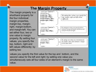
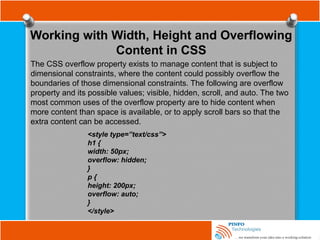
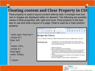
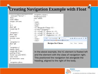
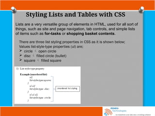
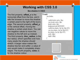
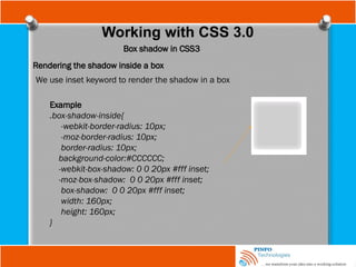
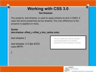
The document provides a comprehensive overview of Cascading Style Sheets (CSS), detailing its role in web design, including how to style HTML elements through selectors, properties, and values. It covers various CSS features such as length measurements, color specifications, font properties, and techniques for including CSS within HTML documents. Additionally, it discusses selectors, pseudoclasses, text styling, image handling, and the CSS box model for layout control.

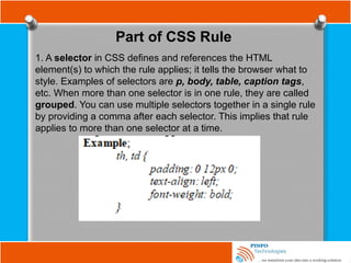
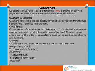
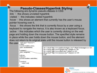
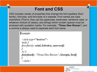
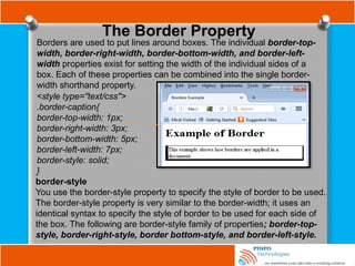
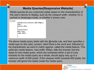
![Other Selectors
Attribute selector
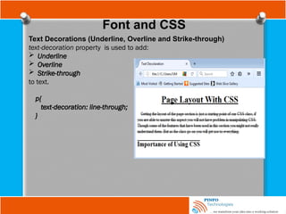
Attribute selectors are used to apply style sheet declarations based on the
presence of attributes or attribute values of an HTML element.
The syntax for attribute selectors is as follows;
In the above, a simple type selector is used to give all input elements a
yellow background. Then using a combined type and attribute selector,
input[name], a dashed border is only added to those inputs that have a
name attribute -the final input, <input type=”submit” value=”Send recipe”>,
does not have a name attribute and therefore does not have a dotted
border around it. This type of attribute selector is known as Select by
Presence of an Attribute.](https://image.slidesharecdn.com/fundamentalofwebdevelopmenttutorials-cssbypinfotechnologies-241027223250-f1542259/85/Fundamental-of-Web-Development-Tutorials-CSS-by-PINFO-Technologies-pptx-18-320.jpg)
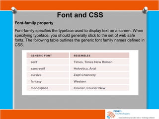
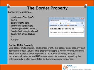
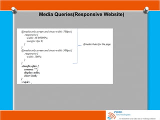
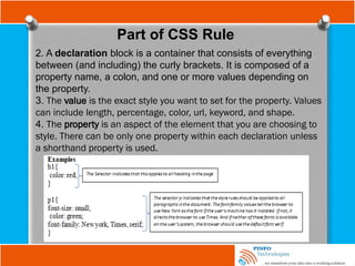
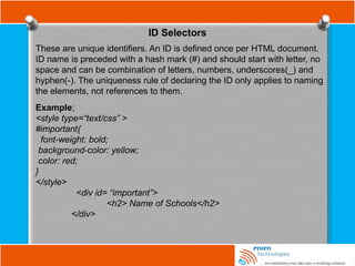
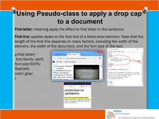
![Other Selectors
Attribute selector
input[name=“email”] {
border: 2px dashed #996600;
}
Here, both an attribute (name) and a value for that attribute (email), to select
on only input elements with name attribute values of email will only match
this selector.
Now using a combined type, attribute, and value selector, input
[name=”email”], a dashed border is only applied to those input elements that
have a name attribute with value equal to email as it is shown above.](https://image.slidesharecdn.com/fundamentalofwebdevelopmenttutorials-cssbypinfotechnologies-241027223250-f1542259/85/Fundamental-of-Web-Development-Tutorials-CSS-by-PINFO-Technologies-pptx-19-320.jpg)
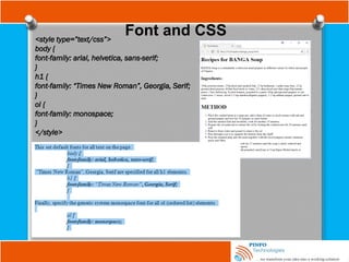
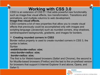
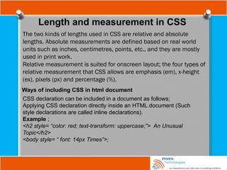
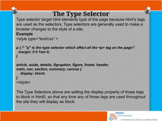
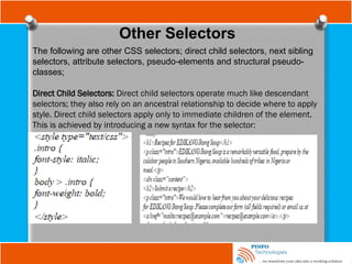
![Other Selectors
Attribute substring selectors : This chooses elements based on
whether a particular string appears at the beginning of an attribute’s value,
at the end of an attribute’s value, or anywhere inside an attribute’s value.
This is also known as regular expression in CSS3.
A combined type, attribute, and a value selector with the ^ character
indicating that you want to match the start of the value with your string,
a[href^=”mailto:”]; you added an envelope icon as a background image.
. This changes all input elements with an id
attribute value that ends in the string name.](https://image.slidesharecdn.com/fundamentalofwebdevelopmenttutorials-cssbypinfotechnologies-241027223250-f1542259/85/Fundamental-of-Web-Development-Tutorials-CSS-by-PINFO-Technologies-pptx-20-320.jpg)