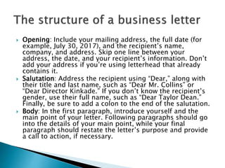
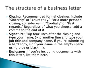
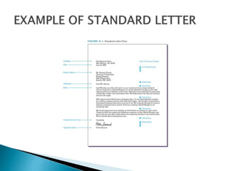
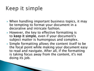
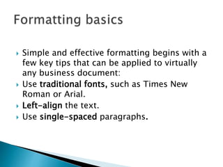
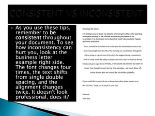
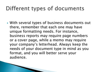
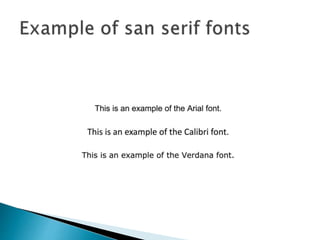
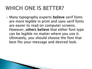
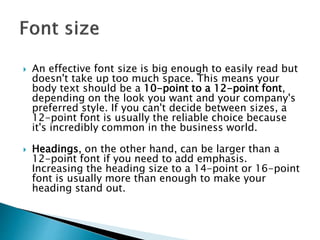
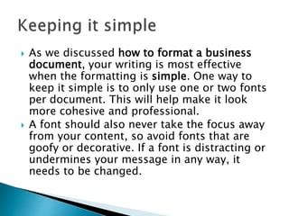
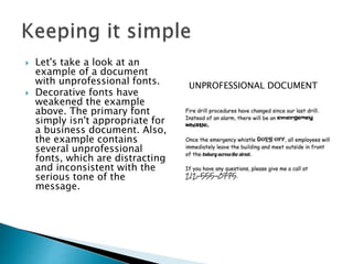
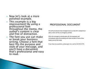
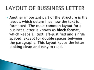
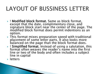
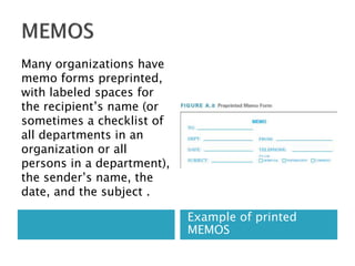
2. The format and layout of business documents
vary from country to country; they even vary
within regions of the States.
3. Your documents tell readers a lot about you
and about your company’s professionalism.
So all your documents must look neat,
present a professional image, and be easy to
read.
Your audience’s first impression of a
document comes from the quality of its
paper, the way it is customized, and its
general appearance.
4. All business letters have certain elements in
common. Several of these elements appear in
every letter; others appear only when
desirable or appropriate. In addition, these
letter parts are usually arranged in one of
three basic formats.
5. The business letter’s precise structure is
crucial to its look and readability. As you
write your letter, you can follow the structure
below to create an effective document.
Opening/Heading:
Salutation:
Body:
Closing:
Signature:
Enclosures:
6. Opening: Include your mailing address, the full date (for
example, July 30, 2017), and the recipient’s name,
company, and address. Skip one line between your
address, the date, and your recipient’s information. Don’t
add your address if you’re using letterhead that already
contains it.
Salutation: Address the recipient using “Dear,” along with
their title and last name, such as “Dear Mr. Collins” or
“Dear Director Kinkade.” If you don’t know the recipient’s
gender, use their full name, such as “Dear Taylor Dean.”
Finally, be sure to add a colon to the end of the salutation.
Body: In the first paragraph, introduce yourself and the
main point of your letter. Following paragraphs should go
into the details of your main point, while your final
paragraph should restate the letter’s purpose and provide
a call to action, if necessary.
7. Closing: Recommended formal closings include
“Sincerely” or “Yours truly.” For a more personal
closing, consider using “Cordially” or “Best
regards.” Regardless of what you choose, add a
comma to the end of it.
Signature: Skip four lines after the closing and
type your name. Skip another line and type your
job title and company name. If you’re submitting
a hard copy, sign your name in the empty space
using blue or black ink.
Enclosures: If you’re including documents with
this letter, list them here.
8.
9. Formatting a business document can seem
daunting. With a little practice, you can get
your document looking organized and
professional.
Your company may use its own style to
format its documents, such as using a
particular font or color scheme. If so, your
company's style should always take priority.
10. When handling important business topics, it may
be tempting to format your document in a
decorative and intricate fashion.
However, the key to effective formatting is
to keep it simple, even if your document's
subject matter is humongous and complex.
Simple formatting allows the content itself to be
the focal point while making your document easy
to read and navigate. After all, if the formatting
is taking focus away from the content, it's not
doing its job.
11. Simple and effective formatting begins with a
few key tips that can be applied to virtually
any business document:
Use traditional fonts, such as Times New
Roman or Arial.
Left-align the text.
Use single-spaced paragraphs.
12. As you use these tips,
remember to be
consistent throughout
your document. To see
how inconsistency can
hurt you, look at the
business letter
example right side.
The font changes four
times, the text shifts
from single double
spacing, and the
alignment changes
twice. It doesn't look
professional, does it?
13. With several types of business documents out
there, remember that each one may have
unique formatting needs. For instance,
business reports may require page numbers
or a cover page, while a memo may require
your company’s letterhead. Always keep the
needs of your document type in mind as you
format, and you will better serve your
audience.
14. If you use graphics like
images and charts in your
document, make sure
they’re clear and legible.
While you should use as
many graphics as
necessary, don’t add them
solely for decoration.
Otherwise, the extra visuals
can take over the document
and bury your message.
In the following example,
the only graphic is a chart
that's easy to read and
doesn't dominate the page.
15. Properly formatting a business document can
make a big difference in the quality of your
work. Take time to format and organize your
message, and it will be professional, clear,
and effective.
16.
17. In order for your content to be the focus of
your document, your text needs to be
professional and easy to read. This is
why choosing the right font is such a crucial
part of business writing.
Fonts are a key part of typography, which is
the art of arranging text in a legible and
appealing way. It’s helpful to know some
background on typography, so watch the
video below to learn more.
18. the business world usually prefers more
professional fonts. Throughout this lesson,
we'll focus on fonts commonly used in
business documents.
Your company may use its own style to
format its documents, such as using a
particular font or color scheme. If so, your
company's style should always take priority
over the tips in this lesson.
19. Choosing the right font depends on how you
want your document to look. Do you want it to
look classic and traditional, or do you need
something more modern? No matter what you're
searching for, it can be found within one of the
two font types: serif and sans serif.
Serif fonts have small strokes attached to the
main part of the letter, which gives the font a
more traditional look. Recommended serif fonts
include Cambria, Georgia, and Times New Roman
20.
21. Sans serif fonts don't have small strokes
attached to their letters, giving them a
cleaner and more modern style. Some
recommended sans serif fonts include Arial,
Calibri, and Verdana.
22.
23. Many typography experts believe serif fonts
are more legible in print and sans serif fonts
are easier to read on computer screens.
However, others believe that either font type
can be legible no matter where you use it.
Ultimately, you should choose the font that
best fits your message and desired look.
24. An effective font size is big enough to easily read but
doesn't take up too much space. This means your
body text should be a 10-point to a 12-point font,
depending on the look you want and your company's
preferred style. If you can't decide between sizes, a
12-point font is usually the reliable choice because
it's incredibly common in the business world.
Headings, on the other hand, can be larger than a
12-point font if you need to add emphasis.
Increasing the heading size to a 14-point or 16-point
font is usually more than enough to make your
heading stand out.
25. As we discussed how to format a business
document, your writing is most effective
when the formatting is simple. One way to
keep it simple is to only use one or two fonts
per document. This will help make it look
more cohesive and professional.
A font should also never take the focus away
from your content, so avoid fonts that are
goofy or decorative. If a font is distracting or
undermines your message in any way, it
needs to be changed.
26. Let's take a look at an
example of a document
with unprofessional fonts.
Decorative fonts have
weakened the example
above. The primary font
simply isn't appropriate for
a business document. Also,
the example contains
several unprofessional
fonts, which are distracting
and inconsistent with the
serious tone of the
message.
UNPROFESSIONAL DOCUMENT
27. Now let's look at a more
polished example.
This example is a big
improvement! By using a
professional font
throughout the memo, the
author's content is clear
and free of distraction.
The font you use can make
or break your business
writing. Choose a font that
best fits the purpose and
style of your message, and
you'll have a document
that's professional and easy
to read.
PROFESSIONAL DOCUMENT
28. Another important part of the structure is the
layout, which determines how the text is
formatted. The most common layout for a
business letter is known as block format,
which keeps all text left-justified and single
spaced, except for double spaces between
the paragraphs. This layout keeps the letter
looking clean and easy to read.
29. ! Modified block format. Same as block format,
except that the date, complimentary close, and
signature block start near the center of the page. The
modified block format does permit indentions as an
option.
This format mixes preparation speed with traditional
placement of some letter parts. It also looks more
balanced on the page than the block format does.
! Simplified format. Instead of using a salutation, this
format often weaves the reader’s name into the first
line or two of the body and often includes a subject
line in capital
letters
30. Example of printed
MEMOS
Many organizations have
memo forms preprinted,
with labeled spaces for
the recipient’s name (or
sometimes a checklist of
all departments in an
organization or all
persons in a department),
the sender’s name, the
date, and the subject .
31. If such forms don’t exist, you can use a memo
Template (which comes with word-processing
software and provides margin settings, headings,
and special formats), or you can use plain paper.
On your document, include a title such as MEMO
or INTER OFFICE CORRESPONDENCE (all in
capitals) centered at the top of the page or
aligned with the left margin.
Also at the top, include the words To, From,
Date, and Subject—followed by the appropriate
information—with a blank line between, as shown
here:
32. MEMO
TO:
FROM:
DATE:
SUBJECT:
Sometimes the heading is organized like this:
MEMO
TO:
DATE:
FROM:
SUBJECT:
33. You can arrange these four pieces of
information in almost any order.
The date sometimes appears without the
heading Date.
The subject may be presented with the letters
Re: (in place of SUBJECT:) or may even be
presented without any heading (but in capital
letters so that it stands out clearly).
You may want to include a file or reference
number, introduced by the word File.
34. Addressees. When sending a memo to a long
list of people, include the notation See
distribution list , then list the names at the
end of the memo.
Arrange this list alphabetically, except when
high-ranking officials deserve more
prominent placement.
You can also address memos to groups of
people—All Sales Representatives, Production
Group, New Product Team.
35. Courtesy titles. You need not use courtesy
titles anywhere in a memo; first initials and
last names, first names, or even initials alone
are often sufficient. However, use a courtesy
title if you would use one in a face to-face
encounter with the person.
Subject line. The subject line of a memo helps
busy colleagues quickly find out what your
memo is about. Although the subject “line”
may overflow onto a second line, it’s most
helpful when it’s short (but still informative).
36. Body. Start the body of the memo on the
second or third line below the heading. Like
the body of a letter, it’s usually single-spaced
with blank lines between paragraphs.
Indenting paragraphs is optional. Handle
lists, important passages, and subheadings
as you do in letters. If the memo is very short,
you may double-space it.
Second page. If the memo carries over to a
second page, head the second page just as
you head the second page of a letter.
37. Writer’s initials. Unlike a letter, a memo doesn’t
require a complimentary close or a signature,
because your name is already prominent at the
top. However, you may initial the memo—either
beside the name appearing at the top of the
memo or at the bottom of the memo—or you
may even sign your name at the bottom,
particularly if the memo deals with money or
confidential matters.
Other elements. Treat elements such as reference
initials, enclosure notations, and copy notations
just as you would in a letter.
38. As stated in Business Writing Essentials, revision is a
crucial part of writing. Review your letter to keep it
concise, and proof read it for spelling and grammar
errors. Once you’re finished writing, ask someone to
read your letter (if it not confidential to him/her) and
give you feedback, as they can spot errors you may
have missed. Also make sure any enclosures are
attached to your document and that any hard copies
are signed.
After revising the content, consider the appearance of
your letter. If you’re printing a hard copy, be sure to
use quality paper. Also try using letterhead to give
your document a more official look.