Download to read offline
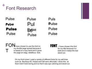
This document discusses font choices for a design project. It uses a boy band inspired font to give the double page spread an edgy, rebellious look. A bold font was chosen for the title to make the text stand out. The front cover uses a variety of fonts like Bauhaus 93, Impact and Gill sans ultra bold for the sell lines to avoid boringness and attract attention.


