
More Related Content
More from Roxannah
Recently uploaded
Recently uploaded (20)
Final Layouts
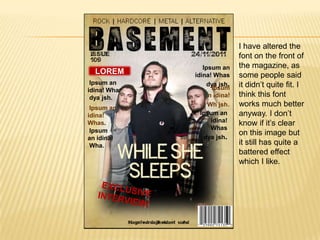
- 1. I have altered the font on the front of Ipsum an the magazine, as LOREM idina! Whas some people said Ipsum an dya jsh. Ipsum it didn’t quite fit. I idina! Wha dya jsh. n idina! think this font Ipsum an Wh jsh. works much better idina! Ipsum an anyway. I don’t Whas. idina! know if it’s clear Ipsum Whas on this image but an idina! dya jsh. Wha. it still has quite a battered effect which I like.
- 2. Suspendiss e at lectus i amgratigh Suspendisse at lectus hecterino Suspendisse at lectus Suspendisse at velit. Lorem ipsum dolor sit amet,tfg lectus hecterino consectetur adirrf amgratis un piscing elitCras cdd geroke ctetur nisi in elit p haretra at consequa sem porttitoconva Suspendisse at lectus hecterino amgratis un geroke
- 3. Phasellus aliquet augue id dolor viverra sollicitudin Phasellus aliquet augue id. Suspendisse at le ctus velit. Lorem ipsu m dolor sit amet, consectetur adipiscing elit. Cras consectetur nisi in elit pharetra at Suspendisse at lectus velit. consequat sem Lorem ipsum dolor sit porttitor. Nunc diam amet, consectetur adipiscing velit, fringilla porta elit. convallis sed, suscipit Cras consectetur quis tortor. Etiam scelerisque accumsan nisi in elit convallis. In vel auctor phaetra at consequat sem p elit. Mauris mi orttitor. Nunc diam 36 velit, fringilla purus, faucibus eget 36 porta convallis sed, suscipit 37 37
- 4. Suspendisse Suspendisse at le at le ctus velit. Lorem ctus velit. Lorem ipsu ipsu m dolor sit m dolor sit amet, consectetur amet, consectetur adipiscing elit. adipiscing elit. Phasellus aliquet augue id dolor Cras consectetur Cras consectetur viverra sollicitudin Phasellus aliquet nisi in elit pharetra nisi in elit pharetra augue id. at consequat sem at consequat sem Suspendisse porttitor. Nunc at le diam velit, fringilla ctus velit. Lorem porta convallis ipsu sed, suscipit quis m dolor sit amet, tortor. Etiam consectetur scelerisque adipiscing elit. accumsan Cras consectetur nisi in elit pharetra at consequat sem
- 5. DPS I can’t decide between the two flat plans of the double page spread. With the second one, I like the way the whole page is taken up with an image (obviously I will try and get a plainer background so the text is a little more legible), but I think I will try both out and see which looks more realistic.