Report
Share
Recommended
Question 1 in what ways does your media evalutation
The documentary follows many conventions of the genre to appear realistic and professional to viewers. These include using a voiceover, text overlays to identify speakers, and a presenter. However, some conventions were challenged, such as not revealing interview questions or hiding victims' faces, to make the experience more realistic. Another challenge was changing the focus from the presenter to the missing girl during narration, to keep viewers engaged in the story. While most conventions were followed, these challenges helped the documentary stand out from others in the industry.
Research into newspaper double page spreads
The document describes the typical layout and elements of newspaper articles and advertisements. It explains that newspaper articles usually include a main image, additional images, headlines, sub-headlines, and the main article text. Advertisements typically feature a large image of the product, the brand name, logos, and information about offers. Across newspaper pages and ads, visual elements are designed to catch the reader's eye and draw them in to read the content.
Institution research
Frozen Planet is a 7-part nature documentary series aired on the BBC in 2011 that was narrated by David Attenborough. It was produced by the BBC Natural History Unit and featured footage from the Arctic and Antarctic. The BBC is the oldest national broadcasting company in the world, founded in 1922, known for high-quality nature documentaries like Planet Earth and for having separate TV channels and radio/online services targeted at different audiences.
My institution
Game Worldwide Limited was chosen as the name for the new institution to sound professional while also being unique. Several logos were designed with the goal of keeping it simple yet attractive. Feedback was collected and the first logo was preferred as the best representation, clearly showing the abbreviation while also including the full name. This logo incorporated a globe to represent "worldwide" and was selected as the final logo for its professional and individual design.
Research into costume, props and location
The document discusses costumes, props, and locations to be used in a documentary reenactment about the kidnapping of girls. Costumes like black tracksuits and gloves will make the kidnappers seem more sinister and scary to viewers. School uniforms on the girls will highlight their vulnerability. Props like folders and a fake weapon add realism, while a getaway car engages viewers. Rural locations like a park and forest school are chosen as they seem fitting for the crime and make the reenactments intriguing for audiences.
Institutions bbc
The BBC is the oldest public broadcaster in the UK, known for its creative entertainment and documentaries. Its values include public trust, creative excellence, and accountability as it is funded by the public. The BBC aims to serve all audiences in the UK, though some demographic groups perceive it more positively than others. It produces several types of documentaries, including nature, crime, sports, and human behavior films. The Wayne Rooney documentary fit the BBC's values by exploring the life of a national figure to build trust and bring quality information to its target audiences.
Documentary styles
The document outlines four styles of documentaries: expository, observational, interactive, and reflective. The expository style uses voiceovers to explain scenes and is suited to historical or nature topics. The observational style films subjects without interaction "like a fly on the wall." Interactive documentaries involve direct interviews but may edit out questions. Reflective documentaries experiment with construction and make no attempt to hide the filmmaking process.
Weird or what
This document discusses the camera shots, edits, sound, mise-en-scene, and likes/dislikes of a documentary. It notes that establishing shots, mid shots, and long shots were used to frame subjects. Short takes during interviews showed facial expressions. Crosscutting was used between the subject and key speaker. Basic cuts transitioned between scenes. Mysterious music and soundtrack intros set the tone. Voiceovers introduced topics. Casual costumes were worn and locations rarely established relevance. The documentary kept viewers interested through intriguing topics but some presentations seemed far-fetched.
Fbi criminal pursiut
The documentary uses various film techniques to explore a crime that took place in a small community. Establishing shots provide context for the location of the crime. Close-ups during interviews show the facial expressions of witnesses recounting the serious situation. Cutaways take the viewer between interviews and recreations of the crime scene from different perspectives. A voiceover provides background throughout, while music and sound effects add to the mystery of the crime and its solution.
Most evil crime documentary
The document analyzes the cinematography, editing, mise-en-scene, sound, and reception of a crime documentary about serial killers. It describes how close-ups, establishing shots, and high angles were used to convey seriousness and perspective. Short takes and focus pulls kept the pace brisk and attention gripped. Suits and an office setting established the presenter's authority and research context. Music, voiceovers, and sound effects heightened the sinister and shocking nature of the crimes depicted. While the information engaged viewers, some effects and lack of transitions received mixed feedback.
Frontline medicine analysis
This document provides an analysis of the filmmaking techniques used in the documentary "Frontline Medicine". It discusses the use of camera shots, editing, sound, mise-en-scene, and the documentarian's opinions on what they liked and disliked. Specifically, it notes that handheld camera shots were used to convey the realism of life in the army. A variety of editing techniques like cuts, short takes, and long takes showed the rushed lifestyle of medics and allowed time to establish locations. Diegetic gunshot sounds and added music were used to illustrate the danger and somber mood. Costumes and locations also helped audiences understand the lives of soldiers. The documentarian liked the realism but disliked some
Kourtney and kim take new york analysis
The document discusses camera shots, edits, sound, mise-en-scene, and likes/dislikes of the reality TV show "Kim and Kourtney". It notes that establishing shots are used to remind viewers the show is set in New York and show their lifestyle. Close-ups are used during arguments and interviews. Two shots are most common as they involve both Kim and Kourtney. Edits include cuts and transitions between scenes. Short takes are used during conversations to keep pace. Music is upbeat to reflect their enjoyable lifestyle. Costumes, locations, and makeup aim to present the stars as fashionable and perfect.
Comparison between two documentaries
The documentaries use different filming and editing styles. Trevor McDonald's interviews mafia members face-to-face and appears uncomfortable, while the BBC documentary interviews homeless people casually as they go about daily activities. Trevor McDonald's interviews are formal while the BBC ones have a less formal, more casual tone. The mafia documentary feels staged while the homeless one aims for realism through handheld camerawork. Music is used more in the homeless documentary to provide context, while Trevor McDonald's focuses more on facts about dangerous criminals.
Change of photos
The original photos for a magazine cover were of poor quality and needed to be changed. Issues with the original photos included the model not looking at the camera and low graphic quality. The new photos were taken with a different, better camera and had a more professional look. While the clothing related to the genre of the magazine, it did not always fit properly. The new photos featured a model with a more effective pose where his face could be seen, which is crucial for attracting buyers to the magazine to make it look like real professional magazines.
Analysis
This magazine cover features rapper J. Cole prominently in black and white in the center. Quotes from reviews of Cole's new album are used to promote it as highly rated. The main colors are yellow, black, and white. Large text at the top serves as the title. Centered text emphasizes Cole as the main subject. Smaller text on the right and bottom lists other articles. The target audience is 16+ due to potentially explicit lyrics and interest in rap music. Featuring Cole in black and white ties into the black and white theme of his new album cover. The magazine brand focuses on rappers in the rap/hip hop industry.
Magazine front cover Analysis
This magazine cover features rapper J. Cole prominently in black and white in the center. Quotes from reviews of Cole's new album are used to promote it as highly rated. The main colors are yellow, black, and white. Large text at the top serves as the title. Centered text emphasizes Cole as the main subject. Smaller text on the right and bottom lists other articles. The target audience is 16+ due to potentially explicit lyrics and interest in rap music. Featuring Cole in black and white ties into the black and white theme of his new album cover. The magazine brand focuses on rappers in the rap/hip hop industry.
Media evaluation
The document evaluates the media magazine project. It discusses how the magazine uses and develops conventions of real magazines. The front cover uses conventions like the masthead and feature titles but changes the issue number placement. The contents page follows conventions like page splits but uses two artist photos instead of one. The double page spread uses an interview format instead of an article to give readers a more personal view of the artist, and includes an artist quote across the photo which clearly attributes it.
Media magazine evaluation
The document is an evaluation of a media magazine product created by the author. It discusses several aspects of the magazine, including how it uses and develops conventions of real magazines. On the front cover, the magazine follows conventions like using a partial masthead but changes the issue number placement. The contents page includes page splits to indicate ad sections and uses two photos of the featured artist rather than one long shot. The double page spread uses a Q&A format with an artist quote across their photo, challenging magazine conventions. The magazine aims to represent all social groups equally and break stereotypes. It would appeal to institutions like Bauer Media or music production companies focused on hip hop. The intended audience is those interested in rap/hip hop music.
Developments for magazine
The document details changes made to a magazine, including revising the front cover photo and design elements, updating the contents page with a new color theme and more professional layout, and completing an article and double page spread with additional design elements like a quote and magazine name.
Coloured drawings analysis
This document analyzes and provides feedback on various layout designs for magazine spreads, pages, and covers. For double page spreads, the author likes ones that are simple with one photo and text, though notes one photo may not be engaging enough. Contents pages work best when text stands out against backgrounds and features variety. Front covers should emphasize colors, include relevant props to the genre, and ensure the model is recognizable, while avoiding too much empty space. Overall, the goal is catch readers' eyes with eye-catching designs while keeping things clear and not overcrowded.
Drawings and analysis
The document discusses layout choices for a magazine cover and contents pages. It recommends a mid-shot image for the cover to allow viewers to see the artist's facial features and draw interest. A non-classical layout is preferred for the contents pages to intrigue readers. While two layout designs for a double-page spread are considered, the document concludes that combining elements from both may produce the most effective result.
Casting
The document discusses potential models to feature on the cover of a music magazine. The first model is described as a good fit due to wearing a snapback and headphones, though his suit may not suit the music genre. The second model also fits well with props representing the genre and a "bad boy" appearance. The third model is considered the best option as everything he wears fits the genre of the magazine. Using a group shot is rejected as the models' clothing would not fit the theme.
Casting
The document discusses four potential models to feature on the cover of a music magazine. The first model is deemed suitable due to wearing headphones and a snapback, relevant props for the music genre. However, his suit is not genre-specific. The second model also suits the genre with props and a loosely-tied shirt. The third model is considered the best option as everything he wears fits the genre's style. Using a group shot is rejected as the models' clothing is not fitting for the magazine's theme.
Costume and prop preperation
The document discusses costume and prop preparations for a magazine photoshoot. It proposes three items: a snapback hat to represent hip hop, rap, and R&B music; gold chains to show wealth as seen on artists in this genre; and a hooded sweatshirt which is commonly worn by rappers and others in this type of music with the hood up. These items are suggested to draw in the target audience for the magazine by making the model's appearance feel familiar and relevant to the genre of music being presented.
Magazine name analysis
The document analyzes the name of a music magazine. It argues that the plain and clear name makes it easily recognizable for customers. While some may find it boring, the plainness allows it to stand out on shelves. The name is also relevant to the genre of music featured, as it references enjoying popular music.
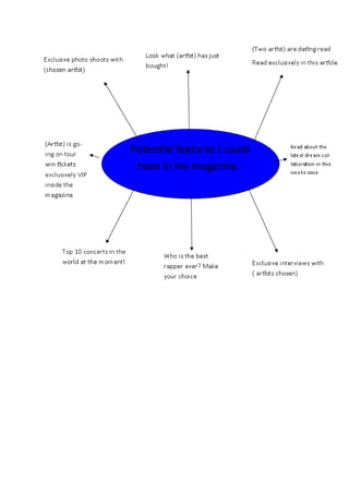
Headlines of mag
This document discusses the rise of rap music and an unnamed artist's journey from struggling to successful. It mentions using quotes and song lyrics to grab people's attention in magazines and headlines about who is the top rapper. The document also refers to exploring the true story behind the career of a chosen rap artist.
Media homework1 (3)
This magazine cover features rapper J. Cole with a headline about his new album. Quotes from reviews about the album emphasize its quality in order to entice readers to learn more. The main colors are yellow, black, and white. Large text at the top serves as the title while smaller text on the right and bottom lists other articles. The target audience is 16+ due to the potentially explicit music and focus on the rap genre. Featuring the artist in black and white ties him to the album's monochrome theme and the magazine's brand focused on rap and hip hop music.
Timeless Principles of Good Design
Timeless Principles of Good Design from my 2015 Presentation at TYPO SF
Storytelling For The Web: Integrate Storytelling in your Design Process
In this slides I explain how I have used storytelling techniques to elevate websites and brands and create memorable user experiences. You can discover practical tips as I showcase the elements of good storytelling and its applied to some examples of diverse brands/projects..
More Related Content
More from louis0141
Fbi criminal pursiut
The documentary uses various film techniques to explore a crime that took place in a small community. Establishing shots provide context for the location of the crime. Close-ups during interviews show the facial expressions of witnesses recounting the serious situation. Cutaways take the viewer between interviews and recreations of the crime scene from different perspectives. A voiceover provides background throughout, while music and sound effects add to the mystery of the crime and its solution.
Most evil crime documentary
The document analyzes the cinematography, editing, mise-en-scene, sound, and reception of a crime documentary about serial killers. It describes how close-ups, establishing shots, and high angles were used to convey seriousness and perspective. Short takes and focus pulls kept the pace brisk and attention gripped. Suits and an office setting established the presenter's authority and research context. Music, voiceovers, and sound effects heightened the sinister and shocking nature of the crimes depicted. While the information engaged viewers, some effects and lack of transitions received mixed feedback.
Frontline medicine analysis
This document provides an analysis of the filmmaking techniques used in the documentary "Frontline Medicine". It discusses the use of camera shots, editing, sound, mise-en-scene, and the documentarian's opinions on what they liked and disliked. Specifically, it notes that handheld camera shots were used to convey the realism of life in the army. A variety of editing techniques like cuts, short takes, and long takes showed the rushed lifestyle of medics and allowed time to establish locations. Diegetic gunshot sounds and added music were used to illustrate the danger and somber mood. Costumes and locations also helped audiences understand the lives of soldiers. The documentarian liked the realism but disliked some
Kourtney and kim take new york analysis
The document discusses camera shots, edits, sound, mise-en-scene, and likes/dislikes of the reality TV show "Kim and Kourtney". It notes that establishing shots are used to remind viewers the show is set in New York and show their lifestyle. Close-ups are used during arguments and interviews. Two shots are most common as they involve both Kim and Kourtney. Edits include cuts and transitions between scenes. Short takes are used during conversations to keep pace. Music is upbeat to reflect their enjoyable lifestyle. Costumes, locations, and makeup aim to present the stars as fashionable and perfect.
Comparison between two documentaries
The documentaries use different filming and editing styles. Trevor McDonald's interviews mafia members face-to-face and appears uncomfortable, while the BBC documentary interviews homeless people casually as they go about daily activities. Trevor McDonald's interviews are formal while the BBC ones have a less formal, more casual tone. The mafia documentary feels staged while the homeless one aims for realism through handheld camerawork. Music is used more in the homeless documentary to provide context, while Trevor McDonald's focuses more on facts about dangerous criminals.
Change of photos
The original photos for a magazine cover were of poor quality and needed to be changed. Issues with the original photos included the model not looking at the camera and low graphic quality. The new photos were taken with a different, better camera and had a more professional look. While the clothing related to the genre of the magazine, it did not always fit properly. The new photos featured a model with a more effective pose where his face could be seen, which is crucial for attracting buyers to the magazine to make it look like real professional magazines.
Analysis
This magazine cover features rapper J. Cole prominently in black and white in the center. Quotes from reviews of Cole's new album are used to promote it as highly rated. The main colors are yellow, black, and white. Large text at the top serves as the title. Centered text emphasizes Cole as the main subject. Smaller text on the right and bottom lists other articles. The target audience is 16+ due to potentially explicit lyrics and interest in rap music. Featuring Cole in black and white ties into the black and white theme of his new album cover. The magazine brand focuses on rappers in the rap/hip hop industry.
Analysis
This magazine cover features rapper J. Cole prominently in black and white in the center. Quotes from reviews of Cole's new album are used to promote it as highly rated. The main colors are yellow, black, and white. Large text at the top serves as the title. Centered text emphasizes Cole as the main subject. Smaller text on the right and bottom lists other articles. The target audience is 16+ due to potentially explicit lyrics and interest in rap music. Featuring Cole in black and white ties into the black and white theme of his new album cover. The magazine brand focuses on rappers in the rap/hip hop industry.
Magazine front cover Analysis
This magazine cover features rapper J. Cole prominently in black and white in the center. Quotes from reviews of Cole's new album are used to promote it as highly rated. The main colors are yellow, black, and white. Large text at the top serves as the title. Centered text emphasizes Cole as the main subject. Smaller text on the right and bottom lists other articles. The target audience is 16+ due to potentially explicit lyrics and interest in rap music. Featuring Cole in black and white ties into the black and white theme of his new album cover. The magazine brand focuses on rappers in the rap/hip hop industry.
Media evaluation
The document evaluates the media magazine project. It discusses how the magazine uses and develops conventions of real magazines. The front cover uses conventions like the masthead and feature titles but changes the issue number placement. The contents page follows conventions like page splits but uses two artist photos instead of one. The double page spread uses an interview format instead of an article to give readers a more personal view of the artist, and includes an artist quote across the photo which clearly attributes it.
Media magazine evaluation
The document is an evaluation of a media magazine product created by the author. It discusses several aspects of the magazine, including how it uses and develops conventions of real magazines. On the front cover, the magazine follows conventions like using a partial masthead but changes the issue number placement. The contents page includes page splits to indicate ad sections and uses two photos of the featured artist rather than one long shot. The double page spread uses a Q&A format with an artist quote across their photo, challenging magazine conventions. The magazine aims to represent all social groups equally and break stereotypes. It would appeal to institutions like Bauer Media or music production companies focused on hip hop. The intended audience is those interested in rap/hip hop music.
Developments for magazine
The document details changes made to a magazine, including revising the front cover photo and design elements, updating the contents page with a new color theme and more professional layout, and completing an article and double page spread with additional design elements like a quote and magazine name.
Coloured drawings analysis
This document analyzes and provides feedback on various layout designs for magazine spreads, pages, and covers. For double page spreads, the author likes ones that are simple with one photo and text, though notes one photo may not be engaging enough. Contents pages work best when text stands out against backgrounds and features variety. Front covers should emphasize colors, include relevant props to the genre, and ensure the model is recognizable, while avoiding too much empty space. Overall, the goal is catch readers' eyes with eye-catching designs while keeping things clear and not overcrowded.
Drawings and analysis
The document discusses layout choices for a magazine cover and contents pages. It recommends a mid-shot image for the cover to allow viewers to see the artist's facial features and draw interest. A non-classical layout is preferred for the contents pages to intrigue readers. While two layout designs for a double-page spread are considered, the document concludes that combining elements from both may produce the most effective result.
Casting
The document discusses potential models to feature on the cover of a music magazine. The first model is described as a good fit due to wearing a snapback and headphones, though his suit may not suit the music genre. The second model also fits well with props representing the genre and a "bad boy" appearance. The third model is considered the best option as everything he wears fits the genre of the magazine. Using a group shot is rejected as the models' clothing would not fit the theme.
Casting
The document discusses four potential models to feature on the cover of a music magazine. The first model is deemed suitable due to wearing headphones and a snapback, relevant props for the music genre. However, his suit is not genre-specific. The second model also suits the genre with props and a loosely-tied shirt. The third model is considered the best option as everything he wears fits the genre's style. Using a group shot is rejected as the models' clothing is not fitting for the magazine's theme.
Costume and prop preperation
The document discusses costume and prop preparations for a magazine photoshoot. It proposes three items: a snapback hat to represent hip hop, rap, and R&B music; gold chains to show wealth as seen on artists in this genre; and a hooded sweatshirt which is commonly worn by rappers and others in this type of music with the hood up. These items are suggested to draw in the target audience for the magazine by making the model's appearance feel familiar and relevant to the genre of music being presented.
Magazine name analysis
The document analyzes the name of a music magazine. It argues that the plain and clear name makes it easily recognizable for customers. While some may find it boring, the plainness allows it to stand out on shelves. The name is also relevant to the genre of music featured, as it references enjoying popular music.
Headlines of mag
This document discusses the rise of rap music and an unnamed artist's journey from struggling to successful. It mentions using quotes and song lyrics to grab people's attention in magazines and headlines about who is the top rapper. The document also refers to exploring the true story behind the career of a chosen rap artist.
Media homework1 (3)
This magazine cover features rapper J. Cole with a headline about his new album. Quotes from reviews about the album emphasize its quality in order to entice readers to learn more. The main colors are yellow, black, and white. Large text at the top serves as the title while smaller text on the right and bottom lists other articles. The target audience is 16+ due to the potentially explicit music and focus on the rap genre. Featuring the artist in black and white ties him to the album's monochrome theme and the magazine's brand focused on rap and hip hop music.
More from louis0141 (20)
Recently uploaded
Timeless Principles of Good Design
Timeless Principles of Good Design from my 2015 Presentation at TYPO SF
Storytelling For The Web: Integrate Storytelling in your Design Process
In this slides I explain how I have used storytelling techniques to elevate websites and brands and create memorable user experiences. You can discover practical tips as I showcase the elements of good storytelling and its applied to some examples of diverse brands/projects..
Impact of Fonts: in Web and Apps Design
Fonts play a crucial role in both User Interface (UI) and User Experience (UX) design. They affect readability, accessibility, aesthetics, and overall user perception.
Revolutionizing the Digital Landscape: Web Development Companies in India
Discover unparalleled creativity and technical prowess with India's leading web development companies. From custom solutions to e-commerce platforms, harness the expertise of skilled developers at competitive prices. Transform your digital presence, enhance the user experience, and propel your business to new heights with innovative solutions tailored to your needs, all from the heart of India's tech industry.
Divertidamente SLIDE.pptxufururururuhrurid8dj
Hsuehebvdhdueuw8wiiwieih3udud8e8wisbdydvw7wbidj38ehehdheuwjhdiwjwieheheueurhryrurhrgryd7eueue
SECURING BUILDING PERMIT CITY OF CALOOCAN.pdf
How to apply for building permit in the city of Caloocan?
What is a building permit?
Who applies for building permit?
Game Concept Presentation for Ukrainian Mythology Based Game With Designs
The Game Concept created as a Final Project piece for college. Creative Media year 2 student
Graphic Design Tools and Software .pptx
Explore the essential graphic design tools and software that can elevate your creative projects. Discover industry favorites and innovative solutions for stunning design results.
AHMED TALAAT ARCHITECTURE PORTFOLIO .pdf
Architectural and constructions management experience since 2003 including 18 years located in UAE.
Coordinate and oversee all technical activities relating to architectural and construction projects,
including directing the design team, reviewing drafts and computer models, and approving design
changes.
Organize and typically develop, and review building plans, ensuring that a project meets all safety and
environmental standards.
Prepare feasibility studies, construction contracts, and tender documents with specifications and
tender analyses.
Consulting with clients, work on formulating equipment and labor cost estimates, ensuring a project
meets environmental, safety, structural, zoning, and aesthetic standards.
Monitoring the progress of a project to assess whether or not it is in compliance with building plans
and project deadlines.
Attention to detail, exceptional time management, and strong problem-solving and communication
skills are required for this role.
EASY TUTORIAL OF HOW TO USE CAPCUT BY: FEBLESS HERNANE
CapCut is an easy-to-use video editing app perfect for beginners. To start, download and open CapCut on your phone. Tap "New Project" and select the videos or photos you want to edit. You can trim clips by dragging the edges, add text by tapping "Text," and include music by selecting "Audio." Enhance your video with filters and effects from the "Effects" menu. When you're happy with your video, tap the export button to save and share it. CapCut makes video editing simple and fun for everyone!
Technoblade The Legacy of a Minecraft Legend.
Technoblade, born Alex on June 1, 1999, was a legendary Minecraft YouTuber known for his sharp wit and exceptional PvP skills. Starting his channel in 2013, he gained nearly 11 million subscribers. His private battle with metastatic sarcoma ended in June 2022, but his enduring legacy continues to inspire millions.
Practical eLearning Makeovers for Everyone
Welcome to Practical eLearning Makeovers for Everyone. In this presentation, we’ll take a look at a bunch of easy-to-use visual design tips and tricks. And we’ll do this by using them to spruce up some eLearning screens that are in dire need of a new look.
Top Interior Designers in Bangalore.pdf1
Decormart Studio is widely recognized as one of the best interior designers in Bangalore, known for their exceptional design expertise and ability to create stunning, functional spaces. With a strong focus on client preferences and timely project delivery, Decormart Studio has built a solid reputation for their innovative and personalized approach to interior design.
定制美国西雅图城市大学毕业证学历证书原版一模一样
原版一模一样【微信:741003700 】【美国西雅图城市大学毕业证学历证书】【微信:741003700 】学位证,留信认证(真实可查,永久存档)offer、雅思、外壳等材料/诚信可靠,可直接看成品样本,帮您解决无法毕业带来的各种难题!外壳,原版制作,诚信可靠,可直接看成品样本。行业标杆!精益求精,诚心合作,真诚制作!多年品质 ,按需精细制作,24小时接单,全套进口原装设备。十五年致力于帮助留学生解决难题,包您满意。
本公司拥有海外各大学样板无数,能完美还原海外各大学 Bachelor Diploma degree, Master Degree Diploma
1:1完美还原海外各大学毕业材料上的工艺:水印,阴影底纹,钢印LOGO烫金烫银,LOGO烫金烫银复合重叠。文字图案浮雕、激光镭射、紫外荧光、温感、复印防伪等防伪工艺。材料咨询办理、认证咨询办理请加学历顾问Q/微741003700
留信网认证的作用:
1:该专业认证可证明留学生真实身份
2:同时对留学生所学专业登记给予评定
3:国家专业人才认证中心颁发入库证书
4:这个认证书并且可以归档倒地方
5:凡事获得留信网入网的信息将会逐步更新到个人身份内,将在公安局网内查询个人身份证信息后,同步读取人才网入库信息
6:个人职称评审加20分
7:个人信誉贷款加10分
8:在国家人才网主办的国家网络招聘大会中纳入资料,供国家高端企业选择人才
哪里办理美国中央华盛顿大学毕业证双学位证书原版一模一样
原版一模一样【微信:741003700 】【美国中央华盛顿大学毕业证双学位证书】【微信:741003700 】学位证,留信认证(真实可查,永久存档)offer、雅思、外壳等材料/诚信可靠,可直接看成品样本,帮您解决无法毕业带来的各种难题!外壳,原版制作,诚信可靠,可直接看成品样本。行业标杆!精益求精,诚心合作,真诚制作!多年品质 ,按需精细制作,24小时接单,全套进口原装设备。十五年致力于帮助留学生解决难题,包您满意。
本公司拥有海外各大学样板无数,能完美还原海外各大学 Bachelor Diploma degree, Master Degree Diploma
1:1完美还原海外各大学毕业材料上的工艺:水印,阴影底纹,钢印LOGO烫金烫银,LOGO烫金烫银复合重叠。文字图案浮雕、激光镭射、紫外荧光、温感、复印防伪等防伪工艺。材料咨询办理、认证咨询办理请加学历顾问Q/微741003700
留信网认证的作用:
1:该专业认证可证明留学生真实身份
2:同时对留学生所学专业登记给予评定
3:国家专业人才认证中心颁发入库证书
4:这个认证书并且可以归档倒地方
5:凡事获得留信网入网的信息将会逐步更新到个人身份内,将在公安局网内查询个人身份证信息后,同步读取人才网入库信息
6:个人职称评审加20分
7:个人信誉贷款加10分
8:在国家人才网主办的国家网络招聘大会中纳入资料,供国家高端企业选择人才
ARENA - Young adults in the workplace (Knight Moves).pdf
Presentations of Bavo Raeymaekers (Project lead youth unemployment at the City of Antwerp), Suzan Martens (Service designer at Knight Moves) and Adriaan De Keersmaeker (Community manager at Talk to C)
during the 'Arena • Young adults in the workplace' conference hosted by Knight Moves.
Heuristics Evaluation - How to Guide.pdf
This guide helps identify potential issues related to navigation, clarity, consistency, and other factors that can affect user experience.
PDF SubmissionDigital Marketing Institute in Noida
https://www.safalta.com/online-digital-marketing/advance-digital-marketing-training-in-noidaTop Digital Marketing Institute in Noida: Boost Your Career Fast
[3:29 am, 30/05/2024] +91 83818 43552: Safalta Digital Marketing Institute in Noida also provides advanced classes for individuals seeking to develop their expertise and skills in this field. These classes, led by industry experts with vast experience, focus on specific aspects of digital marketing such as advanced SEO strategies, sophisticated content creation techniques, and data-driven analytics.
Recently uploaded (20)
Storytelling For The Web: Integrate Storytelling in your Design Process
Storytelling For The Web: Integrate Storytelling in your Design Process
Revolutionizing the Digital Landscape: Web Development Companies in India
Revolutionizing the Digital Landscape: Web Development Companies in India
Game Concept Presentation for Ukrainian Mythology Based Game With Designs
Game Concept Presentation for Ukrainian Mythology Based Game With Designs
EASY TUTORIAL OF HOW TO USE CAPCUT BY: FEBLESS HERNANE
EASY TUTORIAL OF HOW TO USE CAPCUT BY: FEBLESS HERNANE
ARENA - Young adults in the workplace (Knight Moves).pdf
ARENA - Young adults in the workplace (Knight Moves).pdf
PDF SubmissionDigital Marketing Institute in Noida
PDF SubmissionDigital Marketing Institute in Noida