Exports by LDCs
•Download as PPTX, PDF•
1 like•524 views

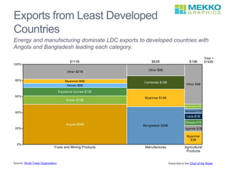
Exports from Least Developed Countries are dominated by energy and manufacturing goods, with Angola leading in energy exports and Bangladesh leading in manufacturing exports to developed nations according to a World Trade Organization report.
Report
Share
Report
Share
Recommended
Stop the extinction of bees,presentation5
encaustic,art,bees,creativity,pen,wax iron,Jesus,God,ecology,Bible
Thrift vs Protocol Buffers vs Avro - Biased Comparison
Igor Anishchenko
Odessa Java TechTalks
Lohika - May, 2012
Let's take a step back and compare data serialization formats, of which there are plenty. What are the key differences between Apache Thrift, Google Protocol Buffers and Apache Avro. Which is "The Best"? Truth of the matter is, they are all very good and each has its own strong points. Hence, the answer is as much of a personal choice, as well as understanding of the historical context for each, and correctly identifying your own, individual requirements.
US Covid-19 Deaths in Long-Term Care
For most states, the majority of Covid-19 deaths were in long-term care facilities, as shown in this horizontal bar chart. For the country as a whole, 42% of all Covid-19 deaths were in long-term care facilities. Minnesota's 635 Covid deaths in long-term care were 81% of the state's total Covid deaths. Rhode Island, New Hampshire and Connecticut all had 70% or more of their Covid deaths among long-term care facility occupants. At the other extreme, only 20% of New York's Covid deaths and 24% of Nevada's were long-term care related. Even though New York's percentage was lowest, it had the greatest number of deaths in long-term care at 5,847. Data were compiled by the Kaiser Family Foundation and came from 37 states as of May 21, 2020.
COVID-19 Deaths
Eighty per cent of the 133,359 COVID-19 deaths are concentrated in 7 countries with 20% in the US, as shown in this 100% stacked bar chart. The seven other countries are mostly in Europe--Italy, Spain, France, United Kingdom, and Belgium, with Iran being the other. The 27,886 US COVID-19 deaths are also concentrated. There were 10,834 in New York, which is 39% of the total in the US. New Jersey accounted for 10% (2,805). Two other states, Michigan and Louisiana, had over 1,000 deaths. COVID-19 deaths data were compiled by worldometer on April 15.
COVID-19 Cases by Country
While the most COVID-19 cases to date have been reported in the US, European countries have the highest ratio of cases per capita, as shown in these two horizontal bar charts. Data are from Johns Hopkins Coronavirus COVID-19 Global Cases report and are as of April 9.
CARES Act $2T Stimulus Bill
While individuals receive the largest share of the package, loans to large companies is the largest segment at $425B or 21% of the total, as shown in this Marimekko chart. The bulk of relief to individuals will come in cash payments ($300B) and extra unemployment benefits ($260B). Other large amounts are for new small business loans ($350B) and aid to state and local governments ($340B).
Global Entertainment Market
Home/mobile accounts for most of the growth in the $100B entertainment market, as shown in the top stacked bar chart. Digital has replaced physical distribution for home/mobile viewers, as shown in the bottom chart. Data are from the Motion Picture Association 2019 Theme Report.
Child Malnutrition Worldwide
Malnutrition affects 29% of school age children worldwide, according to UNICEF. In all regions except South Asia, more are overweight and obese than are underweight, as shown in this Marimekko chart.
Vehicle Buyers by Age
Vehicle buyers are older than the typical American and buyers in 2017 are older than buyers in 2007, as shown in these two 100% stacked bar charts. Americans 55 and over make up 38% of the adult population, but 52% of vehicle buyers. While those 34 and under are 30% of the US adult population, but only 14% of vehicle buyers.
This trend is more pronounced now than a decade ago. The largest changes occurred in vehicle buyers 65 and over and those between 35 and 44. The 65 and over segment grew from 13% to 27% of purchasers. The 35-44 segment shrunk from 29% to 14% of purchasers. Data were compiled by Green Car Congress.
Billionaires and Their Wealth
There were 5% fewer billionaires and total billionaire wealth declined 7% from 2017 to 2018, as shown in these stacked bar charts. The decline in the number of billionaires was greatest in Asia, shrinking from 784 to 677 (14%) and their total wealth went from $2.4T to $2.2T (9%). The number of billionaires went from 821 to 792 in Europe (4%) and their wealth went from $2.3T to $2.2T (7%). In North America, the number of billionaires increased from 727 to 750 (3%), but the total wealth of North American billionaires declined 5% from $3.3T to $3.1T. Data are from the WealthX Billionaire Census 2019.
Ask the Expert webinar February 2019
The deck for our February webinar. David Goldstein answers our most common user questions.
A recording of the session can be viewed at https://youtu.be/jSKyqmZ4gTU
Start-Up Funding
Funding of US VC-backed start-ups reached almost $100B in 2018, up from $76B in 2017, as shown in these bar charts. While the number of deals funded fell by 5%, the average deal size increased 37%. Data are from the PwC/CB Insights MoneyTree Report for Q4 2018.
Profile of America's Homeless
While the 553,000 homeless in the US are more likely to be over 24, male, and on their own, one third of the homeless are members of families with children as shown in this 100% stacked bar chart. Data from the 2018 Annual Homeless Assessment Report to Congress show how the homeless population is broken down by age, race, gender, location and whether or not they were in a shelter.
Ten Worst US Traffic Corridors
The ten worst traffic corridors in the US are shown in this bubble chart. Four are in New York and three in Chicago. The worst is the I-95 corridor in the Bronx, better known as the Cross-Bronx Expressway. The data are supplied by Inrix and the chart can be downloaded in PowerPoint from our website: https://wp.me/p5eN9Y-49Q
Netflix Q1 2018 Results
Member growth and improved international profit margins led to strong Q1 results for Netflix as shown in the cascade and stacked bar charts. Netflix revenue was about evenly split between domestic and international paid members. About 2/3 of profit came from domestic members. Click here to download the chart in PowerPoint to edit using Mekko Graphics: https://wp.me/p5eN9Y-492
Smartphone Sales Growth
Emerging economies had lower priced smartphones and grew between 4 and 10% in units sold in 2017, according to data provided by GfK. Developed economies and China had flat or declining unit sales. The bubble chart maps unit sales growth and cost per unit by region.
Amazon's Record Revenue Quarter
Amazon's revenue grew 34% or $11B in Q3 from 2016 to 2017. Over half came from an increase in sales in North America. Amazon web services (AWS) had the biggest percentage growth. In this cascade chart created using Mekko Graphics, Amazon's Q3 2017 revenue increase from Q3 2016 is broken down by segment.
Mastering Chart Selection
Learn how to choose the right chart based on the message you are trying to convey. See chart examples that address a wide range of business questions.
June 2017 Webinar: Tips and Tricks
This deck was used in our June 2017 webinar to highlight some common tips and time-saving tricks to help you get the most out of Mekko Graphics!
A recorded version of that webinar can be viewed at https://youtu.be/DeT5_qR_pjM
Choosing the Right Chart: Strategies for Effectively Presenting Data
No matter how much effort you’ve put into organizing, validating and analyzing data, if you choose the wrong data representation your insights will be lost on your audience. In this presentation, you’ll see why selecting the right chart is critical, how to match the correct chart to the data you have and the insight you want to present, and how to tweak your charts for maximum impact. I will draw on lessons learned from top strategy consulting and private equity firms.
What's New in Mekko Graphics 8 for Windows
See some of the new Mekko Graphics features in action. Using the latest release, you can apply colors to your charts more strategically and reduce chart production time by taking advantage of fast formatting options. You can also make stunning Gantt charts using the new Gantt interface. New cascade functionality allows you to create more complex cascade charts by customizing the relationship between bars.
Military Spending Per Capita
Military spending per capita varies greatly among the countries with the 10 largest budgets. Saudi Arabia and the USA have the highest per capita spending and India and China the lowest.
More Related Content
More from Mekko Graphics
COVID-19 Cases by Country
While the most COVID-19 cases to date have been reported in the US, European countries have the highest ratio of cases per capita, as shown in these two horizontal bar charts. Data are from Johns Hopkins Coronavirus COVID-19 Global Cases report and are as of April 9.
CARES Act $2T Stimulus Bill
While individuals receive the largest share of the package, loans to large companies is the largest segment at $425B or 21% of the total, as shown in this Marimekko chart. The bulk of relief to individuals will come in cash payments ($300B) and extra unemployment benefits ($260B). Other large amounts are for new small business loans ($350B) and aid to state and local governments ($340B).
Global Entertainment Market
Home/mobile accounts for most of the growth in the $100B entertainment market, as shown in the top stacked bar chart. Digital has replaced physical distribution for home/mobile viewers, as shown in the bottom chart. Data are from the Motion Picture Association 2019 Theme Report.
Child Malnutrition Worldwide
Malnutrition affects 29% of school age children worldwide, according to UNICEF. In all regions except South Asia, more are overweight and obese than are underweight, as shown in this Marimekko chart.
Vehicle Buyers by Age
Vehicle buyers are older than the typical American and buyers in 2017 are older than buyers in 2007, as shown in these two 100% stacked bar charts. Americans 55 and over make up 38% of the adult population, but 52% of vehicle buyers. While those 34 and under are 30% of the US adult population, but only 14% of vehicle buyers.
This trend is more pronounced now than a decade ago. The largest changes occurred in vehicle buyers 65 and over and those between 35 and 44. The 65 and over segment grew from 13% to 27% of purchasers. The 35-44 segment shrunk from 29% to 14% of purchasers. Data were compiled by Green Car Congress.
Billionaires and Their Wealth
There were 5% fewer billionaires and total billionaire wealth declined 7% from 2017 to 2018, as shown in these stacked bar charts. The decline in the number of billionaires was greatest in Asia, shrinking from 784 to 677 (14%) and their total wealth went from $2.4T to $2.2T (9%). The number of billionaires went from 821 to 792 in Europe (4%) and their wealth went from $2.3T to $2.2T (7%). In North America, the number of billionaires increased from 727 to 750 (3%), but the total wealth of North American billionaires declined 5% from $3.3T to $3.1T. Data are from the WealthX Billionaire Census 2019.
Ask the Expert webinar February 2019
The deck for our February webinar. David Goldstein answers our most common user questions.
A recording of the session can be viewed at https://youtu.be/jSKyqmZ4gTU
Start-Up Funding
Funding of US VC-backed start-ups reached almost $100B in 2018, up from $76B in 2017, as shown in these bar charts. While the number of deals funded fell by 5%, the average deal size increased 37%. Data are from the PwC/CB Insights MoneyTree Report for Q4 2018.
Profile of America's Homeless
While the 553,000 homeless in the US are more likely to be over 24, male, and on their own, one third of the homeless are members of families with children as shown in this 100% stacked bar chart. Data from the 2018 Annual Homeless Assessment Report to Congress show how the homeless population is broken down by age, race, gender, location and whether or not they were in a shelter.
Ten Worst US Traffic Corridors
The ten worst traffic corridors in the US are shown in this bubble chart. Four are in New York and three in Chicago. The worst is the I-95 corridor in the Bronx, better known as the Cross-Bronx Expressway. The data are supplied by Inrix and the chart can be downloaded in PowerPoint from our website: https://wp.me/p5eN9Y-49Q
Netflix Q1 2018 Results
Member growth and improved international profit margins led to strong Q1 results for Netflix as shown in the cascade and stacked bar charts. Netflix revenue was about evenly split between domestic and international paid members. About 2/3 of profit came from domestic members. Click here to download the chart in PowerPoint to edit using Mekko Graphics: https://wp.me/p5eN9Y-492
Smartphone Sales Growth
Emerging economies had lower priced smartphones and grew between 4 and 10% in units sold in 2017, according to data provided by GfK. Developed economies and China had flat or declining unit sales. The bubble chart maps unit sales growth and cost per unit by region.
Amazon's Record Revenue Quarter
Amazon's revenue grew 34% or $11B in Q3 from 2016 to 2017. Over half came from an increase in sales in North America. Amazon web services (AWS) had the biggest percentage growth. In this cascade chart created using Mekko Graphics, Amazon's Q3 2017 revenue increase from Q3 2016 is broken down by segment.
Mastering Chart Selection
Learn how to choose the right chart based on the message you are trying to convey. See chart examples that address a wide range of business questions.
June 2017 Webinar: Tips and Tricks
This deck was used in our June 2017 webinar to highlight some common tips and time-saving tricks to help you get the most out of Mekko Graphics!
A recorded version of that webinar can be viewed at https://youtu.be/DeT5_qR_pjM
Choosing the Right Chart: Strategies for Effectively Presenting Data
No matter how much effort you’ve put into organizing, validating and analyzing data, if you choose the wrong data representation your insights will be lost on your audience. In this presentation, you’ll see why selecting the right chart is critical, how to match the correct chart to the data you have and the insight you want to present, and how to tweak your charts for maximum impact. I will draw on lessons learned from top strategy consulting and private equity firms.
What's New in Mekko Graphics 8 for Windows
See some of the new Mekko Graphics features in action. Using the latest release, you can apply colors to your charts more strategically and reduce chart production time by taking advantage of fast formatting options. You can also make stunning Gantt charts using the new Gantt interface. New cascade functionality allows you to create more complex cascade charts by customizing the relationship between bars.
Military Spending Per Capita
Military spending per capita varies greatly among the countries with the 10 largest budgets. Saudi Arabia and the USA have the highest per capita spending and India and China the lowest.
More from Mekko Graphics (20)
Choosing the Right Chart: Strategies for Effectively Presenting Data
Choosing the Right Chart: Strategies for Effectively Presenting Data
Recently uploaded
where can I find a legit pi merchant online
Yes. This is very easy what you need is a recommendation from someone who has successfully traded pi coins before with a merchant.
Who is a pi merchant?
A pi merchant is someone who buys pi network coins and resell them to Investors looking forward to hold thousands of pi coins before the open mainnet.
I will leave the telegram contact of my personal pi merchant to trade with
@Pi_vendor_247
US Economic Outlook - Being Decided - M Capital Group August 2021.pdf
The U.S. economy is continuing its impressive recovery from the COVID-19 pandemic and not slowing down despite re-occurring bumps. The U.S. savings rate reached its highest ever recorded level at 34% in April 2020 and Americans seem ready to spend. The sectors that had been hurt the most by the pandemic specifically reduced consumer spending, like retail, leisure, hospitality, and travel, are now experiencing massive growth in revenue and job openings.
Could this growth lead to a “Roaring Twenties”? As quickly as the U.S. economy contracted, experiencing a 9.1% drop in economic output relative to the business cycle in Q2 2020, the largest in recorded history, it has rebounded beyond expectations. This surprising growth seems to be fueled by the U.S. government’s aggressive fiscal and monetary policies, and an increase in consumer spending as mobility restrictions are lifted. Unemployment rates between June 2020 and June 2021 decreased by 5.2%, while the demand for labor is increasing, coupled with increasing wages to incentivize Americans to rejoin the labor force. Schools and businesses are expected to fully reopen soon. In parallel, vaccination rates across the country and the world continue to rise, with full vaccination rates of 50% and 14.8% respectively.
However, it is not completely smooth sailing from here. According to M Capital Group, the main risks that threaten the continued growth of the U.S. economy are inflation, unsettled trade relations, and another wave of Covid-19 mutations that could shut down the world again. Have we learned from the past year of COVID-19 and adapted our economy accordingly?
“In order for the U.S. economy to continue growing, whether there is another wave or not, the U.S. needs to focus on diversifying supply chains, supporting business investment, and maintaining consumer spending,” says Grace Feeley, a research analyst at M Capital Group.
While the economic indicators are positive, the risks are coming closer to manifesting and threatening such growth. The new variants spreading throughout the world, Delta, Lambda, and Gamma, are vaccine-resistant and muddy the predictions made about the economy and health of the country. These variants bring back the feeling of uncertainty that has wreaked havoc not only on the stock market but the mindset of people around the world. MCG provides unique insight on how to mitigate these risks to possibly ensure a bright economic future.
what is the best method to sell pi coins in 2024
The best way to sell your pi coins safely is trading with an exchange..but since pi is not launched in any exchange, and second option is through a VERIFIED pi merchant.
Who is a pi merchant?
A pi merchant is someone who buys pi coins from miners and pioneers and resell them to Investors looking forward to hold massive amounts before mainnet launch in 2026.
I will leave the telegram contact of my personal pi merchant to trade pi coins with.
@Pi_vendor_247
how can I sell/buy bulk pi coins securely
Even tho Pi network is not listed on any exchange yet.
Buying/Selling or investing in pi network coins is highly possible through the help of vendors. You can buy from vendors[ buy directly from the pi network miners and resell it]. I will leave the telegram contact of my personal vendor.
@Pi_vendor_247
The WhatsPump Pseudonym Problem and the Hilarious Downfall of Artificial Enga...
The WhatsPump Pseudonym Problem and the Hilarious Downfall of Artificial Engagement
Which Crypto to Buy Today for Short-Term in May-June 2024.pdf
The world of bitcoin is constantly changing, with new opportunities and hazards surfacing practically daily.
how to sell pi coins effectively (from 50 - 100k pi)
Anywhere in the world, including Africa, America, and Europe, you can sell Pi Network Coins online and receive cash through online payment options.
Pi has not yet been launched on any exchange because we are currently using the confined Mainnet. The planned launch date for Pi is June 28, 2026.
Reselling to investors who want to hold until the mainnet launch in 2026 is currently the sole way to sell.
Consequently, right now. All you need to do is select the right pi network provider.
Who is a pi merchant?
An individual who buys coins from miners on the pi network and resells them to investors hoping to hang onto them until the mainnet is launched is known as a pi merchant.
debuts.
I'll provide you the Telegram username
@Pi_vendor_247
The Evolution of Non-Banking Financial Companies (NBFCs) in India: Challenges...
Role in Financial System
NBFCs are critical in bridging the financial inclusion gap.
They provide specialized financial services that cater to segments often neglected by traditional banks.
Economic Impact
NBFCs contribute significantly to India's GDP.
They support sectors like micro, small, and medium enterprises (MSMEs), housing finance, and personal loans.
The new type of smart, sustainable entrepreneurship and the next day | Europe...
europeanbusinessreview.eu, 27-05-24
The secret way to sell pi coins effortlessly.
Well as we all know pi isn't launched yet. But you can still sell your pi coins effortlessly because some whales in China are interested in holding massive pi coins. And they are willing to pay good money for it. If you are interested in selling I will leave a contact for you. Just telegram this number below. I sold about 3000 pi coins to him and he paid me immediately.
Telegram: @Pi_vendor_247
Turin Startup Ecosystem 2024 - Ricerca sulle Startup e il Sistema dell'Innov...
Turin Startup Ecosystem 2024 - Ricerca sulle Startup e il Sistema dell'Innov...Quotidiano Piemontese
Turin Startup Ecosystem 2024
Una ricerca de il Club degli Investitori, in collaborazione con ToTeM Torino Tech Map e con il supporto della ESCP Business School e di Growth Capitalhow to sell pi coins in South Korea profitably.
Yes. You can sell your pi network coins in South Korea or any other country, by finding a verified pi merchant
What is a verified pi merchant?
Since pi network is not launched yet on any exchange, the only way you can sell pi coins is by selling to a verified pi merchant, and this is because pi network is not launched yet on any exchange and no pre-sale or ico offerings Is done on pi.
Since there is no pre-sale, the only way exchanges can get pi is by buying from miners. So a pi merchant facilitates these transactions by acting as a bridge for both transactions.
How can i find a pi vendor/merchant?
Well for those who haven't traded with a pi merchant or who don't already have one. I will leave the telegram id of my personal pi merchant who i trade pi with.
Tele gram: @Pi_vendor_247
#pi #sell #nigeria #pinetwork #picoins #sellpi #Nigerian #tradepi #pinetworkcoins #sellmypi
一比一原版BCU毕业证伯明翰城市大学毕业证成绩单如何办理
BCU毕业证原版定制【微信:176555708】【伯明翰城市大学毕业证成绩单-学位证】【微信:176555708】(留信学历认证永久存档查询)采用学校原版纸张、特殊工艺完全按照原版一比一制作(包括:隐形水印,阴影底纹,钢印LOGO烫金烫银,LOGO烫金烫银复合重叠,文字图案浮雕,激光镭射,紫外荧光,温感,复印防伪)行业标杆!精益求精,诚心合作,真诚制作!多年品质 ,按需精细制作,24小时接单,全套进口原装设备,十五年致力于帮助留学生解决难题,业务范围有加拿大、英国、澳洲、韩国、美国、新加坡,新西兰等学历材料,包您满意。
◆◆◆◆◆ — — — — — — — — 【留学教育】留学归国服务中心 — — — — — -◆◆◆◆◆
【主营项目】
一.毕业证【微信:176555708】成绩单、使馆认证、教育部认证、雅思托福成绩单、学生卡等!
二.真实使馆公证(即留学回国人员证明,不成功不收费)
三.真实教育部学历学位认证(教育部存档!教育部留服网站永久可查)
四.办理各国各大学文凭(一对一专业服务,可全程监控跟踪进度)
如果您处于以下几种情况:
◇在校期间,因各种原因未能顺利毕业……拿不到官方毕业证【微信:176555708】
◇面对父母的压力,希望尽快拿到;
◇不清楚认证流程以及材料该如何准备;
◇回国时间很长,忘记办理;
◇回国马上就要找工作,办给用人单位看;
◇企事业单位必须要求办理的
◇需要报考公务员、购买免税车、落转户口
◇申请留学生创业基金
留信网认证的作用:
1:该专业认证可证明留学生真实身份
2:同时对留学生所学专业登记给予评定
3:国家专业人才认证中心颁发入库证书
4:这个认证书并且可以归档倒地方
5:凡事获得留信网入网的信息将会逐步更新到个人身份内,将在公安局网内查询个人身份证信息后,同步读取人才网入库信息
6:个人职称评审加20分
7:个人信誉贷款加10分→ 【关于价格问题(保证一手价格)
我们所定的价格是非常合理的,而且我们现在做得单子大多数都是代理和回头客户介绍的所以一般现在有新的单子 我给客户的都是第一手的代理价格,因为我想坦诚对待大家 不想跟大家在价格方面浪费时间
对于老客户或者被老客户介绍过来的朋友,我们都会适当给一些优惠。
8:在国家人才网主办的国家网络招聘大会中纳入资料,供国家高端企业选择人才
选择实体注册公司办理,更放心,更安全!我们的承诺:可来公司面谈,可签订合同,会陪同客户一起到教育部认证窗口递交认证材料,客户在教育部官方认证查询网站查询到认证通过结果后付款,不成功不收费!
学历顾问:微信:176555708
Recently uploaded (20)
US Economic Outlook - Being Decided - M Capital Group August 2021.pdf
US Economic Outlook - Being Decided - M Capital Group August 2021.pdf
655264371-checkpoint-science-past-papers-april-2023.pdf
655264371-checkpoint-science-past-papers-april-2023.pdf
Scope Of Macroeconomics introduction and basic theories
Scope Of Macroeconomics introduction and basic theories
managementaccountingunitiv-230422140105-dd17d80b.ppt
managementaccountingunitiv-230422140105-dd17d80b.ppt
The WhatsPump Pseudonym Problem and the Hilarious Downfall of Artificial Enga...
The WhatsPump Pseudonym Problem and the Hilarious Downfall of Artificial Enga...
Which Crypto to Buy Today for Short-Term in May-June 2024.pdf
Which Crypto to Buy Today for Short-Term in May-June 2024.pdf
how to sell pi coins effectively (from 50 - 100k pi)
how to sell pi coins effectively (from 50 - 100k pi)
The Evolution of Non-Banking Financial Companies (NBFCs) in India: Challenges...
The Evolution of Non-Banking Financial Companies (NBFCs) in India: Challenges...
The new type of smart, sustainable entrepreneurship and the next day | Europe...
The new type of smart, sustainable entrepreneurship and the next day | Europe...
Turin Startup Ecosystem 2024 - Ricerca sulle Startup e il Sistema dell'Innov...
Turin Startup Ecosystem 2024 - Ricerca sulle Startup e il Sistema dell'Innov...
Exports by LDCs
- 1. Exports from Least Developed Countries Energy and manufacturing dominate LDC exports to developed countries with Angola and Bangladesh leading each category. Source: World Trade Organization Subscribe to the Chart of the Week