The document describes how a hip hop magazine attracts and addresses its audience.
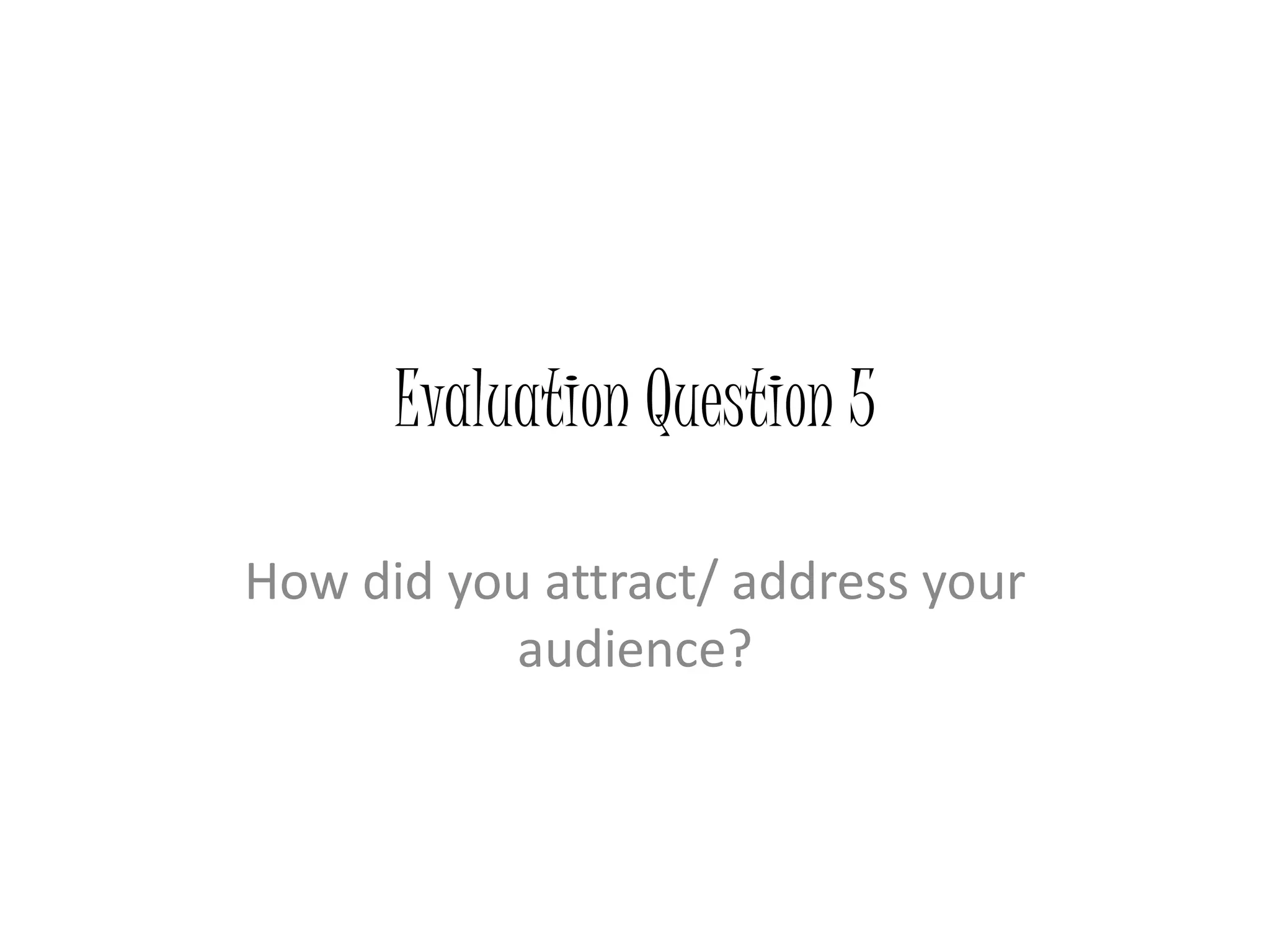
The front cover uses a graffiti font and border to appeal to readers interested in graffiti. It also uses the tagline "at the heart of rap and hip hop" to imply the magazine focuses on these genres. Images of iconic hip hop outfits and accessories also attract readers.
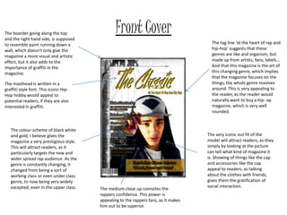
Inside, the content page uses slang in its title to make readers feel relaxed. Images of rappers in expensive clothes appeal to aspirational readers. Historic fonts represent the genres' association with crime.
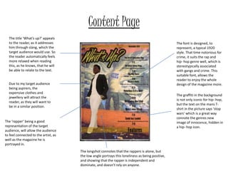
A double page spread uses pull quotes and celebrity photos in different outfits to interest and connect readers to artists. Varied photo effects show the


![Proposal [autosaved]](https://cdn.slidesharecdn.com/ss_thumbnails/proposalautosaved-161114222431-thumbnail.jpg?width=640&height=640&fit=bounds)


