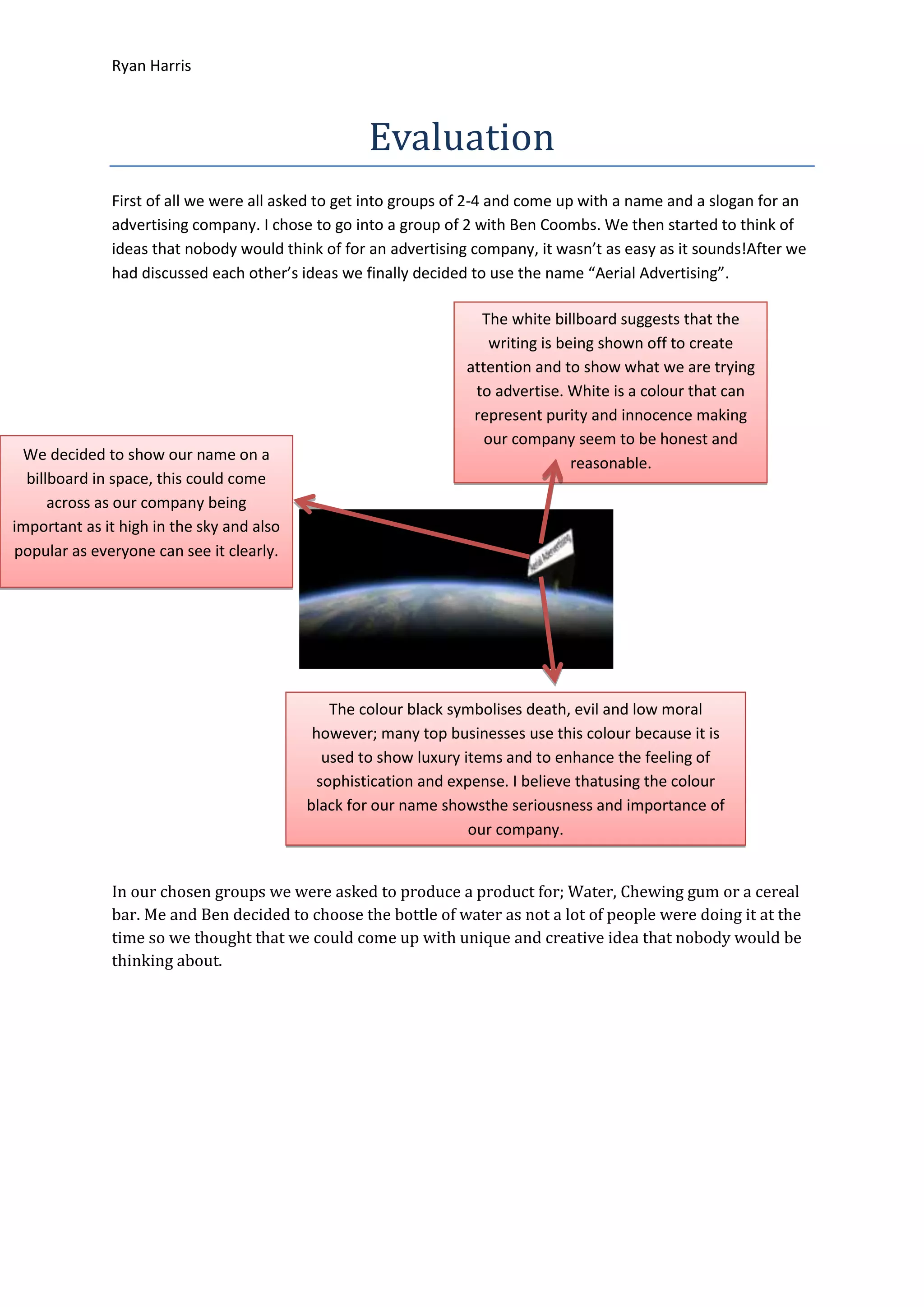
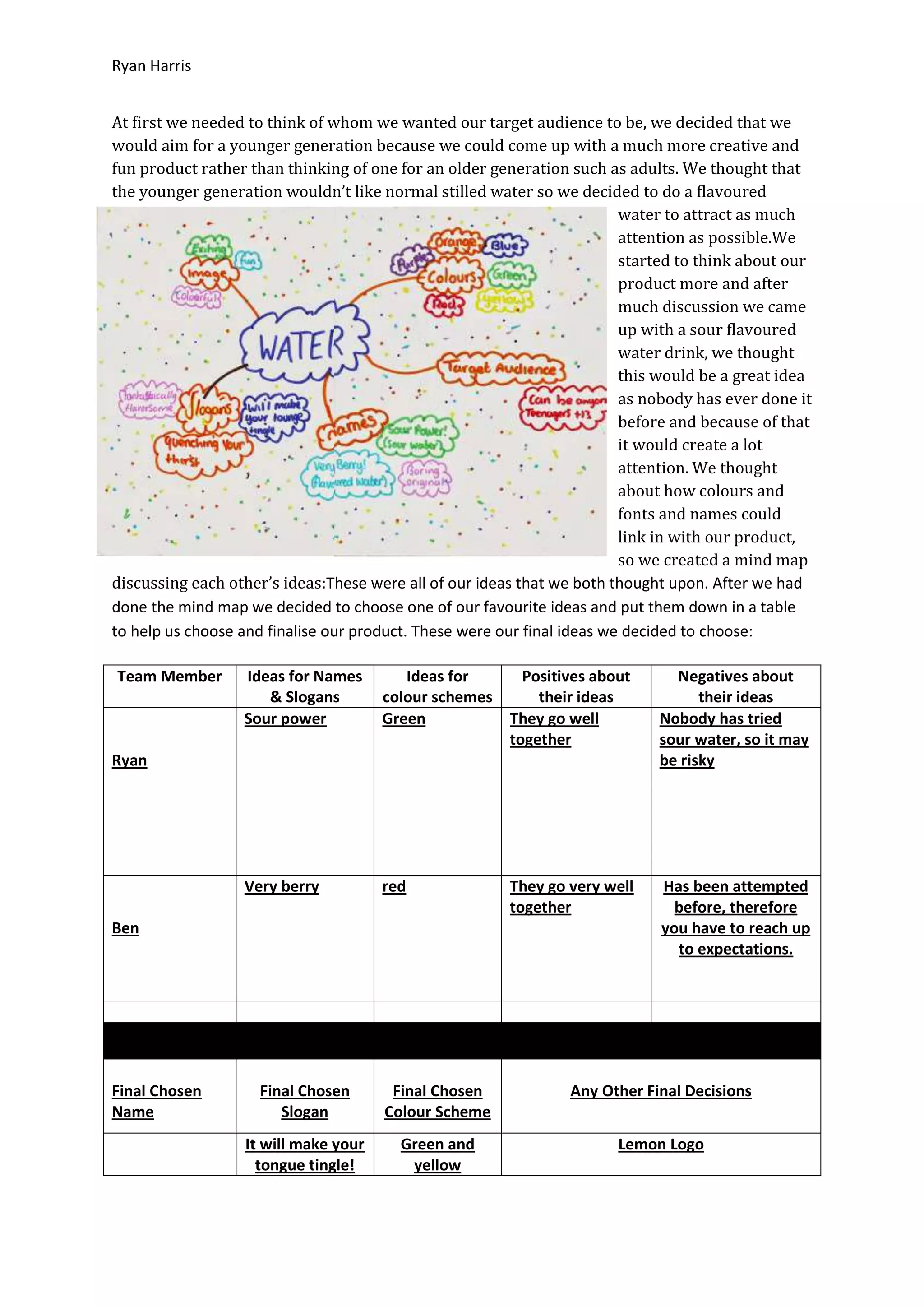
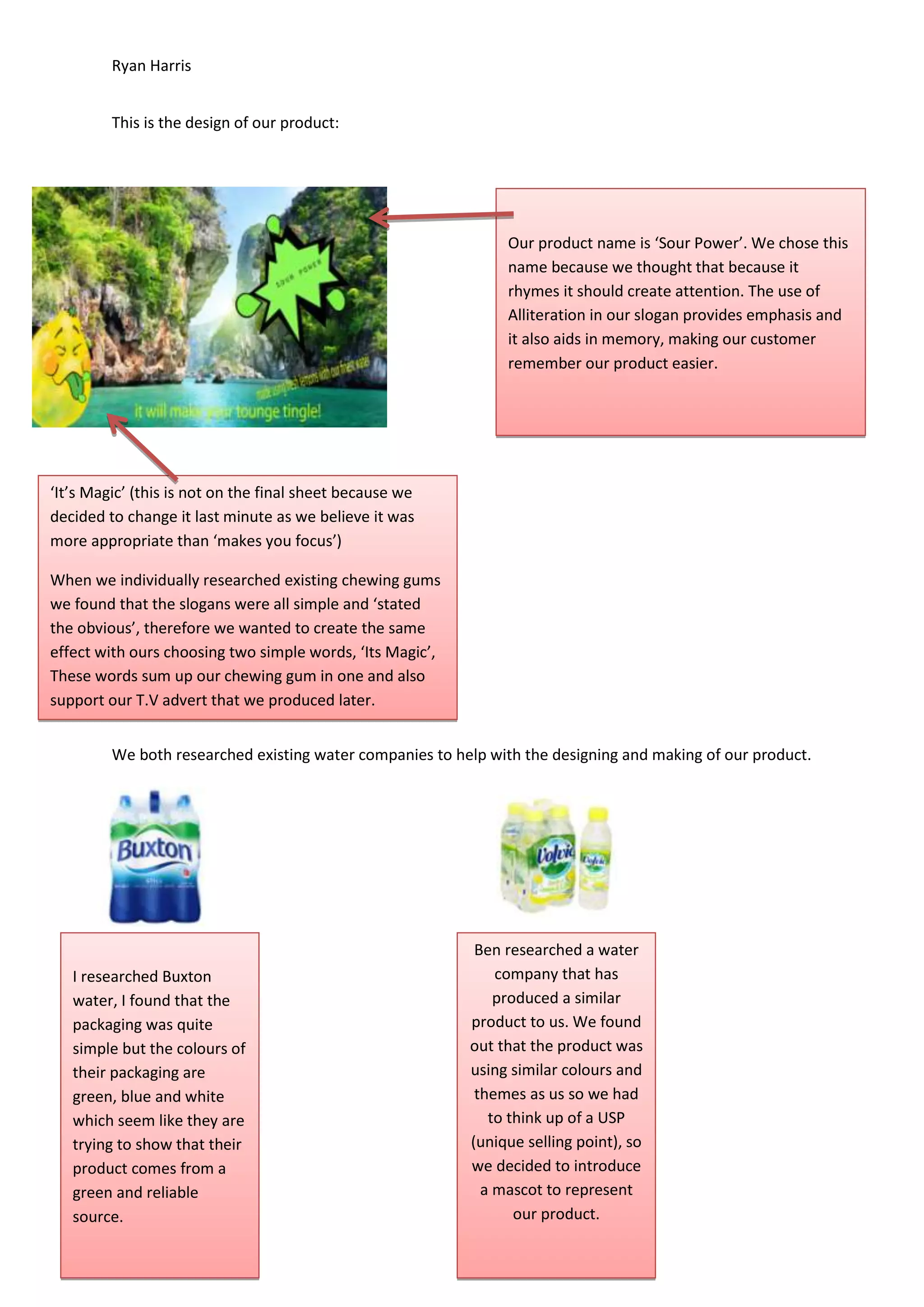
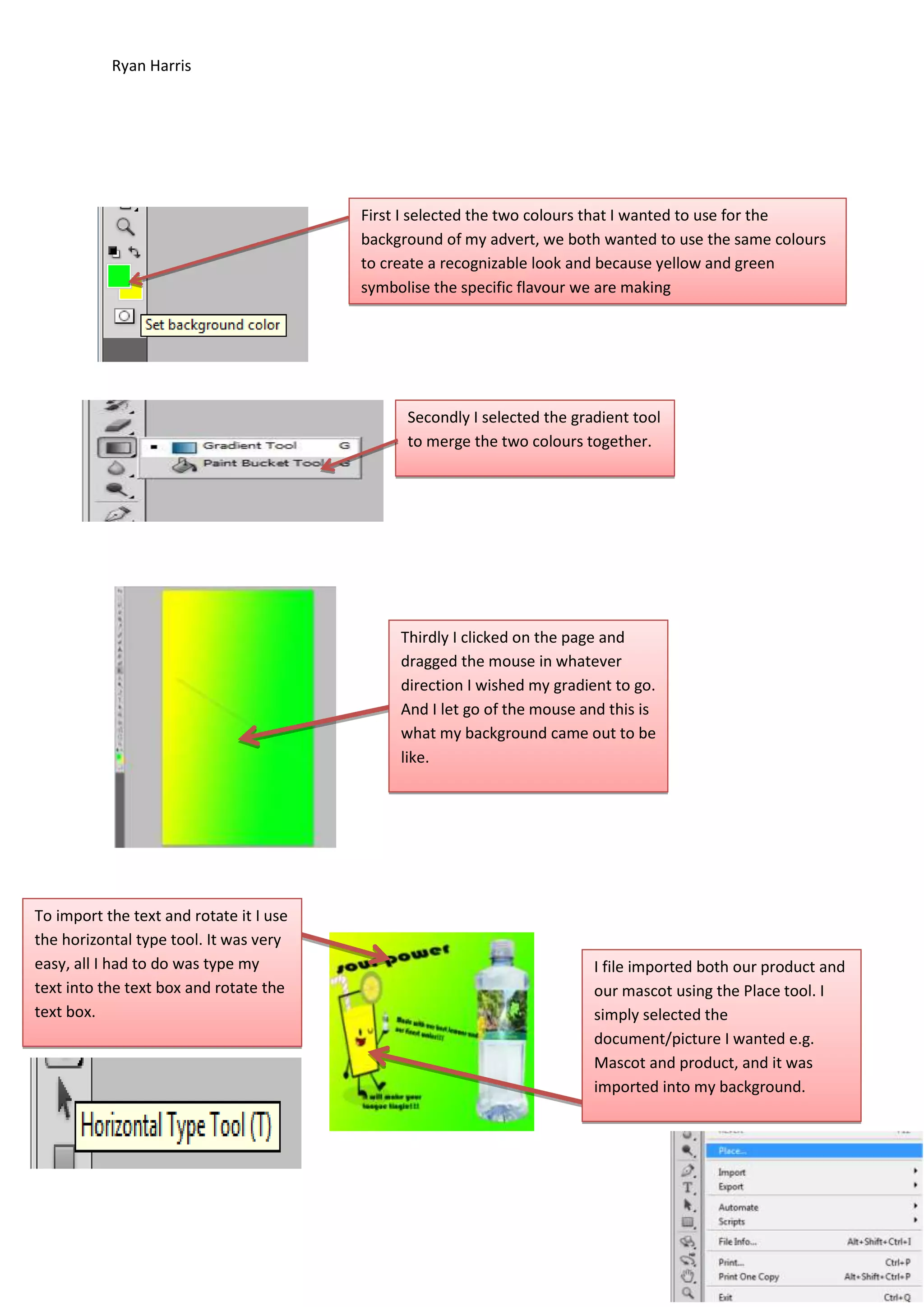
- Ryan and Ben formed a group to create an advertising company called "Aerial Advertising". They chose to create a sour flavored water drink called "Sour Power" targeted at younger audiences.
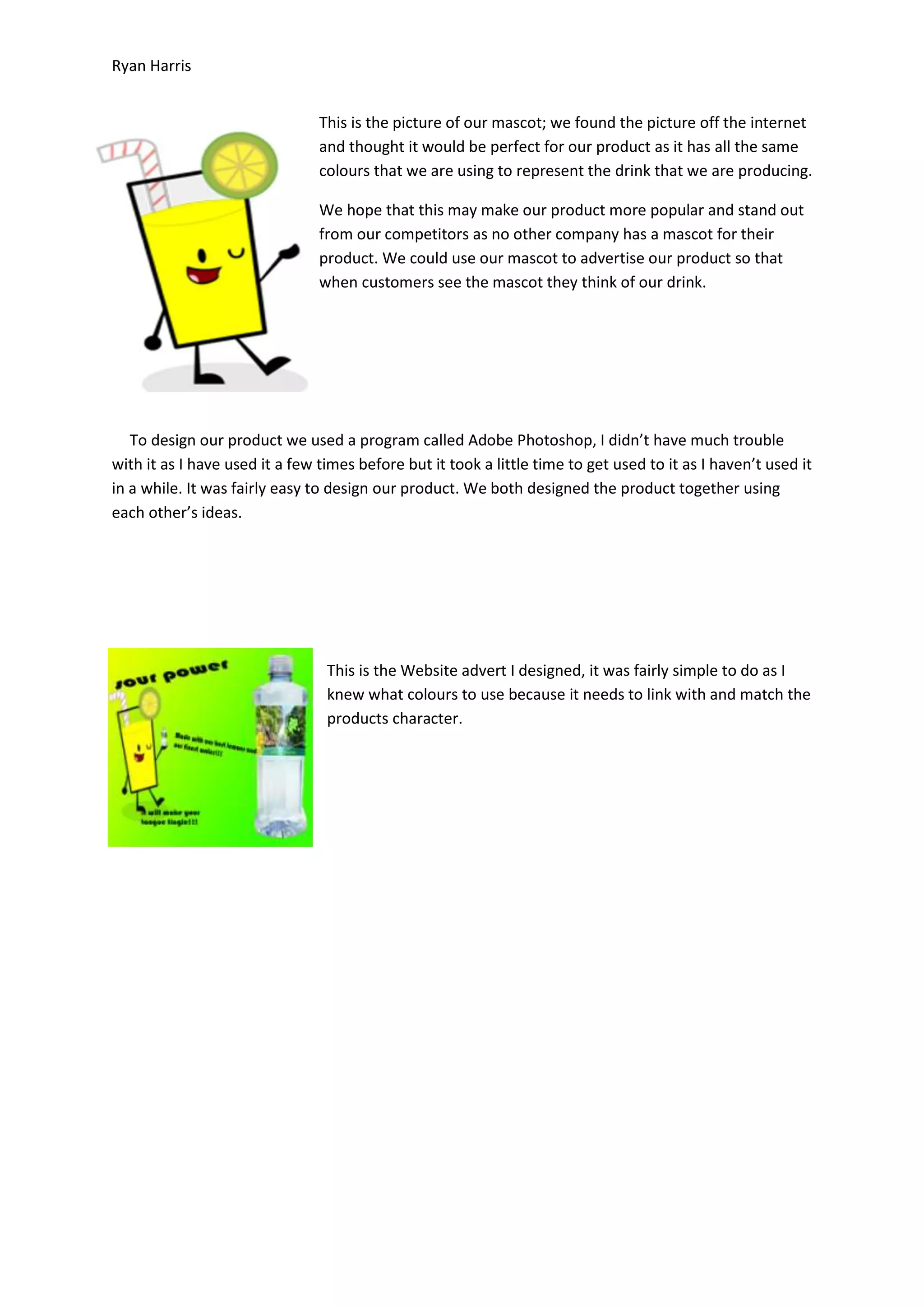
- They designed packaging with green and yellow colors featuring a lemon logo. A mascot was also created to represent the product.
- Ryan created various digital advertisements and a television commercial for "Sour Power" that starts sad in black and white but changes to happy colors and music to surprise and attract their target audience.