1) This document is Rachel Kaur's reflection on her progression from a preliminary school magazine task to a final music magazine product for her AS Media Studies course.
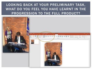
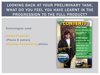
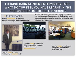
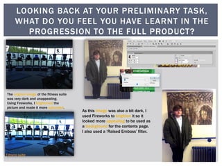
2) In her preliminary task, Rachel did not extensively edit photos using software like Adobe Fireworks, but for her final music magazine, she learned to edit every photo in some way using new skills in Photoshop and Fireworks.
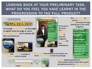
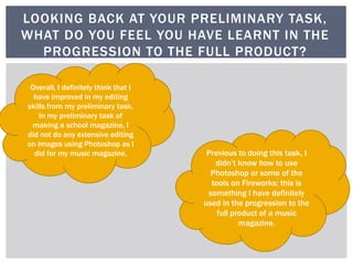
3) Rachel feels she has improved her editing skills and ability to effectively use design software from her initial task to her final product.