Download to read offline
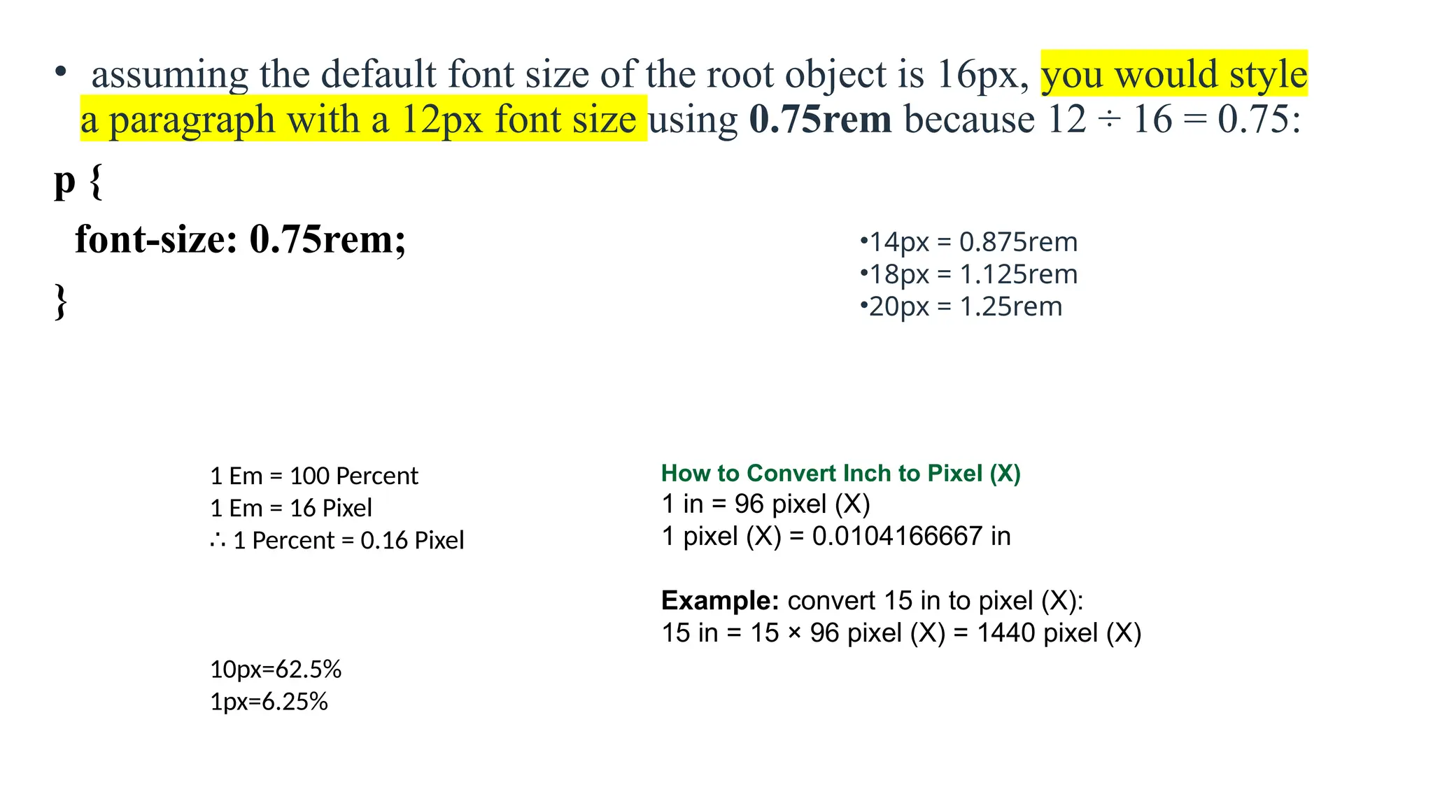
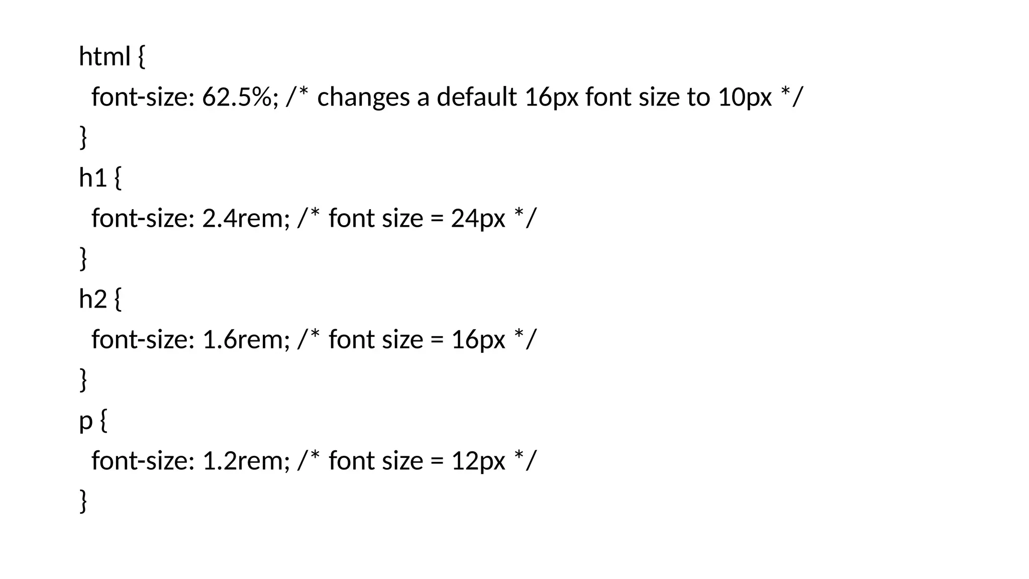
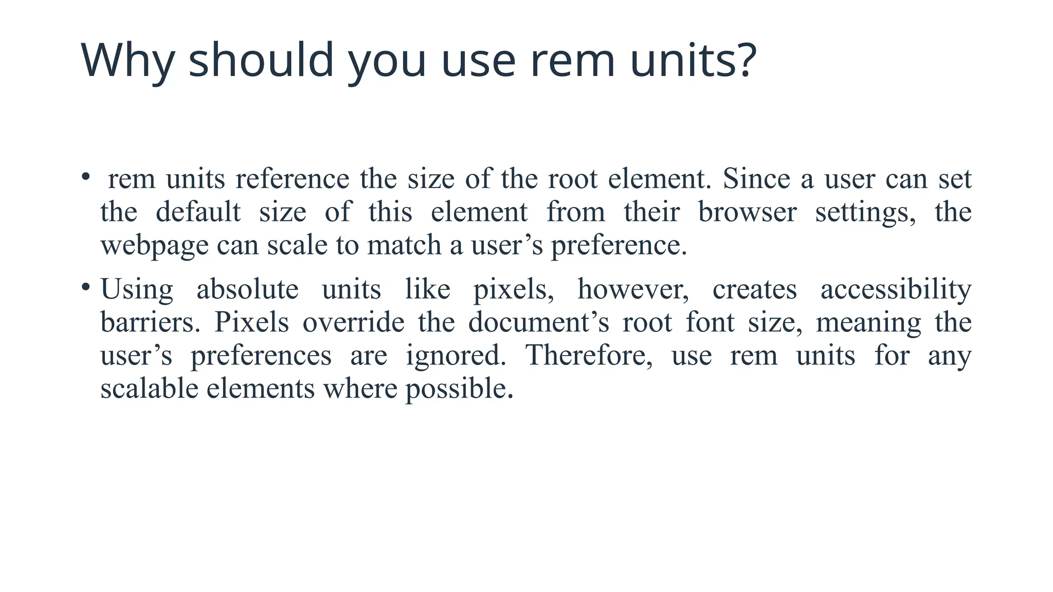
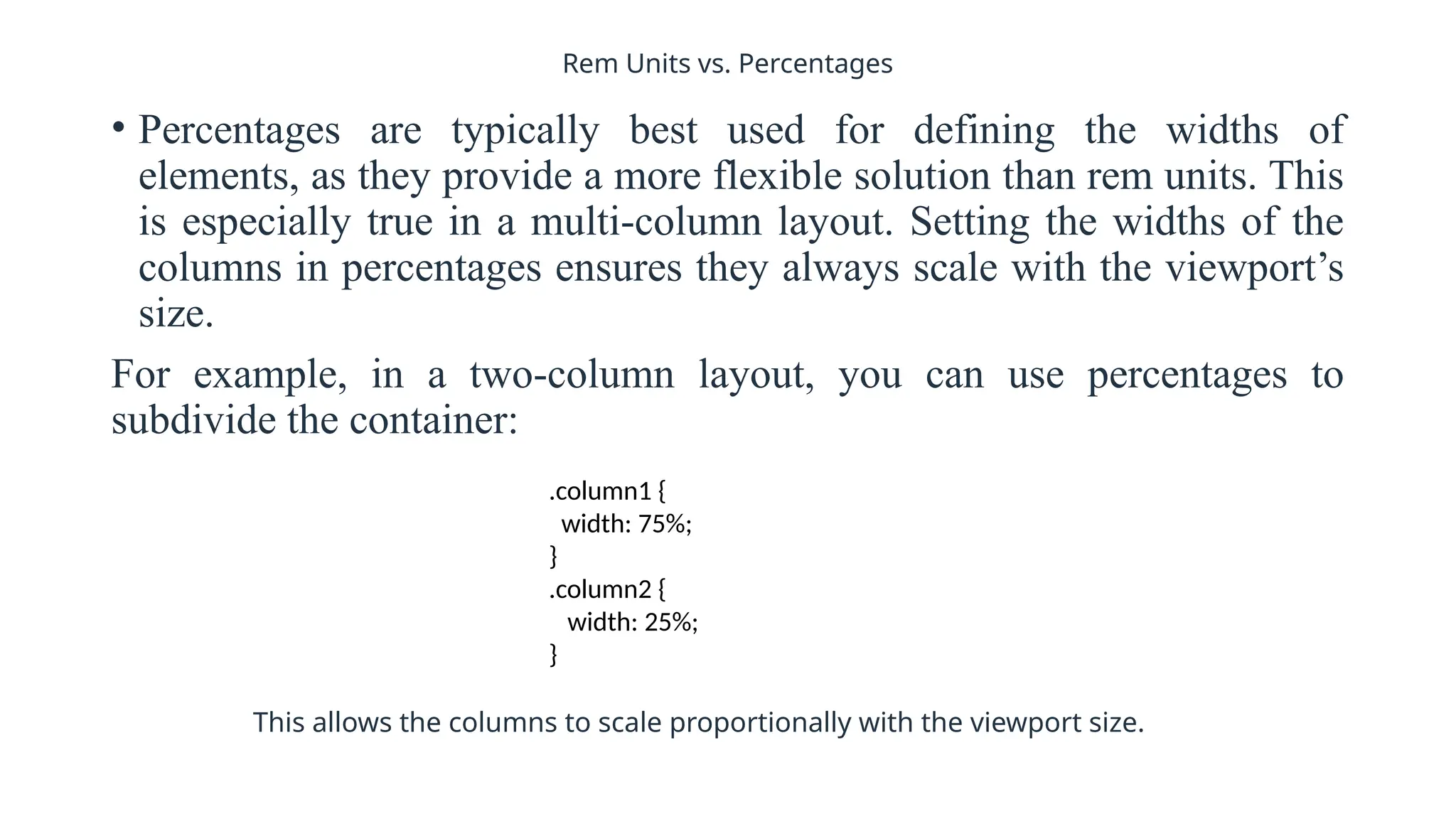


To define responsive web design means that your website (and its pages) can adapt and deliver the best experience to users, whether they’re on their desktop, laptop, tablet, or smartphone. For that to happen, though, your website needs a responsive design.