Dps mock up 3
•
0 likes•172 views
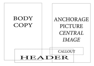
The document contains formatting elements for a page layout, including a body, central image, and header. There is an anchor point and callout for a picture within the central image area.
Report
Share
Report
Share
Download to read offline
Recommended
Dps mock up 2
This document contains a header and sections about Anchorage, a central image, and a callout. It has pictures and copy in the Anchorage and central image sections to provide information about those topics in a few short sections.
Go live!!.. hurricanes vs rebels live super rugby
HD LINK LIVE http://www.superrugbyonline.net/ Go live!!.. hurricanes vs rebels live super rugby By visiting the above link
Hurricanes vs rebels 27 march 2015 live rugby
HD LINK LIVE http://www.superrugbyonline.net/ Hurricanes vs rebels 27 march 2015 live rugby By visiting the above link
Acerca de las pilas
Las pilas en Mac OS X Leopard permiten acceder rápidamente a archivos importantes y usados frecuentemente desde el Dock. Se pueden crear pilas arrastrando carpetas al Dock, y mostrarán sus contenidos como abanico o cuadrícula. Las pilas muestran archivos de forma inteligente por relevancia pero también se puede personalizar el orden.
Marketing Digital Y Publicidad Para Empresas
El documento habla sobre los servicios de alojamiento web económicos. Explica que Hostgator es un líder en este sector debido a que ofrece un servicio de alta calidad a bajo costo. También menciona que en un servicio de hosting la disponibilidad del 100% es casi imposible, pero que un servidor dedicado puede brindar mayores medidas de seguridad en comparación con un plan básico. Finalmente, recomienda que lo más importante es elegir un proveedor que brinde un buen servicio y rapidez a un costo razonable.
Untitled Presentation
Haiku Deck is a presentation tool that allows users to create Haiku style slideshows. The tool encourages users to get started making their own Haiku Deck presentations which can be shared on SlideShare. In just a few sentences, it pitches the idea of using Haiku Deck to easily create visually engaging slideshows.
2015 UCB BDI Acceptance-Letter-K. Kwok-1
BDI is a non-profit organization that promotes socio-economic development in Bangladesh. The document is a letter informing Karen Kwok that her paper "Bangladesh Health Systems Strengthening Initiative: Reevaluating Health Workforce Capacity" has been accepted for presentation at the 2015 BDI International Conference on Development and Democracy in Bangladesh to be held from November 6-8, 2015 at the University of California, Berkeley. The letter requests that she register for the conference by the provided link and inform the contact if she wishes to include her paper in the conference proceedings by September 30th.
Double page spread analysis final
The document analyzes the layout and design of magazine double page spreads. It discusses various design elements used across multiple spreads, including large dominant images, pull quotes, column layouts, and bold typography to grab readers' attention. Color, font, and image choices are described as being effective at guiding readers through the content in a clear and engaging manner.
Double page spread analysis final
The document analyzes the layout and design of a double page magazine spread about a band. It discusses how the large central image of the band wraps around the page and the text is arranged around it. Other design elements discussed include use of pull quotes, drop caps, column structure, font styles, and additional photos and reviews to engage the reader. The overall layout is analyzed as being effective at clearly presenting information about the band and their new music in a way that would interest readers.
Contents page analysis final
This contents page from Rocksound magazine effectively displays information through its creative layout and use of color. Photos of bands fill most of the page and suggest the main articles, with large page numbers layered on top for easy navigation. Red, the color of the magazine logo, is prominently used for important sections and headings. A quote from a popular band draws readers in, while the editor's comment connects with audiences. Varied band images keep the page visually interesting.
Magazine front cover research
Skyline – the skyline gives the audience an idea of some of the articles inside by featuring band names.
Masthead – the masthead is big and bold with uppercase letters that stand out against the black background in a simple design.
Cover lines – the cover lines link to the band in the cover photo and advertise posters inside, with one line using a creative font to stand out.
Barcode and Price – the barcode is clearly visible in the bottom right corner.
Magazine research final
The document analyzes the front cover of a music magazine. It describes the different elements of the cover design including the skyline, masthead, cover lines, cover photo, barcode and price. It notes that the skyline and cover lines advertise bands featured in the magazine. The masthead uses a bold, broken font fitting the rock style. The cover photo shows the band in a studio shot looking at the camera. The barcode and price are clearly visible. The intended audience is described as younger people aged 16-25 interested in rock music and bands. The genre is identified as rock based on the band photographed and words used.
The photo shoot
Chloe Smith will be the sole model for the photo shoot aimed at promoting the magazine's rock music genre. Props will include a guitar to emphasize the rock theme, as well as a black leather jacket, dark jeans, and dark makeup to achieve a "biker look" that suits the magazine's style and appeals to its target audience. A stool or chair will also be used for the model to sit on during the photo session.
Gant chart final
The document is a Gantt chart that outlines the tasks and timeline for a project. It shows the start and end dates for each task over the course of several months. The chart also indicates which tasks can be done concurrently and which tasks depend on the completion of other tasks based on their placement on the timeline.
Planning timeline gantt chart calender final
This document contains a schedule for planning and producing a magazine. It includes tasks such as researching existing magazines and audiences, conducting focus groups and surveys, creating design elements like mood boards and mastheads, planning and conducting a photo shoot, drafting and revising magazine content like covers, articles, and spreads, and getting feedback on drafts from an audience. The schedule spans 4 weeks and includes tasks each day to complete all aspects of launching a new magazine.
Flat plan template
This document contains a magazine layout with various articles, images, and advertisements. The sections include a masthead, table of contents, pull quotes, photos, and articles about concerts, music reviews, social networking, and clothing. Advertisements are placed throughout for concerts, clothing, and social media.
Dps mock ups
These mock ups showcase a double page spread design for a magazine. The left page features a large headline and image along with a brief article. The right page contains additional articles and images in a multi-column layout. Together, the two pages demonstrate an example layout for presenting various magazine content across a double page spread.
Readership profile
The document discusses a new policy that will require all employees to submit a timesheet on a weekly basis to track hours worked. Employees will need to record their start and end times for each day as well as any time taken for lunch or breaks. The timesheets must be submitted to payroll by the end of each week to ensure that employees are paid accurately and on time for their work during that week.
Readership profile
This document summarizes the results of a survey of readers between the ages of 16 and 24. It found that the most popular bands among respondents were Oasis, Linkin Park, Bullet for My Valentine, Green Day, and Foo Fighters. Most respondents use the internet daily, listen to music every day, and have attended a live music event. Many respondents also enjoy shopping at Topshop/Topman, buying music on iTunes, and owning Converse or Vans shoes.
Masthead feedback
The document summarizes audience feedback on four font designs for a magazine masthead. The fourth font design was chosen as the most popular as it is bold and fits the rock genre style. The second most popular design was also bold but some said it was too similar to an existing magazine masthead. The second and third designs were liked but not favorites, with feedback noting the designs were bold but possibly overdone or not bold enough.
4 fonts
This document contains reviews of 4 different fonts. For the first font, the reviewer likes the white splashes and boldness but finds the letters plain. For the second font, they like the diamond shapes and boldness but worry shapes may blend in. For the third font, they really like the flicks, points and rough texture but think it only works in black. For the fourth font, they like the pointed edges that make it look sharp and dramatic.
Magazine questionnaire results
Eight of the 10 students surveyed were between 16-18 years old and interested in buying a college magazine. They said the front cover design was most important in attracting buyers and that articles should be short to keep readers interested. Most would pay £1-£1.50 and were most interested in design, photos and 1-2 page articles in a college magazine.
Magazine questionnaire results
Eight of the 10 students surveyed were between 16-18 years old and interested in buying a college magazine. They said the front cover design was most important in attracting buyers and that articles should be short to keep readers interested. Most would pay £1-£1.50 and were most interested in content about campus life and student issues.
More Related Content
More from tashaa_smith
Double page spread analysis final
The document analyzes the layout and design of magazine double page spreads. It discusses various design elements used across multiple spreads, including large dominant images, pull quotes, column layouts, and bold typography to grab readers' attention. Color, font, and image choices are described as being effective at guiding readers through the content in a clear and engaging manner.
Double page spread analysis final
The document analyzes the layout and design of a double page magazine spread about a band. It discusses how the large central image of the band wraps around the page and the text is arranged around it. Other design elements discussed include use of pull quotes, drop caps, column structure, font styles, and additional photos and reviews to engage the reader. The overall layout is analyzed as being effective at clearly presenting information about the band and their new music in a way that would interest readers.
Contents page analysis final
This contents page from Rocksound magazine effectively displays information through its creative layout and use of color. Photos of bands fill most of the page and suggest the main articles, with large page numbers layered on top for easy navigation. Red, the color of the magazine logo, is prominently used for important sections and headings. A quote from a popular band draws readers in, while the editor's comment connects with audiences. Varied band images keep the page visually interesting.
Magazine front cover research
Skyline – the skyline gives the audience an idea of some of the articles inside by featuring band names.
Masthead – the masthead is big and bold with uppercase letters that stand out against the black background in a simple design.
Cover lines – the cover lines link to the band in the cover photo and advertise posters inside, with one line using a creative font to stand out.
Barcode and Price – the barcode is clearly visible in the bottom right corner.
Magazine research final
The document analyzes the front cover of a music magazine. It describes the different elements of the cover design including the skyline, masthead, cover lines, cover photo, barcode and price. It notes that the skyline and cover lines advertise bands featured in the magazine. The masthead uses a bold, broken font fitting the rock style. The cover photo shows the band in a studio shot looking at the camera. The barcode and price are clearly visible. The intended audience is described as younger people aged 16-25 interested in rock music and bands. The genre is identified as rock based on the band photographed and words used.
The photo shoot
Chloe Smith will be the sole model for the photo shoot aimed at promoting the magazine's rock music genre. Props will include a guitar to emphasize the rock theme, as well as a black leather jacket, dark jeans, and dark makeup to achieve a "biker look" that suits the magazine's style and appeals to its target audience. A stool or chair will also be used for the model to sit on during the photo session.
Gant chart final
The document is a Gantt chart that outlines the tasks and timeline for a project. It shows the start and end dates for each task over the course of several months. The chart also indicates which tasks can be done concurrently and which tasks depend on the completion of other tasks based on their placement on the timeline.
Planning timeline gantt chart calender final
This document contains a schedule for planning and producing a magazine. It includes tasks such as researching existing magazines and audiences, conducting focus groups and surveys, creating design elements like mood boards and mastheads, planning and conducting a photo shoot, drafting and revising magazine content like covers, articles, and spreads, and getting feedback on drafts from an audience. The schedule spans 4 weeks and includes tasks each day to complete all aspects of launching a new magazine.
Flat plan template
This document contains a magazine layout with various articles, images, and advertisements. The sections include a masthead, table of contents, pull quotes, photos, and articles about concerts, music reviews, social networking, and clothing. Advertisements are placed throughout for concerts, clothing, and social media.
Dps mock ups
These mock ups showcase a double page spread design for a magazine. The left page features a large headline and image along with a brief article. The right page contains additional articles and images in a multi-column layout. Together, the two pages demonstrate an example layout for presenting various magazine content across a double page spread.
Readership profile
The document discusses a new policy that will require all employees to submit a timesheet on a weekly basis to track hours worked. Employees will need to record their start and end times for each day as well as any time taken for lunch or breaks. The timesheets must be submitted to payroll by the end of each week to ensure that employees are paid accurately and on time for their work during that week.
Readership profile
This document summarizes the results of a survey of readers between the ages of 16 and 24. It found that the most popular bands among respondents were Oasis, Linkin Park, Bullet for My Valentine, Green Day, and Foo Fighters. Most respondents use the internet daily, listen to music every day, and have attended a live music event. Many respondents also enjoy shopping at Topshop/Topman, buying music on iTunes, and owning Converse or Vans shoes.
Masthead feedback
The document summarizes audience feedback on four font designs for a magazine masthead. The fourth font design was chosen as the most popular as it is bold and fits the rock genre style. The second most popular design was also bold but some said it was too similar to an existing magazine masthead. The second and third designs were liked but not favorites, with feedback noting the designs were bold but possibly overdone or not bold enough.
4 fonts
This document contains reviews of 4 different fonts. For the first font, the reviewer likes the white splashes and boldness but finds the letters plain. For the second font, they like the diamond shapes and boldness but worry shapes may blend in. For the third font, they really like the flicks, points and rough texture but think it only works in black. For the fourth font, they like the pointed edges that make it look sharp and dramatic.
Magazine questionnaire results
Eight of the 10 students surveyed were between 16-18 years old and interested in buying a college magazine. They said the front cover design was most important in attracting buyers and that articles should be short to keep readers interested. Most would pay £1-£1.50 and were most interested in design, photos and 1-2 page articles in a college magazine.
Magazine questionnaire results
Eight of the 10 students surveyed were between 16-18 years old and interested in buying a college magazine. They said the front cover design was most important in attracting buyers and that articles should be short to keep readers interested. Most would pay £1-£1.50 and were most interested in content about campus life and student issues.
More from tashaa_smith (20)
Dps mock up 3
- 1. BODY ANCHORAGE COPY PICTURE CENTRAL IMAGE CALLOUT HEADER