Report
Share
Download to read offline
Recommended
Dazed and confused toc analysis
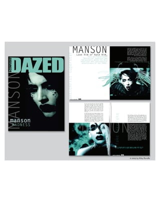
The document analyzes the table of contents for Dazed+Confused magazine. It summarizes the key design elements used including the bold and eye-catching font matching the magazine logo. Imagery includes a vibrant photo of a model with unique styling to attract an experimental audience. White space and a linear layout keep the design simplistic. An extremely colorful background makes the page lively and appealing to readers.
Magazine research
- The document discusses research conducted on the LOVE magazine. It provides details on the magazine's style, audience, layout, and website. The LOVE magazine has a biannual publication schedule and focuses on artistic photography with minimal text. It targets women aged 28 on average from upper middle class backgrounds. Photos are often in black and white and feature nudity. The magazine and website aim to inspire with visuals rather than inform with articles.
Vogue
Fashion impacts our lives in many ways. It expresses our identity and mood, but also creates stereotypes. The clothes we wear are influenced by the constant bombardment of new fashion ideas from various media sources. Fashion is a large global industry, with many workers involved in design, production and distribution of clothing. It also acts as a form of non-verbal communication, conveying information about the person wearing particular styles.
Vogue
Vogue and Glamour magazine covers follow a similar layout structure, with the masthead at the top and cover lines surrounding the main celebrity image. [1] Vogue targets a higher-end audience with more elegant photography and writing, while Glamour uses brighter colors and bolder fonts to attract younger women. [2] Both magazines feature successful celebrities on the cover to draw readers in and promote related stories inside. [3] The mastheads, fonts, images and carefully chosen cover lines are all designed to appeal to their target demographics and get people interested in buying the issue.
Love magazine
LOVE is a biannual British fashion magazine founded in 2009 by Katie Grand, who remains editor-in-chief. It is published by Condé Nast twice a year, both in print and digitally. The target audience is women aged 18-40 in socioeconomic groups A, B, and C1, with 48% in groups A and B. Condé Nast also owns other magazines, websites, and has expanded into film, television and digital video to engage younger audiences as print readership declines over time.
Magazine Analysis
The magazine cover features a young female model with unusual makeup and a spider on her face that grabs the reader's attention. The masthead is placed horizontally but regular readers will still recognize the magazine. A clear color scheme is used throughout the cover that matches different elements. The choice of model represents the magazine's youthful and quirky nature.
Examples of magazines
The document discusses the styles and formats of several different music magazines, including their use of images, colors, text, and layout. Wonderland magazine uses bright colors and features a large central image with cover lines around it. I:D magazines have simplistic covers with a single image, word, and masthead. Dazed and Confused places a bold masthead over a central image and uses clean colors. XXL magazine, targeted towards rap music, has an aggressive style using red, squares, and bullet points. Kerrang and Classic Rock magazines feature multiple images and use cover lines to promote headlines.
GCSE Media Studies Coursework - Magazine research and planning
This document analyzes the cover designs of various magazines to understand how they appeal to their target audiences. It discusses magazines across different genres, including fashion, music, and football. Key techniques identified that magazines use to be appealing include using bright colors, celebrity images similar in age to readers, minimal text, and catchy taglines. Font styles, cover layouts, and photo positioning are also examined for how they draw in audiences.
Recommended
Dazed and confused toc analysis
The document analyzes the table of contents for Dazed+Confused magazine. It summarizes the key design elements used including the bold and eye-catching font matching the magazine logo. Imagery includes a vibrant photo of a model with unique styling to attract an experimental audience. White space and a linear layout keep the design simplistic. An extremely colorful background makes the page lively and appealing to readers.
Magazine research
- The document discusses research conducted on the LOVE magazine. It provides details on the magazine's style, audience, layout, and website. The LOVE magazine has a biannual publication schedule and focuses on artistic photography with minimal text. It targets women aged 28 on average from upper middle class backgrounds. Photos are often in black and white and feature nudity. The magazine and website aim to inspire with visuals rather than inform with articles.
Vogue
Fashion impacts our lives in many ways. It expresses our identity and mood, but also creates stereotypes. The clothes we wear are influenced by the constant bombardment of new fashion ideas from various media sources. Fashion is a large global industry, with many workers involved in design, production and distribution of clothing. It also acts as a form of non-verbal communication, conveying information about the person wearing particular styles.
Vogue
Vogue and Glamour magazine covers follow a similar layout structure, with the masthead at the top and cover lines surrounding the main celebrity image. [1] Vogue targets a higher-end audience with more elegant photography and writing, while Glamour uses brighter colors and bolder fonts to attract younger women. [2] Both magazines feature successful celebrities on the cover to draw readers in and promote related stories inside. [3] The mastheads, fonts, images and carefully chosen cover lines are all designed to appeal to their target demographics and get people interested in buying the issue.
Love magazine
LOVE is a biannual British fashion magazine founded in 2009 by Katie Grand, who remains editor-in-chief. It is published by Condé Nast twice a year, both in print and digitally. The target audience is women aged 18-40 in socioeconomic groups A, B, and C1, with 48% in groups A and B. Condé Nast also owns other magazines, websites, and has expanded into film, television and digital video to engage younger audiences as print readership declines over time.
Magazine Analysis
The magazine cover features a young female model with unusual makeup and a spider on her face that grabs the reader's attention. The masthead is placed horizontally but regular readers will still recognize the magazine. A clear color scheme is used throughout the cover that matches different elements. The choice of model represents the magazine's youthful and quirky nature.
Examples of magazines
The document discusses the styles and formats of several different music magazines, including their use of images, colors, text, and layout. Wonderland magazine uses bright colors and features a large central image with cover lines around it. I:D magazines have simplistic covers with a single image, word, and masthead. Dazed and Confused places a bold masthead over a central image and uses clean colors. XXL magazine, targeted towards rap music, has an aggressive style using red, squares, and bullet points. Kerrang and Classic Rock magazines feature multiple images and use cover lines to promote headlines.
GCSE Media Studies Coursework - Magazine research and planning
This document analyzes the cover designs of various magazines to understand how they appeal to their target audiences. It discusses magazines across different genres, including fashion, music, and football. Key techniques identified that magazines use to be appealing include using bright colors, celebrity images similar in age to readers, minimal text, and catchy taglines. Font styles, cover layouts, and photo positioning are also examined for how they draw in audiences.
Charity Flyers
Bikini car wash charity event poster & flyers. Money raised towards Project RED AIDS research
More Related Content
More from kileyr
Charity Flyers
Bikini car wash charity event poster & flyers. Money raised towards Project RED AIDS research