Downloaded 45 times
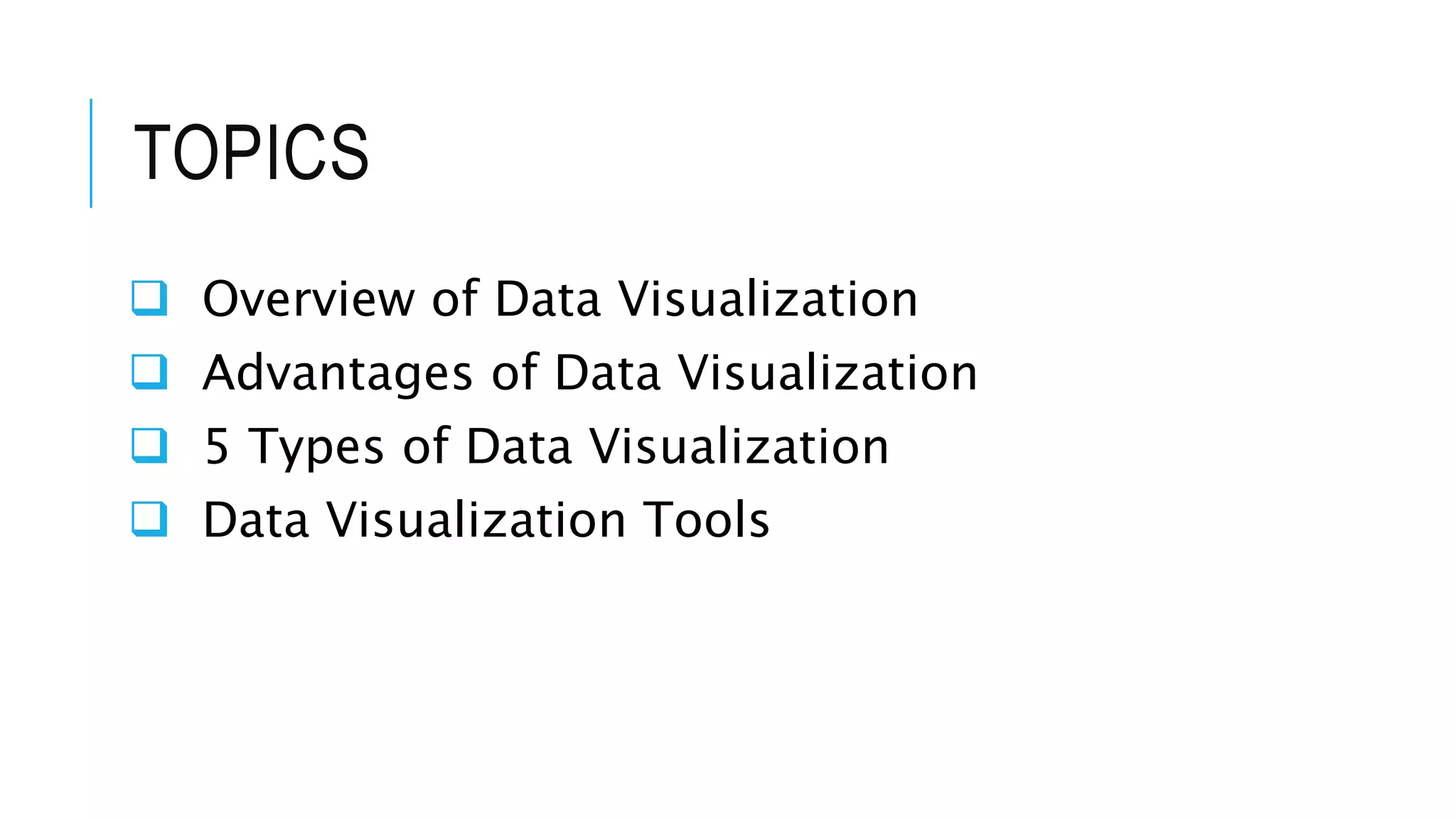

The document discusses data visualization tools. It begins with an overview of data visualization, describing how visualizing data can help identify patterns and trends. It then discusses advantages like aiding quick understanding. Five types of data visualization are mentioned but not described. The document primarily focuses on reviewing popular data visualization tools like Tableau, FusionCharts, Datawrapper, Highcharts, Excel, Sisense, Plotly, and others. It provides brief descriptions of each tool's features and capabilities. In closing, it references additional resources on the topic.
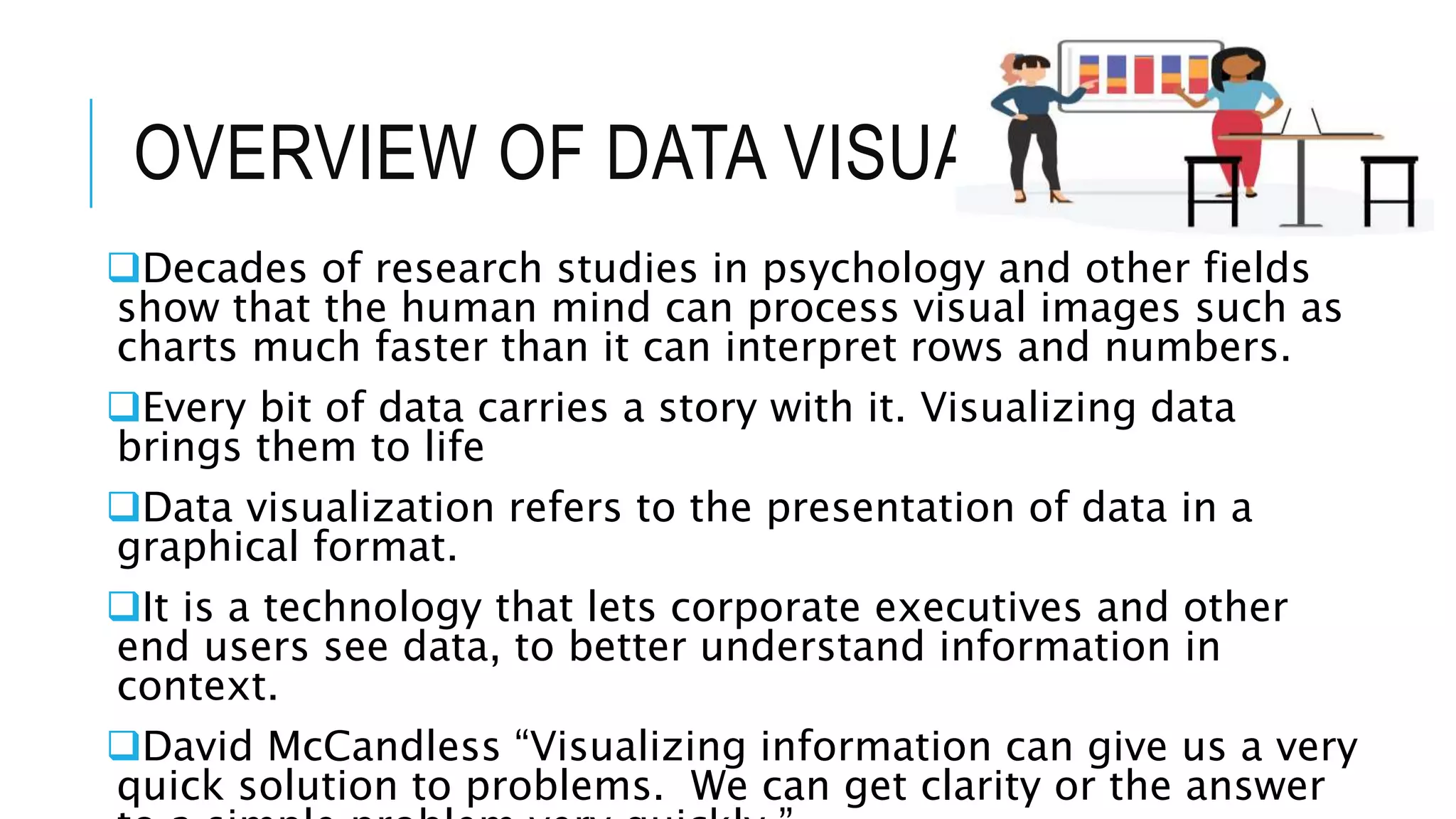
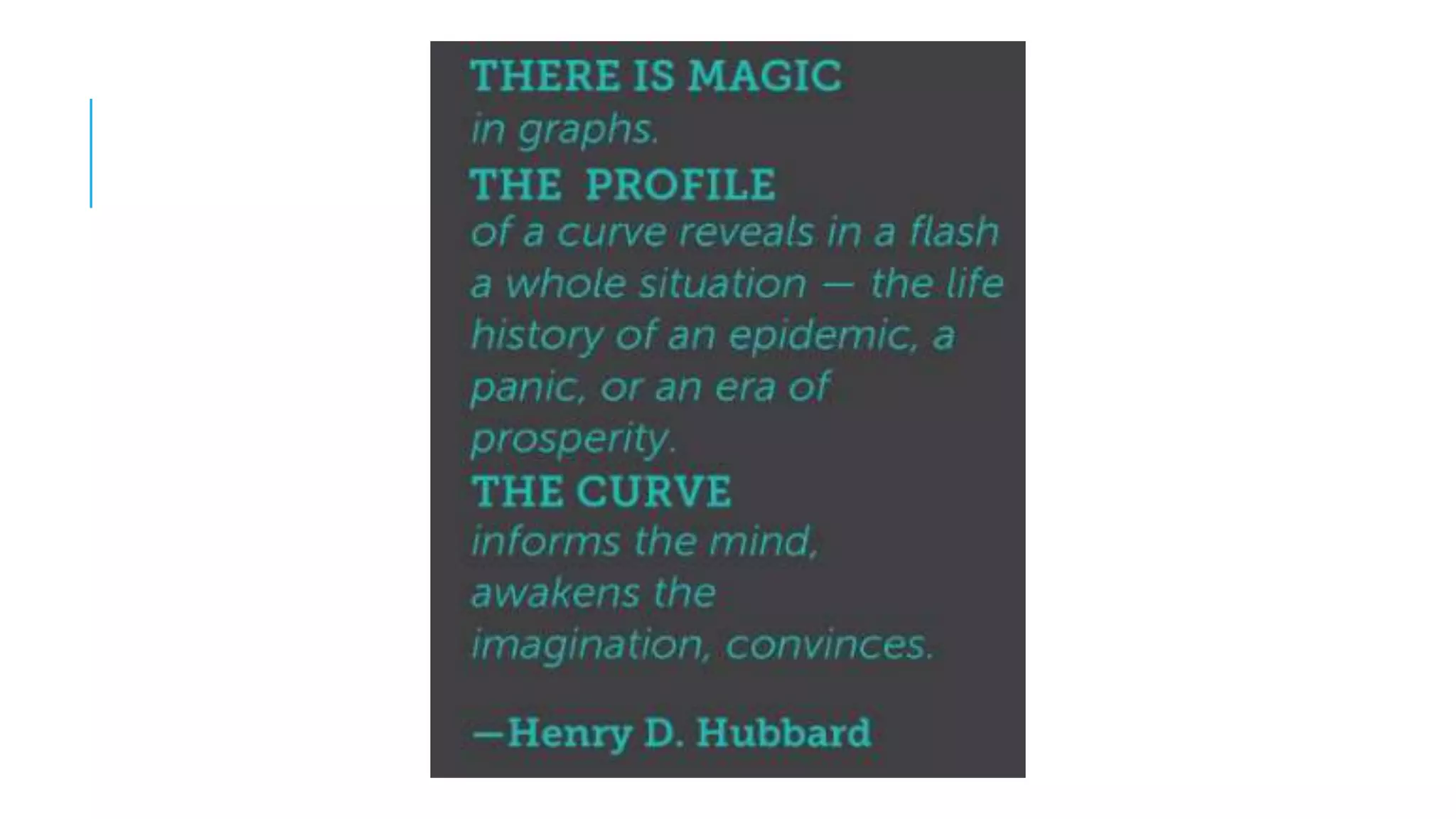
An overview of data visualization and its topics, including research relevance and the importance of visual formats.
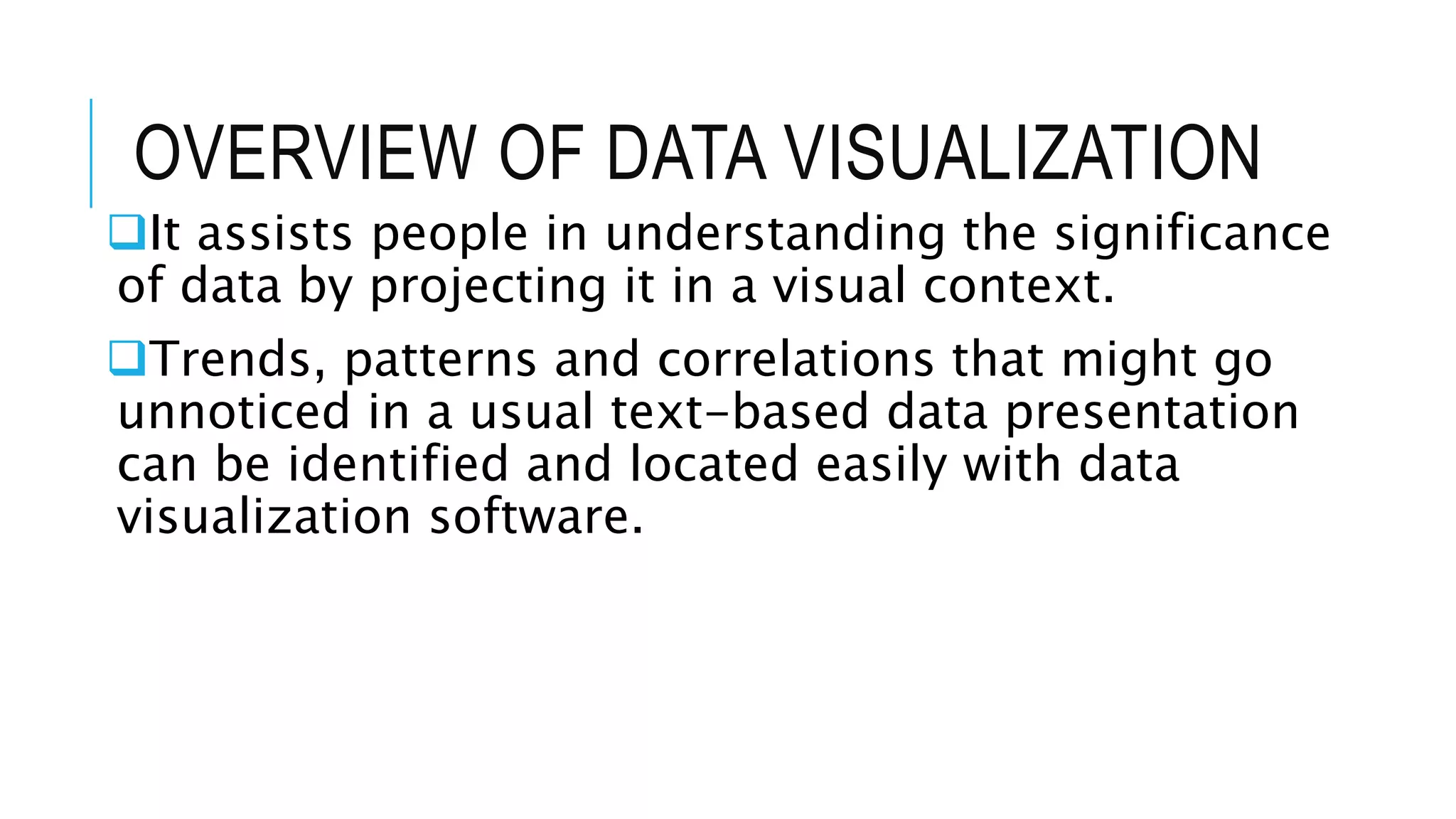
Explains data visualization, its capabilities to streamline data interpretation, and enhance understanding through visual context.
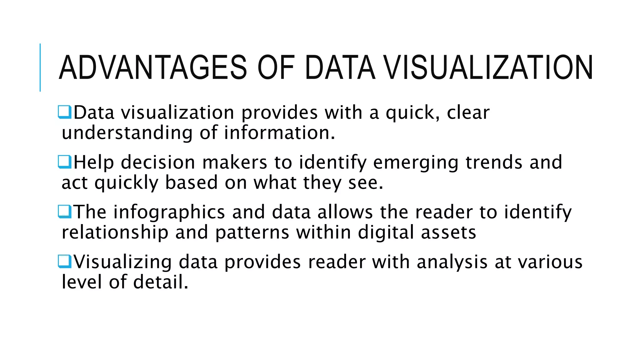
Highlights advantages like quick decision-making, trend identification, and clarity in data relationships.
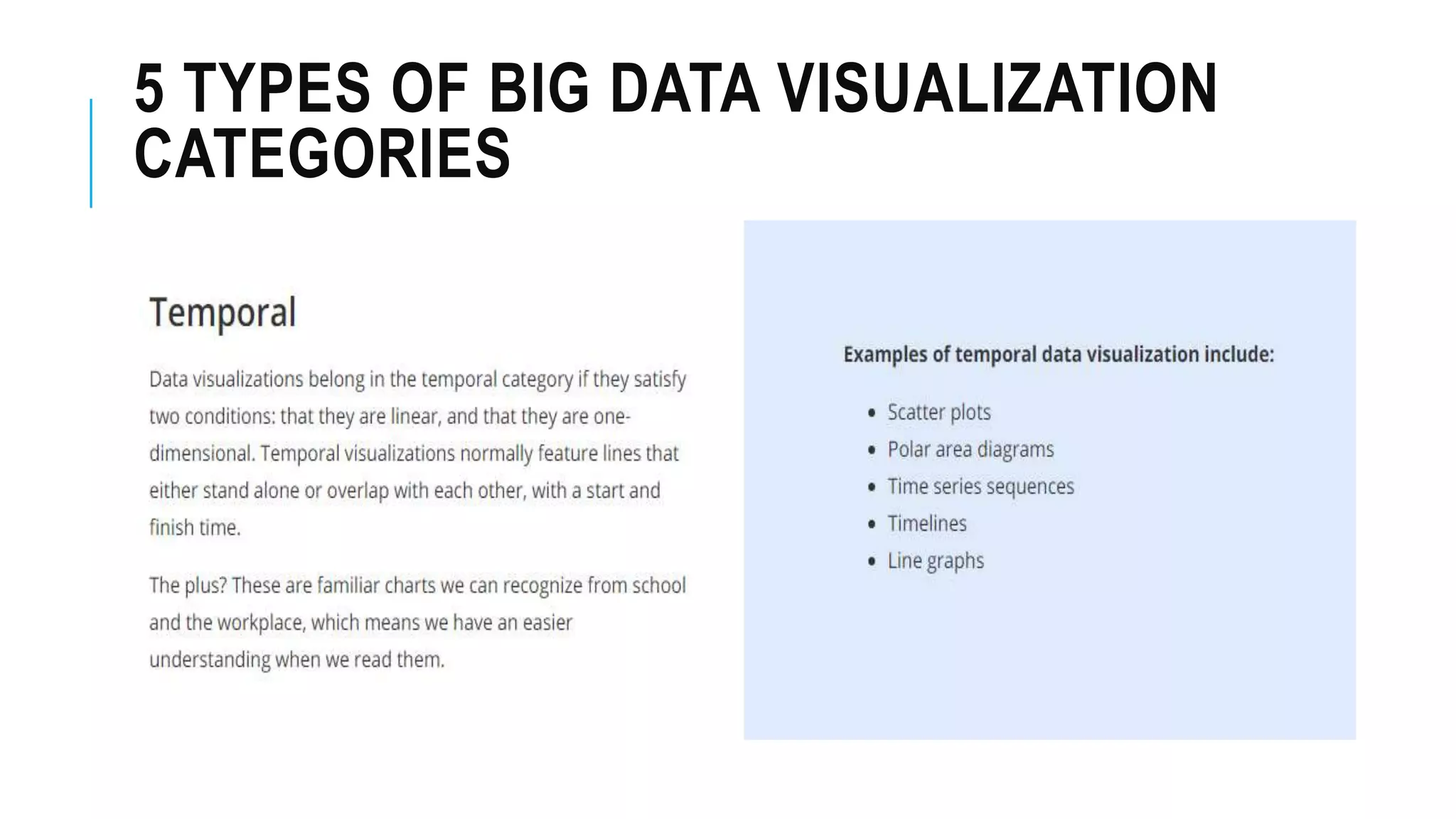
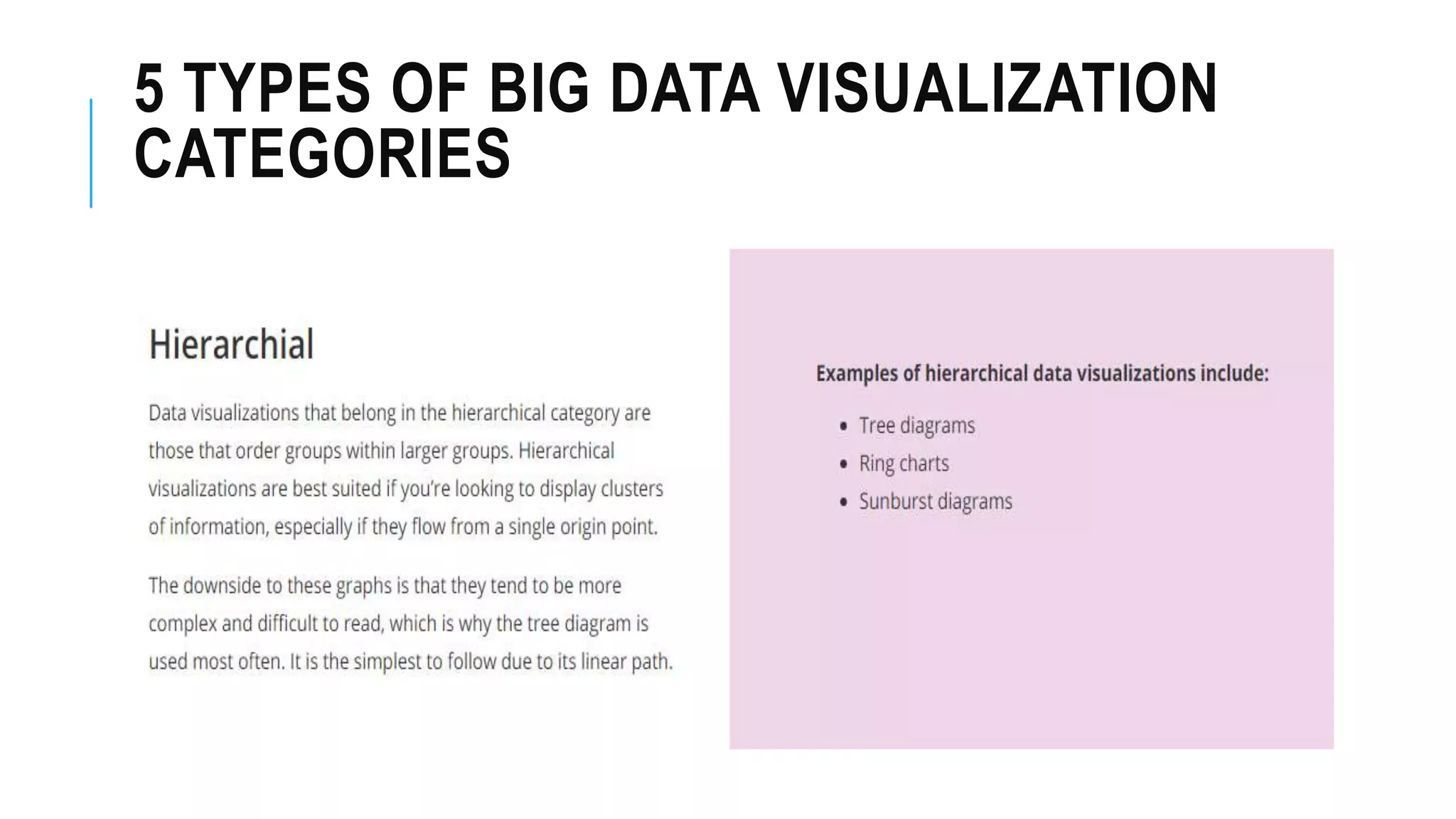
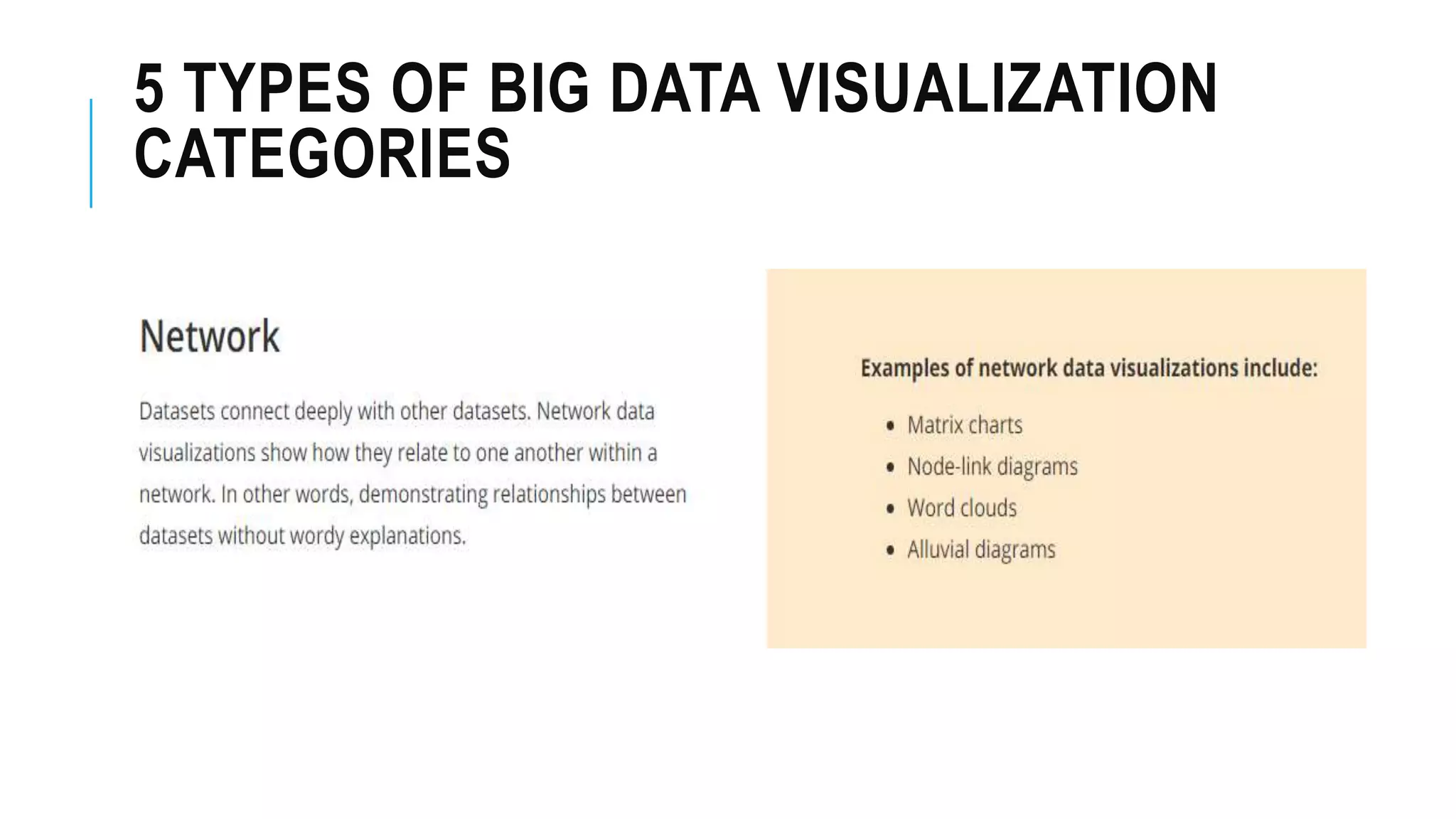
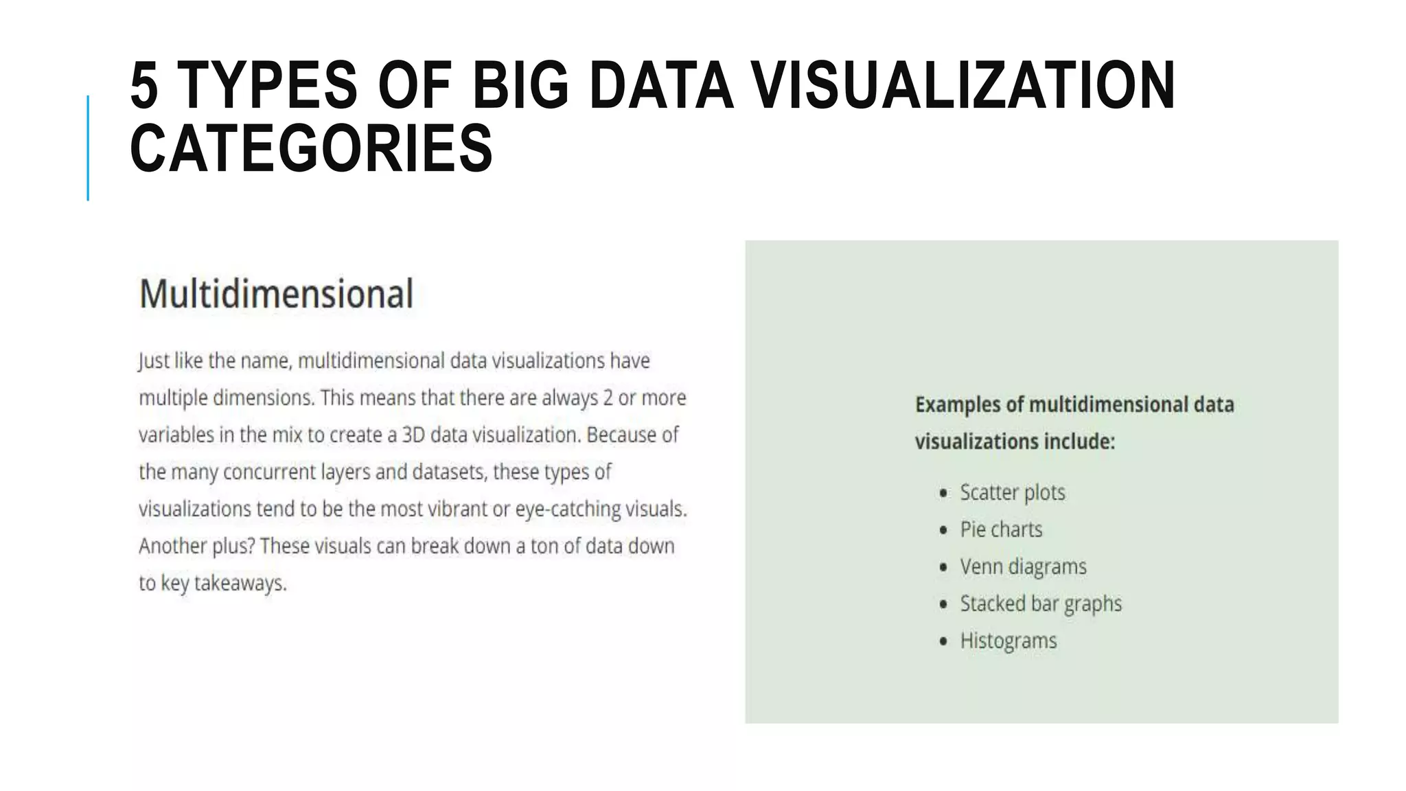
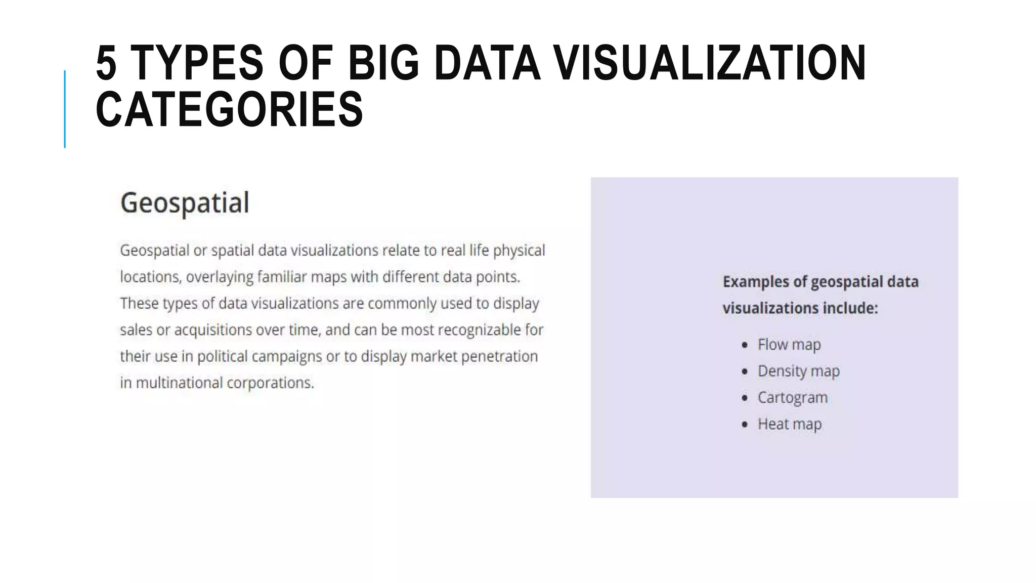
Discusses various categories of big data visualization without detailing specific types.
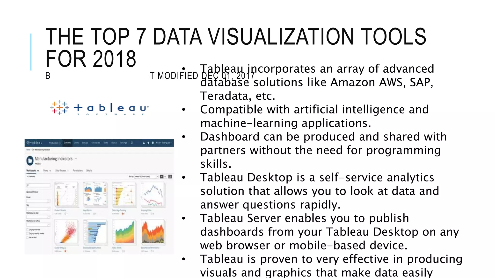
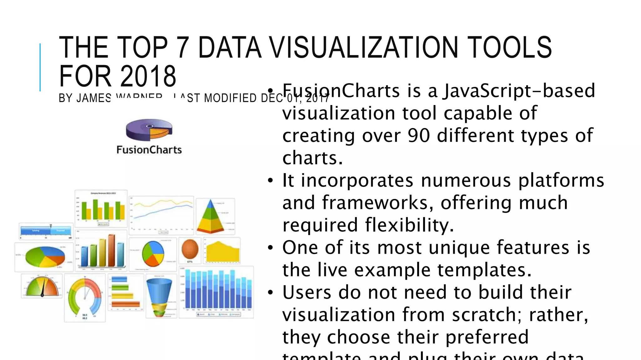
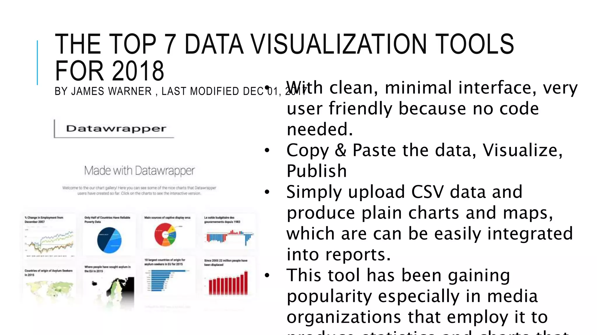
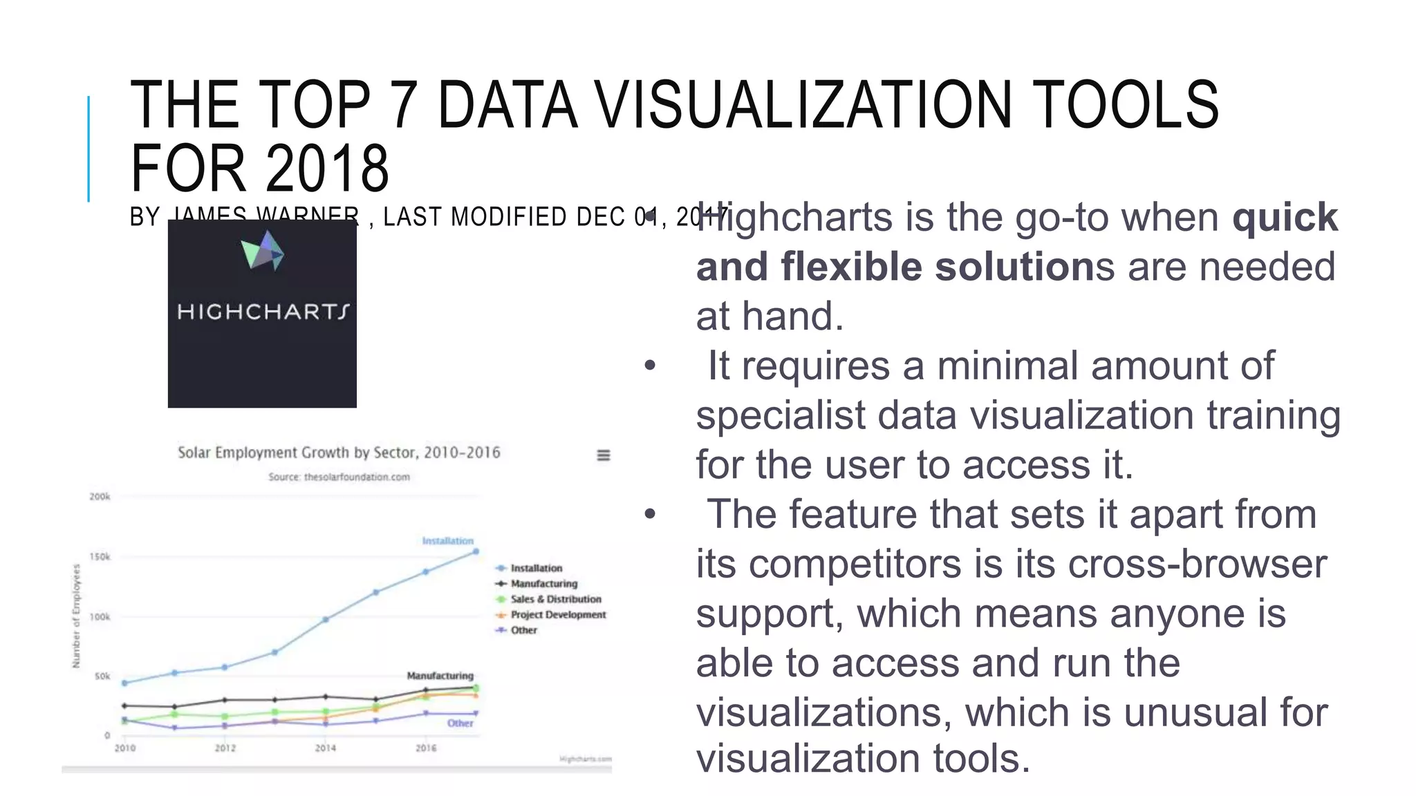
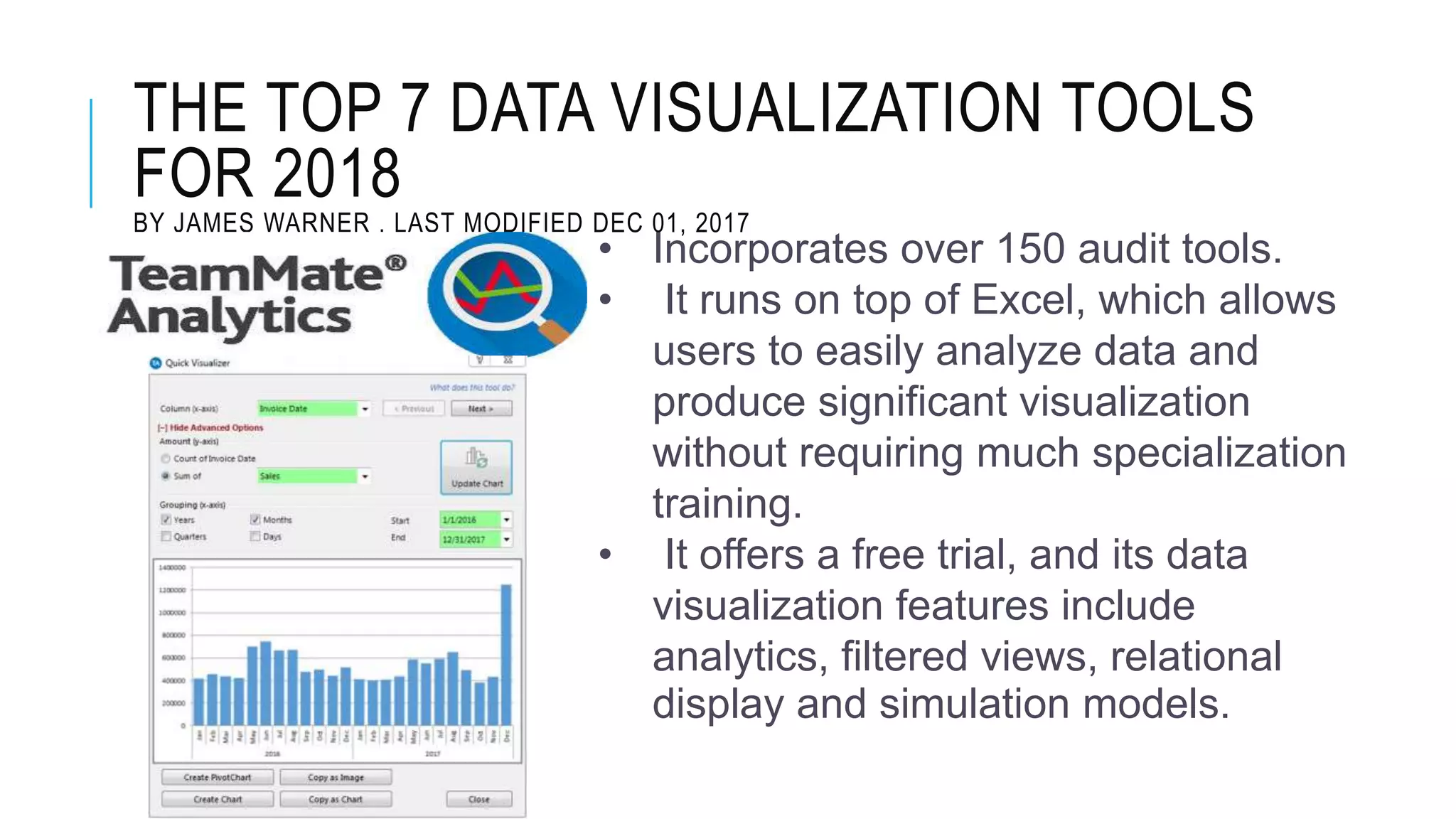
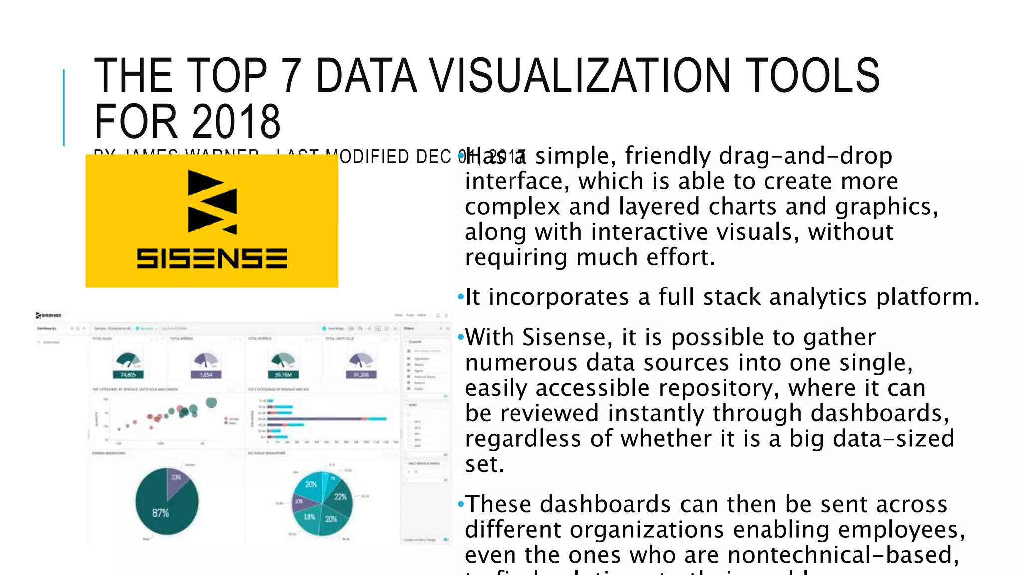
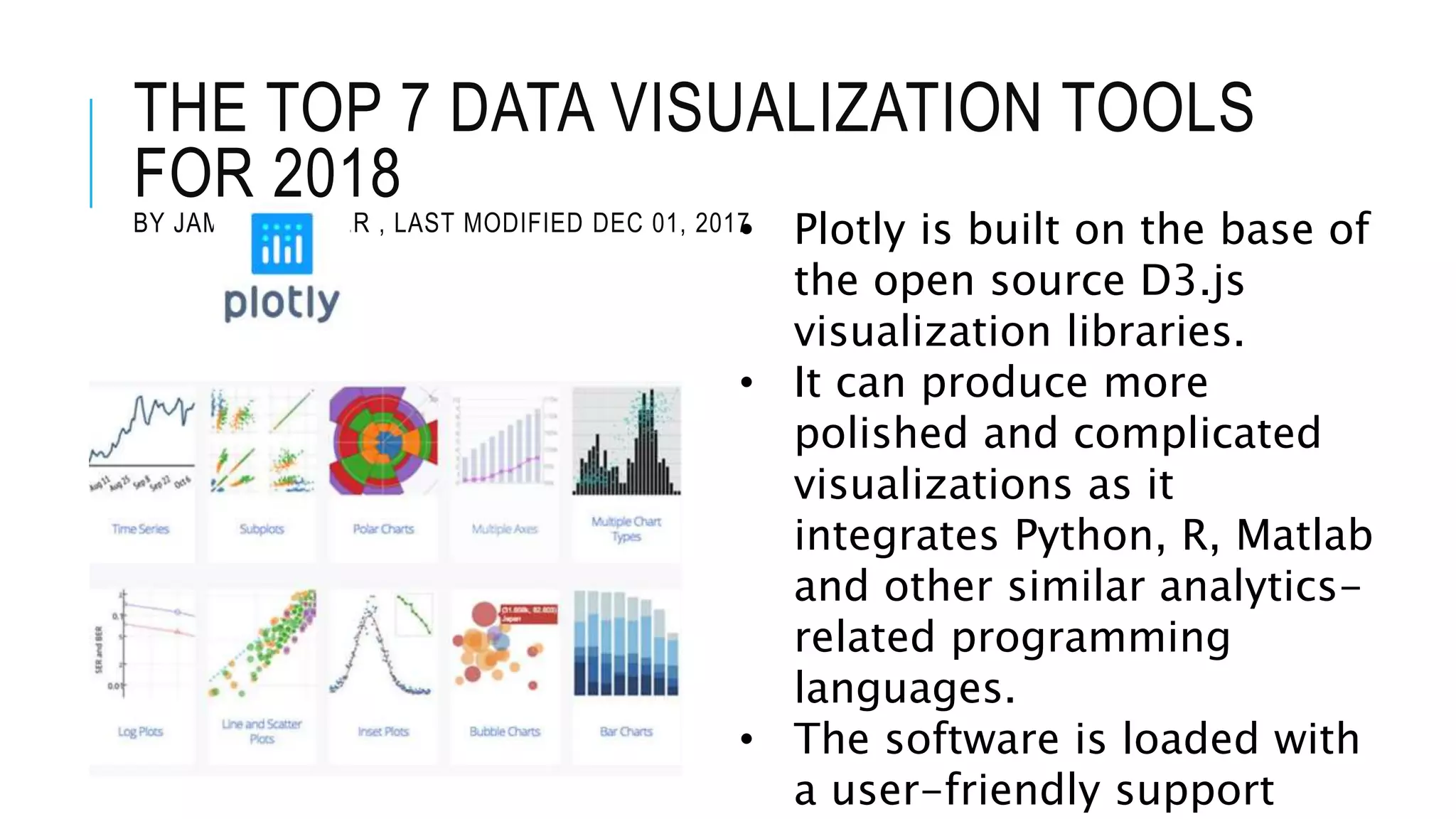
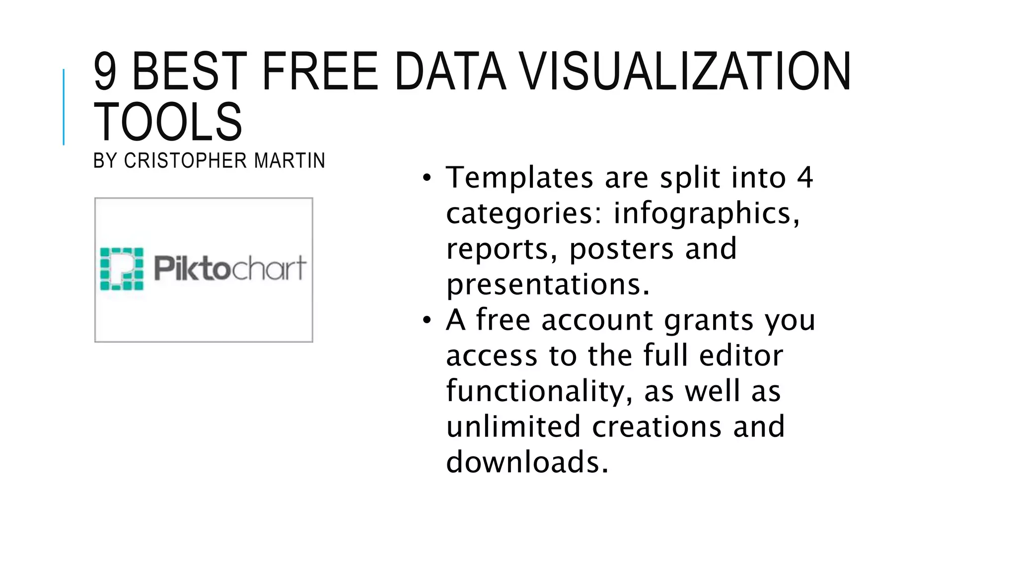
Introduces leading tools for data visualization in 2018, their features, and capabilities for users with minimal programming skills.
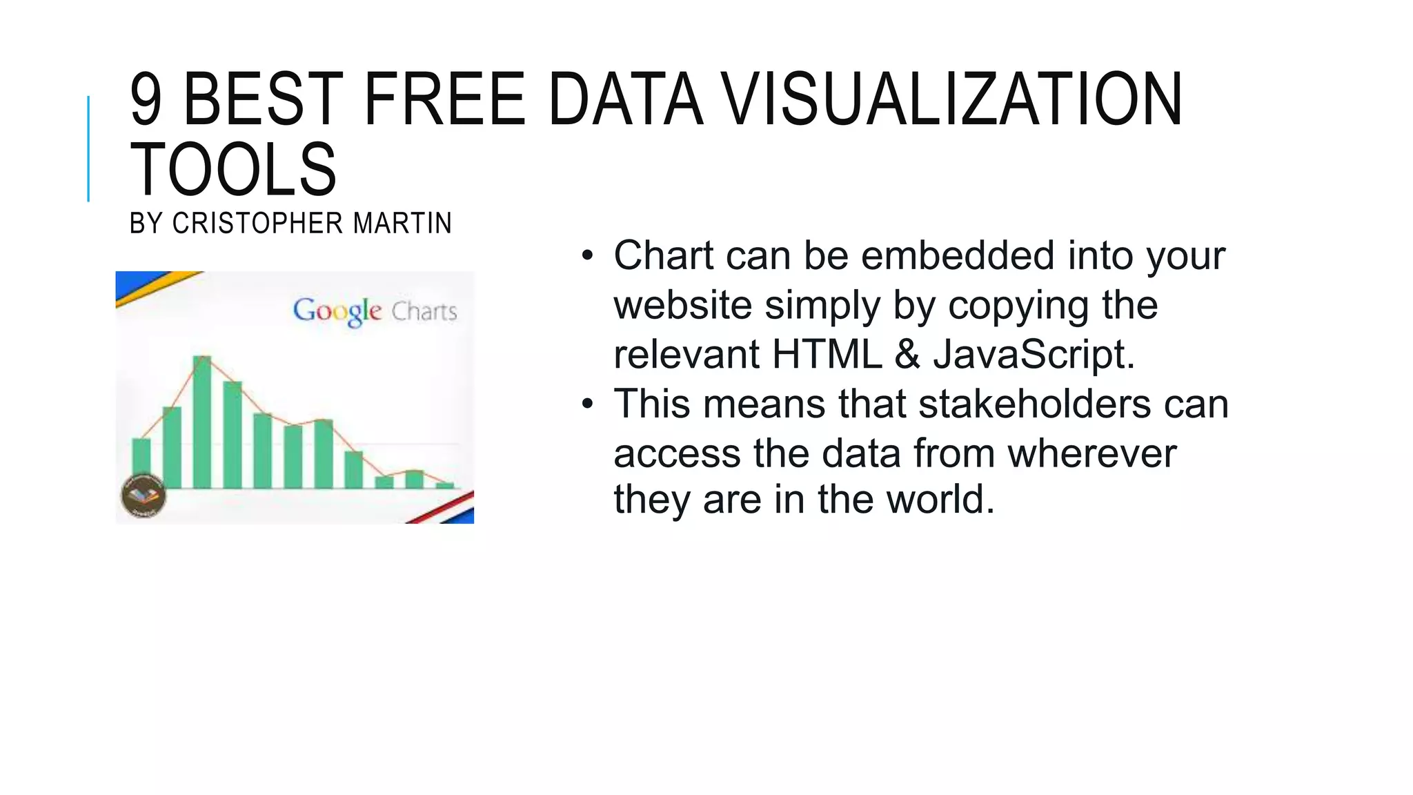
Presents a selection of free data visualization tools, emphasizing their interactive capabilities and customization options.
Lists references for further information on data visualization and tools.


![[DSC Europe 25] Dusan Jovicic - AI Story: From on-prem to cloud and back agai...](https://cdn.slidesharecdn.com/ss_thumbnails/8kp49m6uq22ifnbwhfnk-2-251205085715-964d11a6-thumbnail.jpg?width=640&height=640&fit=bounds)
![[DSC Europe 25] Marija Vlajkovic & Andrea Radonjanin - Integration of AI tool...](https://cdn.slidesharecdn.com/ss_thumbnails/qf1jrglttoc3bm8s3aop-final-integration-of-ai-tools-251208151905-394f3a6a-thumbnail.jpg?width=640&height=640&fit=bounds)

![[DSC Europe 25] Vid Stimac - Policy Parsimony: Between Oversimplifying and Ov...](https://cdn.slidesharecdn.com/ss_thumbnails/eqlepagzqp2rhg3gbluh-dsc-stimac-251120-251205090438-059e7f54-thumbnail.jpg?width=640&height=640&fit=bounds)


![[DSC Europe 25] Dragana Ilic - AI for Big Data in Astronomy.pptx](https://cdn.slidesharecdn.com/ss_thumbnails/8palya86qaatvjhva1ms-2-dragana-ilic-ai-ilic-251208151906-652b819c-thumbnail.jpg?width=640&height=640&fit=bounds)


![[DSC Europe 25] Max Talanov - Non digital NNs.pptx](https://cdn.slidesharecdn.com/ss_thumbnails/wif8tr3gtua74qvtopke-non-digital-nns-251205090438-26b0eea6-thumbnail.jpg?width=640&height=640&fit=bounds)