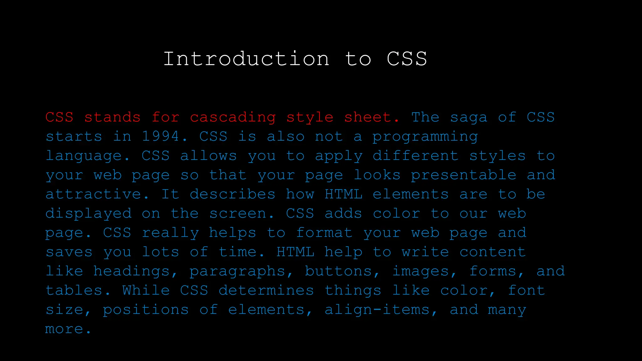
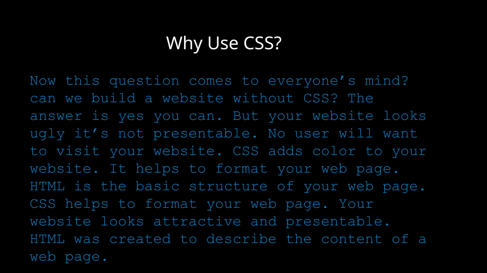
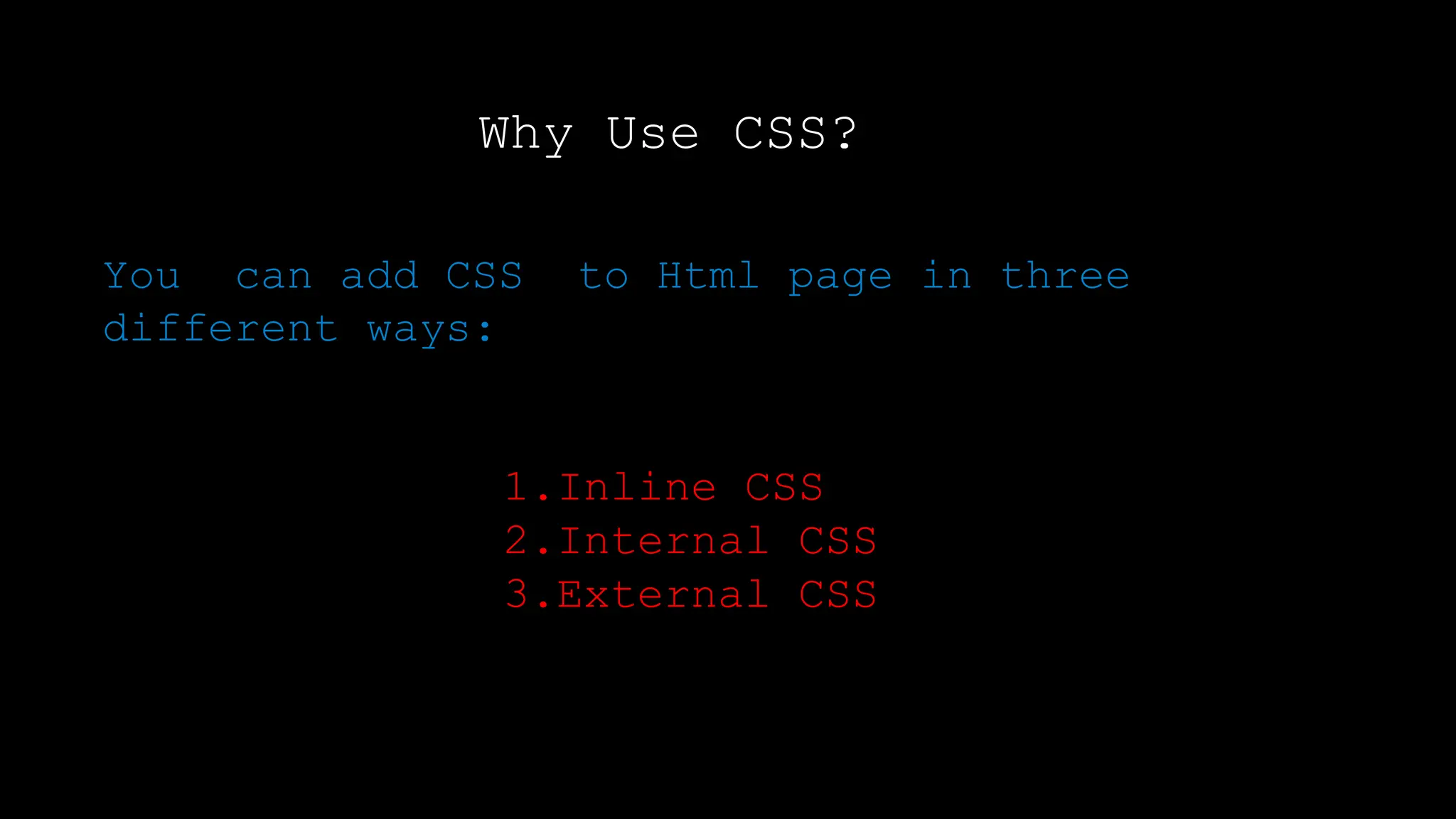
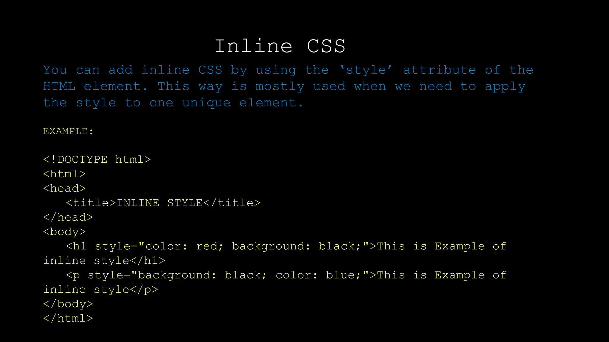
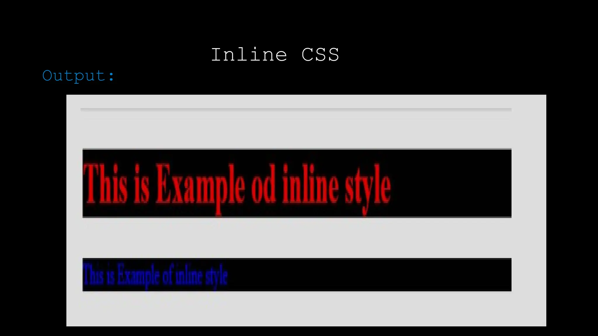
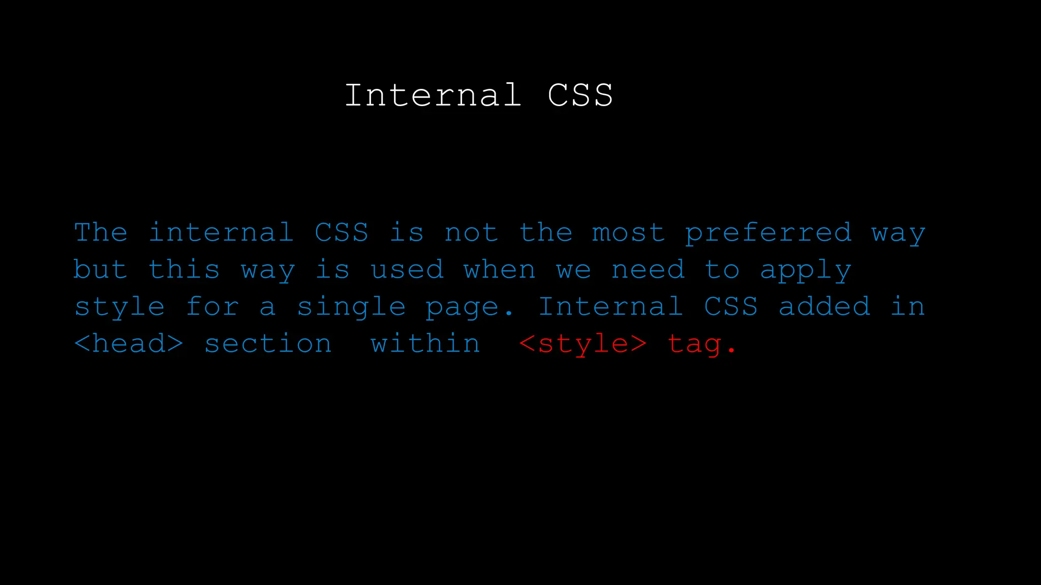
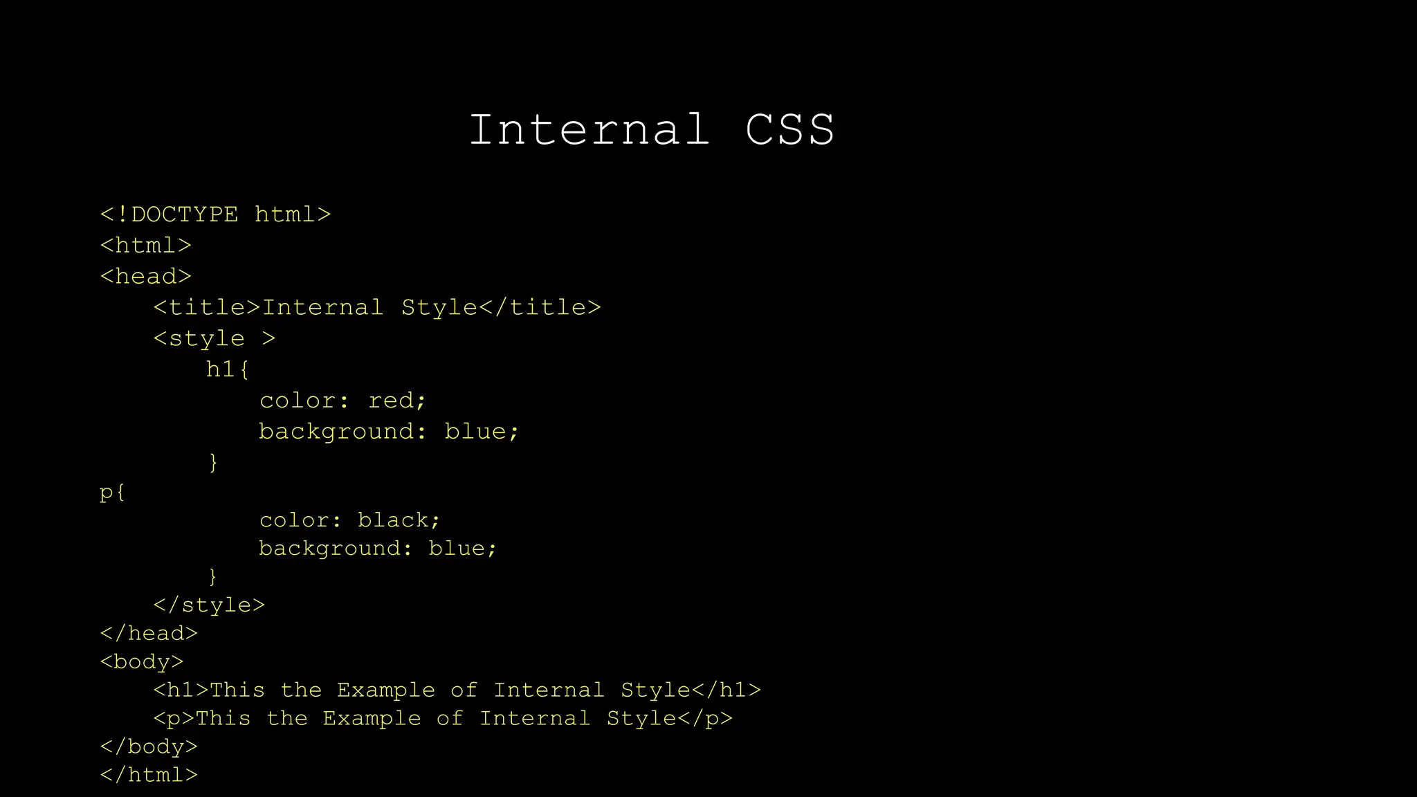
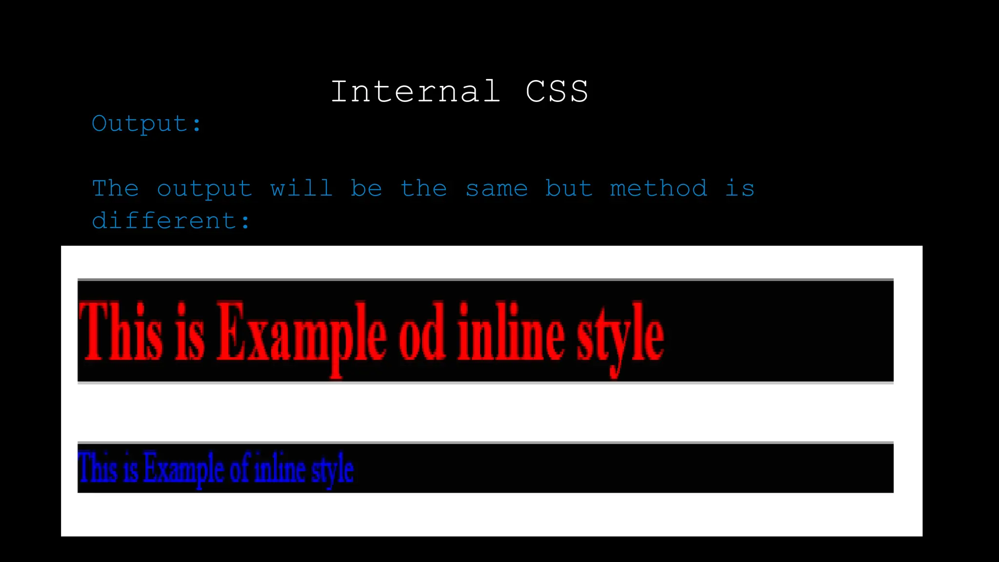
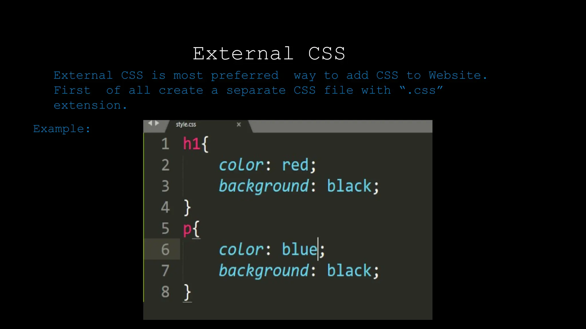
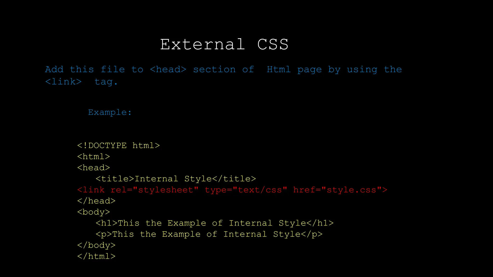
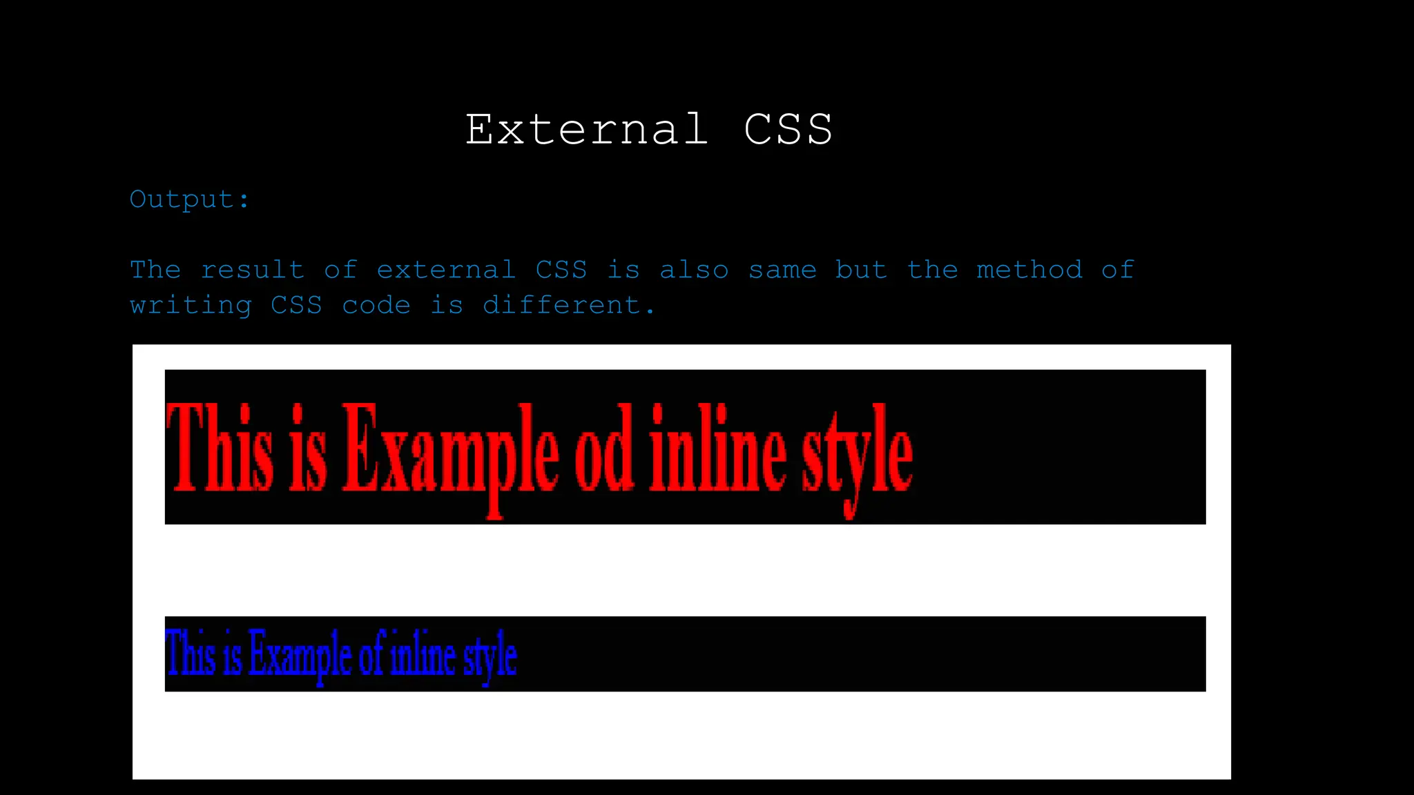
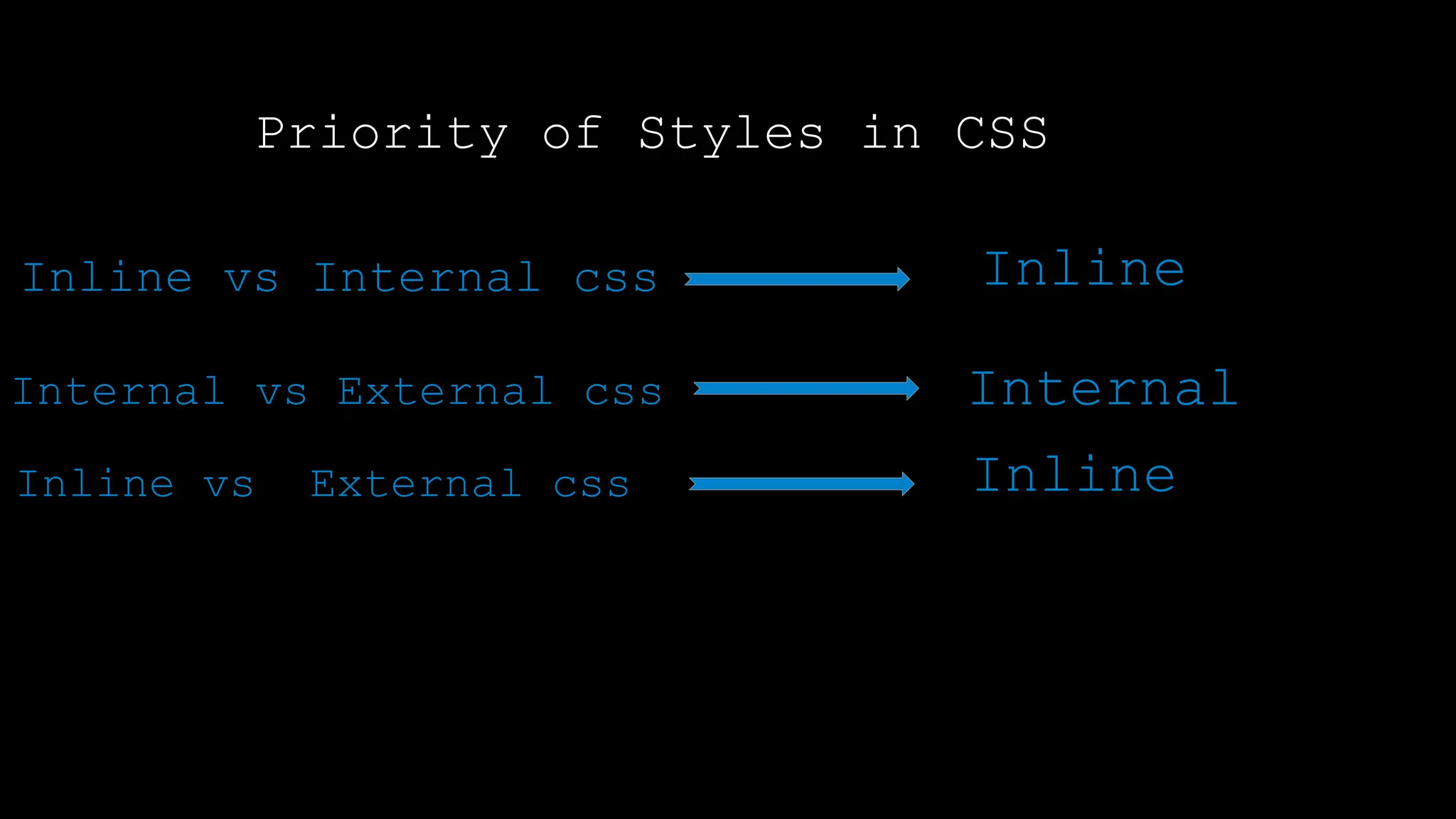
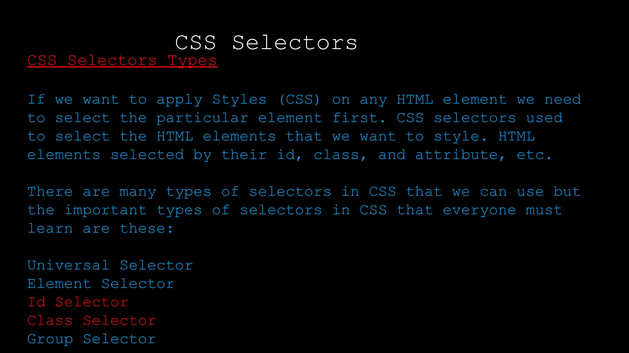
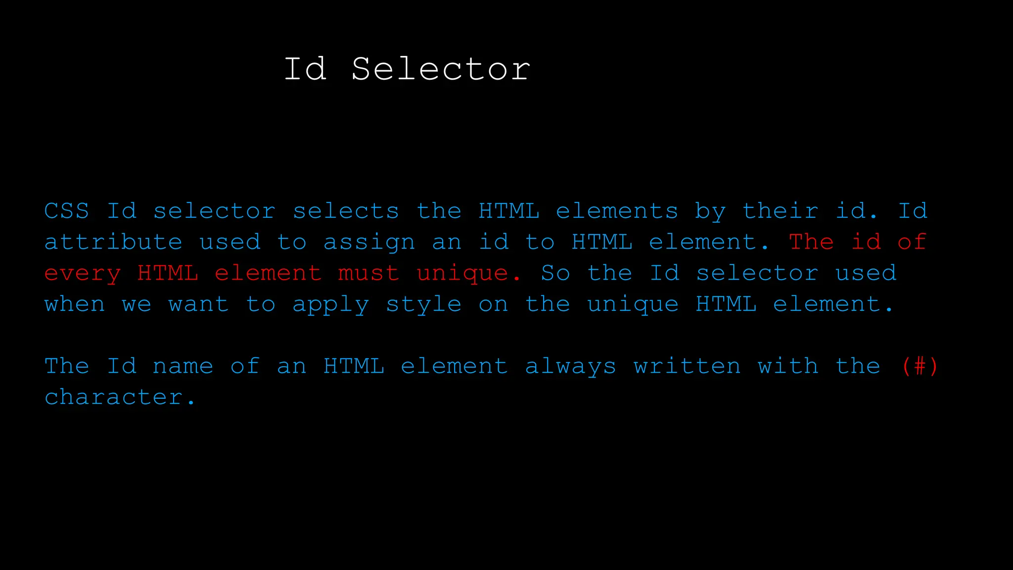
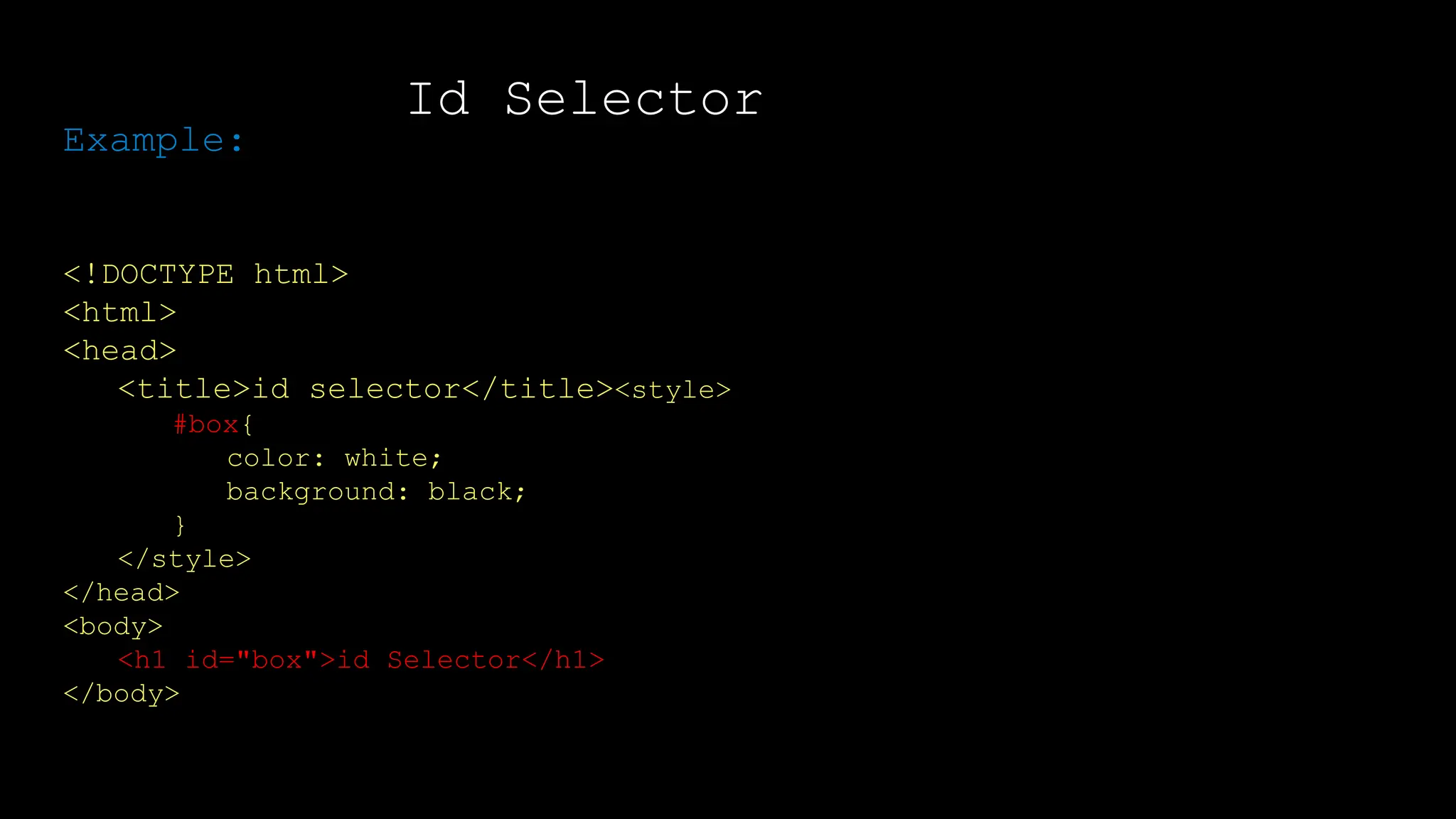
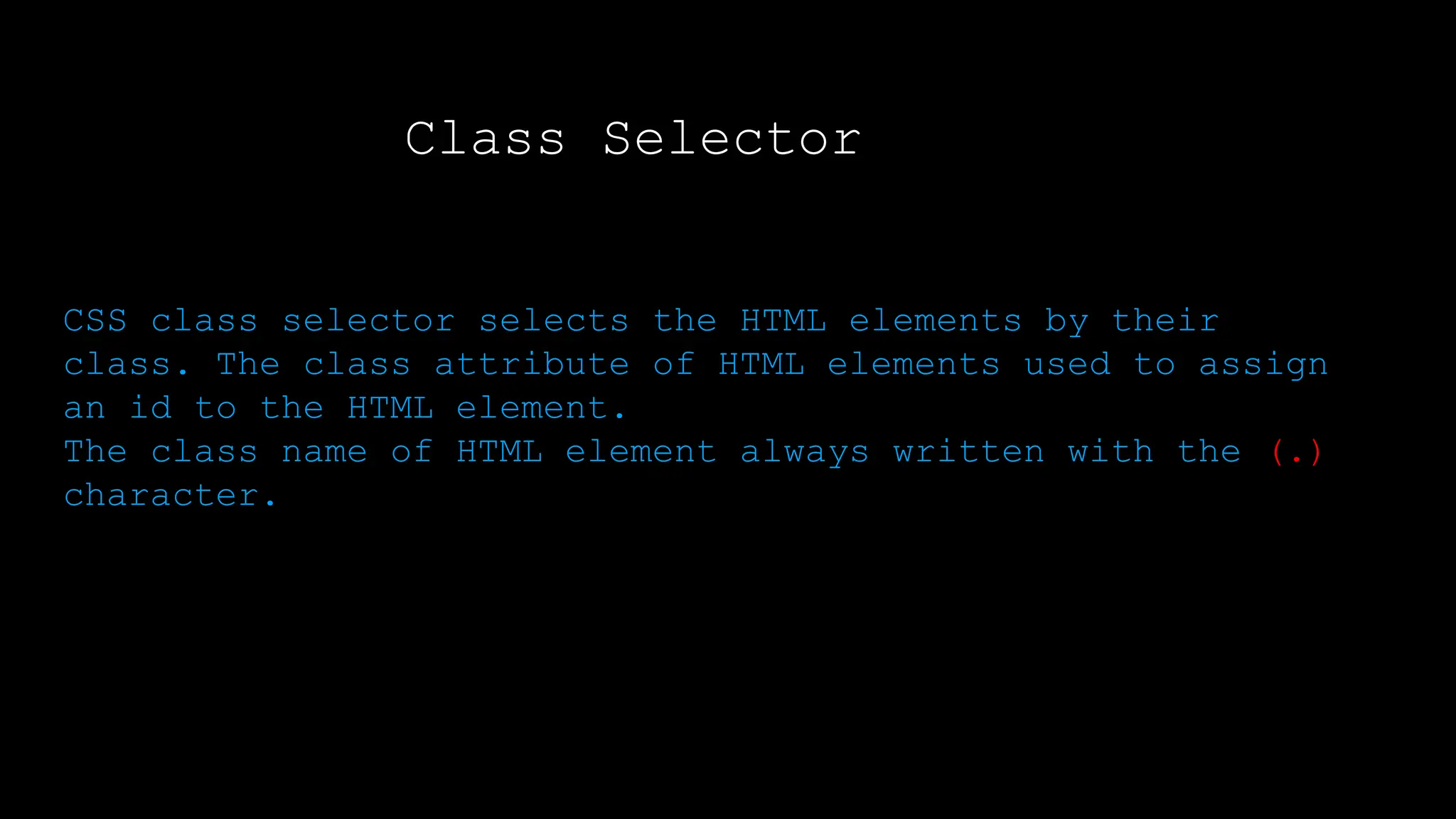
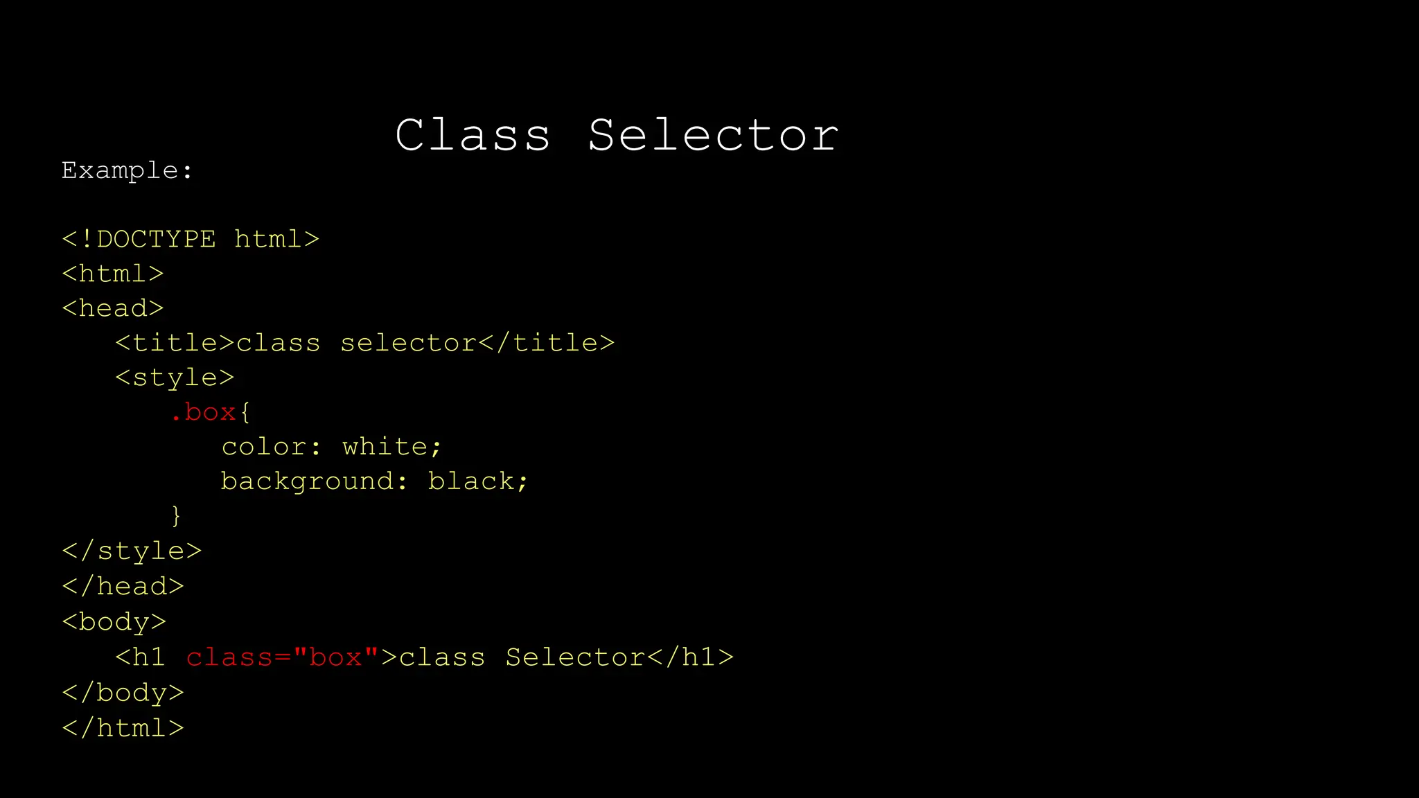
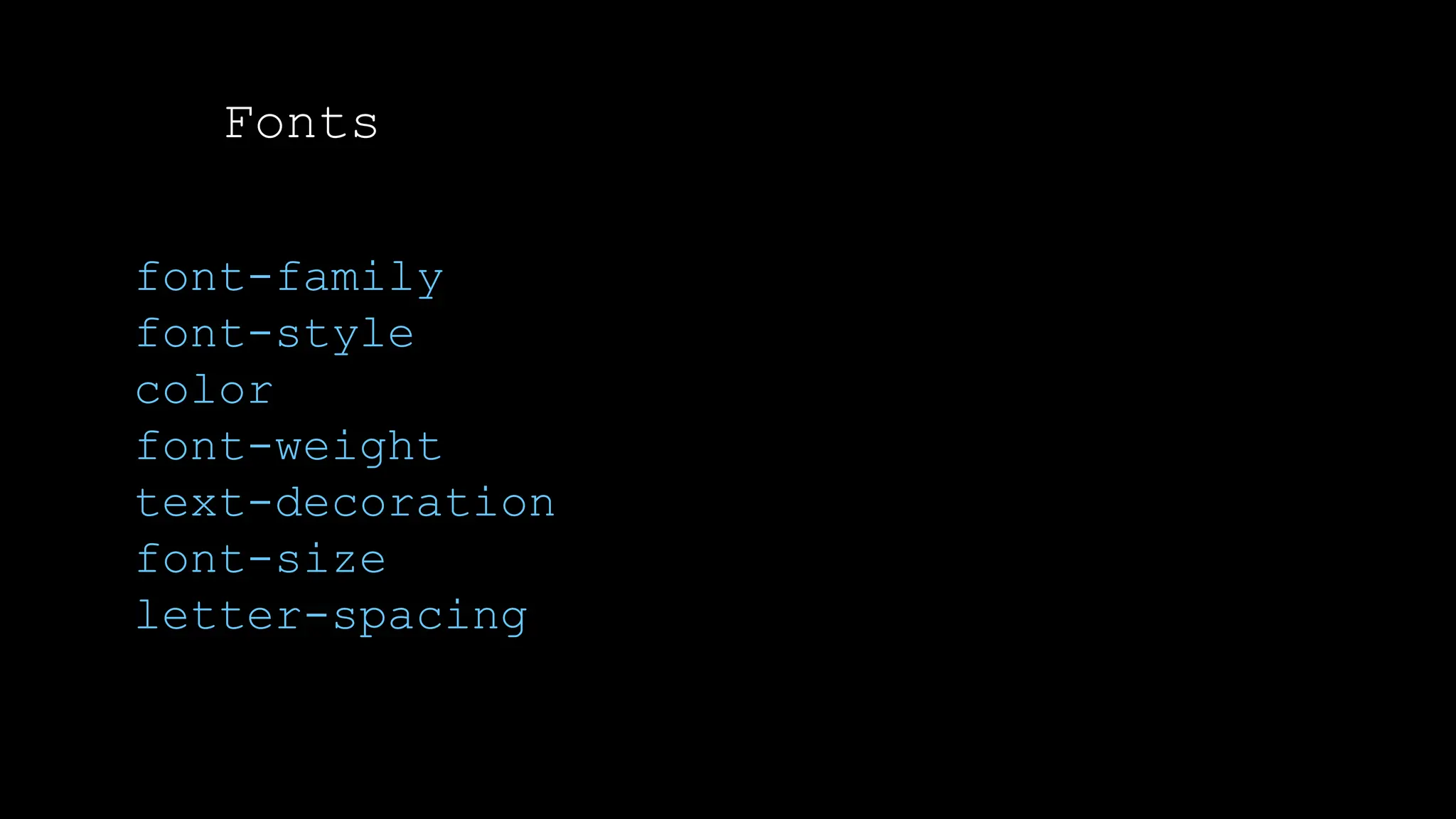
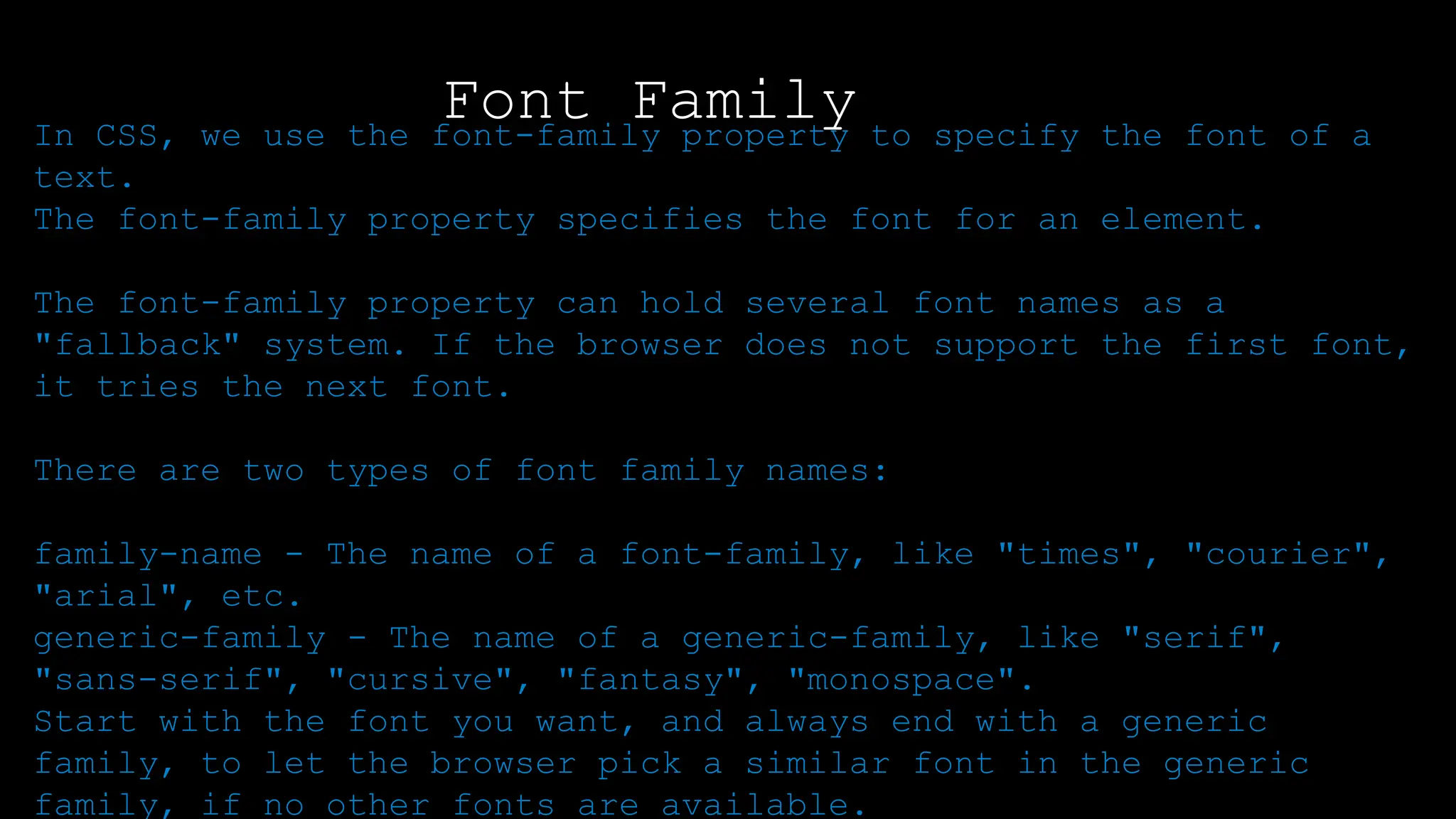
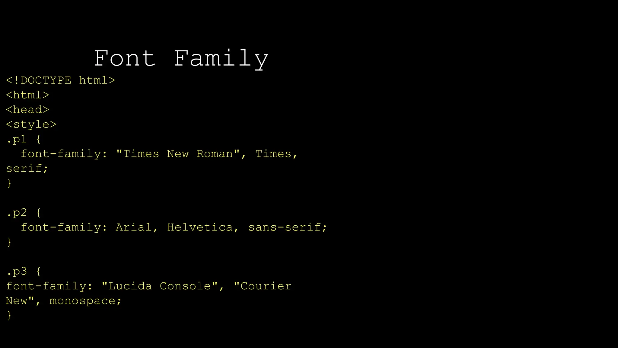
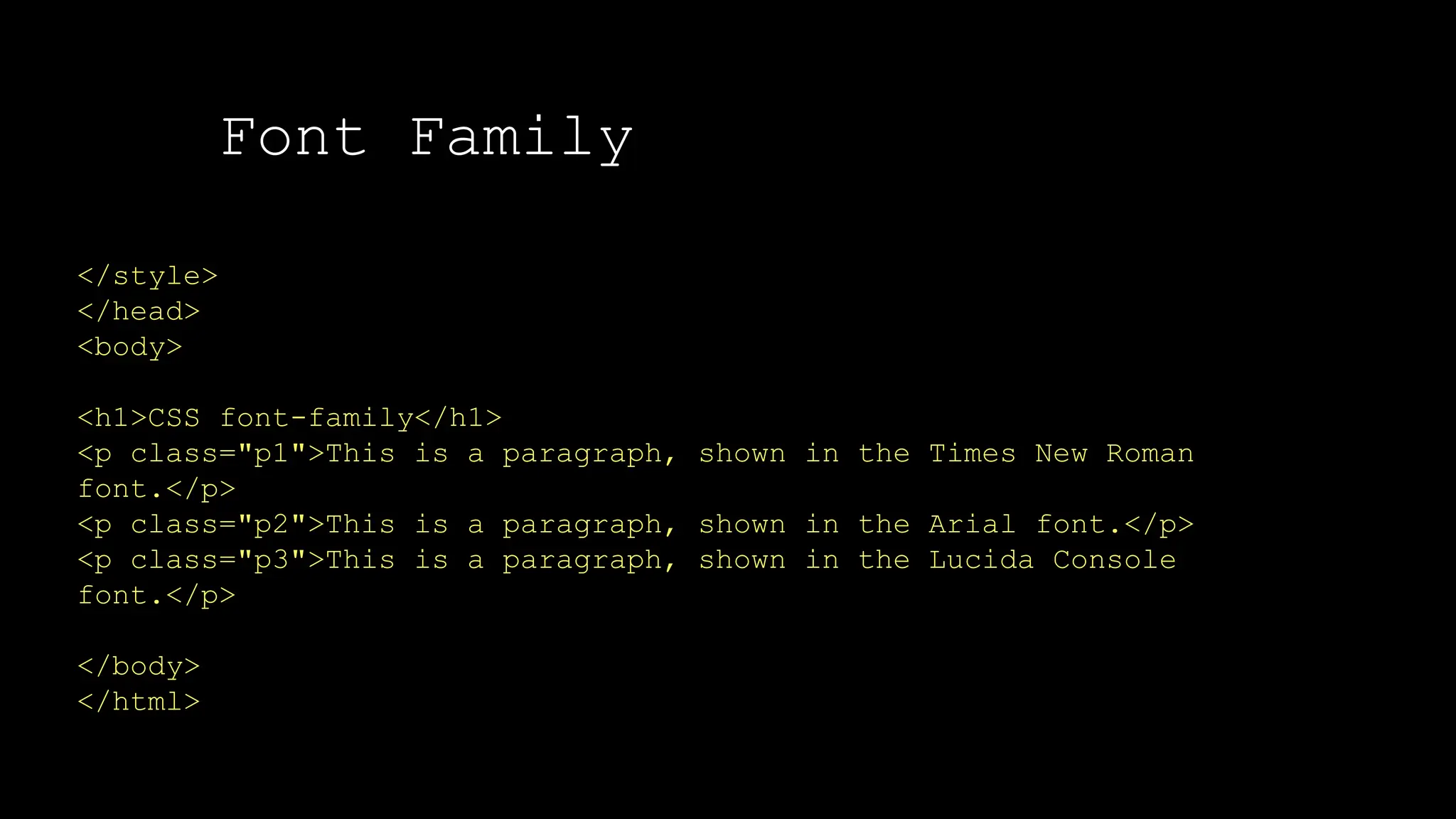
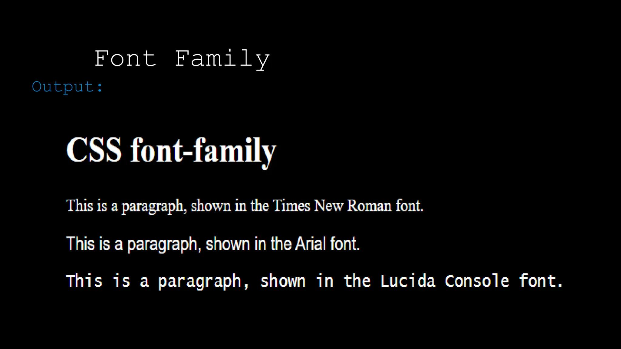
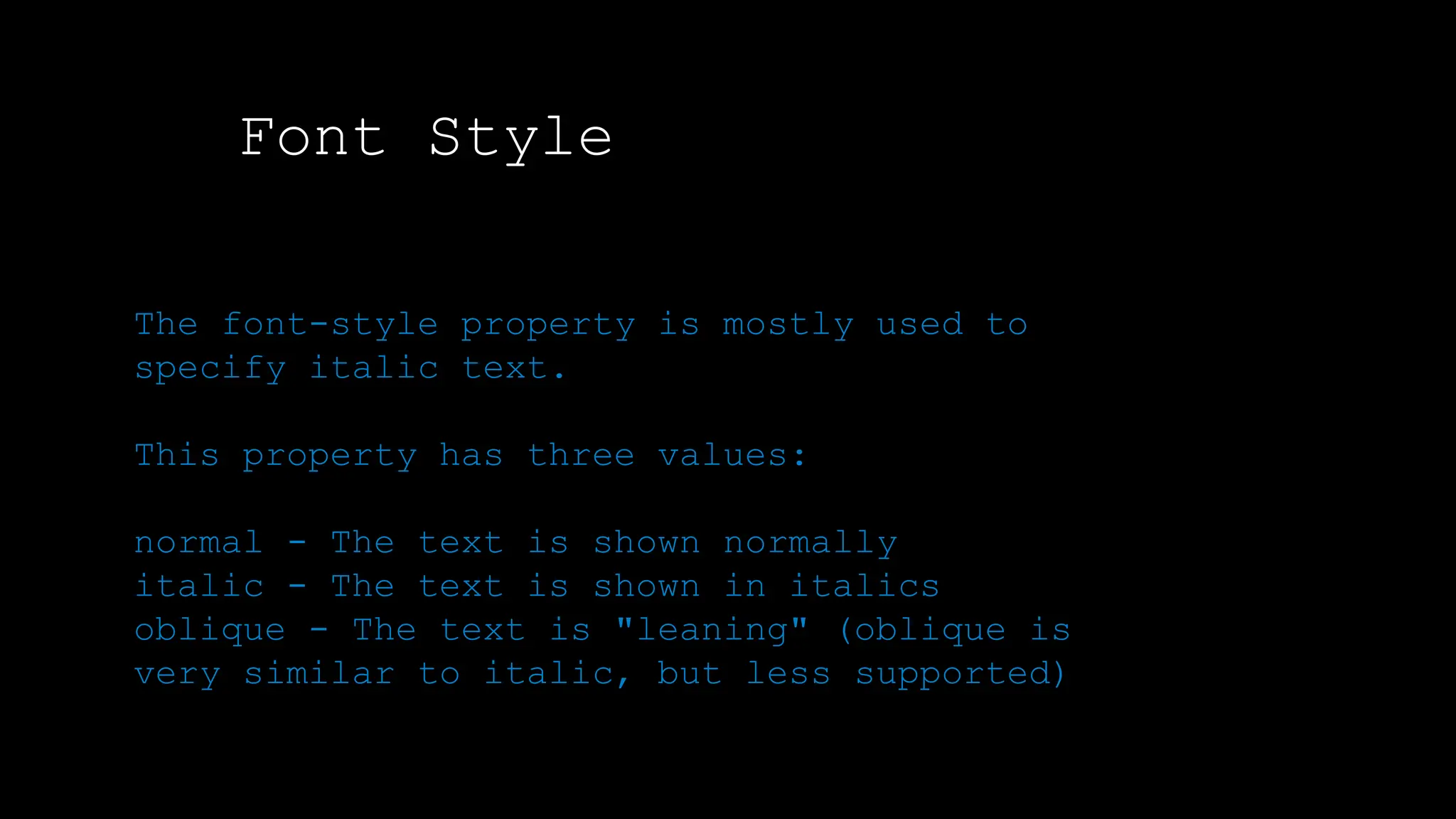
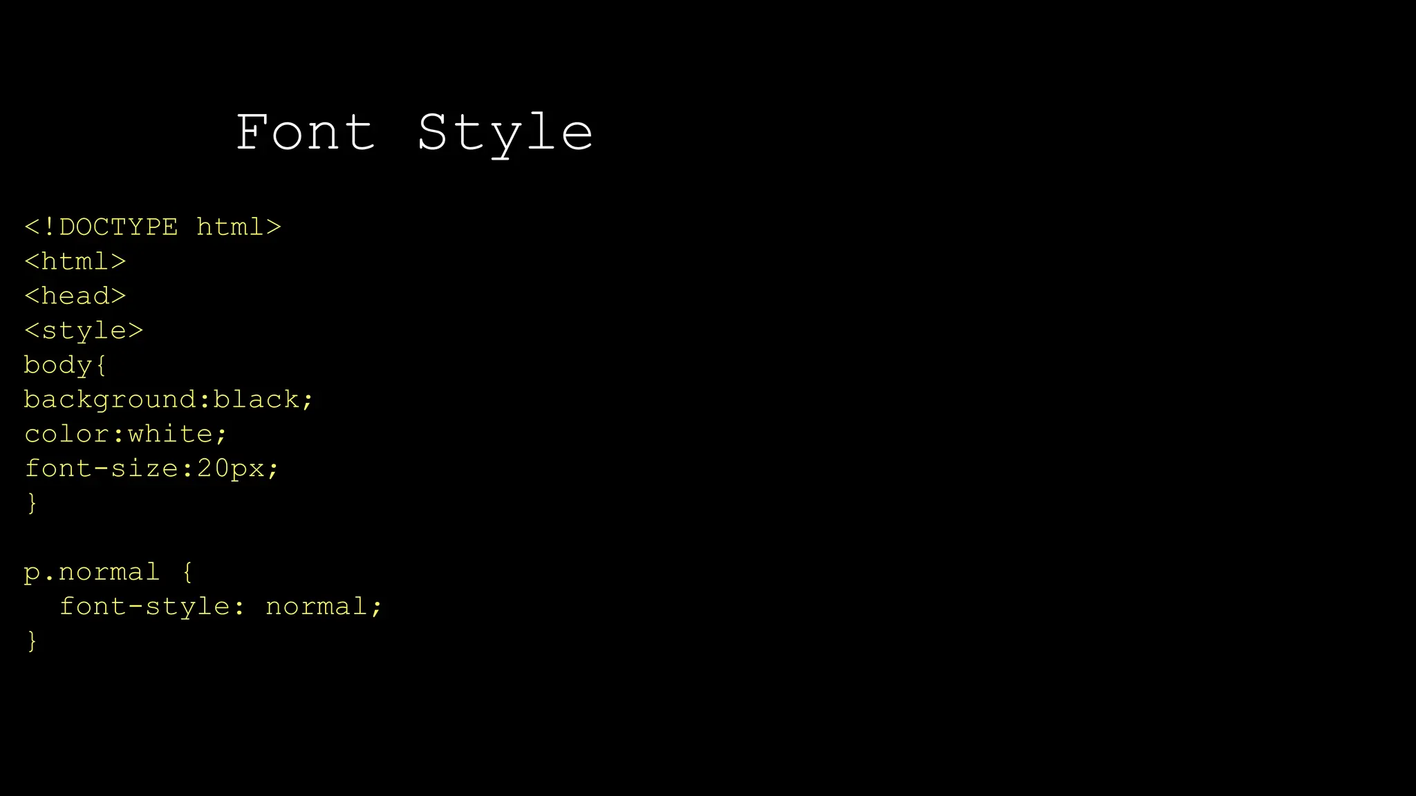
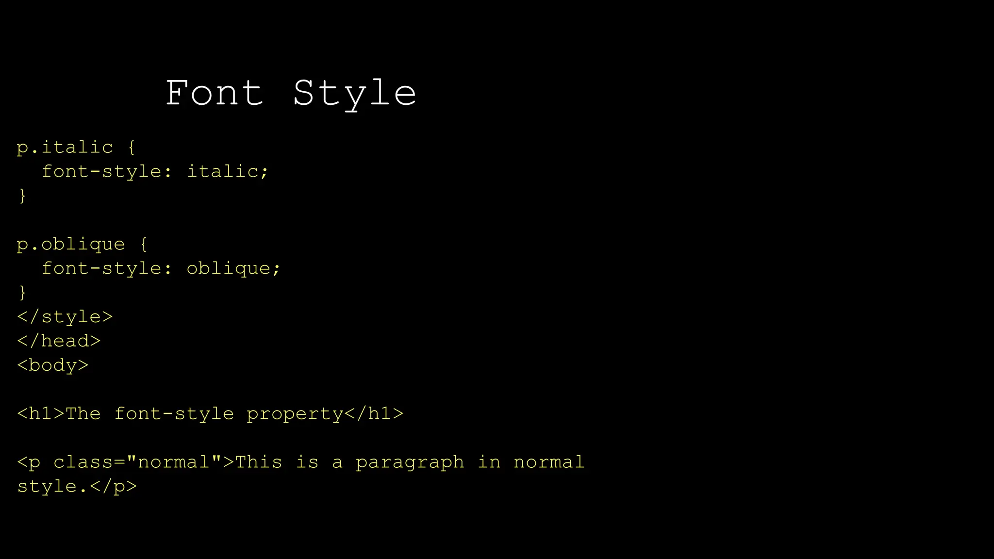
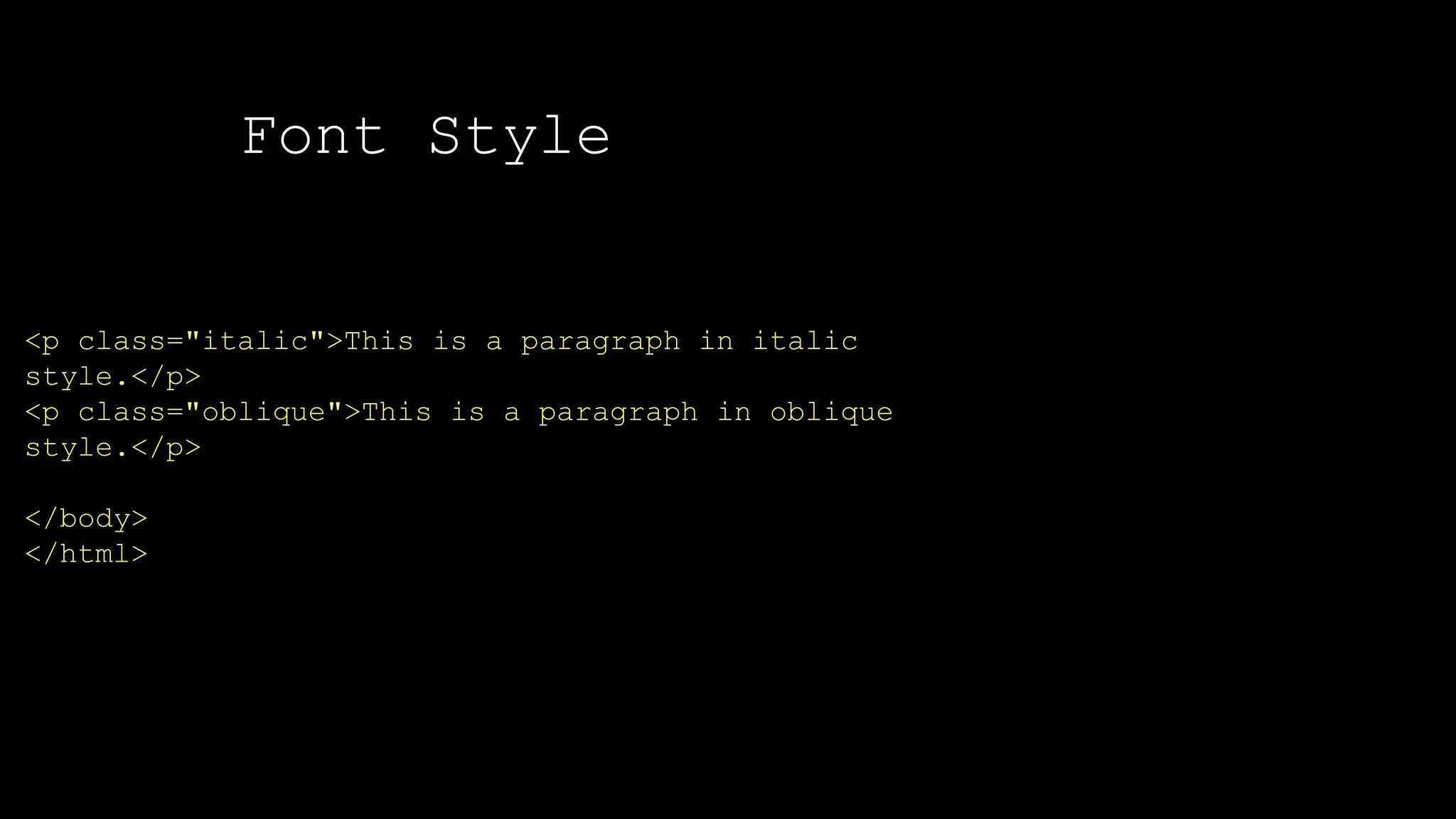
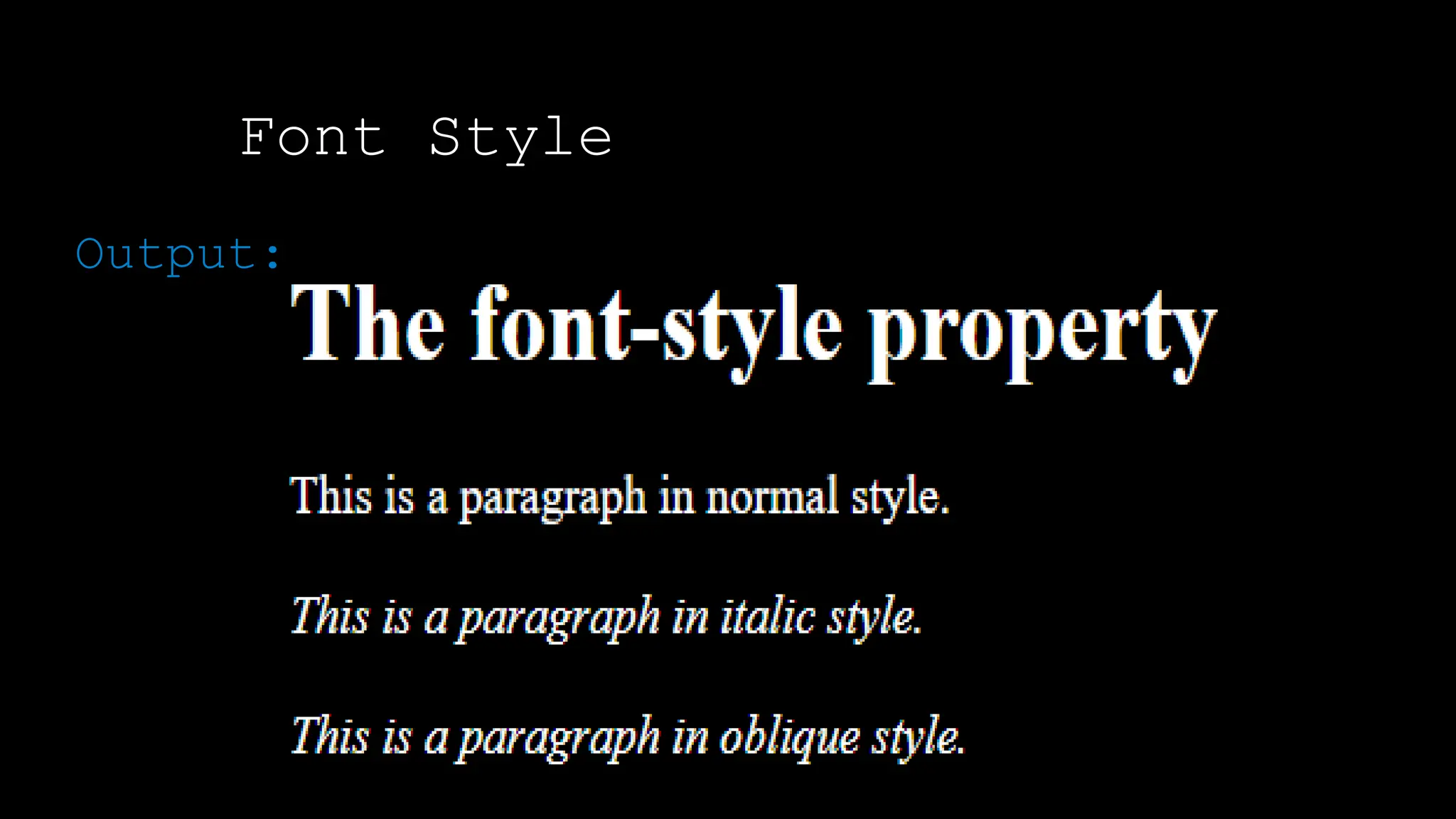
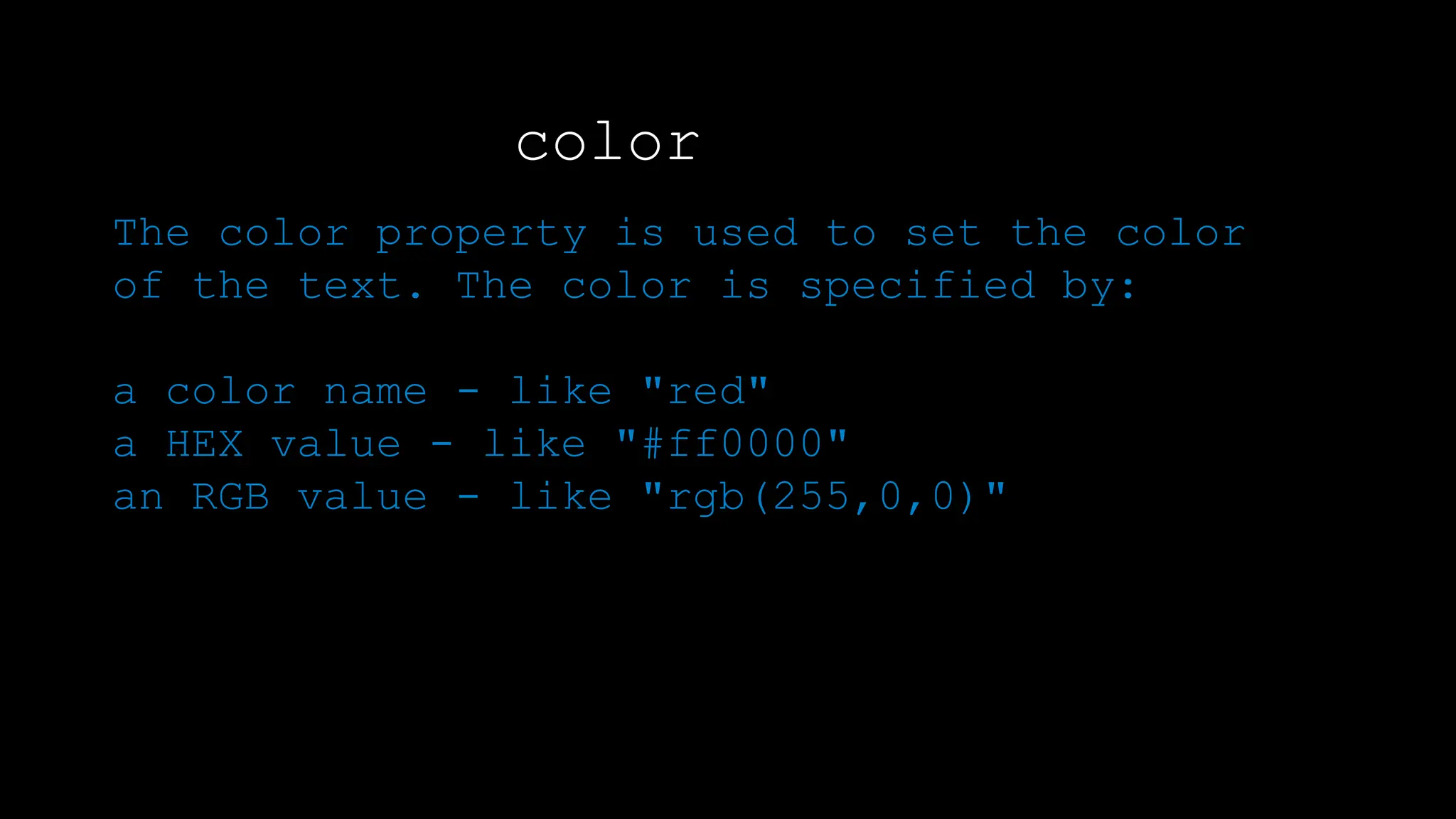
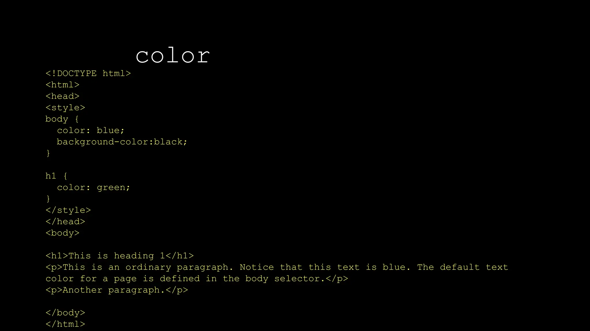
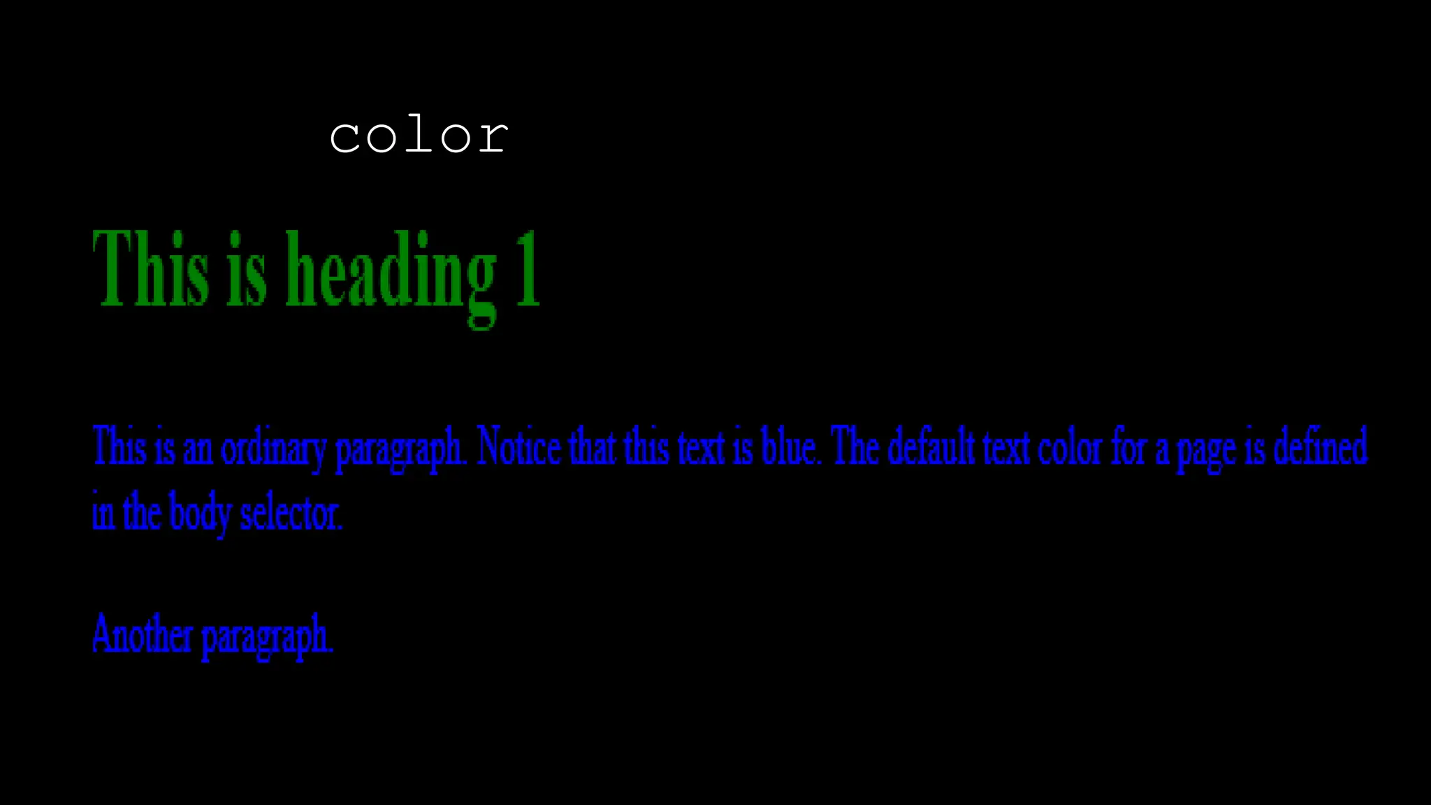
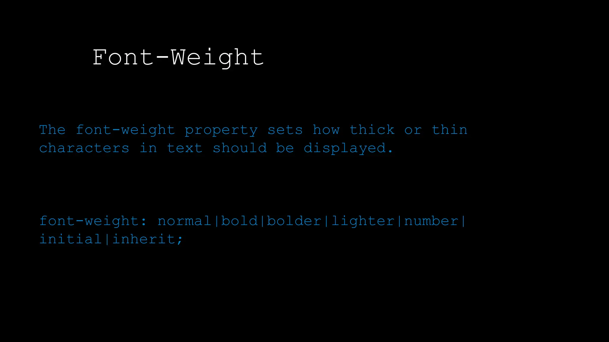
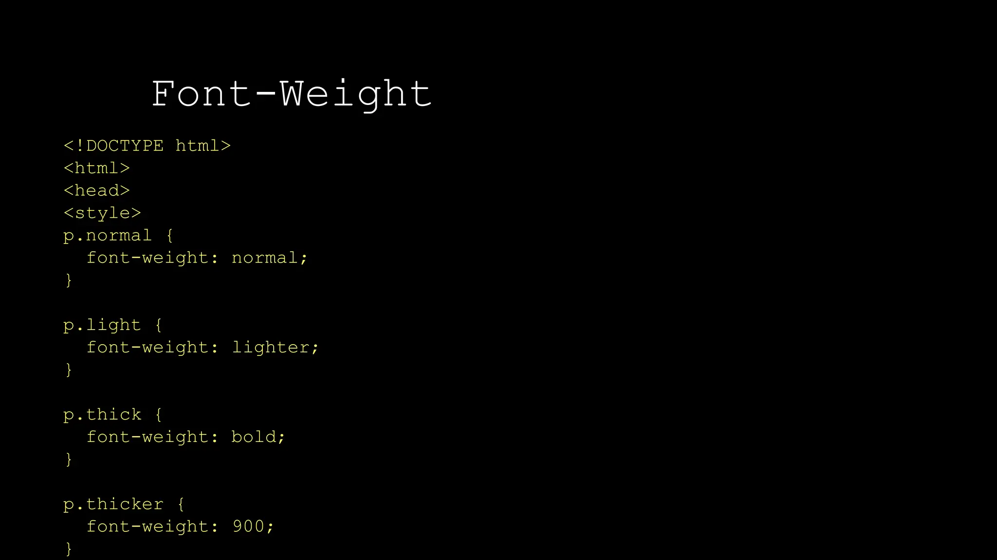
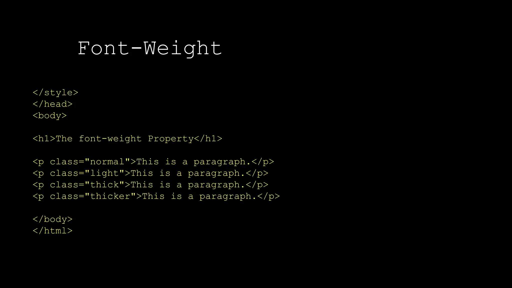
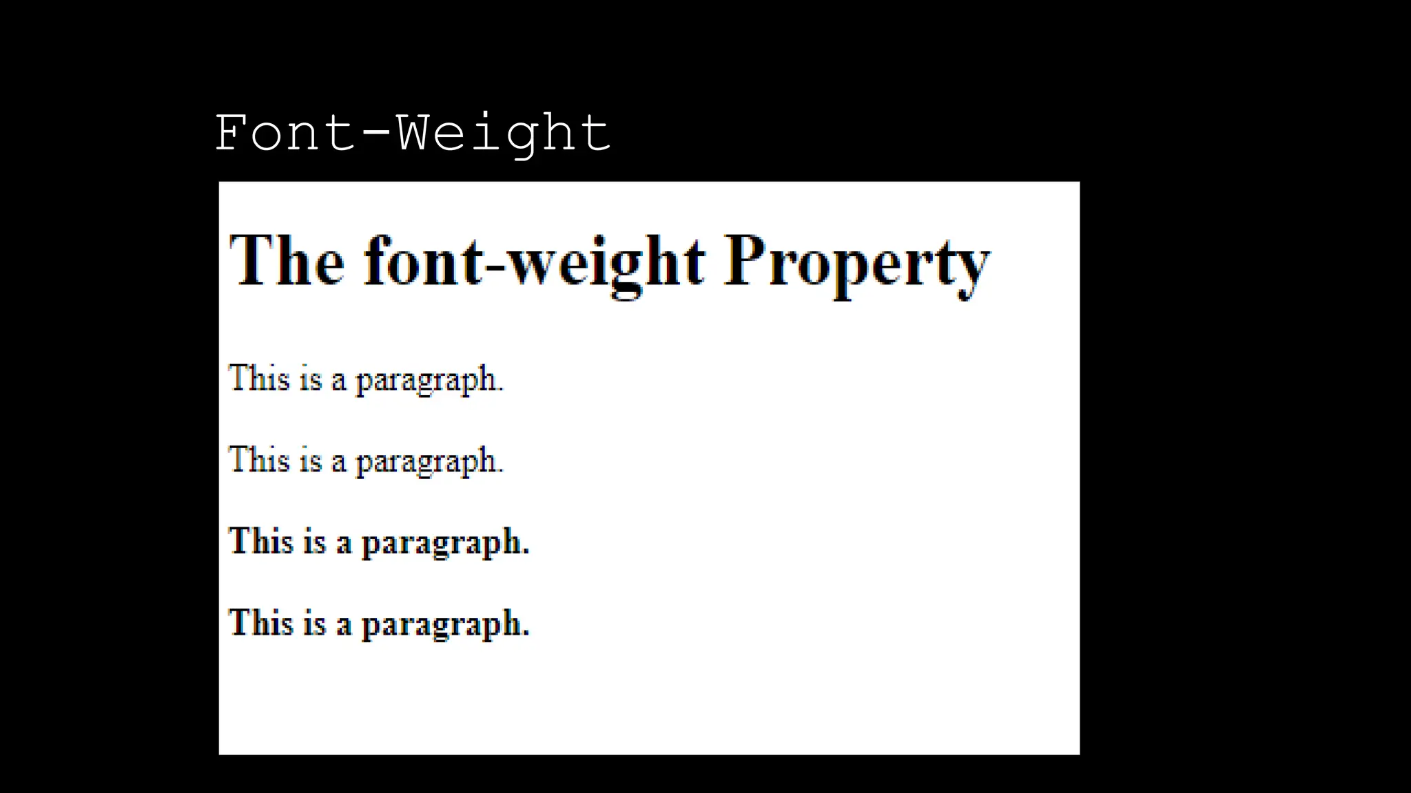
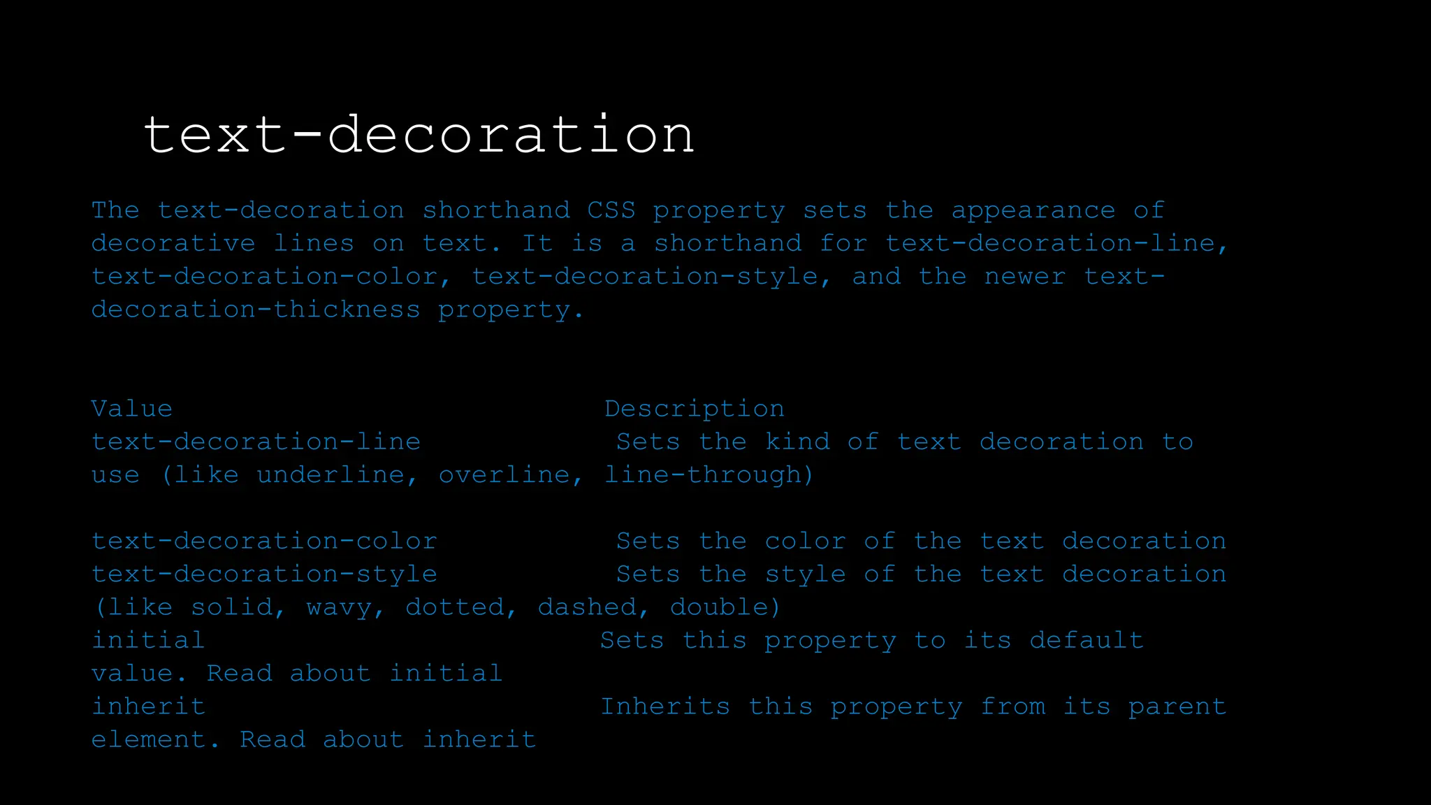
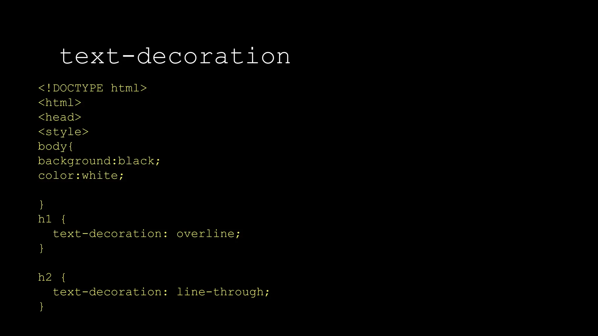
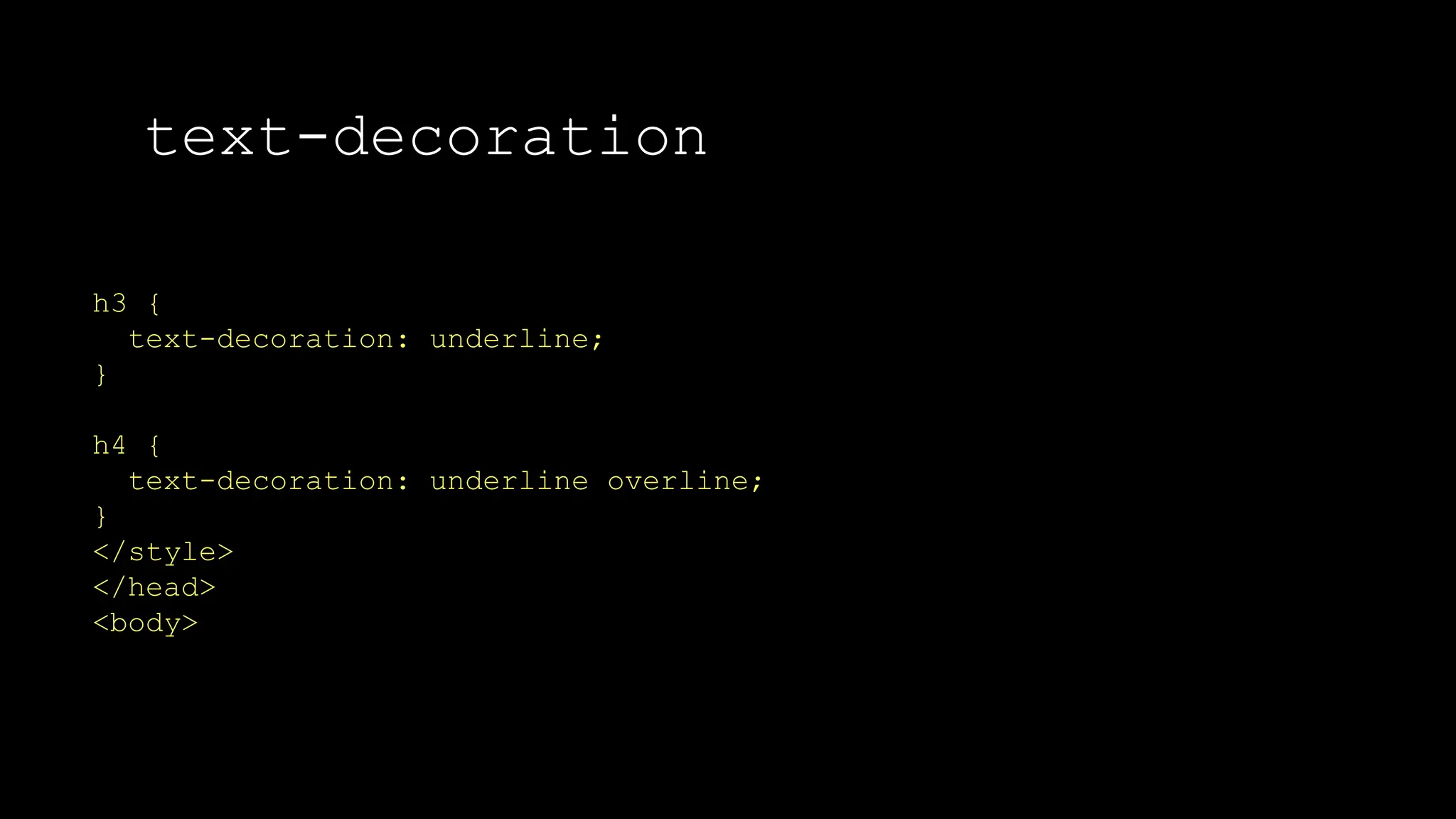
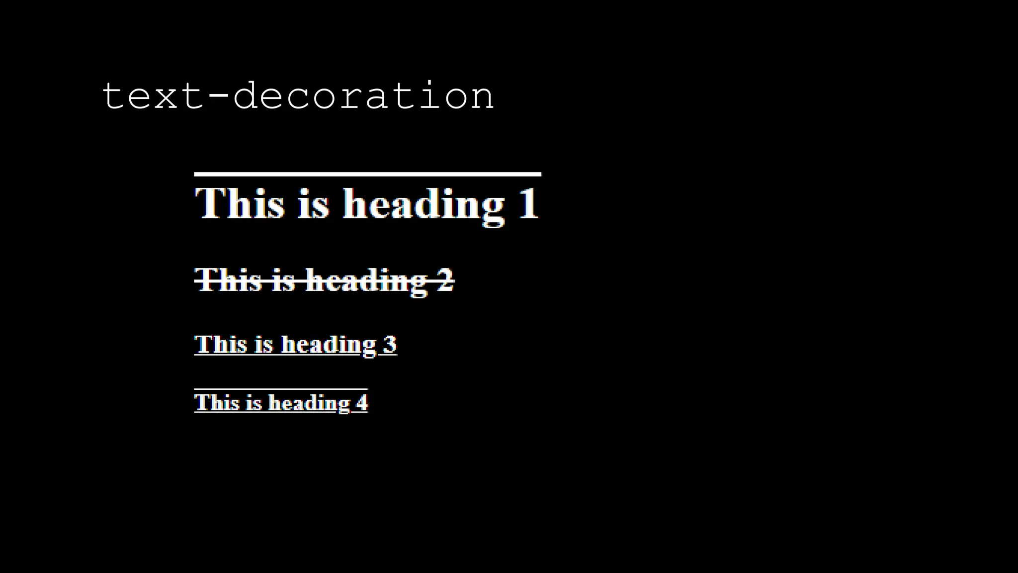
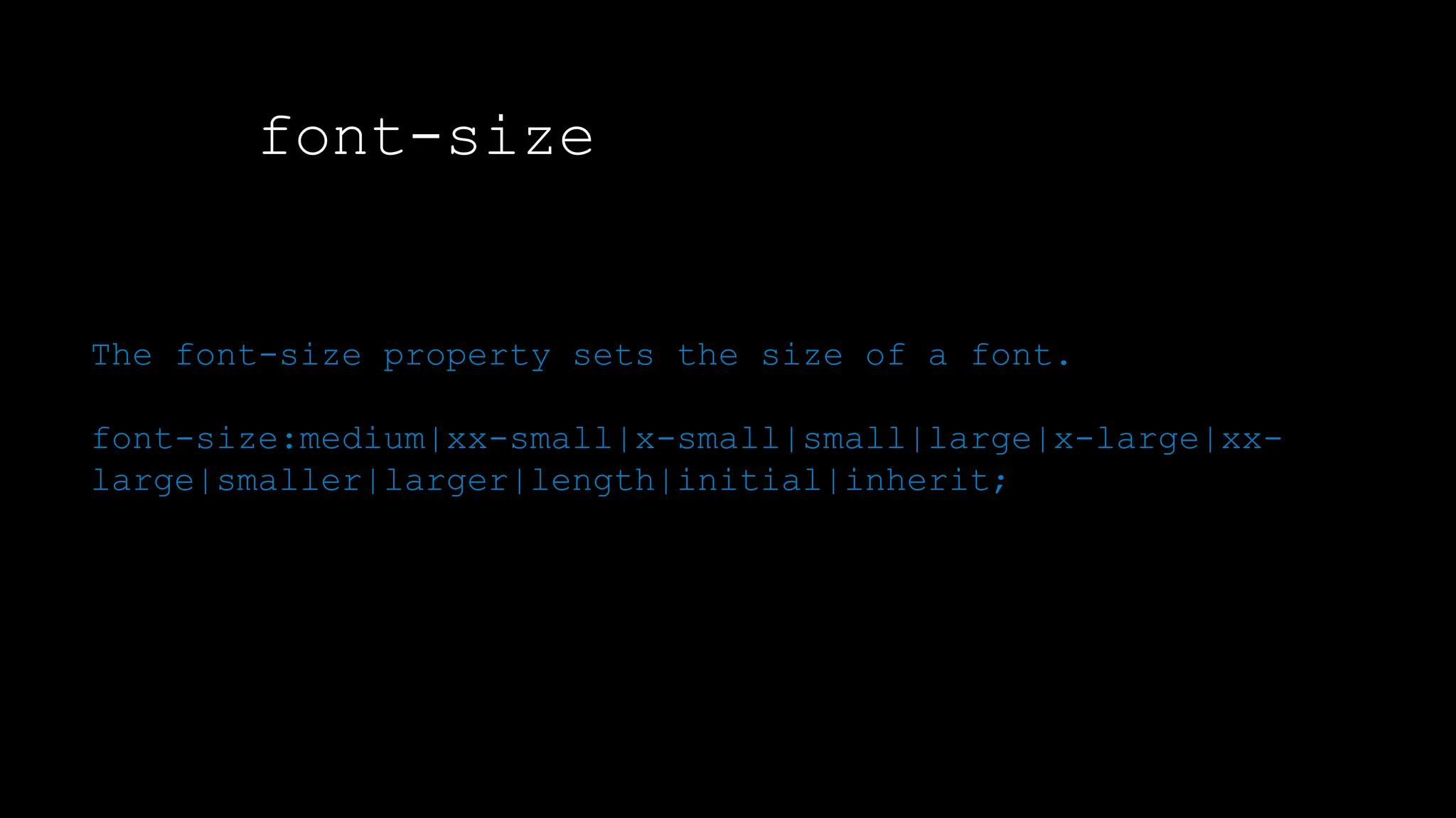
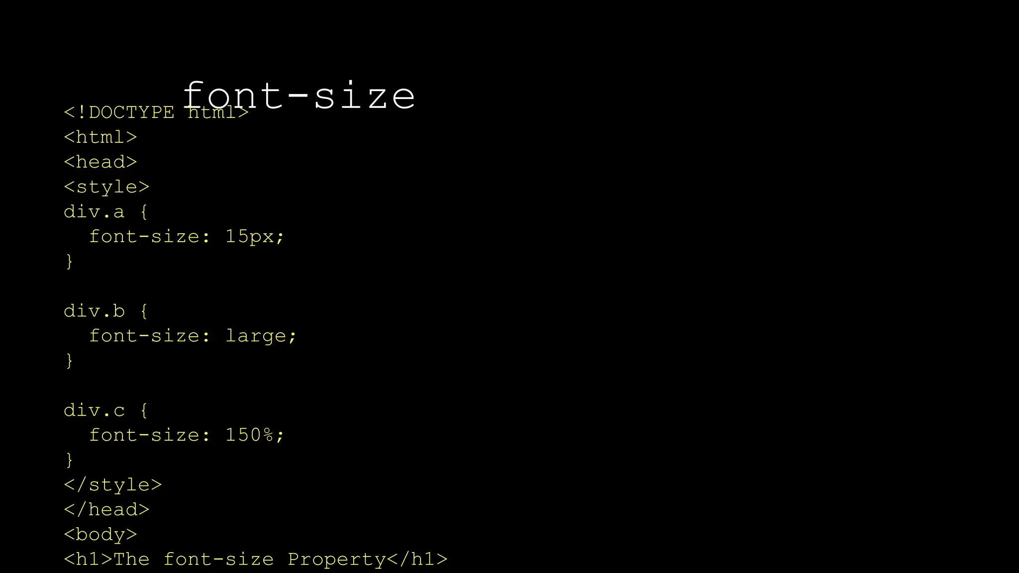
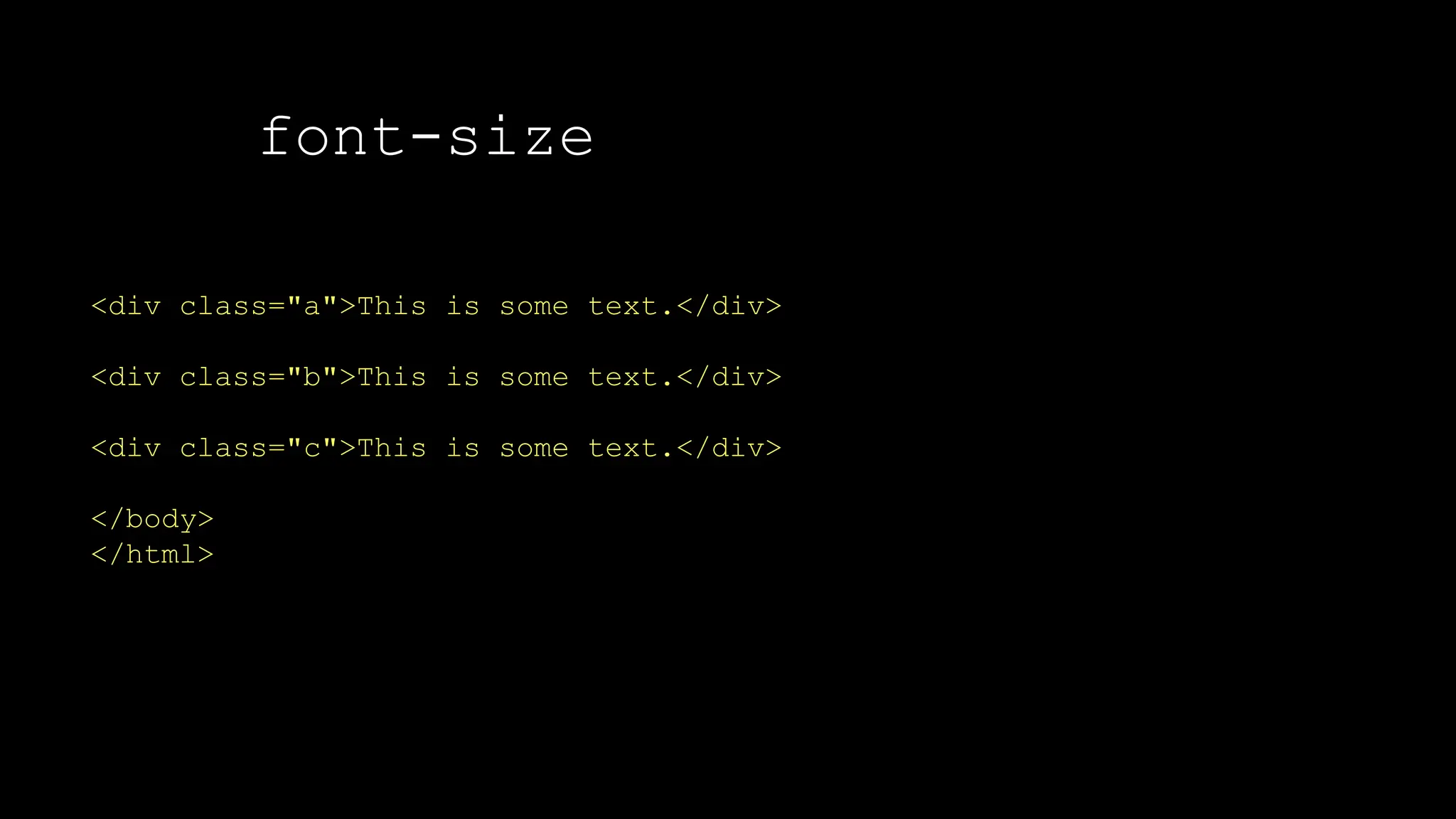
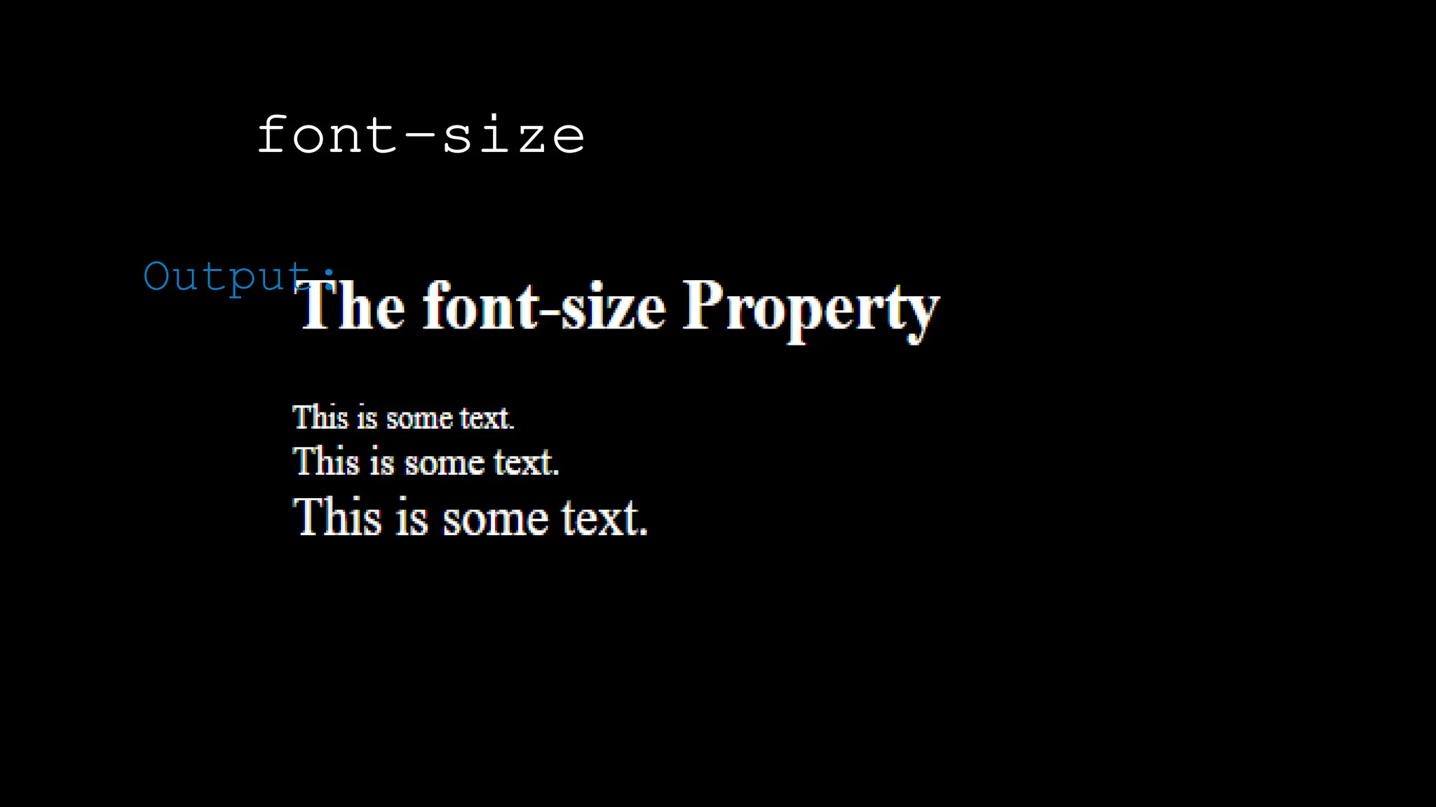
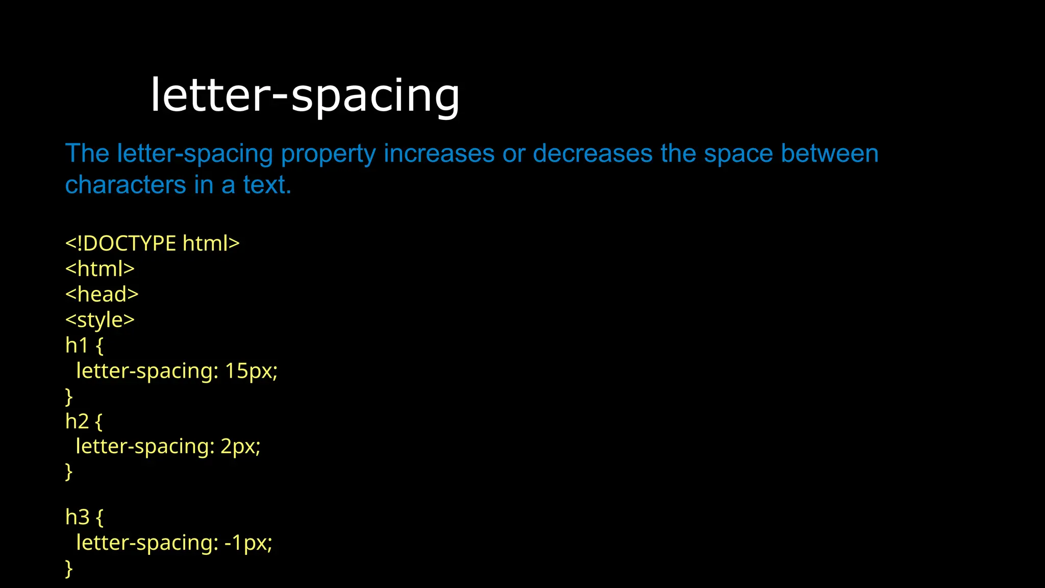
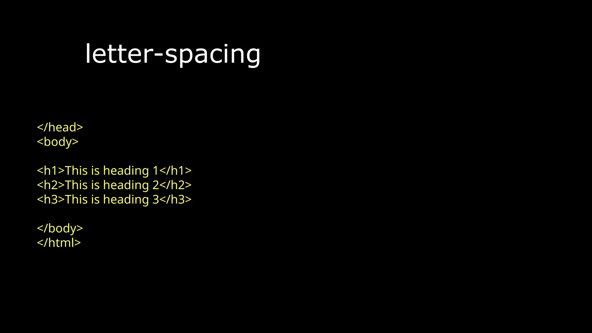
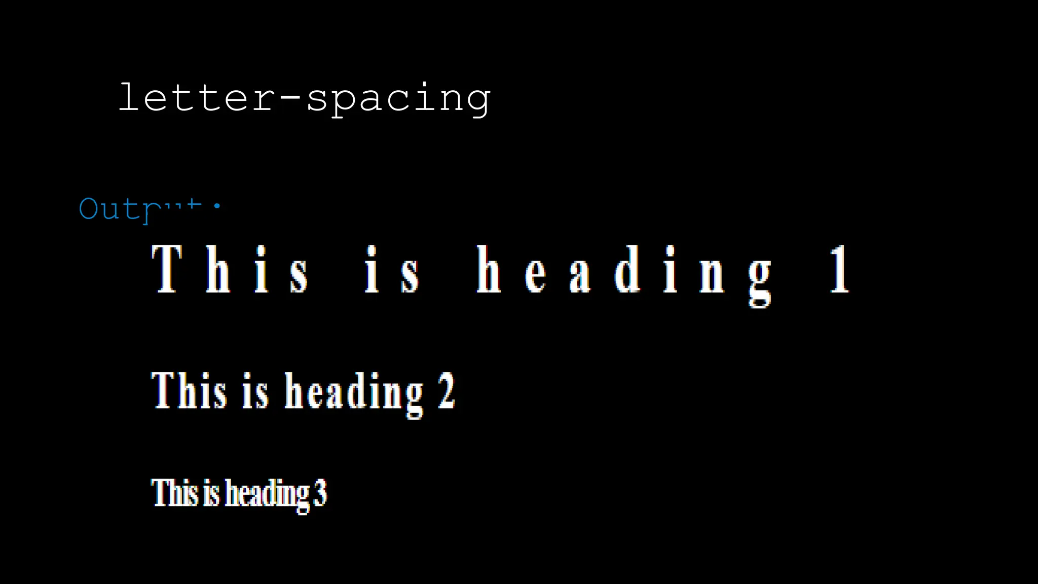
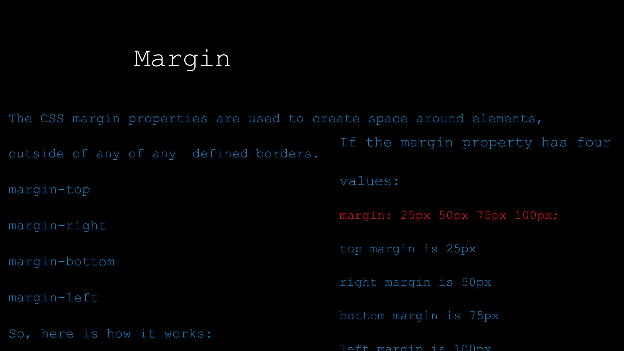
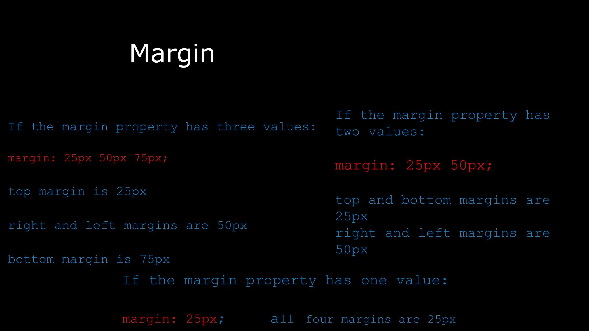
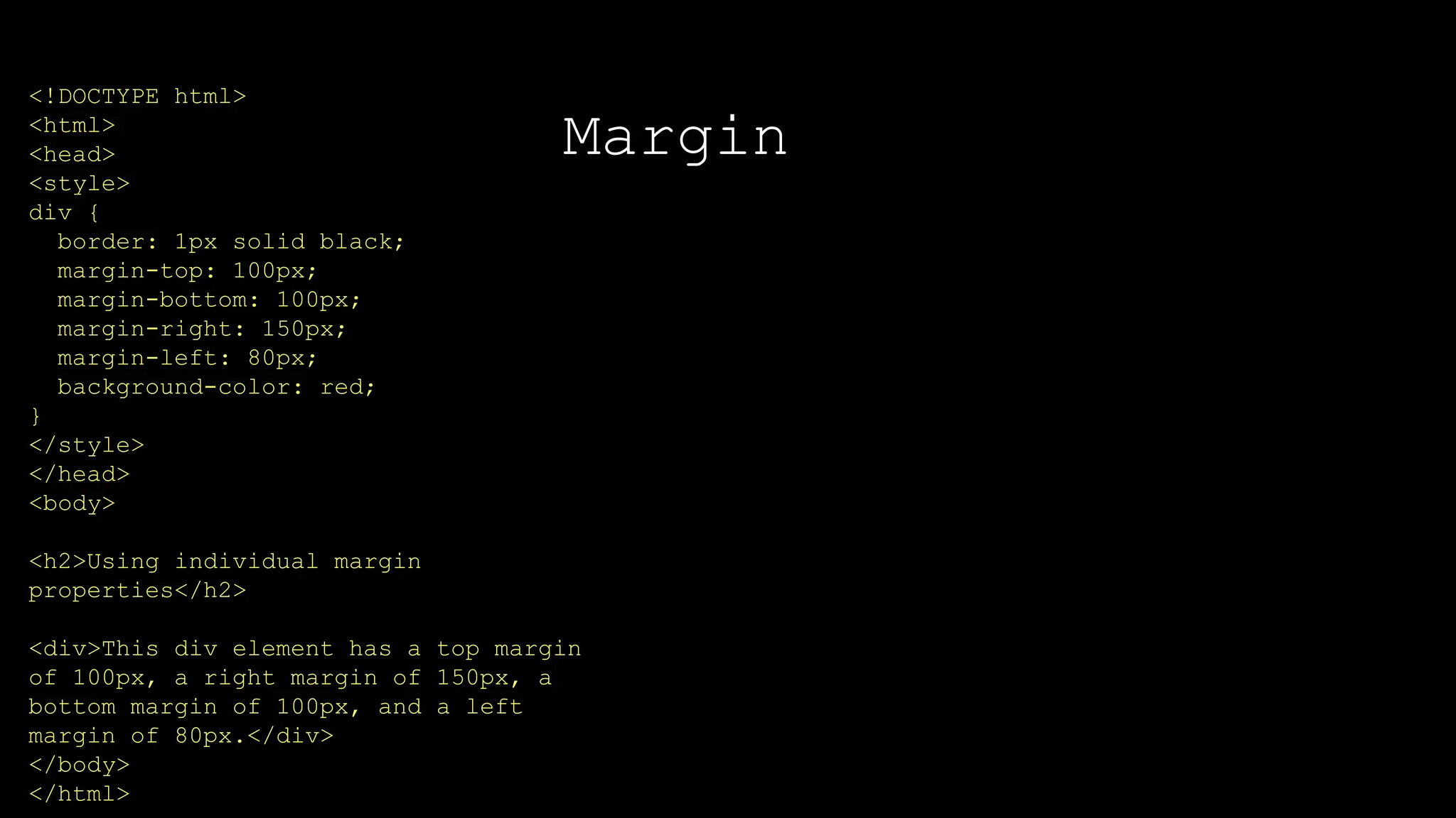
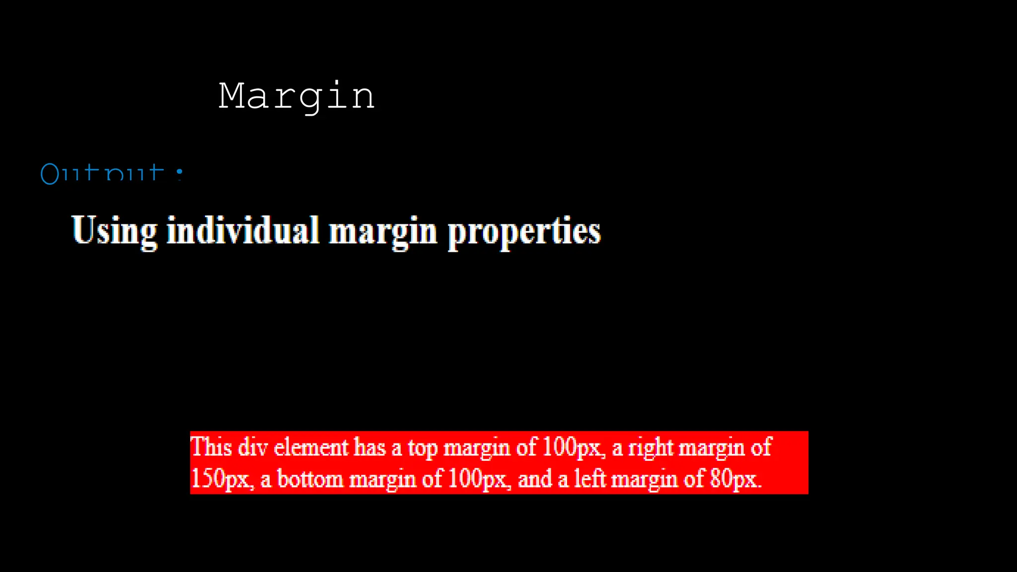
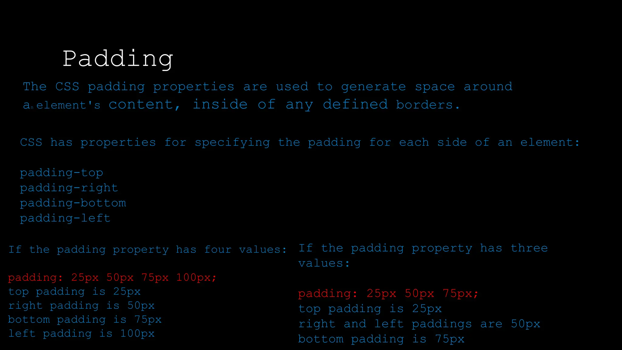
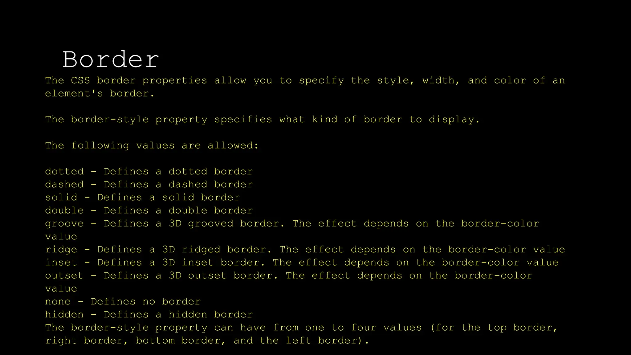
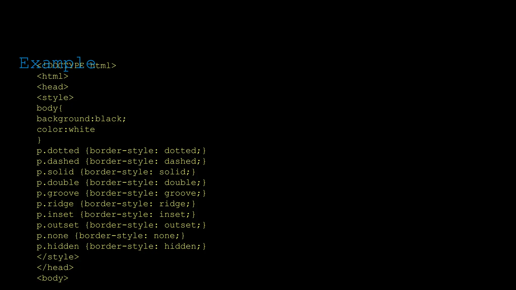
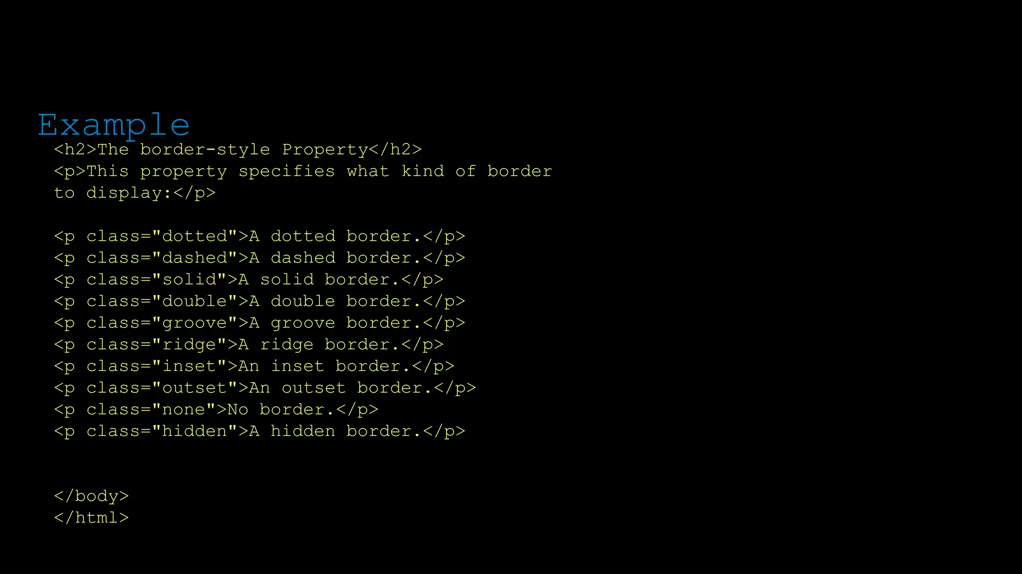
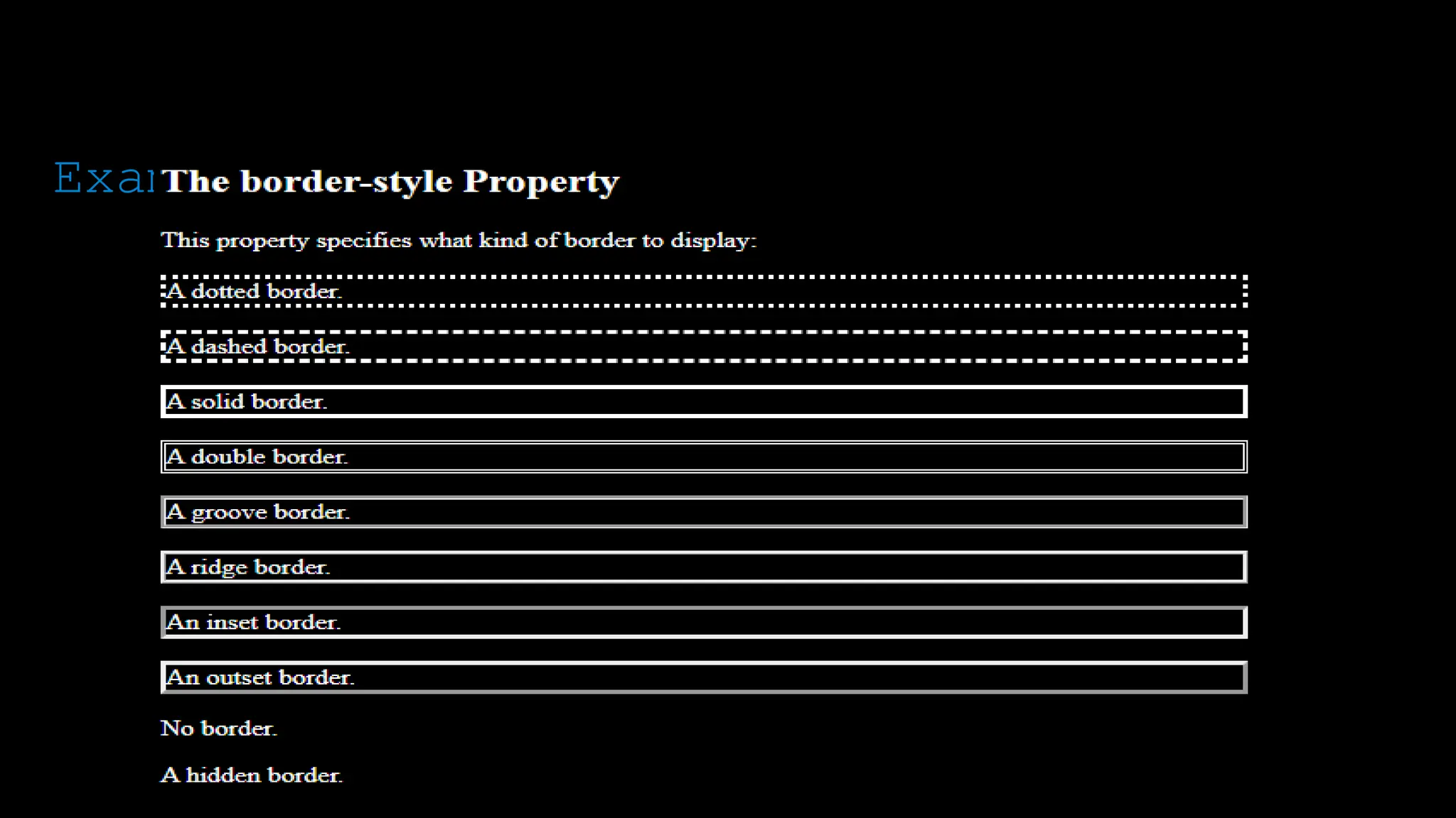
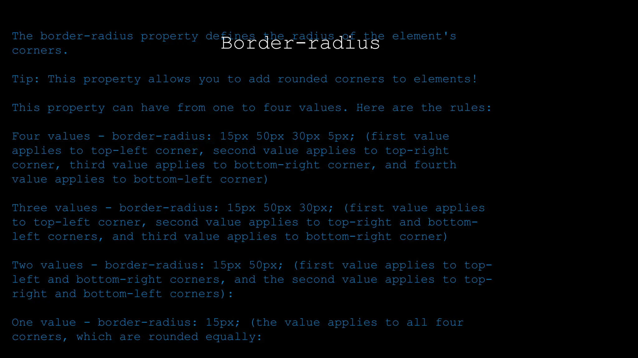
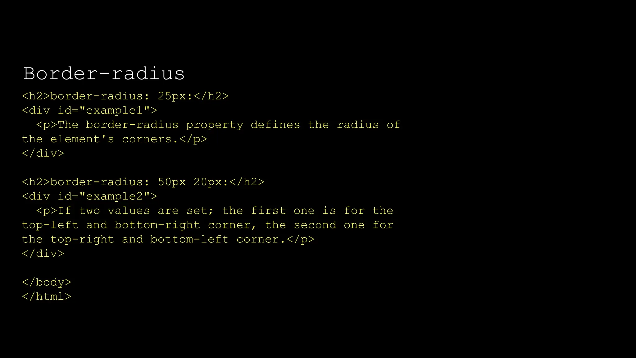
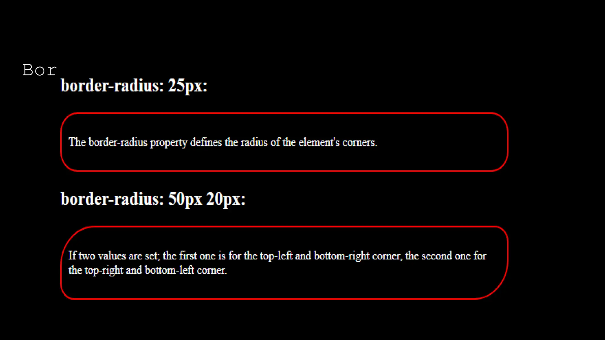
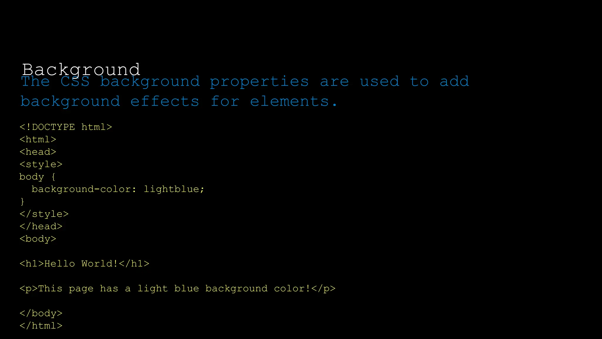
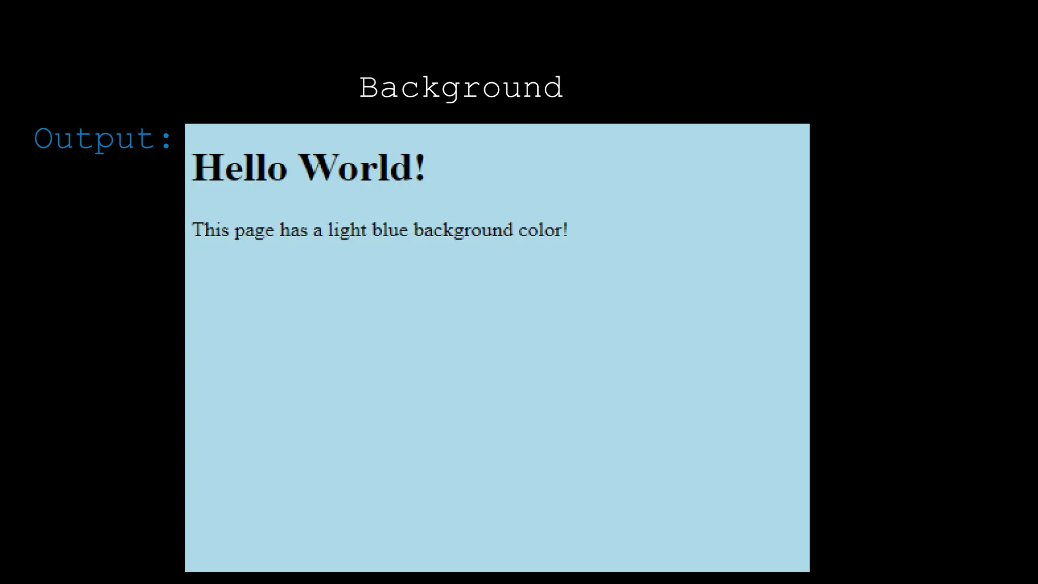
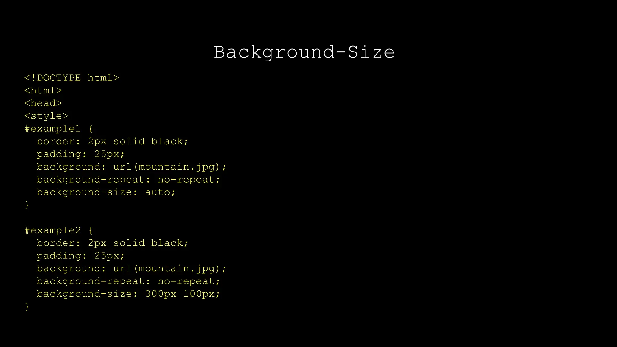
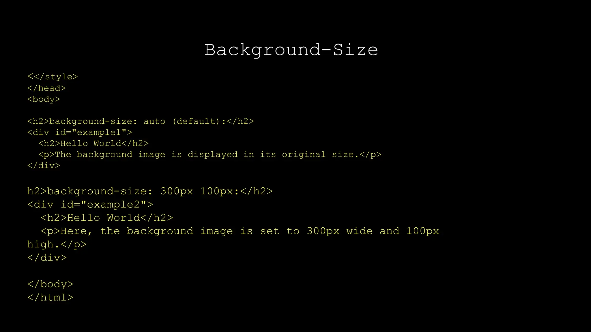
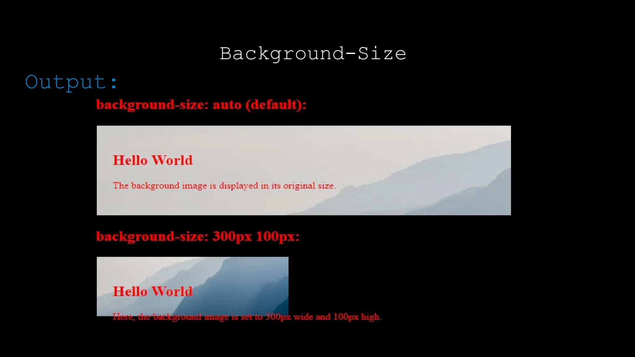
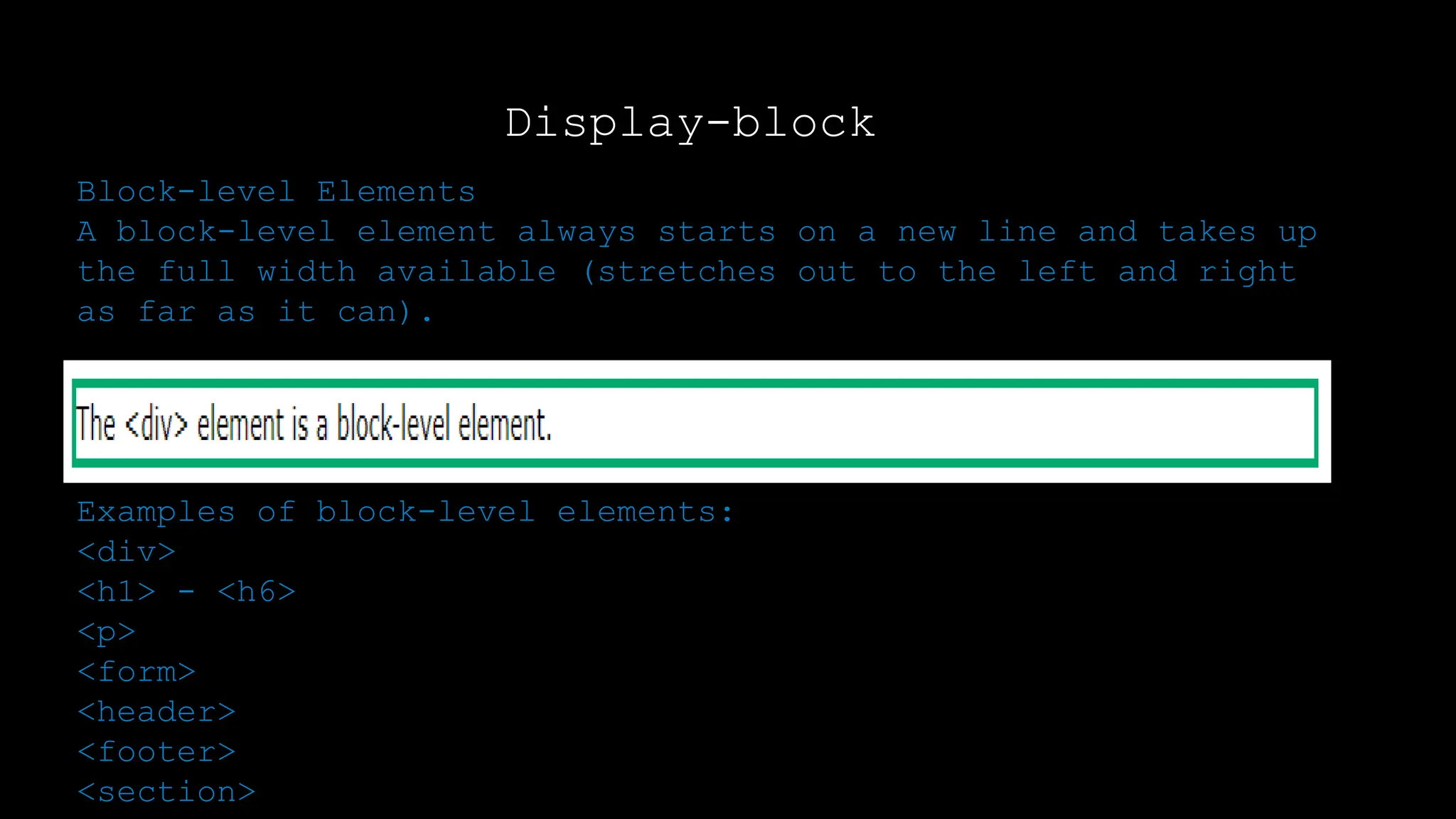
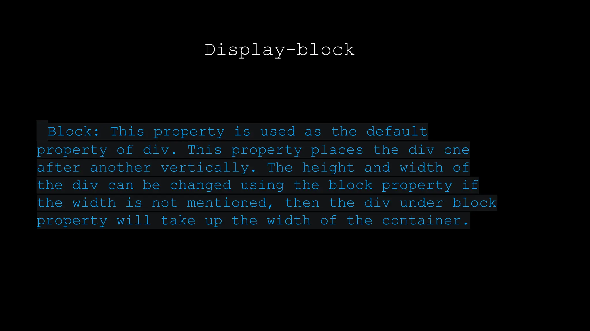
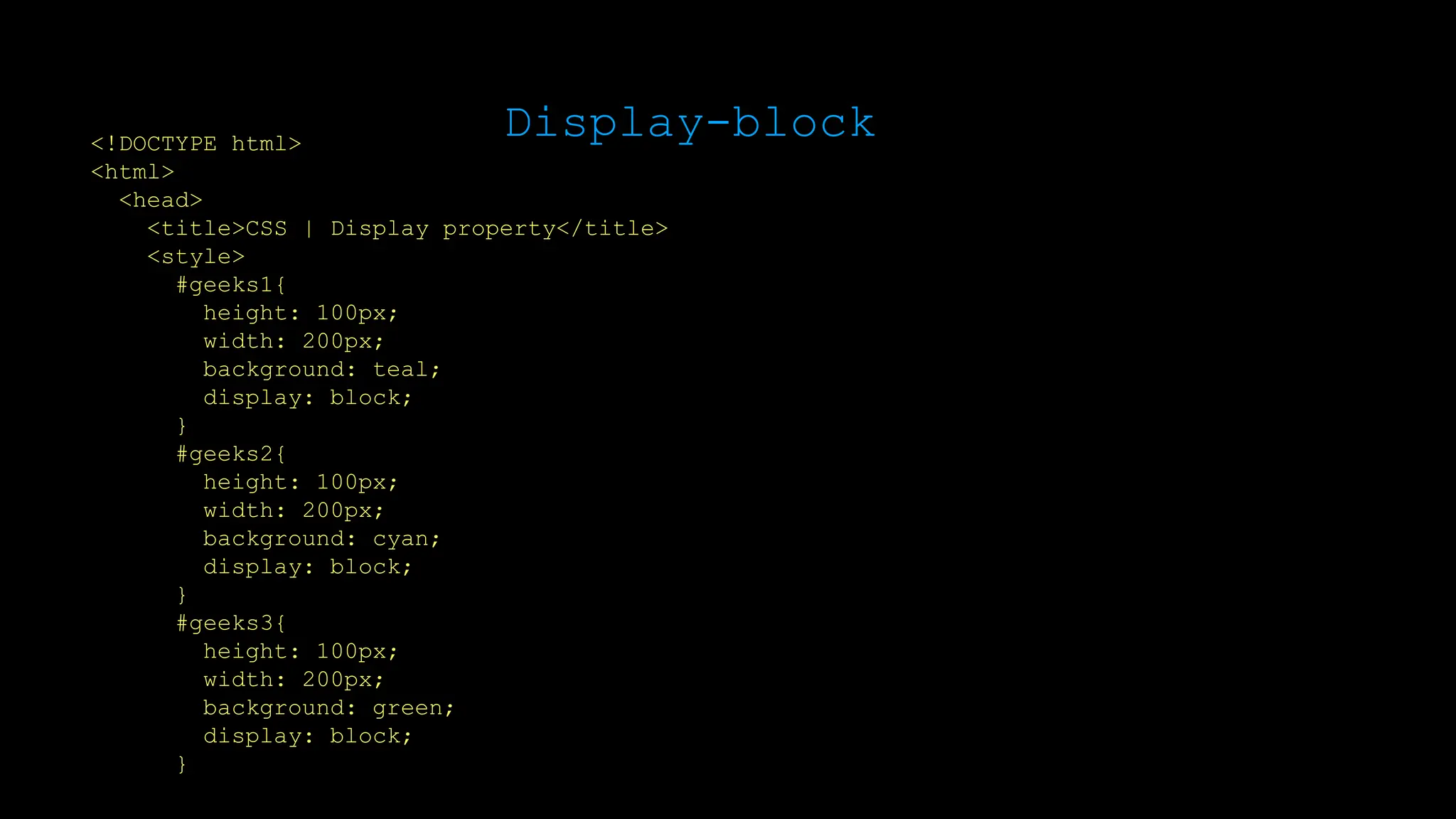
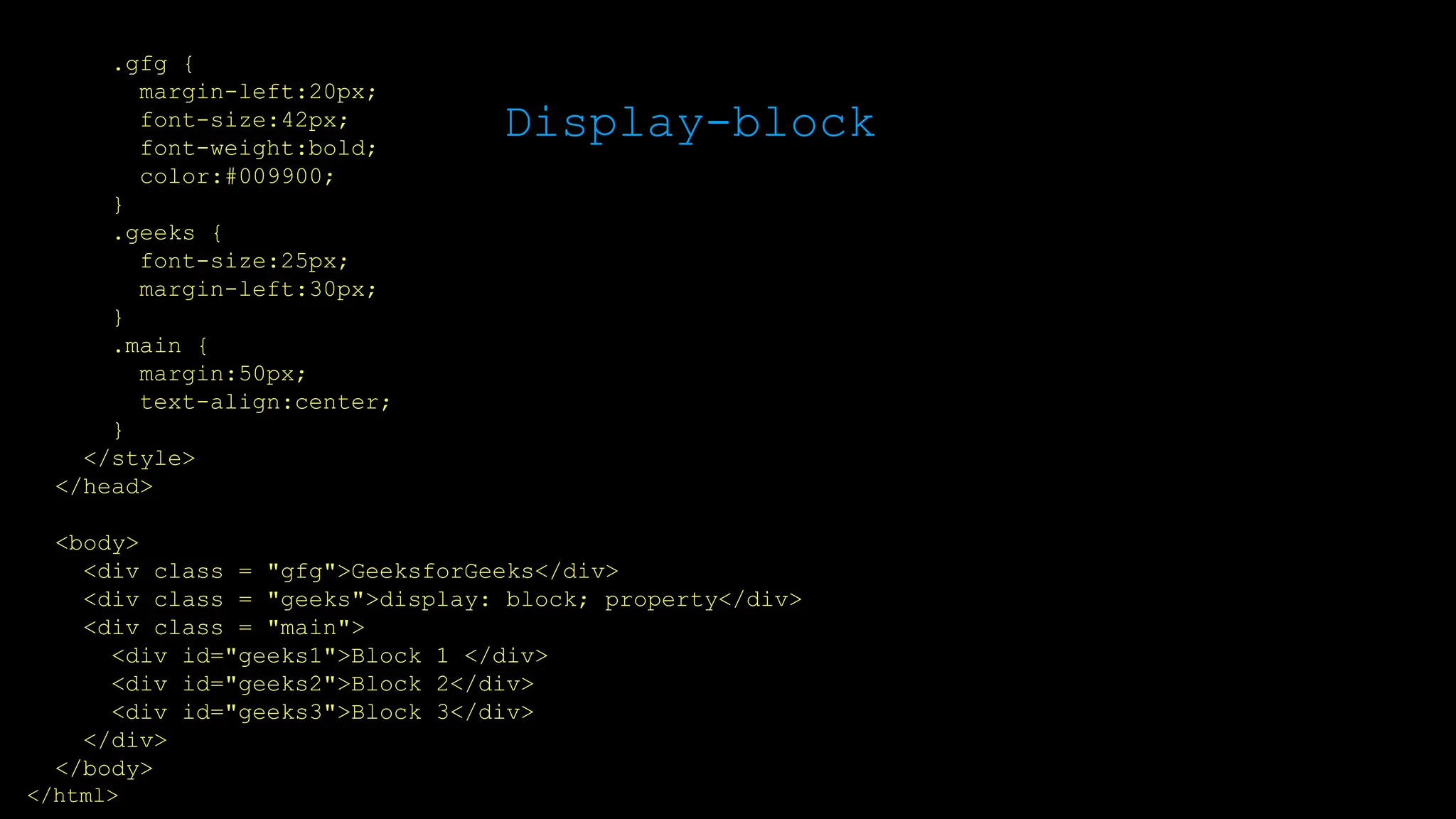
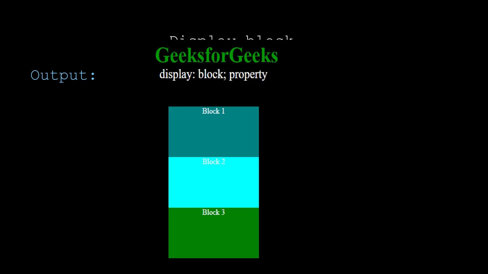
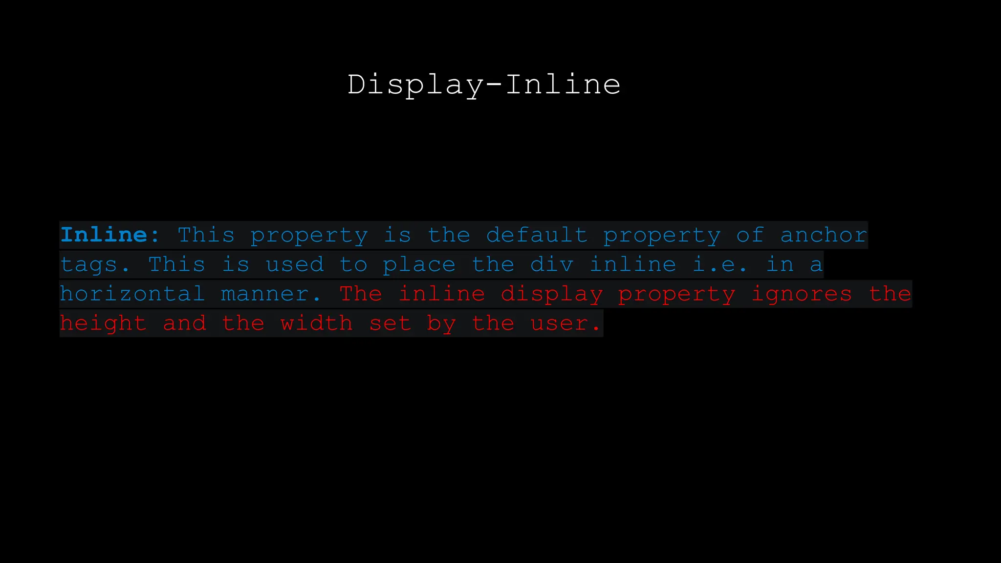
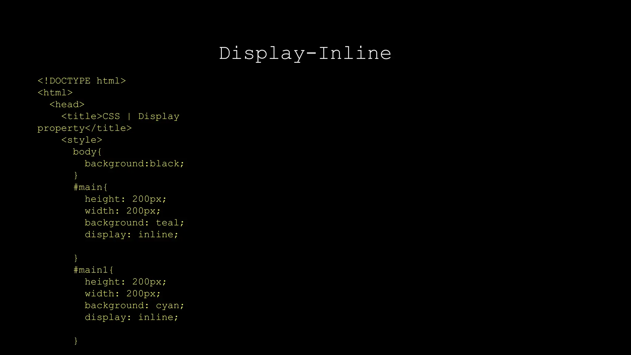
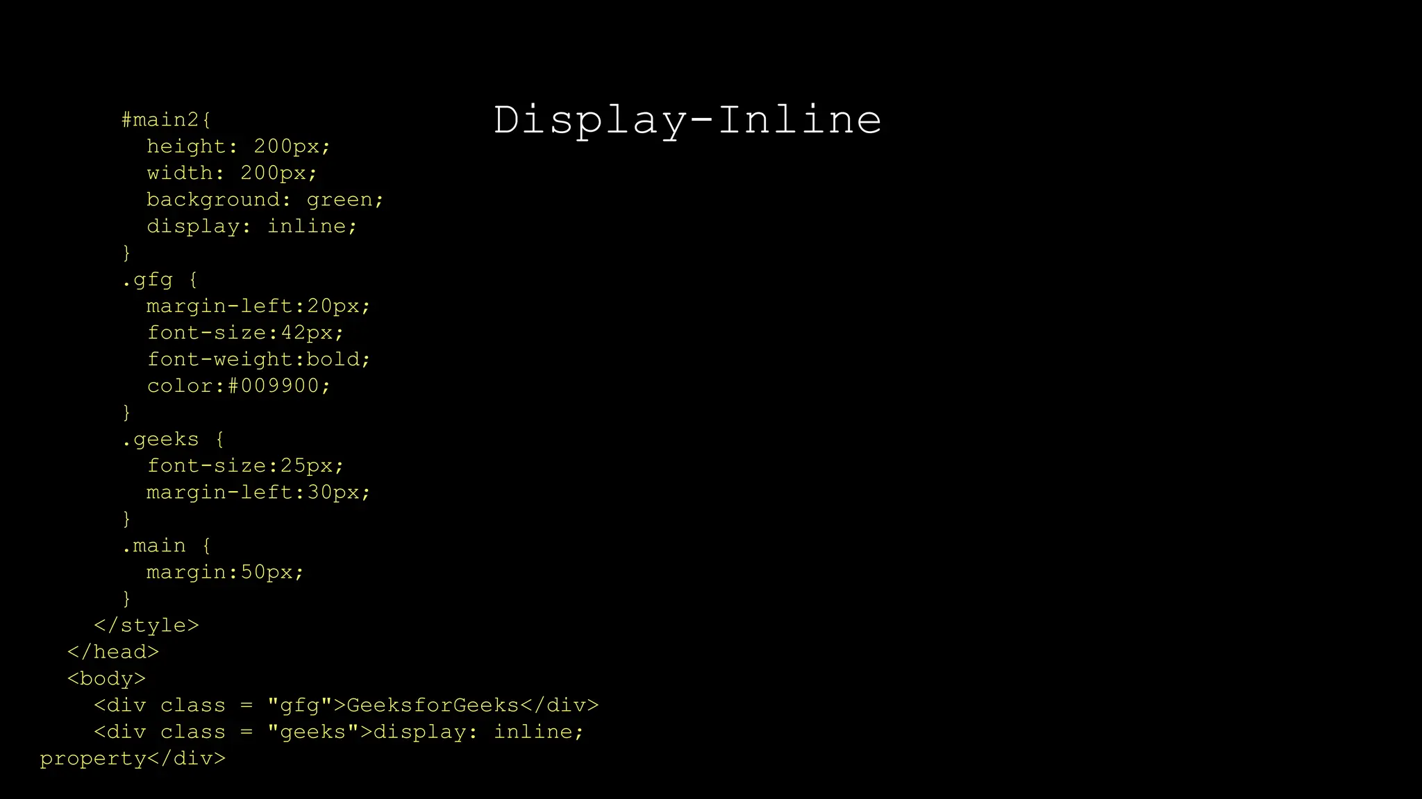
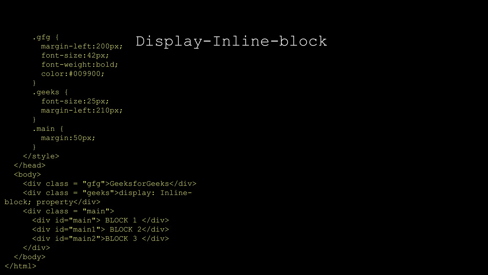
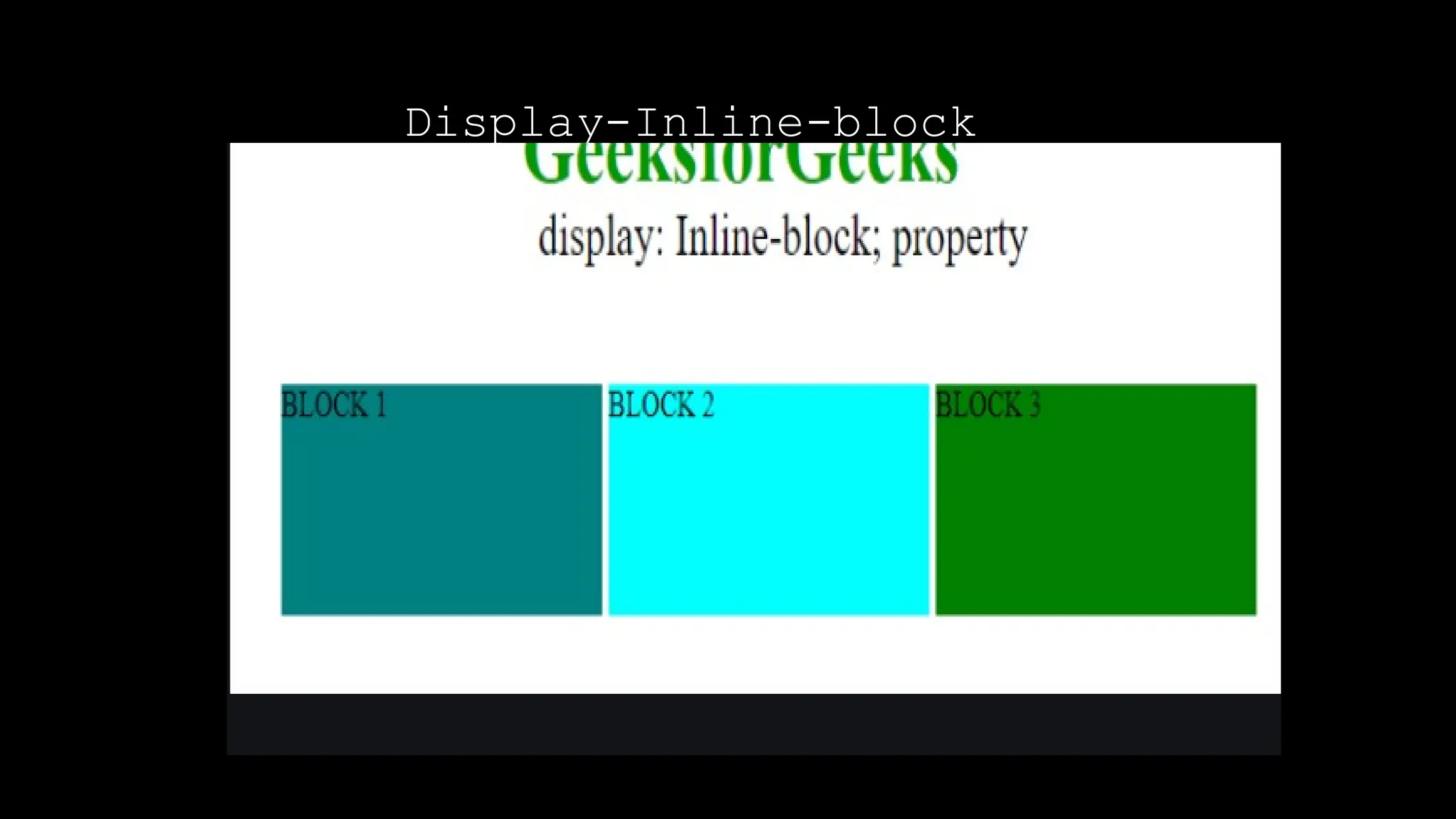
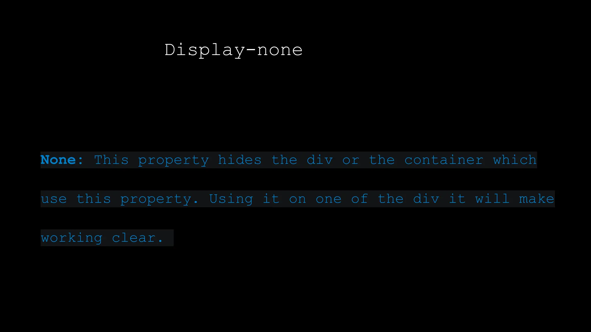
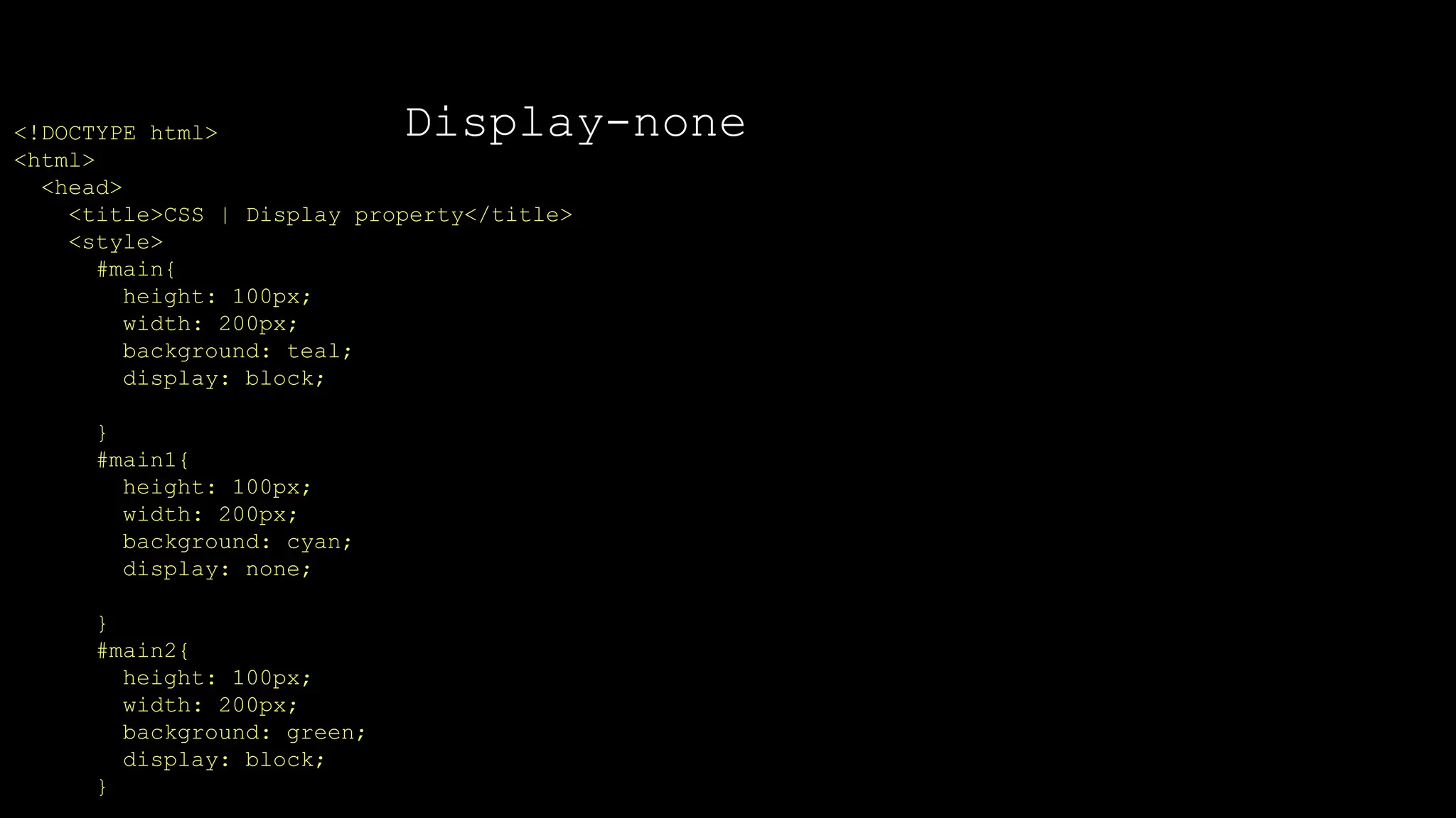
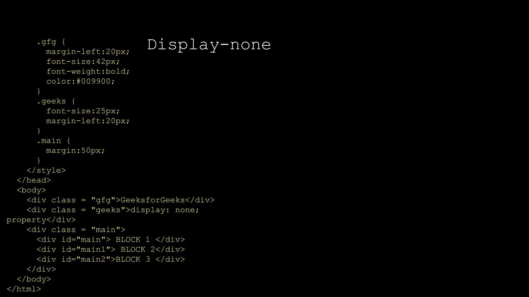
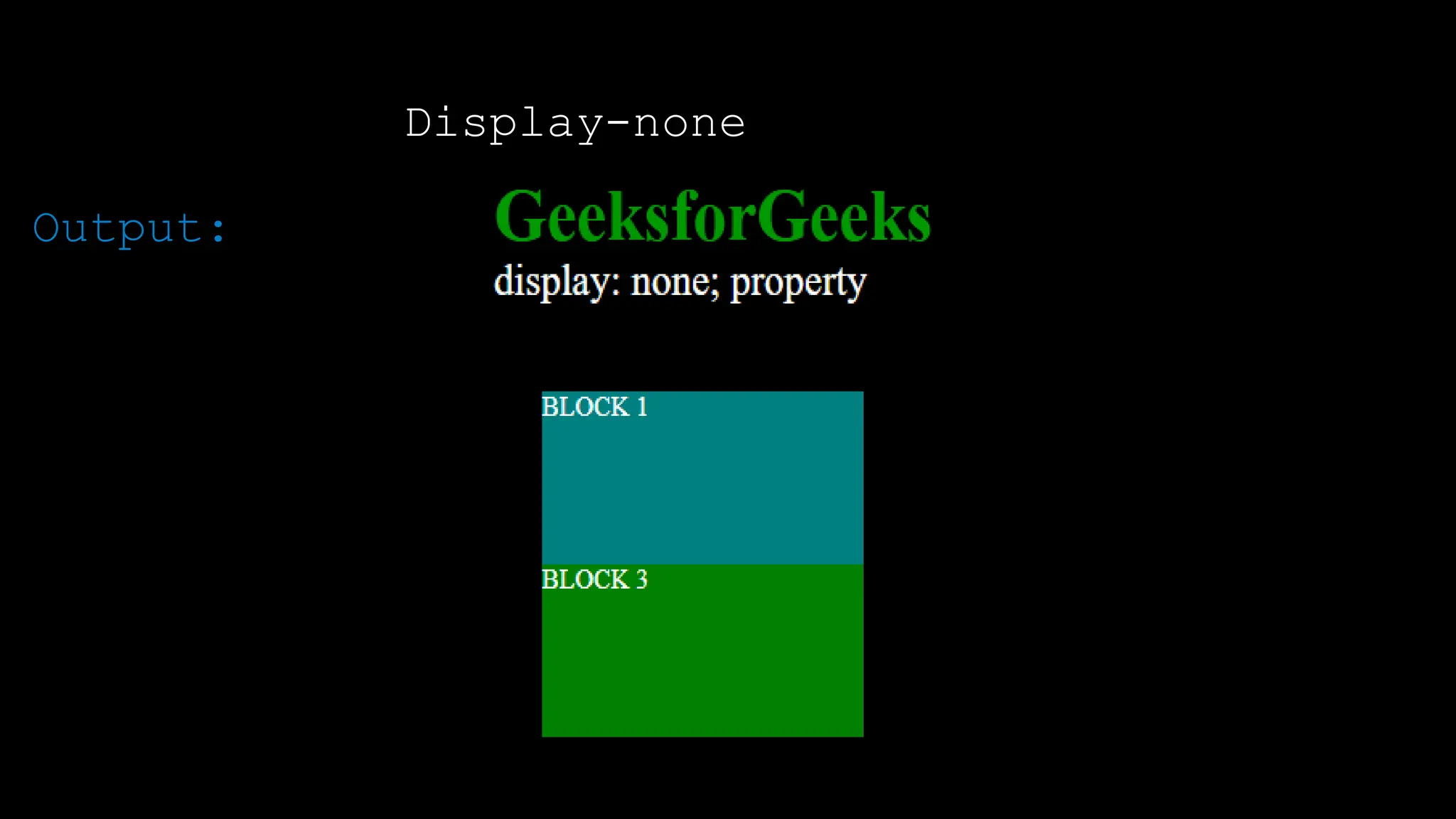
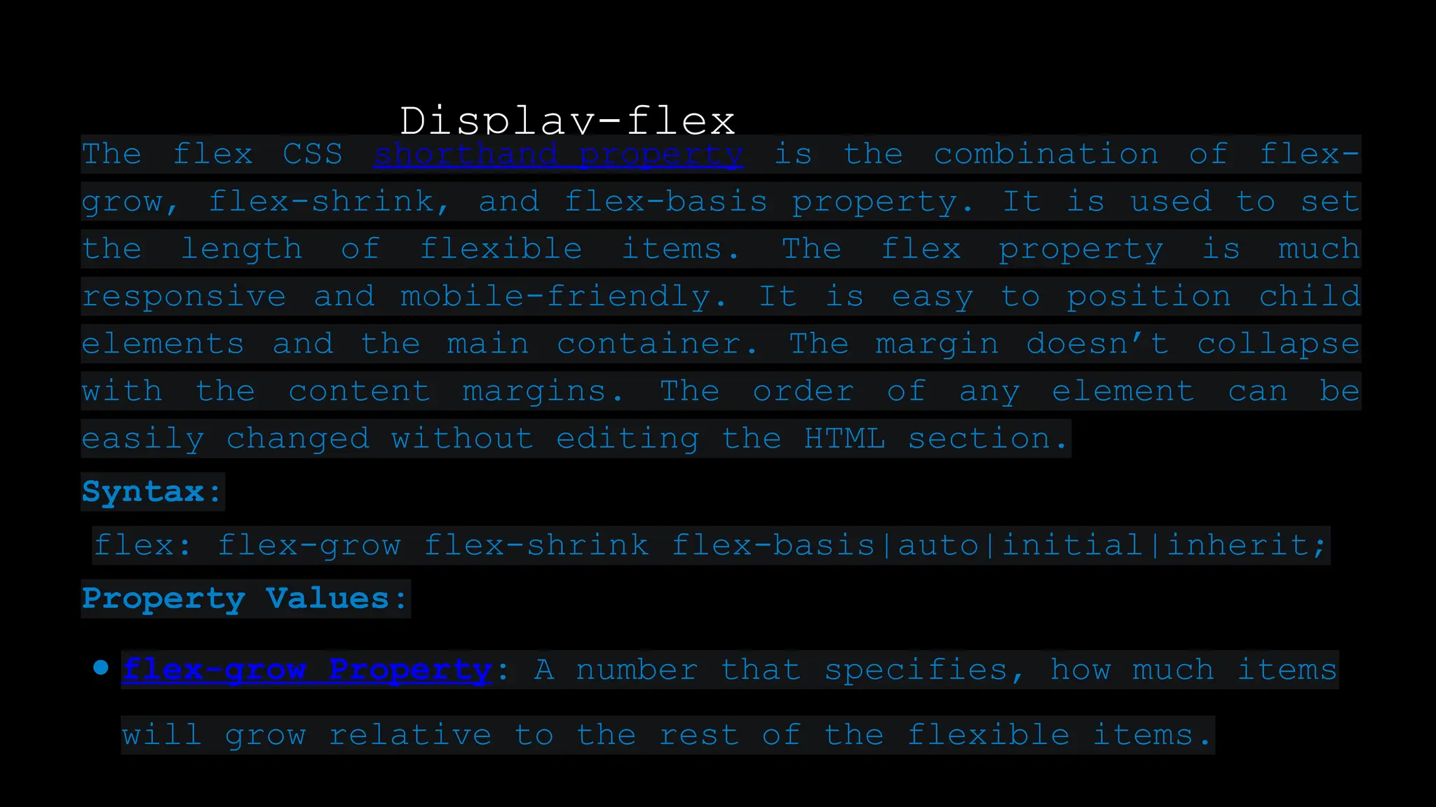
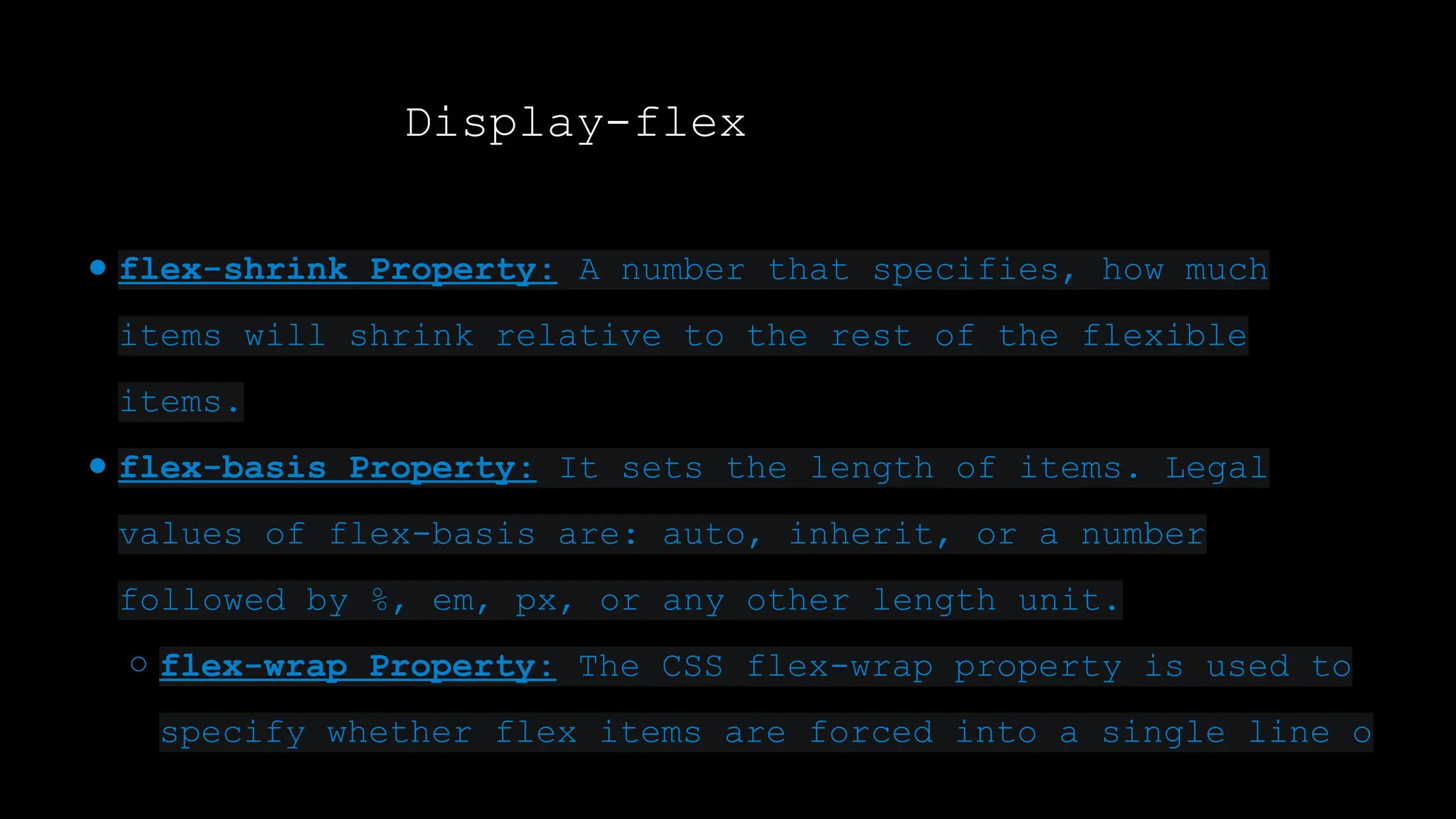
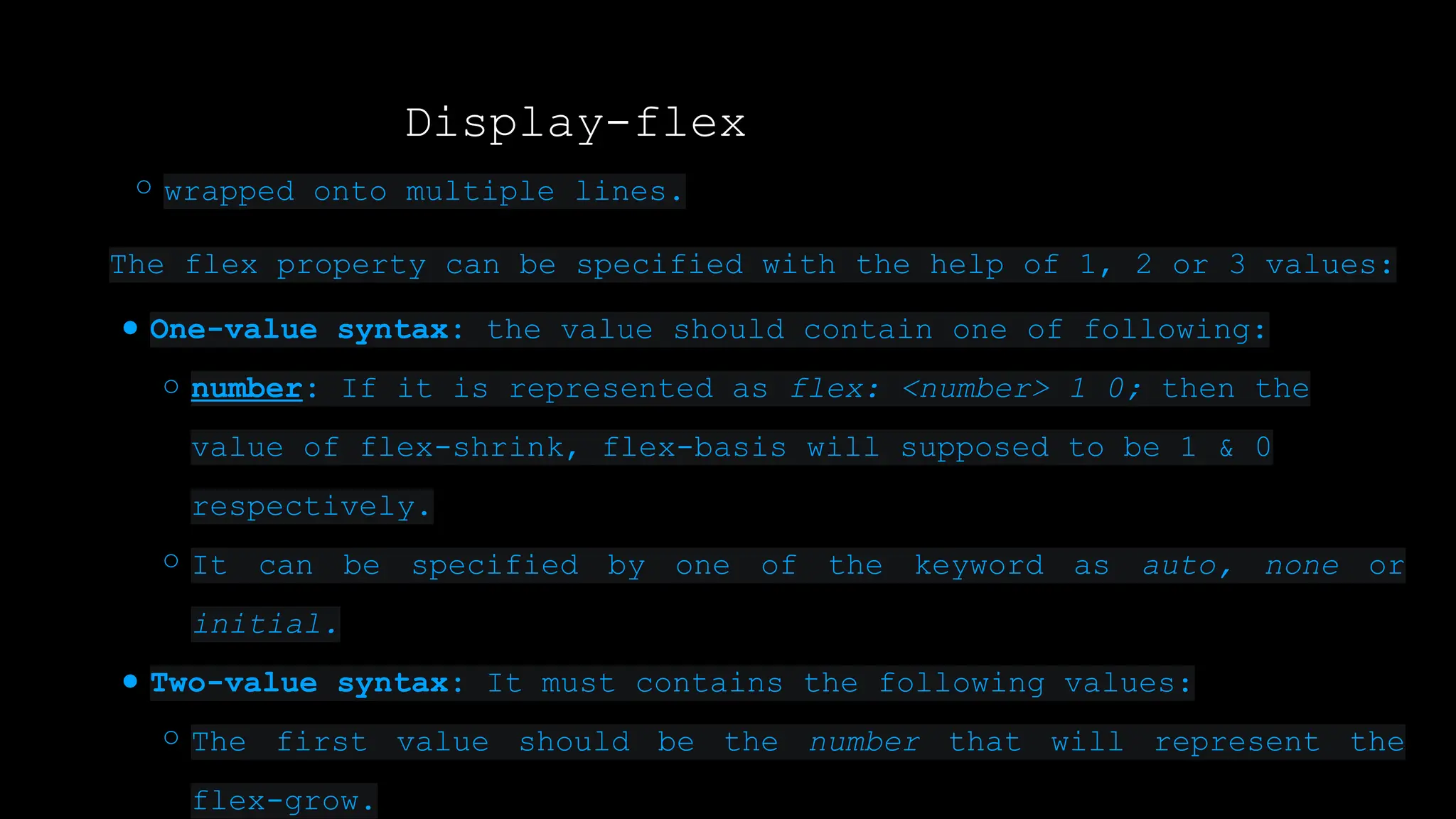
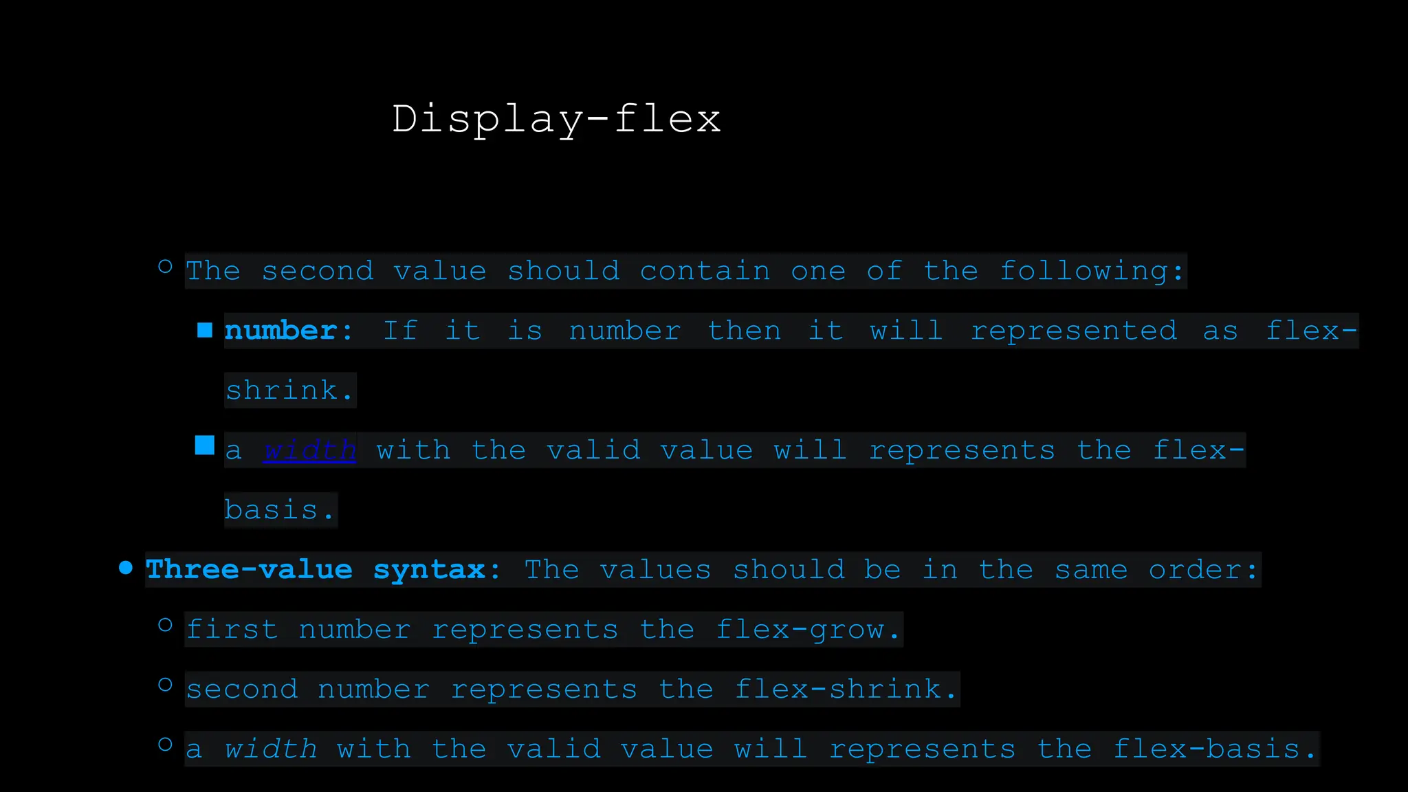
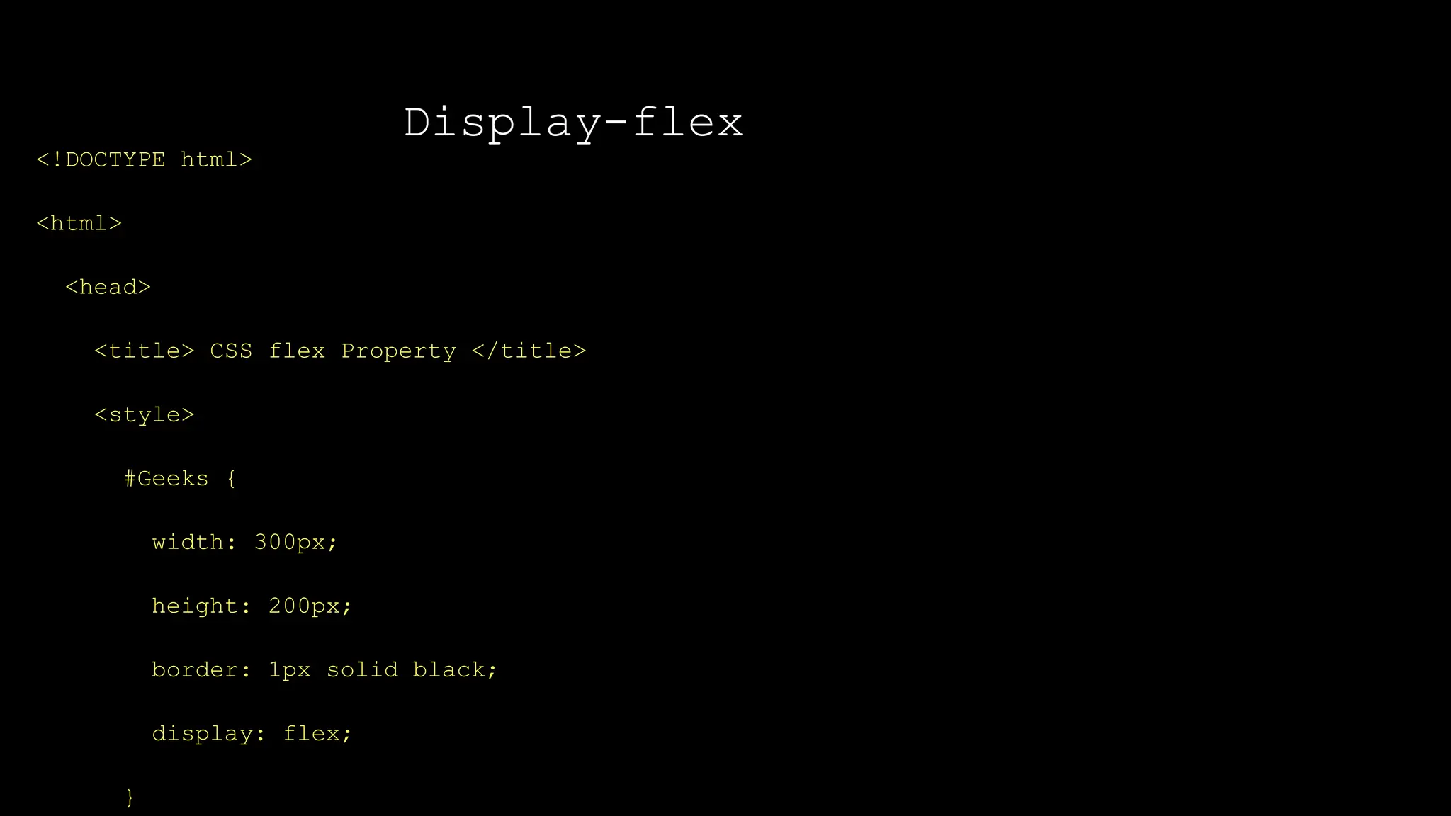
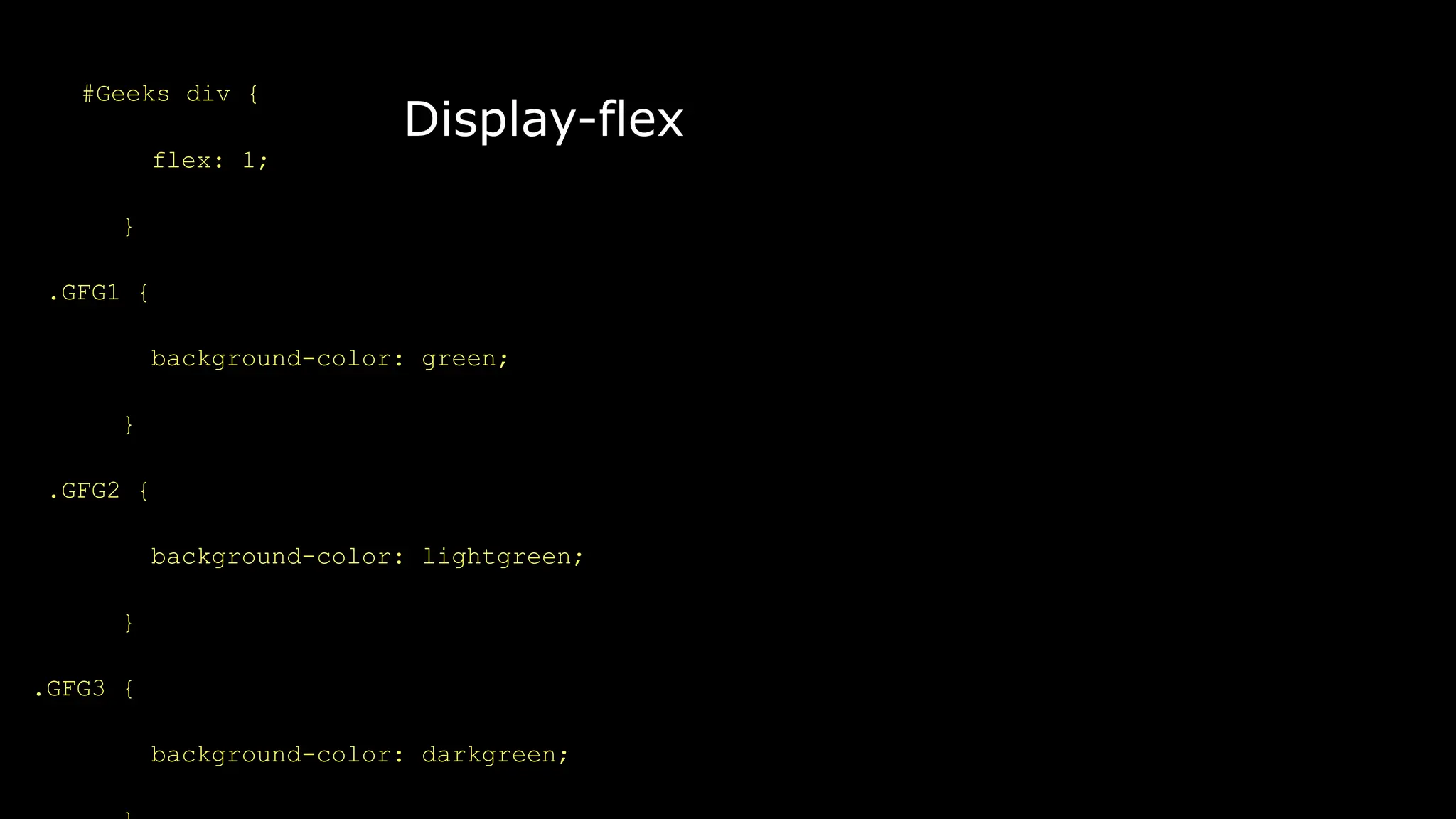
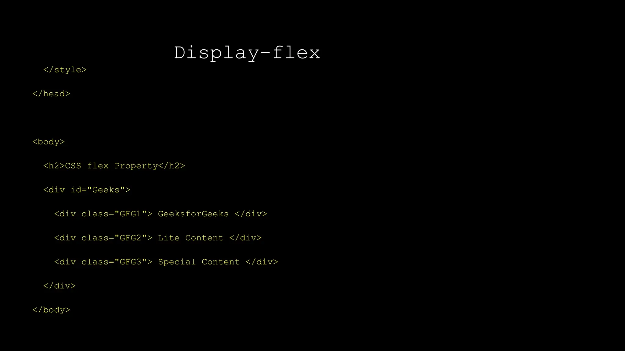
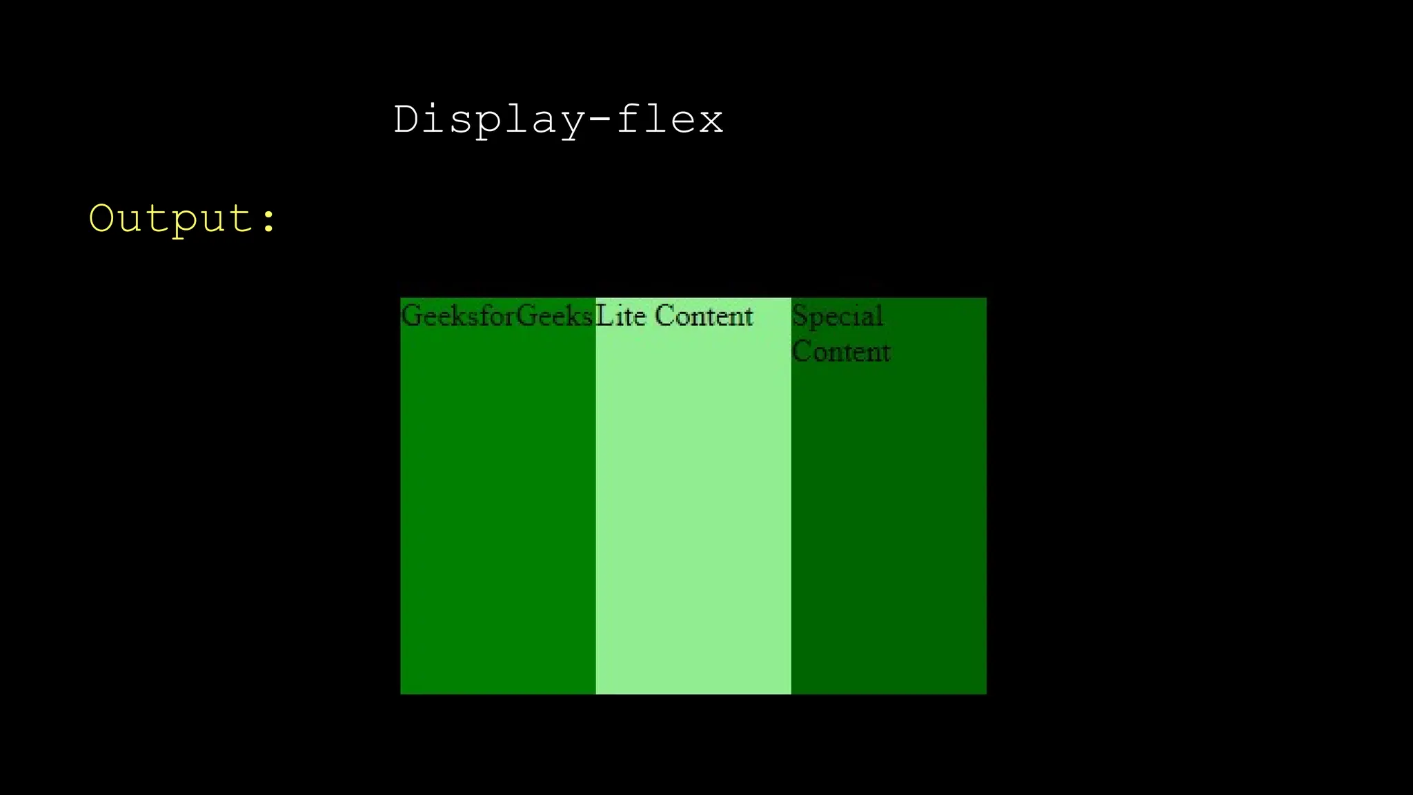
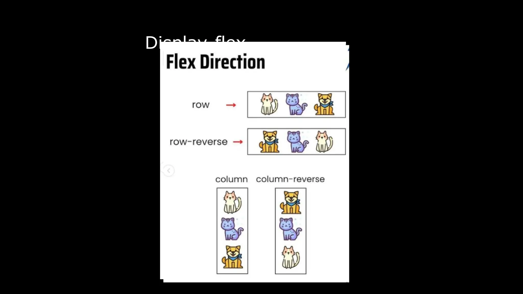
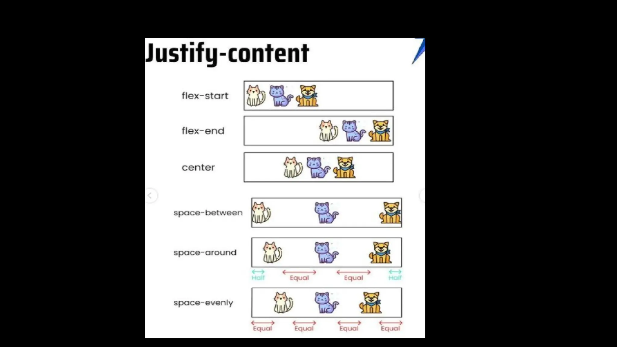
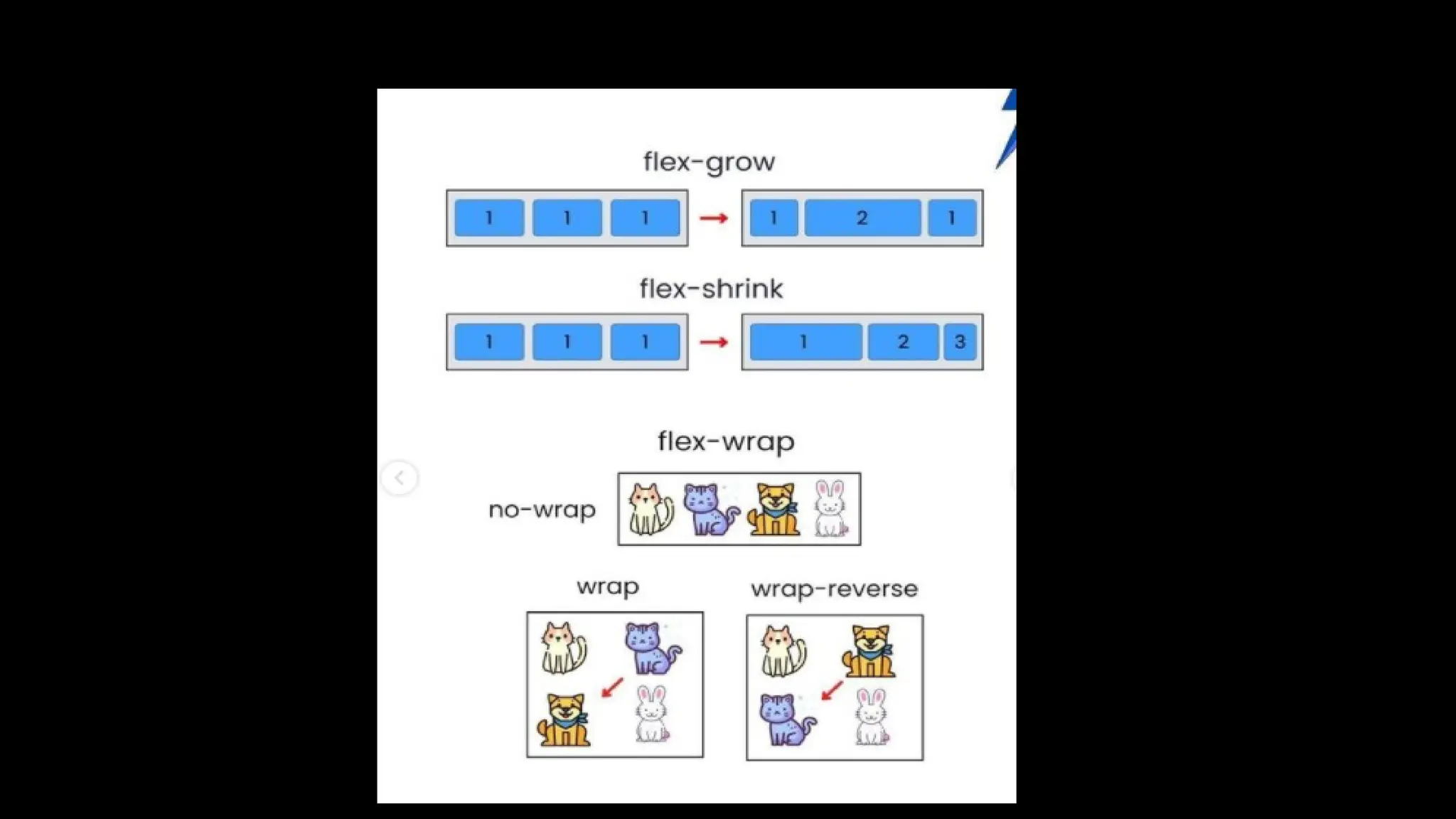
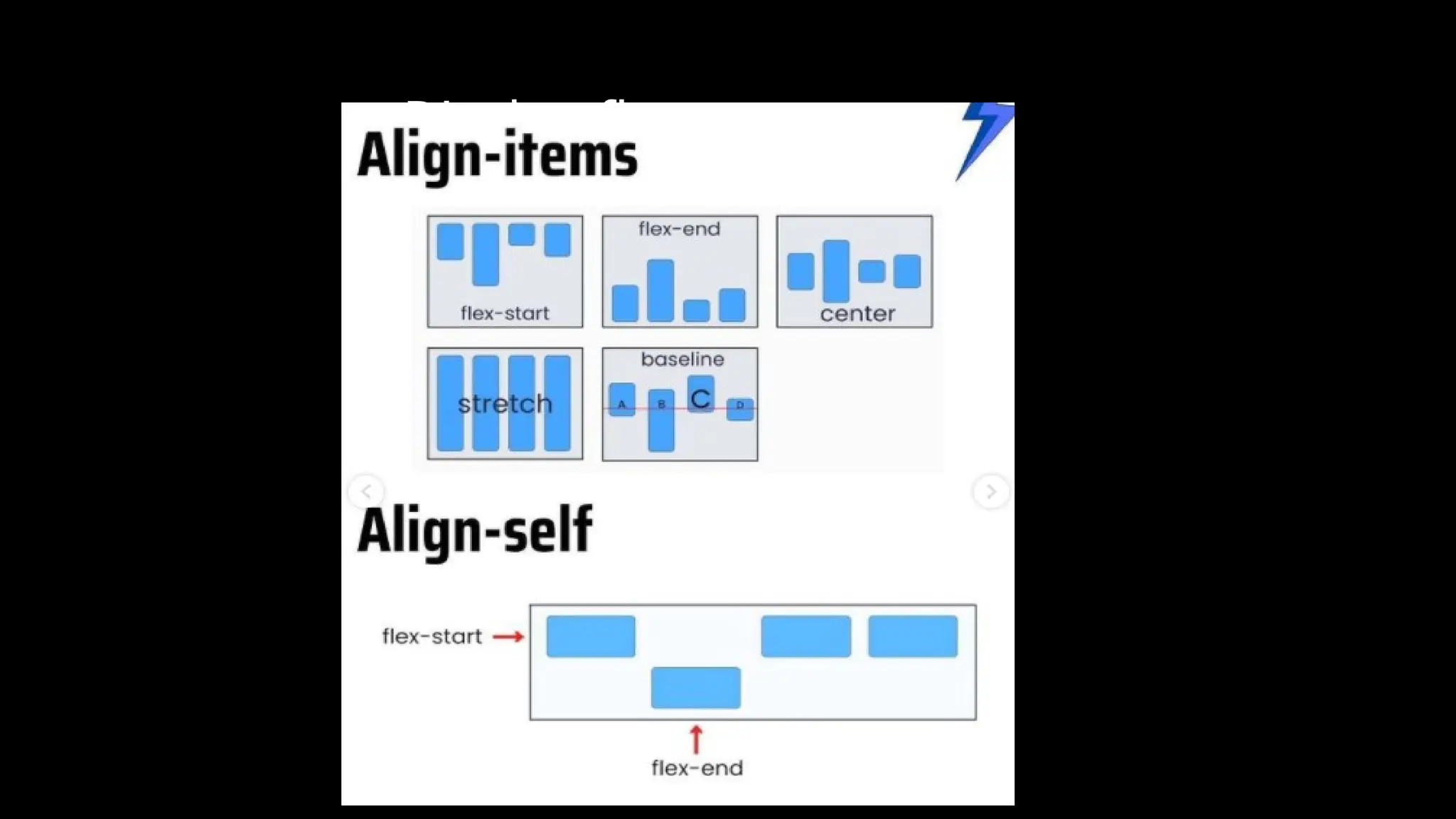
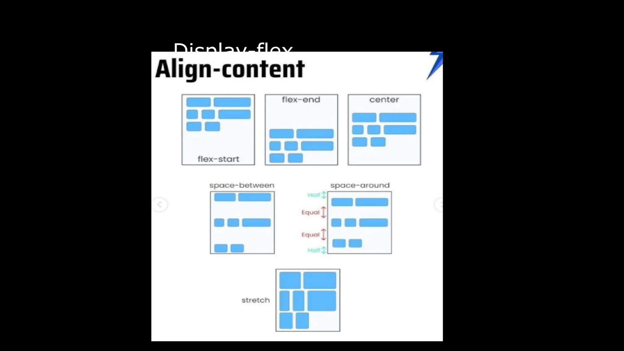
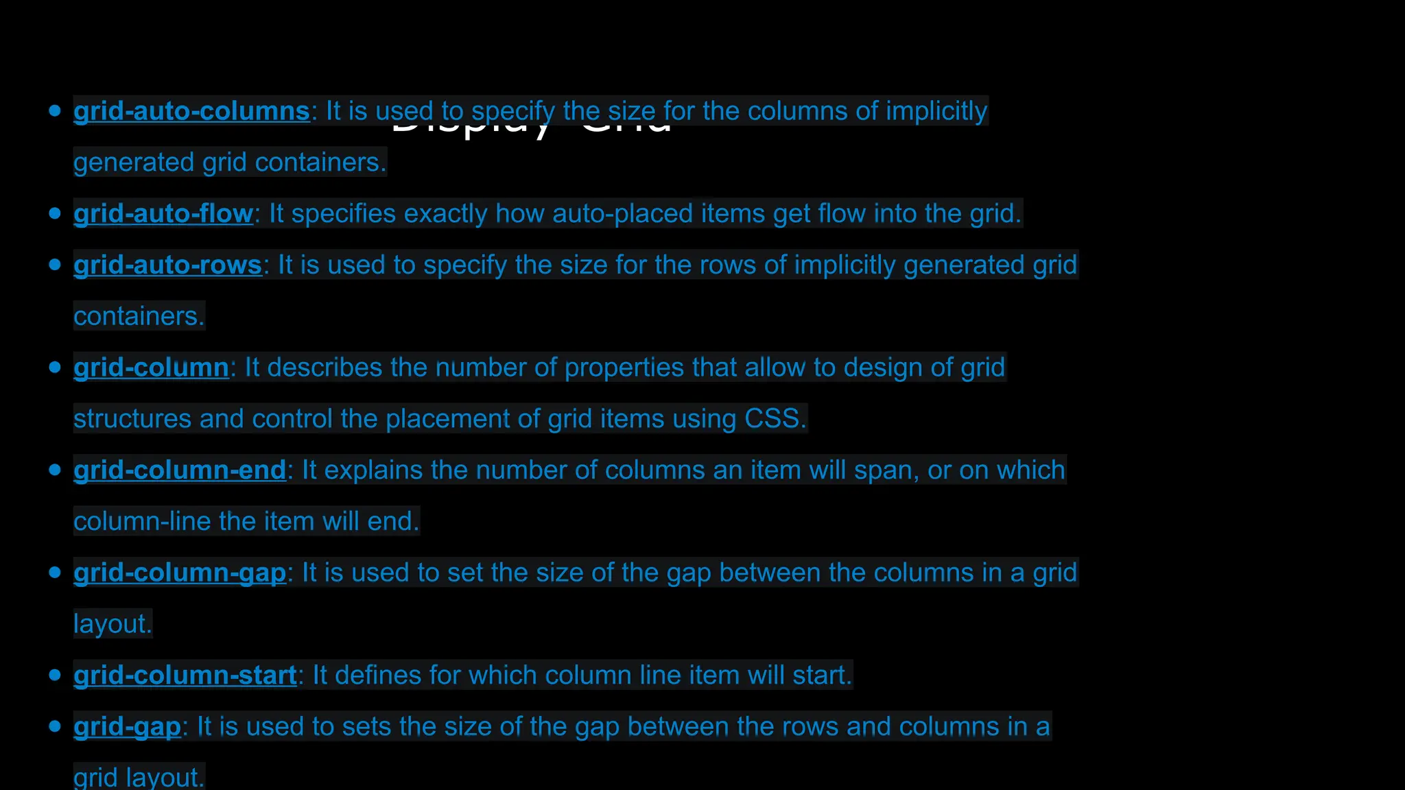
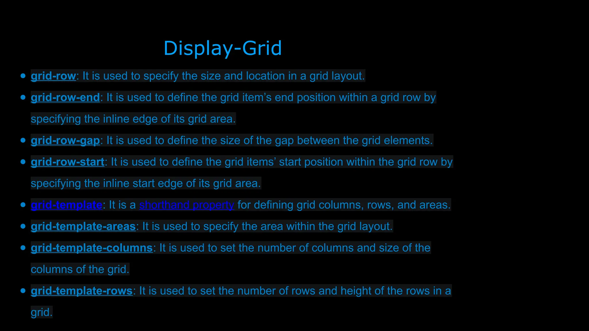
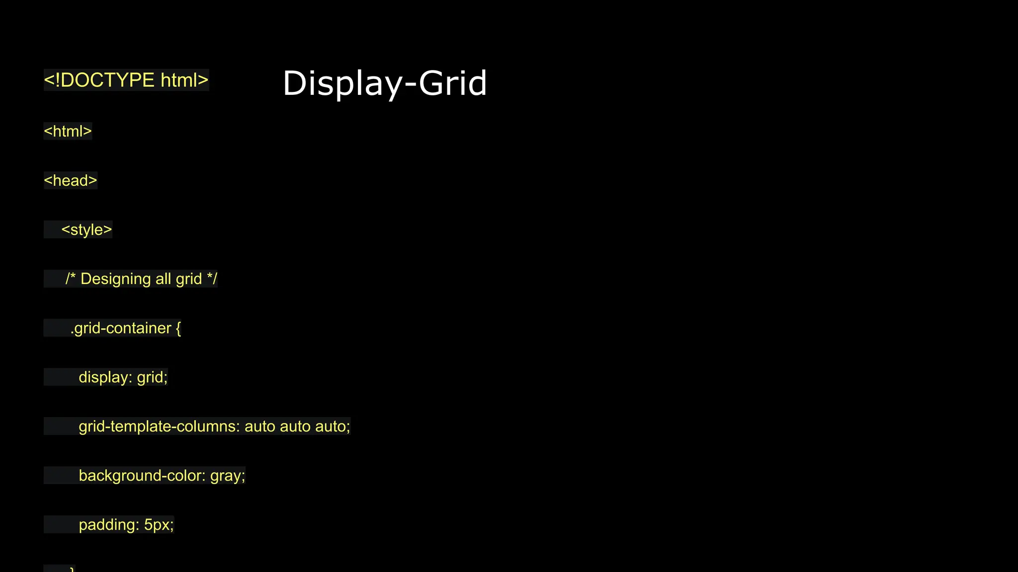
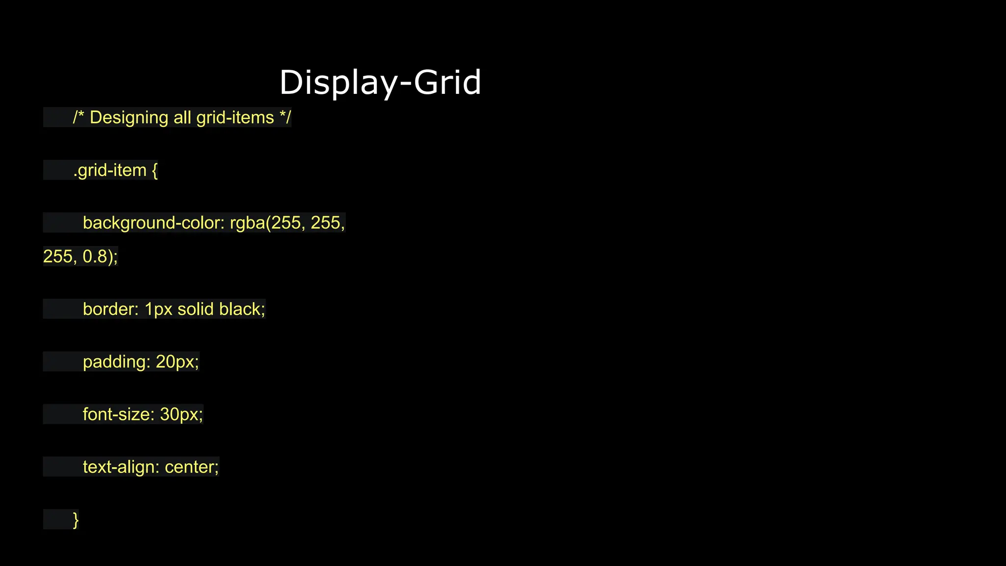
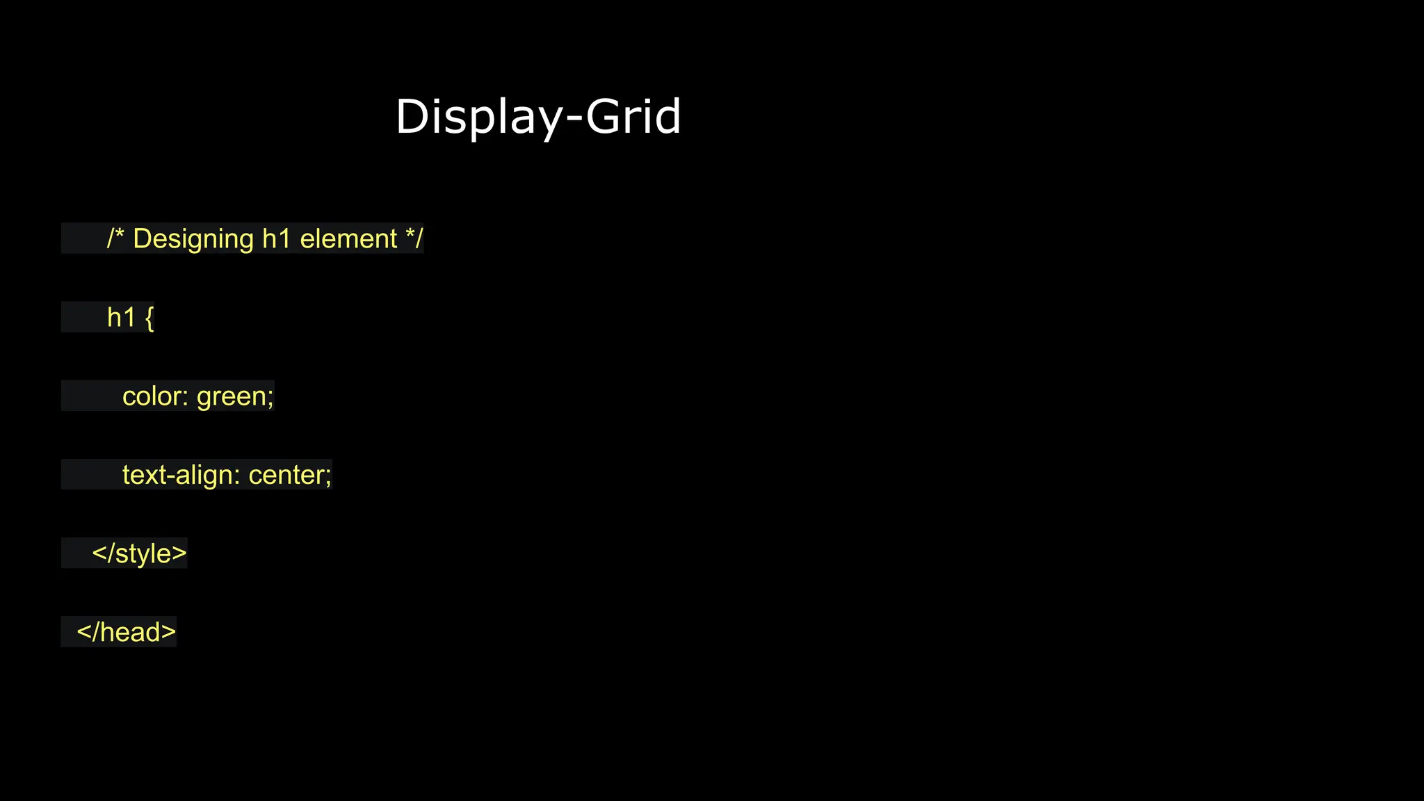
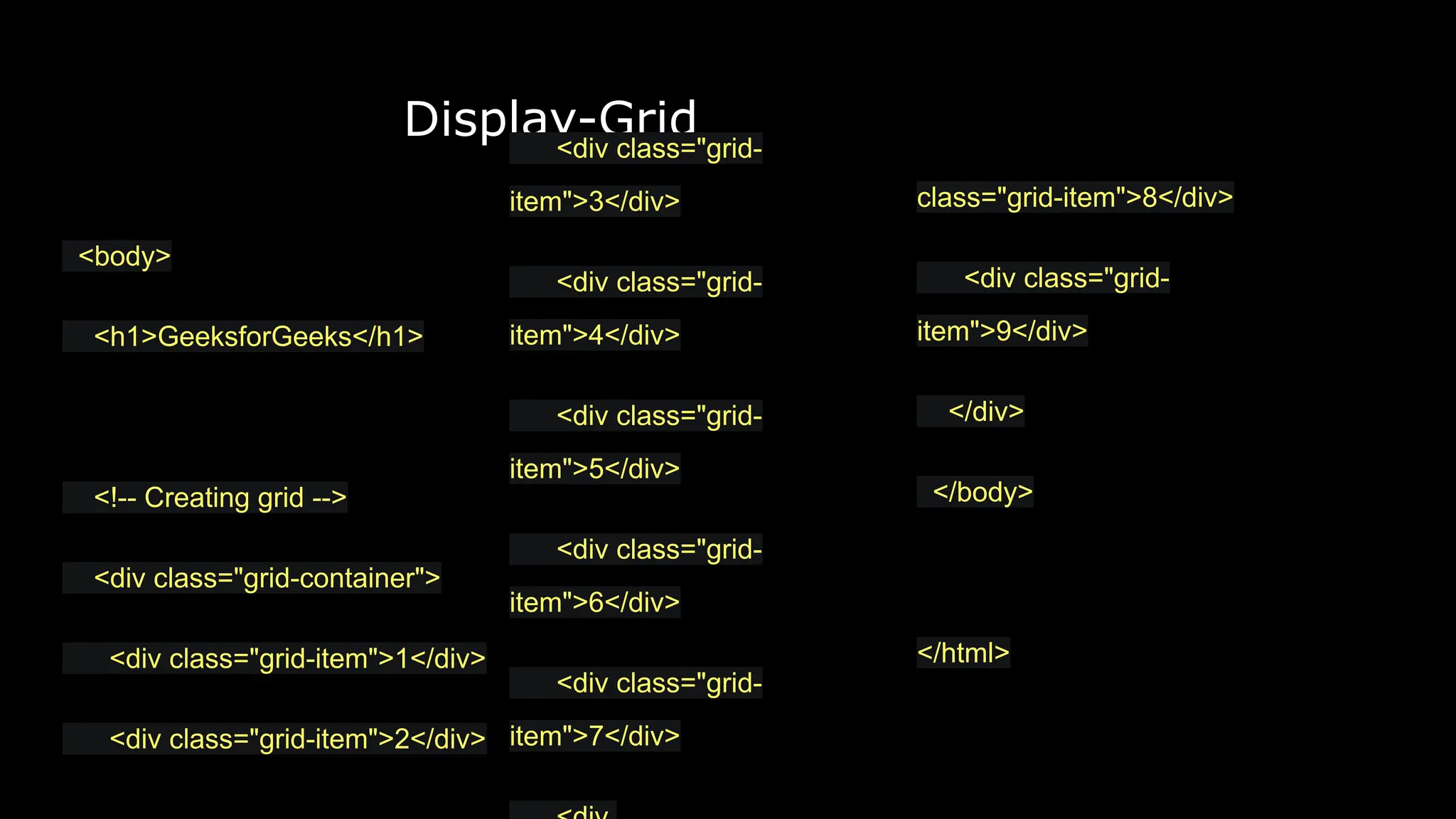
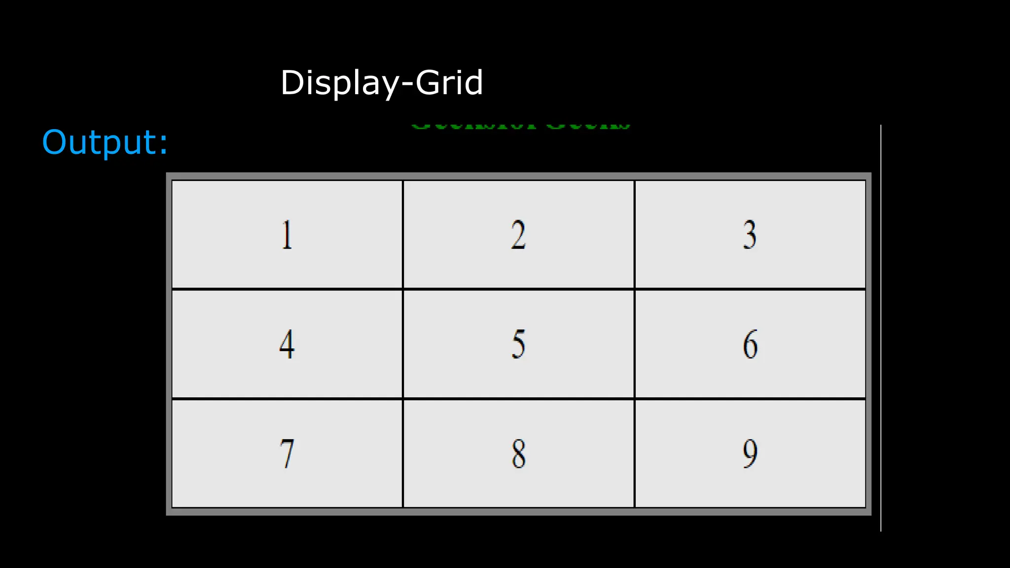
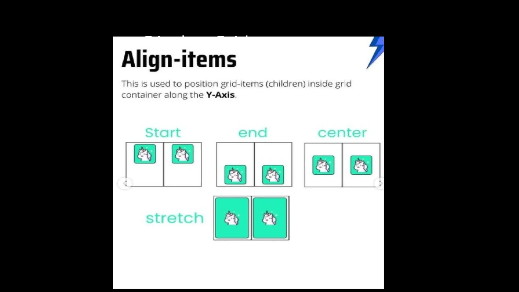
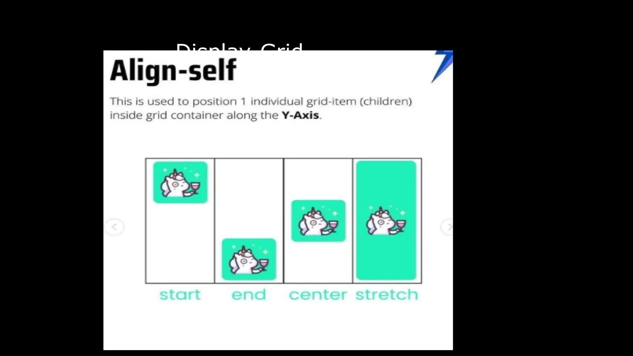
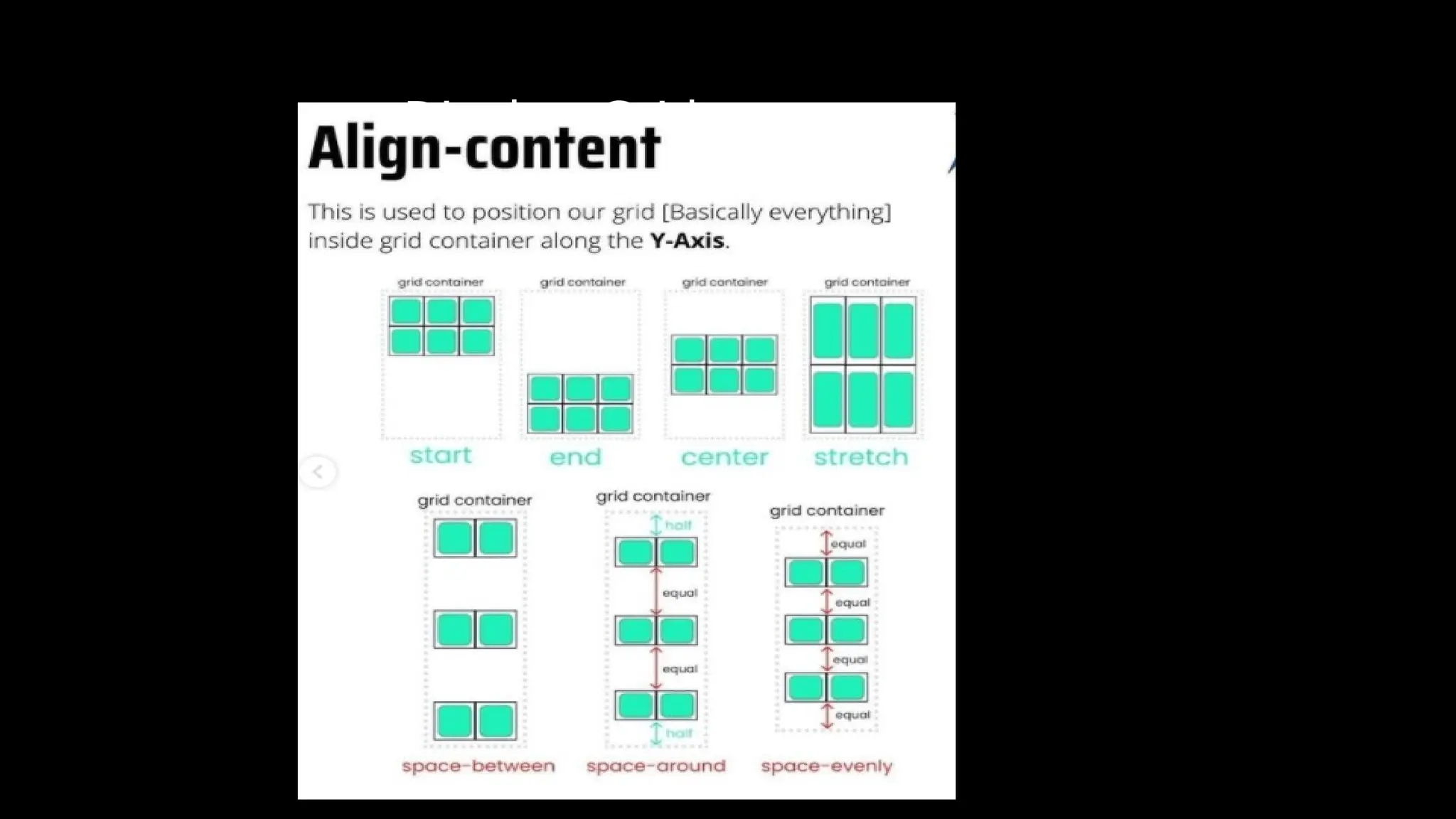
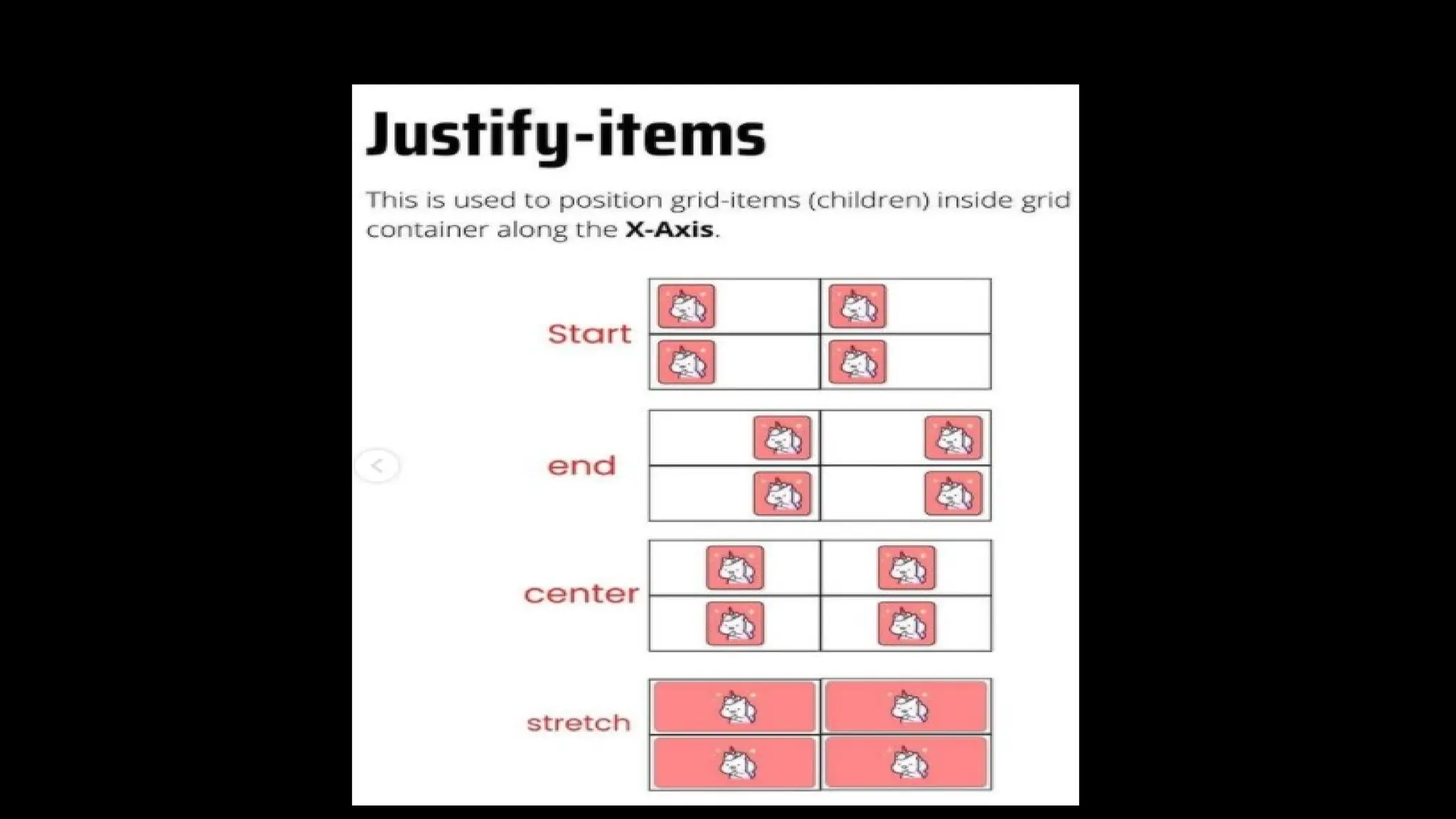
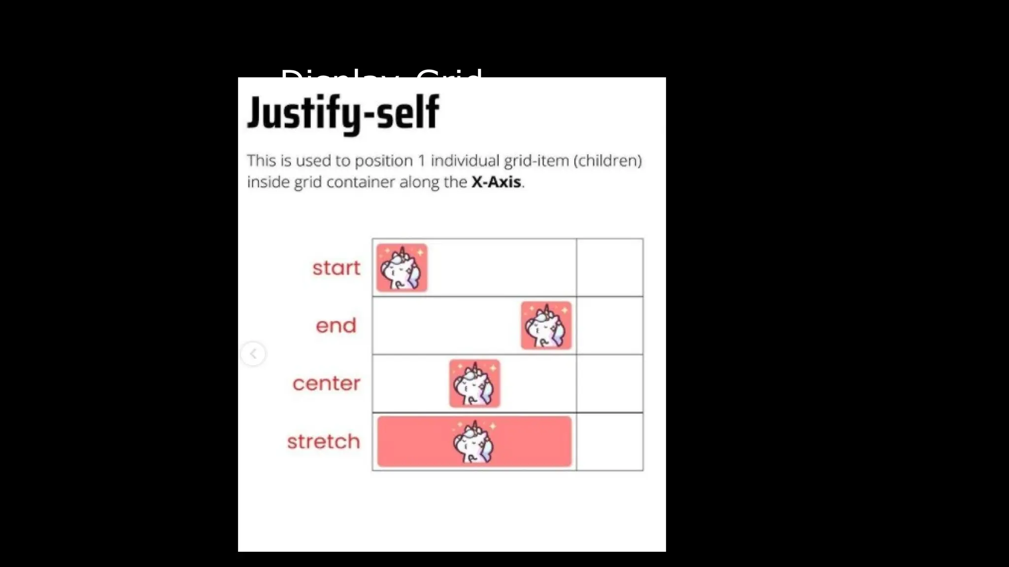
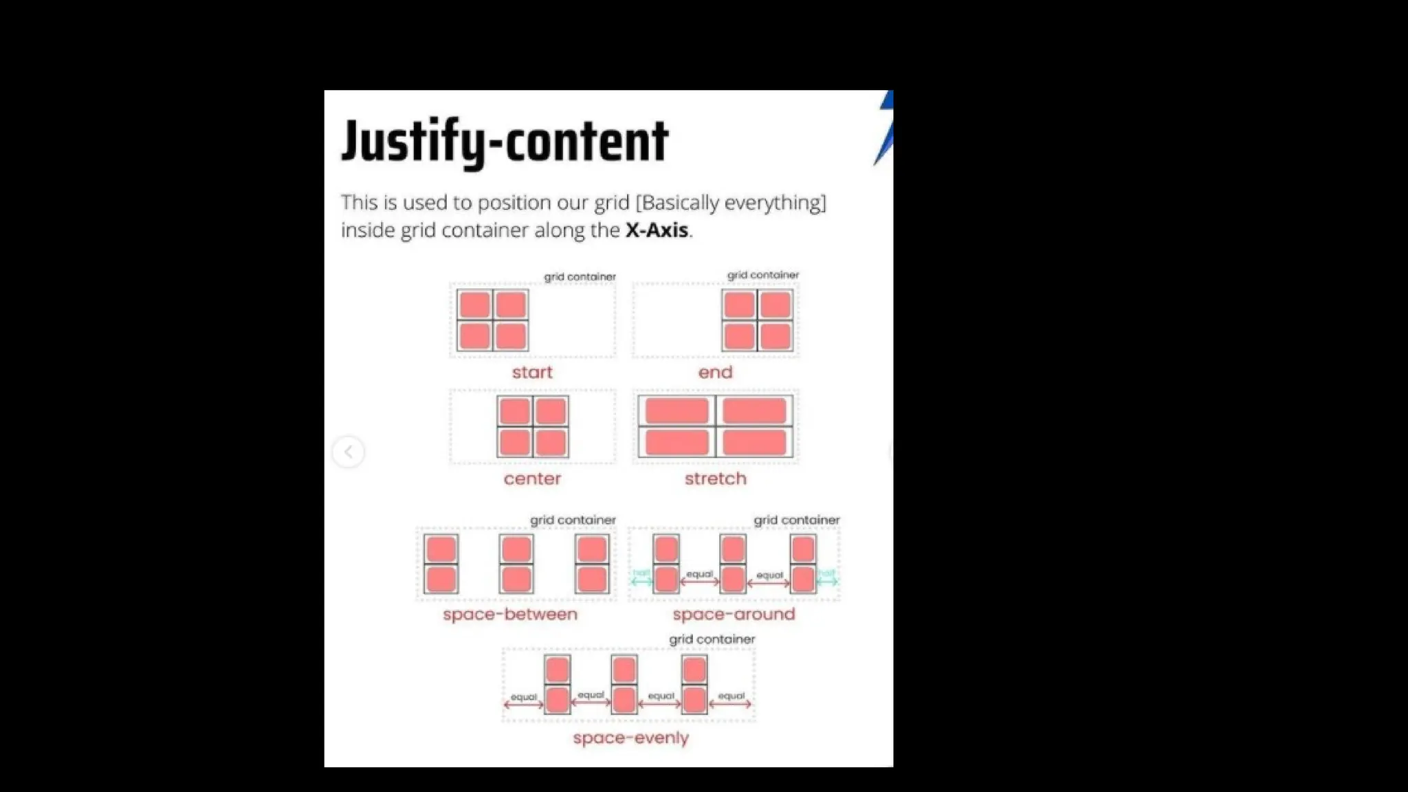
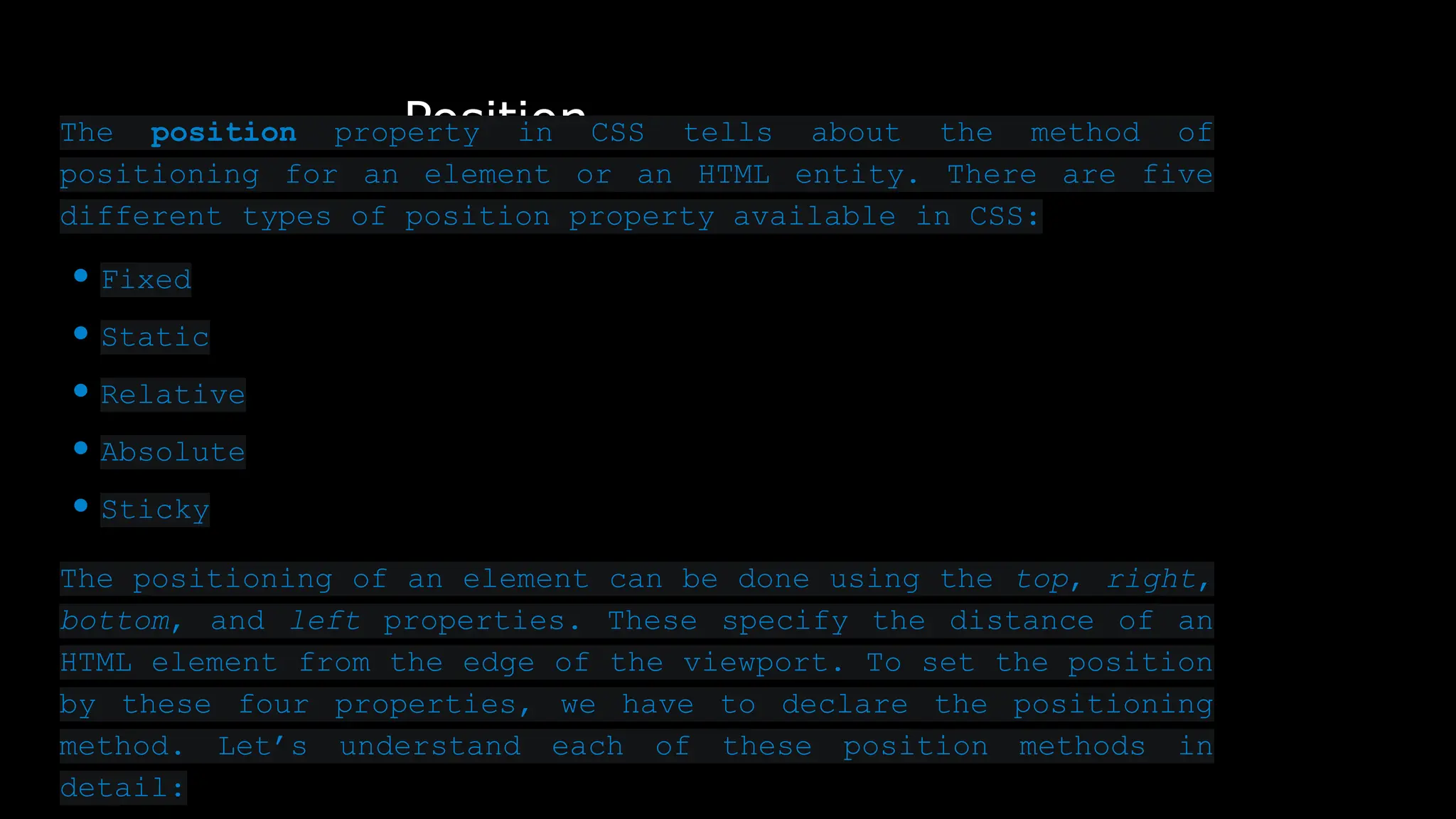
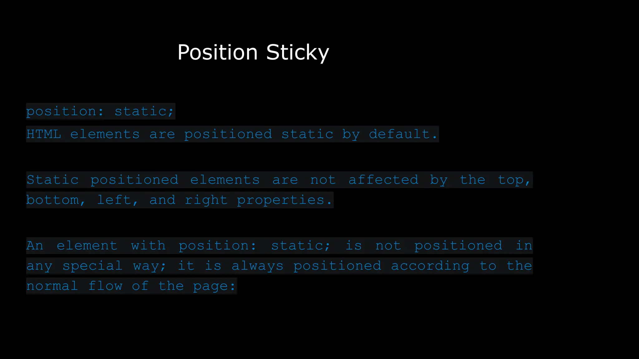
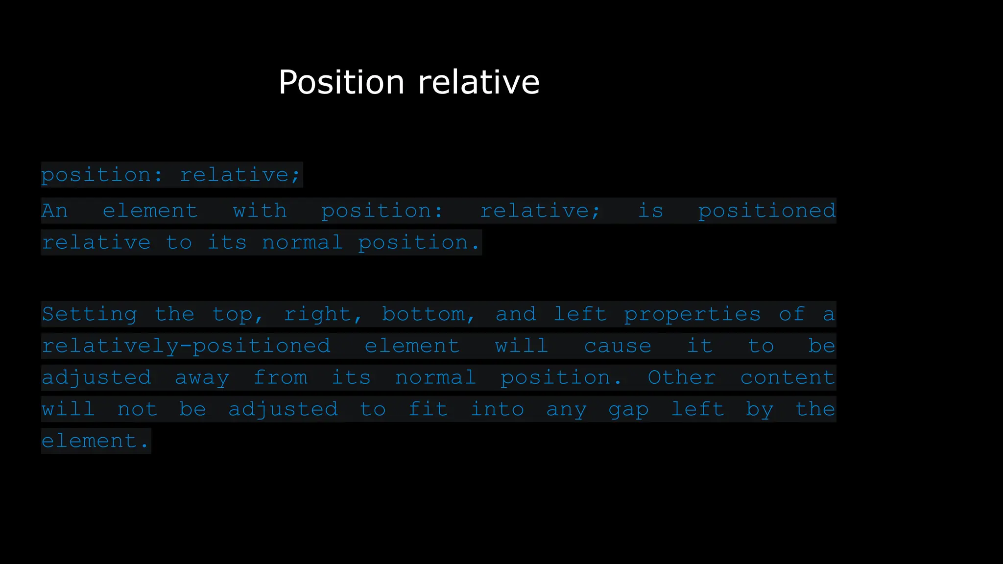
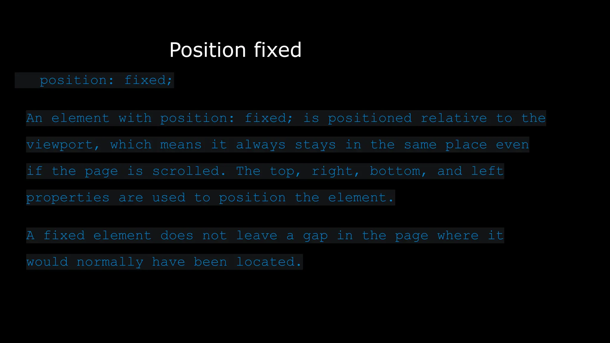
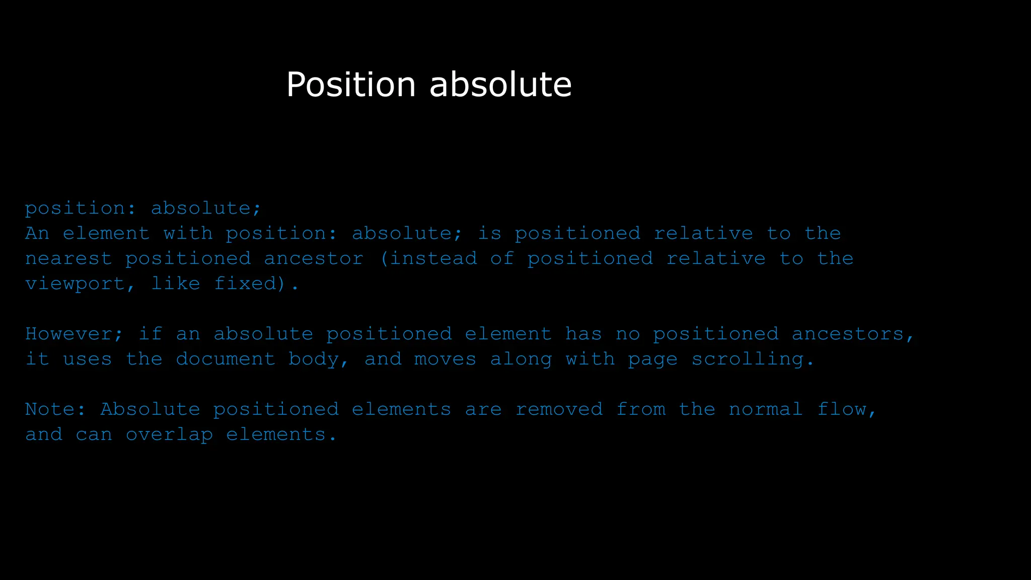
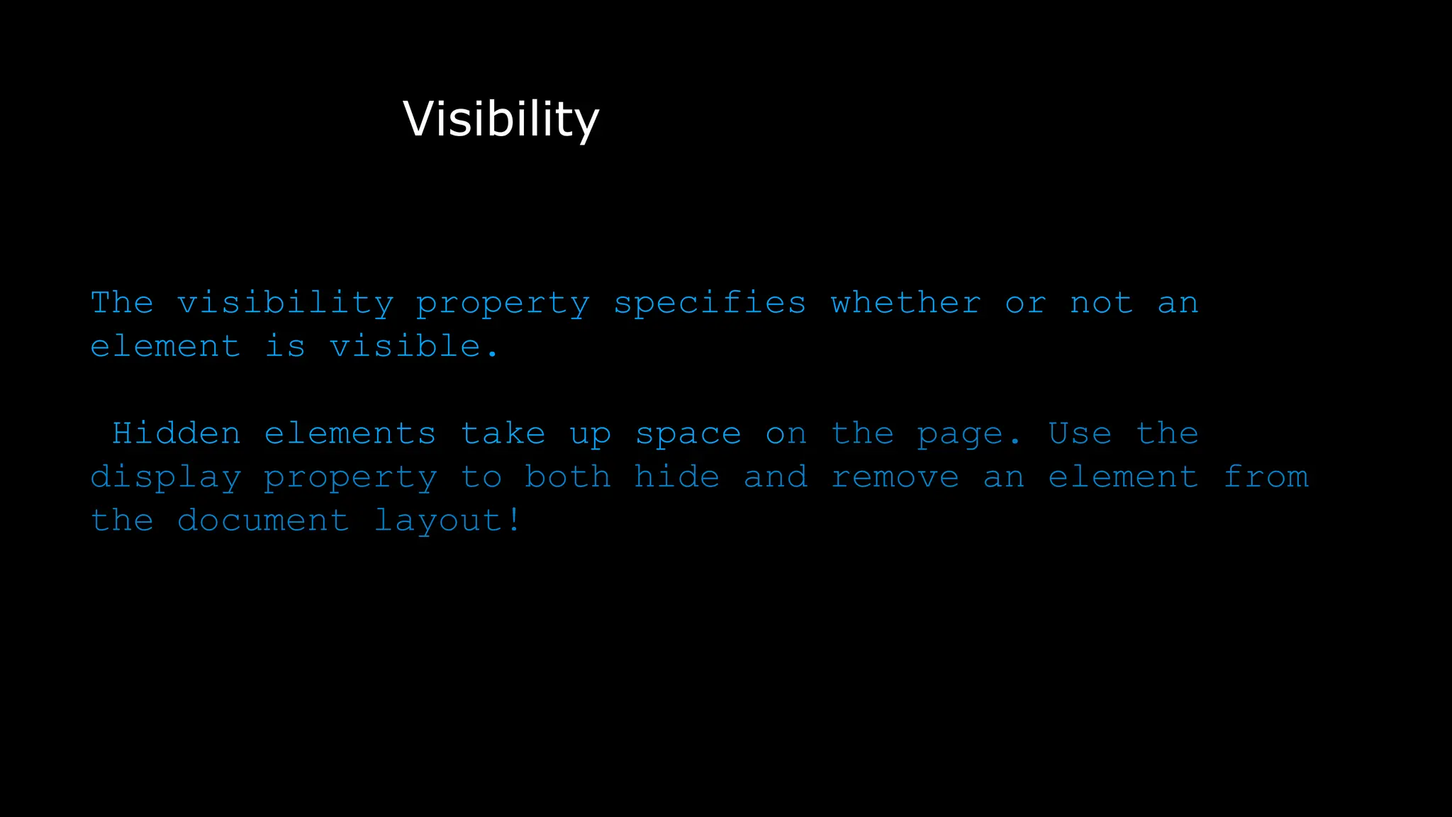
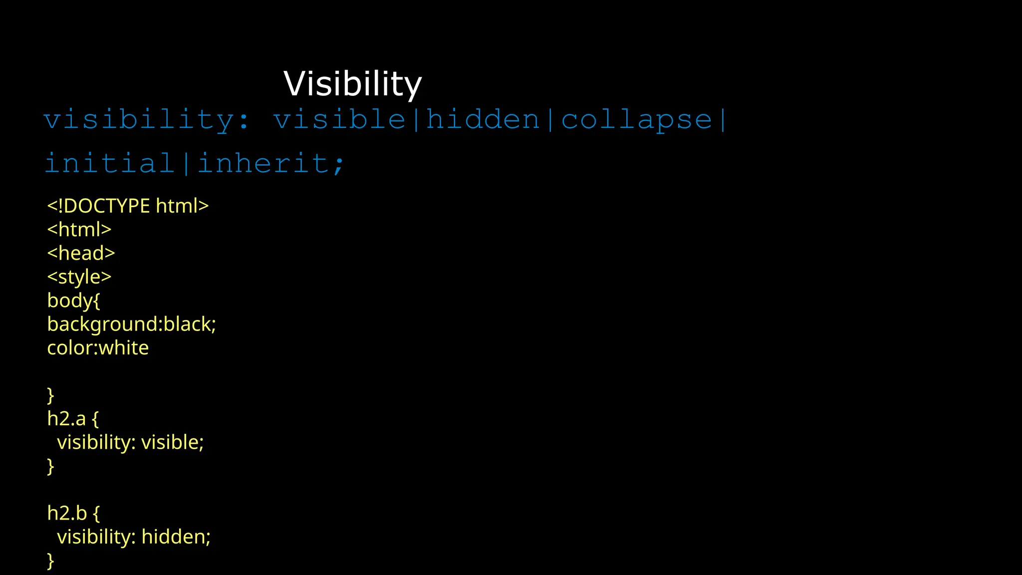
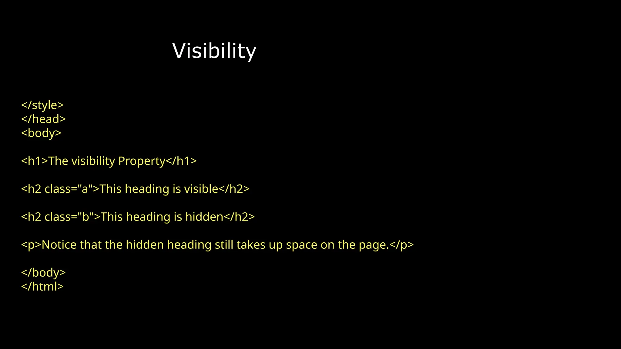
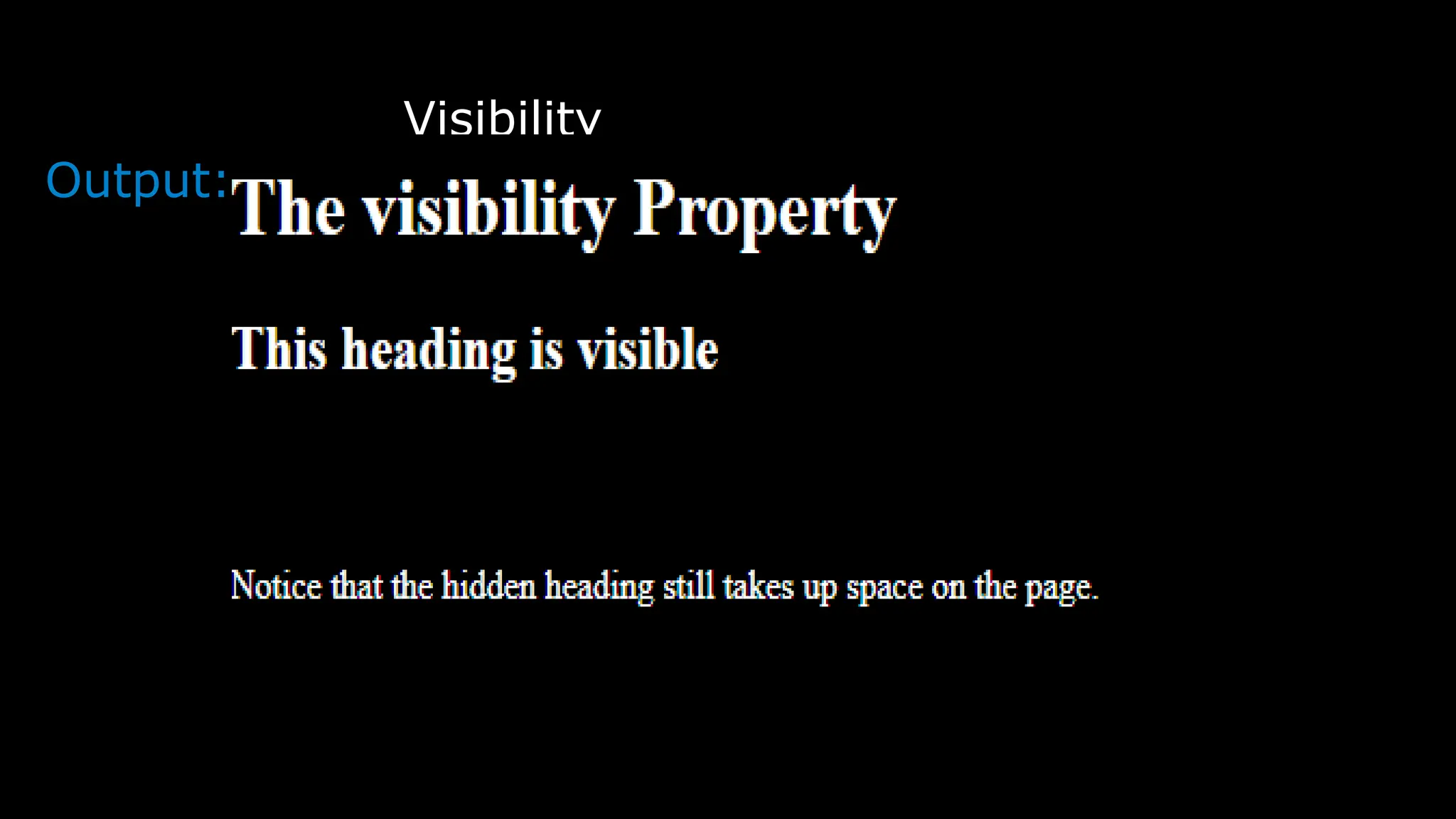
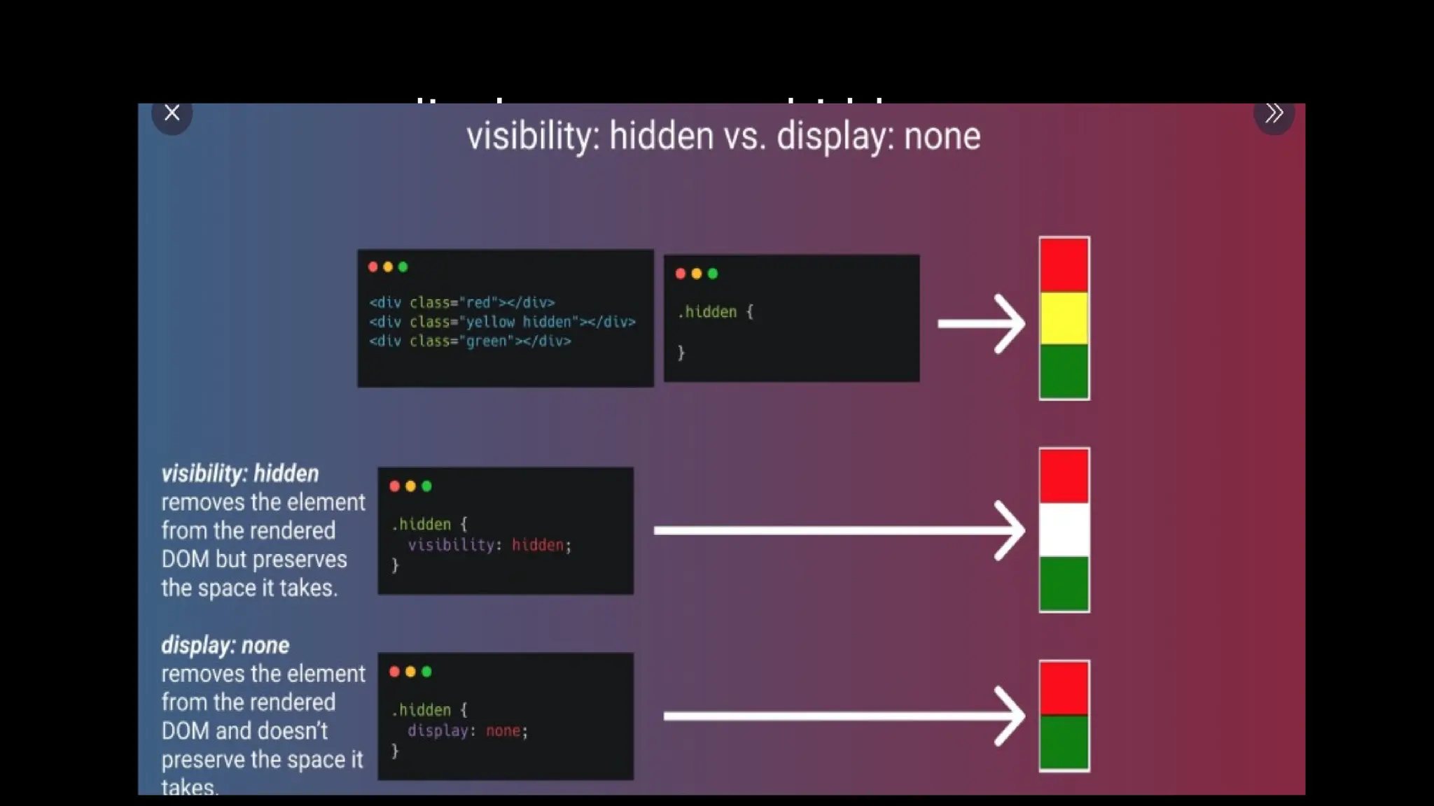
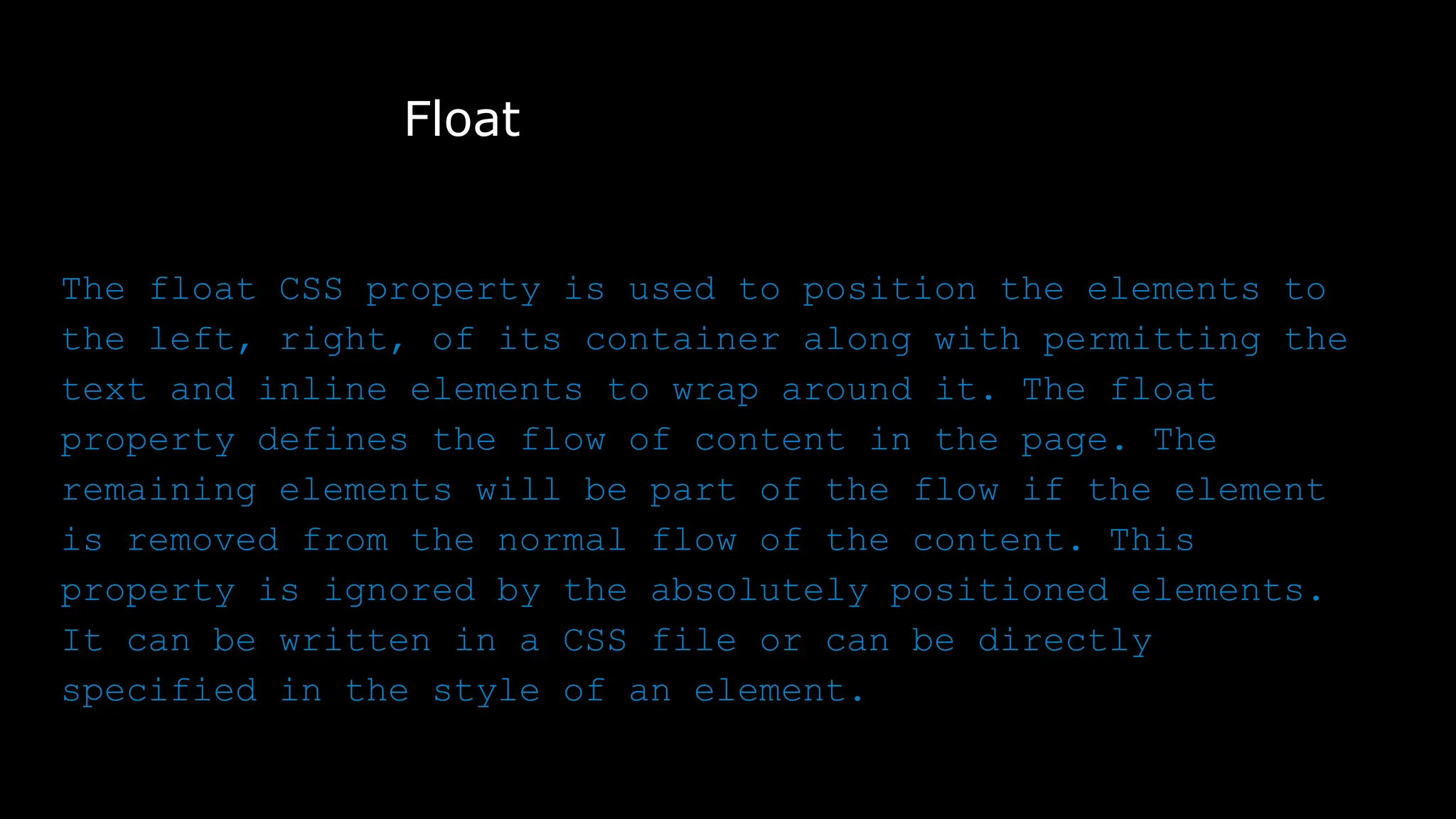
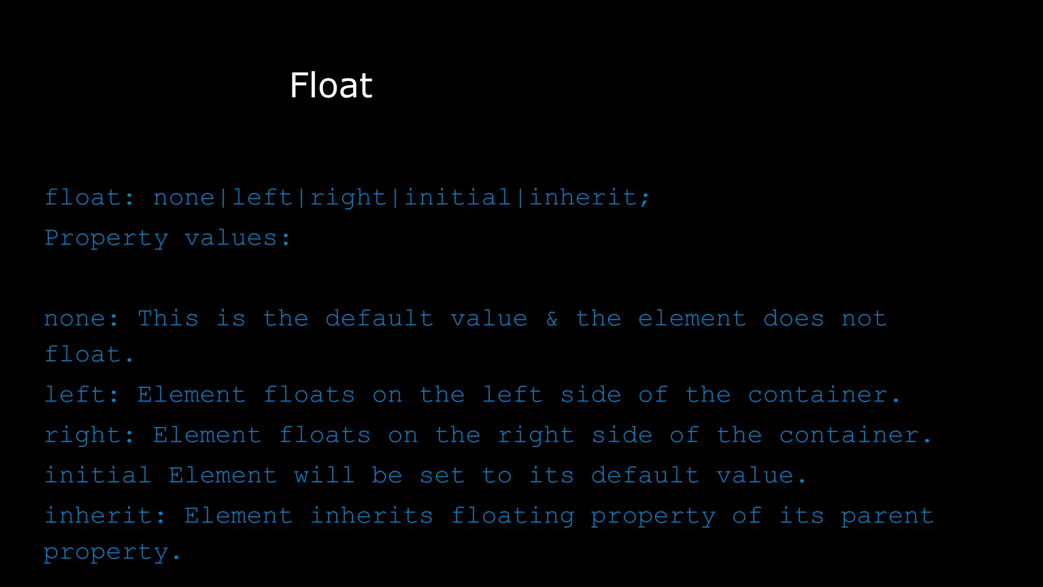
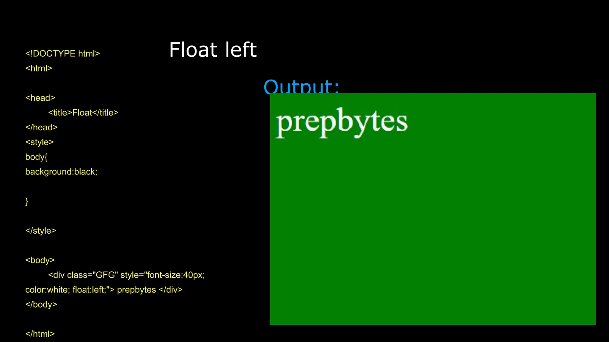
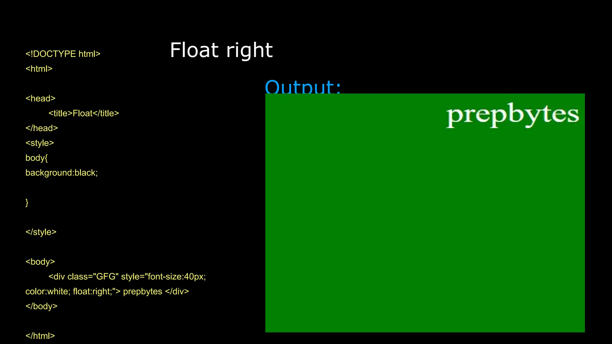
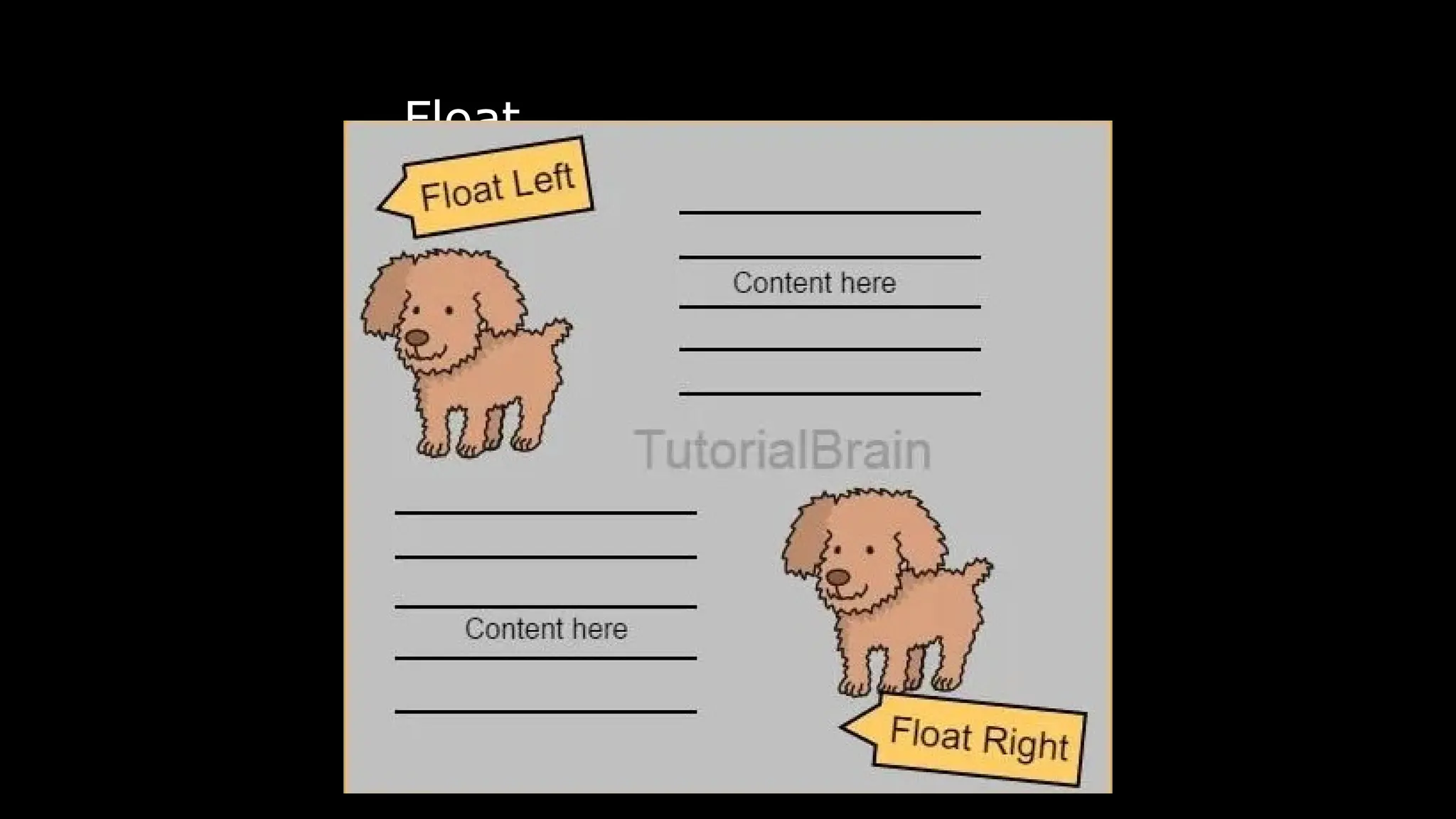
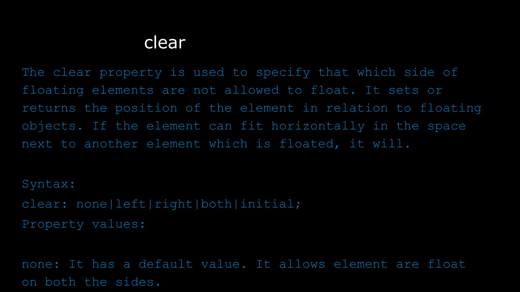
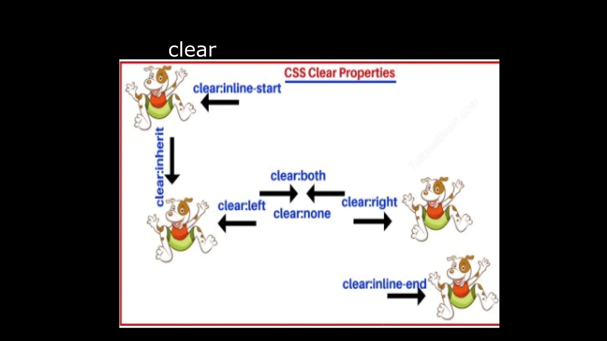
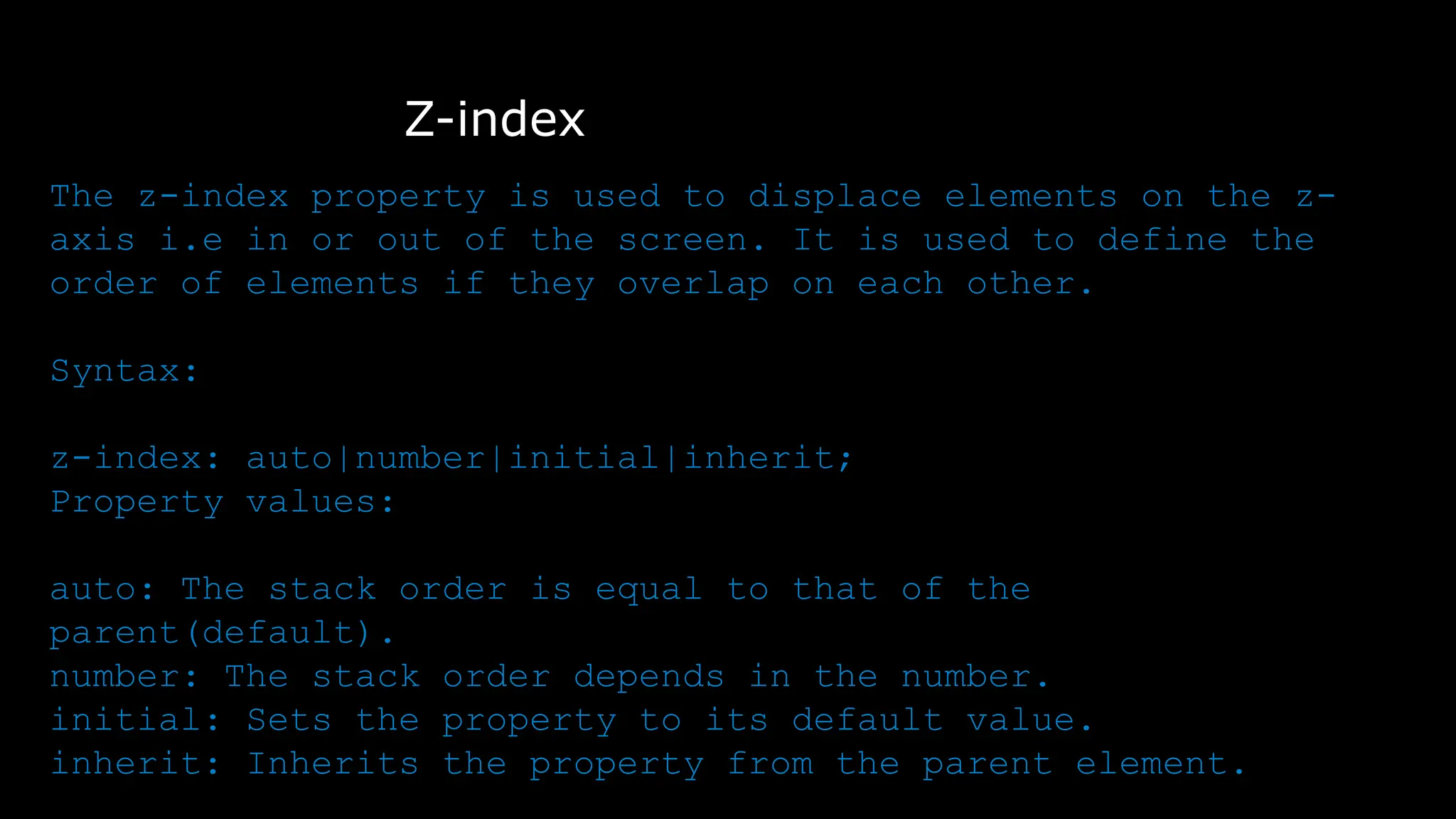
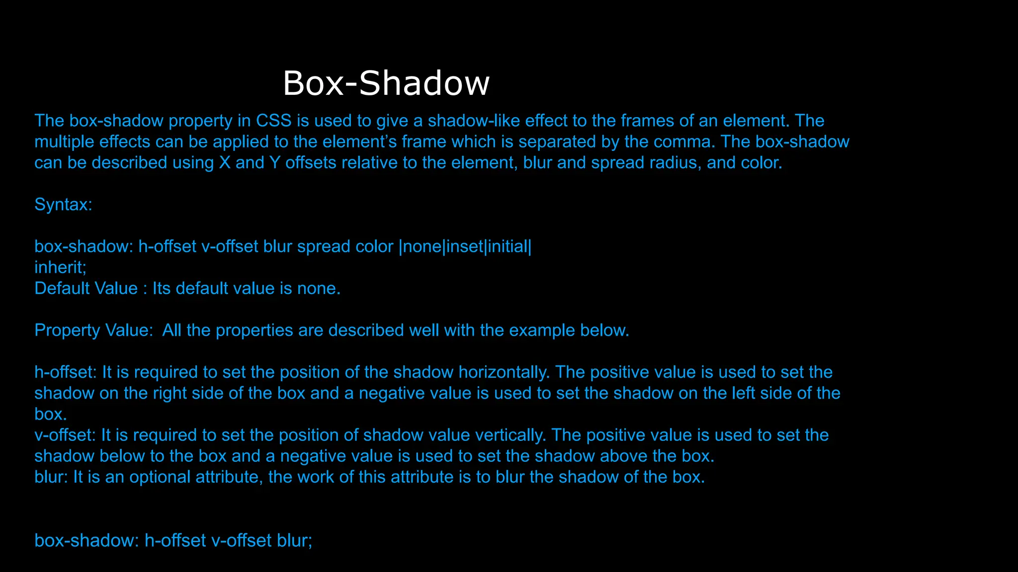
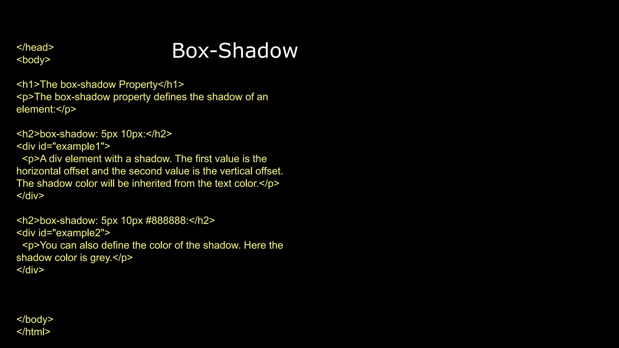
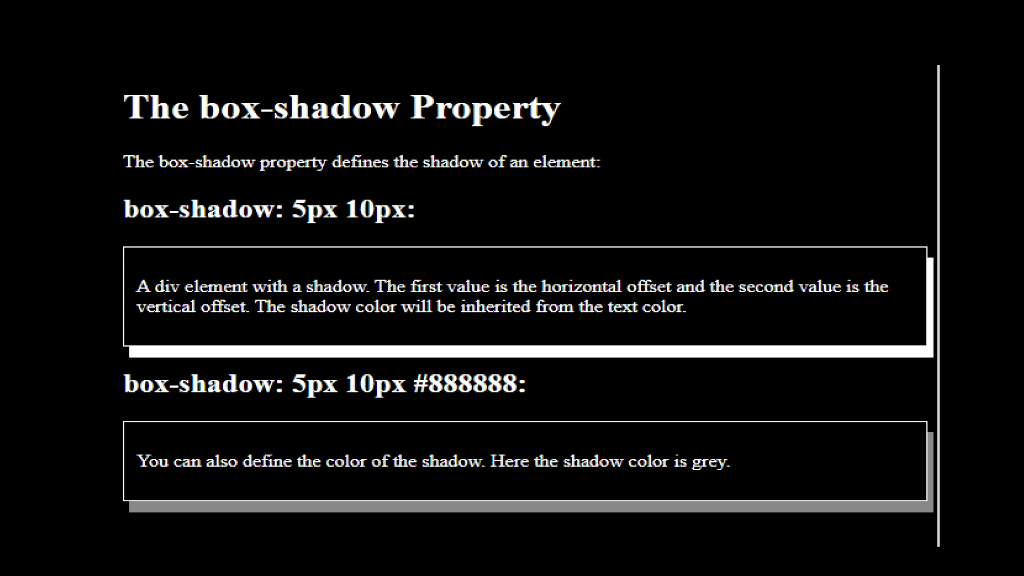
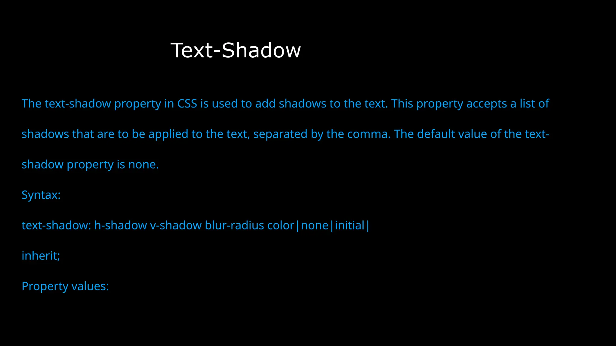
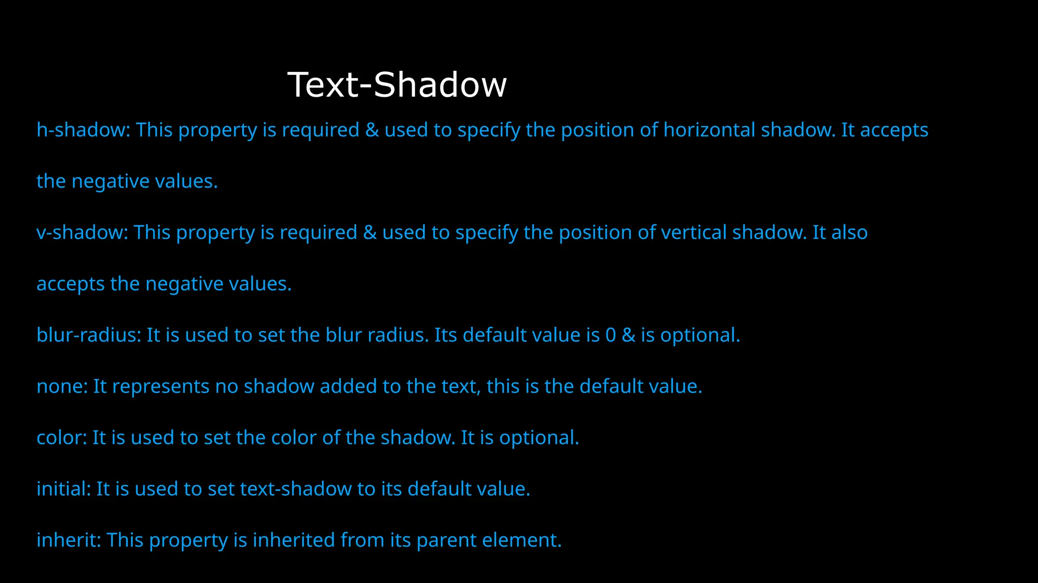
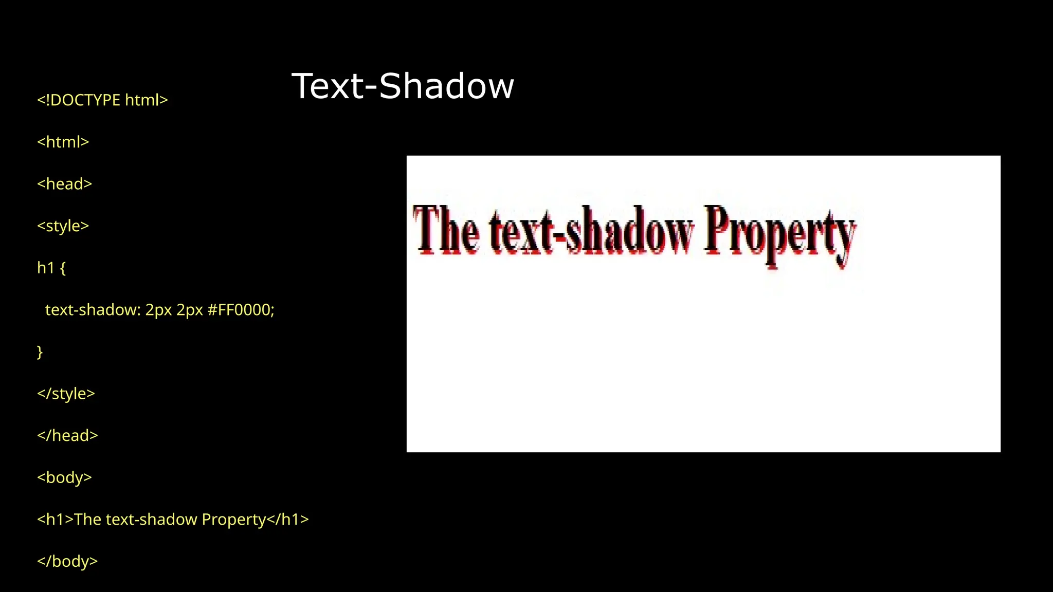
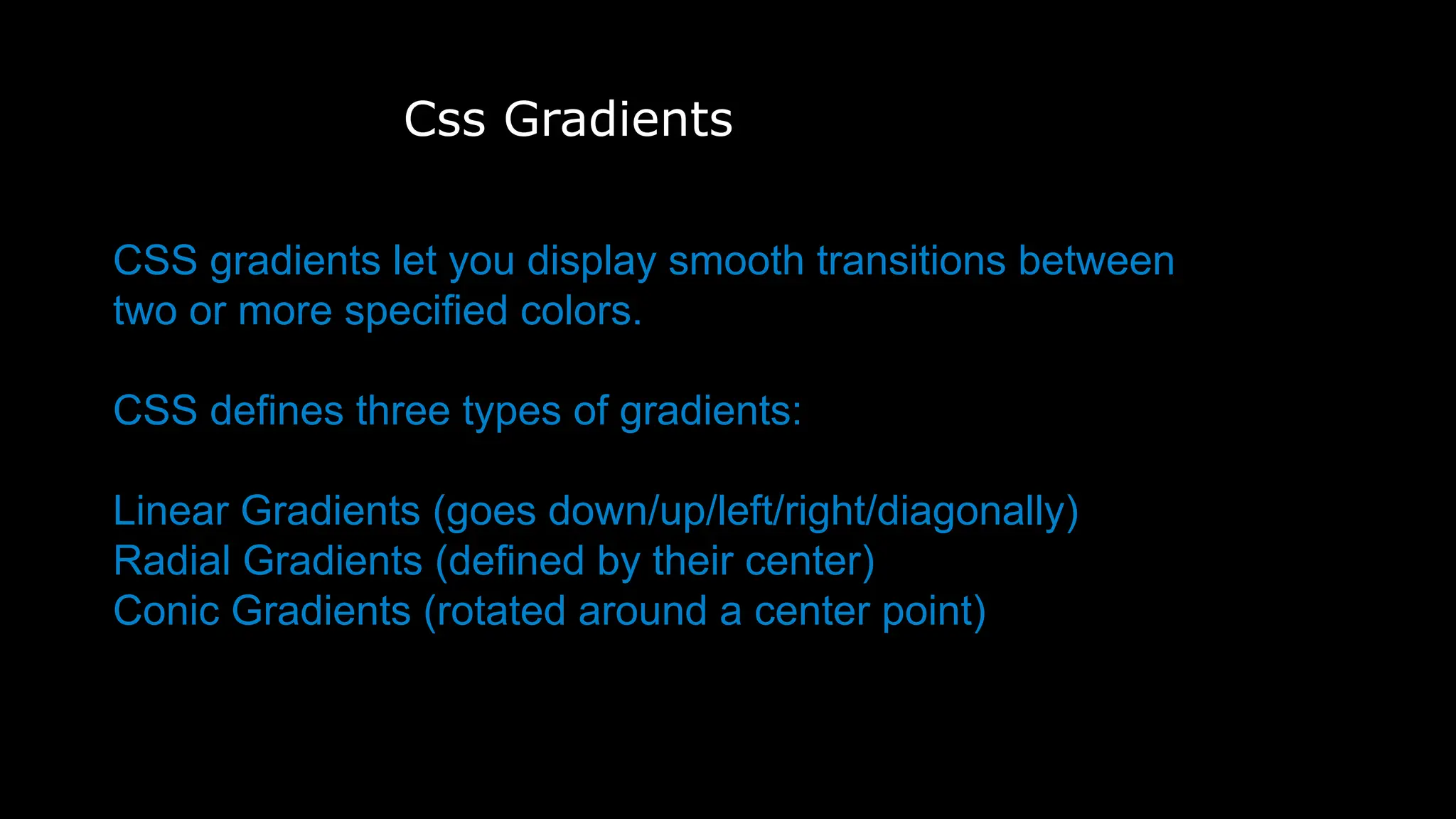
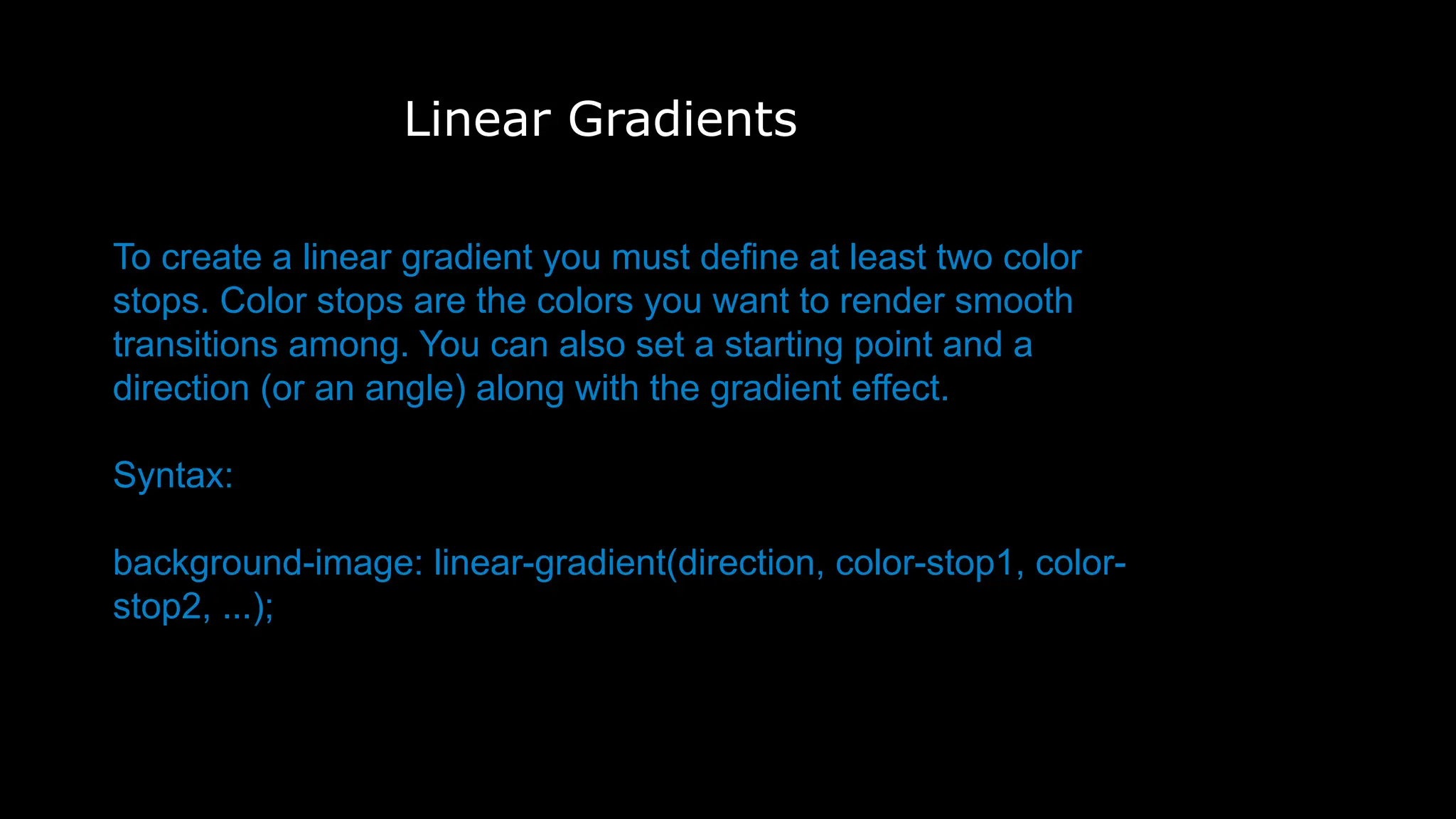
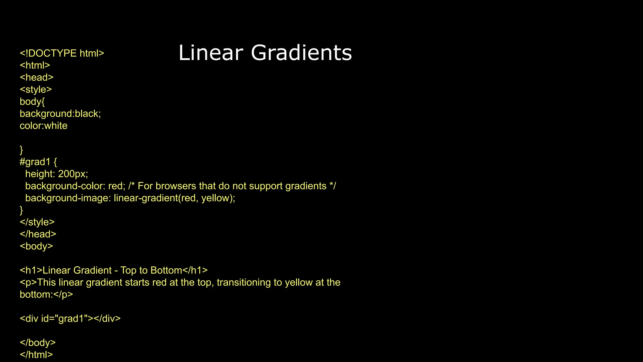
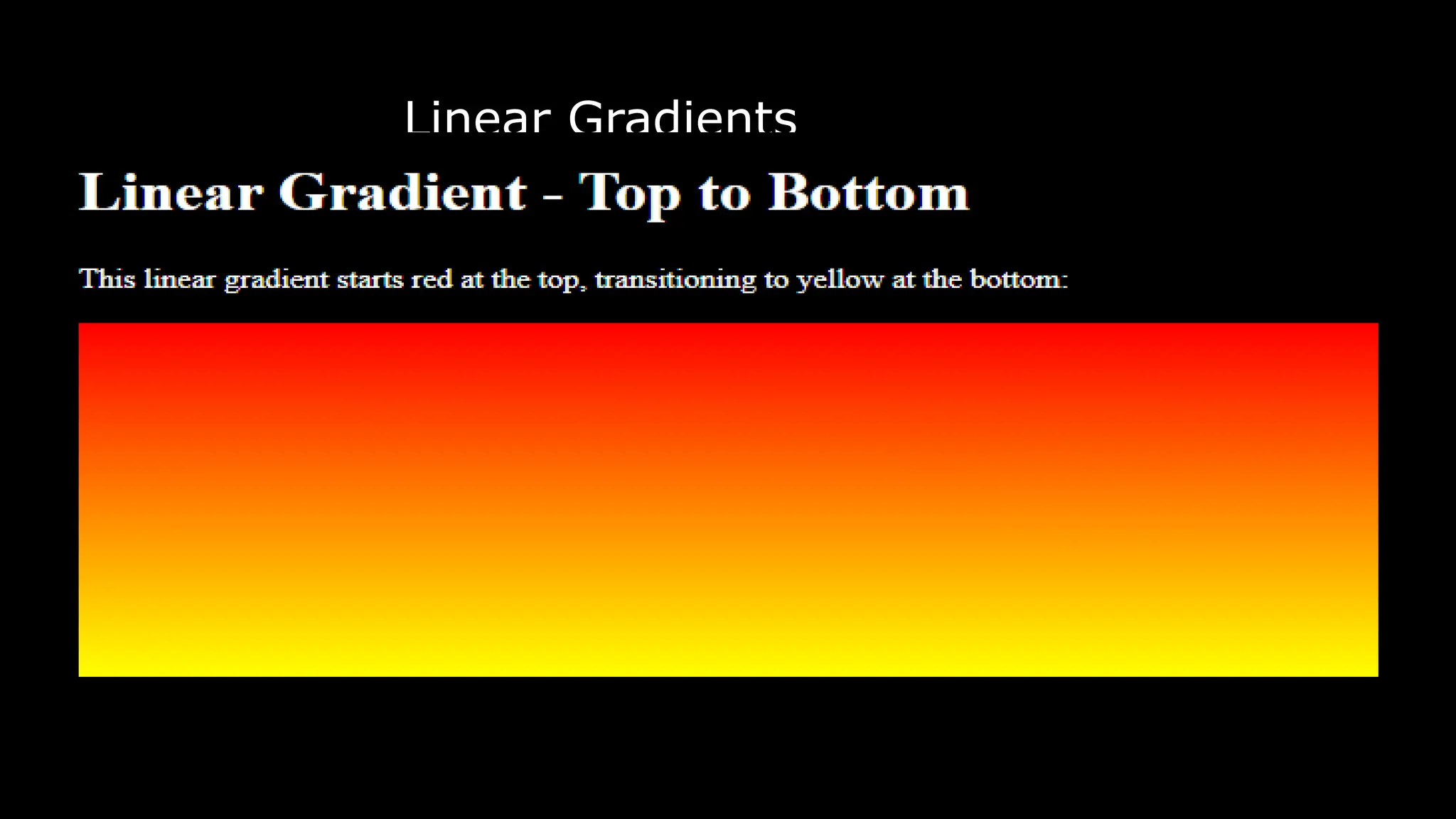
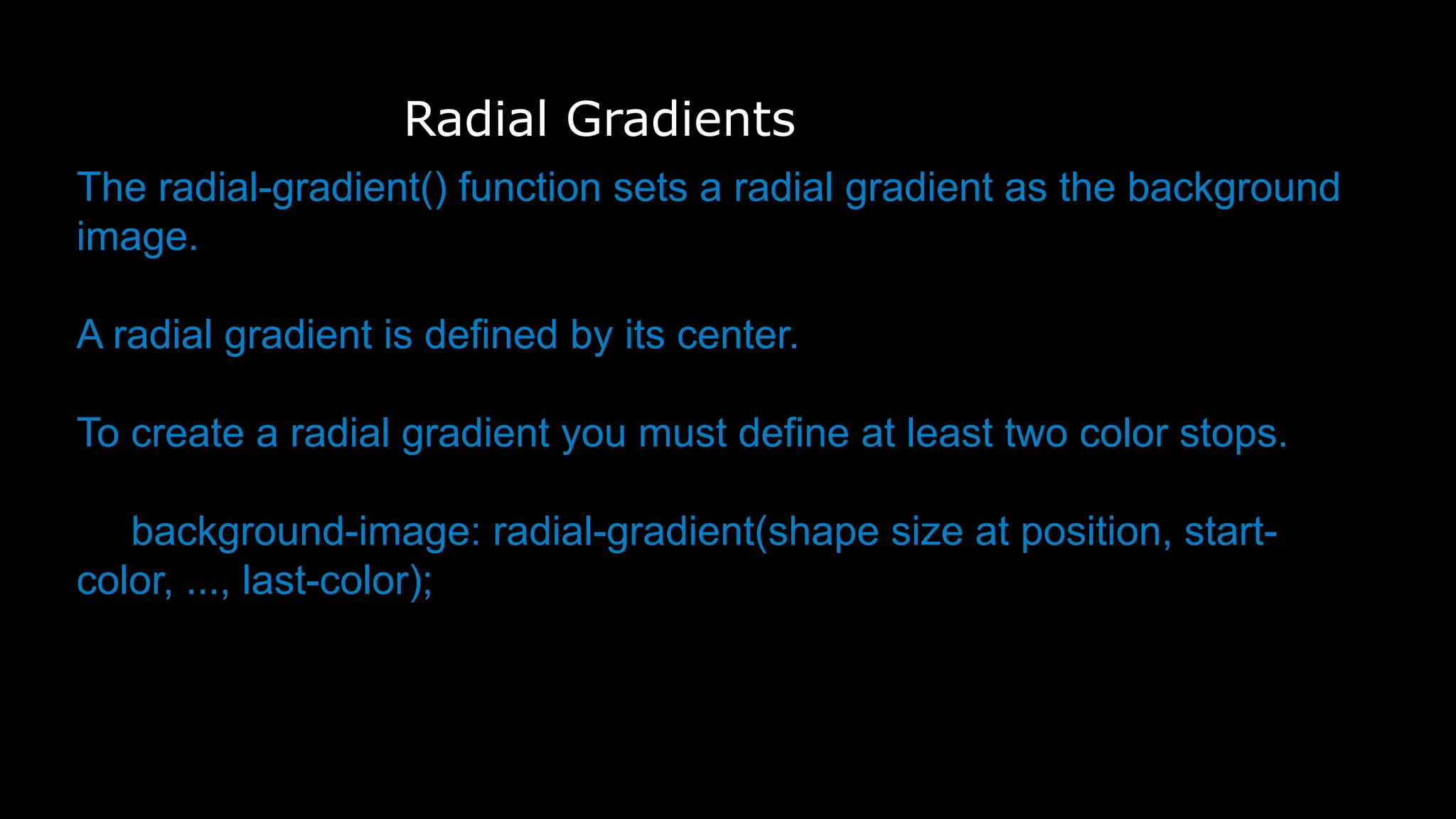
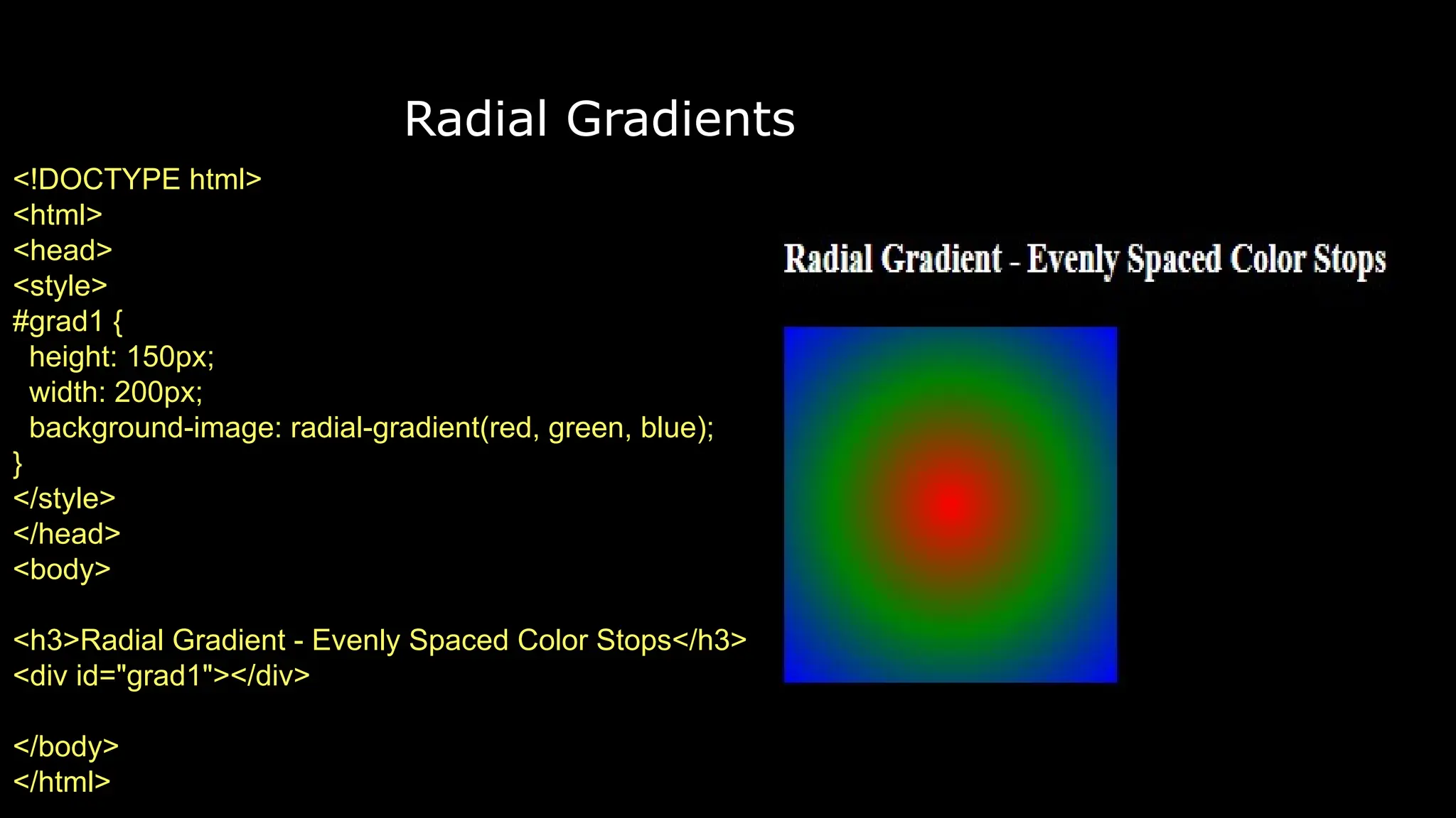
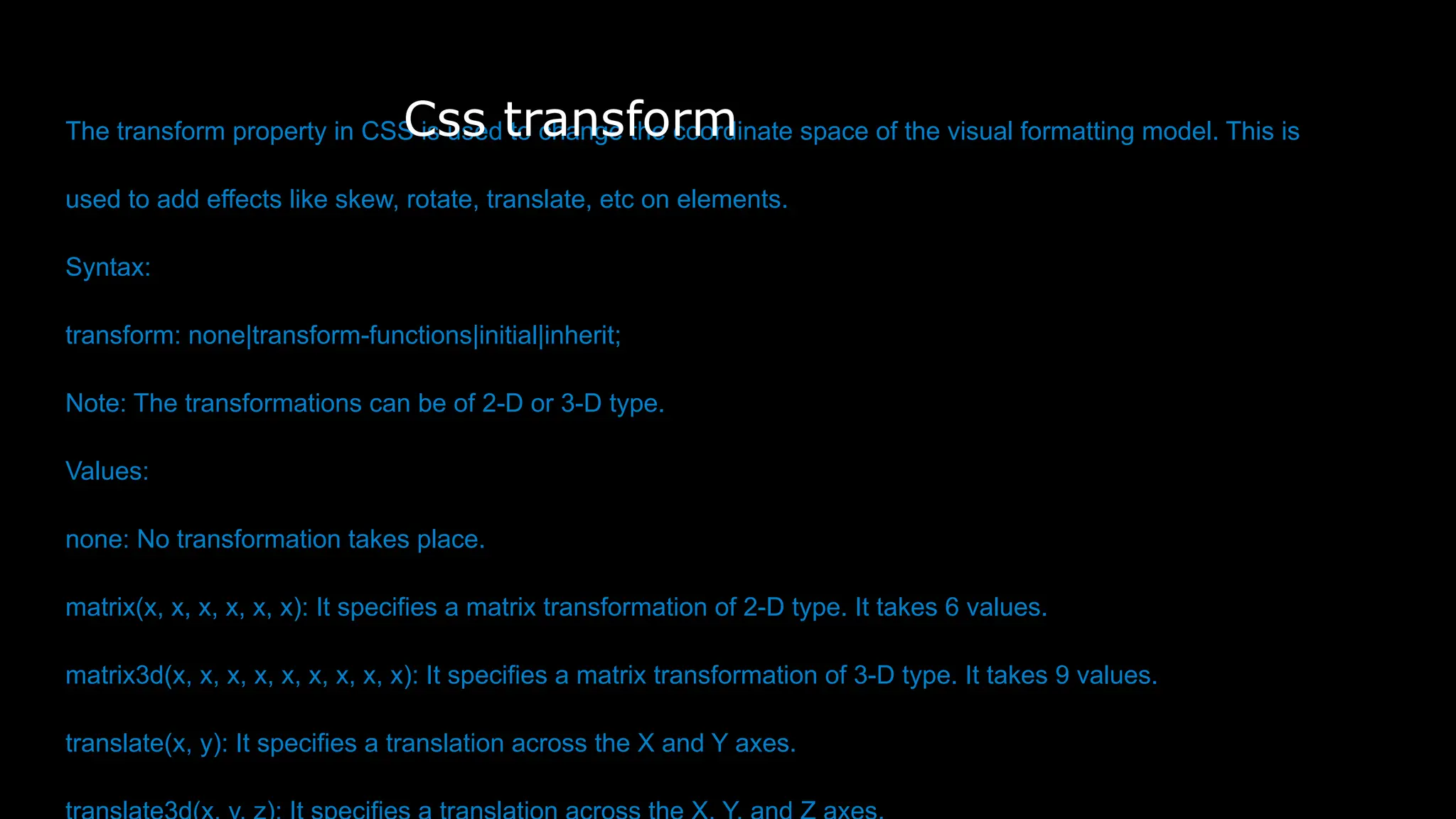
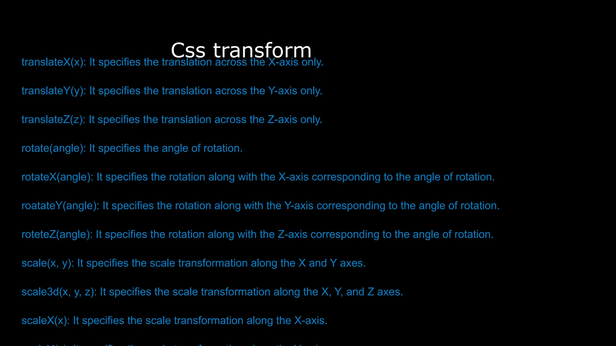
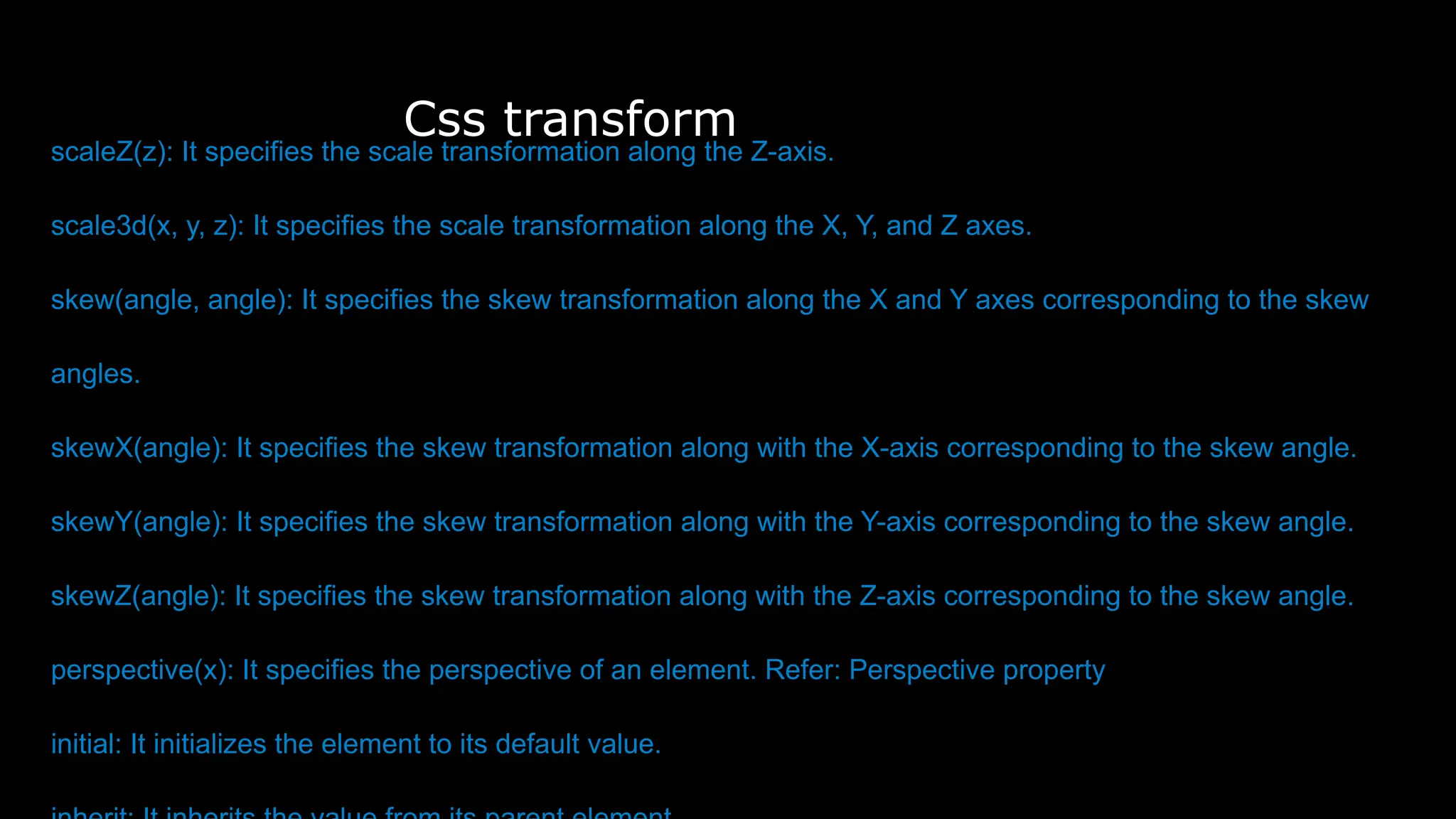
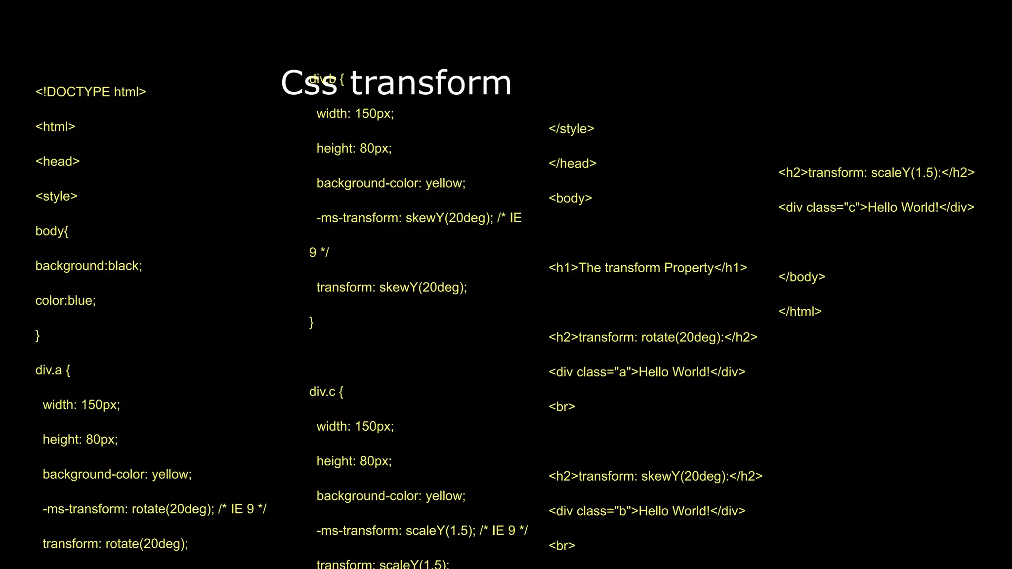
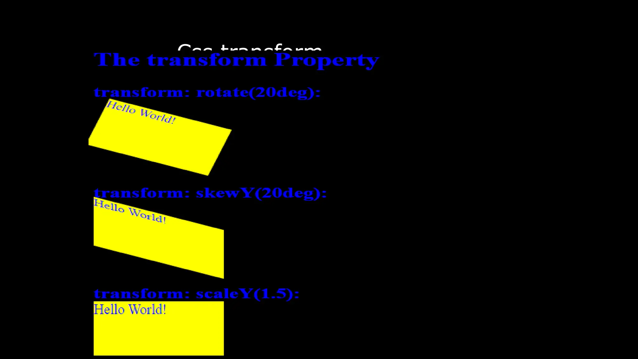
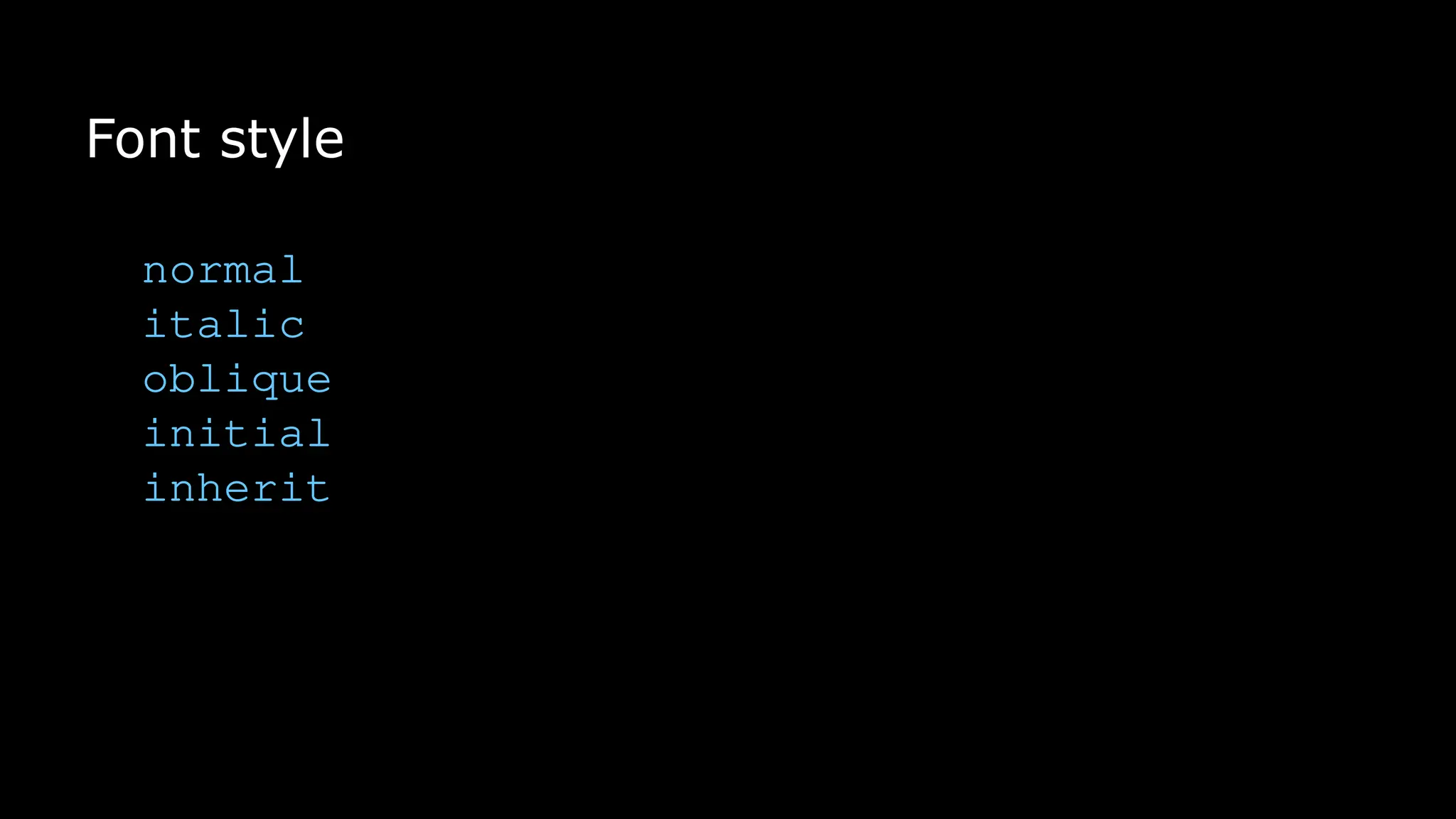
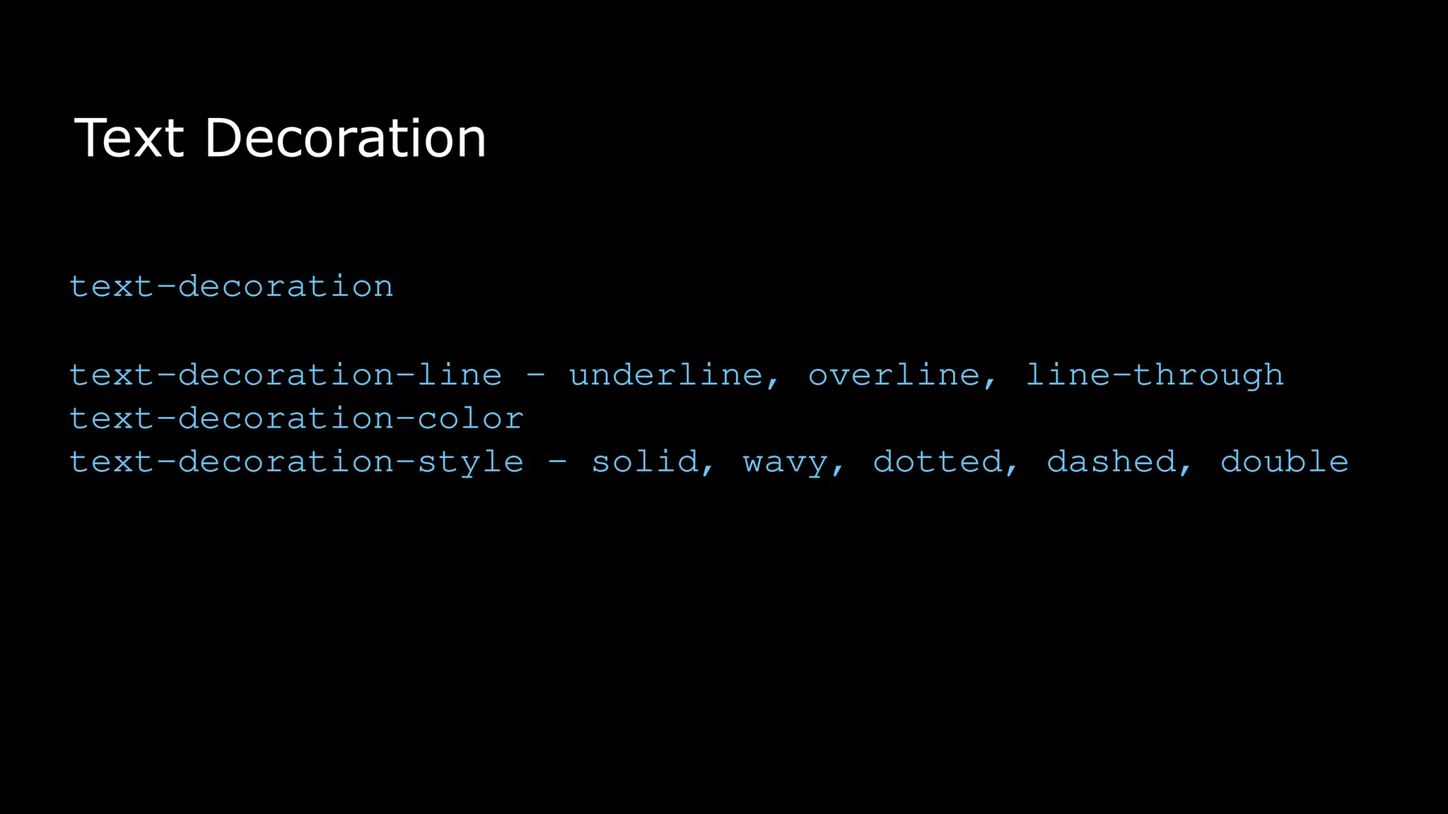
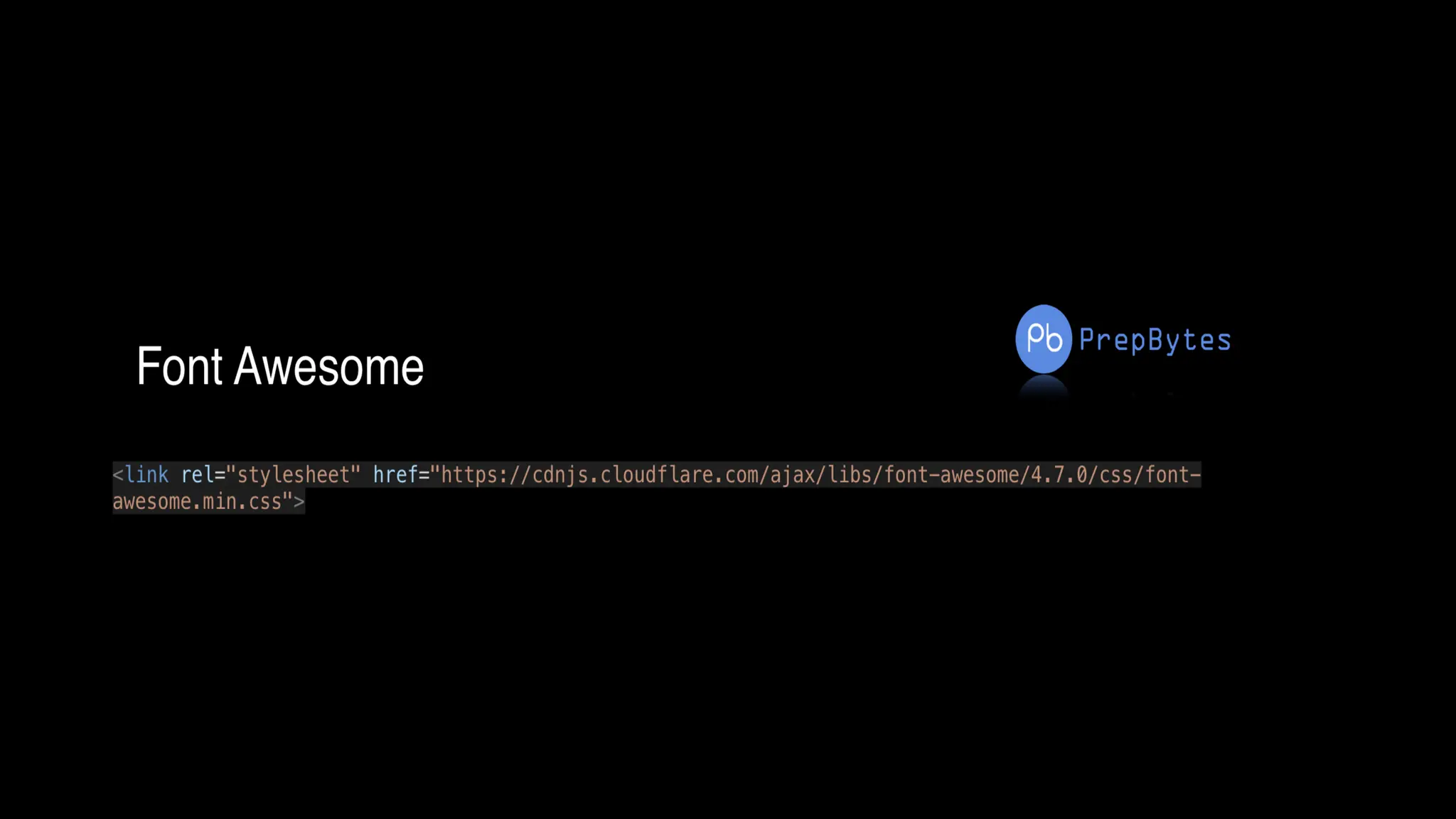
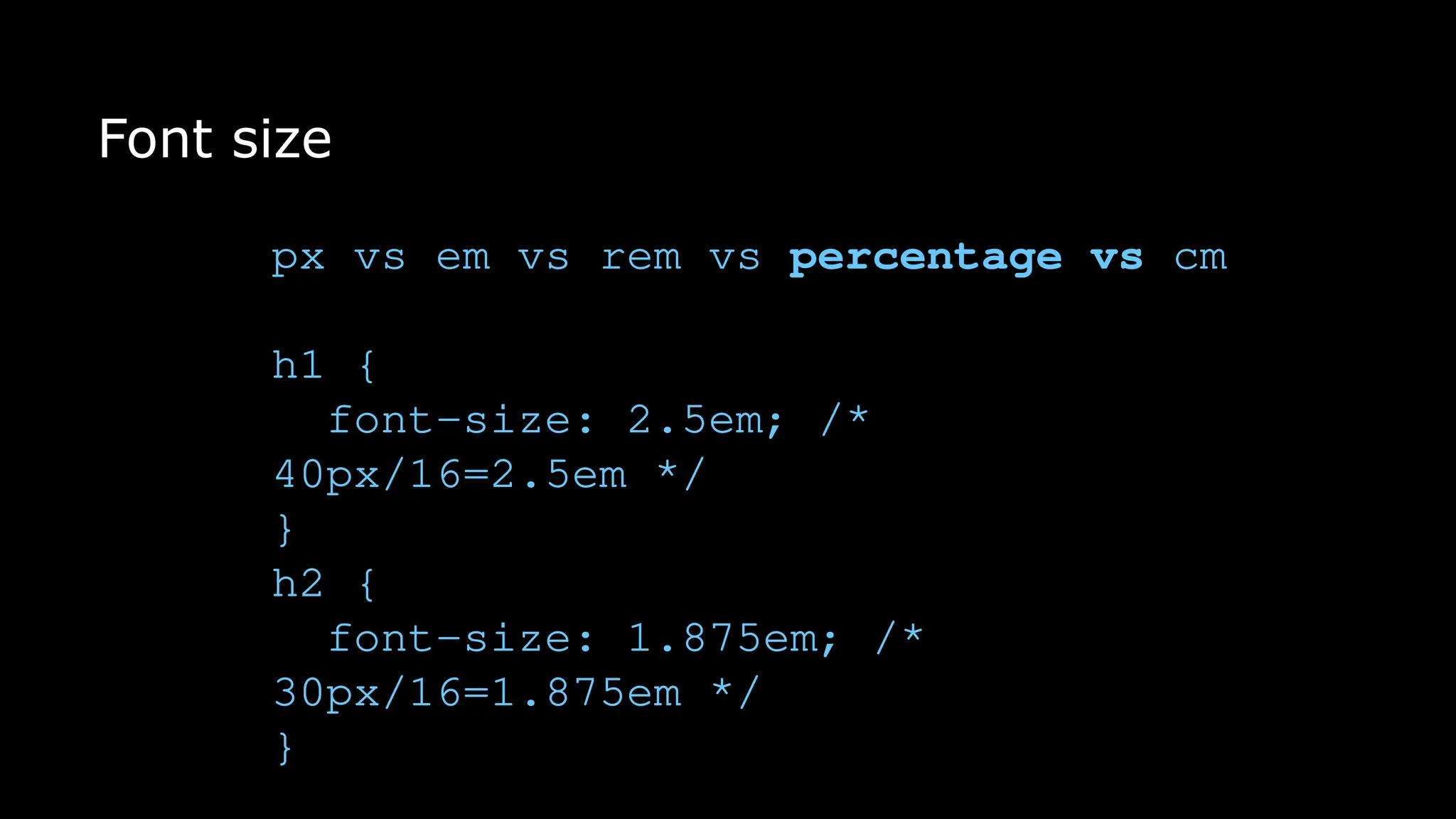
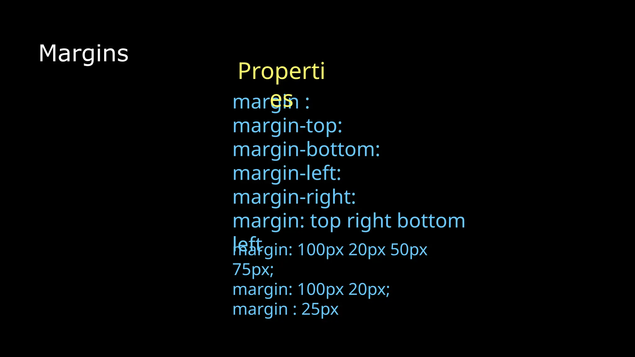
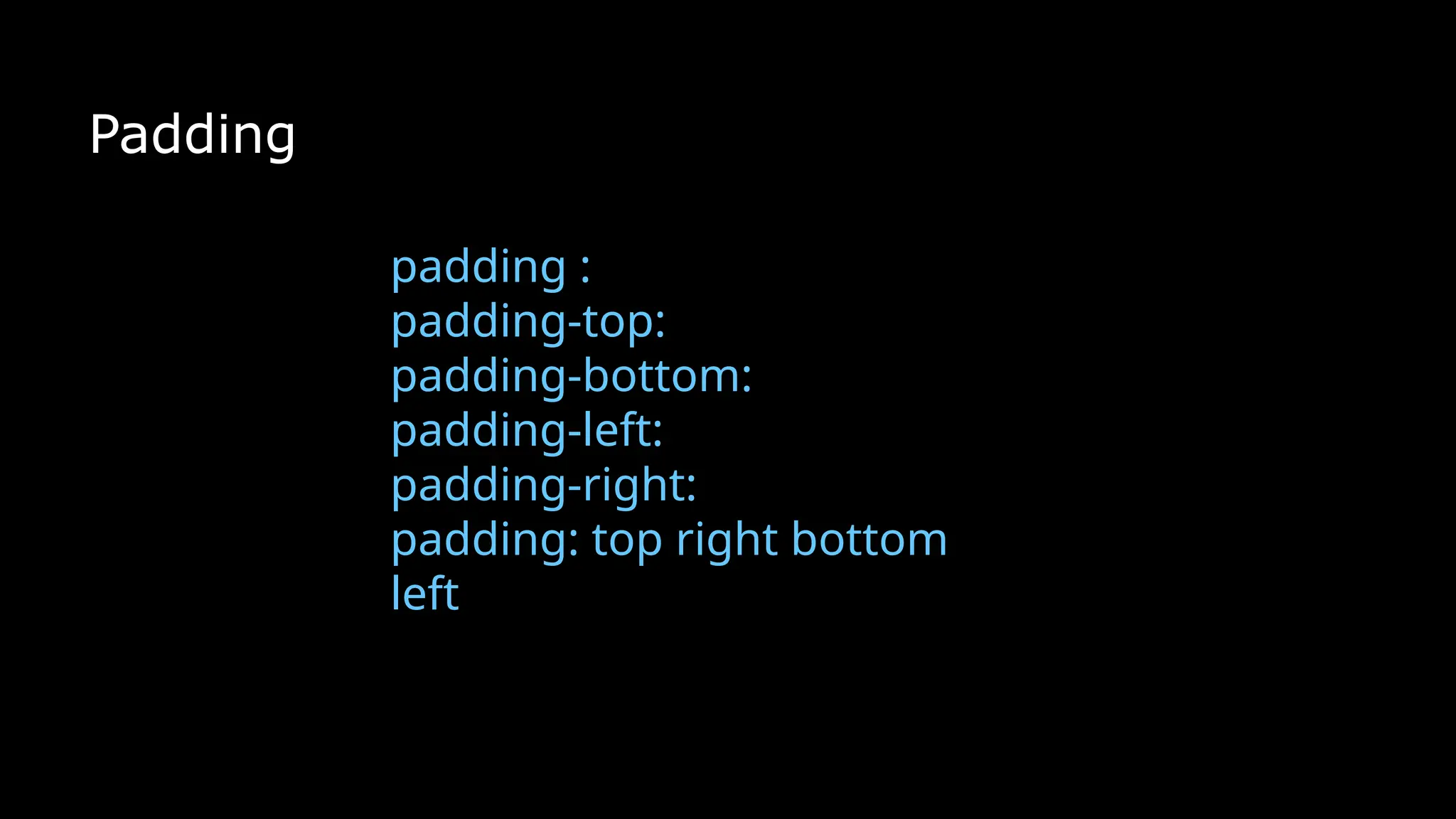
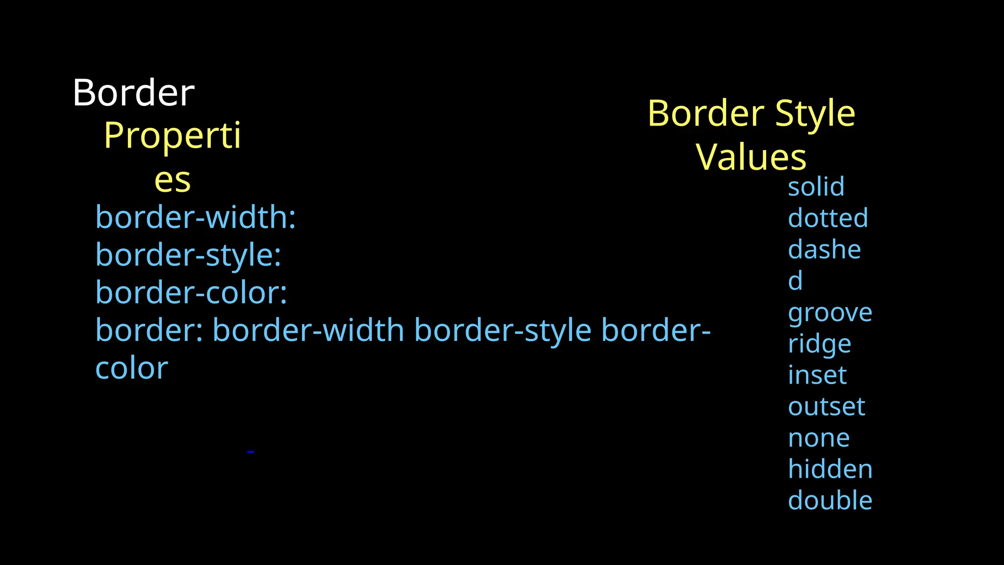
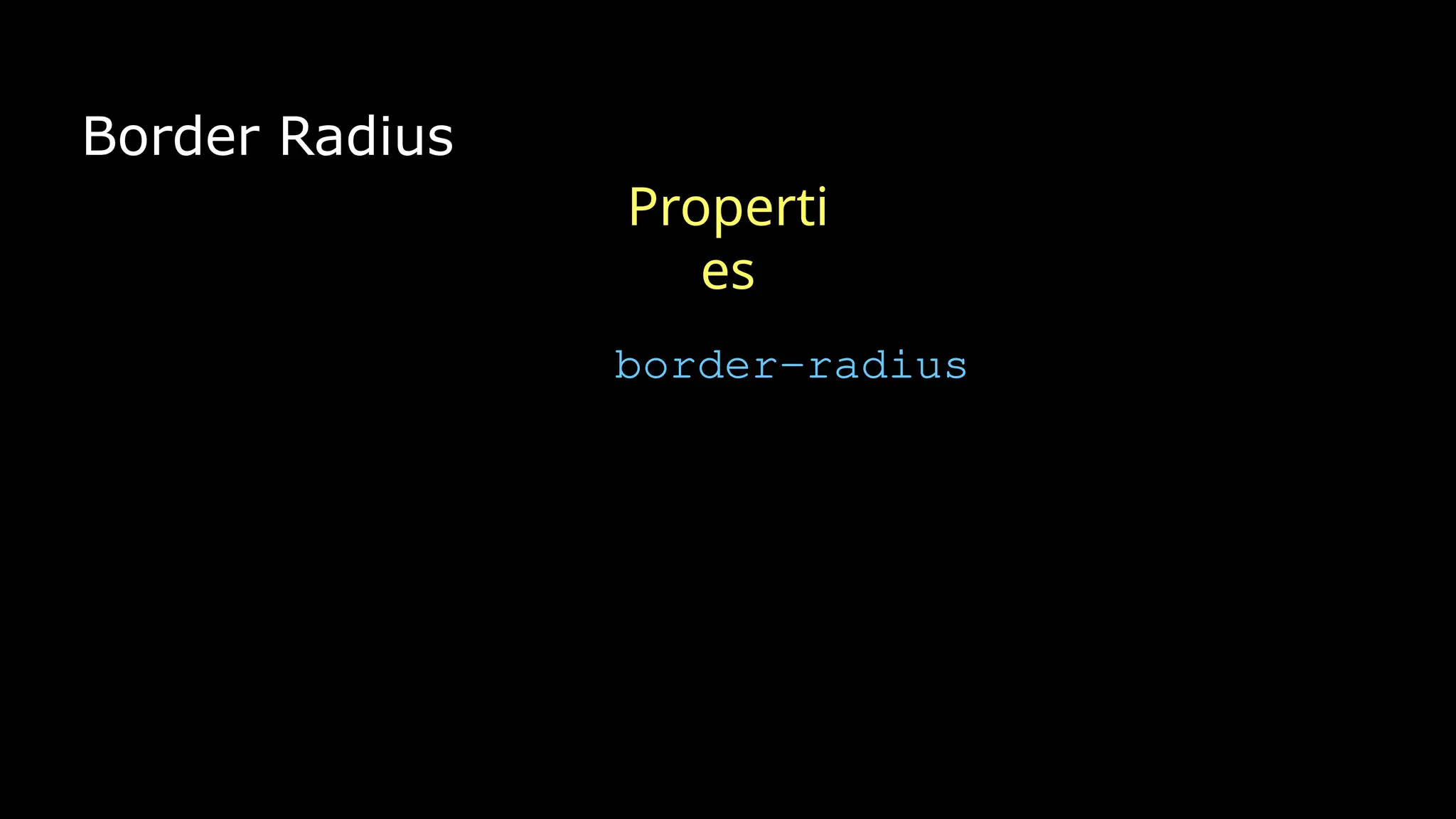
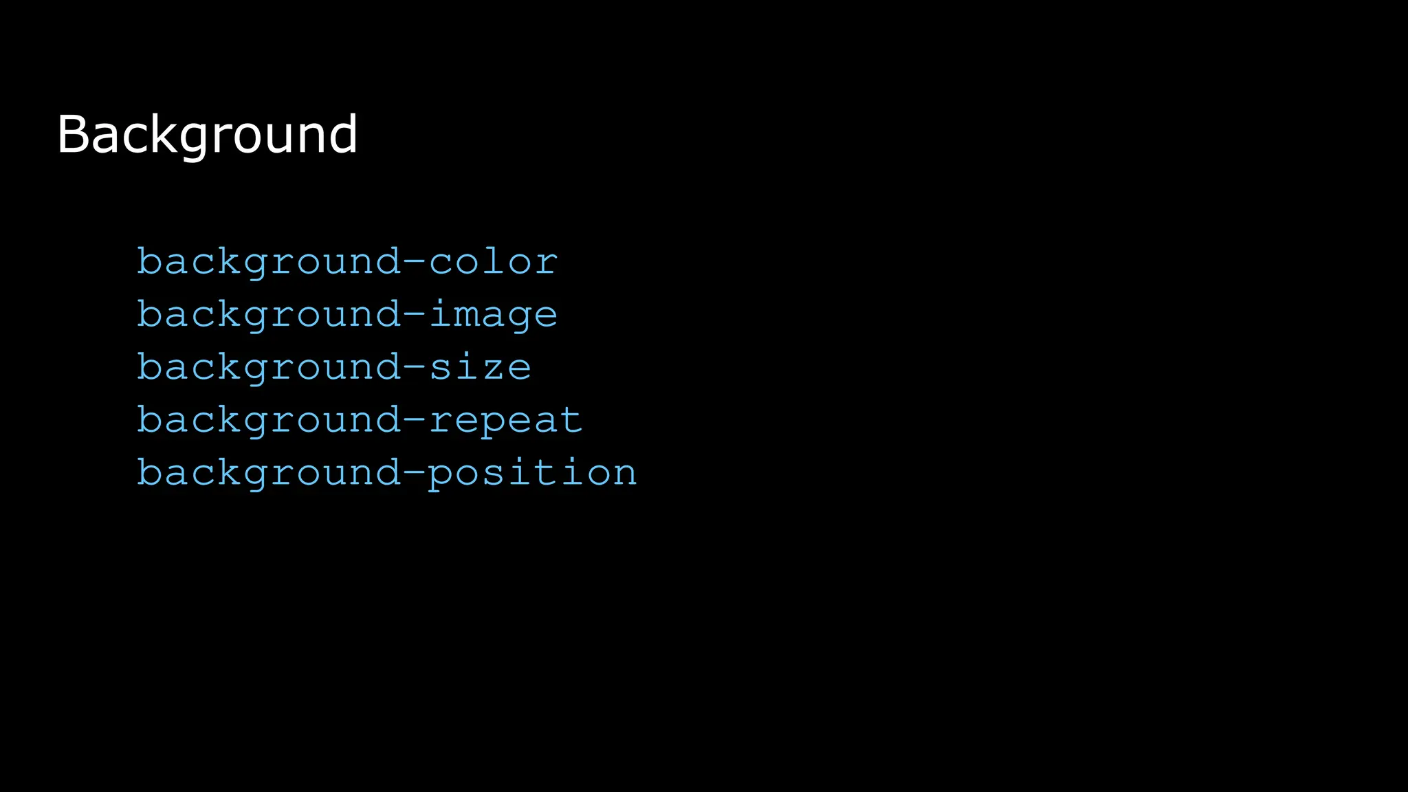
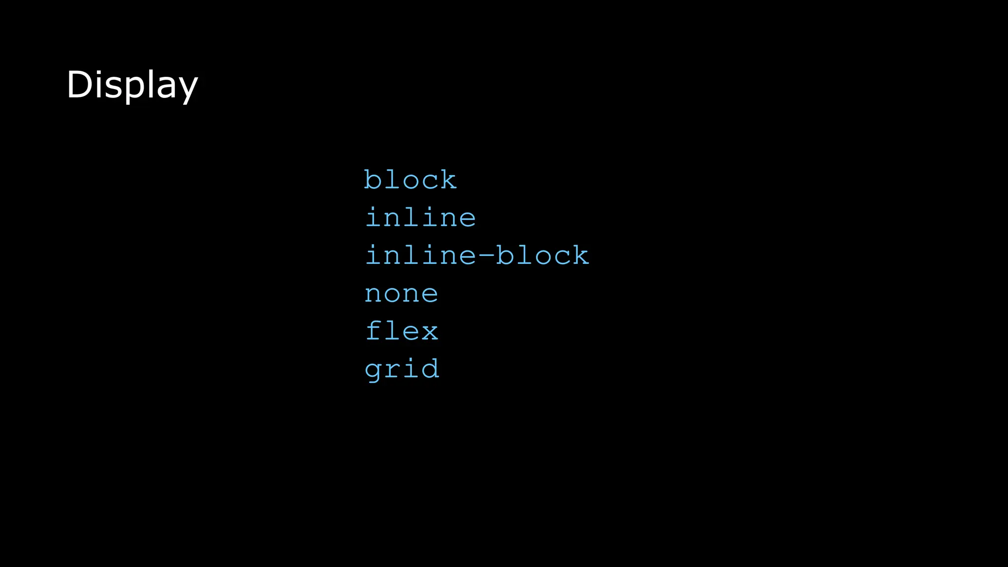
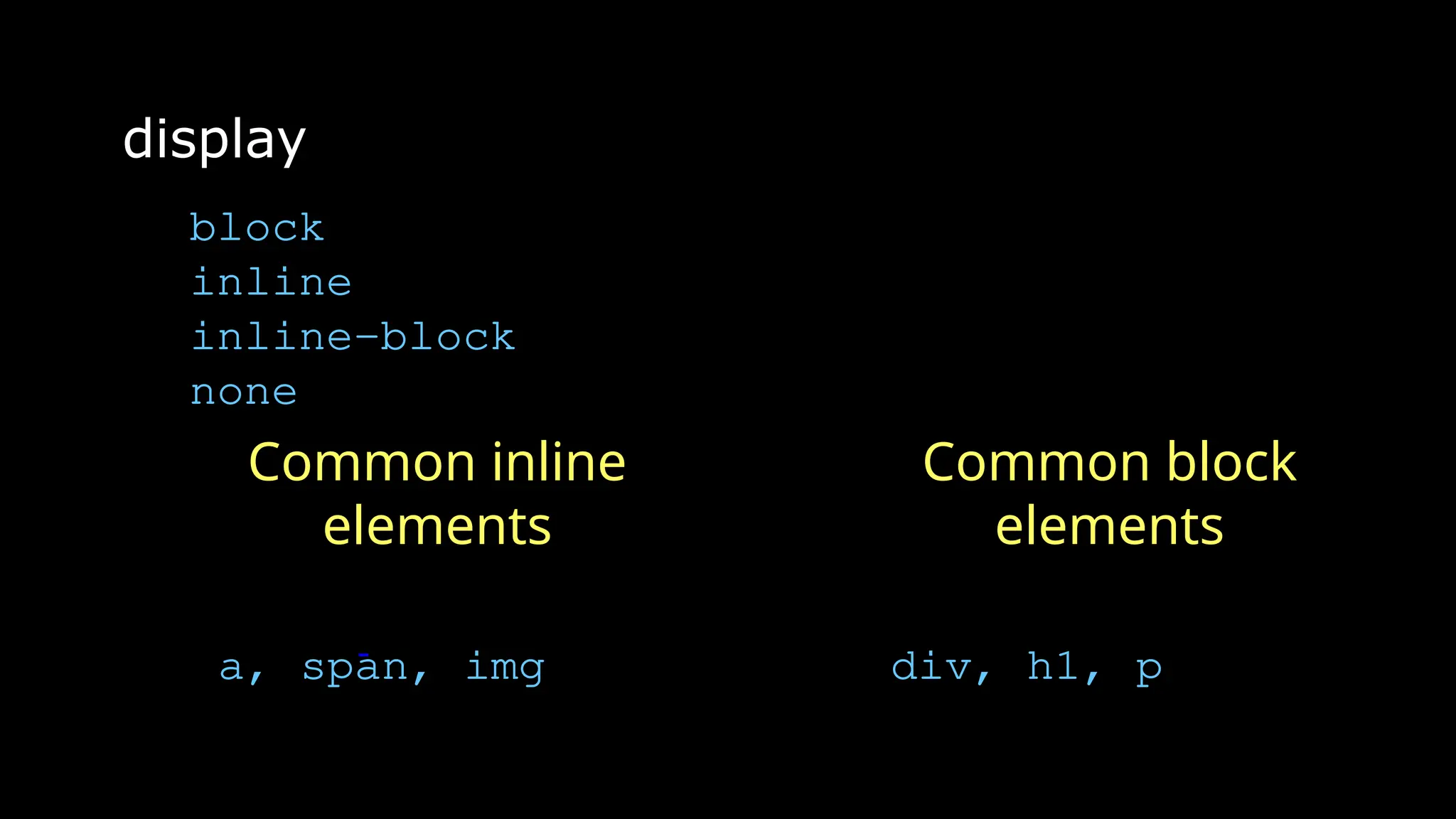
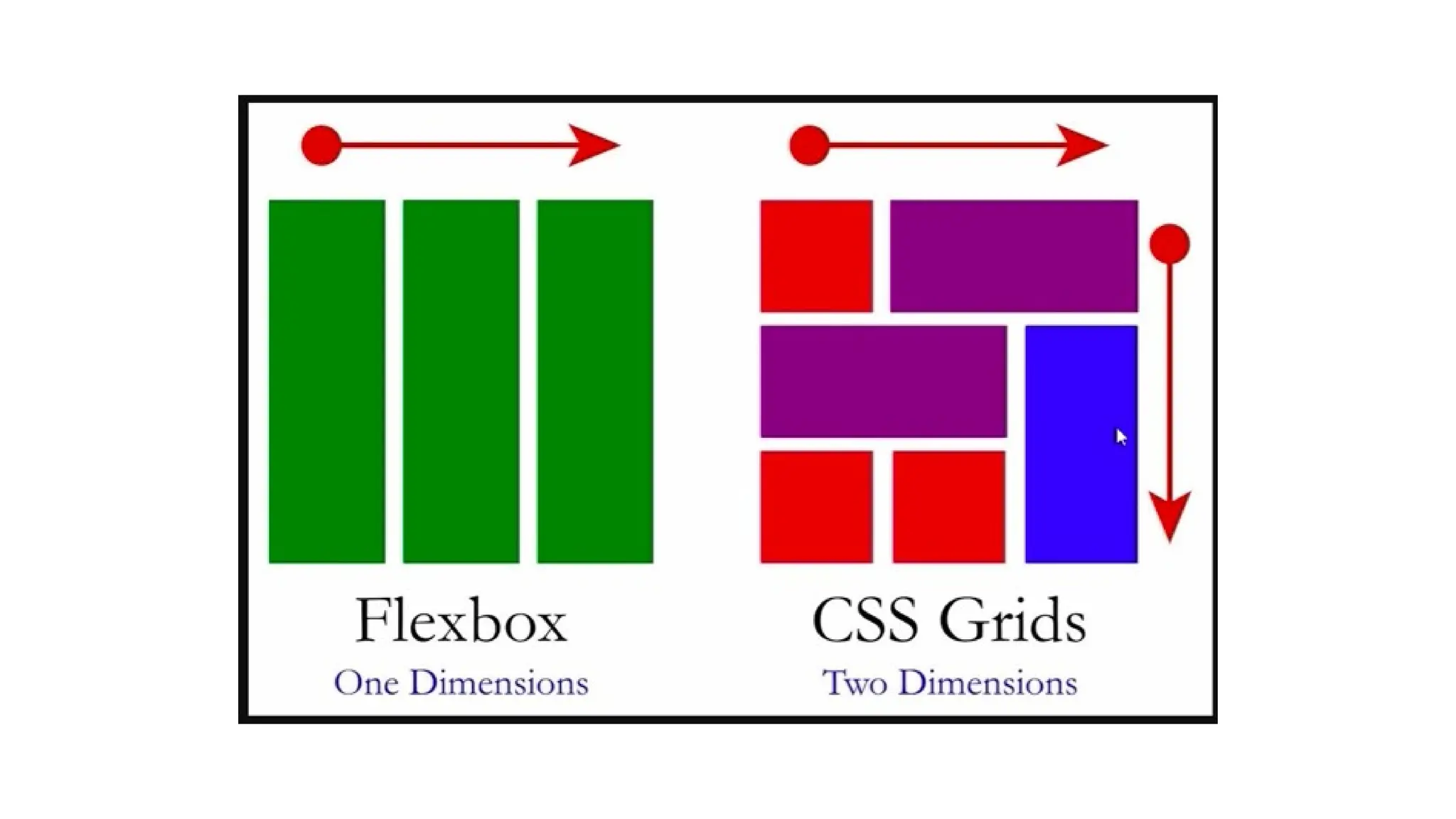
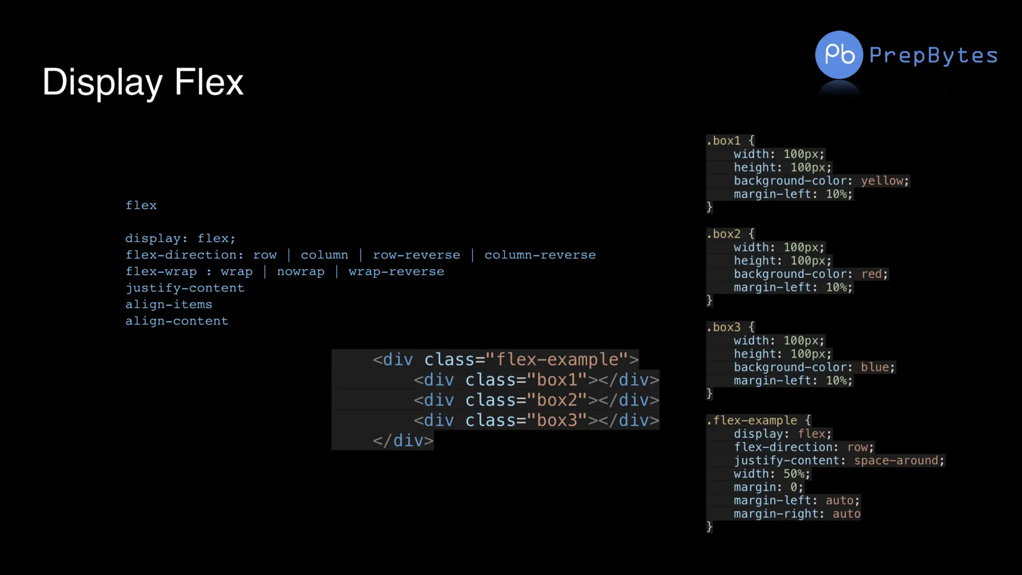
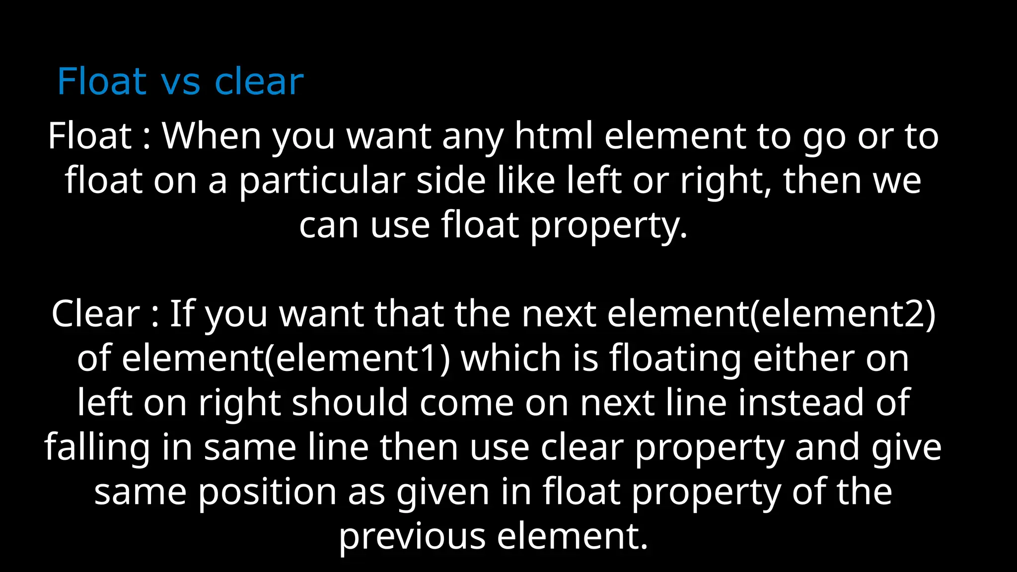
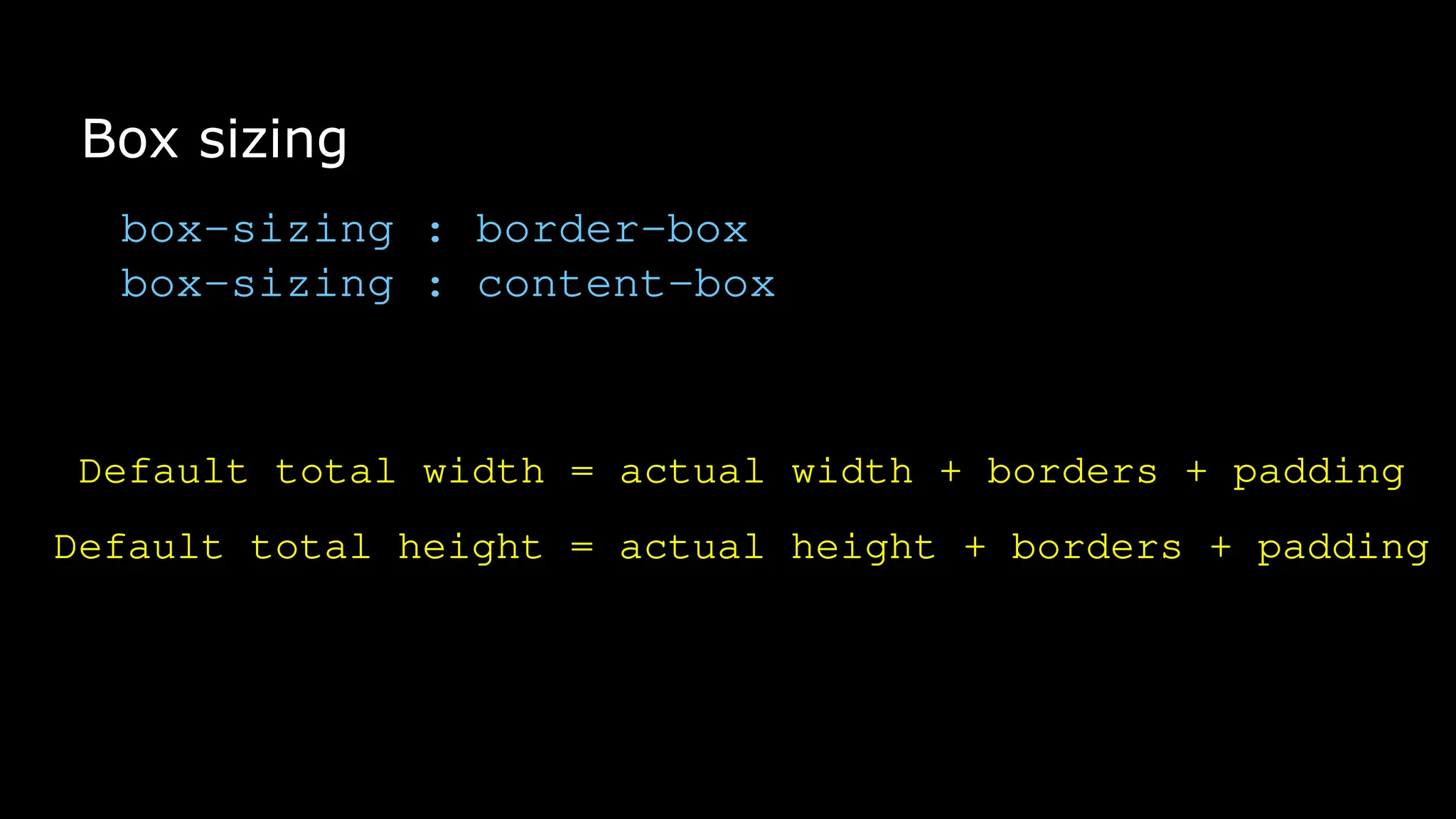
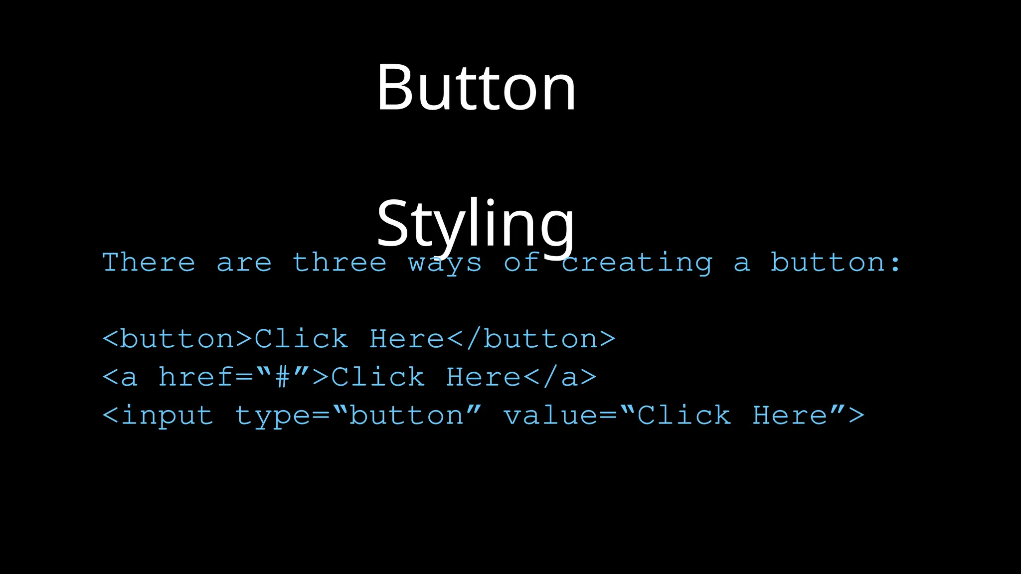
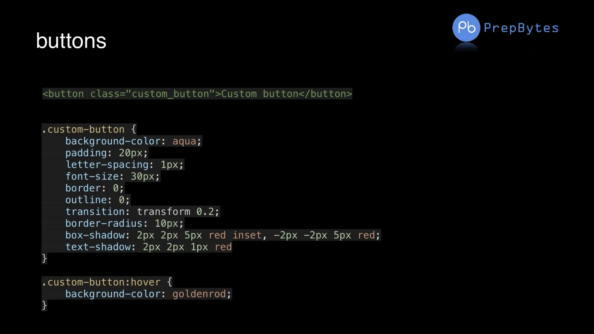
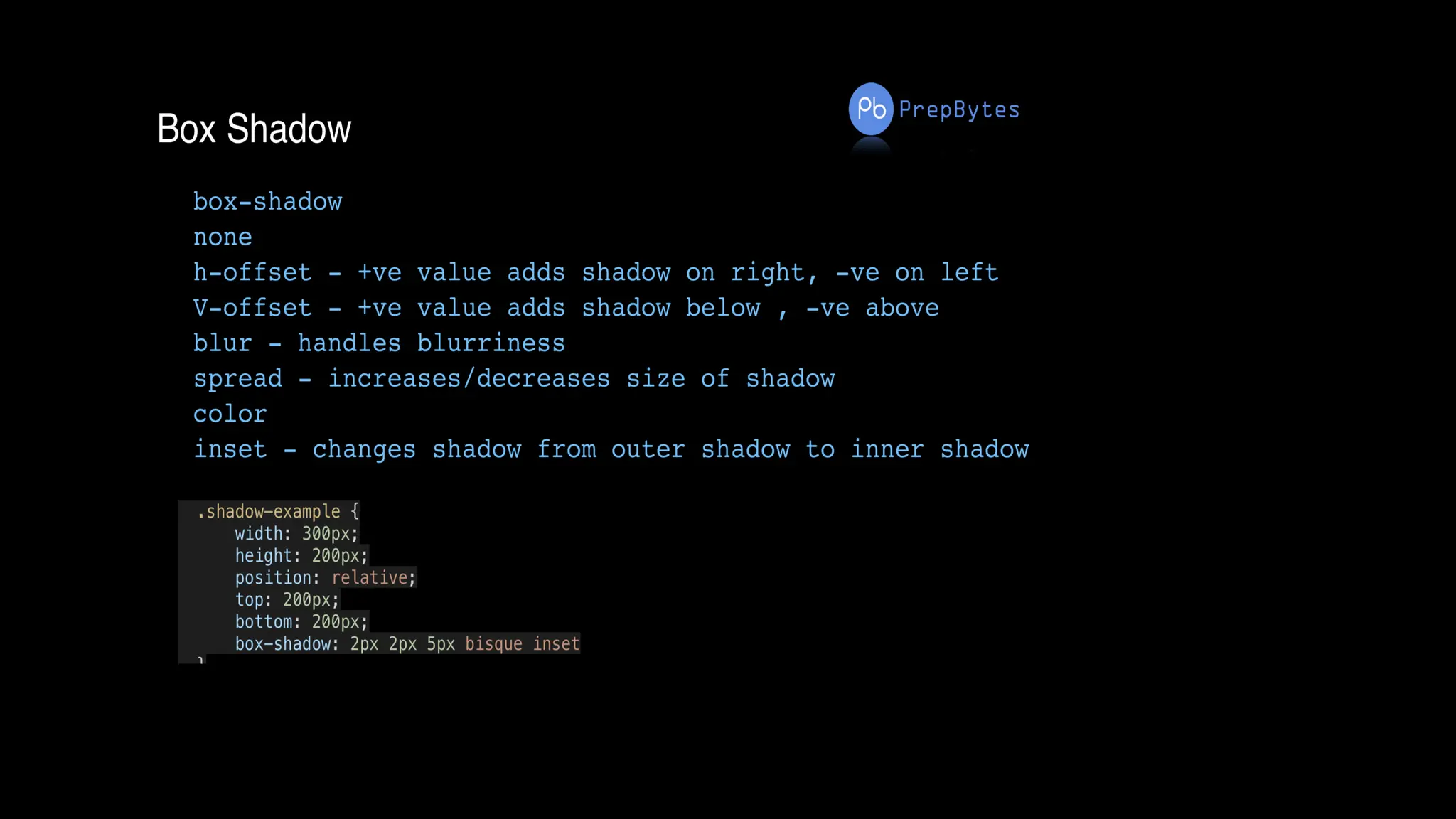
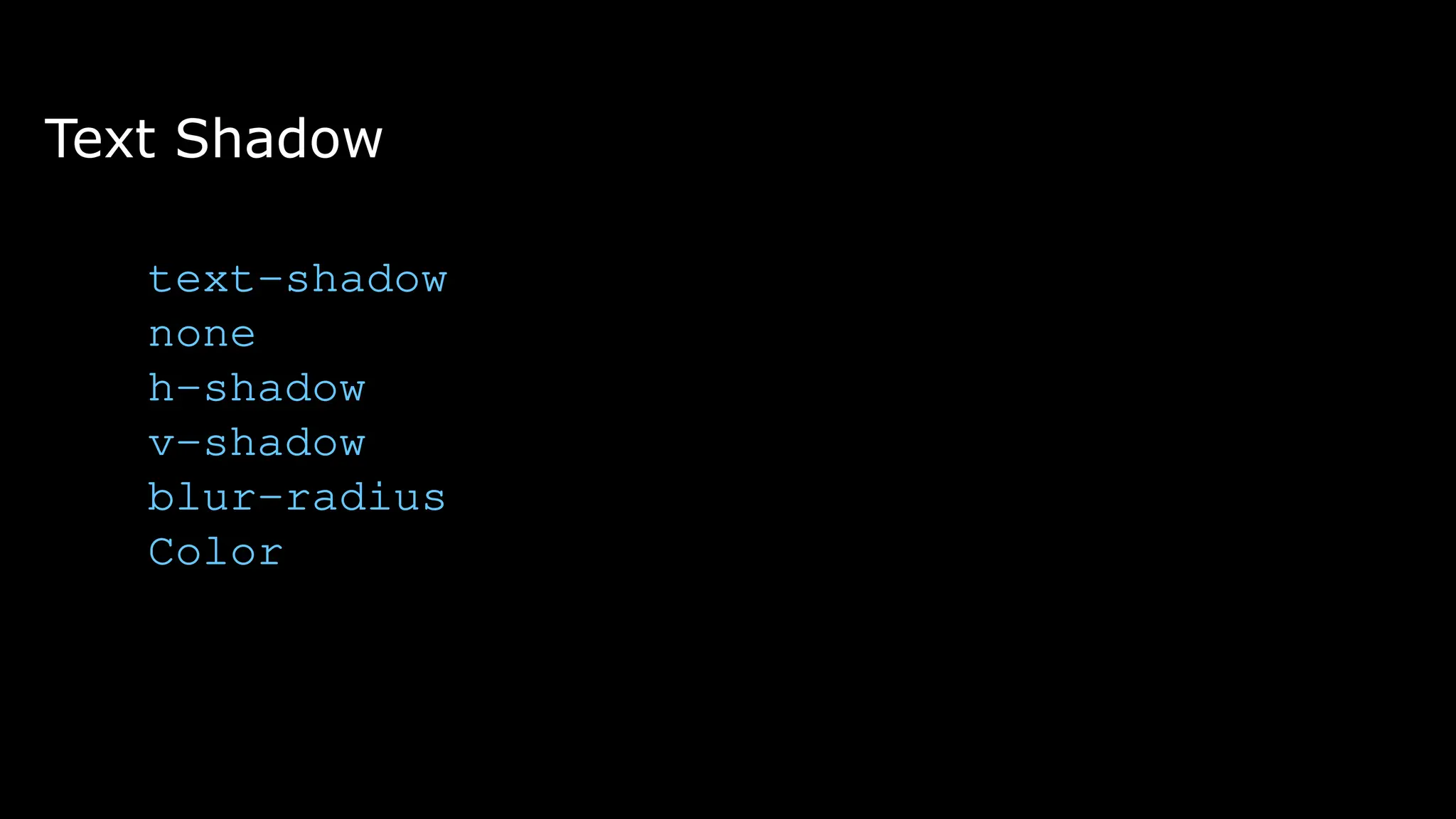
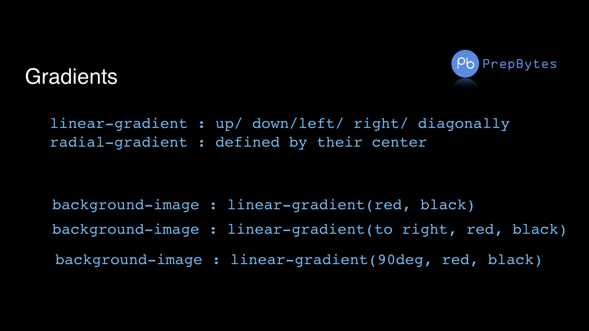
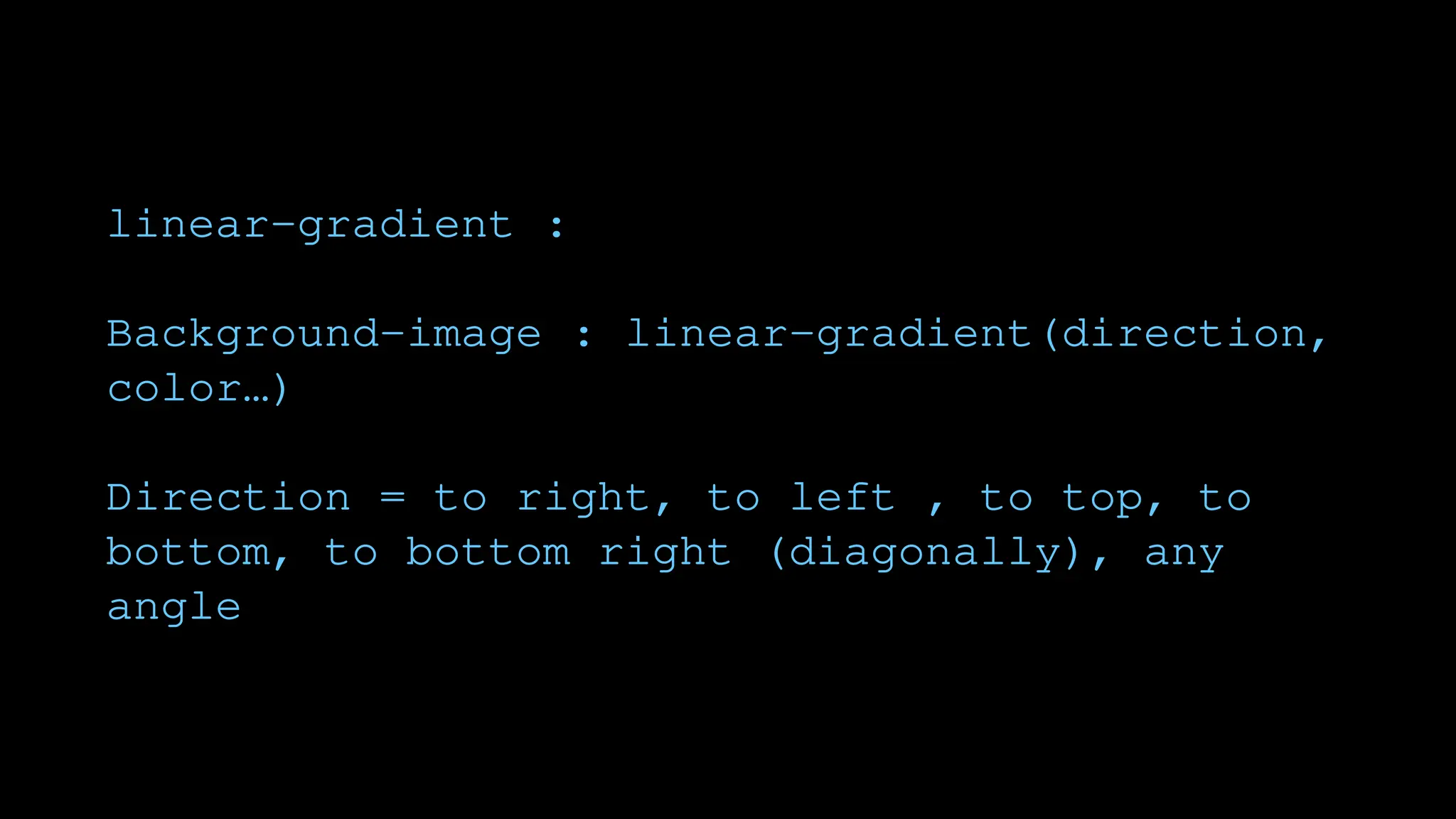
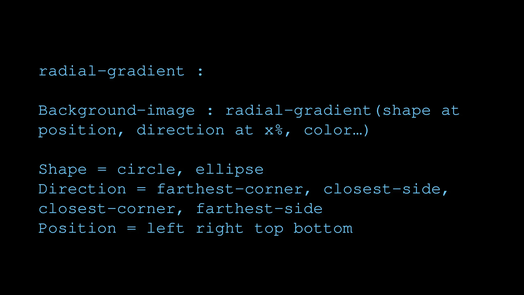
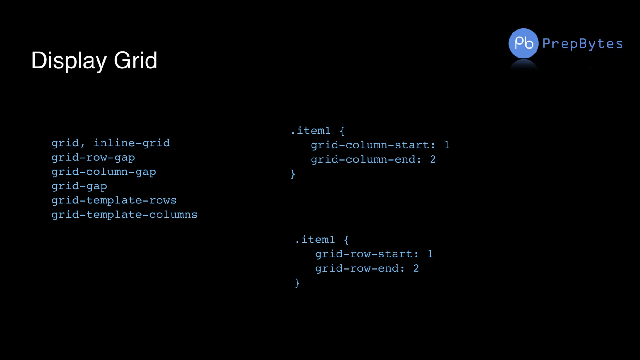
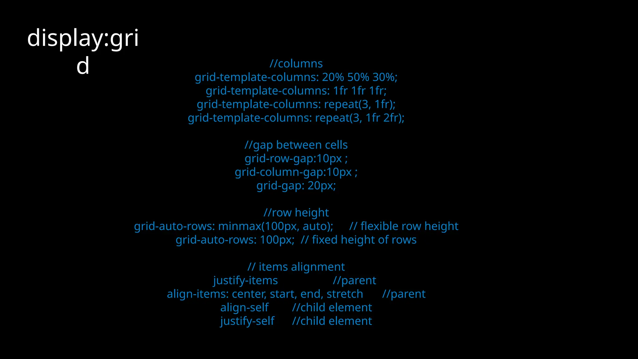
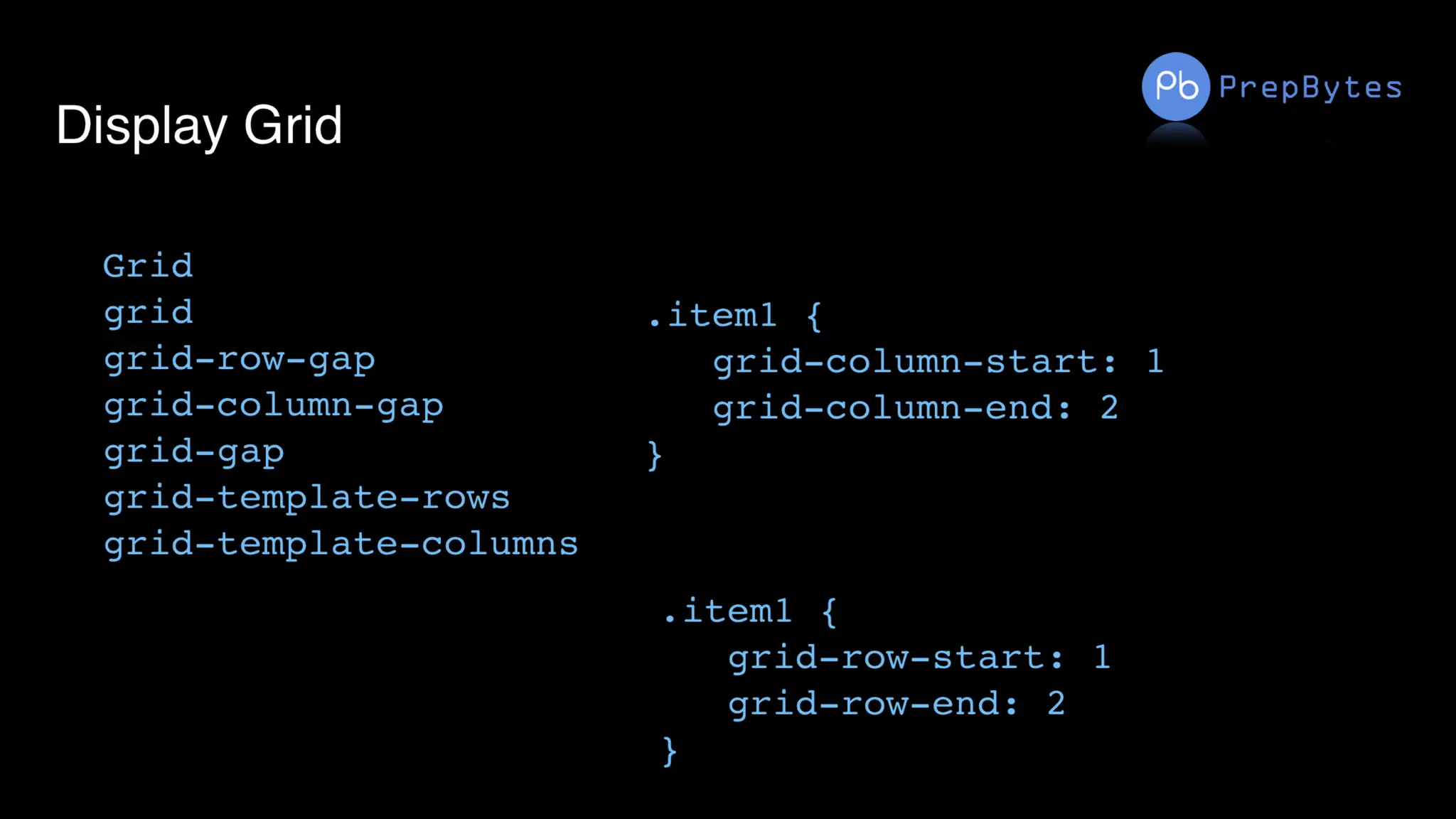
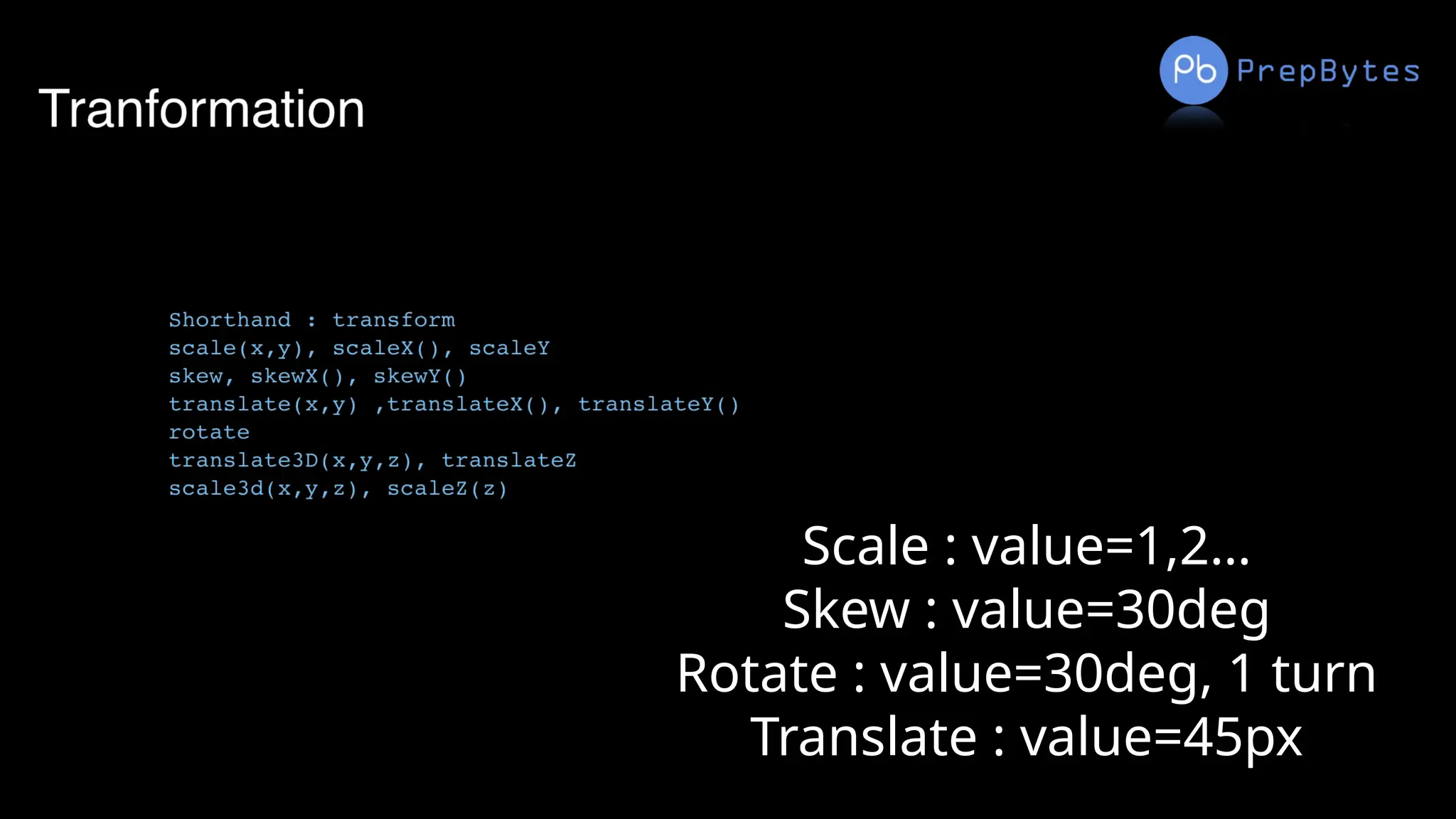
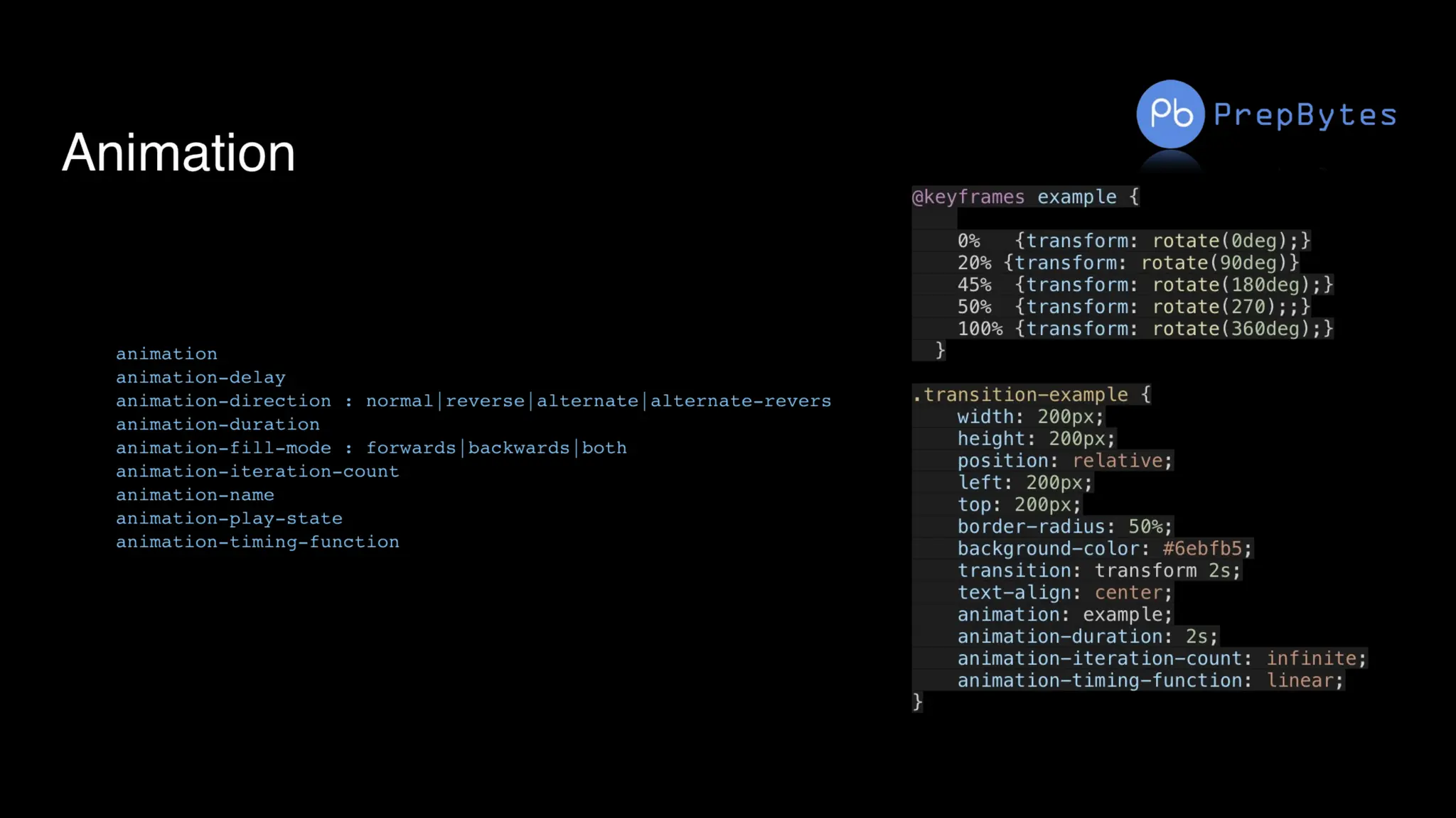
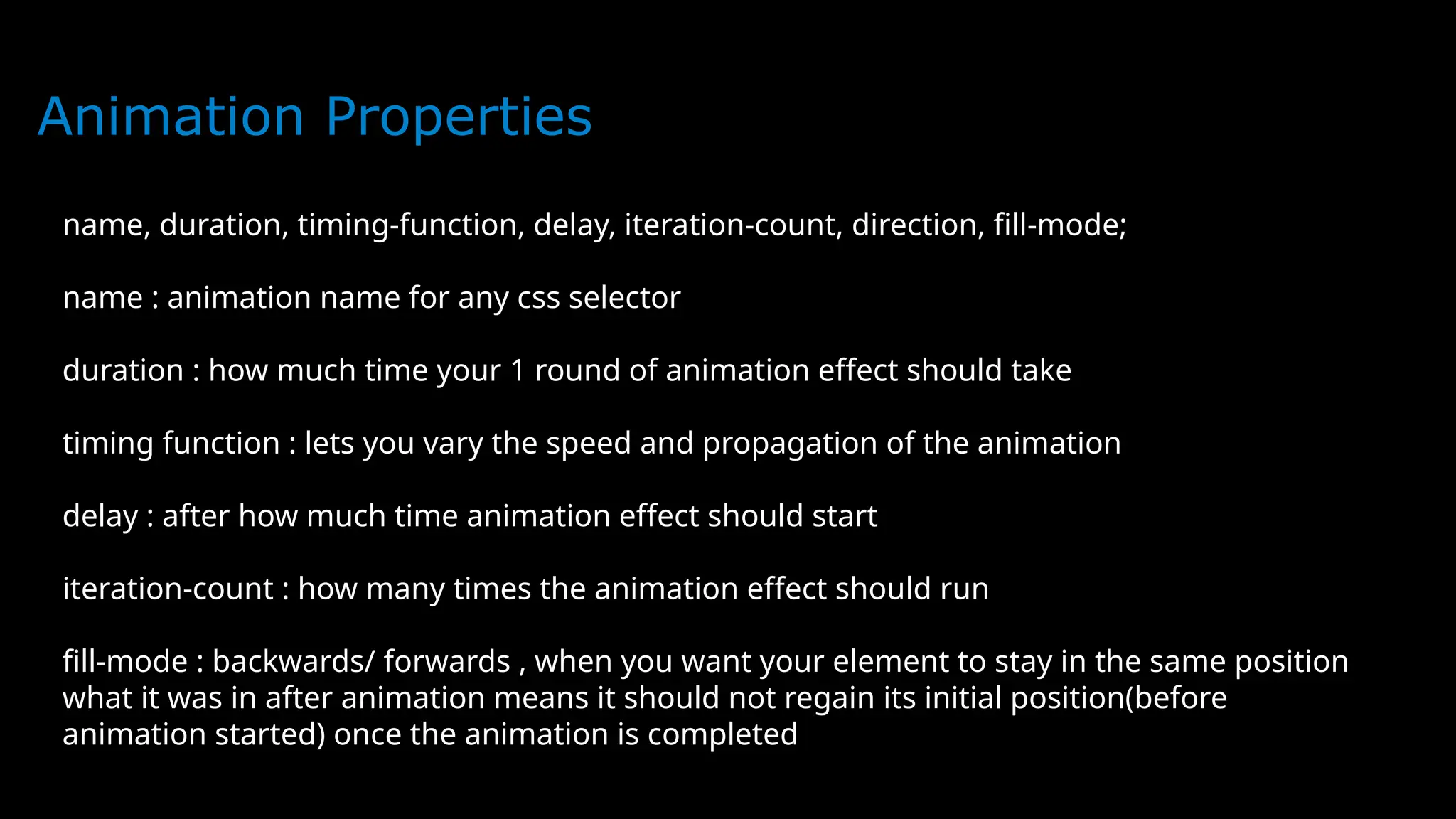
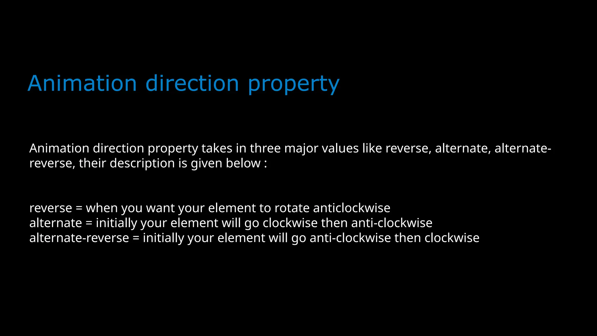
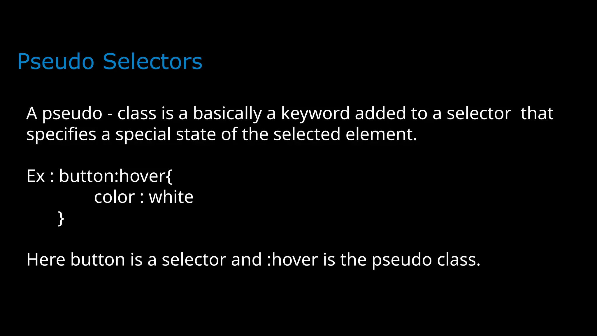
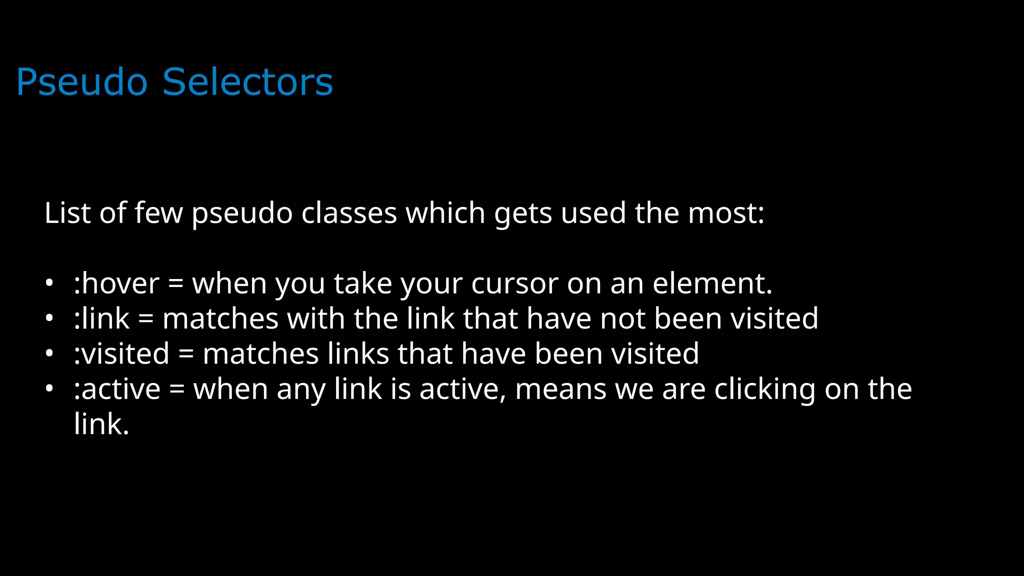
CSS
CSS - Cascading Style Sheet
Introduction to CSS
CSS stands for cascading style sheet. The saga of CSS
starts in 1994. CSS is also not a programming
language. CSS allows you to apply different styles to
your web page so that your page looks presentable and
attractive. It describes how HTML elements are to be
displayed on the screen. CSS adds color to our web
page. CSS really helps to format your web page and
saves you lots of time. HTML help to write content
like headings, paragraphs, buttons, images, forms, and
tables. While CSS determines things like color, font
size, positions of elements, align-items, and many
more.
Why Use CSS?
Now this question comes to everyone’s mind?
can we build a website without CSS? The
answer is yes you can. But your website looks
ugly it’s not presentable. No user will want
to visit your website. CSS adds color to your
website. It helps to format your web page.
HTML is the basic structure of your web page.
CSS helps to format your web page. Your
website looks attractive and presentable.
HTML was created to describe the content of a
web page.
Why Use CSS?
You can add CSS to Html page in three
different ways:
1.Inline CSS
2.Internal CSS
3.External CSS
Inline CSS
You can add inline CSS by using the ‘style’ attribute of the
HTML element. This way is mostly used when we need to apply
the style to one unique element.
EXAMPLE:
<!DOCTYPE html>
<html>
<head>
<title>INLINE STYLE</title>
</head>
<body>
<h1 style="color: red; background: black;">This is Example of
inline style</h1>
<p style="background: black; color: blue;">This is Example of
inline style</p>
</body>
</html>
Inline CSS
Output:
Internal CSS
The internal CSS is not the most preferred way
but this way is used when we need to apply
style for a single page. Internal CSS added in
<head> section within <style> tag.
Internal CSS
<!DOCTYPE html>
<html>
<head>
<title>Internal Style</title>
<style >
h1{
color: red;
background: blue;
}
p{
color: black;
background: blue;
}
</style>
</head>
<body>
<h1>This the Example of Internal Style</h1>
<p>This the Example of Internal Style</p>
</body>
</html>
Internal CSS
Output:
Output:
The output will be the same but method is
different:
External CSS
Output:
External CSS is most preferred way to add CSS to Website.
First of all create a separate CSS file with “.css”
extension.
Example:
External CSS
Output:
Add this file to <head> section of Html page by using the
<link> tag.
Example:
<!DOCTYPE html>
<html>
<head>
<title>Internal Style</title>
<link rel="stylesheet" type="text/css" href="style.css">
</head>
<body>
<h1>This the Example of Internal Style</h1>
<p>This the Example of Internal Style</p>
</body>
</html>
External CSS
Output:
Output:
The result of external CSS is also same but the method of
writing CSS code is different.
Priority of Styles in CSS
Output:
Inline vs Internal css Inline
Inline V
Internal vs External css Internal
Inline vs External css Inline
CSS Selectors
Output:
CSS Selectors Types
If we want to apply Styles (CSS) on any HTML element we need
to select the particular element first. CSS selectors used
to select the HTML elements that we want to style. HTML
elements selected by their id, class, and attribute, etc.
There are many types of selectors in CSS that we can use but
the important types of selectors in CSS that everyone must
learn are these:
Universal Selector
Element Selector
Id Selector
Class Selector
Group Selector
Id Selector
Output:
CSS Id selector selects the HTML elements by their id. Id
attribute used to assign an id to HTML element. The id of
every HTML element must unique. So the Id selector used
when we want to apply style on the unique HTML element.
The Id name of an HTML element always written with the (#)
character.
</html>
Id Selector
Output:
Example:
<!DOCTYPE html>
<html>
<head>
<title>id selector</title><style>
#box{
color: white;
background: black;
}
</style>
</head>
<body>
<h1 id="box">id Selector</h1>
</body>
</html>
Class Selector
Output:
CSS class selector selects the HTML elements by their
class. The class attribute of HTML elements used to assign
an id to the HTML element.
The class name of HTML element always written with the (.)
character.
</html>
Class Selector
Output:
Example:
<!DOCTYPE html>
<html>
<head>
<title>class selector</title>
<style>
.box{
color: white;
background: black;
}
</style>
</head>
<body>
<h1 class="box">class Selector</h1>
</body>
</html>
</html>
Fonts
font-family
font-style
color
font-weight
text-decoration
font-size
letter-spacing
Font Family
In CSS, we use the font-family property to specify the font of a
text.
The font-family property specifies the font for an element.
The font-family property can hold several font names as a
"fallback" system. If the browser does not support the first font,
it tries the next font.
There are two types of font family names:
family-name - The name of a font-family, like "times", "courier",
"arial", etc.
generic-family - The name of a generic-family, like "serif",
"sans-serif", "cursive", "fantasy", "monospace".
Start with the font you want, and always end with a generic
family, to let the browser pick a similar font in the generic
family, if no other fonts are available.
Font Family
<!DOCTYPE html>
<html>
<head>
<style>
.p1 {
font-family: "Times New Roman", Times,
serif;
}
.p2 {
font-family: Arial, Helvetica, sans-serif;
}
.p3 {
font-family: "Lucida Console", "Courier
New", monospace;
}
Font Family
</style>
</head>
<body>
<h1>CSS font-family</h1>
<p class="p1">This is a paragraph, shown in the Times New Roman
font.</p>
<p class="p2">This is a paragraph, shown in the Arial font.</p>
<p class="p3">This is a paragraph, shown in the Lucida Console
font.</p>
</body>
</html>
Font Family
Output:
Font Style
The font-style property is mostly used to
specify italic text.
This property has three values:
normal - The text is shown normally
italic - The text is shown in italics
oblique - The text is "leaning" (oblique is
very similar to italic, but less supported)
Font Style
<!DOCTYPE html>
<html>
<head>
<style>
body{
background:black;
color:white;
font-size:20px;
}
p.normal {
font-style: normal;
}
Font Style
p.italic {
font-style: italic;
}
p.oblique {
font-style: oblique;
}
</style>
</head>
<body>
<h1>The font-style property</h1>
<p class="normal">This is a paragraph in normal
style.</p>
Font Style
<p class="italic">This is a paragraph in italic
style.</p>
<p class="oblique">This is a paragraph in oblique
style.</p>
</body>
</html>
Font Style
Output:
color
The color property is used to set the color
of the text. The color is specified by:
a color name - like "red"
a HEX value - like "#ff0000"
an RGB value - like "rgb(255,0,0)"
The default text color for a page is defined in the body selector.
color
<!DOCTYPE html>
<html>
<head>
<style>
body {
color: blue;
background-color:black;
}
h1 {
color: green;
}
</style>
</head>
<body>
<h1>This is heading 1</h1>
<p>This is an ordinary paragraph. Notice that this text is blue. The default text
color for a page is defined in the body selector.</p>
<p>Another paragraph.</p>
</body>
</html>
color
Font-Weight
The font-weight property sets how thick or thin characters in text should be displayed.
The font-weight property sets how thick or thin
characters in text should be displayed.
font-weight: normal|bold|bolder|lighter|number|
initial|inherit;
Font-Weight
The font-weight property sets how thick or thin characters in text should be displayed.
<!DOCTYPE html>
<html>
<head>
<style>
p.normal {
font-weight: normal;
}
p.light {
font-weight: lighter;
}
p.thick {
font-weight: bold;
}
p.thicker {
font-weight: 900;
}
Font-Weight
The font-weight property sets how thick or thin characters in text should be displayed.
</style>
</head>
<body>
<h1>The font-weight Property</h1>
<p class="normal">This is a paragraph.</p>
<p class="light">This is a paragraph.</p>
<p class="thick">This is a paragraph.</p>
<p class="thicker">This is a paragraph.</p>
</body>
</html>
Font-Weight
The font-weight property sets how thick or thin characters in text should be displayed.
text-decoration
The font-weight property sets how thick or thin characters in text should be displayed.
The text-decoration shorthand CSS property sets the appearance of
decorative lines on text. It is a shorthand for text-decoration-line,
text-decoration-color, text-decoration-style, and the newer text-
decoration-thickness property.
Value Description
text-decoration-line Sets the kind of text decoration to
use (like underline, overline, line-through)
text-decoration-color Sets the color of the text decoration
text-decoration-style Sets the style of the text decoration
(like solid, wavy, dotted, dashed, double)
initial Sets this property to its default
value. Read about initial
inherit Inherits this property from its parent
element. Read about inherit
text-decoration
The font-weight property sets how thick or thin characters in text should be displayed.
<!DOCTYPE html>
<html>
<head>
<style>
body{
background:black;
color:white;
}
h1 {
text-decoration: overline;
}
h2 {
text-decoration: line-through;
}
text-decoration
The font-weight property sets how thick or thin characters in text should be displayed.
h3 {
text-decoration: underline;
}
h4 {
text-decoration: underline overline;
}
</style>
</head>
<body>
text-decoration
The font-weight property sets how thick or thin characters in text should be displayed.
font-size
The font-weight property sets how thick or thin characters in text should be displayed.
The font-size property sets the size of a font.
font-size:medium|xx-small|x-small|small|large|x-large|xx-
large|smaller|larger|length|initial|inherit;
font-size
The font-weight property sets how thick or thin characters in text should be displayed.
<!DOCTYPE html>
<html>
<head>
<style>
div.a {
font-size: 15px;
}
div.b {
font-size: large;
}
div.c {
font-size: 150%;
}
</style>
</head>
<body>
<h1>The font-size Property</h1>
font-size
The font-weight property sets how thick or thin characters in text should be displayed.
<div class="a">This is some text.</div>
<div class="b">This is some text.</div>
<div class="c">This is some text.</div>
</body>
</html>
font-size
The font-weight property sets how thick or thin characters in text should be displayed.
Output:
letter-spacing
The font-weight property sets how thick or thin characters in text should be displayed.
The letter-spacing property increases or decreases the space between
characters in a text.
<!DOCTYPE html>
<html>
<head>
<style>
h1 {
letter-spacing: 15px;
}
h2 {
letter-spacing: 2px;
}
h3 {
letter-spacing: -1px;
}
letter-spacing
The font-weight property sets how thick or thin characters in text should be displayed.
</head>
<body>
<h1>This is heading 1</h1>
<h2>This is heading 2</h2>
<h3>This is heading 3</h3>
</body>
</html>
letter-spacing
The font-weight property sets how thick or thin characters in text should be displayed.
Output:
Margin
The font-weight property sets how thick or thin characters in text should be displayed.
To shorten the code, it is possible to specify all the margin properties in one property.
The CSS margin properties are used to create space around elements,
outside of any of any defined borders.
margin-top
margin-right
margin-bottom
margin-left
So, here is how it works:
If the margin property has four
values:
margin: 25px 50px 75px 100px;
top margin is 25px
right margin is 50px
bottom margin is 75px
Margin
The font-weight property sets how thick or thin characters in text should be displayed.
To shorten the code, it is possible to specify all the margin properties in one property.
If the margin property has three values:
margin: 25px 50px 75px;
top margin is 25px
right and left margins are 50px
bottom margin is 75px
If the margin property has
two values:
margin: 25px 50px;
top and bottom margins are
25px
right and left margins are
50px
If the margin property has one value:
margin: 25px; all four margins are 25px
Margin
The font-weight property sets how thick or thin characters in text should be displayed.
<!DOCTYPE html>
<html>
<head>
<style>
div {
border: 1px solid black;
margin-top: 100px;
margin-bottom: 100px;
margin-right: 150px;
margin-left: 80px;
background-color: red;
}
</style>
</head>
<body>
<h2>Using individual margin
properties</h2>
<div>This div element has a top margin
of 100px, a right margin of 150px, a
bottom margin of 100px, and a left
margin of 80px.</div>
</body>
</html>
Margin
The font-weight property sets how thick or thin characters in text should be displayed.
Output:
Padding
The font-weight property sets how thick or thin characters in text should be displayed.
The CSS padding properties are used to generate space around
an element's content, inside of any defined borders.
CSS has properties for specifying the padding for each side of an element:
padding-top
padding-right
padding-bottom
padding-left
If the padding property has four values:
padding: 25px 50px 75px 100px;
top padding is 25px
right padding is 50px
bottom padding is 75px
left padding is 100px
If the padding property has three
values:
padding: 25px 50px 75px;
top padding is 25px
right and left paddings are 50px
bottom padding is 75px
Padding
The font-weight property sets how thick or thin characters in text should be displayed.
If the padding property has two values:
padding: 25px 50px;
top and bottom paddings are 25px
right and left paddings are 50px
If the padding property has one
value:
padding: 25px;
all four paddings are 25px
Padding
The font-weight property sets how thick or thin characters in text should be displayed.
<!DOCTYPE html>
<html>
<head>
<style>
div {
border: 1px solid black;
background-color: red;
padding-top: 50px;
padding-right: 30px;
padding-bottom: 50px;
padding-left: 80px;
}
</style>
</head>
<body>
<h2>Using individual padding properties</h2>
<div>This div element has a top padding of 50px, a right padding of 30px, a bottom
padding of 50px, and a left padding of 80px.</div>
</body>
</html>
Padding
The font-weight property sets how thick or thin characters in text should be displayed.
Border
The font-weight property sets how thick or thin characters in text should be displayed.
The CSS border properties allow you to specify the style, width, and color of an
element's border.
The border-style property specifies what kind of border to display.
The following values are allowed:
dotted - Defines a dotted border
dashed - Defines a dashed border
solid - Defines a solid border
double - Defines a double border
groove - Defines a 3D grooved border. The effect depends on the border-color
value
ridge - Defines a 3D ridged border. The effect depends on the border-color value
inset - Defines a 3D inset border. The effect depends on the border-color value
outset - Defines a 3D outset border. The effect depends on the border-color
value
none - Defines no border
hidden - Defines a hidden border
The border-style property can have from one to four values (for the top border,
right border, bottom border, and the left border).
The font-weight property sets how thick or thin characters in text should be displayed.
<!DOCTYPE html>
<html>
<head>
<style>
body{
background:black;
color:white
}
p.dotted {border-style: dotted;}
p.dashed {border-style: dashed;}
p.solid {border-style: solid;}
p.double {border-style: double;}
p.groove {border-style: groove;}
p.ridge {border-style: ridge;}
p.inset {border-style: inset;}
p.outset {border-style: outset;}
p.none {border-style: none;}
p.hidden {border-style: hidden;}
</style>
</head>
<body>
Example
The font-weight property sets how thick or thin characters in text should be displayed.
<h2>The border-style Property</h2>
<p>This property specifies what kind of border
to display:</p>
<p class="dotted">A dotted border.</p>
<p class="dashed">A dashed border.</p>
<p class="solid">A solid border.</p>
<p class="double">A double border.</p>
<p class="groove">A groove border.</p>
<p class="ridge">A ridge border.</p>
<p class="inset">An inset border.</p>
<p class="outset">An outset border.</p>
<p class="none">No border.</p>
<p class="hidden">A hidden border.</p>
</body>
</html>
Example
The font-weight property sets how thick or thin characters in text should be displayed.
Example
The font-weight property sets how thick or thin characters in text should be displayed.
The border-radius property defines the radius of the element's
corners.
Tip: This property allows you to add rounded corners to elements!
This property can have from one to four values. Here are the rules:
Four values - border-radius: 15px 50px 30px 5px; (first value
applies to top-left corner, second value applies to top-right
corner, third value applies to bottom-right corner, and fourth
value applies to bottom-left corner)
Three values - border-radius: 15px 50px 30px; (first value applies
to top-left corner, second value applies to top-right and bottom-
left corners, and third value applies to bottom-right corner)
Two values - border-radius: 15px 50px; (first value applies to top-
left and bottom-right corners, and the second value applies to top-
right and bottom-left corners):
One value - border-radius: 15px; (the value applies to all four
corners, which are rounded equally:
Border-radius
The font-weight property sets how thick or thin characters in text should be displayed.
<!DOCTYPE html>
<html>
<head>
<style>
#example1 {
border: 2px solid red;
padding: 10px;
border-radius: 25px;
}
#example2 {
border: 2px solid red;
padding: 10px;
border-radius: 50px 20px;
}
</style>
</head>
<body>
Border-radius
The font-weight property sets how thick or thin characters in text should be displayed.
<h2>border-radius: 25px:</h2>
<div id="example1">
<p>The border-radius property defines the radius of
the element's corners.</p>
</div>
<h2>border-radius: 50px 20px:</h2>
<div id="example2">
<p>If two values are set; the first one is for the
top-left and bottom-right corner, the second one for
the top-right and bottom-left corner.</p>
</div>
</body>
</html>
Border-radius
The font-weight property sets how thick or thin characters in text should be displayed.
Border-radius
The font-weight property sets how thick or thin characters in text should be displayed.
<!DOCTYPE html>
<html>
<head>
<style>
body {
background-color: lightblue;
}
</style>
</head>
<body>
<h1>Hello World!</h1>
<p>This page has a light blue background color!</p>
</body>
</html>
The CSS background properties are used to add
background effects for elements.
Background
The font-weight property sets how thick or thin characters in text should be displayed.
Output:
Background
The font-weight property sets how thick or thin characters in text should be displayed.
The background-image property sets one or more background
images for an element.
By default, a background-image is placed at the top-left
corner of an element, and repeated both vertically and
horizontally.
The background of an element is the total size of the
element, including padding and border (but not the margin).
Background-image
Background-image
<!DOCTYPE html>
<html>
<head>
<style>
body {
background-image: url("img_tree.gif");
background-color: #cccccc;
}
</style>
</head>
<body>
</body>
</html>
Background-image
Output:
Background-Size
The background-size property specifies the size of the background
images.
There are four different syntaxes you can use with this property:
the keyword syntax ("auto", "cover" and "contain"), the one-value
syntax (sets the width of the image (height becomes "auto"), the
two-value syntax (first value: width of the image, second value:
height), and the multiple background syntax (separated with comma).
background-size: auto|length|cover|contain|initial|inherit;
auto Default value. The background image is displayed in its
original size
cover Resize the background image to cover the entire
container, even if it has
to stretch the image or cut a little bit off one
of the edges
contain Resize the background image to make sure the image is
Background-Size
<!DOCTYPE html>
<html>
<head>
<style>
#example1 {
border: 2px solid black;
padding: 25px;
background: url(mountain.jpg);
background-repeat: no-repeat;
background-size: auto;
}
#example2 {
border: 2px solid black;
padding: 25px;
background: url(mountain.jpg);
background-repeat: no-repeat;
background-size: 300px 100px;
}
Background-Size
<</style>
</head>
<body>
<h2>background-size: auto (default):</h2>
<div id="example1">
<h2>Hello World</h2>
<p>The background image is displayed in its original size.</p>
</div>
h2>background-size: 300px 100px:</h2>
<div id="example2">
<h2>Hello World</h2>
<p>Here, the background image is set to 300px wide and 100px
high.</p>
</div>
</body>
</html>
Background-Size
Output:
Display Property
The display property is the most important
CSS property for controlling layout.
The display property specifies if/how an
element is displayed.
Every HTML element has a default display
value depending on what type of element it
is. The default display value for most
elements is block or inline.
Display-block
Block-level Elements
A block-level element always starts on a new line and takes up
the full width available (stretches out to the left and right
as far as it can).
Examples of block-level elements:
<div>
<h1> - <h6>
<p>
<form>
<header>
<footer>
<section>
Display-block
Block: This property is used as the default
property of div. This property places the div one
after another vertically. The height and width of
the div can be changed using the block property if
the width is not mentioned, then the div under block
property will take up the width of the container.
Display-block
<!DOCTYPE html>
<html>
<head>
<title>CSS | Display property</title>
<style>
#geeks1{
height: 100px;
width: 200px;
background: teal;
display: block;
}
#geeks2{
height: 100px;
width: 200px;
background: cyan;
display: block;
}
#geeks3{
height: 100px;
width: 200px;
background: green;
display: block;
}
Display-block
.gfg {
margin-left:20px;
font-size:42px;
font-weight:bold;
color:#009900;
}
.geeks {
font-size:25px;
margin-left:30px;
}
.main {
margin:50px;
text-align:center;
}
</style>
</head>
<body>
<div class = "gfg">GeeksforGeeks</div>
<div class = "geeks">display: block; property</div>
<div class = "main">
<div id="geeks1">Block 1 </div>
<div id="geeks2">Block 2</div>
<div id="geeks3">Block 3</div>
</div>
</body>
</html>
Display-block
Output:
Display-Inline
Inline: This property is the default property of anchor
tags. This is used to place the div inline i.e. in a
horizontal manner. The inline display property ignores the
height and the width set by the user.
Display-Inline
<!DOCTYPE html>
<html>
<head>
<title>CSS | Display
property</title>
<style>
body{
background:black;
}
#main{
height: 200px;
width: 200px;
background: teal;
display: inline;
}
#main1{
height: 200px;
width: 200px;
background: cyan;
display: inline;
}
Display-Inline
#main2{
height: 200px;
width: 200px;
background: green;
display: inline;
}
.gfg {
margin-left:20px;
font-size:42px;
font-weight:bold;
color:#009900;
}
.geeks {
font-size:25px;
margin-left:30px;
}
.main {
margin:50px;
}
</style>
</head>
<body>
<div class = "gfg">GeeksforGeeks</div>
<div class = "geeks">display: inline;
property</div>
Display-Inline
<div class = "main">
<div id="main"> BLOCK 1 </div>
<div id="main1"> BLOCK 2</div>
<div id="main2">BLOCK 3 </div>
</div>
</body>
</html>
Display-Inline
Output:
Display-Inline-block
Inline-block: This features uses the both properties
mentioned above, block and inline. So, this property
aligns the div inline but the difference is it can edit
the height and the width of block. Basically, this will
align the div both in block and inline fashion.
Display-Inline-block
<!DOCTYPE html>
<html>
<head>
<title>CSS | Display property</title>
<style>
#main{
height: 100px;
width: 200px;
background: teal;
display: inline-block;
}
#main1{
height: 100px;
width: 200px;
background: cyan;
display: inline-block;
}
#main2{
height: 100px;
width: 150px;
background: green;
display: inline-block;
}
Display-Inline-block
.gfg {
margin-left:200px;
font-size:42px;
font-weight:bold;
color:#009900;
}
.geeks {
font-size:25px;
margin-left:210px;
}
.main {
margin:50px;
}
</style>
</head>
<body>
<div class = "gfg">GeeksforGeeks</div>
<div class = "geeks">display: Inline-
block; property</div>
<div class = "main">
<div id="main"> BLOCK 1 </div>
<div id="main1"> BLOCK 2</div>
<div id="main2">BLOCK 3 </div>
</div>
</body>
</html>
Display-Inline-block
Display-none
None: This property hides the div or the container which
use this property. Using it on one of the div it will make
working clear.
Display-none
<!DOCTYPE html>
<html>
<head>
<title>CSS | Display property</title>
<style>
#main{
height: 100px;
width: 200px;
background: teal;
display: block;
}
#main1{
height: 100px;
width: 200px;
background: cyan;
display: none;
}
#main2{
height: 100px;
width: 200px;
background: green;
display: block;
}
Display-none
.gfg {
margin-left:20px;
font-size:42px;
font-weight:bold;
color:#009900;
}
.geeks {
font-size:25px;
margin-left:20px;
}
.main {
margin:50px;
}
</style>
</head>
<body>
<div class = "gfg">GeeksforGeeks</div>
<div class = "geeks">display: none;
property</div>
<div class = "main">
<div id="main"> BLOCK 1 </div>
<div id="main1"> BLOCK 2</div>
<div id="main2">BLOCK 3 </div>
</div>
</body>
</html>
Display-none
Output:
Display-flex
The flex CSS shorthand property is the combination of flex-
grow, flex-shrink, and flex-basis property. It is used to set
the length of flexible items. The flex property is much
responsive and mobile-friendly. It is easy to position child
elements and the main container. The margin doesn’t collapse
with the content margins. The order of any element can be
easily changed without editing the HTML section.
Syntax:
flex: flex-grow flex-shrink flex-basis|auto|initial|inherit;
Property Values:
● flex-grow Property: A number that specifies, how much items
will grow relative to the rest of the flexible items.
Display-flex
● flex-shrink Property: A number that specifies, how much
items will shrink relative to the rest of the flexible
items.
● flex-basis Property: It sets the length of items. Legal
values of flex-basis are: auto, inherit, or a number
followed by %, em, px, or any other length unit.
○ flex-wrap Property: The CSS flex-wrap property is used to
specify whether flex items are forced into a single line o
Display-flex
○ wrapped onto multiple lines.
The flex property can be specified with the help of 1, 2 or 3 values:
● One-value syntax: the value should contain one of following:
○ number: If it is represented as flex: <number> 1 0; then the
value of flex-shrink, flex-basis will supposed to be 1 & 0
respectively.
○ It can be specified by one of the keyword as auto, none or
initial.
● Two-value syntax: It must contains the following values:
○ The first value should be the number that will represent the
flex-grow.
Display-flex
○ The second value should contain one of the following:
■ number: If it is number then it will represented as flex-
shrink.
■ a width with the valid value will represents the flex-
basis.
● Three-value syntax: The values should be in the same order:
○ first number represents the flex-grow.
○ second number represents the flex-shrink.
○ a width with the valid value will represents the flex-basis.
Display-flex
<!DOCTYPE html>
<html>
<head>
<title> CSS flex Property </title>
<style>
#Geeks {
width: 300px;
height: 200px;
border: 1px solid black;
display: flex;
}
Display-flex
#Geeks div {
flex: 1;
}
.GFG1 {
background-color: green;
}
.GFG2 {
background-color: lightgreen;
}
.GFG3 {
background-color: darkgreen;
Display-flex
</style>
</head>
<body>
<h2>CSS flex Property</h2>
<div id="Geeks">
<div class="GFG1"> GeeksforGeeks </div>
<div class="GFG2"> Lite Content </div>
<div class="GFG3"> Special Content </div>
</div>
</body>
Display-flex
Output:
Display-flex
Display-flex
Display-flex
Display-flex
Display-flex
Display-Grid
The CSS grid layout module is used to create a grid-based layout system, with the
help of rows and columns it makes it easier to design any webpage without using floats
and positioning.
syntax:
.class {
display:grid;
}
Note: An HTML element becomes a grid if that element sets display: grid; in style
section or inline-grid. Below you will see both examples.
CSS Grid Layout Properties: These are the following grid-layout properties:
● column-gap: It is used to specify the amount of gap between the columns in which a
given text is divided using the column-count property.
● gap: It is used to set the spacing also caller gutter between the rows and columns.
● grid: It offers a grid-based layout system, with rows and columns, making it easier to
design web pages without floats and positioning.
● grid-area: It is used to set a grid item size and location in a grid layout.
Display-Grid
● grid-auto-columns: It is used to specify the size for the columns of implicitly
generated grid containers.
● grid-auto-flow: It specifies exactly how auto-placed items get flow into the grid.
● grid-auto-rows: It is used to specify the size for the rows of implicitly generated grid
containers.
● grid-column: It describes the number of properties that allow to design of grid
structures and control the placement of grid items using CSS.
● grid-column-end: It explains the number of columns an item will span, or on which
column-line the item will end.
● grid-column-gap: It is used to set the size of the gap between the columns in a grid
layout.
● grid-column-start: It defines for which column line item will start.
● grid-gap: It is used to sets the size of the gap between the rows and columns in a
grid layout.
Display-Grid
● grid-row: It is used to specify the size and location in a grid layout.
● grid-row-end: It is used to define the grid item’s end position within a grid row by
specifying the inline edge of its grid area.
● grid-row-gap: It is used to define the size of the gap between the grid elements.
● grid-row-start: It is used to define the grid items’ start position within the grid row by
specifying the inline start edge of its grid area.
● grid-template: It is a shorthand property for defining grid columns, rows, and areas.
● grid-template-areas: It is used to specify the area within the grid layout.
● grid-template-columns: It is used to set the number of columns and size of the
columns of the grid.
● grid-template-rows: It is used to set the number of rows and height of the rows in a
grid.
Display-Grid
<!DOCTYPE html>
<html>
<head>
<style>
/* Designing all grid */
.grid-container {
display: grid;
grid-template-columns: auto auto auto;
background-color: gray;
padding: 5px;
Display-Grid
/* Designing all grid-items */
.grid-item {
background-color: rgba(255, 255,
255, 0.8);
border: 1px solid black;
padding: 20px;
font-size: 30px;
text-align: center;
}
Display-Grid
/* Designing h1 element */
h1 {
color: green;
text-align: center;
</style>
</head>
Display-Grid
class="grid-item">8</div>
<div class="grid-
item">9</div>
</div>
</body>
</html>
<body>
<h1>GeeksforGeeks</h1>
<!-- Creating grid -->
<div class="grid-container">
<div class="grid-item">1</div>
<div class="grid-item">2</div>
<div class="grid-
item">3</div>
<div class="grid-
item">4</div>
<div class="grid-
item">5</div>
<div class="grid-
item">6</div>
<div class="grid-
item">7</div>
Display-Grid
Output:
Display-Grid
Display-Grid
Display-Grid
Display-Grid
Display-Grid
Display-Grid
Position
The position property in CSS tells about the method of
positioning for an element or an HTML entity. There are five
different types of position property available in CSS:
● Fixed
● Static
● Relative
● Absolute
● Sticky
The positioning of an element can be done using the top, right,
bottom, and left properties. These specify the distance of an
HTML element from the edge of the viewport. To set the position
by these four properties, we have to declare the positioning
method. Let’s understand each of these position methods in
detail:
Position Sticky
position: static;
HTML elements are positioned static by default.
Static positioned elements are not affected by the top,
bottom, left, and right properties.
An element with position: static; is not positioned in
any special way; it is always positioned according to the
normal flow of the page:
Position relative
position: relative;
An element with position: relative; is positioned
relative to its normal position.
Setting the top, right, bottom, and left properties of a
relatively-positioned element will cause it to be
adjusted away from its normal position. Other content
will not be adjusted to fit into any gap left by the
element.
Position fixed
position: fixed;
An element with position: fixed; is positioned relative to the
viewport, which means it always stays in the same place even
if the page is scrolled. The top, right, bottom, and left
properties are used to position the element.
A fixed element does not leave a gap in the page where it
would normally have been located.
Position absolute
position: absolute;
An element with position: absolute; is positioned relative to the
nearest positioned ancestor (instead of positioned relative to the
viewport, like fixed).
However; if an absolute positioned element has no positioned ancestors,
it uses the document body, and moves along with page scrolling.
Note: Absolute positioned elements are removed from the normal flow,
and can overlap elements.
Position
Visibility
The visibility property specifies whether or not an
element is visible.
Hidden elements take up space on the page. Use the
display property to both hide and remove an element from
the document layout!
Visibility
visibility: visible|hidden|collapse|
initial|inherit;
<!DOCTYPE html>
<html>
<head>
<style>
body{
background:black;
color:white
}
h2.a {
visibility: visible;
}
h2.b {
visibility: hidden;
}
Visibility
</style>
</head>
<body>
<h1>The visibility Property</h1>
<h2 class="a">This heading is visible</h2>
<h2 class="b">This heading is hidden</h2>
<p>Notice that the hidden heading still takes up space on the page.</p>
</body>
</html>
Visibility
Output:
display:none vs hidden
Float
The float CSS property is used to position the elements to
the left, right, of its container along with permitting the
text and inline elements to wrap around it. The float
property defines the flow of content in the page. The
remaining elements will be part of the flow if the element
is removed from the normal flow of the content. This
property is ignored by the absolutely positioned elements.
It can be written in a CSS file or can be directly
specified in the style of an element.
Float
float: none|left|right|initial|inherit;
Property values:
none: This is the default value & the element does not
float.
left: Element floats on the left side of the container.
right: Element floats on the right side of the container.
initial Element will be set to its default value.
inherit: Element inherits floating property of its parent
property.
Float left
<!DOCTYPE html>
<html>
<head>
<title>Float</title>
</head>
<style>
body{
background:black;
}
</style>
<body>
<div class="GFG" style="font-size:40px;
color:white; float:left;"> prepbytes </div>
</body>
</html>
Output:
Float right
<!DOCTYPE html>
<html>
<head>
<title>Float</title>
</head>
<style>
body{
background:black;
}
</style>
<body>
<div class="GFG" style="font-size:40px;
color:white; float:right;"> prepbytes </div>
</body>
</html>
Output:
Float
clear
The clear property is used to specify that which side of
floating elements are not allowed to float. It sets or
returns the position of the element in relation to floating
objects. If the element can fit horizontally in the space
next to another element which is floated, it will.
Syntax:
clear: none|left|right|both|initial;
Property values:
none: It has a default value. It allows element are float
on both the sides.
clear
Z-index
The z-index property is used to displace elements on the z-
axis i.e in or out of the screen. It is used to define the
order of elements if they overlap on each other.
Syntax:
z-index: auto|number|initial|inherit;
Property values:
auto: The stack order is equal to that of the
parent(default).
number: The stack order depends in the number.
initial: Sets the property to its default value.
inherit: Inherits the property from the parent element.
Z-index
<!DOCTYPE html>
<html>
<head>
<style>
.container {
position: relative;
}
.black-box {
position: relative;
z-index: 1;
border: 2px solid black;
height: 100px;
margin: 30px;
}
.gray-box {
position: absolute;
z-index: 3; /* gray box will be above both green and black box */
background: lightgray;
height: 60px;
width: 70%;
left: 50px;
top: 50px;
}
Z-index
.green-box {
position: absolute;
z-index: 2; /* green box will be above black box */
background: lightgreen;
width: 35%;
left: 270px;
top: -15px;
height: 100px;
}
</style>
</head>
<body>
<h1>Z-index Example</h1>
<p>An element with greater stack order is always above
an element with a lower stack order.</p>
<div class="container">
<div class="black-box">Black box (z-index: 1)</div>
<div class="gray-box">Gray box (z-index: 3)</div>
<div class="green-box">Green box (z-index: 2)</div>
</div>
</body>
</html>
Z-index
Output:
Z-index
Box-Shadow
The box-shadow property in CSS is used to give a shadow-like effect to the frames of an element. The
multiple effects can be applied to the element’s frame which is separated by the comma. The box-shadow
can be described using X and Y offsets relative to the element, blur and spread radius, and color.
Syntax:
box-shadow: h-offset v-offset blur spread color |none|inset|initial|
inherit;
Default Value : Its default value is none.
Property Value: All the properties are described well with the example below.
h-offset: It is required to set the position of the shadow horizontally. The positive value is used to set the
shadow on the right side of the box and a negative value is used to set the shadow on the left side of the
box.
v-offset: It is required to set the position of shadow value vertically. The positive value is used to set the
shadow below to the box and a negative value is used to set the shadow above the box.
blur: It is an optional attribute, the work of this attribute is to blur the shadow of the box.
box-shadow: h-offset v-offset blur;
Box-Shadow
<!DOCTYPE html>
<html>
<head>
<style>
body{
background:black;
color:white
}
#example1 {
border: 1px solid;
padding: 10px;
box-shadow: 5px 10px;
}
#example2 {
border: 1px solid;
padding: 10px;
box-shadow: 5px 10px
#888888;
}
</style>
Box-Shadow
</head>
<body>
<h1>The box-shadow Property</h1>
<p>The box-shadow property defines the shadow of an
element:</p>
<h2>box-shadow: 5px 10px:</h2>
<div id="example1">
<p>A div element with a shadow. The first value is the
horizontal offset and the second value is the vertical offset.
The shadow color will be inherited from the text color.</p>
</div>
<h2>box-shadow: 5px 10px #888888:</h2>
<div id="example2">
<p>You can also define the color of the shadow. Here the
shadow color is grey.</p>
</div>
</body>
</html>
Box-Shadow
Text-Shadow
The text-shadow property in CSS is used to add shadows to the text. This property accepts a list of
shadows that are to be applied to the text, separated by the comma. The default value of the text-
shadow property is none.
Syntax:
text-shadow: h-shadow v-shadow blur-radius color|none|initial|
inherit;
Property values:
Text-Shadow
h-shadow: This property is required & used to specify the position of horizontal shadow. It accepts
the negative values.
v-shadow: This property is required & used to specify the position of vertical shadow. It also
accepts the negative values.
blur-radius: It is used to set the blur radius. Its default value is 0 & is optional.
none: It represents no shadow added to the text, this is the default value.
color: It is used to set the color of the shadow. It is optional.
initial: It is used to set text-shadow to its default value.
inherit: This property is inherited from its parent element.
Text-Shadow
<!DOCTYPE html>
<html>
<head>
<style>
h1 {
text-shadow: 2px 2px #FF0000;
}
</style>
</head>
<body>
<h1>The text-shadow Property</h1>
</body>
Css Gradients
CSS gradients let you display smooth transitions between
two or more specified colors.
CSS defines three types of gradients:
Linear Gradients (goes down/up/left/right/diagonally)
Radial Gradients (defined by their center)
Conic Gradients (rotated around a center point)
Linear Gradients
To create a linear gradient you must define at least two color
stops. Color stops are the colors you want to render smooth
transitions among. You can also set a starting point and a
direction (or an angle) along with the gradient effect.
Syntax:
background-image: linear-gradient(direction, color-stop1, color-
stop2, ...);
background-image: linear-gradient(direction, color-stop1, color-stop2, .
..);
Linear Gradients
<!DOCTYPE html>
<html>
<head>
<style>
body{
background:black;
color:white
}
#grad1 {
height: 200px;
background-color: red; /* For browsers that do not support gradients */
background-image: linear-gradient(red, yellow);
}
</style>
</head>
<body>
<h1>Linear Gradient - Top to Bottom</h1>
<p>This linear gradient starts red at the top, transitioning to yellow at the
bottom:</p>
<div id="grad1"></div>
</body>
</html>
Linear Gradients
Radial Gradients
The radial-gradient() function sets a radial gradient as the background
image.
A radial gradient is defined by its center.
To create a radial gradient you must define at least two color stops.
background-image: radial-gradient(shape size at position, start-
color, ..., last-color);
Radial Gradients
<!DOCTYPE html>
<html>
<head>
<style>
#grad1 {
height: 150px;
width: 200px;
background-image: radial-gradient(red, green, blue);
}
</style>
</head>
<body>
<h3>Radial Gradient - Evenly Spaced Color Stops</h3>
<div id="grad1"></div>
</body>
</html>
The transform property in CSS is used to change the coordinate space of the visual formatting model. This is
used to add effects like skew, rotate, translate, etc on elements.
Syntax:
transform: none|transform-functions|initial|inherit;
Note: The transformations can be of 2-D or 3-D type.
Values:
none: No transformation takes place.
matrix(x, x, x, x, x, x): It specifies a matrix transformation of 2-D type. It takes 6 values.
matrix3d(x, x, x, x, x, x, x, x, x): It specifies a matrix transformation of 3-D type. It takes 9 values.
translate(x, y): It specifies a translation across the X and Y axes.
Css transform
Css transform
translateX(x): It specifies the translation across the X-axis only.
translateY(y): It specifies the translation across the Y-axis only.
translateZ(z): It specifies the translation across the Z-axis only.
rotate(angle): It specifies the angle of rotation.
rotateX(angle): It specifies the rotation along with the X-axis corresponding to the angle of rotation.
roatateY(angle): It specifies the rotation along with the Y-axis corresponding to the angle of rotation.
roteteZ(angle): It specifies the rotation along with the Z-axis corresponding to the angle of rotation.
scale(x, y): It specifies the scale transformation along the X and Y axes.
scale3d(x, y, z): It specifies the scale transformation along the X, Y, and Z axes.
scaleX(x): It specifies the scale transformation along the X-axis.
Css transform
scaleZ(z): It specifies the scale transformation along the Z-axis.
scale3d(x, y, z): It specifies the scale transformation along the X, Y, and Z axes.
skew(angle, angle): It specifies the skew transformation along the X and Y axes corresponding to the skew
angles.
skewX(angle): It specifies the skew transformation along with the X-axis corresponding to the skew angle.
skewY(angle): It specifies the skew transformation along with the Y-axis corresponding to the skew angle.
skewZ(angle): It specifies the skew transformation along with the Z-axis corresponding to the skew angle.
perspective(x): It specifies the perspective of an element. Refer: Perspective property
initial: It initializes the element to its default value.
Css transform
<h2>transform: scaleY(1.5):</h2>
<div class="c">Hello World!</div>
</body>
</html>
div.b {
width: 150px;
height: 80px;
background-color: yellow;
-ms-transform: skewY(20deg); /* IE
9 */
transform: skewY(20deg);
}
div.c {
width: 150px;
height: 80px;
background-color: yellow;
-ms-transform: scaleY(1.5); /* IE 9 */
<!DOCTYPE html>
<html>
<head>
<style>
body{
background:black;
color:blue;
}
div.a {
width: 150px;
height: 80px;
background-color: yellow;
-ms-transform: rotate(20deg); /* IE 9 */
transform: rotate(20deg);
</style>
</head>
<body>
<h1>The transform Property</h1>
<h2>transform: rotate(20deg):</h2>
<div class="a">Hello World!</div>
<br>
<h2>transform: skewY(20deg):</h2>
<div class="b">Hello World!</div>
<br>
Css transform
Css Animation
CSS Animation: CSS Animations is a technique to change the appearance and
behavior of various elements in web pages. It is used to control the elements by
changing their motions or display. It has two parts, one which contains the CSS
properties which describe the animation of the elements and the other contains
certain keyframes which indicate the animation properties of the element and the
specific time intervals at which those have to occur.
The @keyframes rule: Keyframes are the foundations with the help of which CSS
Animations works. They define the display of the animation at the respective stages
of its whole duration.
Css Animation
<!DOCTYPE html>
<html>
<head>
<style>
div {
width: 100px;
height: 100px;
background-color: red;
animation-name: example;
animation-duration: 4s;
}
@keyframes example {
from {background-color: red;}
to {background-color: yellow;}
}
</style>
</head>
<body>
<h1>CSS Animation</h1>
<div></div>
<p><b>Note:</b> When an animation is finished, it goes back to its original style.</p>
</body>
</html>
Css Responsive screen
Types of CSS
Inline CSS
Internal CSS
External CSS
Class and Id - CSS Selectors
class vs id
• id is unique, an id can appear only once on the
page
• An element can have only one id.
• Classes need not be unique
• One class can be used by multiple elements and
• You can have id and class both for a element
Fonts
Fonts
font-family
font-style
color
font-weight
text-decoration
font-size
letter-spacing
Font Family
Generic font family – Serif, Sans-Serif, Monospace
Family name– Times New Roman, Arial, Verdana
Font weight
font-weight
normal
bold
bolder
lighter
100 - 900
Font style
normal
italic
oblique
initial
inherit
Text Decoration
text-decoration
text-decoration-line – underline, overline, line-through
text-decoration-color
text-decoration-style – solid, wavy, dotted, dashed, double
Font size
px vs em vs rem vs percentage vs cm
h1 {
font-size: 2.5em; /*
40px/16=2.5em */
}
h2 {
font-size: 1.875em; /*
30px/16=1.875em */
}
Margin and
Padding
Margins
margin :
margin-top:
margin-bottom:
margin-left:
margin-right:
margin: top right bottom
left
Properti
es
margin: 100px 20px 50px
75px;
margin: 100px 20px;
margin : 25px
Padding
padding :
padding-top:
padding-bottom:
padding-left:
padding-right:
padding: top right bottom
left
Borders
Border
border-width:
border-style:
border-color:
border: border-width border-style border-
color
solid
dotted
dashe
d
groove
ridge
inset
outset
none
hidden
double
Properti
es
Border Style
Values
Border Radius
border-radius
Properti
es
Background
Background
background-color
background-image
background-size
background-repeat
background-position
Display &
Visibility
Display
block
inline
inline-block
none
flex
grid
display
block
inline
inline-block
none
Common inline
elements
a, span, img
Common block
elements
div, h1, p
Position
position
static
relative
absolute
fixed
sticky
Visibility
Hidden
visible
collapse
initial
inherit
Float vs clear
Float : When you want any html element to go or to
float on a particular side like left or right, then we
can use float property.
Clear : If you want that the next element(element2)
of element(element1) which is floating either on
left on right should come on next line instead of
falling in same line then use clear property and give
same position as given in float property of the
previous element.
Box sizing
box-sizing : border-box
box-sizing : content-box
Default total width = actual width + borders + padding
Default total height = actual height + borders + padding
z-
index
z-index property is given specifically to those
elements about which we want to decide that it
should come on top or bottom
bottom = negative value
top = positive value
Button
Styling
There are three ways of creating a button:
<button>Click Here</button>
<a href=“#”>Click Here</a>
<input type=“button” value=“Click Here”>
Text Shadow
text-shadow
none
h-shadow
v-shadow
blur-radius
Color
linear-gradient :
Background-image : linear-gradient(direction,
color…)
Direction = to right, to left , to top, to
bottom, to bottom right (diagonally), any
angle
radial-gradient :
Background-image : radial-gradient(shape at
position, direction at x%, color…)
Shape = circle, ellipse
Direction = farthest-corner, closest-side,
closest-corner, farthest-side
Position = left right top bottom
Display
Grid
//columns
grid-template-columns: 20% 50% 30%;
grid-template-columns: 1fr 1fr 1fr;
grid-template-columns: repeat(3, 1fr);
grid-template-columns: repeat(3, 1fr 2fr);
//gap between cells
grid-row-gap:10px ;
grid-column-gap:10px ;
grid-gap: 20px;
//row height
grid-auto-rows: minmax(100px, auto); // flexible row height
grid-auto-rows: 100px; // fixed height of rows
// items alignment
justify-items //parent
align-items: center, start, end, stretch //parent
align-self //child element
justify-self //child element
display:gri
d
Gradients
linear-gradient
radial-gradient
Transitions
cubic-bezier
Transformation
s
Scale : value=1,2…
Skew : value=30deg
Rotate : value=30deg, 1 turn
Translate : value=45px
Animation Properties
name, duration, timing-function, delay, iteration-count, direction, fill-mode;
name : animation name for any css selector
duration : how much time your 1 round of animation effect should take
timing function : lets you vary the speed and propagation of the animation
delay : after how much time animation effect should start
iteration-count : how many times the animation effect should run
fill-mode : backwards/ forwards , when you want your element to stay in the same position
what it was in after animation means it should not regain its initial position(before
animation started) once the animation is completed
Animation direction property
Animation direction property takes in three major values like reverse, alternate, alternate-
reverse, their description is given below :
reverse = when you want your element to rotate anticlockwise
alternate = initially your element will go clockwise then anti-clockwise
alternate-reverse = initially your element will go anti-clockwise then clockwise
Pseudo Selectors
A pseudo - class is a basically a keyword added to a selector that
specifies a special state of the selected element.
Ex : button:hover{
color : white
}
Here button is a selector and :hover is the pseudo class.
Pseudo Selectors
List of few pseudo classes which gets used the most:
• :hover = when you take your cursor on an element.
• :link = matches with the link that have not been visited
• :visited = matches links that have been visited
• :active = when any link is active, means we are clicking on the
link.
:nth-child(n) of CSS
• This is one of the pseudo class in CSS. It allows you to select a
element of a given type (tag name while writing this css
property) based on the expression (written in brackets) among a
group of elements.
• This expression can be numeric (like 2), a keyword (like odd,
even) and formula(like 2n+1)
Example => p:nth-child(odd){
color : white;
}
Combining CSS :
A CSS selector can contain more than one simple selector.
Between these selectors we can include a symbol which is known
as combinator in CSS.
There are 4 combinators in CSS:
• space : descendant selector
• > : child selector
• + : adjacent sibling selector
• ~ : general sibling selector (tilda/ tilde = ~, ` = backtick)
Responsive
Design
CSS ppt of cascading Style sheet for beginners.pptx

CSS ppt of cascading Style sheet for beginners.pptx

  • 1.
  • 2.
    CSS - CascadingStyle Sheet
  • 3.
    Introduction to CSS CSSstands for cascading style sheet. The saga of CSS starts in 1994. CSS is also not a programming language. CSS allows you to apply different styles to your web page so that your page looks presentable and attractive. It describes how HTML elements are to be displayed on the screen. CSS adds color to our web page. CSS really helps to format your web page and saves you lots of time. HTML help to write content like headings, paragraphs, buttons, images, forms, and tables. While CSS determines things like color, font size, positions of elements, align-items, and many more.
  • 4.
    Why Use CSS? Nowthis question comes to everyone’s mind? can we build a website without CSS? The answer is yes you can. But your website looks ugly it’s not presentable. No user will want to visit your website. CSS adds color to your website. It helps to format your web page. HTML is the basic structure of your web page. CSS helps to format your web page. Your website looks attractive and presentable. HTML was created to describe the content of a web page.
  • 5.
    Why Use CSS? Youcan add CSS to Html page in three different ways: 1.Inline CSS 2.Internal CSS 3.External CSS
  • 6.
    Inline CSS You canadd inline CSS by using the ‘style’ attribute of the HTML element. This way is mostly used when we need to apply the style to one unique element. EXAMPLE: <!DOCTYPE html> <html> <head> <title>INLINE STYLE</title> </head> <body> <h1 style="color: red; background: black;">This is Example of inline style</h1> <p style="background: black; color: blue;">This is Example of inline style</p> </body> </html>
  • 7.
  • 8.
    Internal CSS The internalCSS is not the most preferred way but this way is used when we need to apply style for a single page. Internal CSS added in <head> section within <style> tag.
  • 9.
    Internal CSS <!DOCTYPE html> <html> <head> <title>InternalStyle</title> <style > h1{ color: red; background: blue; } p{ color: black; background: blue; } </style> </head> <body> <h1>This the Example of Internal Style</h1> <p>This the Example of Internal Style</p> </body> </html>
  • 10.
    Internal CSS Output: Output: The outputwill be the same but method is different:
  • 11.
    External CSS Output: External CSSis most preferred way to add CSS to Website. First of all create a separate CSS file with “.css” extension. Example:
  • 12.
    External CSS Output: Add thisfile to <head> section of Html page by using the <link> tag. Example: <!DOCTYPE html> <html> <head> <title>Internal Style</title> <link rel="stylesheet" type="text/css" href="style.css"> </head> <body> <h1>This the Example of Internal Style</h1> <p>This the Example of Internal Style</p> </body> </html>
  • 13.
    External CSS Output: Output: The resultof external CSS is also same but the method of writing CSS code is different.
  • 14.
    Priority of Stylesin CSS Output: Inline vs Internal css Inline Inline V Internal vs External css Internal Inline vs External css Inline
  • 15.
    CSS Selectors Output: CSS SelectorsTypes If we want to apply Styles (CSS) on any HTML element we need to select the particular element first. CSS selectors used to select the HTML elements that we want to style. HTML elements selected by their id, class, and attribute, etc. There are many types of selectors in CSS that we can use but the important types of selectors in CSS that everyone must learn are these: Universal Selector Element Selector Id Selector Class Selector Group Selector
  • 16.
    Id Selector Output: CSS Idselector selects the HTML elements by their id. Id attribute used to assign an id to HTML element. The id of every HTML element must unique. So the Id selector used when we want to apply style on the unique HTML element. The Id name of an HTML element always written with the (#) character. </html>
  • 17.
    Id Selector Output: Example: <!DOCTYPE html> <html> <head> <title>idselector</title><style> #box{ color: white; background: black; } </style> </head> <body> <h1 id="box">id Selector</h1> </body> </html>
  • 18.
    Class Selector Output: CSS classselector selects the HTML elements by their class. The class attribute of HTML elements used to assign an id to the HTML element. The class name of HTML element always written with the (.) character. </html>
  • 19.
    Class Selector Output: Example: <!DOCTYPE html> <html> <head> <title>classselector</title> <style> .box{ color: white; background: black; } </style> </head> <body> <h1 class="box">class Selector</h1> </body> </html> </html>
  • 20.
  • 21.
    Font Family In CSS,we use the font-family property to specify the font of a text. The font-family property specifies the font for an element. The font-family property can hold several font names as a "fallback" system. If the browser does not support the first font, it tries the next font. There are two types of font family names: family-name - The name of a font-family, like "times", "courier", "arial", etc. generic-family - The name of a generic-family, like "serif", "sans-serif", "cursive", "fantasy", "monospace". Start with the font you want, and always end with a generic family, to let the browser pick a similar font in the generic family, if no other fonts are available.
  • 22.
    Font Family <!DOCTYPE html> <html> <head> <style> .p1{ font-family: "Times New Roman", Times, serif; } .p2 { font-family: Arial, Helvetica, sans-serif; } .p3 { font-family: "Lucida Console", "Courier New", monospace; }
  • 23.
    Font Family </style> </head> <body> <h1>CSS font-family</h1> <pclass="p1">This is a paragraph, shown in the Times New Roman font.</p> <p class="p2">This is a paragraph, shown in the Arial font.</p> <p class="p3">This is a paragraph, shown in the Lucida Console font.</p> </body> </html>
  • 24.
  • 25.
    Font Style The font-styleproperty is mostly used to specify italic text. This property has three values: normal - The text is shown normally italic - The text is shown in italics oblique - The text is "leaning" (oblique is very similar to italic, but less supported)
  • 26.
  • 27.
    Font Style p.italic { font-style:italic; } p.oblique { font-style: oblique; } </style> </head> <body> <h1>The font-style property</h1> <p class="normal">This is a paragraph in normal style.</p>
  • 28.
    Font Style <p class="italic">Thisis a paragraph in italic style.</p> <p class="oblique">This is a paragraph in oblique style.</p> </body> </html>
  • 29.
  • 30.
    color The color propertyis used to set the color of the text. The color is specified by: a color name - like "red" a HEX value - like "#ff0000" an RGB value - like "rgb(255,0,0)" The default text color for a page is defined in the body selector.
  • 31.
    color <!DOCTYPE html> <html> <head> <style> body { color:blue; background-color:black; } h1 { color: green; } </style> </head> <body> <h1>This is heading 1</h1> <p>This is an ordinary paragraph. Notice that this text is blue. The default text color for a page is defined in the body selector.</p> <p>Another paragraph.</p> </body> </html>
  • 32.
  • 33.
    Font-Weight The font-weight propertysets how thick or thin characters in text should be displayed. The font-weight property sets how thick or thin characters in text should be displayed. font-weight: normal|bold|bolder|lighter|number| initial|inherit;
  • 34.
    Font-Weight The font-weight propertysets how thick or thin characters in text should be displayed. <!DOCTYPE html> <html> <head> <style> p.normal { font-weight: normal; } p.light { font-weight: lighter; } p.thick { font-weight: bold; } p.thicker { font-weight: 900; }
  • 35.
    Font-Weight The font-weight propertysets how thick or thin characters in text should be displayed. </style> </head> <body> <h1>The font-weight Property</h1> <p class="normal">This is a paragraph.</p> <p class="light">This is a paragraph.</p> <p class="thick">This is a paragraph.</p> <p class="thicker">This is a paragraph.</p> </body> </html>
  • 36.
    Font-Weight The font-weight propertysets how thick or thin characters in text should be displayed.
  • 37.
    text-decoration The font-weight propertysets how thick or thin characters in text should be displayed. The text-decoration shorthand CSS property sets the appearance of decorative lines on text. It is a shorthand for text-decoration-line, text-decoration-color, text-decoration-style, and the newer text- decoration-thickness property. Value Description text-decoration-line Sets the kind of text decoration to use (like underline, overline, line-through) text-decoration-color Sets the color of the text decoration text-decoration-style Sets the style of the text decoration (like solid, wavy, dotted, dashed, double) initial Sets this property to its default value. Read about initial inherit Inherits this property from its parent element. Read about inherit
  • 38.
    text-decoration The font-weight propertysets how thick or thin characters in text should be displayed. <!DOCTYPE html> <html> <head> <style> body{ background:black; color:white; } h1 { text-decoration: overline; } h2 { text-decoration: line-through; }
  • 39.
    text-decoration The font-weight propertysets how thick or thin characters in text should be displayed. h3 { text-decoration: underline; } h4 { text-decoration: underline overline; } </style> </head> <body>
  • 40.
    text-decoration The font-weight propertysets how thick or thin characters in text should be displayed.
  • 41.
    font-size The font-weight propertysets how thick or thin characters in text should be displayed. The font-size property sets the size of a font. font-size:medium|xx-small|x-small|small|large|x-large|xx- large|smaller|larger|length|initial|inherit;
  • 42.
    font-size The font-weight propertysets how thick or thin characters in text should be displayed. <!DOCTYPE html> <html> <head> <style> div.a { font-size: 15px; } div.b { font-size: large; } div.c { font-size: 150%; } </style> </head> <body> <h1>The font-size Property</h1>
  • 43.
    font-size The font-weight propertysets how thick or thin characters in text should be displayed. <div class="a">This is some text.</div> <div class="b">This is some text.</div> <div class="c">This is some text.</div> </body> </html>
  • 44.
    font-size The font-weight propertysets how thick or thin characters in text should be displayed. Output:
  • 45.
    letter-spacing The font-weight propertysets how thick or thin characters in text should be displayed. The letter-spacing property increases or decreases the space between characters in a text. <!DOCTYPE html> <html> <head> <style> h1 { letter-spacing: 15px; } h2 { letter-spacing: 2px; } h3 { letter-spacing: -1px; }
  • 46.
    letter-spacing The font-weight propertysets how thick or thin characters in text should be displayed. </head> <body> <h1>This is heading 1</h1> <h2>This is heading 2</h2> <h3>This is heading 3</h3> </body> </html>
  • 47.
    letter-spacing The font-weight propertysets how thick or thin characters in text should be displayed. Output:
  • 48.
    Margin The font-weight propertysets how thick or thin characters in text should be displayed. To shorten the code, it is possible to specify all the margin properties in one property. The CSS margin properties are used to create space around elements, outside of any of any defined borders. margin-top margin-right margin-bottom margin-left So, here is how it works: If the margin property has four values: margin: 25px 50px 75px 100px; top margin is 25px right margin is 50px bottom margin is 75px
  • 49.
    Margin The font-weight propertysets how thick or thin characters in text should be displayed. To shorten the code, it is possible to specify all the margin properties in one property. If the margin property has three values: margin: 25px 50px 75px; top margin is 25px right and left margins are 50px bottom margin is 75px If the margin property has two values: margin: 25px 50px; top and bottom margins are 25px right and left margins are 50px If the margin property has one value: margin: 25px; all four margins are 25px
  • 50.
    Margin The font-weight propertysets how thick or thin characters in text should be displayed. <!DOCTYPE html> <html> <head> <style> div { border: 1px solid black; margin-top: 100px; margin-bottom: 100px; margin-right: 150px; margin-left: 80px; background-color: red; } </style> </head> <body> <h2>Using individual margin properties</h2> <div>This div element has a top margin of 100px, a right margin of 150px, a bottom margin of 100px, and a left margin of 80px.</div> </body> </html>
  • 51.
    Margin The font-weight propertysets how thick or thin characters in text should be displayed. Output:
  • 52.
    Padding The font-weight propertysets how thick or thin characters in text should be displayed. The CSS padding properties are used to generate space around an element's content, inside of any defined borders. CSS has properties for specifying the padding for each side of an element: padding-top padding-right padding-bottom padding-left If the padding property has four values: padding: 25px 50px 75px 100px; top padding is 25px right padding is 50px bottom padding is 75px left padding is 100px If the padding property has three values: padding: 25px 50px 75px; top padding is 25px right and left paddings are 50px bottom padding is 75px
  • 53.
    Padding The font-weight propertysets how thick or thin characters in text should be displayed. If the padding property has two values: padding: 25px 50px; top and bottom paddings are 25px right and left paddings are 50px If the padding property has one value: padding: 25px; all four paddings are 25px
  • 54.
    Padding The font-weight propertysets how thick or thin characters in text should be displayed. <!DOCTYPE html> <html> <head> <style> div { border: 1px solid black; background-color: red; padding-top: 50px; padding-right: 30px; padding-bottom: 50px; padding-left: 80px; } </style> </head> <body> <h2>Using individual padding properties</h2> <div>This div element has a top padding of 50px, a right padding of 30px, a bottom padding of 50px, and a left padding of 80px.</div> </body> </html>
  • 55.
    Padding The font-weight propertysets how thick or thin characters in text should be displayed.
  • 56.
    Border The font-weight propertysets how thick or thin characters in text should be displayed. The CSS border properties allow you to specify the style, width, and color of an element's border. The border-style property specifies what kind of border to display. The following values are allowed: dotted - Defines a dotted border dashed - Defines a dashed border solid - Defines a solid border double - Defines a double border groove - Defines a 3D grooved border. The effect depends on the border-color value ridge - Defines a 3D ridged border. The effect depends on the border-color value inset - Defines a 3D inset border. The effect depends on the border-color value outset - Defines a 3D outset border. The effect depends on the border-color value none - Defines no border hidden - Defines a hidden border The border-style property can have from one to four values (for the top border, right border, bottom border, and the left border).
  • 57.
    The font-weight propertysets how thick or thin characters in text should be displayed. <!DOCTYPE html> <html> <head> <style> body{ background:black; color:white } p.dotted {border-style: dotted;} p.dashed {border-style: dashed;} p.solid {border-style: solid;} p.double {border-style: double;} p.groove {border-style: groove;} p.ridge {border-style: ridge;} p.inset {border-style: inset;} p.outset {border-style: outset;} p.none {border-style: none;} p.hidden {border-style: hidden;} </style> </head> <body> Example
  • 58.
    The font-weight propertysets how thick or thin characters in text should be displayed. <h2>The border-style Property</h2> <p>This property specifies what kind of border to display:</p> <p class="dotted">A dotted border.</p> <p class="dashed">A dashed border.</p> <p class="solid">A solid border.</p> <p class="double">A double border.</p> <p class="groove">A groove border.</p> <p class="ridge">A ridge border.</p> <p class="inset">An inset border.</p> <p class="outset">An outset border.</p> <p class="none">No border.</p> <p class="hidden">A hidden border.</p> </body> </html> Example
  • 59.
    The font-weight propertysets how thick or thin characters in text should be displayed. Example
  • 60.
    The font-weight propertysets how thick or thin characters in text should be displayed. The border-radius property defines the radius of the element's corners. Tip: This property allows you to add rounded corners to elements! This property can have from one to four values. Here are the rules: Four values - border-radius: 15px 50px 30px 5px; (first value applies to top-left corner, second value applies to top-right corner, third value applies to bottom-right corner, and fourth value applies to bottom-left corner) Three values - border-radius: 15px 50px 30px; (first value applies to top-left corner, second value applies to top-right and bottom- left corners, and third value applies to bottom-right corner) Two values - border-radius: 15px 50px; (first value applies to top- left and bottom-right corners, and the second value applies to top- right and bottom-left corners): One value - border-radius: 15px; (the value applies to all four corners, which are rounded equally: Border-radius
  • 61.
    The font-weight propertysets how thick or thin characters in text should be displayed. <!DOCTYPE html> <html> <head> <style> #example1 { border: 2px solid red; padding: 10px; border-radius: 25px; } #example2 { border: 2px solid red; padding: 10px; border-radius: 50px 20px; } </style> </head> <body> Border-radius
  • 62.
    The font-weight propertysets how thick or thin characters in text should be displayed. <h2>border-radius: 25px:</h2> <div id="example1"> <p>The border-radius property defines the radius of the element's corners.</p> </div> <h2>border-radius: 50px 20px:</h2> <div id="example2"> <p>If two values are set; the first one is for the top-left and bottom-right corner, the second one for the top-right and bottom-left corner.</p> </div> </body> </html> Border-radius
  • 63.
    The font-weight propertysets how thick or thin characters in text should be displayed. Border-radius
  • 64.
    The font-weight propertysets how thick or thin characters in text should be displayed. <!DOCTYPE html> <html> <head> <style> body { background-color: lightblue; } </style> </head> <body> <h1>Hello World!</h1> <p>This page has a light blue background color!</p> </body> </html> The CSS background properties are used to add background effects for elements. Background
  • 65.
    The font-weight propertysets how thick or thin characters in text should be displayed. Output: Background
  • 66.
    The font-weight propertysets how thick or thin characters in text should be displayed. The background-image property sets one or more background images for an element. By default, a background-image is placed at the top-left corner of an element, and repeated both vertically and horizontally. The background of an element is the total size of the element, including padding and border (but not the margin). Background-image
  • 67.
    Background-image <!DOCTYPE html> <html> <head> <style> body { background-image:url("img_tree.gif"); background-color: #cccccc; } </style> </head> <body> </body> </html>
  • 68.
  • 69.
    Background-Size The background-size propertyspecifies the size of the background images. There are four different syntaxes you can use with this property: the keyword syntax ("auto", "cover" and "contain"), the one-value syntax (sets the width of the image (height becomes "auto"), the two-value syntax (first value: width of the image, second value: height), and the multiple background syntax (separated with comma). background-size: auto|length|cover|contain|initial|inherit; auto Default value. The background image is displayed in its original size cover Resize the background image to cover the entire container, even if it has to stretch the image or cut a little bit off one of the edges contain Resize the background image to make sure the image is
  • 70.
    Background-Size <!DOCTYPE html> <html> <head> <style> #example1 { border:2px solid black; padding: 25px; background: url(mountain.jpg); background-repeat: no-repeat; background-size: auto; } #example2 { border: 2px solid black; padding: 25px; background: url(mountain.jpg); background-repeat: no-repeat; background-size: 300px 100px; }
  • 71.
    Background-Size <</style> </head> <body> <h2>background-size: auto (default):</h2> <divid="example1"> <h2>Hello World</h2> <p>The background image is displayed in its original size.</p> </div> h2>background-size: 300px 100px:</h2> <div id="example2"> <h2>Hello World</h2> <p>Here, the background image is set to 300px wide and 100px high.</p> </div> </body> </html>
  • 72.
  • 73.
    Display Property The displayproperty is the most important CSS property for controlling layout. The display property specifies if/how an element is displayed. Every HTML element has a default display value depending on what type of element it is. The default display value for most elements is block or inline.
  • 74.
    Display-block Block-level Elements A block-levelelement always starts on a new line and takes up the full width available (stretches out to the left and right as far as it can). Examples of block-level elements: <div> <h1> - <h6> <p> <form> <header> <footer> <section>
  • 75.
    Display-block Block: This propertyis used as the default property of div. This property places the div one after another vertically. The height and width of the div can be changed using the block property if the width is not mentioned, then the div under block property will take up the width of the container.
  • 76.
    Display-block <!DOCTYPE html> <html> <head> <title>CSS |Display property</title> <style> #geeks1{ height: 100px; width: 200px; background: teal; display: block; } #geeks2{ height: 100px; width: 200px; background: cyan; display: block; } #geeks3{ height: 100px; width: 200px; background: green; display: block; }
  • 77.
    Display-block .gfg { margin-left:20px; font-size:42px; font-weight:bold; color:#009900; } .geeks { font-size:25px; margin-left:30px; } .main{ margin:50px; text-align:center; } </style> </head> <body> <div class = "gfg">GeeksforGeeks</div> <div class = "geeks">display: block; property</div> <div class = "main"> <div id="geeks1">Block 1 </div> <div id="geeks2">Block 2</div> <div id="geeks3">Block 3</div> </div> </body> </html>
  • 78.
  • 79.
    Display-Inline Inline: This propertyis the default property of anchor tags. This is used to place the div inline i.e. in a horizontal manner. The inline display property ignores the height and the width set by the user.
  • 80.
    Display-Inline <!DOCTYPE html> <html> <head> <title>CSS |Display property</title> <style> body{ background:black; } #main{ height: 200px; width: 200px; background: teal; display: inline; } #main1{ height: 200px; width: 200px; background: cyan; display: inline; }
  • 81.
    Display-Inline #main2{ height: 200px; width: 200px; background:green; display: inline; } .gfg { margin-left:20px; font-size:42px; font-weight:bold; color:#009900; } .geeks { font-size:25px; margin-left:30px; } .main { margin:50px; } </style> </head> <body> <div class = "gfg">GeeksforGeeks</div> <div class = "geeks">display: inline; property</div>
  • 82.
    Display-Inline <div class ="main"> <div id="main"> BLOCK 1 </div> <div id="main1"> BLOCK 2</div> <div id="main2">BLOCK 3 </div> </div> </body> </html>
  • 83.
  • 84.
    Display-Inline-block Inline-block: This featuresuses the both properties mentioned above, block and inline. So, this property aligns the div inline but the difference is it can edit the height and the width of block. Basically, this will align the div both in block and inline fashion.
  • 85.
    Display-Inline-block <!DOCTYPE html> <html> <head> <title>CSS |Display property</title> <style> #main{ height: 100px; width: 200px; background: teal; display: inline-block; } #main1{ height: 100px; width: 200px; background: cyan; display: inline-block; } #main2{ height: 100px; width: 150px; background: green; display: inline-block; }
  • 86.
    Display-Inline-block .gfg { margin-left:200px; font-size:42px; font-weight:bold; color:#009900; } .geeks { font-size:25px; margin-left:210px; } .main{ margin:50px; } </style> </head> <body> <div class = "gfg">GeeksforGeeks</div> <div class = "geeks">display: Inline- block; property</div> <div class = "main"> <div id="main"> BLOCK 1 </div> <div id="main1"> BLOCK 2</div> <div id="main2">BLOCK 3 </div> </div> </body> </html>
  • 87.
  • 88.
    Display-none None: This propertyhides the div or the container which use this property. Using it on one of the div it will make working clear.
  • 89.
    Display-none <!DOCTYPE html> <html> <head> <title>CSS |Display property</title> <style> #main{ height: 100px; width: 200px; background: teal; display: block; } #main1{ height: 100px; width: 200px; background: cyan; display: none; } #main2{ height: 100px; width: 200px; background: green; display: block; }
  • 90.
    Display-none .gfg { margin-left:20px; font-size:42px; font-weight:bold; color:#009900; } .geeks { font-size:25px; margin-left:20px; } .main{ margin:50px; } </style> </head> <body> <div class = "gfg">GeeksforGeeks</div> <div class = "geeks">display: none; property</div> <div class = "main"> <div id="main"> BLOCK 1 </div> <div id="main1"> BLOCK 2</div> <div id="main2">BLOCK 3 </div> </div> </body> </html>
  • 91.
  • 92.
    Display-flex The flex CSSshorthand property is the combination of flex- grow, flex-shrink, and flex-basis property. It is used to set the length of flexible items. The flex property is much responsive and mobile-friendly. It is easy to position child elements and the main container. The margin doesn’t collapse with the content margins. The order of any element can be easily changed without editing the HTML section. Syntax: flex: flex-grow flex-shrink flex-basis|auto|initial|inherit; Property Values: ● flex-grow Property: A number that specifies, how much items will grow relative to the rest of the flexible items.
  • 93.
    Display-flex ● flex-shrink Property:A number that specifies, how much items will shrink relative to the rest of the flexible items. ● flex-basis Property: It sets the length of items. Legal values of flex-basis are: auto, inherit, or a number followed by %, em, px, or any other length unit. ○ flex-wrap Property: The CSS flex-wrap property is used to specify whether flex items are forced into a single line o
  • 94.
    Display-flex ○ wrapped ontomultiple lines. The flex property can be specified with the help of 1, 2 or 3 values: ● One-value syntax: the value should contain one of following: ○ number: If it is represented as flex: <number> 1 0; then the value of flex-shrink, flex-basis will supposed to be 1 & 0 respectively. ○ It can be specified by one of the keyword as auto, none or initial. ● Two-value syntax: It must contains the following values: ○ The first value should be the number that will represent the flex-grow.
  • 95.
    Display-flex ○ The secondvalue should contain one of the following: ■ number: If it is number then it will represented as flex- shrink. ■ a width with the valid value will represents the flex- basis. ● Three-value syntax: The values should be in the same order: ○ first number represents the flex-grow. ○ second number represents the flex-shrink. ○ a width with the valid value will represents the flex-basis.
  • 96.
    Display-flex <!DOCTYPE html> <html> <head> <title> CSSflex Property </title> <style> #Geeks { width: 300px; height: 200px; border: 1px solid black; display: flex; }
  • 97.
    Display-flex #Geeks div { flex:1; } .GFG1 { background-color: green; } .GFG2 { background-color: lightgreen; } .GFG3 { background-color: darkgreen;
  • 98.
    Display-flex </style> </head> <body> <h2>CSS flex Property</h2> <divid="Geeks"> <div class="GFG1"> GeeksforGeeks </div> <div class="GFG2"> Lite Content </div> <div class="GFG3"> Special Content </div> </div> </body>
  • 99.
  • 100.
  • 101.
  • 102.
  • 103.
  • 104.
  • 105.
    Display-Grid The CSS gridlayout module is used to create a grid-based layout system, with the help of rows and columns it makes it easier to design any webpage without using floats and positioning. syntax: .class { display:grid; } Note: An HTML element becomes a grid if that element sets display: grid; in style section or inline-grid. Below you will see both examples. CSS Grid Layout Properties: These are the following grid-layout properties: ● column-gap: It is used to specify the amount of gap between the columns in which a given text is divided using the column-count property. ● gap: It is used to set the spacing also caller gutter between the rows and columns. ● grid: It offers a grid-based layout system, with rows and columns, making it easier to design web pages without floats and positioning. ● grid-area: It is used to set a grid item size and location in a grid layout.
  • 106.
    Display-Grid ● grid-auto-columns: Itis used to specify the size for the columns of implicitly generated grid containers. ● grid-auto-flow: It specifies exactly how auto-placed items get flow into the grid. ● grid-auto-rows: It is used to specify the size for the rows of implicitly generated grid containers. ● grid-column: It describes the number of properties that allow to design of grid structures and control the placement of grid items using CSS. ● grid-column-end: It explains the number of columns an item will span, or on which column-line the item will end. ● grid-column-gap: It is used to set the size of the gap between the columns in a grid layout. ● grid-column-start: It defines for which column line item will start. ● grid-gap: It is used to sets the size of the gap between the rows and columns in a grid layout.
  • 107.
    Display-Grid ● grid-row: Itis used to specify the size and location in a grid layout. ● grid-row-end: It is used to define the grid item’s end position within a grid row by specifying the inline edge of its grid area. ● grid-row-gap: It is used to define the size of the gap between the grid elements. ● grid-row-start: It is used to define the grid items’ start position within the grid row by specifying the inline start edge of its grid area. ● grid-template: It is a shorthand property for defining grid columns, rows, and areas. ● grid-template-areas: It is used to specify the area within the grid layout. ● grid-template-columns: It is used to set the number of columns and size of the columns of the grid. ● grid-template-rows: It is used to set the number of rows and height of the rows in a grid.
  • 108.
    Display-Grid <!DOCTYPE html> <html> <head> <style> /* Designingall grid */ .grid-container { display: grid; grid-template-columns: auto auto auto; background-color: gray; padding: 5px;
  • 109.
    Display-Grid /* Designing allgrid-items */ .grid-item { background-color: rgba(255, 255, 255, 0.8); border: 1px solid black; padding: 20px; font-size: 30px; text-align: center; }
  • 110.
    Display-Grid /* Designing h1element */ h1 { color: green; text-align: center; </style> </head>
  • 111.
    Display-Grid class="grid-item">8</div> <div class="grid- item">9</div> </div> </body> </html> <body> <h1>GeeksforGeeks</h1> <!-- Creatinggrid --> <div class="grid-container"> <div class="grid-item">1</div> <div class="grid-item">2</div> <div class="grid- item">3</div> <div class="grid- item">4</div> <div class="grid- item">5</div> <div class="grid- item">6</div> <div class="grid- item">7</div>
  • 112.
  • 113.
  • 114.
  • 115.
  • 116.
  • 117.
  • 118.
  • 119.
    Position The position propertyin CSS tells about the method of positioning for an element or an HTML entity. There are five different types of position property available in CSS: ● Fixed ● Static ● Relative ● Absolute ● Sticky The positioning of an element can be done using the top, right, bottom, and left properties. These specify the distance of an HTML element from the edge of the viewport. To set the position by these four properties, we have to declare the positioning method. Let’s understand each of these position methods in detail:
  • 120.
    Position Sticky position: static; HTMLelements are positioned static by default. Static positioned elements are not affected by the top, bottom, left, and right properties. An element with position: static; is not positioned in any special way; it is always positioned according to the normal flow of the page:
  • 121.
    Position relative position: relative; Anelement with position: relative; is positioned relative to its normal position. Setting the top, right, bottom, and left properties of a relatively-positioned element will cause it to be adjusted away from its normal position. Other content will not be adjusted to fit into any gap left by the element.
  • 122.
    Position fixed position: fixed; Anelement with position: fixed; is positioned relative to the viewport, which means it always stays in the same place even if the page is scrolled. The top, right, bottom, and left properties are used to position the element. A fixed element does not leave a gap in the page where it would normally have been located.
  • 123.
    Position absolute position: absolute; Anelement with position: absolute; is positioned relative to the nearest positioned ancestor (instead of positioned relative to the viewport, like fixed). However; if an absolute positioned element has no positioned ancestors, it uses the document body, and moves along with page scrolling. Note: Absolute positioned elements are removed from the normal flow, and can overlap elements.
  • 124.
  • 125.
    Visibility The visibility propertyspecifies whether or not an element is visible. Hidden elements take up space on the page. Use the display property to both hide and remove an element from the document layout!
  • 126.
  • 127.
    Visibility </style> </head> <body> <h1>The visibility Property</h1> <h2class="a">This heading is visible</h2> <h2 class="b">This heading is hidden</h2> <p>Notice that the hidden heading still takes up space on the page.</p> </body> </html>
  • 128.
  • 129.
  • 130.
    Float The float CSSproperty is used to position the elements to the left, right, of its container along with permitting the text and inline elements to wrap around it. The float property defines the flow of content in the page. The remaining elements will be part of the flow if the element is removed from the normal flow of the content. This property is ignored by the absolutely positioned elements. It can be written in a CSS file or can be directly specified in the style of an element.
  • 131.
    Float float: none|left|right|initial|inherit; Property values: none:This is the default value & the element does not float. left: Element floats on the left side of the container. right: Element floats on the right side of the container. initial Element will be set to its default value. inherit: Element inherits floating property of its parent property.
  • 132.
    Float left <!DOCTYPE html> <html> <head> <title>Float</title> </head> <style> body{ background:black; } </style> <body> <divclass="GFG" style="font-size:40px; color:white; float:left;"> prepbytes </div> </body> </html> Output:
  • 133.
    Float right <!DOCTYPE html> <html> <head> <title>Float</title> </head> <style> body{ background:black; } </style> <body> <divclass="GFG" style="font-size:40px; color:white; float:right;"> prepbytes </div> </body> </html> Output:
  • 134.
  • 135.
    clear The clear propertyis used to specify that which side of floating elements are not allowed to float. It sets or returns the position of the element in relation to floating objects. If the element can fit horizontally in the space next to another element which is floated, it will. Syntax: clear: none|left|right|both|initial; Property values: none: It has a default value. It allows element are float on both the sides.
  • 136.
  • 137.
    Z-index The z-index propertyis used to displace elements on the z- axis i.e in or out of the screen. It is used to define the order of elements if they overlap on each other. Syntax: z-index: auto|number|initial|inherit; Property values: auto: The stack order is equal to that of the parent(default). number: The stack order depends in the number. initial: Sets the property to its default value. inherit: Inherits the property from the parent element.
  • 138.
    Z-index <!DOCTYPE html> <html> <head> <style> .container { position:relative; } .black-box { position: relative; z-index: 1; border: 2px solid black; height: 100px; margin: 30px; } .gray-box { position: absolute; z-index: 3; /* gray box will be above both green and black box */ background: lightgray; height: 60px; width: 70%; left: 50px; top: 50px; }
  • 139.
    Z-index .green-box { position: absolute; z-index:2; /* green box will be above black box */ background: lightgreen; width: 35%; left: 270px; top: -15px; height: 100px; } </style> </head> <body> <h1>Z-index Example</h1> <p>An element with greater stack order is always above an element with a lower stack order.</p> <div class="container"> <div class="black-box">Black box (z-index: 1)</div> <div class="gray-box">Gray box (z-index: 3)</div> <div class="green-box">Green box (z-index: 2)</div> </div> </body> </html>
  • 140.
  • 141.
  • 142.
    Box-Shadow The box-shadow propertyin CSS is used to give a shadow-like effect to the frames of an element. The multiple effects can be applied to the element’s frame which is separated by the comma. The box-shadow can be described using X and Y offsets relative to the element, blur and spread radius, and color. Syntax: box-shadow: h-offset v-offset blur spread color |none|inset|initial| inherit; Default Value : Its default value is none. Property Value: All the properties are described well with the example below. h-offset: It is required to set the position of the shadow horizontally. The positive value is used to set the shadow on the right side of the box and a negative value is used to set the shadow on the left side of the box. v-offset: It is required to set the position of shadow value vertically. The positive value is used to set the shadow below to the box and a negative value is used to set the shadow above the box. blur: It is an optional attribute, the work of this attribute is to blur the shadow of the box. box-shadow: h-offset v-offset blur;
  • 143.
    Box-Shadow <!DOCTYPE html> <html> <head> <style> body{ background:black; color:white } #example1 { border:1px solid; padding: 10px; box-shadow: 5px 10px; } #example2 { border: 1px solid; padding: 10px; box-shadow: 5px 10px #888888; } </style>
  • 144.
    Box-Shadow </head> <body> <h1>The box-shadow Property</h1> <p>Thebox-shadow property defines the shadow of an element:</p> <h2>box-shadow: 5px 10px:</h2> <div id="example1"> <p>A div element with a shadow. The first value is the horizontal offset and the second value is the vertical offset. The shadow color will be inherited from the text color.</p> </div> <h2>box-shadow: 5px 10px #888888:</h2> <div id="example2"> <p>You can also define the color of the shadow. Here the shadow color is grey.</p> </div> </body> </html>
  • 145.
  • 146.
    Text-Shadow The text-shadow propertyin CSS is used to add shadows to the text. This property accepts a list of shadows that are to be applied to the text, separated by the comma. The default value of the text- shadow property is none. Syntax: text-shadow: h-shadow v-shadow blur-radius color|none|initial| inherit; Property values:
  • 147.
    Text-Shadow h-shadow: This propertyis required & used to specify the position of horizontal shadow. It accepts the negative values. v-shadow: This property is required & used to specify the position of vertical shadow. It also accepts the negative values. blur-radius: It is used to set the blur radius. Its default value is 0 & is optional. none: It represents no shadow added to the text, this is the default value. color: It is used to set the color of the shadow. It is optional. initial: It is used to set text-shadow to its default value. inherit: This property is inherited from its parent element.
  • 148.
    Text-Shadow <!DOCTYPE html> <html> <head> <style> h1 { text-shadow:2px 2px #FF0000; } </style> </head> <body> <h1>The text-shadow Property</h1> </body>
  • 149.
    Css Gradients CSS gradientslet you display smooth transitions between two or more specified colors. CSS defines three types of gradients: Linear Gradients (goes down/up/left/right/diagonally) Radial Gradients (defined by their center) Conic Gradients (rotated around a center point)
  • 150.
    Linear Gradients To createa linear gradient you must define at least two color stops. Color stops are the colors you want to render smooth transitions among. You can also set a starting point and a direction (or an angle) along with the gradient effect. Syntax: background-image: linear-gradient(direction, color-stop1, color- stop2, ...); background-image: linear-gradient(direction, color-stop1, color-stop2, . ..);
  • 151.
    Linear Gradients <!DOCTYPE html> <html> <head> <style> body{ background:black; color:white } #grad1{ height: 200px; background-color: red; /* For browsers that do not support gradients */ background-image: linear-gradient(red, yellow); } </style> </head> <body> <h1>Linear Gradient - Top to Bottom</h1> <p>This linear gradient starts red at the top, transitioning to yellow at the bottom:</p> <div id="grad1"></div> </body> </html>
  • 152.
  • 153.
    Radial Gradients The radial-gradient()function sets a radial gradient as the background image. A radial gradient is defined by its center. To create a radial gradient you must define at least two color stops. background-image: radial-gradient(shape size at position, start- color, ..., last-color);
  • 154.
    Radial Gradients <!DOCTYPE html> <html> <head> <style> #grad1{ height: 150px; width: 200px; background-image: radial-gradient(red, green, blue); } </style> </head> <body> <h3>Radial Gradient - Evenly Spaced Color Stops</h3> <div id="grad1"></div> </body> </html>
  • 155.
    The transform propertyin CSS is used to change the coordinate space of the visual formatting model. This is used to add effects like skew, rotate, translate, etc on elements. Syntax: transform: none|transform-functions|initial|inherit; Note: The transformations can be of 2-D or 3-D type. Values: none: No transformation takes place. matrix(x, x, x, x, x, x): It specifies a matrix transformation of 2-D type. It takes 6 values. matrix3d(x, x, x, x, x, x, x, x, x): It specifies a matrix transformation of 3-D type. It takes 9 values. translate(x, y): It specifies a translation across the X and Y axes. Css transform
  • 156.
    Css transform translateX(x): Itspecifies the translation across the X-axis only. translateY(y): It specifies the translation across the Y-axis only. translateZ(z): It specifies the translation across the Z-axis only. rotate(angle): It specifies the angle of rotation. rotateX(angle): It specifies the rotation along with the X-axis corresponding to the angle of rotation. roatateY(angle): It specifies the rotation along with the Y-axis corresponding to the angle of rotation. roteteZ(angle): It specifies the rotation along with the Z-axis corresponding to the angle of rotation. scale(x, y): It specifies the scale transformation along the X and Y axes. scale3d(x, y, z): It specifies the scale transformation along the X, Y, and Z axes. scaleX(x): It specifies the scale transformation along the X-axis.
  • 157.
    Css transform scaleZ(z): Itspecifies the scale transformation along the Z-axis. scale3d(x, y, z): It specifies the scale transformation along the X, Y, and Z axes. skew(angle, angle): It specifies the skew transformation along the X and Y axes corresponding to the skew angles. skewX(angle): It specifies the skew transformation along with the X-axis corresponding to the skew angle. skewY(angle): It specifies the skew transformation along with the Y-axis corresponding to the skew angle. skewZ(angle): It specifies the skew transformation along with the Z-axis corresponding to the skew angle. perspective(x): It specifies the perspective of an element. Refer: Perspective property initial: It initializes the element to its default value.
  • 158.
    Css transform <h2>transform: scaleY(1.5):</h2> <divclass="c">Hello World!</div> </body> </html> div.b { width: 150px; height: 80px; background-color: yellow; -ms-transform: skewY(20deg); /* IE 9 */ transform: skewY(20deg); } div.c { width: 150px; height: 80px; background-color: yellow; -ms-transform: scaleY(1.5); /* IE 9 */ <!DOCTYPE html> <html> <head> <style> body{ background:black; color:blue; } div.a { width: 150px; height: 80px; background-color: yellow; -ms-transform: rotate(20deg); /* IE 9 */ transform: rotate(20deg); </style> </head> <body> <h1>The transform Property</h1> <h2>transform: rotate(20deg):</h2> <div class="a">Hello World!</div> <br> <h2>transform: skewY(20deg):</h2> <div class="b">Hello World!</div> <br>
  • 159.
  • 160.
    Css Animation CSS Animation:CSS Animations is a technique to change the appearance and behavior of various elements in web pages. It is used to control the elements by changing their motions or display. It has two parts, one which contains the CSS properties which describe the animation of the elements and the other contains certain keyframes which indicate the animation properties of the element and the specific time intervals at which those have to occur. The @keyframes rule: Keyframes are the foundations with the help of which CSS Animations works. They define the display of the animation at the respective stages of its whole duration.
  • 161.
    Css Animation <!DOCTYPE html> <html> <head> <style> div{ width: 100px; height: 100px; background-color: red; animation-name: example; animation-duration: 4s; } @keyframes example { from {background-color: red;} to {background-color: yellow;} } </style> </head> <body> <h1>CSS Animation</h1> <div></div> <p><b>Note:</b> When an animation is finished, it goes back to its original style.</p> </body> </html>
  • 162.
  • 163.
    Types of CSS InlineCSS Internal CSS External CSS
  • 164.
    Class and Id- CSS Selectors
  • 165.
    class vs id •id is unique, an id can appear only once on the page • An element can have only one id. • Classes need not be unique • One class can be used by multiple elements and • You can have id and class both for a element
  • 166.
  • 167.
  • 168.
    Font Family Generic fontfamily – Serif, Sans-Serif, Monospace Family name– Times New Roman, Arial, Verdana
  • 169.
  • 170.
  • 171.
    Text Decoration text-decoration text-decoration-line –underline, overline, line-through text-decoration-color text-decoration-style – solid, wavy, dotted, dashed, double
  • 173.
    Font size px vsem vs rem vs percentage vs cm h1 { font-size: 2.5em; /* 40px/16=2.5em */ } h2 { font-size: 1.875em; /* 30px/16=1.875em */ }
  • 174.
  • 175.
    Margins margin : margin-top: margin-bottom: margin-left: margin-right: margin: topright bottom left Properti es margin: 100px 20px 50px 75px; margin: 100px 20px; margin : 25px
  • 176.
  • 177.
  • 178.
    Border border-width: border-style: border-color: border: border-width border-styleborder- color solid dotted dashe d groove ridge inset outset none hidden double Properti es Border Style Values
  • 179.
  • 180.
  • 181.
  • 182.
  • 183.
  • 184.
  • 187.
  • 188.
  • 189.
  • 190.
    Float vs clear Float: When you want any html element to go or to float on a particular side like left or right, then we can use float property. Clear : If you want that the next element(element2) of element(element1) which is floating either on left on right should come on next line instead of falling in same line then use clear property and give same position as given in float property of the previous element.
  • 191.
    Box sizing box-sizing :border-box box-sizing : content-box Default total width = actual width + borders + padding Default total height = actual height + borders + padding
  • 192.
    z- index z-index property isgiven specifically to those elements about which we want to decide that it should come on top or bottom bottom = negative value top = positive value
  • 193.
    Button Styling There are threeways of creating a button: <button>Click Here</button> <a href=“#”>Click Here</a> <input type=“button” value=“Click Here”>
  • 196.
  • 198.
    linear-gradient : Background-image :linear-gradient(direction, color…) Direction = to right, to left , to top, to bottom, to bottom right (diagonally), any angle
  • 199.
    radial-gradient : Background-image :radial-gradient(shape at position, direction at x%, color…) Shape = circle, ellipse Direction = farthest-corner, closest-side, closest-corner, farthest-side Position = left right top bottom
  • 200.
  • 202.
    //columns grid-template-columns: 20% 50%30%; grid-template-columns: 1fr 1fr 1fr; grid-template-columns: repeat(3, 1fr); grid-template-columns: repeat(3, 1fr 2fr); //gap between cells grid-row-gap:10px ; grid-column-gap:10px ; grid-gap: 20px; //row height grid-auto-rows: minmax(100px, auto); // flexible row height grid-auto-rows: 100px; // fixed height of rows // items alignment justify-items //parent align-items: center, start, end, stretch //parent align-self //child element justify-self //child element display:gri d
  • 204.
  • 205.
  • 206.
  • 207.
  • 208.
  • 209.
    Scale : value=1,2… Skew: value=30deg Rotate : value=30deg, 1 turn Translate : value=45px
  • 211.
    Animation Properties name, duration,timing-function, delay, iteration-count, direction, fill-mode; name : animation name for any css selector duration : how much time your 1 round of animation effect should take timing function : lets you vary the speed and propagation of the animation delay : after how much time animation effect should start iteration-count : how many times the animation effect should run fill-mode : backwards/ forwards , when you want your element to stay in the same position what it was in after animation means it should not regain its initial position(before animation started) once the animation is completed
  • 212.
    Animation direction property Animationdirection property takes in three major values like reverse, alternate, alternate- reverse, their description is given below : reverse = when you want your element to rotate anticlockwise alternate = initially your element will go clockwise then anti-clockwise alternate-reverse = initially your element will go anti-clockwise then clockwise
  • 213.
    Pseudo Selectors A pseudo- class is a basically a keyword added to a selector that specifies a special state of the selected element. Ex : button:hover{ color : white } Here button is a selector and :hover is the pseudo class.
  • 214.
    Pseudo Selectors List offew pseudo classes which gets used the most: • :hover = when you take your cursor on an element. • :link = matches with the link that have not been visited • :visited = matches links that have been visited • :active = when any link is active, means we are clicking on the link.
  • 215.
    :nth-child(n) of CSS •This is one of the pseudo class in CSS. It allows you to select a element of a given type (tag name while writing this css property) based on the expression (written in brackets) among a group of elements. • This expression can be numeric (like 2), a keyword (like odd, even) and formula(like 2n+1) Example => p:nth-child(odd){ color : white; }
  • 216.
    Combining CSS : ACSS selector can contain more than one simple selector. Between these selectors we can include a symbol which is known as combinator in CSS. There are 4 combinators in CSS: • space : descendant selector • > : child selector • + : adjacent sibling selector • ~ : general sibling selector (tilda/ tilde = ~, ` = backtick)
  • 217.