This document discusses the design process for promotional materials for a new online training program for deaf and hard of hearing students.
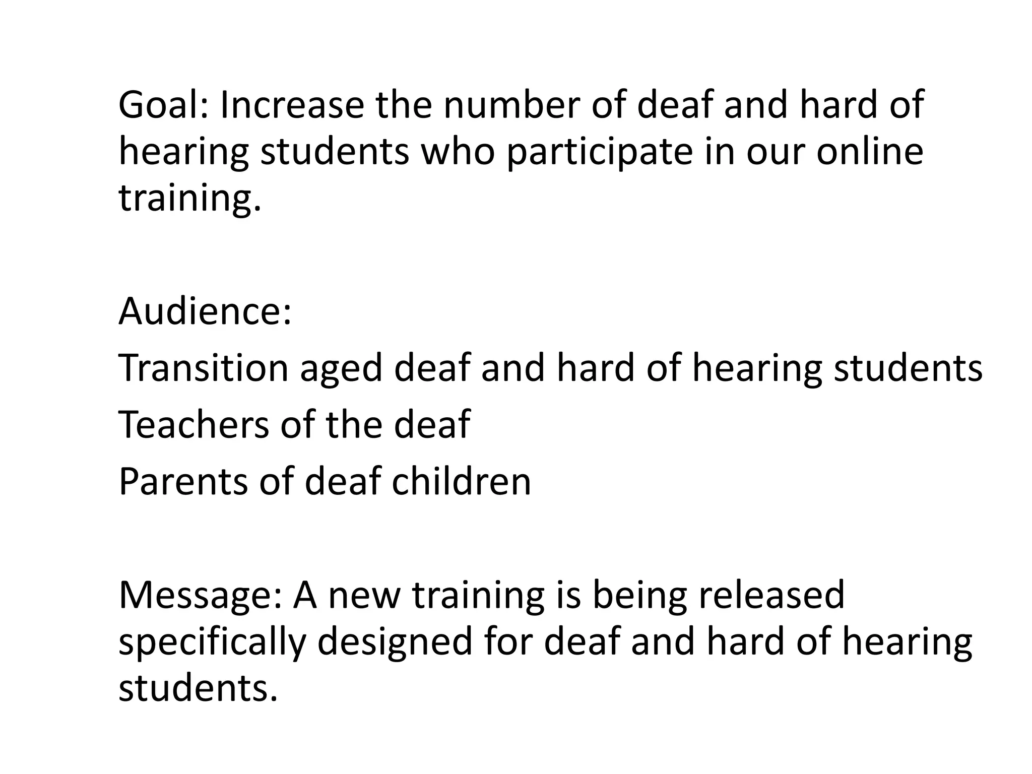
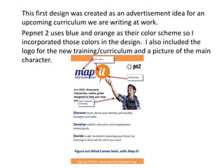
The initial design incorporated the color scheme of an existing program and included the logo and a character image. A second design added American Sign Language handshapes to represent the training's objectives.
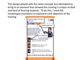
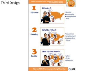
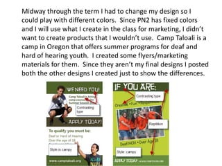
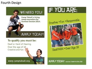
A third design featured screenshots from an introductory animation to show the training's sections. Additional changes were made, resulting in a fourth design for a summer camp.
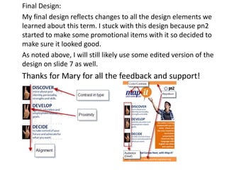
The final design reflected all design elements learned and was selected for use in promotional items, though an earlier design may also be used after further editing.