Blocking contents
•Download as DOCX, PDF•
0 likes•171 views
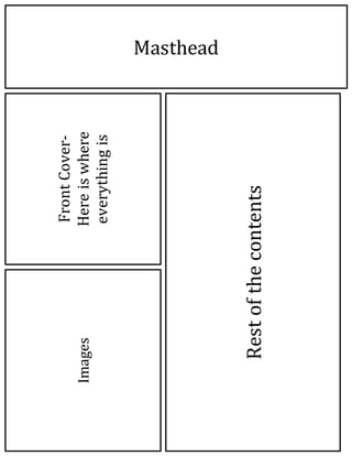
This document describes the layout of a publication. It contains a masthead on the front cover along with images. The rest of the contents are described as being inside the publication.
Report
Share
Report
Share
Recommended
3rd update
The designer changed the text color from black to various shades of pink because black was not suitable for a pop magazine aimed at young girls, and darker colors are inappropriate. Using different pink shades allowed the designer to maintain their house style while distinguishing subheadings. Furthermore, a digital-looking font with hashtags supported the magazine's focus on social networking and coordinated with the masthead.
Front cover blog actual
The document discusses the design choices for a magazine targeted at girls ages 11-15. Bright pink and yellow colors were chosen to appeal to the target audience. A heart-shaped starburst graphic was selected as the central image to match the style and readers. Different fonts were used for subheadings to relate to the topics. Images of popular boy bands were featured prominently to attract readers. Challenges in editing photos were addressed, such as removing a green screen background. The band name "Rubix" was stylized with an overlaid cube pattern and glow effect to make it legible against images.
Contents page analysis
The front cover of the magazine displays the table of contents to make navigation easier, appealing to a younger audience. Color and text indicate the target audience is girls. Throughout the magazine, bright colors, clear labeling, and promised celebrity content aim to keep young female readers engaged and purchasing issues.
Double page spread ana
The document summarizes the layout and design techniques used in a magazine article about celebrity Taylor Swift. A large pull quote is used to grab attention about the celebrity and topic. Smaller embedded images break up dense text and make the magazine feel lighter and appeal more to a younger audience. The chosen image of Taylor Swift presents her as approachable and "girl next door" to suit the targeted younger readers.
Blocking
This document appears to be a magazine or publication layout that includes common elements like a masthead, cover image, barcode, and pull quotes, as well as additional text sections or ads. It references common design elements but does not provide much contextual information.
Finalised Magazine Layout Plans
This document does not contain any text to summarize. It appears to be a placeholder for an image, masthead, pull quote, and body text but those elements are not present. In 3 sentences or less, a summary cannot be provided since the document does not contain any information to summarize.
FC upd2
The designer removed heart shapes from the magazine layout because they took up too much space and did not fit the bold, in-your-face direction they wanted to take. They made all article headings the same bold font for unity and inserted a barcode with serial number and issue date to make the magazine look authentic, positioning it out of the way at the bottom right to free up space for other elements. The bold black and red text catches the reader's eye, suggesting urgent must-read topics and urging them to learn more.
Fc updatelkj
The designer experimented with different colors and patterns for a graphic element originally called 'Rubix' because the original green color was too similar to other greens on the page. A bold, bubbly, and bright new design suited the magazine style well by making the boy band featured stand out and be the clear main focus.
Contents updateefr
The document discusses design choices made for a magazine targeted at young girls, including using different colored sections to distinguish content types and make the magazine more lively, breaking up the page with sections to reduce perceived writing while adding visual clutter, highlighting subheadings with different colors and font sizes, and using images and a large poster visual to break up text and draw readers' attention without overwhelming them.
Contents updateyuj
This document discusses design choices for a magazine targeted at young girls. It explains using different colored sections to separate content and make the magazine appear less text-heavy while adding visual interest. Subheadings are styled with different colors and fonts to highlight sections, and images are included to break up the text and draw readers' attention without overwhelming them. The overall layout aims to appeal to its target audience through an engaging visual design.
4th fc
The document describes various design elements added to a magazine mock-up to make the text and content stand out from the background, emphasize excitement, and create a cluttered look similar to other pop magazines through techniques like using darker pink text that contrasts the lighter background, adding banners, name tags, tabs, and changing text colors. The goal is to attract an impressionable target audience through catchy design.
Front cover so far
The document discusses design choices for a magazine targeted at girls ages 11-15. Bright pink and yellow colors were chosen to appeal to the target audience. Different fonts were used for subheadings to match topics, such as a digital font for texting tutorials. Four boys were featured prominently on the cover to attract the majority of readers. Issues arose with photoshopping curly hair over a green screen, which was tackled by using smudge and cover tools for a satisfactory solution. The band name "Rubix" was incorporated over the boy band image with an overlay pattern and outer glow to resemble a Rubix cube and make the text more legible against the photo.
Front Cover so far
The document discusses the design choices for a magazine targeted at girls ages 11-15. Bright pink and yellow colors were chosen to appeal to the target audience. Different fonts were used for subheadings to match topics, such as a digital font for texting tutorials. Four boys were featured prominently on the cover to attract the majority of readers. Issues arose in editing due to curly hair revealing the green screen, but smudging helped cover it to an acceptable level, though not perfect. The band name "Rubix" had a pattern overlay resembling a Rubix cube to make the text more legible against the boy band image on the page.
Front cover first blog
The document discusses the design choices for a magazine targeted at girls ages 11-15. Bright pink and yellow colors were chosen to appeal to the target audience. Different fonts were used for subheadings to match topics, such as a digital font for texting tutorials. Four boys were featured prominently on the cover to attract the majority of readers. Issues arose around one boy's curly hair revealing the green screen background, which was addressed by using photo editing tools. The band name "Rubix" was incorporated into the design using a pattern overlay resembling a Rubik's cube puzzle to make the text more legible.
Magazine Analysis
The document discusses the design elements of a magazine cover featuring Taylor Swift. It notes that the masthead uses bright bold colors that match other design elements and highlights the title. Taylor Swift's picture is the largest as the headline feature, and a pull quote about her love life is used to intrigue readers. Other design elements like stars and quotes from TV shows are intended to appeal to the magazine's target audience of young female fans of pop music and celebrity culture.
Media moodboard
This document lists various font names and styles including Gil Sans Ultra Bold, Showcard Gothic, Georgia, Impact, and Rockwell Extra Bold. It also contains three hashtags - #wow, #Hashtag, and #omgosh.
Why these images?
The photographer took pictures of Plumstead Manor from tilted angles to make the images more imposing and symbolic. The clear blue sky in one photo represents a new beginning for the school. Another photo shows sixth form students studying at an angle that captures both the students and their work, demonstrating their transition from GCSE to A-level courses. A third photo stands out for featuring a dancing figure, signifying the importance of performing arts at Plumstead Manor.
Evaluation of Plumazine
The document describes a magazine cover design with a bright red title in large bold font to represent the color scheme of Plumstead Manor. Large pictures are used that dominate the cover and show the headings. Subheadings are in bright colors to draw attention and appeal to a young audience.
More Related Content
More from carlajacquesasmedia
Contents updateefr
The document discusses design choices made for a magazine targeted at young girls, including using different colored sections to distinguish content types and make the magazine more lively, breaking up the page with sections to reduce perceived writing while adding visual clutter, highlighting subheadings with different colors and font sizes, and using images and a large poster visual to break up text and draw readers' attention without overwhelming them.
Contents updateyuj
This document discusses design choices for a magazine targeted at young girls. It explains using different colored sections to separate content and make the magazine appear less text-heavy while adding visual interest. Subheadings are styled with different colors and fonts to highlight sections, and images are included to break up the text and draw readers' attention without overwhelming them. The overall layout aims to appeal to its target audience through an engaging visual design.
4th fc
The document describes various design elements added to a magazine mock-up to make the text and content stand out from the background, emphasize excitement, and create a cluttered look similar to other pop magazines through techniques like using darker pink text that contrasts the lighter background, adding banners, name tags, tabs, and changing text colors. The goal is to attract an impressionable target audience through catchy design.
Front cover so far
The document discusses design choices for a magazine targeted at girls ages 11-15. Bright pink and yellow colors were chosen to appeal to the target audience. Different fonts were used for subheadings to match topics, such as a digital font for texting tutorials. Four boys were featured prominently on the cover to attract the majority of readers. Issues arose with photoshopping curly hair over a green screen, which was tackled by using smudge and cover tools for a satisfactory solution. The band name "Rubix" was incorporated over the boy band image with an overlay pattern and outer glow to resemble a Rubix cube and make the text more legible against the photo.
Front Cover so far
The document discusses the design choices for a magazine targeted at girls ages 11-15. Bright pink and yellow colors were chosen to appeal to the target audience. Different fonts were used for subheadings to match topics, such as a digital font for texting tutorials. Four boys were featured prominently on the cover to attract the majority of readers. Issues arose in editing due to curly hair revealing the green screen, but smudging helped cover it to an acceptable level, though not perfect. The band name "Rubix" had a pattern overlay resembling a Rubix cube to make the text more legible against the boy band image on the page.
Front cover first blog
The document discusses the design choices for a magazine targeted at girls ages 11-15. Bright pink and yellow colors were chosen to appeal to the target audience. Different fonts were used for subheadings to match topics, such as a digital font for texting tutorials. Four boys were featured prominently on the cover to attract the majority of readers. Issues arose around one boy's curly hair revealing the green screen background, which was addressed by using photo editing tools. The band name "Rubix" was incorporated into the design using a pattern overlay resembling a Rubik's cube puzzle to make the text more legible.
Magazine Analysis
The document discusses the design elements of a magazine cover featuring Taylor Swift. It notes that the masthead uses bright bold colors that match other design elements and highlights the title. Taylor Swift's picture is the largest as the headline feature, and a pull quote about her love life is used to intrigue readers. Other design elements like stars and quotes from TV shows are intended to appeal to the magazine's target audience of young female fans of pop music and celebrity culture.
Media moodboard
This document lists various font names and styles including Gil Sans Ultra Bold, Showcard Gothic, Georgia, Impact, and Rockwell Extra Bold. It also contains three hashtags - #wow, #Hashtag, and #omgosh.
Why these images?
The photographer took pictures of Plumstead Manor from tilted angles to make the images more imposing and symbolic. The clear blue sky in one photo represents a new beginning for the school. Another photo shows sixth form students studying at an angle that captures both the students and their work, demonstrating their transition from GCSE to A-level courses. A third photo stands out for featuring a dancing figure, signifying the importance of performing arts at Plumstead Manor.
Evaluation of Plumazine
The document describes a magazine cover design with a bright red title in large bold font to represent the color scheme of Plumstead Manor. Large pictures are used that dominate the cover and show the headings. Subheadings are in bright colors to draw attention and appeal to a young audience.
More from carlajacquesasmedia (10)
Blocking contents
- 1. Masthead Front Cover- Here is where everything is Images Rest of the contents