ANALYTICAL PARAGRAPH
PIE CHART
•A pie chart is a circular statistical
graphic, which is divided into slices to
illustrate numerical proportion. In a pie
chart, the arc length of each slice, is
proportional to the quantity it
represents.
The charts below show the reasons why
people travel to work by bicycle or by car.
Summarise the information by selecting
and reporting the main features, and make
comparisons where relevant.
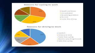
• The first pie chart shows the reasons why some people in the UK prefer to
cycle to work. Conversely, the second pie chart gives reasons for those who
choose to go to work by car.
• The highest percentage of those who favour cycling say that this is because
riding a bicycle to work is healthier than driving. 30% of them gave this as a
reason. The same amount of people, 30% say that they cycle to work
because it causes less pollution. 13% of people cycle to work because it is
cheaper than driving. Surprisingly, a similar amount of people said that they
cycled to work because it is faster than travelling by car.
• In contrast to this, the percentage who prefer to travel by car because it is
more comfortable is 40%. The two least important reasons for going to work
by car, with 14% and 11% respectively, is that people need to carry things to
work and that it is safer than cycling to work. Finally, 16% say they prefer
driving because it is faster than cycling. This contrasts with the cyclists who
ride to work because it is faster than driving.
• In general, it seems that the majority of people who cycle to work do this for
health and environmental reasons. By contrast, those who travel by car want
to have a more comfortable journey over longer distances.
Introductory Paragraph
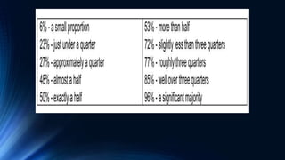
This table presents some examples of how you can change
percentages to fractions or ratios:
Percentage Fraction
80% four-fifths
75% three-quarters
70% seven in ten
65% two-thirds
60% three-fifths
55% more than half
50% half
45%
more than two
fifths
ANALYTICAL PARAGRAPH-PIE CHART.pptx

ANALYTICAL PARAGRAPH-PIE CHART.pptx

  • 1.
  • 3.
    PIE CHART •A piechart is a circular statistical graphic, which is divided into slices to illustrate numerical proportion. In a pie chart, the arc length of each slice, is proportional to the quantity it represents.
  • 4.
    The charts belowshow the reasons why people travel to work by bicycle or by car. Summarise the information by selecting and reporting the main features, and make comparisons where relevant.
  • 6.
    • The firstpie chart shows the reasons why some people in the UK prefer to cycle to work. Conversely, the second pie chart gives reasons for those who choose to go to work by car. • The highest percentage of those who favour cycling say that this is because riding a bicycle to work is healthier than driving. 30% of them gave this as a reason. The same amount of people, 30% say that they cycle to work because it causes less pollution. 13% of people cycle to work because it is cheaper than driving. Surprisingly, a similar amount of people said that they cycled to work because it is faster than travelling by car. • In contrast to this, the percentage who prefer to travel by car because it is more comfortable is 40%. The two least important reasons for going to work by car, with 14% and 11% respectively, is that people need to carry things to work and that it is safer than cycling to work. Finally, 16% say they prefer driving because it is faster than cycling. This contrasts with the cyclists who ride to work because it is faster than driving. • In general, it seems that the majority of people who cycle to work do this for health and environmental reasons. By contrast, those who travel by car want to have a more comfortable journey over longer distances.
  • 7.
  • 8.
    This table presentssome examples of how you can change percentages to fractions or ratios: Percentage Fraction 80% four-fifths 75% three-quarters 70% seven in ten 65% two-thirds 60% three-fifths 55% more than half 50% half 45% more than two fifths