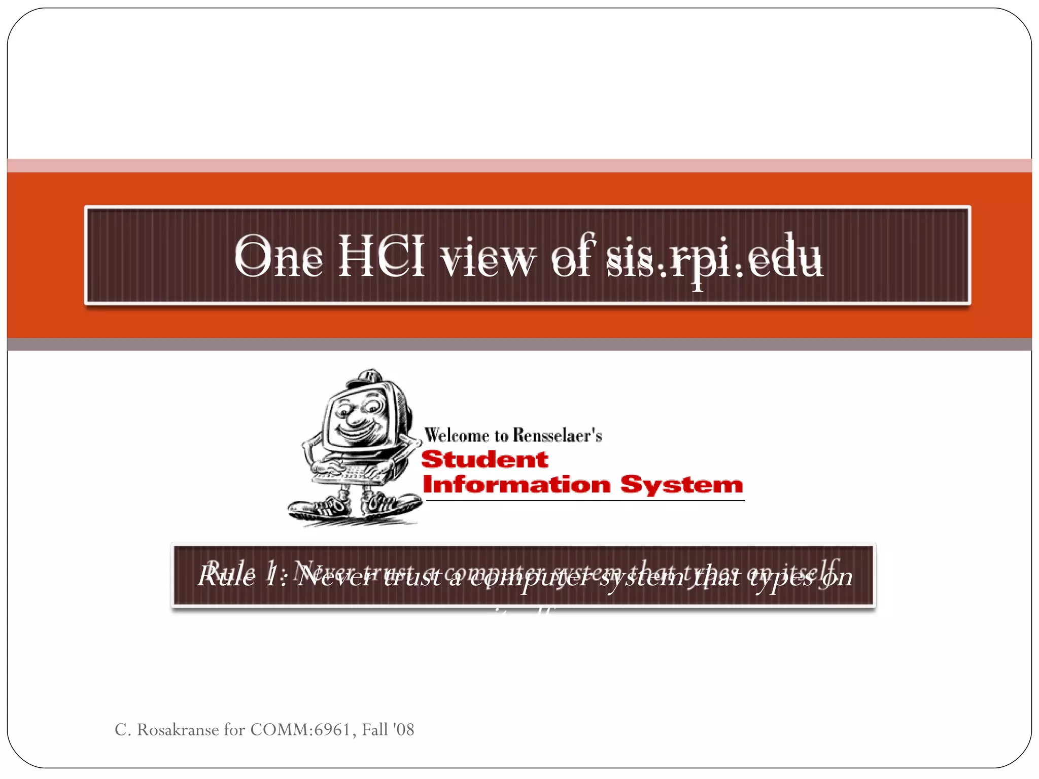
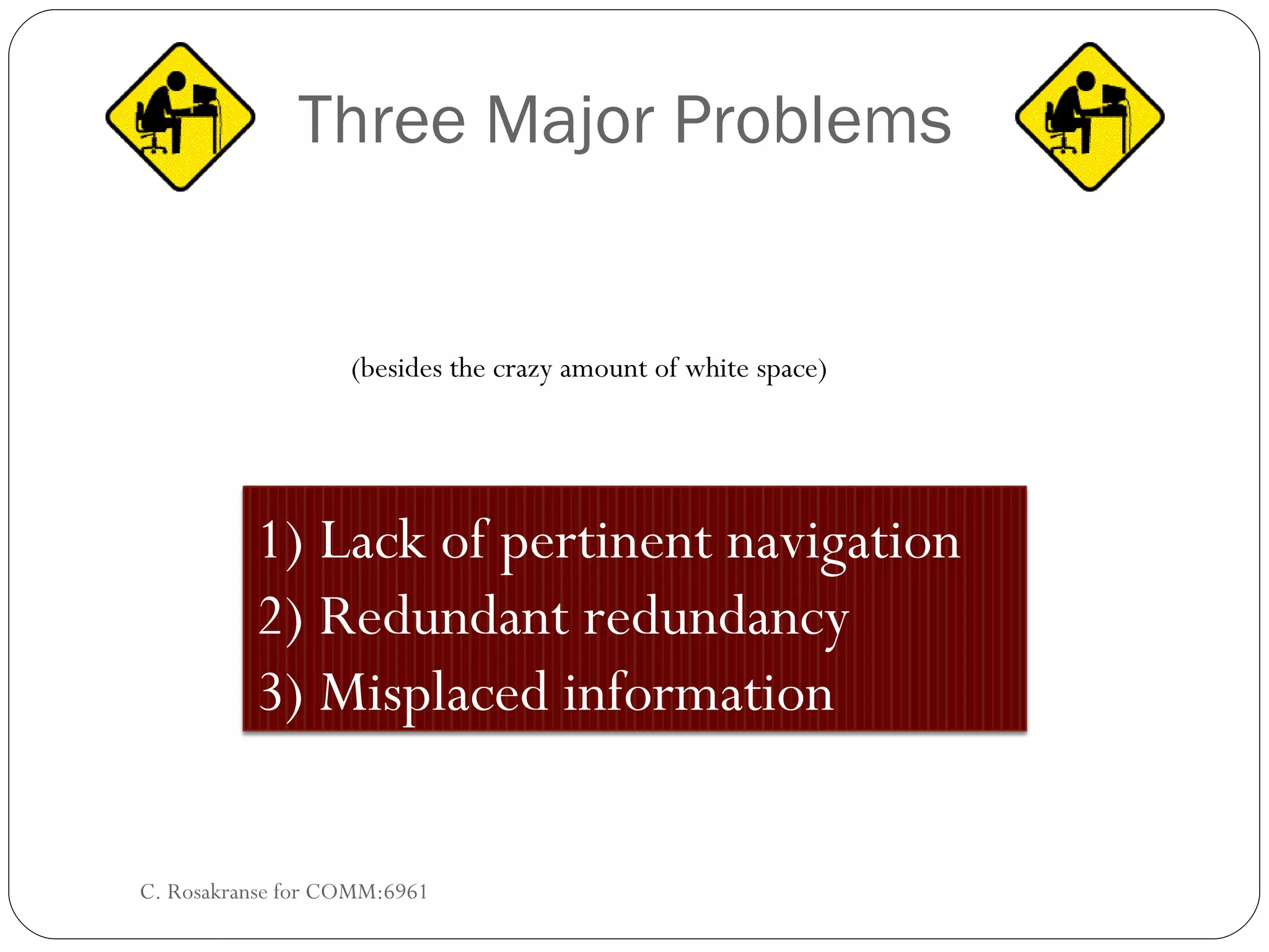
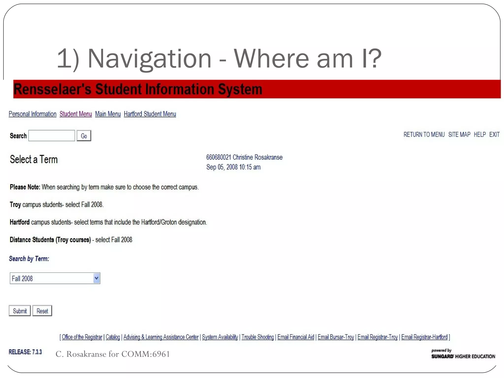
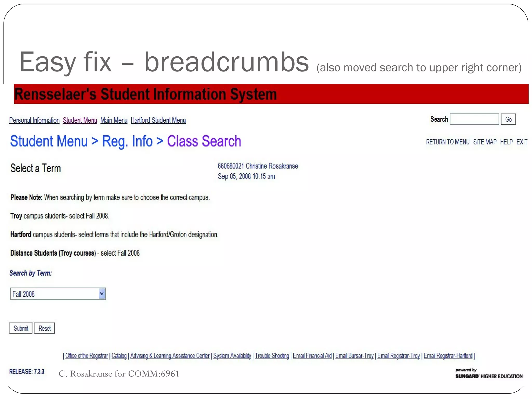
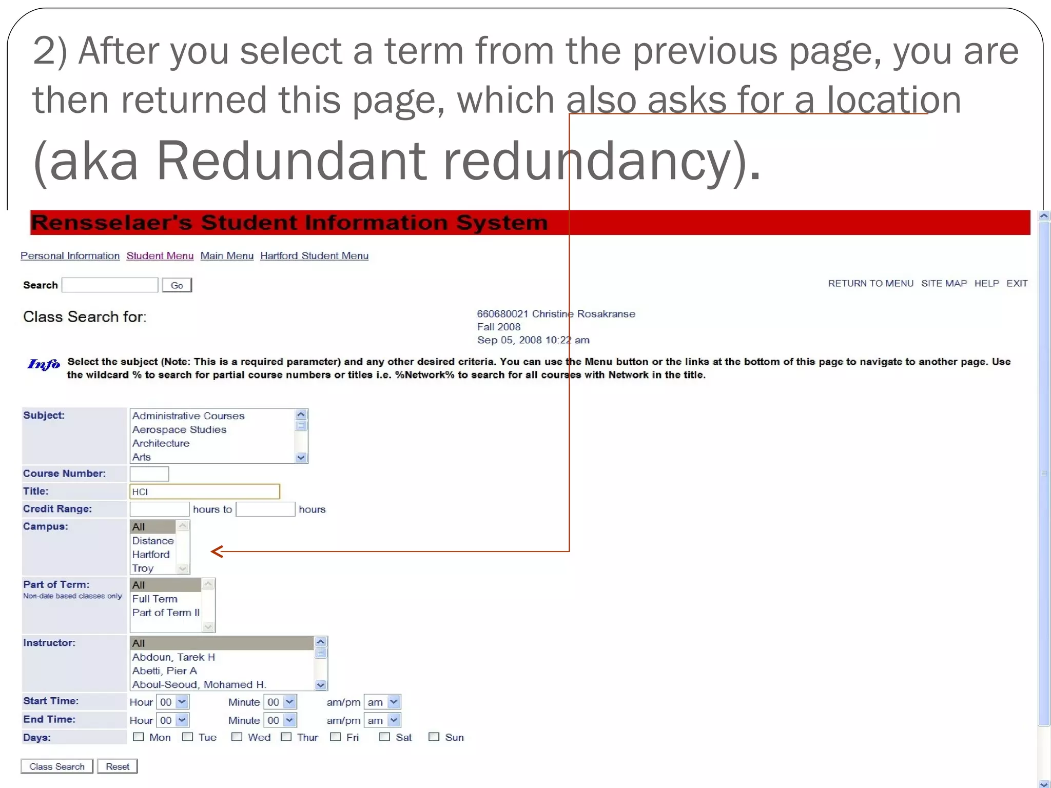
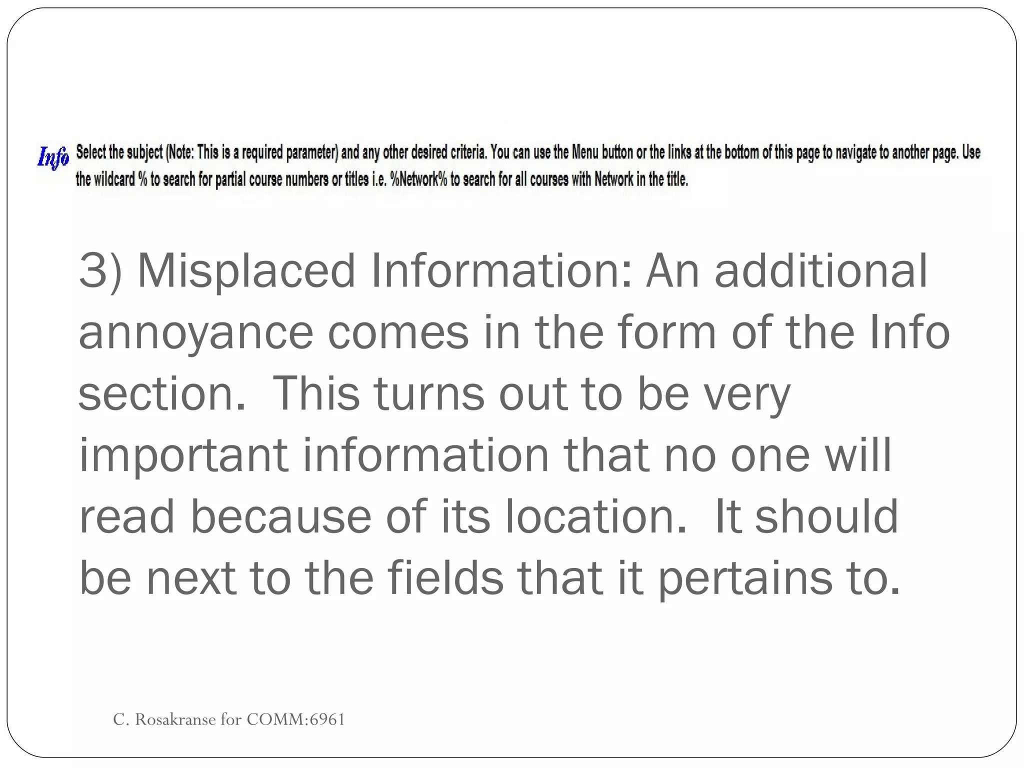
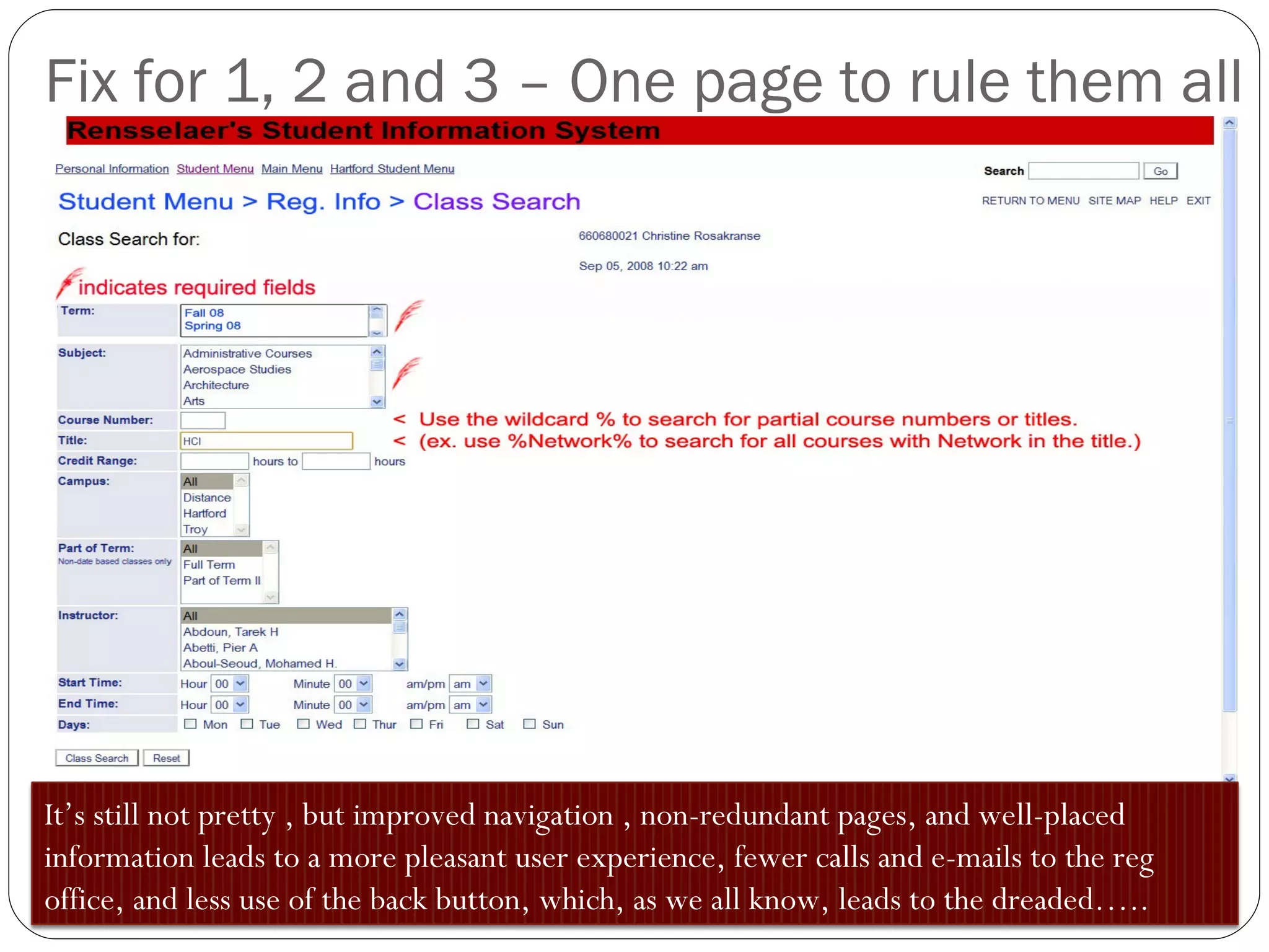
C. Rosakranse for COMM:6961, Fall '08 Rule 1: Never trust a computer system that types on itself. One HCI view of sis.rpi.edu
Three Major Problems (besides the crazy amount of white space) C. Rosakranse for COMM:6961 1) Lack of pertinent navigation 2) Redundant redundancy 3) Misplaced information
1) Navigation - Where am I? C. Rosakranse for COMM:6961
Easy fix – breadcrumbs  (also moved search to upper right corner) C. Rosakranse for COMM:6961
2) After you select a term from the previous page, you are then returned this page, which also asks for a location  (aka Redundant redundancy).
3) Misplaced Information: An additional annoyance comes in the form of the Info section.  This turns out to be very important information that no one will read because of its location.  It should be next to the fields that it pertains to. C. Rosakranse for COMM:6961
Fix for 1, 2 and 3 – One page to rule them all It’s still not pretty , but improved navigation , non-redundant pages, and well-placed information leads to a more pleasant user experience, fewer calls and e-mails to the reg office, and less use of the back button, which, as we all know, leads to the dreaded…..
But that’s another presentation. C. Rosakranse for COMM:6961

An HCI View if RPI's SIS

  • 1.
    C. Rosakranse forCOMM:6961, Fall '08 Rule 1: Never trust a computer system that types on itself. One HCI view of sis.rpi.edu
  • 2.
    Three Major Problems(besides the crazy amount of white space) C. Rosakranse for COMM:6961 1) Lack of pertinent navigation 2) Redundant redundancy 3) Misplaced information
  • 3.
    1) Navigation -Where am I? C. Rosakranse for COMM:6961
  • 4.
    Easy fix –breadcrumbs (also moved search to upper right corner) C. Rosakranse for COMM:6961
  • 5.
    2) After youselect a term from the previous page, you are then returned this page, which also asks for a location (aka Redundant redundancy).
  • 6.
    3) Misplaced Information:An additional annoyance comes in the form of the Info section. This turns out to be very important information that no one will read because of its location. It should be next to the fields that it pertains to. C. Rosakranse for COMM:6961
  • 7.
    Fix for 1,2 and 3 – One page to rule them all It’s still not pretty , but improved navigation , non-redundant pages, and well-placed information leads to a more pleasant user experience, fewer calls and e-mails to the reg office, and less use of the back button, which, as we all know, leads to the dreaded…..
  • 8.
    But that’s anotherpresentation. C. Rosakranse for COMM:6961