More Related Content
More from Hanin Fatani (10)
8.2 p3
- 1. Colour Icons
Zodiac Signs
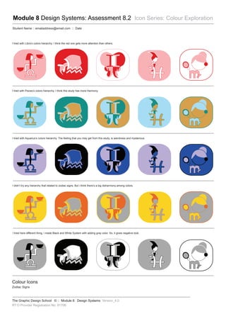
I tried with Pisces’s colors hierarchy. I think this study has more Harmony.
I tried with Aquarius’s colors hierarchy. The feeling that you may get from this study, is weirdness and mysterious.
I didn’t try any hierarchy that related to zodiac signs. But i think there’s a big disharmony among colors.
I tried here different thing, I made Black and White System with adding gray color. So, it gives negative look.
I tried with Libra’s colors hierarchy. I think the red one gets more attention than others.
Module 8 Design Systems: Assessment 8.2 Icon Series: Colour Exploration
Student Name :: emailaddress@email.com :: Date
The Graphic Design School © :: Module 8: Design Systems Version_4.0
RT O Provider Registration No: 91706