Este documento contiene información sobre diferentes tipos de frases como las frases hechas y los refranes. Explica que las frases hechas tienen una forma fija y un significado figurado, mientras que los refranes son dichos tradicionales que ofrecen consejos o advertencias. Además, proporciona detalles sobre la conjugación de verbos como las formas verbales, lexemas y desinencias que indican la persona, número y tiempo de la acción.
Este documento presenta un método para evaluar críticamente las páginas web para estudiantes de primaria, secundaria y secundaria. Explica que debido a que Internet es una gran fuente de información, tanto verdadera como falsa, es importante enseñar a los estudiantes a evaluar críticamente la información en línea. A continuación, describe cuatro áreas clave para evaluar una página web: la autoridad de la fuente, la actualización y validez de la información, la navegabilidad del sitio y la organización
The document describes a new range of tableware called Slateware made from Welsh slate. Slateware was designed in partnership with Michelin chef Michael Caines using Welsh slate from the Penrhyn quarry, known for its high quality. The slateware combines the natural beauty and durability of 500 million year old Welsh slate with contemporary cuisine design. The slateware is non-porous, easy to clean, and dishwasher safe. The document then provides product details and pricing for various slateware items including placemats, plates, boards, holders, and coasters.
The document describes a proposed design for an exhibition pavilion for Tile of Spain. The pavilion would have a dynamic, parametric design made of a light steel wireframe filled with tile samples. It would create a unique architectural form with an interior and exterior visually connected through wavy, tiled facades displaying samples from various manufacturers. The goal is for the pavilion to attract attention and tell the story of Tile of Spain through an eye-catching, permanent installation.
This document provides details on the design project for an informational-corporate exhibition stand for Tile of Spain at the 2015 Batimat Russia exhibition. The stand was a joint collaboration between Spanish organizations to promote Spanish ceramic tiles in the Russian market. The design concept was to use common materials transformed into strong textures to create an experience that forms a positive image of Spanish tile products while coordinating the Spanish Pavilion and providing information to visitors. Floor plans, elevation drawings, and sections are included that show the functional layout and organization of the 108m2 space, including areas for reception, conference, and showcasing various tile collections from participating companies.
The pavilion concept for the Spanish Ceramic Tile Manufacturer's Association draws inspiration from Spanish mountains and 20th century cubist art movements. It features complex shapes created from simple materials like drywall and plywood on metal frames. Some panels use frosted Plexiglass with LED lighting, while ceramic tile surfaces symbolize exposed rock layers and organically extend the concept. The floor plan includes areas for reception, conferences, catering, guests, and navigation.
The document presents the concept for the Spanish Cinema pavilion exhibit at MOSBUILD. The main idea is to create distinct functional zones for visitors using large "cinemastripe" structures that represent movie frames. These zones include a reception area, space for presentations and networking, and a promo zone to display tile samples. The cinemastripe structures divide the space while also advertising Spanish tile companies and creating multiple viewing areas for visitors from afar. The structures are made of lightweight but sturdy plastic and will display tiles from seven Spanish brands.
The document describes an exhibition floor setup using octanorm panels with a glossy laminated chipboard floor surface and MDF frame faced with glossy white plastic. Various presentation elements are mounted on movable panels including ceramic tiles, film, catalogs, speakers, soft seating, tables, a podium and projector. Graphics are produced using a printing and cutting plotter and some panels are stationary.
The document summarizes an exhibition stand project consisting of simple geometric shapes made from ceramic tiles. The stand features a cube area for events, a cylindrical closet, a pipe reception area, and a multi-level labyrinth structure. Ceramic tiles from several manufacturers create and define the shapes of the objects that make up the stand while also serving as the formative material.
This document describes a checkroom layout with different zones. It includes a guest zone for checking items, a promotional zone likely for advertising, and mentions the main stand is made of acrylic or plasterboard.
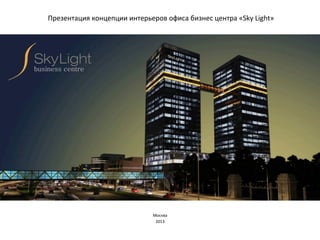
3. Sky
Light
-‐
CosmoPark
–
концепция
и
планировочное
решение.
CosmoPark
–
современное
офисное
пространство
в
футуристично-‐
технологичном
развитии,
обладающее
визуальными
интригами
и
удобным
функциональным
зонированием
Основа
концепции
интерьера
офиса
в
бизнес-‐центре
«SkyLight»
КОСМОПАРК
–
продолжение
темы
неба
в
более
широком
смысле
–
как
космоса.
Панорамные
виды
из
окон
Исходный
план
Близкие
нам
планеты
солнечной
системы
Источник
вдохновения
4. Цветовая
палитра
–
монохромный
фон
и
яркие
акценты
Формообразование
–
сочетание
прямоугольных
и
пластичных
форм
–
как
символа
природных
форм
открывает
широкие
возможности
применения
множества
разнообразных
композиционных
вариантов
Sky
Light
-‐
CosmoPark
-‐
форма,
цвет,
фактура.
Фактура
поверхностей
Покраска
–
шелковисто-‐матовая
Потолок,
стены.
металл
хром,
черный,
Дерево
Светлых
пород
-‐
Стеновые
панели,
столешницы.
Группы
отделочных
материалов:
-‐Полы
–
ПВХ
покрытие,
ковровая
плитка
по
фальш
полу.
-‐
Потолки
–многоуровневые
–
ГКЛ
с
реечными
вставками
-‐
Светильники
–
встроенные;
подвесные
в
переговорных,
зоне
ресепшн,
зонах
лаунжа;
торшеры-‐
индивидуальные
источники
света-‐
в
рабочей
зоне
опен-‐спейс;
декоративные
плафоны
в
зоне
ресепшн
-‐
Перегородки
-‐
ГКЛ
по
металлическому
каркасу;
стеклянные
безрамные
моллированные;
деревянные
панели
в
зоне
ресепшн,
переговорных
комнатах;декоративные
экраны
для
зон
отдыха
-‐Стойка
ресепшн
–
матированное
стекло
с
подсветкой
5. Sky
Light
-‐
CosmoPark
–
концепция
и
планировочное
решение.
В
основе
построения
планировки
интерьера
-‐
ось,
внутри
и
вокруг
которой
развивается
жизнь
офиса.
Ось
собирает
в
себе
необходимые
функциональные
зоны
и
формирует
пространство
вокруг
себя
по
радиусно-‐
лучевой
схеме,
сохраняя
возможность
динамических,
функциональных
и
визуальных
трансформаций.
6. Sky
Light
-‐
CosmoPark
–
концепция
и
планировочное
решение.
В
основе
построения
планировки
интерьера
-‐
ось,
внутри
и
вокруг
которой
развивается
жизнь
офиса.
Ось
собирает
в
себе
необходимые
функциональные
зоны
и
формирует
пространство
вокруг
себя
по
радиусно-‐
лучевой
схеме,
сохраняя
возможность
динамических,
функциональных
и
визуальных
трансформаций.
7. Sky
Light
-‐
CosmoPark
–
концепция
и
планировочное
решение.
В
основе
построения
планировки
интерьера
-‐
ось,
внутри
и
вокруг
которой
развивается
жизнь
офиса.
Ось
собирает
в
себе
необходимые
функциональные
зоны
и
формирует
пространство
вокруг
себя
по
радиусно-‐
лучевой
схеме,
сохраняя
возможность
динамических,
функциональных
и
визуальных
трансформаций.
8. Sky
Light
-‐
CosmoPark
–
концепция
и
планировочное
решение.
Тема
космоса
получает
свое
развитие
в
центрической
планировке.
Функционально-‐планировочное
решение:
В
центральной
части
сгруппированы
отдельные
рабочие
кабинеты,
кофе-‐пойнты,
санузлы.
Во
внешних
углах,
имеющих
панорамное
остекление,
размещены
конференц-‐зал,
лаунж-‐зона,
зона
руководства.
План
этажа
9. Sky
Light
-‐
CosmoPark
–
концепция
и
планировочное
решение.
План
видовых
точек
Вид
1
Вид
2
Вид
3
Вид
4
В
дизайнерских
решениях
тему
космоса
поддерживают:
-‐темная
поверхность
потолка
над
зоной
коммуникации
вокруг
центрального
«ядра»;
-‐
расходящиеся
лучи-‐рейки
в
участках
потолка
над
рабочей
зоной
и
скомпонованные
по
такому
же
принципу
рабочие
столы
в
зоне
опен-‐спейс;
-‐
трассирующие
линии
на
полу,
создающие
направление
движения
потоков
в
офисе
и
ассоциирующиеся
с
линиями
падающих
звезд;
данный
мотив
повторяется
в
принтах
на
стеклянных
перегородках;
-‐
светильники
–
круглый
плафон
над
зоной
ожидания,
подвесные
«Звезды»
над
стойкой
ресепшн,
встроенные
световые
профили-‐лучи
в
реечные
участки
Функционально-‐планировочное
решение:
В
центральной
части
сгруппированы
отдельные
рабочие
кабинеты,
кофе-‐пойнты,
санузлы.
Во
внешних
углах,
имеющих
панорамное
остекление,
размещены
конференц-‐зал,
лаунж-‐зона,
зона
руководства.
10. Визуализация.
Вид
1.
Входная
зона
(ресепшен)
-‐ Типографика
и
Инфографика
–
благодаря
использованию
крупных
надписей
и
изображений
в
пространстве
офиса
становиться
легко
ориентироваться
и
появляются
интересные
акценты
-‐ Тематика
переговорных
-‐
планеты
нашей
системы
различны
по
цветам
и
фактурам
(Марс,
Юпитер,
Сатурн,
Луна…)
11. Визуализация.
Вид
2.
Рабочая
зона
-‐
open
space
–
цветной
вариант
Акустические
проблемы
опен
спейса
(шум
от
разговоров
сотрудников)
решаем
за
счет
звукопоглощающих
материалов
потолка
и
настольных
перегородок
12. Визуализация.
Вид
2.
Рабочая
зона
-‐
open
space
–
темно-‐синий
вариант
В
зависимости
от
вида
деятельности
компании-‐арендатора
оформление
планировочного
«ядра»
может
быть
различным
13. Визуализация.
Вид
2.
Рабочая
зона
-‐
open
space
–
темно-‐зеленый
вариант
Трансформация
пространства
–
фальшполы
с
разводкой
коммуникаций
к
рабочим
местам,
небольшие
кластеры
столов,
модульность
потолка
и
принцип
размещения
осветительных
приборов
-‐
обеспечивают
высокую
мобильность
и
трансформативность
планировочного
решения
14. Визуализация.
Вид
2.
Рабочая
зона
-‐
open
space
–
белый
вариант
-‐ Экономика
–
за
счет
использования
светодиодных
технологий
и
применения
индивидуального
освещения
рабочих
мест
можно
существенно
сократить
расходы
на
электроэнергию
-‐ Экология
офиса
–
живые
растения,
естественное
освещение,
качественные
экологически
чистые
отделочные
материалы
15. Визуализация.
Вид
3.
Рабочая
зона
-‐
open
space
-‐ Круговая
схема
движения
потоков
сотрудников,
руководителей
и
гостей
(по
проходам
без
углов)
позволяет
свободно
коммуницировать
всем
необходимым
отделам
компании.
Декоративные
трассирующие
линии
на
полу
в
проходах
добавляют
динамики
и
символизируют
движение
планет
-‐ Визуальное
различие
отделов
выполнено
за
счет
цветных
разделительных
перегородок
на
столах
(возможно
различия
в
цветах
спинок
рабочих
кресел
или
стеклянных
перегородках
руководителей
и
переговорных
комнат..
16. Визуализация.
Вид
4.
Лаунж
зона.
-‐ Зона
отдыха,
лаунж
зона
и
игротека
–
для
здоровой
атмосферы;
в
современном
офисе
необходимо
найти
место
для
более
расслабленной
атмосферы,
в
котором
можно
перевести
дух
и
настроиться
на
продуктивную
работу
-‐ Медиа
системы
–
в
общих
пространствах
на
больших
мониторах
транслируется
полезная
информация.
Так
же
хорошо
размещать
неспешный
видеоряд
с
мотиваторами
или
любой
другой
необходимой
информации