Download free for 30 days
Sign in
Upload
Language (EN)
Support
Business
Mobile
Social Media
Marketing
Technology
Art & Photos
Career
Design
Education
Presentations & Public Speaking
Government & Nonprofit
Healthcare
Internet
Law
Leadership & Management
Automotive
Engineering
Software
Recruiting & HR
Retail
Sales
Services
Science
Small Business & Entrepreneurship
Food
Environment
Economy & Finance
Data & Analytics
Investor Relations
Sports
Spiritual
News & Politics
Travel
Self Improvement
Real Estate
Entertainment & Humor
Health & Medicine
Devices & Hardware
Lifestyle
Change Language
Language
English
Español
Português
Français
Deutsche
Cancel
Save
Submit search
EN
Uploaded by
Moscow IFF
405 views
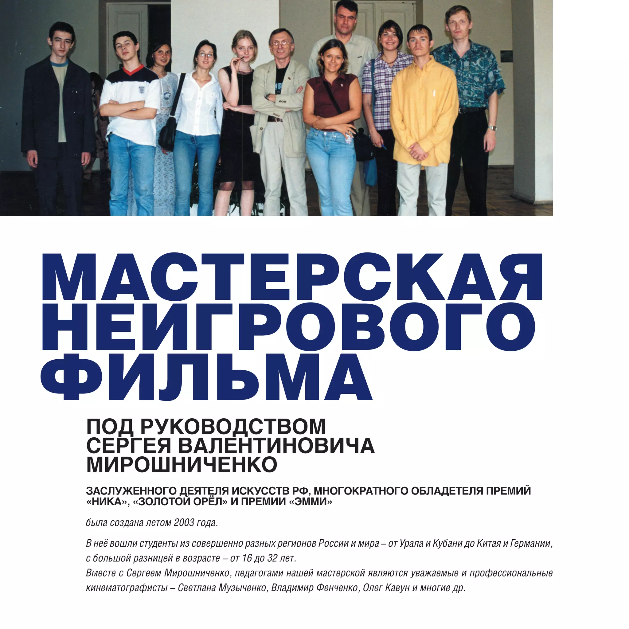
Презентация мастерской С.В.Мирошниченко (выпуск 2008 г.)
Издание 2007 года
Entertainment & Humor
◦
Read more
0
Save
Share
Embed
Embed presentation
Download
Download to read offline
1
/ 32
2
/ 32
3
/ 32
4
/ 32
5
/ 32
6
/ 32
7
/ 32
8
/ 32
9
/ 32
10
/ 32
11
/ 32
12
/ 32
13
/ 32
14
/ 32
15
/ 32
16
/ 32
17
/ 32
18
/ 32
19
/ 32
20
/ 32
21
/ 32
22
/ 32
23
/ 32
24
/ 32
25
/ 32
26
/ 32
27
/ 32
28
/ 32
29
/ 32
30
/ 32
31
/ 32
32
/ 32
More Related Content
PDF
русский язык 3 класс бунеев бунеева пронина
by
kov89
PDF
VR Film Festival, Distribution and Monetisation of 360 content
by
Moscow IFF
PDF
Moscow IFF Documentary Sections
by
Moscow IFF
PDF
Moscow IFF Documentary Programs 2016
by
Moscow IFF
PDF
VRability - презентация проекта в VR360
by
Moscow IFF
PDF
Documentary Programs of the 37th Moscow International Film Festival
by
Moscow IFF
PPT
Rgdoc
by
Moscow IFF
PDF
Documentary sections of the 36th Moscow IFF
by
Moscow IFF
русский язык 3 класс бунеев бунеева пронина
by
kov89
VR Film Festival, Distribution and Monetisation of 360 content
by
Moscow IFF
Moscow IFF Documentary Sections
by
Moscow IFF
Moscow IFF Documentary Programs 2016
by
Moscow IFF
VRability - презентация проекта в VR360
by
Moscow IFF
Documentary Programs of the 37th Moscow International Film Festival
by
Moscow IFF
Rgdoc
by
Moscow IFF
Documentary sections of the 36th Moscow IFF
by
Moscow IFF
More from Moscow IFF
PDF
Documentary sections of the 36th Moscow IFF
by
Moscow IFF
PDF
Logo Presentation
by
Moscow IFF
PDF
Ross speaks
by
Moscow IFF
PDF
She speaks
by
Moscow IFF
PDF
TapIt! PSA Campaign Proposal
by
Moscow IFF
PDF
Booklet web
by
Moscow IFF
PDF
DEAF-MOTION
by
Moscow IFF
Documentary sections of the 36th Moscow IFF
by
Moscow IFF
Logo Presentation
by
Moscow IFF
Ross speaks
by
Moscow IFF
She speaks
by
Moscow IFF
TapIt! PSA Campaign Proposal
by
Moscow IFF
Booklet web
by
Moscow IFF
DEAF-MOTION
by
Moscow IFF
Download