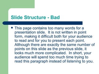
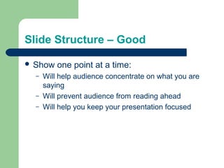
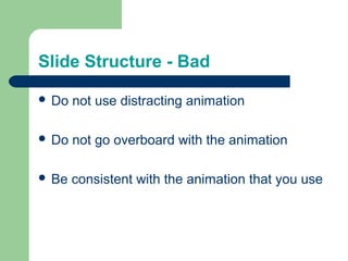
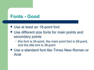
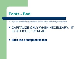
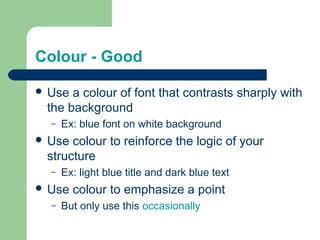
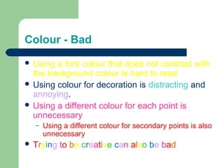
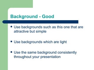
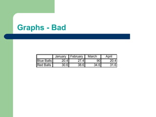
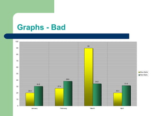
SlideShare a Scribd company logo
Making PowerPoint Slides 
Avoiding the Pitfalls 
of Bad Slides
Tips to be Covered 
 Outlines 
 Slide Structure 
 Fonts 
 Colour 
 Background 
 Graphs 
 Spelling and Grammar 
 Conclusions 
 Questions
Outline 
 Make your 1st or 2nd slide an outline of your 
presentation 
– Ex: previous slide 
 Follow the order of your outline for the rest of 
the presentation 
 Only place main points on the outline slide 
– Ex: Use the titles of each slide as main points
Slide Structure – Good 
 Use 1-2 slides per minute of your presentation 
 Write in point form, not complete sentences 
 Include 4-5 points per slide 
 Avoid wordiness: use key words and phrases 
only
Slide Structure - Bad 
 This page contains too many words for a 
presentation slide. It is not written in point 
form, making it difficult both for your audience 
to read and for you to present each point. 
Although there are exactly the same number of 
points on this slide as the previous slide, it 
looks much more complicated. In short, your 
audience will spend too much time trying to 
read this paragraph instead of listening to you.
Slide Structure – Good 
 Show one point at a time: 
– Will help audience concentrate on what you are 
saying 
– Will prevent audience from reading ahead 
– Will help you keep your presentation focused
Slide Structure - Bad 
 Do not use distracting animation 
 Do not go overboard with the animation 
 Be consistent with the animation that you use
Fonts - Good 
 Use at least an 18-point font 
 Use different size fonts for main points and 
secondary points 
– this font is 24-point, the main point font is 28-point, 
and the title font is 36-point 
 Use a standard font like Times New Roman or 
Arial
Fonts - Bad 
 If you use a small font, your audience won’t be able to read what you have written 
 CAPITALIZE ONLY WHEN NECESSARY. IT 
IS DIFFICULT TO READ 
 Don’t use a complicated font
Colour - Good 
 Use a colour of font that contrasts sharply with 
the background 
– Ex: blue font on white background 
 Use colour to reinforce the logic of your 
structure 
– Ex: light blue title and dark blue text 
 Use colour to emphasize a point 
– But only use this occasionally
Colour - Bad 
 Using a font colour that does not contrast with 
the background colour is hard to read 
 Using colour for decoration is distracting and 
annoying. 
 Using a different colour for each point is 
unnecessary 
– Using a different colour for secondary points is also 
unnecessary 
 Trying to be creative can also be bad
Background - Good 
 Use backgrounds such as this one that are 
attractive but simple 
 Use backgrounds which are light 
 Use the same background consistently 
throughout your presentation
Background – Bad 
 Avoid backgrounds that are distracting or 
difficult to read from 
 Always be consistent with the background that 
you use
Graphs - Good 
 Use graphs rather than just charts and words 
– Data in graphs is easier to comprehend & retain 
than is raw data 
– Trends are easier to visualize in graph form 
 Always title your graphs
Graphs - Bad 
January February March April 
Blue Balls 20.4 27.4 90 20.4 
Red Balls 30.6 38.6 34.6 31.6
Graphs - Good 
Items Sold in First Quarter of 2002 
100 
90 
80 
70 
60 
50 
40 
30 
20 
10 
0 
January February March April 
Blue Balls 
Red Balls
Graphs - Bad 
20.4 
27.4 
90 
20.4 
30.6 
38.6 
34.6 
31.6 
100 
90 
80 
70 
60 
50 
40 
30 
20 
10 
0 
January February March April 
Blue Balls 
Red Balls
Graphs - Bad 
 Minor gridlines are unnecessary 
 Font is too small 
 Colours are illogical 
 Title is missing 
 Shading is distracting
Spelling and Grammar 
 Proof your slides for: 
– speling mistakes 
– the use of of repeated words 
– grammatical errors you might have make 
 If English is not your first language, please 
have someone else check your presentation!
Conclusion 
 Use an effective and strong closing 
– Your audience is likely to remember your last words 
 Use a conclusion slide to: 
– Summarize the main points of your presentation 
– Suggest future avenues of research
Questions?? 
 End your presentation with a simple question 
slide to: 
– Invite your audience to ask questions 
– Provide a visual aid during question period 
– Avoid ending a presentation abruptly

More Related Content

Viewers also liked

Prometna Učilica: Kako alkohol utječe na naše tijelo
Prometna Učilica: Kako alkohol utječe na naše tijeloPrometna Učilica: Kako alkohol utječe na naše tijelo
Prometna Učilica: Kako alkohol utječe na naše tijelo
prometna
 
Specialist castings-infographic1
Specialist castings-infographic1Specialist castings-infographic1
Specialist castings-infographic1
Specialist Castings
 
God’s healing way 17
God’s healing way 17God’s healing way 17
God’s healing way 17
Nick Pellicciotta
 
Turkish students musical taste
Turkish students musical tasteTurkish students musical taste
Turkish students musical taste
Kerim Sivrikaya
 
Nintendo
NintendoNintendo
Nintendo
Julio Gonzalez
 
паралелограм
паралелогрампаралелограм
паралелограмbalazki1975
 
zaffarullah web apps portfolio
zaffarullah web apps portfoliozaffarullah web apps portfolio
zaffarullah web apps portfolio
Zaffarullah .
 
The story of a perpetual learner
The story of a perpetual learner The story of a perpetual learner
The story of a perpetual learner
Ali Mujahid
 
Lexical approach
Lexical approachLexical approach
Lexical approach
englishteacherr
 
World war ii manns
World war ii mannsWorld war ii manns
World war ii mannsgregtree
 

Viewers also liked (11)

Prometna Učilica: Kako alkohol utječe na naše tijelo
Prometna Učilica: Kako alkohol utječe na naše tijeloPrometna Učilica: Kako alkohol utječe na naše tijelo
Prometna Učilica: Kako alkohol utječe na naše tijelo
 
Specialist castings-infographic1
Specialist castings-infographic1Specialist castings-infographic1
Specialist castings-infographic1
 
God’s healing way 17
God’s healing way 17God’s healing way 17
God’s healing way 17
 
Turkish students musical taste
Turkish students musical tasteTurkish students musical taste
Turkish students musical taste
 
Nintendo
NintendoNintendo
Nintendo
 
паралелограм
паралелогрампаралелограм
паралелограм
 
zaffarullah web apps portfolio
zaffarullah web apps portfoliozaffarullah web apps portfolio
zaffarullah web apps portfolio
 
Lesson03
Lesson03Lesson03
Lesson03
 
The story of a perpetual learner
The story of a perpetual learner The story of a perpetual learner
The story of a perpetual learner
 
Lexical approach
Lexical approachLexical approach
Lexical approach
 
World war ii manns
World war ii mannsWorld war ii manns
World war ii manns
 

Similar to 1d234e57c847c93bee40c8f91f0dd90b.ppt

Presentations-Tips.ppt
Presentations-Tips.pptPresentations-Tips.ppt
Presentations-Tips.ppt
DrNeoMorningstar
 
Presentations tips
Presentations tipsPresentations tips
Presentations tips
gooseboi
 
Presentations of health-Tips.ppt
Presentations of health-Tips.pptPresentations of health-Tips.ppt
Presentations of health-Tips.ppt
JIBRILALI9
 
not from widget
not from widgetnot from widget
not from widget
Bhavani Testone
 
Presentations-Tips that change your life
Presentations-Tips that change your lifePresentations-Tips that change your life
Presentations-Tips that change your life
highclanme
 
Presentations Tips
Presentations TipsPresentations Tips
Presentations Tips
RidaRana9
 

Similar to 1d234e57c847c93bee40c8f91f0dd90b.ppt (6)

Presentations-Tips.ppt
Presentations-Tips.pptPresentations-Tips.ppt
Presentations-Tips.ppt
 
Presentations tips
Presentations tipsPresentations tips
Presentations tips
 
Presentations of health-Tips.ppt
Presentations of health-Tips.pptPresentations of health-Tips.ppt
Presentations of health-Tips.ppt
 
not from widget
not from widgetnot from widget
not from widget
 
Presentations-Tips that change your life
Presentations-Tips that change your lifePresentations-Tips that change your life
Presentations-Tips that change your life
 
Presentations Tips
Presentations TipsPresentations Tips
Presentations Tips
 

More from swebtests

c7acf137c910eaed26a18b00ee1e35d2.ppt
c7acf137c910eaed26a18b00ee1e35d2.pptc7acf137c910eaed26a18b00ee1e35d2.ppt
c7acf137c910eaed26a18b00ee1e35d2.ppt
swebtests
 
841c4ec28c2ff2ce99ea10a166b727a4.ppt
841c4ec28c2ff2ce99ea10a166b727a4.ppt841c4ec28c2ff2ce99ea10a166b727a4.ppt
841c4ec28c2ff2ce99ea10a166b727a4.ppt
swebtests
 
cd81e9aec8601b4e120e3f9475b7fce8.ppt
cd81e9aec8601b4e120e3f9475b7fce8.pptcd81e9aec8601b4e120e3f9475b7fce8.ppt
cd81e9aec8601b4e120e3f9475b7fce8.ppt
swebtests
 
eefa7a8144719a068359ed302deb6abe.ppt
eefa7a8144719a068359ed302deb6abe.ppteefa7a8144719a068359ed302deb6abe.ppt
eefa7a8144719a068359ed302deb6abe.ppt
swebtests
 
f08d82673f459ca2f40d57a3eef1e7ec.ppt
f08d82673f459ca2f40d57a3eef1e7ec.pptf08d82673f459ca2f40d57a3eef1e7ec.ppt
f08d82673f459ca2f40d57a3eef1e7ec.ppt
swebtests
 
fe52647a6b2c6b9b99b7faa56d5598f9.ppt
fe52647a6b2c6b9b99b7faa56d5598f9.pptfe52647a6b2c6b9b99b7faa56d5598f9.ppt
fe52647a6b2c6b9b99b7faa56d5598f9.ppt
swebtests
 
edab0066a65b6d89c64f98cf4a5c438e.pptx
edab0066a65b6d89c64f98cf4a5c438e.pptxedab0066a65b6d89c64f98cf4a5c438e.pptx
edab0066a65b6d89c64f98cf4a5c438e.pptx
swebtests
 
Working.pptx
Working.pptxWorking.pptx
Working.pptx
swebtests
 
3.ppt
3.ppt3.ppt
3.ppt
swebtests
 
2.pptx
2.pptx2.pptx
2.pptx
swebtests
 
1.ppt
1.ppt1.ppt
1.ppt
swebtests
 
1.ppt
1.ppt1.ppt
1.ppt
swebtests
 
1.ppt
1.ppt1.ppt
1.ppt
swebtests
 
1.ppt
1.ppt1.ppt
1.ppt
swebtests
 
1.ppt
1.ppt1.ppt
1.ppt
swebtests
 
1.ppt
1.ppt1.ppt
1.ppt
swebtests
 
1.ppt
1.ppt1.ppt
1.ppt
swebtests
 
1.ppt
1.ppt1.ppt
1.ppt
swebtests
 
1.ppt
1.ppt1.ppt
1.ppt
swebtests
 
1.ppt
1.ppt1.ppt
1.ppt
swebtests
 

More from swebtests (20)

c7acf137c910eaed26a18b00ee1e35d2.ppt
c7acf137c910eaed26a18b00ee1e35d2.pptc7acf137c910eaed26a18b00ee1e35d2.ppt
c7acf137c910eaed26a18b00ee1e35d2.ppt
 
841c4ec28c2ff2ce99ea10a166b727a4.ppt
841c4ec28c2ff2ce99ea10a166b727a4.ppt841c4ec28c2ff2ce99ea10a166b727a4.ppt
841c4ec28c2ff2ce99ea10a166b727a4.ppt
 
cd81e9aec8601b4e120e3f9475b7fce8.ppt
cd81e9aec8601b4e120e3f9475b7fce8.pptcd81e9aec8601b4e120e3f9475b7fce8.ppt
cd81e9aec8601b4e120e3f9475b7fce8.ppt
 
eefa7a8144719a068359ed302deb6abe.ppt
eefa7a8144719a068359ed302deb6abe.ppteefa7a8144719a068359ed302deb6abe.ppt
eefa7a8144719a068359ed302deb6abe.ppt
 
f08d82673f459ca2f40d57a3eef1e7ec.ppt
f08d82673f459ca2f40d57a3eef1e7ec.pptf08d82673f459ca2f40d57a3eef1e7ec.ppt
f08d82673f459ca2f40d57a3eef1e7ec.ppt
 
fe52647a6b2c6b9b99b7faa56d5598f9.ppt
fe52647a6b2c6b9b99b7faa56d5598f9.pptfe52647a6b2c6b9b99b7faa56d5598f9.ppt
fe52647a6b2c6b9b99b7faa56d5598f9.ppt
 
edab0066a65b6d89c64f98cf4a5c438e.pptx
edab0066a65b6d89c64f98cf4a5c438e.pptxedab0066a65b6d89c64f98cf4a5c438e.pptx
edab0066a65b6d89c64f98cf4a5c438e.pptx
 
Working.pptx
Working.pptxWorking.pptx
Working.pptx
 
3.ppt
3.ppt3.ppt
3.ppt
 
2.pptx
2.pptx2.pptx
2.pptx
 
1.ppt
1.ppt1.ppt
1.ppt
 
1.ppt
1.ppt1.ppt
1.ppt
 
1.ppt
1.ppt1.ppt
1.ppt
 
1.ppt
1.ppt1.ppt
1.ppt
 
1.ppt
1.ppt1.ppt
1.ppt
 
1.ppt
1.ppt1.ppt
1.ppt
 
1.ppt
1.ppt1.ppt
1.ppt
 
1.ppt
1.ppt1.ppt
1.ppt
 
1.ppt
1.ppt1.ppt
1.ppt
 
1.ppt
1.ppt1.ppt
1.ppt
 

1d234e57c847c93bee40c8f91f0dd90b.ppt

  • 1. Making PowerPoint Slides Avoiding the Pitfalls of Bad Slides
  • 2. Tips to be Covered  Outlines  Slide Structure  Fonts  Colour  Background  Graphs  Spelling and Grammar  Conclusions  Questions
  • 3. Outline  Make your 1st or 2nd slide an outline of your presentation – Ex: previous slide  Follow the order of your outline for the rest of the presentation  Only place main points on the outline slide – Ex: Use the titles of each slide as main points
  • 4. Slide Structure – Good  Use 1-2 slides per minute of your presentation  Write in point form, not complete sentences  Include 4-5 points per slide  Avoid wordiness: use key words and phrases only
  • 5. Slide Structure - Bad  This page contains too many words for a presentation slide. It is not written in point form, making it difficult both for your audience to read and for you to present each point. Although there are exactly the same number of points on this slide as the previous slide, it looks much more complicated. In short, your audience will spend too much time trying to read this paragraph instead of listening to you.
  • 6. Slide Structure – Good  Show one point at a time: – Will help audience concentrate on what you are saying – Will prevent audience from reading ahead – Will help you keep your presentation focused
  • 7. Slide Structure - Bad  Do not use distracting animation  Do not go overboard with the animation  Be consistent with the animation that you use
  • 8. Fonts - Good  Use at least an 18-point font  Use different size fonts for main points and secondary points – this font is 24-point, the main point font is 28-point, and the title font is 36-point  Use a standard font like Times New Roman or Arial
  • 9. Fonts - Bad  If you use a small font, your audience won’t be able to read what you have written  CAPITALIZE ONLY WHEN NECESSARY. IT IS DIFFICULT TO READ  Don’t use a complicated font
  • 10. Colour - Good  Use a colour of font that contrasts sharply with the background – Ex: blue font on white background  Use colour to reinforce the logic of your structure – Ex: light blue title and dark blue text  Use colour to emphasize a point – But only use this occasionally
  • 11. Colour - Bad  Using a font colour that does not contrast with the background colour is hard to read  Using colour for decoration is distracting and annoying.  Using a different colour for each point is unnecessary – Using a different colour for secondary points is also unnecessary  Trying to be creative can also be bad
  • 12. Background - Good  Use backgrounds such as this one that are attractive but simple  Use backgrounds which are light  Use the same background consistently throughout your presentation
  • 13. Background – Bad  Avoid backgrounds that are distracting or difficult to read from  Always be consistent with the background that you use
  • 14. Graphs - Good  Use graphs rather than just charts and words – Data in graphs is easier to comprehend & retain than is raw data – Trends are easier to visualize in graph form  Always title your graphs
  • 15. Graphs - Bad January February March April Blue Balls 20.4 27.4 90 20.4 Red Balls 30.6 38.6 34.6 31.6
  • 16. Graphs - Good Items Sold in First Quarter of 2002 100 90 80 70 60 50 40 30 20 10 0 January February March April Blue Balls Red Balls
  • 17. Graphs - Bad 20.4 27.4 90 20.4 30.6 38.6 34.6 31.6 100 90 80 70 60 50 40 30 20 10 0 January February March April Blue Balls Red Balls
  • 18. Graphs - Bad  Minor gridlines are unnecessary  Font is too small  Colours are illogical  Title is missing  Shading is distracting
  • 19. Spelling and Grammar  Proof your slides for: – speling mistakes – the use of of repeated words – grammatical errors you might have make  If English is not your first language, please have someone else check your presentation!
  • 20. Conclusion  Use an effective and strong closing – Your audience is likely to remember your last words  Use a conclusion slide to: – Summarize the main points of your presentation – Suggest future avenues of research
  • 21. Questions??  End your presentation with a simple question slide to: – Invite your audience to ask questions – Provide a visual aid during question period – Avoid ending a presentation abruptly